Survivorship Bias
We study the products that made it and forget the ones that taught the real lesson.
Survivorship Bias
The holes that weren't there
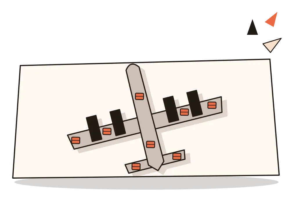
During the Second World War, the statistician Abraham Wald was asked a practical question: where should bombers carry extra armour? Armour is heavy, so a plane can't be covered in it. It has to go where it will do the most good. The planes coming back from missions were covered in bullet holes, mostly along the wings and the body. The obvious answer was to protect those areas.
Wald pointed out what the data couldn't show. These were the planes that came back. The ones hit in the engines never returned to be counted. The holes marked the places a plane could be hit and survive. The armour belonged where the holes weren't.

That is survivorship bias: drawing conclusions from the things that made it through a filter, while the things that didn't make it quietly disappear from view. The filter can be death, failure, bankruptcy, a deleted app, an unanswered survey or a rejected paper. Whatever it is, the evidence on the other side of it is gone, and we tend to reason as though it never existed.
I've been looking forward to this post since I wrote about cherry picking, where the evidence was chosen by someone. Survivorship bias is stranger and in some ways harder to catch, because nobody chooses anything. The world does the choosing before we arrive, and hands us only the survivors.
Planes, cats and mutual funds
The real story of Wald's work is a little less tidy than the version that gets passed around, and I think more interesting. Wald was a Jewish mathematician from Cluj, in present-day Romania, who left Europe for the United States in 1938. During the war he worked with the Statistical Research Group at Columbia University in New York, a small team of statisticians and economists doing calculations for the armed forces. In 1943 he wrote a series of technical memoranda on how to estimate a plane's vulnerability from the damage on the ones that returned. They were full of equations, not sketches. They were published more widely only decades later, and in 1984 the statisticians Marc Mangel and Francisco Samaniego wrote a paper explaining his method. The famous diagram of a plane covered in red dots is a modern illustration, and how exactly the military used his work isn't clear. But the insight at the heart of the retelling is genuinely his: the missing planes are part of the data.

The same mistake turns up in places that have nothing to do with war. In 1987, two vets in New York, Wayne Whitney and Cheryl Mehlhaff, published a study of 132 cats brought to a city animal hospital after falling from high-rise buildings. Strangely, cats that had fallen from above the seventh floor seemed to have fewer injuries than those that fell from lower floors. One suggested explanation was that cats relax and spread out once they reach top speed. Another was simpler. A cat that died from a very high fall was much less likely to be taken to a vet at all, so it never entered the study.
Finance has measured the effect carefully. When a mutual fund performs badly, its company often closes it or merges it into a more successful fund, and its record can quietly drop out of the databases people use to judge funds. In 1992, Stephen Brown, William Goetzmann, Roger Ibbotson and Stephen Ross showed how this can make the average fund look better, and more consistent, than it really is. A few years later, Edwin Elton, Martin Gruber and Christopher Blake confirmed that the funds that disappeared had generally done worse. Look only at the funds still alive, and fund managers as a group seem more skilful than they are.
Why the missing stay missing
Daniel Kahneman described a basic habit of the mind with a clumsy but memorable phrase: what you see is all there is. We build the best story we can from the evidence in front of us, and we rarely ask what evidence isn't in front of us. Absence doesn't feel like information. Nassim Nicholas Taleb called the missing cases silent evidence, and in The Black Swan he retells the same story of the drowned sailors that Francis Bacon used, which I wrote about in the post on cherry picking.
There's also a structural reason, which the organisational researcher Jerker Denrell set out in a 2003 paper. Companies that take big risks are more likely to end up either spectacularly successful or dead. The dead ones stop producing annual reports, case studies and conference talks. So anyone who studies successful firms will find that bold risk-taking seems to go with success, because the bold firms that failed are no longer around to be studied. Denrell called this the undersampling of failure, and argued that it could create management myths all by itself.
The shortcut underneath is usually sensible. Learning from people and things that have done well is one of the fastest ways to learn anything, and most of the time we can't see the failures anyway. The trouble starts only when we forget that what we're looking at has already been filtered.
Eleven great companies, looked at later
In 2001, Jim Collins published Good to Great, one of the best-selling business books of its time. His team had searched through more than 1,400 companies that had appeared in the Fortune 500, looking for those whose stock had performed only about as well as the market for years and then dramatically better for at least fifteen. They found eleven, studied them in depth, and identified the habits they seemed to share, such as a particular kind of humble but determined leader and a disciplined focus on one thing the company could be best at.

Collins was more careful than many business writers. He compared each of his eleven with a similar company that hadn't made the leap. But the companies were chosen because they had already succeeded, and the shared habits were read backwards from that success, so it was hard to know how many unsuccessful companies had the same habits. The following years were a natural test. Circuit City, the electronics retailer that was one of the eleven, filed for bankruptcy in 2008 and closed in 2009. Fannie Mae was taken over by the American government during the 2008 financial crisis. Wells Fargo, also on the list, later had the sales scandal I described in the post on the fundamental attribution error. Others did well. As a group, the economist Steven Levitt pointed out in 2008, their stock had done no better than the market since the book came out.
I don't think the book is worthless, and plenty of its advice is sensible. But it's a useful warning about a genre that designers read a lot: the success story, told backwards. Start-up culture in India has its own version. The founders of companies that became unicorns are interviewed endlessly, and their habits, from dropping out to working through the night, become advice. A widely reported 2016 study by IBM's Institute for Business Value estimated that around nine in ten Indian start-ups fail within five years. Those founders had habits too.
Picture a survey that only reached the happy users
Picture a team running a language-learning app. They want to know what to build next, so they look at two sources. The first is an in-app survey. Seventy per cent of respondents say they love the daily streak counter. The second is analytics: users who complete the weekly challenge are far more likely to still be around after three months. The roadmap almost writes itself. Make streaks more prominent, and push the weekly challenge to everyone.

Now ask how each number was filtered. The survey appeared inside the app, so it only reached people who were still opening it, and of those, only the ones patient enough to answer. Anyone who quit in week two, perhaps because breaking a streak made them feel like a failure, was never asked. The analytics have the same problem in a different form. People who complete the weekly challenge are the most motivated learners to begin with. They would probably have stayed anyway. Pushing the challenge on everyone might do nothing, or it might drive away the people who were already struggling.
The honest version goes looking for the missing group. The team starts tracking every user from the day they sign up, not just those still active, so that the people who left are part of the picture. They add a one-question exit prompt when someone unsubscribes from reminders, and read uninstall feedback and app-store reviews from people who left. They call ten lapsed users. Two of the ten mention the streak counter, and not kindly. That doesn't settle the question, but it puts the people who left back into the data.
When the survivors are the point
Survivors aren't useless. Wald's whole method used nothing but the planes that came back. He simply reasoned carefully about what their damage implied about the ones that didn't. Survivor data is fine as long as you account for the filter.
Sometimes the filter is exactly what you want. If a team is designing an advanced feature for its most committed users, studying the people who stayed is the right thing to do, as long as nobody then claims the findings apply to everyone. Looking at successful products also shows what's possible. One great example proves that something can be done, even if it can't tell you how often it works. And the opposite mistake exists too. Dismissing every success story as luck is its own kind of laziness. Some survivors survived for good reasons, and the work is in finding out which.
How I try to catch it
Before trusting a pattern, I ask how the data was filtered on its way to me. Who had to stay, succeed or reply to be counted? A dashboard of active users, a survey, a list of case studies and a pile of five-star reviews all come through a filter of some kind.
Then I go looking for the missing group: churned users, abandoned carts, the support tickets nobody tagged, the people who uninstalled on day one. They're the hardest people to reach and usually the most informative.
I also keep what I think of as a graveyard, a folder of products, features and ideas that failed, including my own. When I'm tempted to copy something that worked, I look there for anything that tried the same thing and didn't survive.
I keep coming back to Wald's planes. The engineers weren't careless. They were looking hard at real evidence, and the evidence was misleading because of what it left out. In the next post, I'll look at a bias that makes all of this harder still: the bias blind spot, our habit of spotting bias in everyone except ourselves.
Further reading: Marc Mangel and Francisco Samaniego, "Abraham Wald's Work on Aircraft Survivability" (1984) · Jerker Denrell, "Vicarious Learning, Undersampling of Failure, and the Myths of Management" (2003) · Stephen Brown, William Goetzmann, Roger Ibbotson and Stephen Ross, "Survivorship Bias in Performance Studies" (1992) · Nassim Nicholas Taleb, The Black Swan (2007) · Jordan Ellenberg, How Not to Be Wrong (2014)
The question to askWho isn't in this data?