Status Quo Bias
Why the option that's already selected wins so often, and what designers owe people because of it.
Status Quo Bias
Two states, one choice, opposite answers
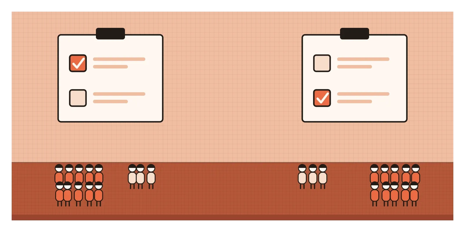
In 1988, New Jersey changed its car insurance law. Drivers could now choose a cheaper policy that limited their right to sue another driver for pain and suffering after an accident, or pay more to keep the full right. The cheaper, limited policy was the default. If you did nothing, that's what you got.
Two years later, the neighbouring state of Pennsylvania introduced almost the same choice, with one difference. There, the full right to sue was the default, and drivers had to ask for the cheaper, limited policy if they wanted it.
The results were studied by Eric Johnson, John Hershey, Jacqueline Meszaros and Howard Kunreuther, who published them in 1993. In New Jersey, only about 20 per cent of drivers bought the full right to sue. In Pennsylvania, about 75 per cent kept it. The two populations were similar, the options were nearly identical, and the prices pointed the same way. The main thing that differed was which box had been ticked before anyone looked. The researchers estimated that if Pennsylvania had used New Jersey's default, its drivers would have paid around $200 million a year less in premiums.
That's status quo bias: our tendency to stick with the current state of affairs, or with whatever option is already chosen for us, more often than its merits would explain. Defaults are its most visible form, but it also shows up whenever changing means doing something and staying means doing nothing.
This post opens the third and last part of this series. So far I've written about flawed arguments and then about the biases inside the people who make things. From here on I'm looking at the people we make things for: the users, customers and citizens who meet our defaults, our prices and our wording, and who bring their own mental shortcuts to every screen. Those shortcuts give designers a lot of power, which is why each post in this part ends with the honest uses of it and the dishonest ones.
The inheritance experiment
The name comes from a 1988 paper by the economists William Samuelson and Richard Zeckhauser. In one of their experiments, people imagined they had inherited a sum of money and had to choose how to invest it, from a menu that included a riskier company, a safer company, government bonds and so on. Some people were simply given the menu. Others were told that the money was already invested in one of the options, and they could leave it there or move it. Whichever option was described as the current investment became noticeably more popular, whichever one it was.
Samuelson and Zeckhauser then looked at real decisions. When Harvard added new health plans for its staff, new employees chose among them freely, while longer-serving employees mostly stayed on the plans they already had, even when the newer ones might have suited them better. Among members of a large American retirement fund, most people rarely or never changed how their savings were split between investments once they had made the first choice.
In 2001, Brigitte Madrian and Dennis Shea showed how large the effect can be in a real workplace. A large American company changed its retirement savings plan so that new employees were enrolled automatically unless they opted out. Participation among new hires jumped from roughly 37 per cent to 86 per cent. Most of them also stayed at the default contribution rate and the default fund, even though these were deliberately cautious choices that many would have been better off changing.
How solid is all this? The field evidence on defaults is among the strongest in behavioural science. A 2019 meta-analysis led by Jon Jachimowicz found that defaults do shift choices on average, but that the size of the effect varies enormously with the setting. They matter less when people have strong, clear preferences and more when a decision is unfamiliar, complicated or easy to put off.
Why staying put feels like the safe choice
In 2011, Isaac Dinner, Eric Johnson, Daniel Goldstein and Kaiya Liu suggested three reasons defaults work, and I find the list useful. The first is effort. Changing anything means reading, comparing and deciding, and doing nothing costs nothing today. The second is endorsement. People assume that whoever set the default chose it for a reason, perhaps because it's recommended or what most people pick. The third is the reference point. The current option becomes the place we measure from, so moving away from it feels like giving something up, and we tend to feel losses more sharply than equal gains, which I'll come back to in a later post on loss aversion.
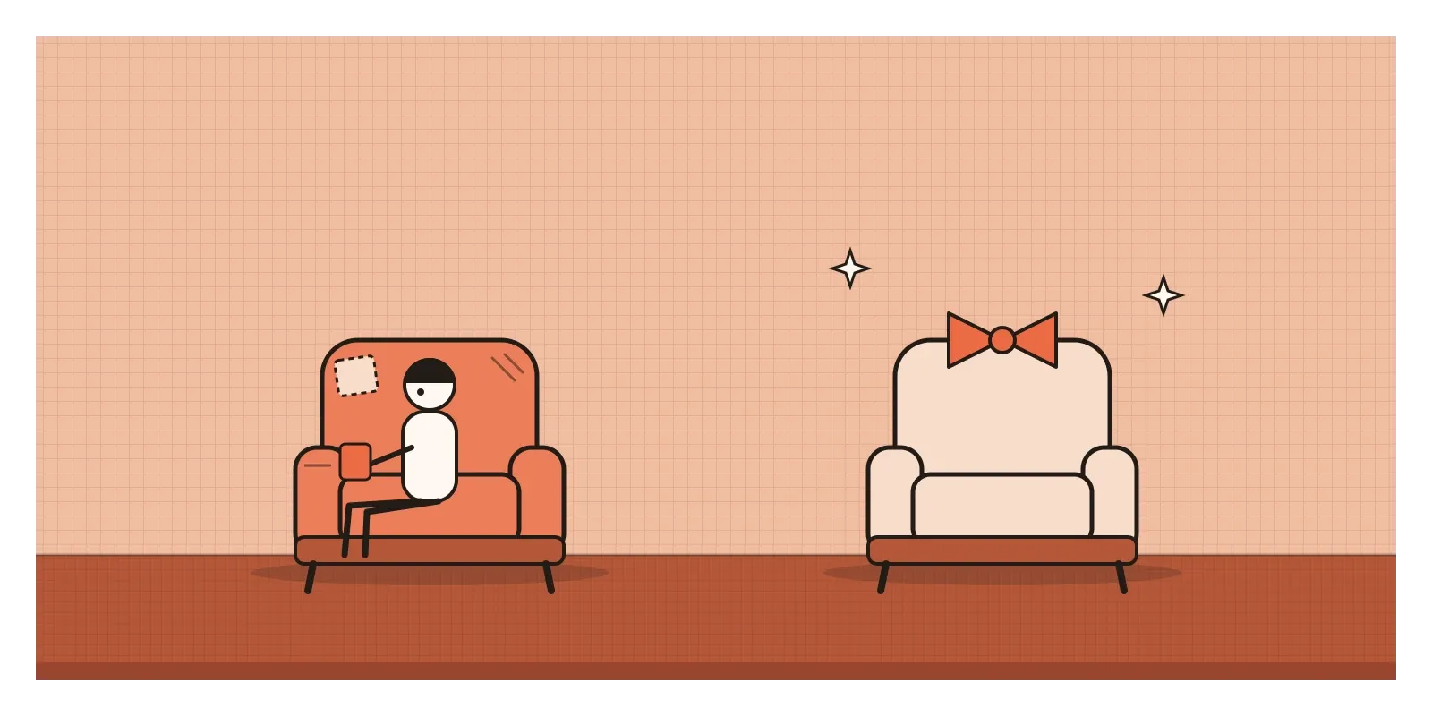
There's also a quieter reason, close to the omission bias I wrote about recently. If I switch to a new plan and it goes badly, it's my fault. If I stay on the old plan and it goes badly, that's just how things were. Staying feels less blameworthy, even when the outcome is the same.
And most of the time, sticking with what we have is a good shortcut. The current arrangement has at least been tested by experience. We know its flaws. A new one carries unknowns, and switching has real costs in time, learning and risk. Someone who reconsidered every setting in their life each morning would get nothing done. The trouble is that the shortcut can't tell the difference between "this is fine" and "this is simply what I was given".
Six clicks to leave
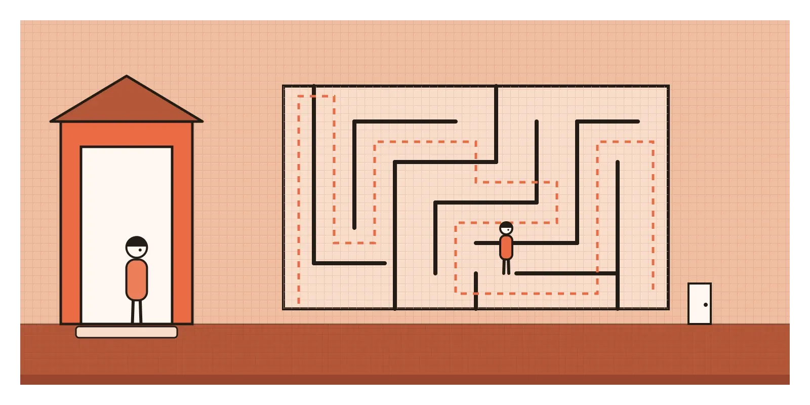
In June 2023, the US Federal Trade Commission sued Amazon over its Prime subscription. The complaint made two main charges. The first was that Amazon had steered people into Prime without clear consent, for example through checkout pages where the most prominent button signed you up, while the option to decline was harder to find. The second was about leaving. According to the complaint, cancelling Prime meant going through a four-page, six-click, fifteen-option process, and internally the company had a name for it: Iliad, after Homer's long poem about the Trojan War. The FTC also alleged that Amazon had slowed or turned down changes that would have made the process simpler, because they would have cost it subscribers.
In September 2025, three days into the trial, Amazon settled for $2.5 billion, made up of a $1 billion civil penalty and $1.5 billion in refunds, without admitting wrongdoing. It agreed to offer a clear button for declining Prime and a simpler way to cancel.
What makes this a status quo story is the asymmetry. Joining was one click, and often the default. Leaving was work. A subscription is the purest form of status quo: once you're in, continuing requires nothing and stopping requires effort. Every extra step on the way out adds a little more weight to staying, and some of the people who stay aren't choosing to. They just haven't got round to leaving. The FTC's wider "click to cancel" rule, adopted in 2024 to make cancelling as easy as signing up, was struck down by a federal appeals court in 2025 on procedural grounds, so for now cases like this one carry much of the weight.
Picture a savings feature for delivery riders
Picture a team at an Indian fintech company designing a savings feature for delivery riders, who are paid every day or every week and often have nothing put aside for a bad month. The idea is simple: a small slice of each payout goes into a savings pot the rider can withdraw from at any time. Research tells the team that riders like the idea when it's explained, but very few have turned it on during a pilot where it started switched off.
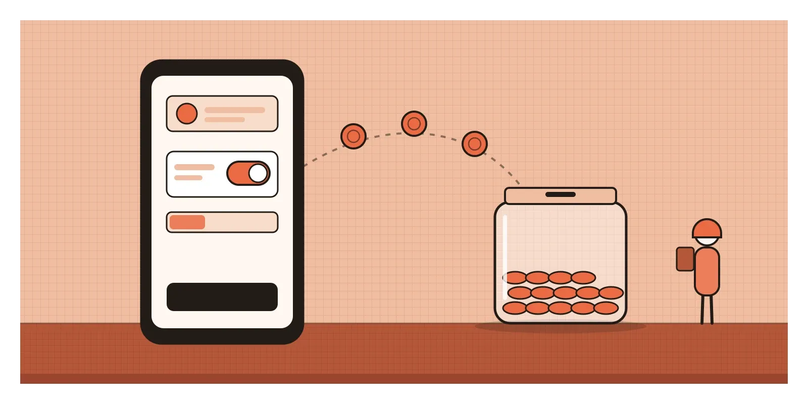
The first proposal is to switch it on for everyone, at 5 per cent of each payout, with the setting tucked into a profile page. Uptake would be excellent. But 5 per cent is a lot when a payout covers today's fuel and food, the setting would be hard to find, and some riders wouldn't notice the feature at all until a payout looked smaller than expected.
The better version keeps the default, because the research says most riders want this and won't get round to it alone. But it starts at 1 per cent, asks each rider once, clearly, during onboarding ("We'll save 1% of each payout for you. You can change or stop this anytime"), shows the saved amount on every payout screen, and puts the off switch where the on switch is. A month later, it suggests raising the rate and lets the rider say no in one tap. The team watches how many riders turn it off, and treats a high number as a sign the default was wrong, not a problem to be hidden.
The difference between the two versions isn't whether there's a default. Everything has one. It's whether the default is what most people would choose for themselves, and whether changing it is as easy as accepting it.
Using it honestly, and where it becomes manipulation
Since there's no such thing as having no default, the honest question is which default, and for whose benefit. Richard Thaler and Cass Sunstein called this choice architecture in their 2008 book Nudge, and automatic enrolment in retirement savings is their favourite example of using it well. The European Union's data protection law, the GDPR, builds the same idea into Article 25, which asks for data protection by default: the most privacy-protective settings should be the starting point, and users can choose to share more.
Manipulation is the mirror image: a default that benefits the company at the user's expense, and that the user wouldn't have chosen. A pre-ticked box for travel insurance, a donation added to a basket, a newsletter sign-up hidden in the checkout. European law has been firm on some of these. The Consumer Rights Directive of 2011 bars sellers from treating pre-ticked boxes as consent to extra payments, and in the 2019 Planet49 case, the EU's Court of Justice ruled that a pre-ticked box doesn't count as consent to cookies.
India's clearest example is about recurring payments. From October 2021, the Reserve Bank of India's rules on card e-mandates meant that a recurring auto-debit had to be registered with an extra step of authentication, and the bank had to notify the cardholder at least twenty-four hours before each debit, giving them a chance to stop it. Debits above a threshold, at first ₹5,000 and from June 2022 ₹15,000, needed fresh authentication each time. Many subscriptions were disrupted at first, which was a cost. But the rules did something subtle: they turned a silent status quo into a visible one. A payment you're reminded of is a payment you can actually choose.
How I try to catch it
The first question I ask about any default is whether most people would pick it if they had to choose actively. If the honest answer is no, it's serving us, not them.
The second is a symmetry test. I count the steps to get into something and the steps to get out, whether it's a subscription, a data-sharing setting or a notification. If leaving is harder than joining, I want a reason that has to do with the user.
The third is to watch what people change. A default that many users turn off is telling me something. A default that almost nobody changes isn't necessarily good either, because it may just mean nobody found the setting.
I think about New Jersey and Pennsylvania often, because nobody in either state was being tricked. The options were explained, the prices were known, and still the ticked box decided for most people. If that's how strongly a default works when everything is above board, then whoever sets it is making the decision for most people, and should set it as if they were.
In the next post I'll look at another way the first thing people see shapes everything after it: anchoring.
Further reading: William Samuelson and Richard Zeckhauser, "Status Quo Bias in Decision Making" (1988) · Eric Johnson, John Hershey, Jacqueline Meszaros and Howard Kunreuther, "Framing, Probability Distortions, and Insurance Decisions" (1993) · Brigitte Madrian and Dennis Shea, "The Power of Suggestion: Inertia in 401(k) Participation and Savings Behavior" (2001) · Richard Thaler and Cass Sunstein, Nudge (2008) · Jon Jachimowicz and colleagues, "When and Why Defaults Influence Decisions: A Meta-Analysis of Default Effects" (2019)
The question to askWould they pick this, or did we pick it for them?