The Representativeness Heuristic
Why we judge how likely something is by how well it fits a picture, and forget how common it is.
The Representativeness Heuristic
Linda, the bank teller
In the early 1980s, the psychologists Amos Tversky and Daniel Kahneman gave university students a short description of a woman they called Linda. She was 31, single, outspoken and very bright. She had majored in philosophy, and as a student she had been deeply concerned with discrimination and social justice, and had taken part in anti-nuclear demonstrations.
Then they asked which statements about Linda were more probable. Among them were two that matter here. "Linda is a bank teller." And "Linda is a bank teller and is active in the feminist movement." In one version of the study, about 85% of students said the second was more likely than the first.
It can't be. Every feminist bank teller is a bank teller, so the chance of Linda being both can never be higher than the chance of her being a bank teller at all. Adding a detail can only shrink the group. But the second statement feels more likely, because it fits the picture. The palaeontologist Stephen Jay Gould, who knew the right answer, later wrote that a little voice in his head kept insisting that she couldn't just be a bank teller. Tversky and Kahneman published the study in 1983 and called the error the conjunction fallacy.
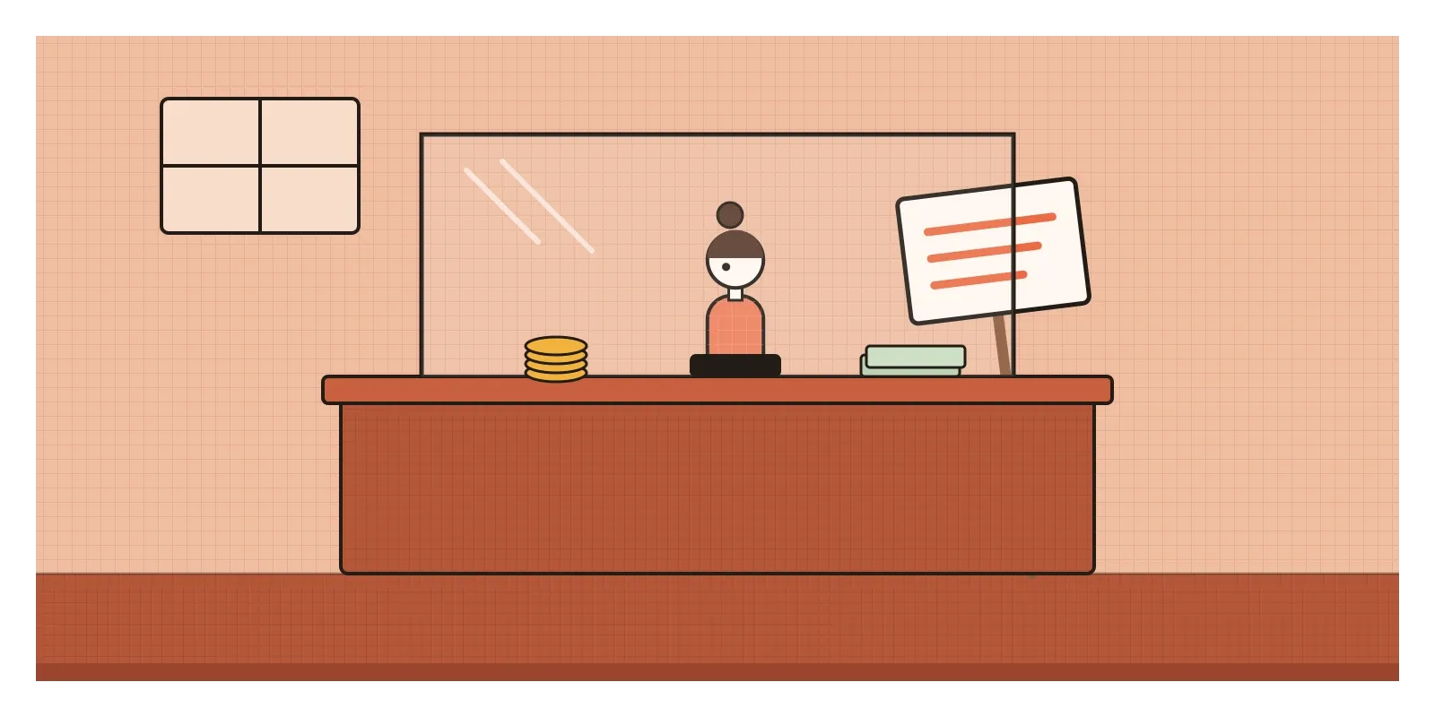
The shortcut behind it is the representativeness heuristic: judging how likely something is by how closely it resembles our picture of a typical case, instead of by how common it actually is. Linda resembles our image of a feminist much more than our image of a bank teller, so the description that includes feminism wins, even though it's logically less likely.
Judging by resemblance
Kahneman and Tversky first described the heuristic in a 1972 paper on subjective probability. They suggested that when people judge the probability of something, they often ask a different and easier question: how similar is this to the category, or to the process I think produced it? Similarity is usually quick to judge. Probability isn't.
In a 1973 study, they showed how this crowds out base rates, the plain facts about how common things are. People read short personality sketches said to be drawn at random from a group of 100 professionals. Some were told the group had 70 engineers and 30 lawyers; others were told the reverse. Then they judged how likely each person was to be an engineer. Their answers barely changed between the two groups. A sketch that sounded like an engineer was judged likely to be an engineer, whether engineers made up 70% of the group or 30%. Even a sketch that said nothing useful at all led many people to answer fifty-fifty, ignoring the 70 to 30 split entirely.
The same shortcut explains the gambler's fallacy. After five reds in a row on a roulette wheel, black feels "due", because a run of five reds doesn't look like our picture of randomness, which is well mixed. But the wheel has no memory. And it connects to the law of small numbers that I wrote about in the post on hasty generalisation: we expect a small sample to look like the population it came from, so we trust it too much.
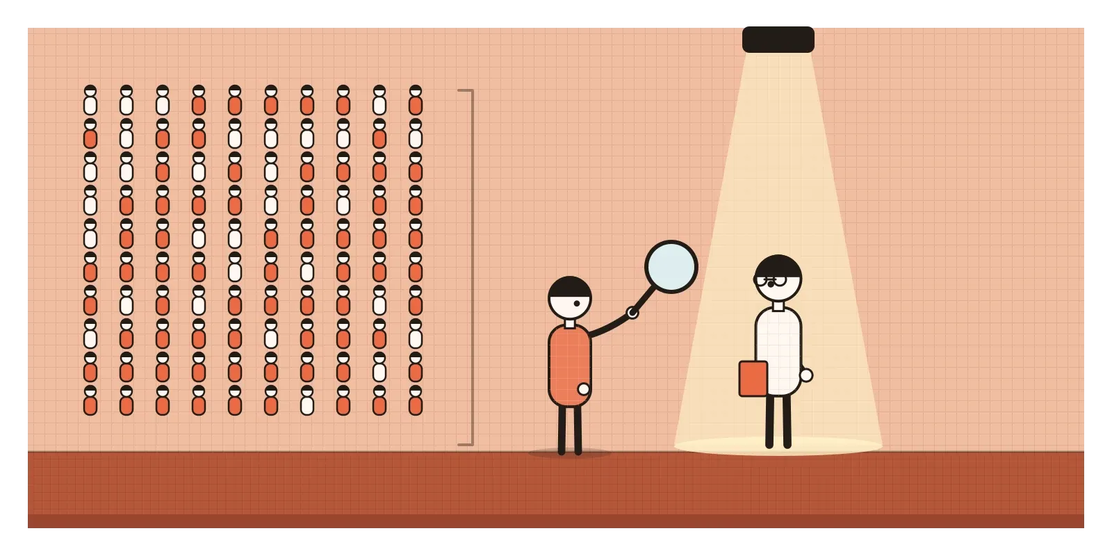
The Linda problem has had serious critics. The psychologist Gerd Gigerenzer argued that "probable" in everyday speech can mean plausible or fitting, so people may have been answering a reasonable question that wasn't the one the researchers meant. In 1999, Ralph Hertwig and Gigerenzer found that asking how many out of 100 women like Linda would be bank tellers, and how many feminist bank tellers, sharply reduced the error. Kahneman, Hertwig and Barbara Mellers then did something unusual: they designed experiments together, as an "adversarial collaboration", published in 2001. Frequency questions reduced the error, but didn't remove it on their own, and the two sides still interpreted the results differently. My reading of the whole debate is that the conjunction error is real and robust, but how we ask the question changes how often it happens. That turns out to be very useful for designers.
Why looking the part usually works
Resemblance is a good guide surprisingly often. Things that look like members of a category usually are. Something with feathers, a beak and wings is very probably a bird. A message that looks exactly like the ones your bank always sends is usually from your bank. Our brains have learned these patterns from thousands of examples, and checking them is fast and mostly right. Kahneman later described the general move as attribute substitution: faced with a hard question, the mind quietly answers an easier one that's related to it.
The heuristic fails in two predictable situations. The first is when base rates are very lopsided. A person who looks exactly like a typical librarian may still be more likely to be a salesperson, simply because there are so many more salespeople. The second is when someone deliberately builds the resemblance. If you know what people use to judge "this is real", you can fake it.
The request that looked like a payment
India's Unified Payments Interface, UPI, has made sending money as quick as sending a message. For years it also let one person send another a "collect request", asking them to pay. The feature was useful for splitting bills. It also became a favourite tool of fraudsters. A typical version targeted people selling something online. A "buyer" would agree a price, then say they had sent the money and the seller just needed to approve it. What arrived on the seller's phone was a collect request: a screen with a name, an amount and a prompt to enter a PIN. To many people, it looked like what receiving money looks like. They entered the PIN and the money went the other way.
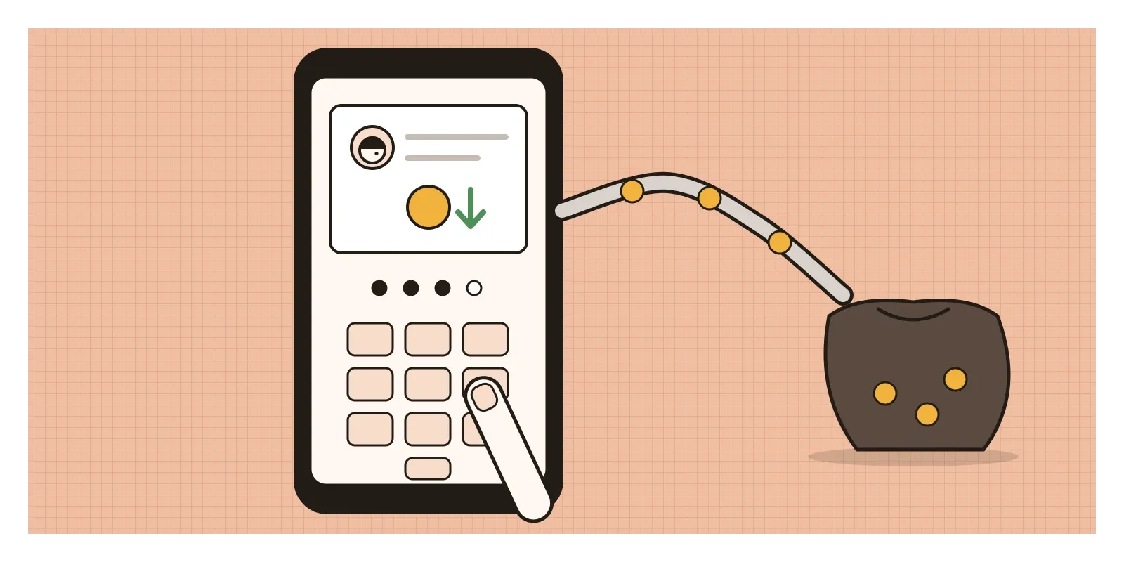
Banks and the National Payments Corporation of India, which runs UPI, repeated the same advice for years: you never need to enter your PIN to receive money. The advice was correct, but it asked people to override a strong resemblance in a hurried moment. NPCI first limited person-to-person collect requests to small amounts. Then, in a circular dated 29 July 2025, it told banks and payment apps that person-to-person collect requests would not be processed from 1 October 2025. Requests from verified merchants continued. Payments between people now start only from the person paying.
I find that decision instructive. Rather than relying on millions of people to resist a convincing resemblance, the system removed the pattern that made the deception possible.
"I don't look like someone who gets that"
Picture a team designing a screening feature for a health app in India, aimed at type 2 diabetes. The idea is simple: a short questionnaire, then a nudge to get a blood sugar test if the answers suggest risk. In early tests, the team notices that slim, active people in their thirties skip the questionnaire almost entirely. In interviews, several say some version of the same thing: "I'm not the type." Their picture of a person with diabetes is someone older and much heavier. The first draft of the feature didn't help. Its illustration showed exactly that person.
This is representativeness on the user's side. People judge their own risk by how much they resemble a typical patient, not by how common the condition is or by the factors that predict it. In India, that picture is especially misleading. The ICMR-INDIAB study, published in 2023, estimated that about one in ten Indian adults had diabetes and more still had prediabetes, and South Asians tend to develop type 2 diabetes at lower body weights than people of European descent.
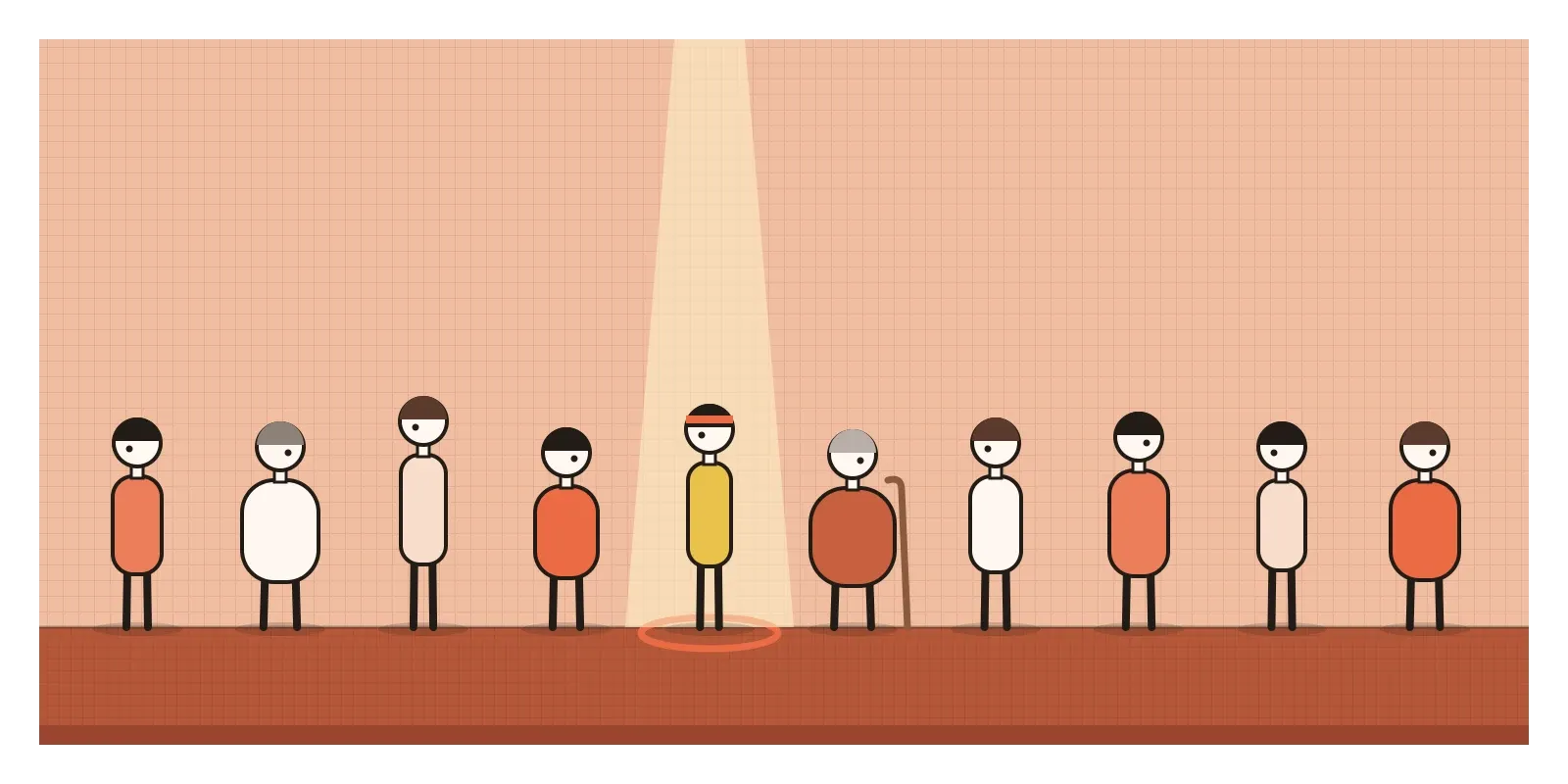
The better version changes both the picture and the question. The illustrations show a varied set of people, slim and heavy, young and old, so that nobody can rule themselves out by looking at them. The screen opens with the base rate as a plain count, "about 1 in 10 adults in India has diabetes, and many don't know it", because counts are easier to grasp than percentages, as the Linda debate showed. The questions focus on what actually predicts risk, such as family history, waist size, age and activity, rather than on what a patient supposedly looks like. And the result explains itself in the same terms. The feature still can't make anyone take a test, but it no longer lets a stereotype make the decision for them.
Using it honestly, and where looking the part becomes a disguise
A great deal of good design works with representativeness. When a "pay" button looks like a pay button, a link looks like a link, and a bank's real messages always look the same, people can rely on resemblance safely. Conventions are honest resemblance: they make things look like what they are. Designers can also protect people by making things that are different look different, such as sending money and receiving it, or an ad and an answer.
It becomes manipulation when resemblance is used as a disguise. Ads designed to look like news articles or search results, lookalike apps with near-identical icons, fake "verified" ticks and phishing pages all exploit the same shortcut. In 2015, the US Federal Trade Commission issued an enforcement policy statement on deceptively formatted advertising, making clear that ads must be identifiable as ads, whatever format they borrow. The EU's Digital Services Act requires online platforms to label advertising clearly. India's 2023 dark-pattern guidelines list "disguised advertisement" among the practices they prohibit. The common principle is simple: if something is not what it looks like, the person has to be told.
Fifty-two ways of being sure
The habit I use most is to ask about the base rate before I look at the details. How common is this, in general? Only then do I ask how well this particular case fits. If I look at the details first, they win.
The second is to translate probabilities into counts. "Out of 100 users like this, how many would actually do that?" It's the same trick that cut the error rate on the Linda problem, and it works in design reviews as well as in labs.
The third is to be suspicious of detail. A persona with a name, a job, a favourite café and a backstory feels more real than a plain segment description, but each added detail makes it describe fewer actual people. Like Linda the feminist bank teller, the more vivid the story, the less likely it is to be true as a whole.
This is the last post in this section, and it seems a fitting place to stop. We began with arguments: false cause, cherry picking, the straw man and the other fallacies that creep into how we reason with each other. Then we turned to the maker's mind, the biases that shape how designers, researchers and teams decide, from false consensus to zero-risk bias. And we ended with the user's mind, from status quo bias to this one, the shortcuts that shape how the people we design for choose and remember. Almost every one of them is a shortcut that usually works, used in a place where it doesn't. Linda still looks like a feminist to me, too. The point was never to stop seeing the resemblance. It was to remember to ask how many bank tellers there are.
The next section on the site, The Physics of Interfaces: Laws, Principles and Patterns, moves from how people think to how they actually use what we build, through the laws and patterns that describe it.
Further reading: Amos Tversky and Daniel Kahneman, "Extensional Versus Intuitive Reasoning: The Conjunction Fallacy in Probability Judgment" (1983) · Daniel Kahneman and Amos Tversky, "On the Psychology of Prediction" (1973) · Ralph Hertwig and Gerd Gigerenzer, "The 'Conjunction Fallacy' Revisited: How Intelligent Inferences Look Like Reasoning Errors" (1999) · Barbara Mellers, Ralph Hertwig and Daniel Kahneman, "Do Frequency Representations Eliminate Conjunction Effects? An Exercise in Adversarial Collaboration" (2001) · Daniel Kahneman, Thinking, Fast and Slow (2011)
The question to askHow common is this, whatever it looks like?