False Cause
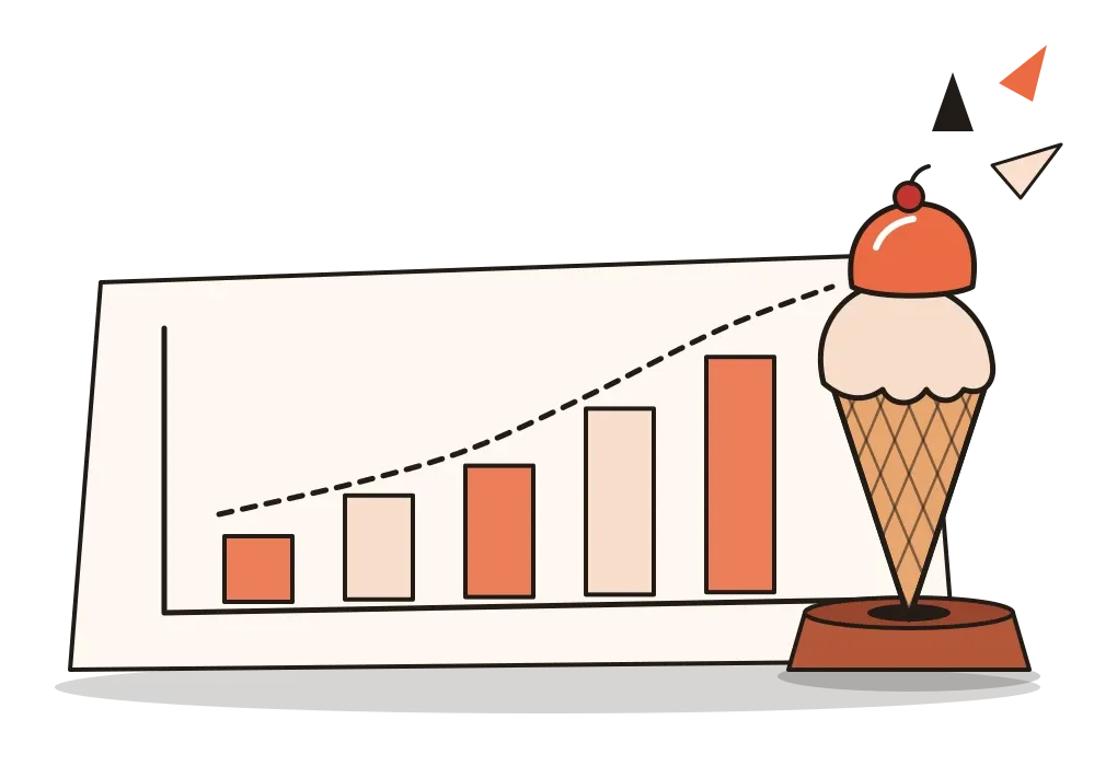
Two lines on a chart go up together, and the whole room decides one pushed the other.
False Cause
Chocolate and the Nobel Prize
In October 2012, the New England Journal of Medicine, one of the most respected medical journals in the world, published a short paper about chocolate. Its author, Franz Messerli, a cardiologist in New York, had been reading about flavanols, compounds in cocoa that some studies had linked to better thinking in older people. He wondered whether a country that ate more chocolate might, as a whole, be a little sharper. For a measure of a nation's brainpower he chose the number of Nobel Prize winners per ten million people, and he plotted it against how much chocolate each country ate per person.
The points lined up beautifully. Across 23 countries, the more chocolate a nation ate, the more Nobel laureates it had produced. Switzerland sat in the top right corner, high on both. Sweden was an outlier, with more prizes than its chocolate habit predicted, and Messerli offered two explanations with a straight face: perhaps the prize committees in Stockholm favoured their own, or perhaps Swedes were unusually sensitive to chocolate.
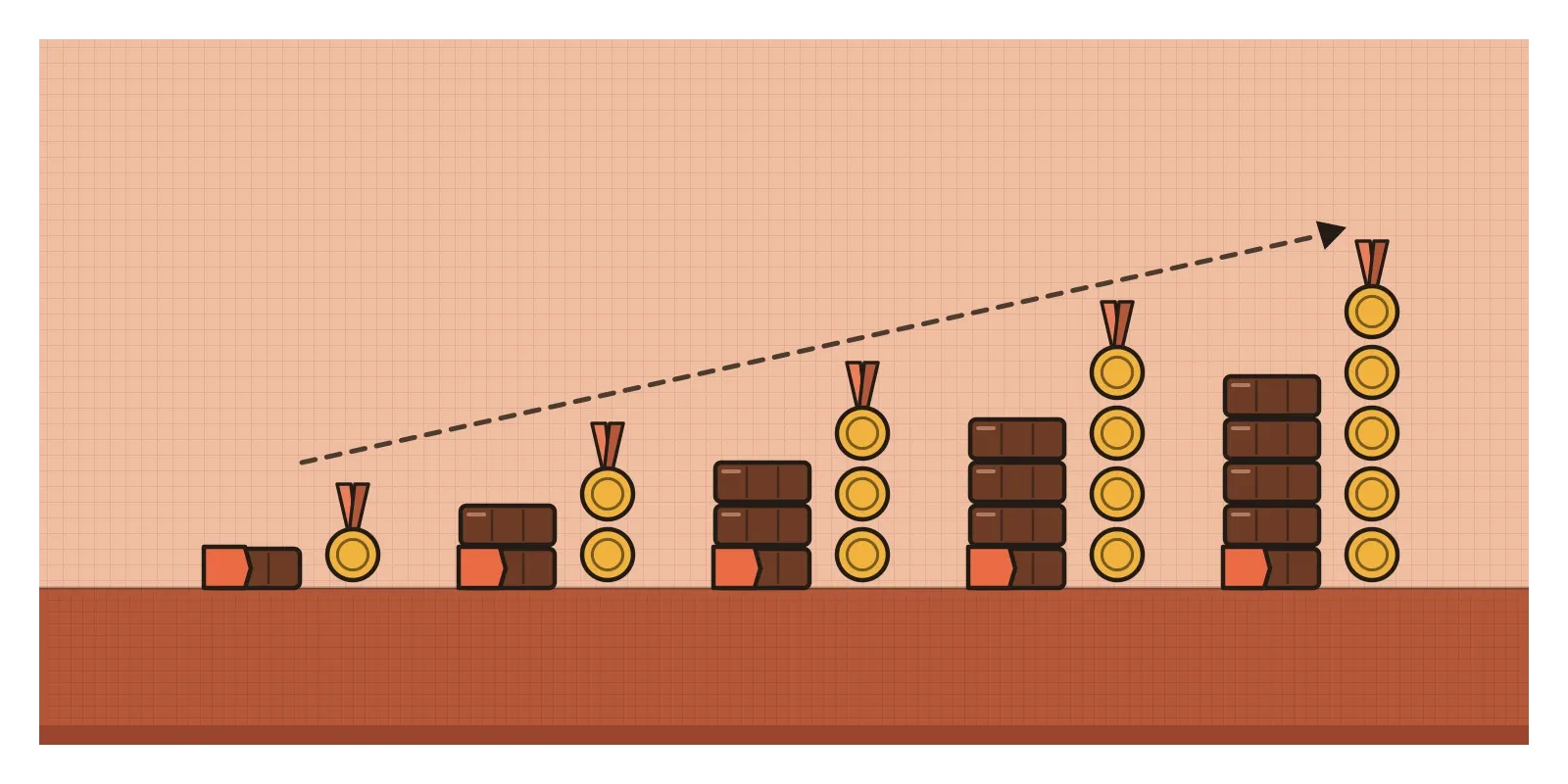
The paper was written with a wink, and many readers took it as a joke about exactly the mistake I want to write about. A wealthy country can afford plenty of chocolate. It can also afford the universities, laboratories and long, well-funded careers that produce Nobel laureates. Wealth sits behind both lines. Chocolate doesn't win anyone a prize.
This is the false cause fallacy: concluding that because two things happen together, or one after the other, the first must have caused the second. Logicians call it non causa pro causa, a non-cause taken for a cause. When the mistake rests on timing it has its own Latin name, post hoc ergo propter hoc, "after this, therefore because of this". I wore my lucky shirt and we won the match. I changed the button colour and sales went up.
This post opens a new part of Thoughtcloud, about the invisible forces that bend how we reason and decide, beginning with the classic mistakes of argument. False cause felt like the right place to start, because I've met it most often in my own work, usually on a slide with a big upward arrow. Correlation is a hint. It is never a verdict. That's easy to agree with and remarkably hard to live by, especially when the correlation happens to flatter you.
Two lines that rise together
Aristotle named something like this mistake more than two thousand years ago. In Sophistical Refutations, his short book on arguments that look convincing but aren't, he describes treating what is not a cause as a cause. He meant a fairly narrow trick in formal debate, but later logicians stretched the name to cover any argument that pins an effect on the wrong cause.
The deeper puzzle came from the Scottish philosopher David Hume. In An Enquiry Concerning Human Understanding (1748), he used the example of one billiard ball striking another. We say the first ball made the second one move. But all we actually see is one ball moving, touching the other, and then the other moving. We never see the "making". Our minds supply the connection. The feeling that this caused that is something we add, not something we observe.
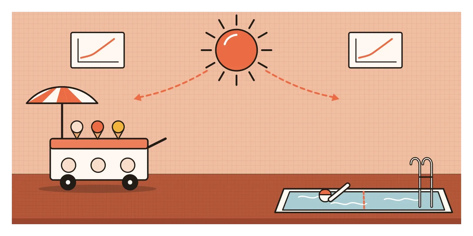
The textbook illustration involves ice cream. Every summer, ice cream sales rise. Every summer, drownings rise too. Put the two lines on one chart and they climb and fall almost in step. Ice cream isn't dangerous, of course. Hot weather sends people to the ice cream cart and to the swimming pool. One hidden cause drives both lines. Statisticians call it a confounding variable, and it's the most common way a false cause sneaks in, just as wealth did with the chocolate.
Two lines can travel together in other ways too. The arrow can point backwards: places with more crime tend to hire more police, so a chart can make police look like a cause of crime. The link can be pure coincidence. Tyler Vigen's book Spurious Correlations is full of charts like the one where drownings in swimming pools rise and fall, year by year, with the number of films Nicolas Cage appeared in. Search enough data and some lines will always match.
And sometimes the "cause" is just ordinary variation. In Thinking, Fast and Slow, Daniel Kahneman remembers a flight instructor in the Israeli Air Force who insisted that praise made cadets worse and shouting made them better, because a great manoeuvre was usually followed by a weaker one, and a bad one by a better one. Kahneman realised the instructor was watching regression to the mean. An unusually good or bad performance is partly luck, so the next one is likely to be closer to average, whatever anyone says.
Why the leap feels like insight
In the 1940s, the Belgian psychologist Albert Michotte ran a set of experiments that still surprise me. He showed people very simple animations. A small square slides across and stops beside a second square, which immediately starts moving away. Almost everyone described what they saw in the language of causes. The first square hit the second and launched it. When Michotte added a short pause before the second square moved, the impression of pushing faded quickly. He published the work in 1946 as La perception de la causalité, and his conclusion was that in moments like these we don't reason our way to a cause. We see it, almost as directly as we see colour.
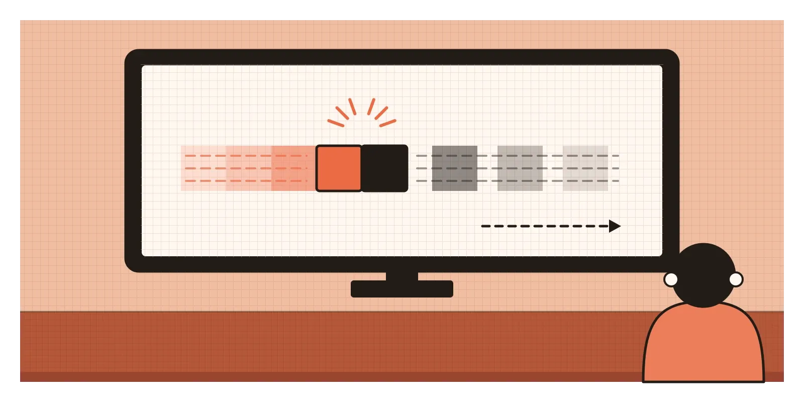
That instinct makes sense. For our ancestors, a brain that waited for a controlled experiment before running from a rustle in the grass would not have lasted long. So we still leap from "together" to "because", and the leap feels like insight rather than guesswork.
Stories make it worse. "Conversions rose" is a fact. "Conversions rose because of the redesign" is a story with a hero, and the hero is often us. Incentives finish the job. When a metric improves after my work ships, I have every reason to believe I caused it. Nobody writes a case study titled "Something went up and we don't know why".
Indian cricket has a whole folk science of this. For years a story went around that India tended to lose when Sachin Tendulkar scored a century. The records don't support it: India won most of the one-day internationals in which he made a hundred. A few painful, memorable defeats were enough to build the myth. Most of us also know someone who won't move from their seat while a partnership is going well.
What happens when you test the hunch
The best protection people have invented against this mistake is the randomised controlled trial. You randomly assign some people to receive a treatment and others not to. Because chance decides who goes where, hidden factors such as age, wealth, health and habits end up spread roughly evenly across both groups. If the treated group then does better, the treatment is the most likely reason. In digital products, the same idea is called an A/B test.
Its value is clearest when it overturns a belief. For years, observational studies suggested that women who took hormone replacement therapy after menopause had less heart disease, and the therapy was widely prescribed partly for that reason. Then, in 2002, the Women's Health Initiative, a large randomised trial in the United States, stopped one of its arms early. It found no protective effect on the heart from the combined therapy it was testing, and increased risks of some serious conditions, including breast cancer and stroke. One widely discussed explanation for the earlier findings was that the women who chose the therapy tended to be healthier and better off to begin with. Their good health came with them. Later analyses added nuance about the age at which women start, and that debate continues, but the trial showed how easily the earlier studies had misled.
People who run experiments in technology companies tell similar stories. Ronny Kohavi, who led experimentation teams at Microsoft and later at Airbnb, has written that at Microsoft roughly a third of the ideas they tested improved the metric they were designed to improve. Another third made no meaningful difference, and the last third made things worse. Launched without a test, many of those ideas would have been followed by a rise for unrelated reasons, and their teams would have taken the credit.
A checkout that shipped in festival month
Picture a team redesigning the checkout of a food delivery app. The old checkout has four screens and the new one has two. It ships on the first of November. By the end of the month, completed orders are up 11%, and the slide at the monthly review says, in large type, "New checkout increased orders by 11%." Everyone is pleased, and if I'm honest, I'd be pleased too.
Now walk through what else happened that month. Diwali fell in the second week, when lots of families order in. The marketing team ran a discount campaign for new users. A large competitor had a two-day outage. And engineering quietly fixed a payment bug that had been failing for some card users since September.
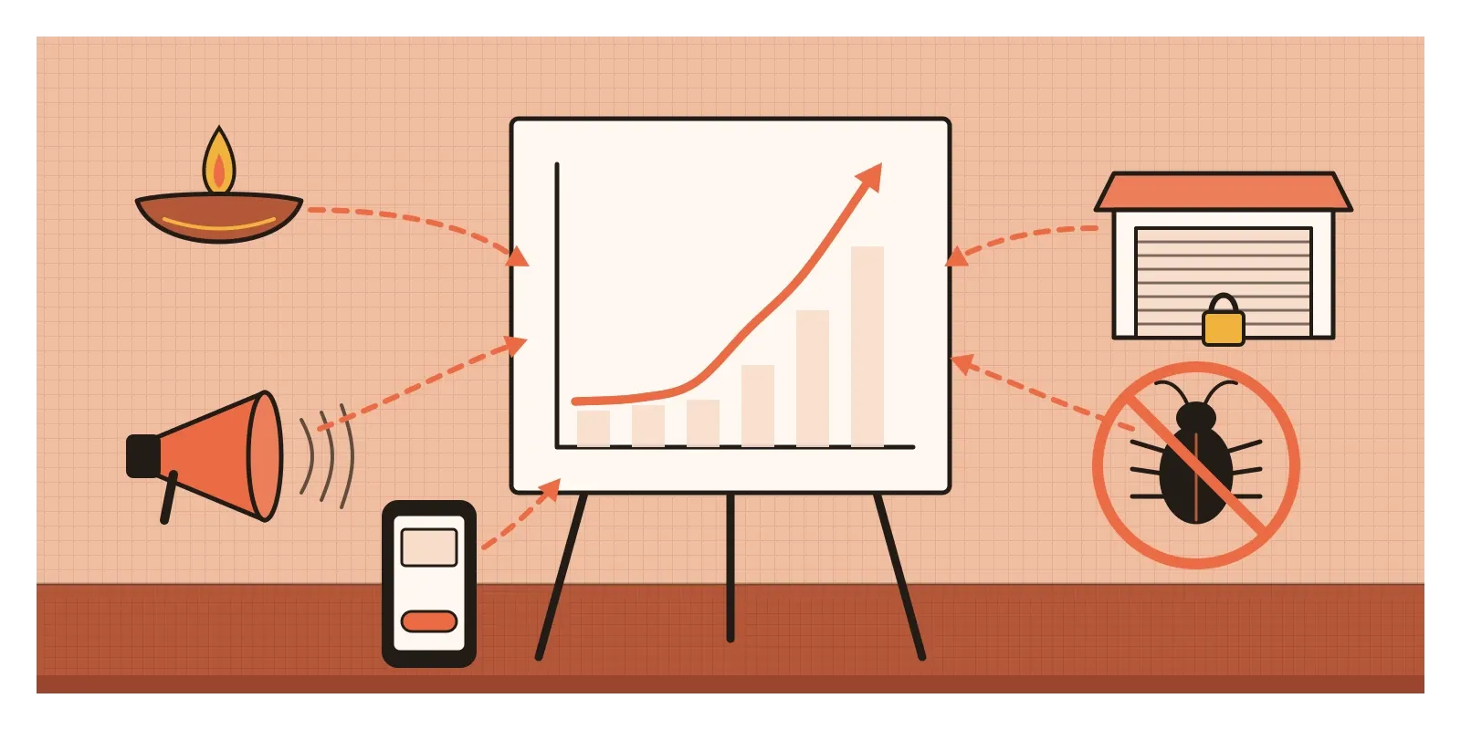
Any one of these could explain part of the 11%. Together they could explain more than all of it, which would mean the new checkout might even have lowered orders slightly while everything else lifted the total. The slide can't tell those two worlds apart. The honest version reads: "Orders rose 11% in November. Several things changed in the same month. We can't yet isolate the effect of the new checkout." It's a less exciting slide. It's also the only true one.
The better slide comes from a test. Run the old and new checkouts side by side for two weeks, with users randomly assigned to each. Diwali, the campaign and the outage now affect both groups in the same way, so whatever difference remains belongs to the checkout. Without a test, the team can still look for clues, such as whether fewer people dropped out at the exact step the redesign removed.
When the connection is real
None of this means correlations are useless. Many real causes were first spotted as correlations. The link between smoking and lung cancer was established largely from observational evidence, because randomly assigning people to smoke for decades would be unethical. In 1950, Richard Doll and Austin Bradford Hill showed that lung cancer patients in London hospitals were far more likely to be heavy smokers than other patients. In 1965, Bradford Hill set out what makes a causal reading more believable: a strong association, consistency across studies, the cause coming before the effect, more of the cause bringing more of the effect, a plausible mechanism, and a few more. He called them viewpoints, not a checklist.
Designers can borrow the same habit when a test is impossible. Does the effect show up in more than one place? Is it bigger where the change was bigger? Is there a believable mechanism? None of these alone proves causation, but together they build a reasonable case. And "after, therefore because" isn't always wrong. If the light comes on every time I press the switch, and I know there's a wire between them, I'm entitled to my conclusion.
Not every decision needs proof either. If a redesign clearly fixes a problem we watched people struggle with in testing, it may be worth shipping without a perfect measurement. The fallacy isn't in acting without proof. It's in claiming proof you don't have.
How I try to catch it
The first question I ask is: what else changed at the same time? I list campaigns, seasons, festivals, pricing changes, outages, bug fixes and competitors' moves. The list is almost always longer than I expect.
The second is: what does the line usually look like? Before reading meaning into a change, I look at the same metric over many previous weeks. Most apparent effects turn out to be smaller than the ordinary ups and downs.
The third is about language. "Rose after" and "rose because of" are different claims, and in my own case studies I try to use the one my evidence supports. Whenever I can, I test.
I still think of Messerli's chart, with Switzerland glowing in its top corner, whenever a slide looks that tidy. It's a lovely picture, and it says nothing at all about chocolate. In the next post I'll look at a shortcut that persuades us not with a chart but with a crowd: the bandwagon fallacy.
Further reading: David Hume, An Enquiry Concerning Human Understanding (1748) · Austin Bradford Hill, "The Environment and Disease: Association or Causation?" (1965) · Judea Pearl and Dana Mackenzie, The Book of Why (2018) · Ron Kohavi, Diane Tang and Ya Xu, Trustworthy Online Controlled Experiments (2020) · Tyler Vigen, Spurious Correlations (2015)
The question to askWhat else changed at the same time?