The Mere Exposure Effect
How seeing something again and again makes us like it, and why designers are its easiest targets.
The Mere Exposure Effect
The tower Paris's artists wanted gone
On 14 February 1887, a Paris newspaper, Le Temps, published a letter of protest. Its signatories were some of the best-known artists and writers in France, among them the composer Charles Gounod, the architect of the Paris Opéra, Charles Garnier, and the writer Guy de Maupassant. They objected to a tower then being planned for the Exposition Universelle of 1889, designed by the engineering firm of Gustave Eiffel. They called it useless and monstrous. They compared it to a gigantic factory chimney looming over the city's cathedrals and palaces, and warned that it would humiliate everything around it.
The tower went up anyway, and was finished in time for the exhibition. It was meant to stand for twenty years and then come down. There's a well-known story that Maupassant later took his lunch in the tower's restaurant, because it was the one place in Paris from which he didn't have to look at it. The essayist Roland Barthes retold it, and it may be more legend than fact. What isn't in doubt is how the story ends. The tower stayed, partly because it proved useful for radio, and over the following decades Paris got used to it, then fond of it, and then made it the symbol of the city.
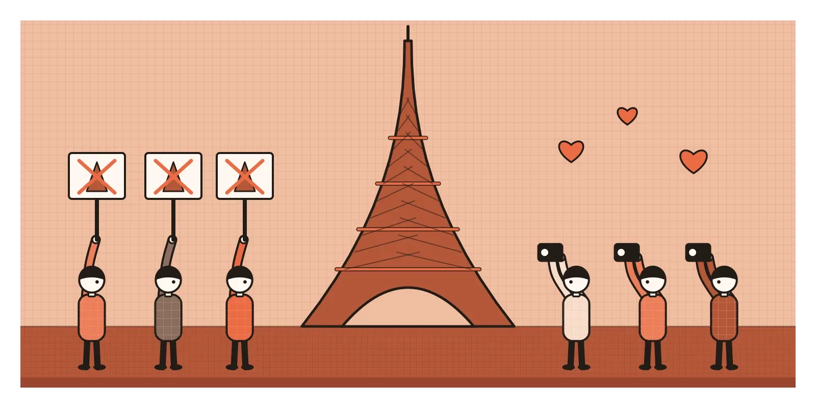
The tower didn't change much. The people looking at it did, simply by looking at it every day. Psychologists call this the mere exposure effect: the more often we're exposed to something, the more we tend to like it, even when nothing else about it, or about us, has changed. It's sometimes called the familiarity principle. I think it's one of the more dangerous biases for people who make things, because no one sees a design more often than the person designing it.
Nonsense words that grew on people
The effect was pinned down by the psychologist Robert Zajonc at the University of Michigan. In a long paper in 1968, he showed people a set of made-up words that looked vaguely Turkish, such as iktitaf and saricik. Some words appeared once, some twice, and some up to twenty-five times. Afterwards, he told participants the words were Turkish adjectives and asked them to guess whether each meant something good or something bad. The more often a word had been shown, the more likely people were to guess it meant something good. He found the same pattern with Chinese-like characters shown to people who couldn't read Chinese, and with photographs of strangers' faces.
In 1980, Zajonc and William Kunst-Wilson took it further. They flashed irregular shapes on a screen for just a millisecond, too fast for anyone to say what they'd seen. Later, when people were shown pairs of shapes, they couldn't tell which ones they'd seen before any better than chance. But when asked which one they liked more, they picked the previously flashed shape more often than chance would predict. They liked it without knowing why.
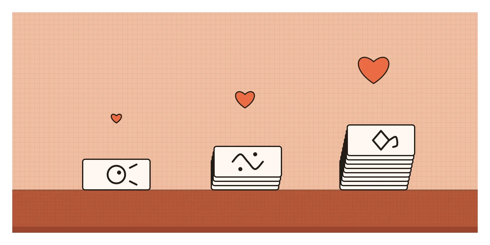
Two other studies stay with me. In 1977, Theodore Mita, Marshall Dermer and Jeffrey Knight photographed women and showed them two prints of their own face: a normal one and a mirror-reversed one. The women preferred the mirror image, the face they saw every morning. Their friends preferred the normal print, the face they knew. And in 1992, Richard Moreland and Scott Beach arranged for four women of similar appearance to attend a large university lecture course a different number of times, from never to fifteen times, without talking to anyone. At the end of term, students rated the women who had come more often as more attractive and more likeable.
The effect has held up well over decades. In 1989, Robert Bornstein reviewed more than two hundred experiments and found it again and again, with faces, words, shapes, music and paintings. But it's usually modest, and it has limits. Bornstein found it was strongest with fairly brief, limited exposures, and a 2017 review led by Matthew Montoya found that liking tends to rise with the first several exposures and then level off or fall as boredom sets in. Familiarity warms us up. Too much of it wears us out.
Why familiar feels right
Zajonc's own explanation was about safety. For any creature, something it has met many times without being harmed is probably safe. A small, automatic warmth towards the familiar would have helped our ancestors tell friends from strangers and safe food from risky food, without having to think it through each time.
A second explanation is about ease. Something we've seen before is easier for the brain to process. Psychologists call this processing fluency, and we tend to misread that ease as a sign of quality. In 1998, Rolf Reber, Piotr Winkielman and Norbert Schwarz showed that making a picture slightly easier to see, by showing it with more contrast, for a little longer, or after a brief hint of its outline, made people like it more. The picture hadn't improved. It just went down more smoothly.
Fluency even seems to shape taste across a whole field. In 2003, the psychologist James Cutting at Cornell noticed that the Impressionist paintings people prefer tend to be the ones reproduced most often in books. In his classes he then showed students lesser-known Impressionist works more often than famous ones, and their preferences shifted towards them. Part of what we call the canon may be what we've simply seen the most.
The score that lost to the temp track
While Stanley Kubrick was editing 2001: A Space Odyssey in 1967, he cut the film to recordings of existing classical music, including Richard Strauss's Also sprach Zarathustra, Johann Strauss's The Blue Danube and pieces by György Ligeti. Film editors call this a temp track, music used only while the film is being cut, to be replaced later by an original score. Kubrick hired the composer Alex North, who had written the music for Spartacus, to write that score.
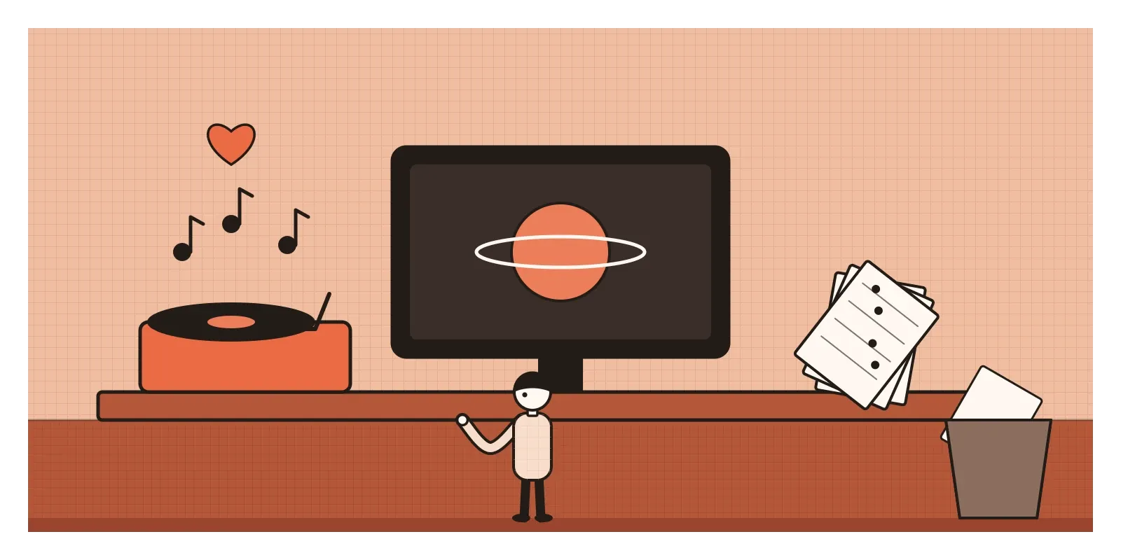
North worked intensely for weeks. Kubrick dropped his music and kept the temp tracks. According to North's own account, he found out only when he watched the film at its premiere in 1968. His score was finally recorded and released in the 1990s, conducted by Jerry Goldsmith.
Kubrick may simply have been right. The classical choices are now inseparable from the film, and he said in interviews that he preferred great existing music to anything a film composer could write on a deadline. I'm not claiming exposure alone made his decision. But film people have a name for what happens when a director hears the same temporary music under the same scenes for months: temp love. Every new score is then judged against something the director has heard hundreds of times, and it sounds wrong mostly because it's different.
Designers have their own temp love. We live with a placeholder icon, a working title, a first layout or a borrowed colour for weeks. By the time a better version arrives, the placeholder has had a head start that no new idea can catch up with in one meeting.
Picture a home screen that had been on the wall for weeks
Picture a team redesigning the home screen of a savings app. In the first week, the lead designer pins an early concept, option A, to the wall. Over the next six weeks it appears in every critique, every stand-up and the product manager's update to leadership. Everyone has seen it forty or fifty times. In week seven, a newer designer brings option B, which reorganises the screen around the user's next bill rather than their balance.
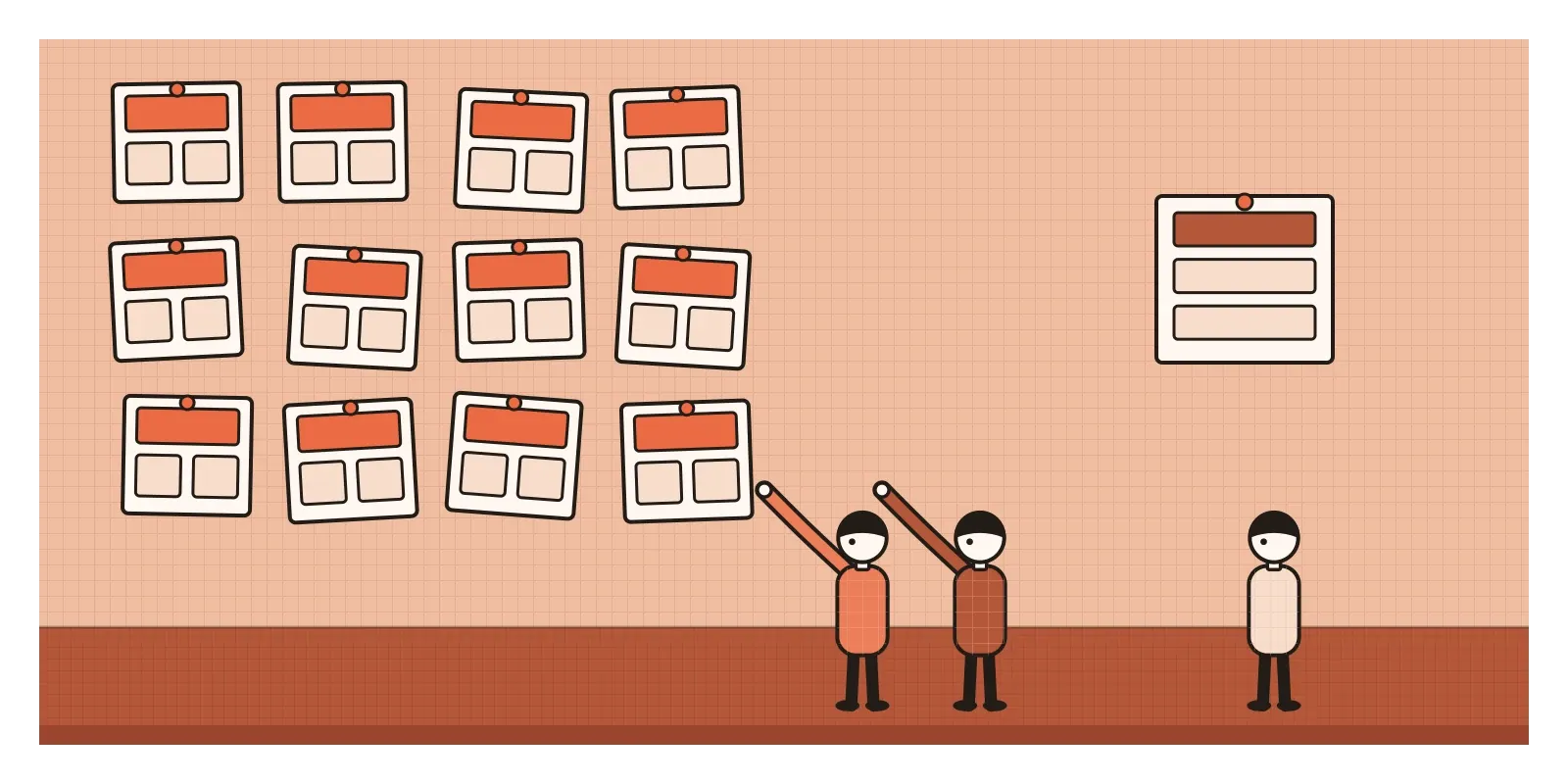
The discussion is short. Option A "feels more like us". It "just works". B feels "a bit off", "busy", "not quite there". Nobody says, or perhaps notices, that A has had six weeks of familiarity and B has had six minutes. The team picks A. In a way, they're picking the option they've rehearsed liking.
The honest version starts by noticing the imbalance. The team gives both options the same level of polish, shows them in a random order, and asks a different set of eyes: people who have seen neither. A quick five-second test with first-time users, asking what the screen is for and where they'd tap first, shows that B is understood faster. Some team members still prefer A, and that's fine. Now they know which part of their preference comes from the design and which part comes from the wall.
The same effect hides inside every mature product. The people who build an app use it daily, so its clutter, odd labels and three-step detours feel perfectly normal to them. A new user meets all of it for the first time. That's why research with first-time users is so valuable. It's the only way the team gets to see the product without the warmth of familiarity.
When familiar is the right answer
Familiarity isn't always a trick. For the people who use our products, it's often a genuine benefit. The usability expert Jakob Nielsen pointed out that users spend most of their time on other websites, so they expect ours to work the same way. A search box at the top, a cart in the corner and a familiar gesture for going back all lean on years of exposure that users bring with them. Following those conventions is using the mere exposure effect honestly. It saves people from learning what they already know.
It also cuts the other way for makers. Designers tend to tire of their own work long before users have even noticed it. A brand colour we've stared at for two years can feel stale to us and still feel like home to customers. That boredom isn't a reason to redesign, any more than novelty is a reason to switch, as I wrote in the post on appeal to novelty. And some things deserve repeated exposure before we judge them. A complex piece of music or an unusual building often needs a few encounters before we can see what it's doing. Giving something a fair hearing isn't a bias. Mistaking the hearing for the merit is.
How I try to catch it
The first thing I do is count. When I find myself preferring one option, I ask how many times I've seen it compared with the alternatives. If the answer is "far more", I hold my preference loosely. The question I ask myself is simple: do I like it, or have I just seen it a lot?
The second is to borrow fresh eyes. I show options to people who haven't been in the room, in a random order and at the same level of finish. First reactions from someone who has never seen either option are the closest I can get to a fair comparison.
The third is distance. When I can, I put a design away for a few days and come back to it. A short break doesn't erase familiarity, but it helps me see the parts I'd stopped noticing.
The Eiffel Tower is a lovely structure, and I don't think the people who came to love it were wrong. But I sometimes picture Maupassant at his table in its restaurant, whether or not he ever sat there, and it reminds me that time and repetition can make anything feel right, the good and the merely familiar alike. In the next post I'll look at a bias that hides the evidence we most need, by showing us only the things that survived: survivorship bias.
Further reading: Robert Zajonc, "Attitudinal effects of mere exposure" (1968) · Robert Bornstein, "Exposure and affect: overview and meta-analysis of research, 1968-1987" (1989) · Rolf Reber, Piotr Winkielman and Norbert Schwarz, "Effects of perceptual fluency on affective judgments" (1998) · James Cutting, "Gustave Caillebotte, French Impressionism, and mere exposure" (2003) · Derek Thompson, Hit Makers (2017)
The question to askDo I like it, or have I just seen it a lot?