
The Halo Effect
How one good quality, a beautiful screen or a healthy-sounding label, quietly lights up everything around it.
The Halo Effect
Twenty-six cash machine screens
In 1995, two researchers at the Design Center of Hitachi in Japan, Masaaki Kurosu and Kaori Kashimura, presented a short paper at CHI, the main conference on human-computer interaction. They wanted to separate two things that designers often blur: how easy an interface is to use, and how easy it looks to use.
Their material was the screen of a cash machine, the familiar arrangement of number keys, a yen key, cancel and correction buttons and a display. They worked with 26 different layouts of the same elements, some neat and balanced, some cluttered, and asked people to rate each layout on two things: how beautiful it was, and how easy it seemed to use. The two ratings moved together strongly. Layouts people found attractive were also judged easier to use, and beauty predicted those judgements better than the features that actually affect ease of use. They called it the difference between apparent usability and inherent usability.

Two years later, Noam Tractinsky repeated the study in Israel. He expected the effect to weaken in a different culture. Instead, the link between beauty and apparent usability came out even stronger. In 2000, Tractinsky, Adi Katz and Dror Ikar went a step further, asking people to actually use versions of a cash machine that varied in both looks and real usability. After using them, people's sense of how usable a system had been still leaned on how good it looked. Designers now call this the aesthetic-usability effect.
It's a special case of something much broader, the halo effect: a good impression of one quality spreads to our judgements of other, unrelated qualities. A beautiful screen seems easier. A friendly doctor seems more competent. A company with a soaring share price seems wisely run. The opposite also happens, and is sometimes called the horns effect: one bad quality darkens everything else.
I mentioned the halo effect briefly in the post on appeal to authority, where a famous name lends weight to claims outside its owner's expertise. The halo effect is wider than that. It isn't about whom we believe. It colours what we see and feel ourselves, including our own direct experience of a product.
A glow that spreads
As I wrote in that earlier post, the psychologist Edward Thorndike gave the effect its name in 1920, after noticing that officers' ratings of soldiers on separate qualities were suspiciously similar. The most elegant later demonstration came in 1977, from Richard Nisbett and Timothy DeCamp Wilson at the University of Michigan. Students watched a videotaped interview with a college instructor who spoke with a European accent. Half saw a version in which he was warm and friendly. The other half saw the same man being cold and distrustful.
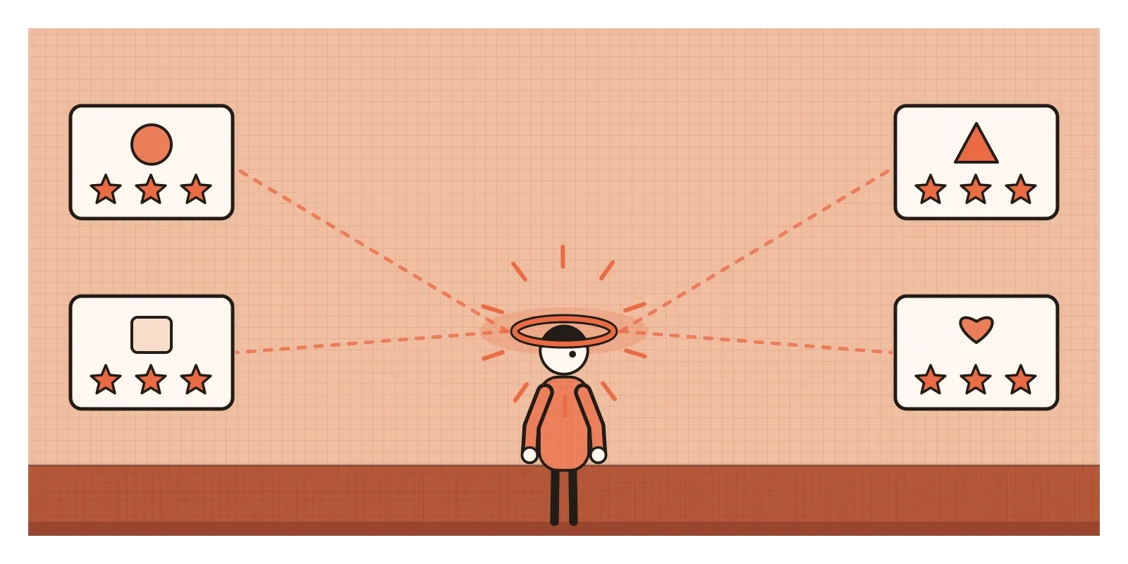
Then the students rated his appearance, his mannerisms and his accent, which were identical in both versions. Those who had seen the warm instructor mostly found his looks appealing and his accent charming. Those who had seen the cold one mostly found the same features irritating. The striking part came next. When asked, the students insisted that liking or disliking him hadn't affected their ratings of his appearance. Some of those who disliked him even believed it was the other way round: that his irritating accent was why they disliked him. The halo was working, and from the inside it was invisible.
In 1972, Karen Dion, Ellen Berscheid and Elaine Walster published a study with the memorable title "What Is Beautiful Is Good". People shown photographs of more attractive strangers assumed they had more desirable personalities and better lives ahead of them. Later research added nuance. A 1991 review led by Alice Eagly combined many such studies and found the attractiveness halo was real but uneven: strong for judgements of social skill and popularity, weak for judgements of honesty or concern for others.
There's another honest caveat. Not every correlation between ratings is a halo. Sometimes qualities really do go together: a carefully made product may well be careful in other ways too. Researchers distinguish this "true halo" from the illusory kind, and separating the two is harder than it sounds.
Why one quality colours the rest
Most of the qualities we care about are hard to judge. Is this doctor competent? Is this app trustworthy with my money? Will this company treat its customers well? We rarely have the evidence. What we do have is a quick, vivid impression: a manner, a look, a reputation. Daniel Kahneman and Shane Frederick described this as attribute substitution. Faced with a hard question, the mind quietly answers an easier one and hands back the result as if it answered the hard one.
We also like our impressions to be coherent. A person who is warm and kind and also dishonest is an uncomfortable mixture. It's easier to hold a single overall verdict, good or bad, and let it shape the details.
The shortcut often works, because good qualities really are somewhat correlated, and care in one area can signal care in others. A shop that keeps its shelves tidy may also keep its accounts tidy. The shortcut fails when the visible quality and the hidden one have nothing to do with each other, and especially when someone has worked hard to polish the visible one precisely because they know we'll judge the rest by it.
The same company, before and after the crash
In The Halo Effect (2007), the business professor Phil Rosenzweig tells the story of Cisco Systems. Around 2000, Cisco, which makes the networking equipment the internet runs on, was briefly one of the most valuable companies in the world. The business press admired it for its focus on customers, its skill at buying and absorbing other companies, its disciplined management and its strong culture.
Then the dot-com bubble burst. Cisco's share price fell from about $80 in early 2000 to well under $20 a year later, and it laid off thousands of employees. The press now found that Cisco had been arrogant with customers, reckless with acquisitions and poorly managed. Rosenzweig's point was that the company itself hadn't changed very much in a year. Its results had. And because results are easy to see and culture and strategy are hard to see, writers judged the hard-to-see qualities through the glow, or the gloom, of the share price.
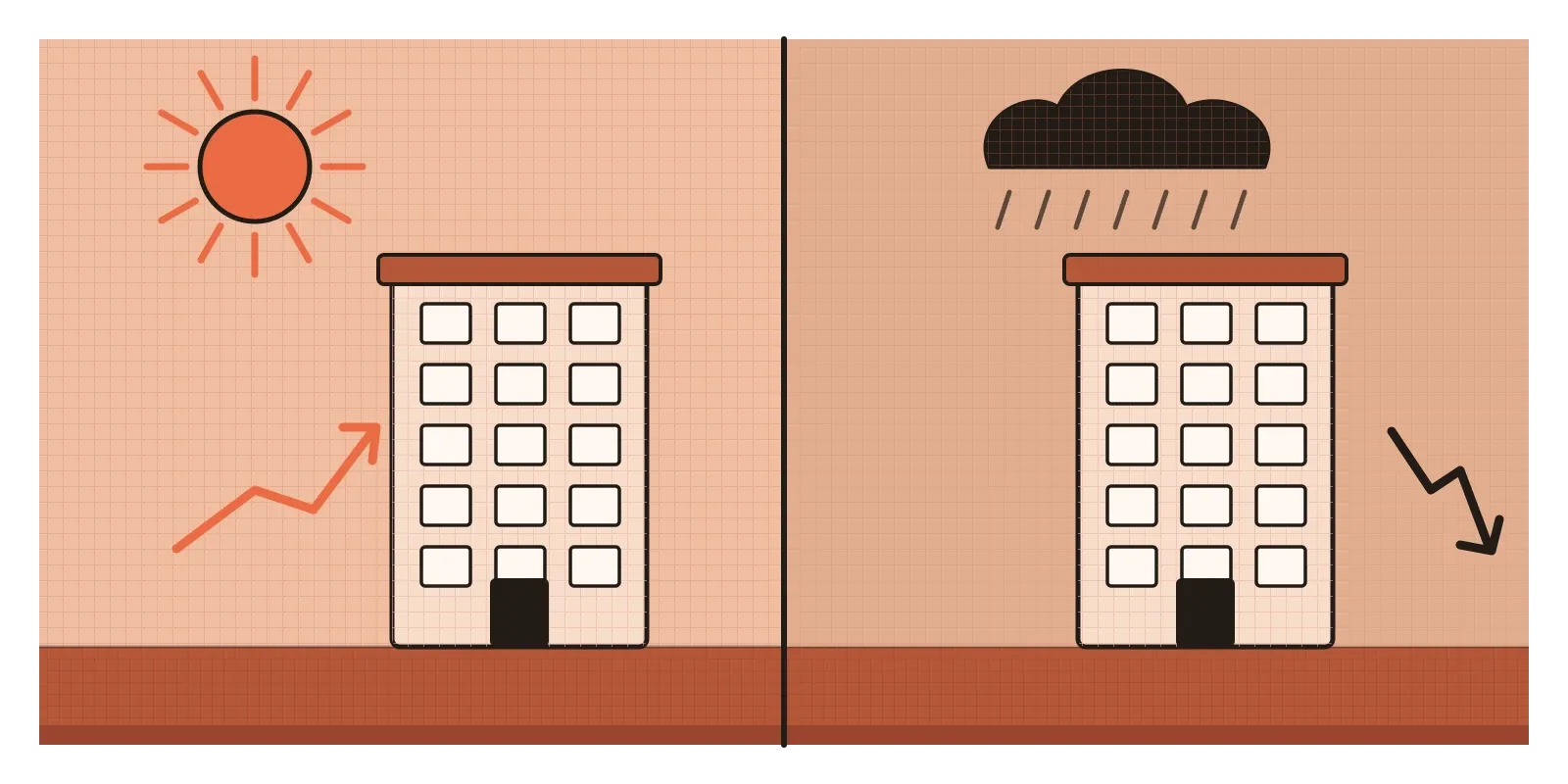
Rosenzweig's wider target was a whole genre of business books that study successful companies, describe their cultures and practices, and present those as the causes of success. If the descriptions themselves were shaped by the success, the books were measuring the halo and calling it the secret.
Picture a team designing doctor ratings
Picture a team working on a doctor-booking app used across Indian cities. After each appointment, patients are asked for a star rating from one to five, and doctors are ranked in search by their average. The team starts reading the reviews behind the stars and notices a pattern. A five-star review praises a short wait, a clean clinic and a friendly receptionist. A one-star review complains about a two-hour wait. Very few reviews say anything about whether the diagnosis was right, which most patients can't judge anyway. The single star has become a halo score, mostly about waiting time and warmth.
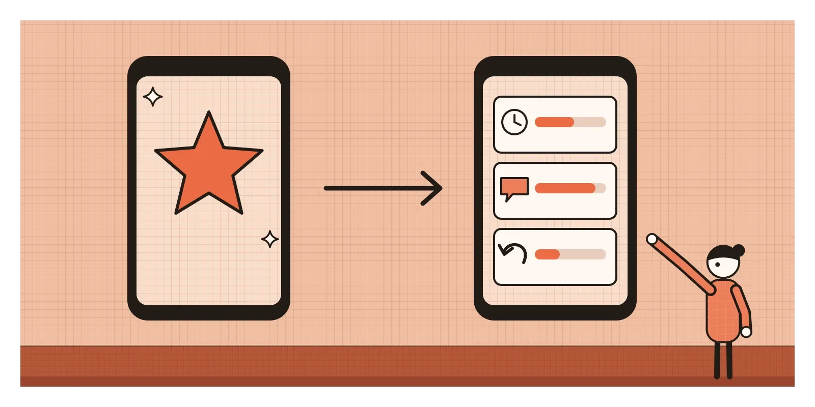
The tempting design responds to the halo by exploiting it. Doctors are coached to upload a professionally shot photograph, and profiles get a "Top Rated" ribbon above a certain average, which pushes those doctors to the top of the search results, which brings them more bookings and more five-star ratings. A gentle, friendly doctor with a modern clinic rises. A brilliant, brusque one in a crowded, plain clinic sinks, whatever the quality of their care.
The better version designs for the way patients actually judge. It asks about separate things, one at a time, before asking for any overall rating: how long did you wait, did the doctor explain your condition in a way you understood, would you go back. It shows those answers separately on the profile, so a patient who cares about explanations can see them. It keeps facts apart from feelings, with qualifications and registration details checked by the platform and shown plainly, not mixed into the stars. And it says honestly what the ratings can't measure. A star rating will never tell anyone whether a diagnosis was right, so the design shouldn't pretend it does.
Using it honestly, and where it becomes manipulation
Craft creates a halo, and that's not a bad thing. When B. J. Fogg and his colleagues at Stanford asked more than 2,500 people how they judged whether a website was credible, the most commonly mentioned factor, in their 2003 study, was the site's design and look. A well-made product earns some patience: people forgive small flaws in something that feels cared for. The honest use of the halo is to make the quality people can see an accurate signal of the quality they can't, and to spend the goodwill it earns on fixing real problems rather than hiding them.
Manipulation is polish without substance. A phishing page that copies a bank's look exactly is using the halo as a weapon. So is a trust badge or security seal that nobody actually awarded. The European Union's Unfair Commercial Practices Directive bans, in all circumstances, displaying a trust mark or quality mark without the necessary authorisation.
Food labels show the same pattern, often called a health halo. In April 2023, a video by the influencer Revant Himatsingka questioned the sugar content of Bournvita, a malted drink long sold to Indian parents as nutrition for growing children. Mondelez, which makes it, disputed his claims, and the video was taken down after the company sent a legal notice. But the National Commission for Protection of Child Rights issued a notice asking the company to review its packaging and advertising, and in December 2023 the company said it had cut added sugar by 14.4 per cent. In April 2024, after the commission concluded that "health drink" isn't a category defined in India's food law, the Ministry of Commerce and Industry asked e-commerce sites to remove such drinks from their "health drinks" sections. One reassuring word on a label had been lighting up everything else in the jar.
How I try to catch it
In Thinking, Fast and Slow, Kahneman describes catching the halo effect in his own grading. He used to read all of one student's exam answers in a row, and found that a strong first essay made him generous to the later ones. So he started grading the first question for every student, then the second for every student, hiding his earlier scores. I try to do the same in design reviews and research synthesis: judge one dimension at a time, write it down, and only then form an overall view.
The second habit is to ask, about any strong impression, which quality I'm actually judging. "This onboarding is great" often turns out to mean "the illustrations are lovely". Lovely illustrations are worth having, but they aren't the same as people understanding what to do.
When I'm designing, I try to make sure the qualities people can see honestly reflect the ones they can't, and to separate the two wherever users have to judge us.
Kurosu and Kashimura's cash machines still seem to me the most useful lesson for designers. Beauty and usability are both real, and both matter. They're just not the same thing, and we have to test them separately. In the next post, I'll look at a bias that runs the other way: negativity bias, the extra weight our minds give to what's bad.
Further reading: Masaaki Kurosu and Kaori Kashimura, "Apparent Usability vs. Inherent Usability" (1995) · Noam Tractinsky, Adi Katz and Dror Ikar, "What Is Beautiful Is Usable" (2000) · Richard Nisbett and Timothy DeCamp Wilson, "The Halo Effect: Evidence for Unconscious Alteration of Judgments" (1977) · Phil Rosenzweig, The Halo Effect (2007) · Alice Eagly and colleagues, "What Is Beautiful Is Good, But..." (1991)
The question to askWhich quality am I actually judging?