
The Framing Effect
How the same fact, described two different ways, can lead the same people to opposite decisions.
The Framing Effect
Ninety per cent alive, or ten per cent dead
In 1982, the New England Journal of Medicine published a study by Barbara McNeil, Stephen Pauker, Harold Sox and Amos Tversky. They asked people to imagine they had lung cancer and had to choose between two treatments: surgery, which carried a risk of dying during or soon after the operation but better long-term survival, and radiation, which was safer in the short term but less effective later. The people they asked included patients with chronic illnesses, business school students and more than four hundred physicians.
The statistics were the same for everyone. Only the wording changed. Some people read the outcomes as chances of surviving: of a hundred people having surgery, ninety live through the operation and the month after it. Others read them as chances of dying: of a hundred people having surgery, ten die during the operation or the month after it. Ninety alive and ten dead are the same fact. But in all three groups, surgery was clearly more popular when the numbers were about living. In Daniel Kahneman's later retelling of the physicians' answers, 84 per cent chose surgery when told the one-month survival rate was 90 per cent, while only half did when told that mortality in the first month was 10 per cent.
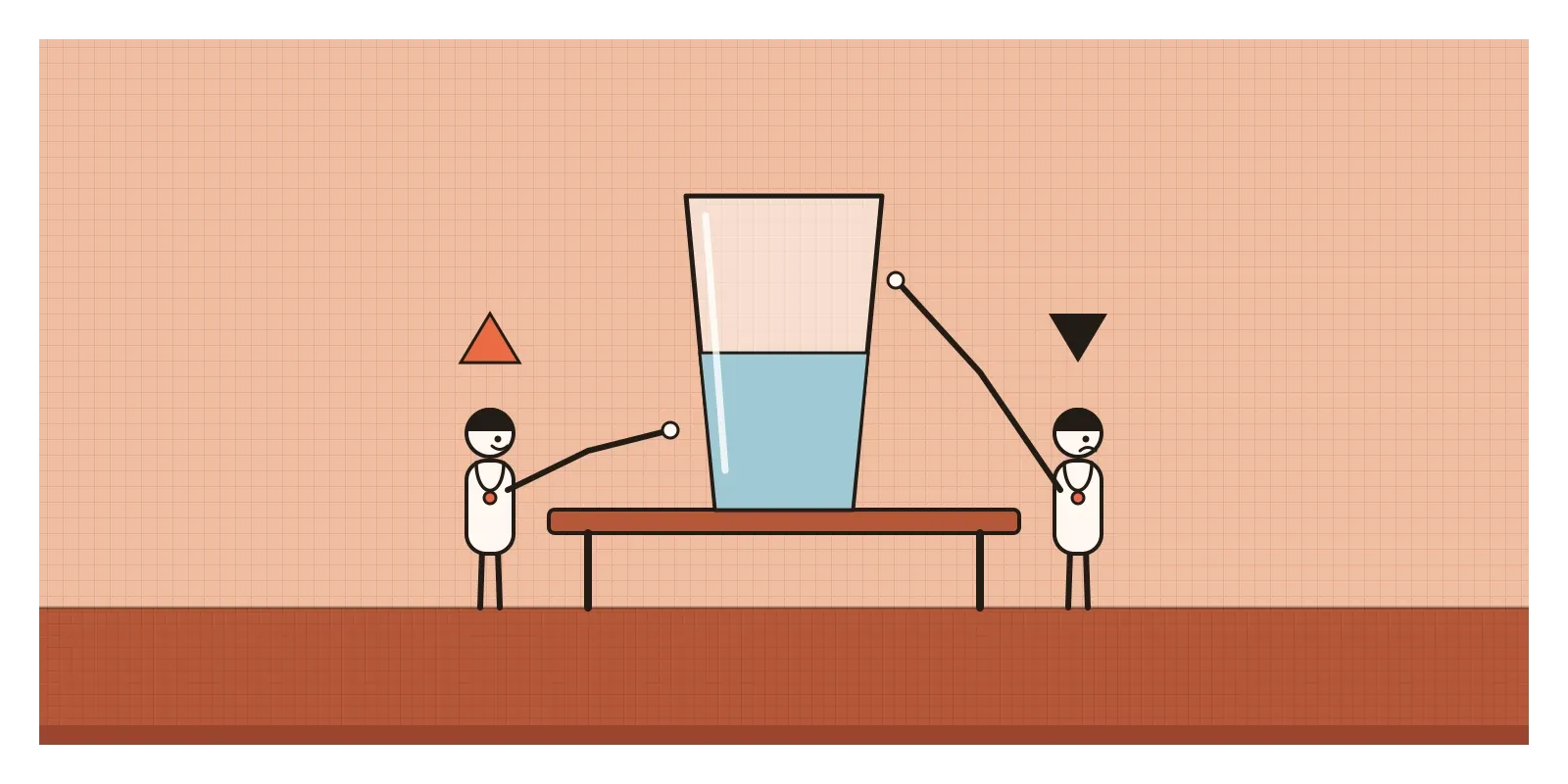
Doctors are trained to read statistics, and these ones were simple. The frame still moved them.
That's the framing effect: our choices change depending on how the same information is presented, as a gain or a loss, as a success rate or a failure rate, as a discount or a charge, even when nothing about the options themselves has changed. In the previous post, on anchoring, the first number on the page shaped the judgement. Here the numbers stay put and only the words around them move.
Six hundred lives, described two ways
The best-known demonstration came a year earlier. In 1981, Amos Tversky and Daniel Kahneman asked university students to imagine that the United States was preparing for an outbreak of an unusual disease expected to kill six hundred people. Two programmes had been proposed. One group read that under Programme A, two hundred people would be saved, while under Programme B there was a one-in-three chance that all six hundred would be saved and a two-in-three chance that nobody would be. Most of them, 72 per cent, chose the certain option, A.
A second group read the same choice described in terms of deaths. Under Programme C, four hundred people would die. Under Programme D, there was a one-in-three chance that nobody would die and a two-in-three chance that all six hundred would. Now 78 per cent chose the gamble. The programmes were identical. Described as lives saved, people played safe. Described as lives lost, they gambled.
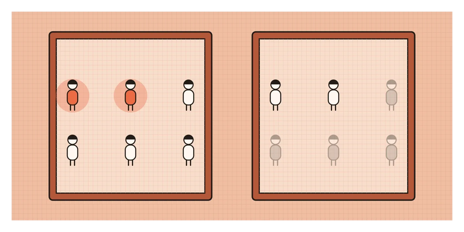
Framing doesn't need life and death. In 1988, Irwin Levin and Gary Gaeth gave people ground beef labelled either "75% lean" or "25% fat". The lean label made the meat seem better tasting and less greasy, and the effect shrank but didn't vanish when people actually ate it. In 1998, Levin, Sandra Schneider and Gaeth sorted the many studies into three families: risky choice framing, like the disease problem; attribute framing, like the beef; and goal framing, where a message stresses what you gain by acting or what you lose by not acting.
This is one of the better-replicated effects in the field. In 2014, the Many Labs project repeated the disease problem in dozens of laboratories and found the effect again. A 1998 meta-analysis by Anton Kühberger found framing effects to be reliable but usually small to moderate, and sensitive to exact wording. The medical study has had sharper criticism: a 2021 replication published in Judgment and Decision Making argued that some of its shift came from how the cumulative death figures were laid out, not from framing alone. So I take the direction as solid and the precise sizes as approximate.
Why the same fact feels different
Kahneman and Tversky's explanation comes from prospect theory. We don't judge outcomes on their own. We judge them as gains or losses from a reference point, and the frame quietly chooses the reference point for us. "Two hundred saved" puts us at the point where everyone is lost, so the sure option feels like a gift. "Four hundred die" puts us at the point where everyone is alive, so the sure option feels like a guaranteed loss, and a gamble that might avoid it looks better. I'll come back to why losses loom so large in a later post on loss aversion.
There's a simpler reason too. Kahneman described a habit of the fast, intuitive mind that he called "what you see is all there is". We respond to the description in front of us and rarely translate it into the other version on our own. Hardly anyone reading "ten die" stops to think "so ninety live".
And sometimes our sensitivity to frames isn't foolish at all. In 2003, Craig McKenzie and Jonathan Nelson showed that the frame a speaker picks often carries real information. People who describe a glass as "half empty" are more likely to be talking about a glass that used to be full. A doctor who says "ten per cent die" may be hinting at a worry, even without meaning to. Listening to the frame is usually a sensible way to read between the lines. The trouble is that it also lets the person choosing the frame steer us.
A discount, never a surcharge
In 1980, the economist Richard Thaler described a fight over two words. Paying by credit card costs shops money, so in principle a shop could charge card users more than cash customers. As card use spread in the United States, the credit card industry pushed hard on how that difference could be described. If a shop wanted two prices, the industry wanted the gap to be called a discount for paying cash, never a surcharge for paying by card. For a time, federal law banned card surcharges while allowing cash discounts.
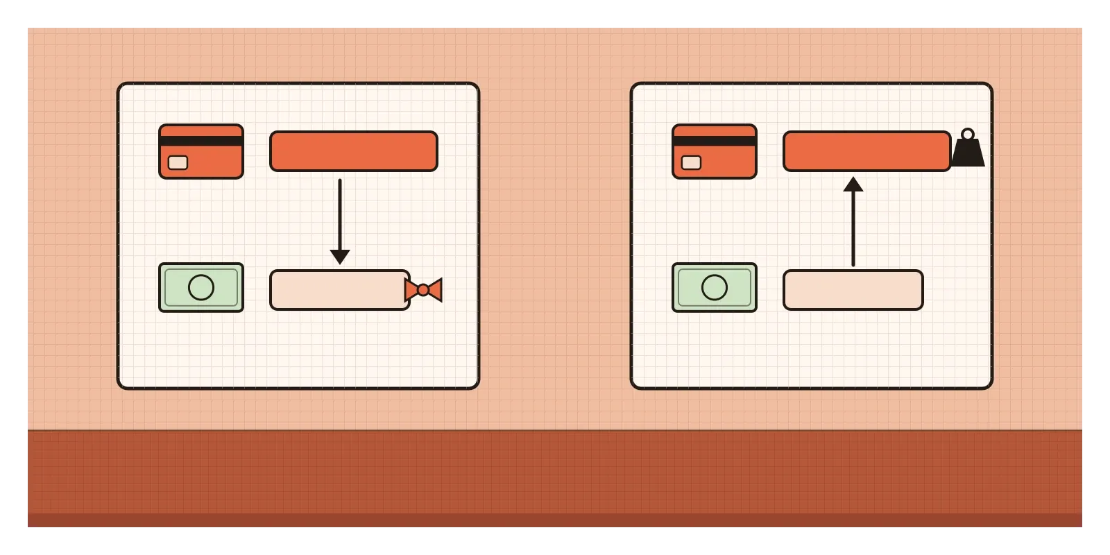
Economically, the two descriptions are identical. A shop that charges ₹100 in cash and ₹102 by card has a 2 per cent gap whichever way you name it. But Thaler saw that the industry understood something about shoppers. A cash discount is a gain that people using cards simply don't receive, and forgone gains don't sting much. A card surcharge is a loss they pay every time, and losses are noticed. The people who wrote the rules knew which frame would keep cards in wallets.
I find this one useful because nobody was lying. Every price was disclosed. The frame did all the work.
Picture an AI assistant's accuracy label
Picture a team building an AI assistant that drafts answers to customers' tax questions for small accountancy firms. Internal testing shows that 92 per cent of its draft answers need no correction, and 8 per cent contain a mistake, sometimes a serious one. The team is designing the panel that explains the tool to new users.
The first draft says "92% accurate", in large type, with a green tick. It's true, and it tests well. Users trust the assistant, adopt it quickly and start sending its drafts to clients with only a glance. Within weeks, a firm forwards a wrong answer about a filing deadline to a client.
The second draft swings the other way: "Makes errors in 8% of answers", in red. Adoption drops sharply, and the few firms who use it check every line so carefully that it saves them no time.
The better version stops treating the frame as a dial for adoption and asks what the user needs to do with the number. It says: "In testing, about 1 in 12 drafts contained an error. Errors were most common on deadlines and exemptions. Check these before sending." It uses a natural frequency instead of a percentage, gives both sides of the fact, and attaches it to an action. The same panel highlights deadlines and exemptions inside each draft. The number hasn't changed. The frame now serves the user's job, not the team's launch metrics.
Using it honestly, and where it becomes manipulation
Every message has a frame, so the question is never whether to frame but which frame helps people understand. The German psychologist Gerd Gigerenzer has spent much of his career on this. In Calculated Risks (2002), he describes the UK contraceptive pill scare of 1995, when health authorities warned that a newer type of pill doubled the risk of a dangerous blood clot. "Twice the risk" sounded alarming. In absolute terms, it meant a rise from roughly one woman in seven thousand to two. Many women stopped taking the pill, and in the following year there were an estimated thirteen thousand additional abortions in England and Wales. Gigerenzer's advice is to give absolute numbers and natural frequencies ("2 in 7,000") rather than relative ones ("doubles"), and good patient decision aids now show outcomes both ways.
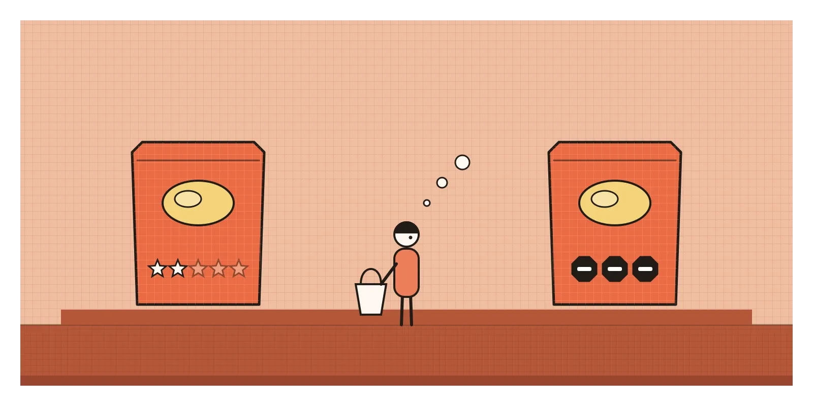
India is in the middle of a framing argument about food labels. In 2022, the Food Safety and Standards Authority of India proposed an "Indian Nutrition Rating", a front-of-pack score from half a star to five stars. Many doctors and public health groups objected. They argued that stars frame a packet of chips by its virtues, and that a biscuit earning two stars would still be wearing a badge that looks like praise. They wanted warning labels instead, like the black octagons Chile introduced in 2016, which frame a product by what's too high in it. The question has gone back and forth for years, with the Supreme Court pressing the regulator to decide. Whatever India settles on, both sides agree that the same nutrient data, framed differently, will change what millions of people put in their baskets.
The manipulative uses tend to hide the cost frame. A ticket priced at ₹499 that becomes ₹687 at checkout, after "convenience" and "platform" fees, has framed its real price as a set of small additions. In the United States, a Federal Trade Commission rule that took effect in 2025 now requires sellers of live-event tickets and short-term stays to show the total price upfront. Then there's the button that says "No thanks, I don't like saving money", which frames declining an offer as a character flaw. India's 2023 guidelines on dark patterns name this "confirm shaming" and prohibit it.
How I try to catch it
When I'm writing anything that carries a number, I write both versions next to each other: the success and the failure, the gain and the loss, the relative and the absolute. If one version would make me uneasy to publish, the other probably shouldn't go out alone.
The second habit is to ask what the person needs to do with the information, and to choose the frame that makes that action clearer, not the one that makes our feature look best. A natural frequency attached to an instruction usually beats a percentage attached to a tick.
The third is for my own decisions. When a proposal sounds unusually good or unusually frightening, I turn it round before I react. If a vendor says their tool "saves 30% of review time", I ask what the other 70 per cent of the time looks like.
I keep coming back to those physicians in 1982. They knew the numbers, they understood surgery and radiation better than almost anyone, and two words still changed what they would have recommended. If the frame can do that to doctors, it can certainly do it to someone glancing at a screen in a hurry. Whoever writes the sentence is helping decide the answer.
In the next post I'll look at a trick that changes a choice without changing the options people actually want, only by adding one nobody wants: the decoy effect.
Further reading: Amos Tversky and Daniel Kahneman, "The Framing of Decisions and the Psychology of Choice" (1981) · Barbara McNeil, Stephen Pauker, Harold Sox and Amos Tversky, "On the Elicitation of Preferences for Alternative Therapies" (1982) · Irwin Levin, Sandra Schneider and Gary Gaeth, "All Frames Are Not Created Equal" (1998) · Gerd Gigerenzer, Calculated Risks (2002) · Daniel Kahneman, Thinking, Fast and Slow (2011)
The question to askHow would this sound if I said it the other way round?