The Decoy Effect
How an option that almost nobody wants can quietly decide what almost everybody buys.
The Decoy Effect
A subscription that nobody chose
In his 2008 book Predictably Irrational, the behavioural economist Dan Ariely describes an advertisement he came across on The Economist's website. It offered three ways to subscribe. A web-only subscription cost $59 a year. A print-only subscription cost $125. And a subscription to both print and web also cost $125.
The middle option is strange. Nobody in their right mind would pay $125 for print alone when the same $125 buys print and the website. Ariely suspected that was the point, so he tried the offer on a hundred of his students at MIT. With all three options in front of them, 16 chose web-only, nobody chose print-only, and 84 chose print and web. Then he removed the option nobody had picked and asked another group. Now 68 chose web-only and only 32 chose print and web.
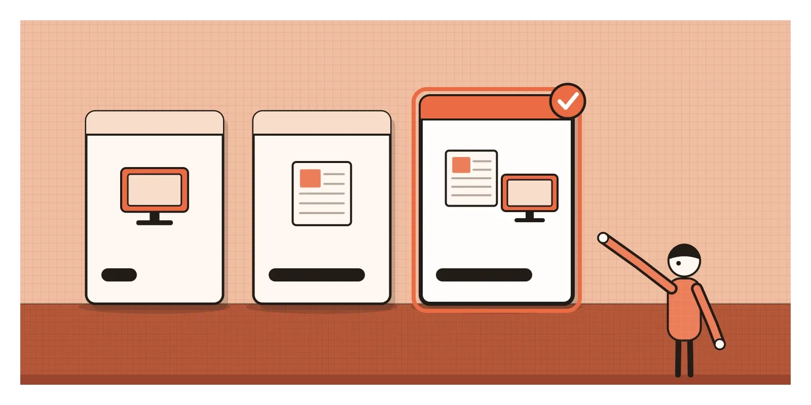
An option that attracted no buyers at all had more than doubled the popularity of its neighbour. It wasn't there to be chosen. It was there to make the bundle look like a bargain.
This is the decoy effect: adding an option that is clearly worse than one of the existing options, but not clearly worse than the others, makes people more likely to choose the option it is worse than. Researchers also call it the attraction effect or, more precisely, the asymmetric dominance effect. The decoy is "dominated" by its target, meaning the target is at least as good on every count, and that dominance is lopsided, because the decoy isn't plainly beaten by the other choices.
A word on the source. Ariely's version was a small classroom demonstration in a popular book, not a peer-reviewed study, and his wider work has since faced serious scrutiny, including the 2021 retraction of a paper after one of its studies was found to contain fabricated data, which he has said he did not fabricate. Happily, the decoy effect doesn't rest on him. It had been studied for a quarter of a century before his book.
In the posts on anchoring and framing I looked at how a number or a choice of words shapes the judgements of the people we design for. A decoy works through something else: the company an option keeps.
The option that breaks a rule
In 1982, three researchers at Duke University, Joel Huber, John Payne and Christopher Puto, published a paper in the Journal of Consumer Research with a dry title and a startling result. They asked people to choose between products such as beers, cars and restaurants, each described by two qualities, for example price and a quality rating. One group chose between two options. Another group saw the same two options plus a third that was slightly worse than one of them on both qualities. Almost nobody chose the newcomer, yet its arrival raised the share of the option it was worse than.
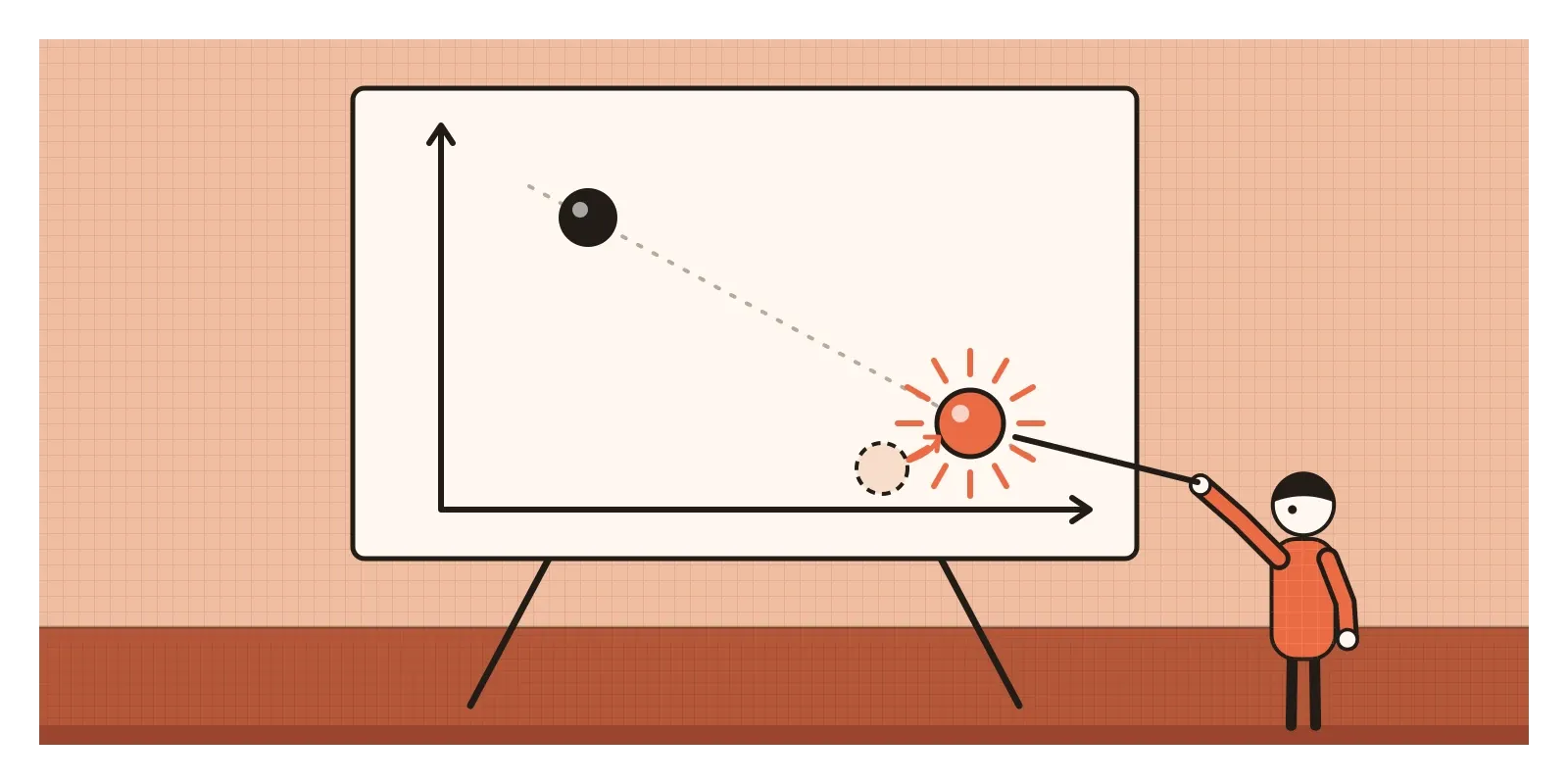
Economists had long assumed something called regularity: adding an option to a menu can't make an existing option more popular. It can only take customers away. A new lemon tart might steal orders from the chocolate cake, but it shouldn't make more people order the cake. Huber, Payne and Puto showed that, with the right kind of newcomer, that is exactly what happens.
A cousin of the effect came a decade later. In 1992, Itamar Simonson and Amos Tversky gave people a choice between two cameras, a cheaper basic model and a better mid-range one, and the choices split roughly evenly. When a third, expensive premium model was added, the mid-range camera became the clear favourite, chosen by about half. They called this the compromise effect: when we can't decide, the middle feels safe, so an extreme option on one side pulls people towards whatever now sits in the centre.
The effect's reputation is larger than its reach, though, and that's worth knowing. In 2014, the Journal of Marketing Research published two papers that tested it with more realistic material. Shane Frederick, Leonard Lee and Ernest Baskin found it reliably when options were laid out as numbers in a table, and much less often when people saw pictures or the real things. Cathy Yang and Michael Lynn reported that out of 91 attempts to produce it, across 23 product types, only 11 gave reliable effects. Huber, Payne and Puto replied in the same issue that the effect is real but conditional: it needs options that are easy to compare and a decoy whose inferiority people can actually see. That matches my own reading. Decoys work best on spec sheets and pricing tables, which happen to be things designers make.
Why a bad option helps us choose
Most of us can't say what a thing is worth in isolation. What is a fair price for a year of a news website? We have no internal price list. What we can do easily is compare: this one costs the same as that one but gives me more. Comparison is the shortcut, and a decoy feeds it a comparison that is unusually easy to win.
In 1989, Simonson argued that people often choose the option they can most easily justify, to others and to themselves. A dominated neighbour hands us a ready-made justification. I didn't pick the bundle on a whim. I picked it because it was obviously better than print alone for the same money. The decision feels reasoned, and in a narrow sense it is.
The shortcut usually serves us well. Relative judgement is how our senses work too. As I wrote in the post on Josef Albers and the interaction of colour, the same grey looks lighter or darker depending on what surrounds it, because the eye judges contrasts rather than absolute values. In a market, nearby options really are informative: if every other laptop with this much memory costs more, this one is probably good value. The trouble comes when someone chooses the surroundings for us, and chooses them to make one option shine.
Diamonds that sold their neighbours
For a long time, almost all the evidence for decoys came from laboratories and classrooms. In 2020, Chunhua Wu and Koray Cosguner published a study in Marketing Science that looked for them in a real market: the diamonds listed by a large online jewellery retailer.
Diamonds are a near-perfect setting. Each stone is described by price and by a handful of grades, such as carat, cut, colour and clarity, all shown side by side. With a very large catalogue, it's common for one stone to be as good as or worse than a nearby stone on every grade while costing more. That makes it a decoy for its better neighbour, whether or not anyone planned it.
Wu and Cosguner tracked how quickly individual diamonds sold. Most shoppers never noticed these dominated pairs. They estimated that only somewhere between 11 and 25 per cent of the time did a shopper spot one. But when a pair was noticed, the better diamond became between about 1.8 and 3.2 times more likely to sell. By their estimate, decoys added 14.3 per cent to the retailer's gross profit. It fits the 2014 debate neatly: a diamond listing is exactly the kind of numerical comparison where decoys work, and the effect appeared only when the comparison was seen.
Picture a pricing page with three plans
Picture a team designing the pricing page for an invoicing app used by small businesses across India. There are two plans. Basic, at ₹199 a month, covers up to fifty invoices. Pro, at ₹499, adds unlimited invoices, GST reports and inventory. Most customers pick Basic, and the business wants more of them on Pro.
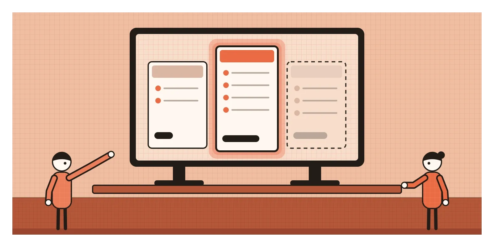
Someone in the review has read about The Economist. They suggest a third plan, Pro Lite, at ₹449, with GST reports but without inventory and capped at two hundred invoices. Nobody expects anyone to buy it. Its job is to make Pro, for ₹50 more, look irresistible. The test runs, Pro sign-ups rise, and the slide at the monthly review is green.
Three months later, the support queue tells a different story. Many new Pro customers are a tailor's shop or a two-person tuition centre that sends fifteen invoices a month and has no inventory. They're paying more than twice what they need to. Some downgrade, some cancel. The decoy did its job, and the job was wrong.
Now picture the team starting from the same fact, that people choosing plans compare rather than judge, and designing for it honestly. The first screen asks two questions: roughly how many invoices do you send a month, and do you track stock? The page then highlights the plan that fits the answers, even when that's Basic, and says why in one line. The comparison table shows only real differences, in plain words, and every plan on it is one the team would happily sell to the right customer. A third plan, say a Business tier for firms with several branches, is fine if real firms need it. Pro uptake may grow more slowly, but the people who choose it will use it, and stay.
Using it honestly, and where it becomes manipulation
Every menu has a context, so no choice is presented without influence. A plan that genuinely suits most people can be marked as the most popular, if it is. A premium tier that real customers buy will make the middle tier look reasonable, and that's fine, because it's an honest part of the range. Comparison tables are good design: they make differences visible.
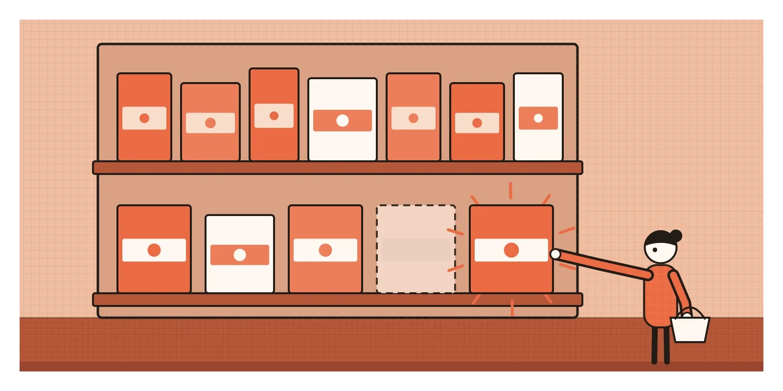
The line is crossed when an option exists only to be rejected. A useful test is to ask whether the option would survive if it stopped making another one look good. If the honest answer is no, it's a decoy. Worse still is a phantom option: something advertised that can't actually be bought, a sold-out size that was never in stock, a cheap plan that turns out to be unavailable in your area, used to steer people towards a pricier one.
Regulators have names for the worst versions. The European Union's Unfair Commercial Practices Directive of 2005 includes a list of practices banned in all circumstances, among them "bait advertising", offering a product at a price without saying you have reason to believe you can't supply it, and "bait and switch", advertising one thing and then pushing something else. India's Central Consumer Protection Authority included bait and switch, along with what it called interface interference, in its Guidelines for Prevention and Regulation of Dark Patterns in 2023. An ordinary, sellable third plan breaks none of these rules. It's the stooge that sits closer to the line, and the phantom that crosses it.
As a designer, I find a softer test more useful than the legal one. Would we be comfortable if a customer read the notes from the meeting where we chose the options? "We added Business for multi-branch firms" reads well. "We added Pro Lite so nobody would buy it" doesn't.
How I try to catch it
When I'm the one choosing, I cover up the option I've just dismissed and ask myself whether I'd still pick the same thing. If removing an option nobody wants changes my mind, that option was doing my thinking for me. When I can, I also write down what I need before I look at the menu, such as how much storage or how many invoices, so I'm judging against my needs and not only against the neighbours.
When I'm designing the menu, I ask who each option is for, and I check whether anyone actually picks it. An option with almost no takers that lifts the share of the option beside it is behaving like a decoy, whatever we meant by it. And I try to recommend by fit, not by margin.
Ariely's print-only subscription is one of the most successful products I know of that nobody bought. It's a useful reminder that the options we don't choose are part of the decision too. In the next post I'll look at a bias that runs even deeper in how people weigh their options: loss aversion, the way a loss stings more than an equal gain pleases.
Further reading: Joel Huber, John Payne and Christopher Puto, "Adding Asymmetrically Dominated Alternatives: Violations of Regularity and the Similarity Hypothesis" (1982) · Itamar Simonson and Amos Tversky, "Choice in Context: Tradeoff Contrast and Extremeness Aversion" (1992) · Shane Frederick, Leonard Lee and Ernest Baskin, "The Limits of Attraction" (2014) · Chunhua Wu and Koray Cosguner, "Profiting from the Decoy Effect: A Case Study of an Online Diamond Retailer" (2020) · Dan Ariely, Predictably Irrational (2008)
The question to askWould I still choose this if that option weren't there?