The Availability Heuristic
How we judge what's common by what comes to mind first, and why the loudest example isn't the usual one.
The Availability Heuristic
The summer of the shark
In early July 2001, an eight-year-old boy named Jessie Arbogast was playing in shallow water off Santa Rosa Island, near Pensacola in Florida, when a bull shark bit off his right arm. His uncle wrestled the shark onto the beach, a park ranger shot it, and the arm was pulled from its throat and later reattached in hospital. Jessie survived, though he had lost so much blood that he was left with lasting brain injuries. It was a terrible, extraordinary story, and it was everywhere.
For the rest of that summer, every shark sighting along an American coast seemed to make the news. In late July, Time magazine put a shark on its cover with the words "Summer of the Shark". Television crews camped on Florida beaches. George Burgess, who ran the International Shark Attack File at the University of Florida, later said he gave hundreds more interviews than in a normal year.
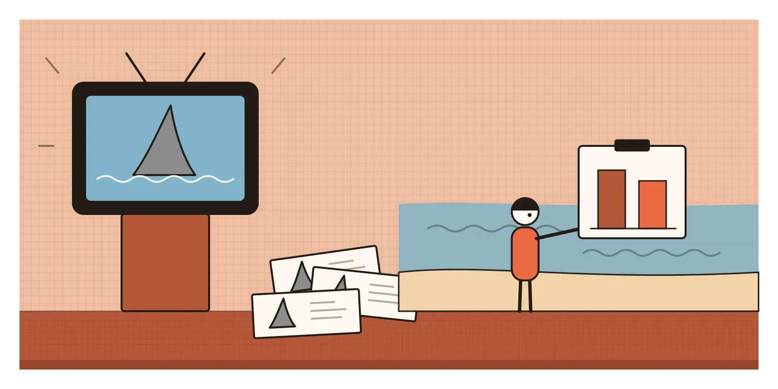
When Burgess's team added up the year, the numbers told a different story. There had been 76 unprovoked shark attacks worldwide in 2001, fewer than the 85 recorded in 2000. In the United States the count was almost unchanged. Deaths had fallen. Burgess called it a summer of media frenzy, not of sharks. Then, on 11 September, the news turned elsewhere, and the "summer of the shark" vanished as suddenly as it had arrived. The sharks hadn't changed their habits. What had changed was how easily a shark attack came to mind.
That's the availability heuristic: judging how common or likely something is by how easily examples of it come to mind. I mentioned it in passing in the post on anecdotal evidence, as one reason a vivid story can beat a spreadsheet. It deserves a closer look, because it shapes not only what audiences believe but what designers, product managers and founders think is happening to their users.
Famous names and twelve examples
Amos Tversky and Daniel Kahneman named the heuristic in a paper published in 1973. In one of its experiments, they read people a list of names, some of men and some of women. In one version, the women on the list were very famous and the men were not; in another, it was the reverse. Afterwards, people were asked whether the list had contained more men or more women. Most chose whichever sex had the famous names, even when that group was slightly smaller. They could also recall more of the famous names. The famous ones were easier to retrieve, and ease turned into a feeling of "there were lots of them".
The same paper asked whether the letter K is more likely to appear as the first letter of an English word or the third. Most people said first, because it's much easier to call up words that start with K than words with K in third place, although in ordinary English text K appears more often in third place. That letter task has been criticised by later researchers, who questioned whether it shows what it claims. The famous-names result has held up better.
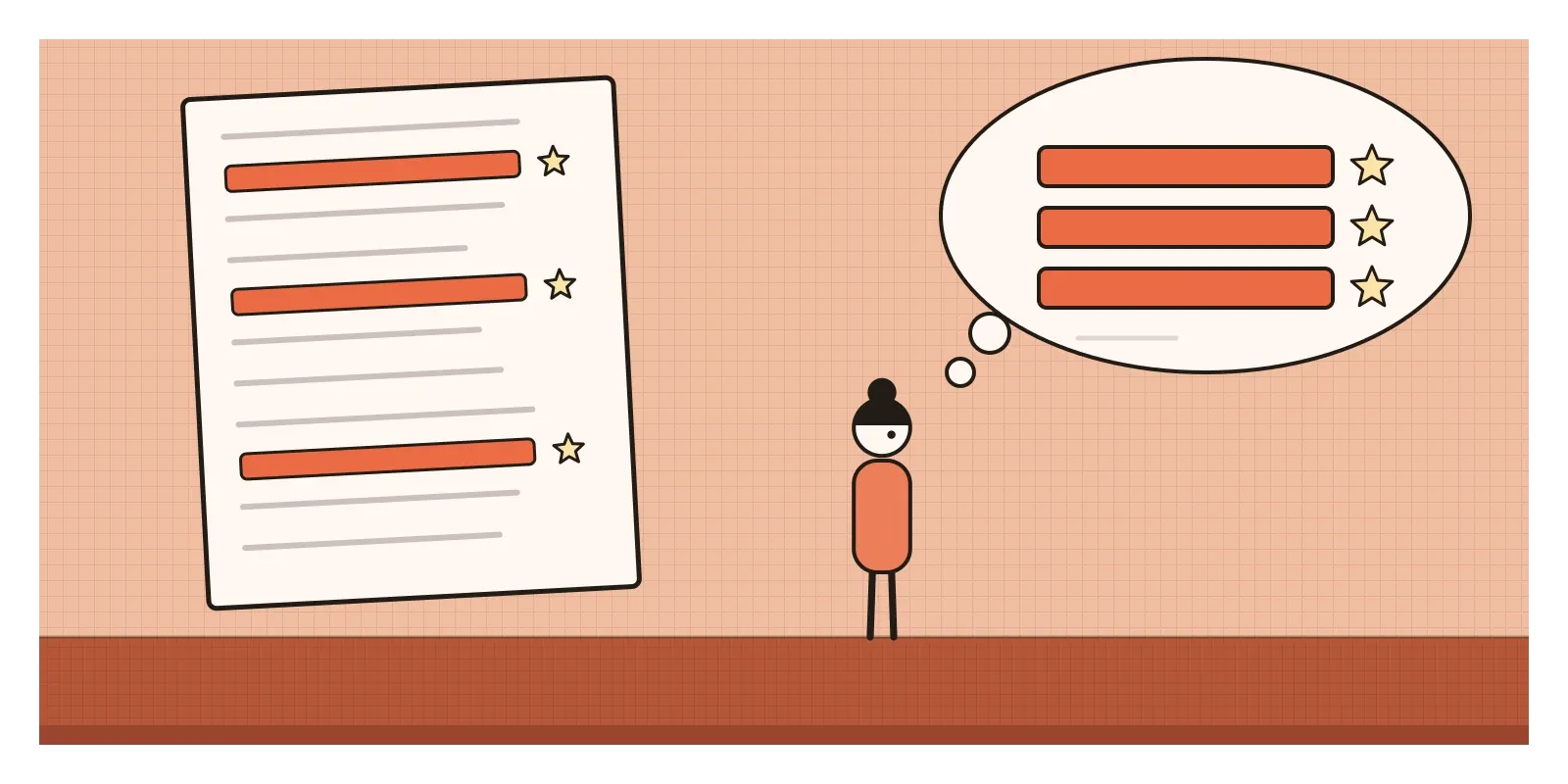
In 1991, Norbert Schwarz and his colleagues pushed the idea further. They asked some people to recall six times they had behaved assertively, and others to recall twelve. Six examples come easily. Twelve are a struggle. The people who had to find twelve then rated themselves as less assertive than those who found six, even though they had just listed more evidence of assertiveness. What seemed to matter was not how many examples people had, but how hard it felt to find them. I should be honest about this one. A 2018 meta-analysis of more than two hundred studies found an effect on average, but a large preregistered attempt to repeat the original study in 2021 didn't find it. The ease effect may be real but more fragile than the textbooks suggest.
The finding that matters most for everyday life came from Sarah Lichtenstein, Paul Slovic, Baruch Fischhoff and their colleagues in 1978. They asked people to estimate how many Americans died each year from forty-one causes. People overestimated dramatic causes, such as tornadoes, floods, botulism and murder, and underestimated quiet, common ones, such as diabetes, stroke and asthma. A follow-up by Barbara Combs and Slovic in 1979 found that the misjudgements tracked how often each cause appeared in newspapers.
Why ease feels like evidence
Most of the time, the shortcut works. Things that happen often really are easier to remember, because we've met them more. If I'm asked whether rain or hail is more common in Bengaluru, I don't need weather records. I just notice how easily memories of rain arrive. Psychologists such as Gerd Gigerenzer have argued that simple cues like this are often surprisingly accurate, because they match the world we actually live in.
The trouble is that ease of recall has many other causes besides frequency. Vivid events are easier to remember than dull ones. Events that frighten us, events we saw ourselves, events that happened to someone we know, and events the news repeated for weeks all come to mind faster. Our memory can't tell the difference between "this came to mind easily because it's common" and "this came to mind easily because it was dramatic". Both arrive feeling the same. So a bias that started as a sensible shortcut becomes a way for the most memorable things to pass as the most common things.
It's worth separating this from two neighbours later in the series. Recency bias, the subject of the next post, is about giving the latest information too much weight. Negativity bias is about bad things weighing more than good ones. The availability heuristic is broader and more mechanical: whatever is easiest to retrieve gets treated as most frequent, whether it's recent, bad, or just vivid.
The road trips after September 11
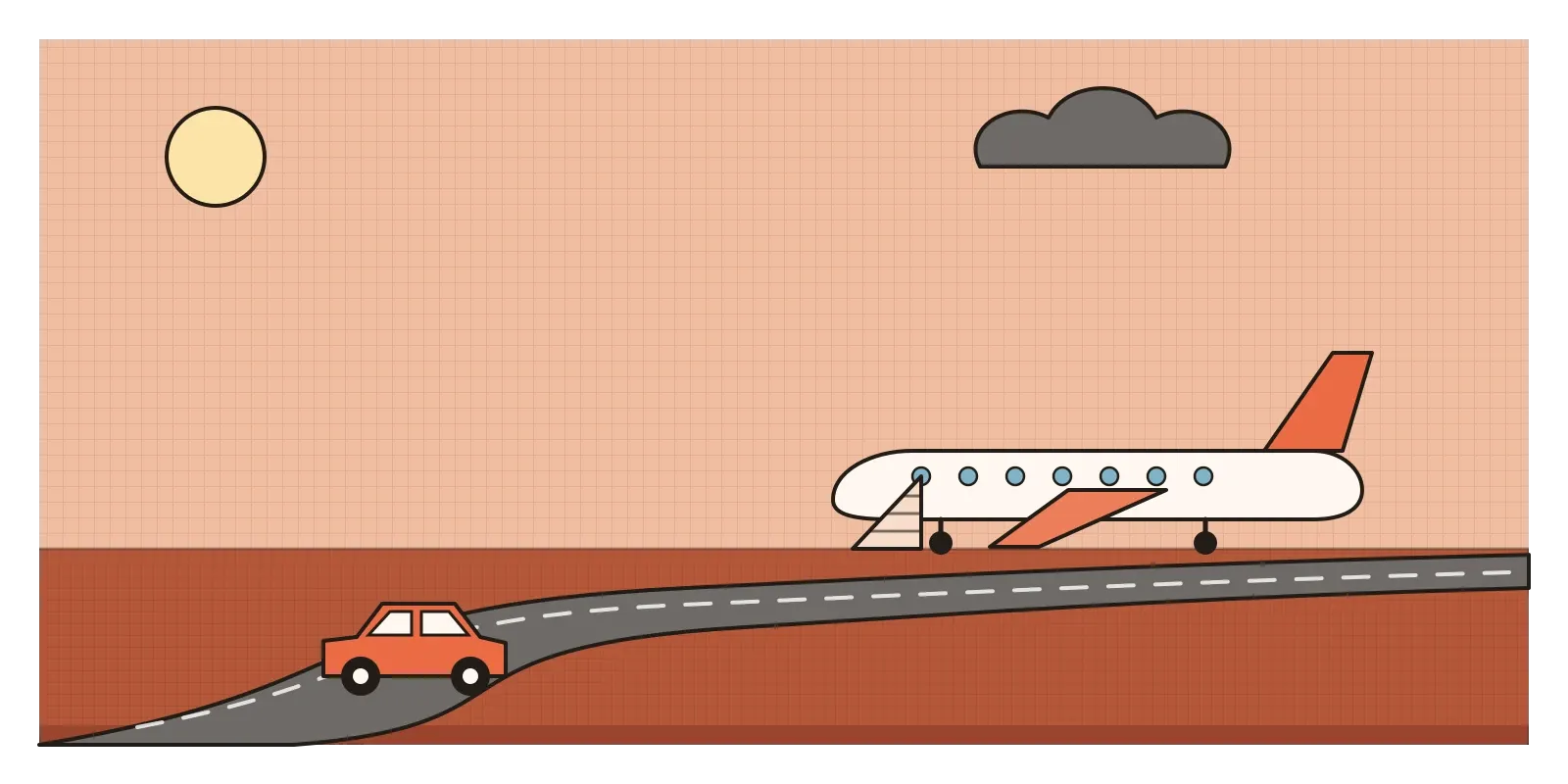
In 2004, Gigerenzer published a short analysis of what happened in the United States after the attacks of 11 September 2001. For months, the image of hijacked planes was overwhelmingly available, and many Americans avoided flying. Some of them drove long distances instead, and driving is far more dangerous per mile than flying. Comparing road deaths with the same months in previous years, Gigerenzer estimated that about 350 more people died on American roads in the last three months of 2001 than would have been expected, and in a later paper he put the figure for the following year at around 1,500. Other researchers have argued about the size of the effect, and one analysis using stricter statistical tests didn't find a clear national increase, so the exact number is uncertain. But the pattern is a sobering one: a vivid risk pushed people towards a quieter, larger one.
India has a quiet killer of its own. In 2020, a team led by Wilson Suraweera and Prabhat Jha used India's Million Death Study, which records the causes of hundreds of thousands of deaths across the country, to estimate how many people die of snakebite. Their answer was about 1.2 million deaths between 2000 and 2019, an average of roughly 58,000 a year, mostly in rural areas, many of them farmers bitten during the monsoon. That is about half of all snakebite deaths in the world. Very few of these deaths become national news. They happen far from cameras, one at a time, to people whose stories rarely travel. A death that's easy to picture gets attention, funding and design effort. One that isn't can go on for decades.
Picture a bug triage meeting
Picture a team at a travel booking app holding its monthly triage meeting to decide which problems to fix next. Two items go straight to the top. Last week the CEO was charged twice for a train ticket and forwarded the screenshot with a furious message. And a customer's post about a refund that took three weeks went viral, with thousands of replies. Everyone has seen both. Everyone has an opinion.
Further down the list, with almost no discussion, is a line from the analytics team: on some low-end Android phones, the seat selection screen freezes, and about one in twenty-five users on those phones abandons the booking at that step. There are hardly any support tickets about it, because people whose app freezes don't usually write in. They just leave, or book at the station.
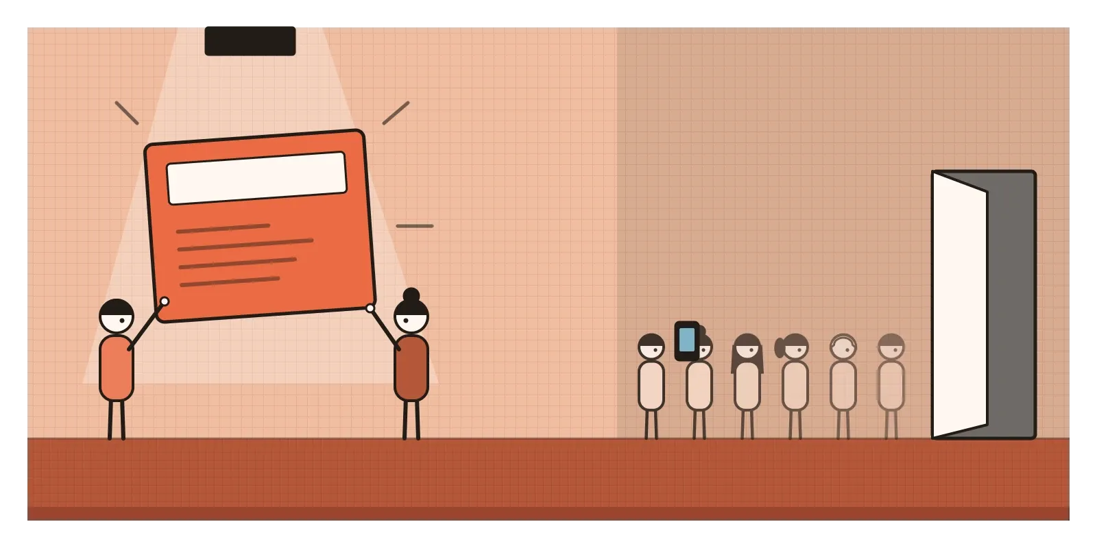
The room isn't being careless. It's ranking problems by how easily they come to mind, and the CEO's double charge and the viral post are the two most available things in the company. Nobody asks how often a double charge actually happens. When someone finally checks, it's turned up a handful of times in six months. The freeze, meanwhile, is costing thousands of bookings a month.
The better version keeps the vivid cases, because they're real and they matter to the people involved, but treats them as starting points for a question: how often does this happen, and to how many people? The team ranks problems by frequency and severity from logs and funnels, not from inboxes. It deliberately looks for failures that don't generate complaints, such as drop-offs, crashes and abandoned flows, because those are the least available of all. And the CEO's bug still gets fixed, quickly, once someone has checked whether it's one person's bad week or a pattern.
When what comes to mind is a good guide
Ease of recall isn't always misleading. A support lead who reads every ticket, every day, has a memory that's been shaped by a fairly complete sample, and her sense of "this keeps coming up" is often worth more than a dashboard someone built last week. An emergency nurse's feeling that a pattern of symptoms is common in winter is drawing on thousands of cases. The heuristic is only as good as the sample that filled our memory, and some people's samples are very good.
Availability can also be put to work deliberately. Vivid examples are how people learn and remember, which is why I argued in the post on anecdotal evidence that a single story can be a fine illustration as long as it's typical. Public health campaigns try to make quiet risks available, with images and stories, precisely because statistics alone don't stick. The aim isn't to ignore what comes to mind. It's to make sure the right things come to mind, in proportion.
How I try to catch it
The first question I ask is: how would I know how often this happens, other than remembering it? If the only answer is "I've seen it", I go and count. Often the count confirms the memory. Sometimes, like the double charge, it shrinks it to almost nothing.
The second is to ask what never reaches me. Users who quit, people who never sign up, and problems that don't hurt enough to complain about are the least available evidence in any product team. I try to keep at least one source in every review, such as a funnel, a drop-off report or a sample of silent users, that exists to show me what nobody is shouting about.
The third is to notice when something has recently been in the news, in a meeting or in my own life. If a risk feels urgent the week after a dramatic example, I make myself look at the long-run numbers before I change anything.
George Burgess spent the summer of 2001 explaining, again and again, that the sharks were behaving normally. The cover was more memorable than his count. I try to remember that the count is usually the one worth trusting. In the next post, I'll look at a close neighbour, the pull of whatever happened last: recency bias.
Further reading: Amos Tversky and Daniel Kahneman, "Availability: A Heuristic for Judging Frequency and Probability" (1973) · Norbert Schwarz and colleagues, "Ease of Retrieval as Information" (1991) · Sarah Lichtenstein, Paul Slovic and colleagues, "Judged Frequency of Lethal Events" (1978) · Gerd Gigerenzer, "Dread Risk, September 11, and Fatal Traffic Accidents" (2004) · Wilson Suraweera and colleagues, "Trends in snakebite deaths in India from 2000 to 2019" (2020)
The question to askIs this common, or just easy to remember?