
The Y2K Revival
How the shiny, see-through look of the turn of the millennium came back in the 2020s, and what it was replying to.
The Y2K Revival
Waiting for the clocks to roll over
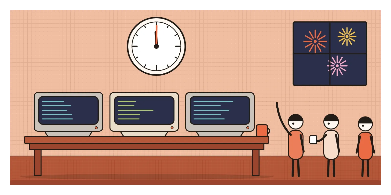
On the night of 31 December 1999, a lot of people around the world spent New Year's Eve watching screens instead of fireworks. In banks, power stations, airports and government offices, engineers sat in control rooms as midnight moved across the time zones, starting in the Pacific islands of Kiribati and New Zealand, then Australia, Japan, India and on towards Europe and the Americas. They were waiting to see whether the computers would break.
The problem had a nickname, Y2K, short for the year 2000. For decades, to save expensive memory, programmers had stored years as two digits, so 1999 was simply 99. When the clocks rolled over, 00 might be read as 1900, and nobody was entirely sure what that would do to interest calculations, flight schedules or the systems that ran power grids. Governments and companies spent hundreds of billions of dollars, by most estimates, checking and rewriting old code. When midnight finally came, almost nothing happened. There were a few minor glitches and a lot of relief. People still argue about whether that was because the repair work succeeded or because the danger had been exaggerated. The honest answer is probably some of both.
The bug's nickname has had a second life as the name of a look. Y2K style, as it's now called, is the shiny, translucent, slightly futuristic design of roughly the late 1990s and early 2000s, all chrome, candy-coloured plastic, glossy gradients and bubbly type. The Y2K Revival is the return of that look in the 2020s, in fashion, music videos, graphic design and even phone hardware, led largely by young people who were babies, or not yet born, when the original was new. This post is about both, because the revival only makes sense once you see what the original was and what the revival is pushing against.
Beige boxes and a party at the end of the century
The original Y2K look grew out of a particular mood. The Cold War was over, the internet was arriving in homes, the stock market was full of new technology companies, and the year 2000 itself felt like a deadline for the future to show up. Designers in fashion, music, games and products all seemed to be answering the same question: what should the new millennium look like? Their answer was mostly silver, see-through and smooth.
It was also a reply to what had come just before. Most personal computers of the early 1990s were beige or grey boxes, designed to look serious in an office. Graphic design was swinging between the strict grids of corporate modernism and the messy, layered type of the grunge years, which I described in the post on grunge typography. Y2K style was cheerful by comparison. It treated technology as something fun, glossy and personal, closer to a toy or a piece of jewellery than to office equipment.
The label was mostly applied afterwards, and nobody agrees on exact dates. Online archivists in the late 2010s, including a loose group calling itself the Consumer Aesthetics Research Institute, began collecting and naming the period's graphics, and the term Y2K aesthetic spread from there. Roughly, the style runs from about 1997 to the middle of the 2000s, when it slid into the glossy buttons and reflections of Web 2.0, which has its own post in this section.
Bondi blue, black leather and an inflated suit
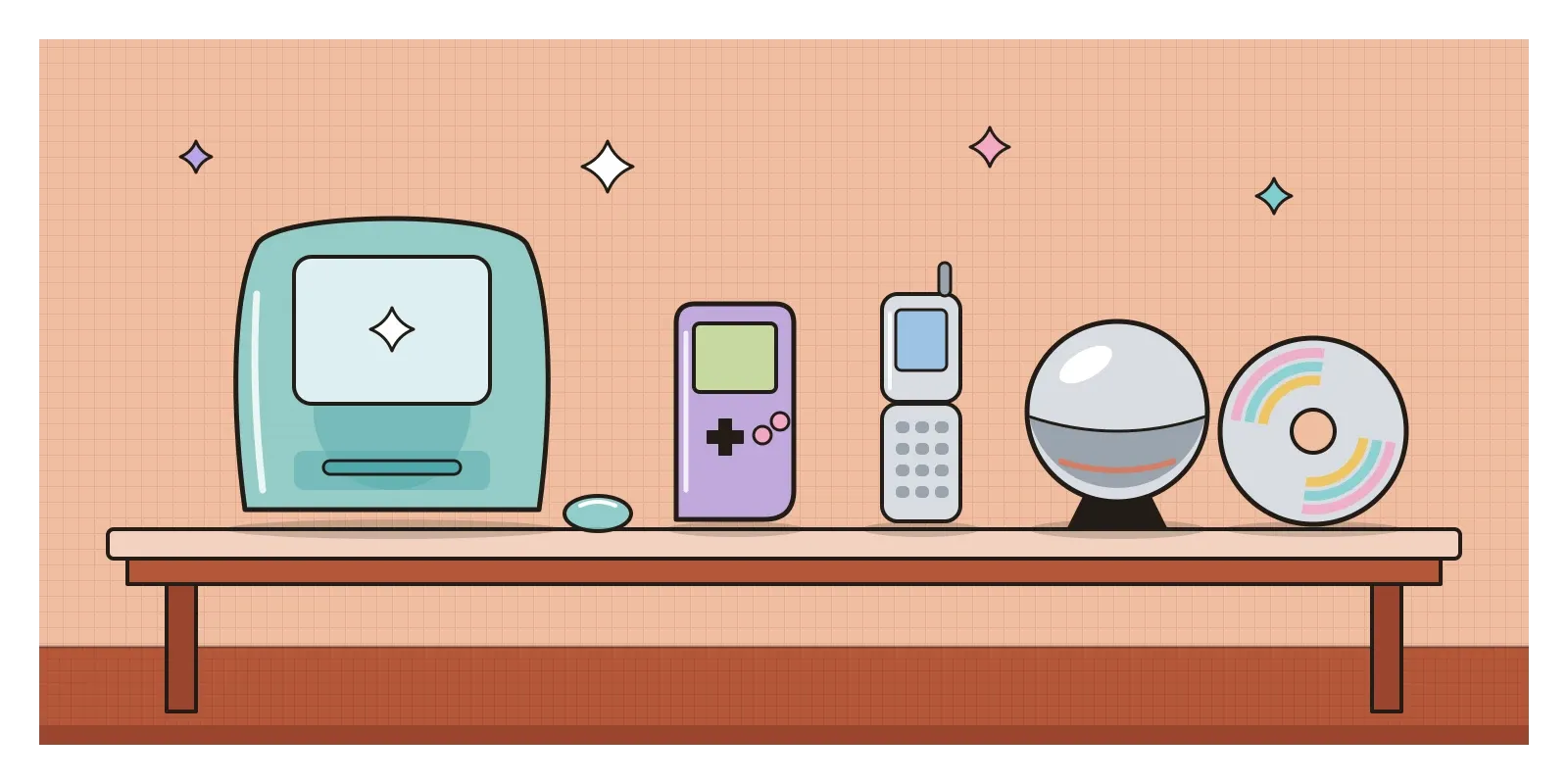
The single object most people associate with the era is a computer. In 1998, Apple released the iMac, designed by a team led by Jony Ive, an all-in-one machine with a rounded body of translucent blue-green plastic that Apple called Bondi Blue. You could see a little way into it, which made the inside of a computer feel like something to show rather than hide. In January 1999, it came in five fruit colours, and suddenly translucent plastic was everywhere: on phones, kettles, staplers, handheld games consoles and pencil sharpeners. Designers and critics took to calling these soft, rounded products blobjects.
Film and music videos gave the era its other side, darker and shinier. The Matrix, released in 1999, wrapped its heroes in black leather and sunglasses and filled its screens with falling green code, which became shorthand for the digital world for years. The American director Hype Williams shot music videos with fisheye lenses, glossy surfaces and saturated colour. In his video for Missy Elliott's "The Rain (Supa Dupa Fly)" in 1997, she dances in a huge, inflated black suit, as if made of the same stuff as a pool toy.
Graphic design had its own version. In Sheffield, the studio The Designers Republic created the look of Wipeout, a futuristic racing game released for the Sony PlayStation in 1995, with invented brands, pictograms and sleek logos that looked like packaging from a future supermarket. It became one of the most copied styles of the late 1990s.
See-through, shiny and slightly wet
Y2K style is easy to spot once you know the ingredients. Surfaces are glossy and often look wet: chrome, liquid metal, polished plastic, holographic foil. Plastics are translucent and tinted in sweet colours, lilac, aqua, tangerine, lime and bubblegum pink, so you see layers through each other. Forms are rounded and inflated, like bubbles, droplets and pill shapes, rather than boxy. Colour runs in gradients, especially cool blues fading into silver, or iridescent rainbows that shift as you move.
In graphics, the computer is proud of itself. Early versions of Photoshop and 3D software made it easy to add bevels, glows, lens flares and drop shadows, and designers used them generously. Type is wide, rounded or futuristic, often in metallic or bubble effects, set over starbursts, swooshes and grids that recede into a glowing horizon. Small sparkles, stars and butterflies float around. In fashion, the same vocabulary shows up as low-rise jeans, metallic fabrics, tinted sunglasses, velour tracksuits, platform trainers, frosted lip gloss and plastic butterfly hair clips.
What ties it together is an attitude: optimistic, a little naive and openly artificial. It wants to look as new as possible, which is exactly what makes it look dated a few years later.
Bluescreen bhangra and a scrapbook called Orkut
India's connection to the year 2000 began with the bug itself. Much of the work of checking and rewriting old code was sent abroad, and Indian software companies such as Infosys, Wipro and TCS took on a large share of it. Many accounts of the Indian IT industry treat those years as a turning point, when American and European clients discovered that teams in Bangalore, Pune and Chennai could do large, careful software projects, and kept coming back after the deadline had passed.
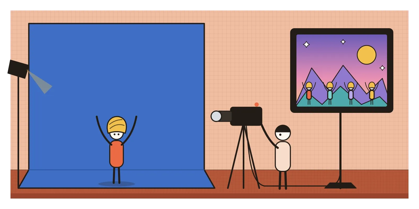
Visually, India had its own millennial moment. In 1998, the Punjabi singer Daler Mehndi released "Tunak Tunak Tun", with a music video made almost entirely against a blue screen. Mehndi appears as four copies of himself in different coloured outfits, dancing over computer-generated landscapes of rocks, water and sparkles. The story he has told is that critics claimed his videos only sold because of the models in them, so he made one with nobody but himself. Whatever the reason, its cheerful, slightly clunky digital effects made it one of the earliest Indian videos to become an internet joke around the world, and it's still shared today.
The same effects turned up in wedding videos, with spinning cube transitions, heart-shaped wipes and glittering titles, and in the music channels Channel V and MTV India, which shaped how a generation of Indian teenagers dressed. Hindi films of the early 2000s supplied the fashion. In Karan Johar's Kabhi Khushi Kabhie Gham (2001), Kareena Kapoor's character Poo wears tiny tops, metallic fabrics and a lot of attitude, and twenty years later she became a favourite of Indian Gen Z nostalgia on Instagram, imitated in reels and party costumes. Online, many young Indians had their first social network in Orkut, launched by Google in 2004 and hugely popular in India and Brazil until it closed in 2014, with its scrapbooks, testimonials and glittery profile pictures.
India wasn't simply copying an American style. Its millennium look mixed the global chrome-and-plastic vocabulary with film costume, wedding video craft and the novelty of cheap colour screens, and the Indian revival draws on that local archive, not just on American pop stars.
Chrome on your phone again
The revival started to gather pace around 2020. On TikTok and Instagram, young people began posting outfits, edits and mood boards built from the late 1990s and early 2000s, and the look spread quickly into fashion. Dua Lipa titled her 2020 album Future Nostalgia, which could stand as a caption for the whole movement. Low-rise jeans, tiny shoulder bags, butterfly clips and tinted glasses returned. Diesel's collections under Glenn Martens, from 2022, leaned heavily on the era's denim and big metallic belt buckles. By 2023 there were news stories about teenagers buying old compact digital cameras from second-hand shops, because they liked the harsh flash and slightly blurry colour of photos from twenty years earlier.
Chrome lettering, liquid metal shapes, bubble type and iridescent gradients came back into posters, album covers and brand campaigns made with modern 3D tools. In 2021, Apple released a new iMac in seven bright colours, widely read as a nod to the 1998 original.
To understand the revival, look at what came before it. The 2010s were the decade of flat design, which has its own post in this section: plain colour, simple icons, no shadows, no shine. Brand identities converged on clean sans serif logos, so many companies replaced their old lettering with similar plain type that critics coined the term blanding. The Y2K Revival is a reply to all that restraint. It's loud, shiny, slightly tacky and happy to look artificial.
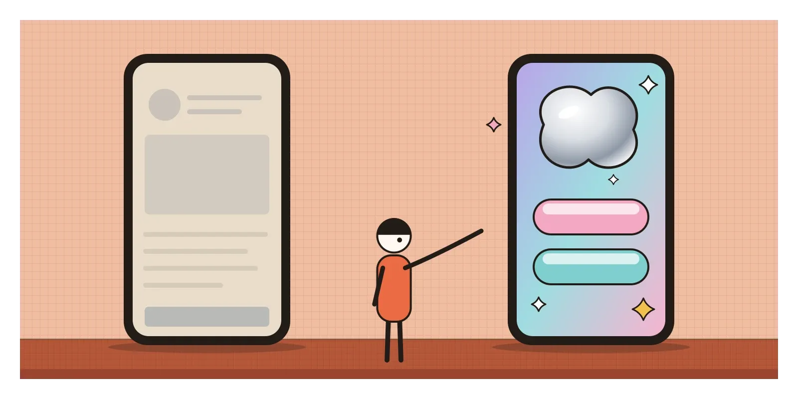
For product designers, the useful lessons are smaller than the trend. Gloss, depth and play can make an interface feel personal and alive, and the revival is a reminder that the flat, grey defaults most of us use, including many of the AI tools I work with, are a choice, not a law. But chrome type is often hard to read, iridescent gradients can wreck contrast, and a look borrowed from posters rarely survives contact with a settings screen. The best interfaces in this spirit save the shine for small moments, a sticker, a badge, a celebration, and keep the working parts plain.
The revival has real problems. It moves at the speed of social media, and microtrends that last a few months feed fast fashion, with cheap clothes bought for one photo and thrown away. Nostalgia also edits the past. The early 2000s had a harsh culture around women's bodies, and when low-rise jeans returned, many writers worried that the body standards might come back with them. And for people who were adults at the time, the era meant the dot-com crash of 2000, when many of those optimistic technology companies collapsed. The revival remembers the shine and forgets the bust. The nostalgia cycle is getting shorter, too: the 2010s look is already being revived.
Dig out an old phone
To see the original style for yourself this week, you won't need a museum. Look for an old phone, a translucent gadget or a music video from around 2000, and notice how much of its personality comes from surface: the shine, the tinted plastic, the glow. Rewatch the "Tunak Tunak Tun" video with a designer's eye and count the effects. If you want a thoughtful read on why styles from our childhoods return, Simon Reynolds's Retromania is the best book I know on pop culture's habit of recycling itself, and Kyle Chayka's Filterworld is good on how social platforms speed up trends.
For an exercise, take a plain screen you've designed and make a Y2K version: one chrome element, one translucent layer, one gradient, one sparkle, no more. Then decide honestly which details help and which only decorate. It's a quick way to learn what shine is for.
On that New Year's Eve in 1999, the engineers in their control rooms were watching for the future to break. It didn't, and the shiny, hopeful look of that moment became a period style like any other. Twenty years later, people who weren't there decided they missed it. In the next post, on Speculative and Critical Design, designers stop dressing up the future and start making objects that question it.
Further reading: Simon Reynolds, Retromania: Pop Culture's Addiction to Its Own Past (2011) · Kyle Chayka, Filterworld: How Algorithms Flattened Culture (2024) · Leander Kahney, Jony Ive: The Genius Behind Apple's Greatest Products (2013) · Rick Poynor, No More Rules: Graphic Design and Postmodernism (2003)
A reply toThe flat, beige and careful minimalism of the 2010s.