Web 2.0 Aesthetics
How the mid-2000s web turned glossy, rounded and reflective, and started asking its visitors to fill it.
Web 2.0 Aesthetics
A magazine cover you could see yourself in
In December 2006, Time magazine announced its Person of the Year, and it wasn't a president, a scientist or a pop star. It was you. The cover showed a white computer keyboard and a screen, and the screen was a panel of reflective Mylar, a thin mirror-like film, so that anyone who picked the magazine up off a newsstand saw their own face looking back from the monitor. The issue's argument, in an essay by Lev Grossman, was that millions of ordinary people writing blogs, uploading videos and editing encyclopaedia entries had taken the information age away from the professionals. The mirror was the editors' way of making that point literal.
Plenty of people called it a gimmick, and the cheap film gave back a slightly warped reflection, which seems, looking back, to sum up the internet rather well. But as design, the cover caught something precise about its moment. The web of the mid-2000s was obsessed with reflections, with shine, with things that looked like polished plastic and glass. And it was obsessed with the person on the other side of the screen.
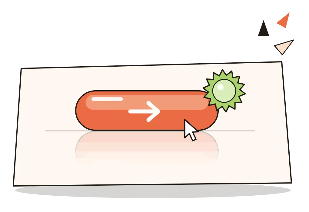
Web 2.0 aesthetics is the name I'll use for the look of websites and web applications from roughly 2004 to 2009: glossy candy-coloured buttons, soft gradients, reflections on a shiny floor, rounded corners, star-shaped badges, big friendly type and plenty of white space. Strictly, Web 2.0 was a business idea rather than a style, but the two arrived together so completely that for a few years you could tell a new web company by its buttons alone.
The web, version two
The phrase is older than the look. In 1999, the information architect Darcy DiNucci wrote an article for Print magazine called "Fragmented Future", predicting that the web, then mostly static pages loaded one screenful at a time, would soon spread to televisions, cars and phones, and she called that coming web Web 2.0. Hardly anyone noticed. The phrase was revived in 2004, in a brainstorm between the technology publisher O'Reilly Media and the events company MediaLive International, who were planning a conference. The first Web 2.0 Conference was held at the Hotel Nikko in San Francisco in October 2004, and in 2005 Tim O'Reilly wrote a long essay, "What Is Web 2.0", trying to pin down what the survivors of the dot-com crash had in common. His answer, roughly, was that software was becoming a service that was never finished, and that the most valuable sites got better the more people used them.
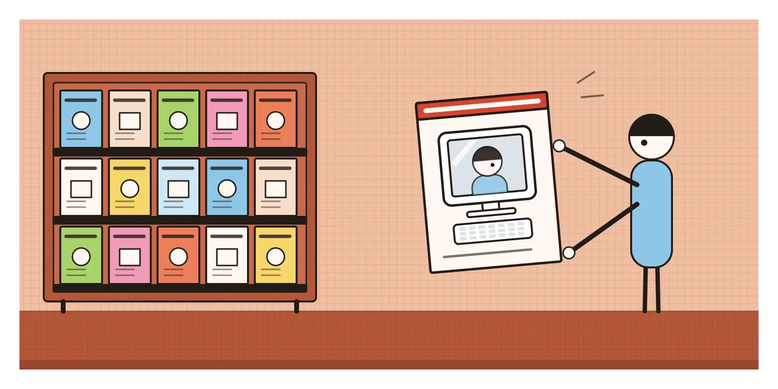
That was the reply. The dot-com boom of the late 1990s had built the web as a shop window and a broadcast channel: crowded portal pages, banner adverts, long Flash intros you had to sit through or skip, and layouts built from nested tables, which the post on early web design describes. When the bubble burst in 2000 and 2001, money dried up, and the companies that came next were small, cheap and in a hurry. Broadband was spreading, and new tricks with JavaScript meant a page could change without reloading. The new sites wanted to feel less like brochures and more like tools you could add to.
The shine came from somewhere specific too. In January 2000, Apple had shown Aqua, the new look of its Mac OS X, with translucent blue buttons like boiled sweets, and Steve Jobs said around that time that the team had made the buttons look so good you'd want to lick them. By the middle of the decade, Photoshop tutorials for glassy buttons and reflections were everywhere on design blogs.
A yellow fade, a tag cloud and a beta badge
Some of the most influential work was surprisingly small. In Chicago, a little web design firm called 37signals launched a project management tool, Basecamp, in early 2004. Its interface was plain and calm, with large type and generous spacing, but in February 2004 the company described one tiny trick it had invented. When you edited something and the page reloaded, it was hard to spot what had changed, so the changed area flashed a pale yellow and then faded back to white over a second or two. They called it the Yellow Fade Technique, and within months it was everywhere.
A year later, in February 2005, the designer Jesse James Garrett gave a name, Ajax, to the bundle of techniques that let web pages fetch new information quietly in the background. Google's new products showed what that felt like. Gmail, announced in April 2004, offered a then astonishing gigabyte of free storage and threaded conversations that opened without a page reload. Gmail also carried a small grey "beta" label next to its logo, which stayed there until 2009. The beta badge became a badge of honour across the industry. It said: we're new, we're not finished, and you're helping.
Flickr, a photo-sharing site launched in 2004 by Stewart Butterfield and Caterina Fake's company in Vancouver, made that helping visible. People labelled their own photographs with free-form keywords called tags, and Flickr showed the most popular ones as a tag cloud, a jumble of words in which more popular tags were set in bigger type. The information architect Thomas Vander Wal coined the word folksonomy for this kind of classification by the crowd. The tag cloud was a strange, beautiful bit of typography, and it was also the whole Web 2.0 argument in one picture: the structure of the site was made by its visitors.

Wet floors, starbursts and candy buttons
A typical Web 2.0 homepage is easy to picture. It's a single column of content, centred in the browser window, with a fixed width so it doesn't stretch on big screens. At the top is a gently graded header, perhaps pale blue fading to white. The logo is set in a rounded, friendly typeface, often in lowercase, sometimes with a vowel missing from the company name, and sometimes standing on an invisible shiny surface so that a faded, upside-down copy of it hangs underneath. Designers called that the wet floor effect. A large glossy button invites you to sign up, its top half brighter than its bottom half, as though light were falling on a bulging piece of plastic. A starburst in a bright colour shouts that the service is free, or new, or in beta. Somewhere there's a screenshot of the product, tilted slightly in perspective and standing on that same wet floor.
The colours were bright but soft: lime green, sky blue, tangerine and hot pink, usually as gradients rather than flat fills. Edges were rounded wherever possible. Icons were small, cute and often a little glossy themselves. Type was bigger than on the dense pages of the 1990s, with lots of space between sections, and the language was chatty and informal. In the later 2000s the web designer Ben Hunt wrote a widely shared guide to this look, listing many of these features, and it reads now like a field guide to a vanished species.
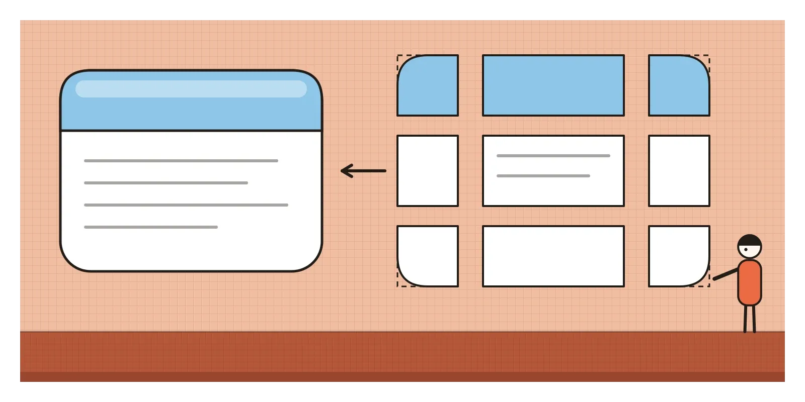
Many of these effects were harder to make than they looked. CSS, the language that styles web pages, had no simple way to round a corner until the border-radius property worked across the major browsers around 2010 and 2011. Before that, a rounded box was usually built from small images, one for each corner, carefully stitched to the edges of a box in code. Douglas Bowman's celebrated "Sliding Doors" technique of 2003 made stretchy tabs from two background images sliding over each other. Much Web 2.0 craft was patient engineering in the service of softness.
A word for blog in Hindi
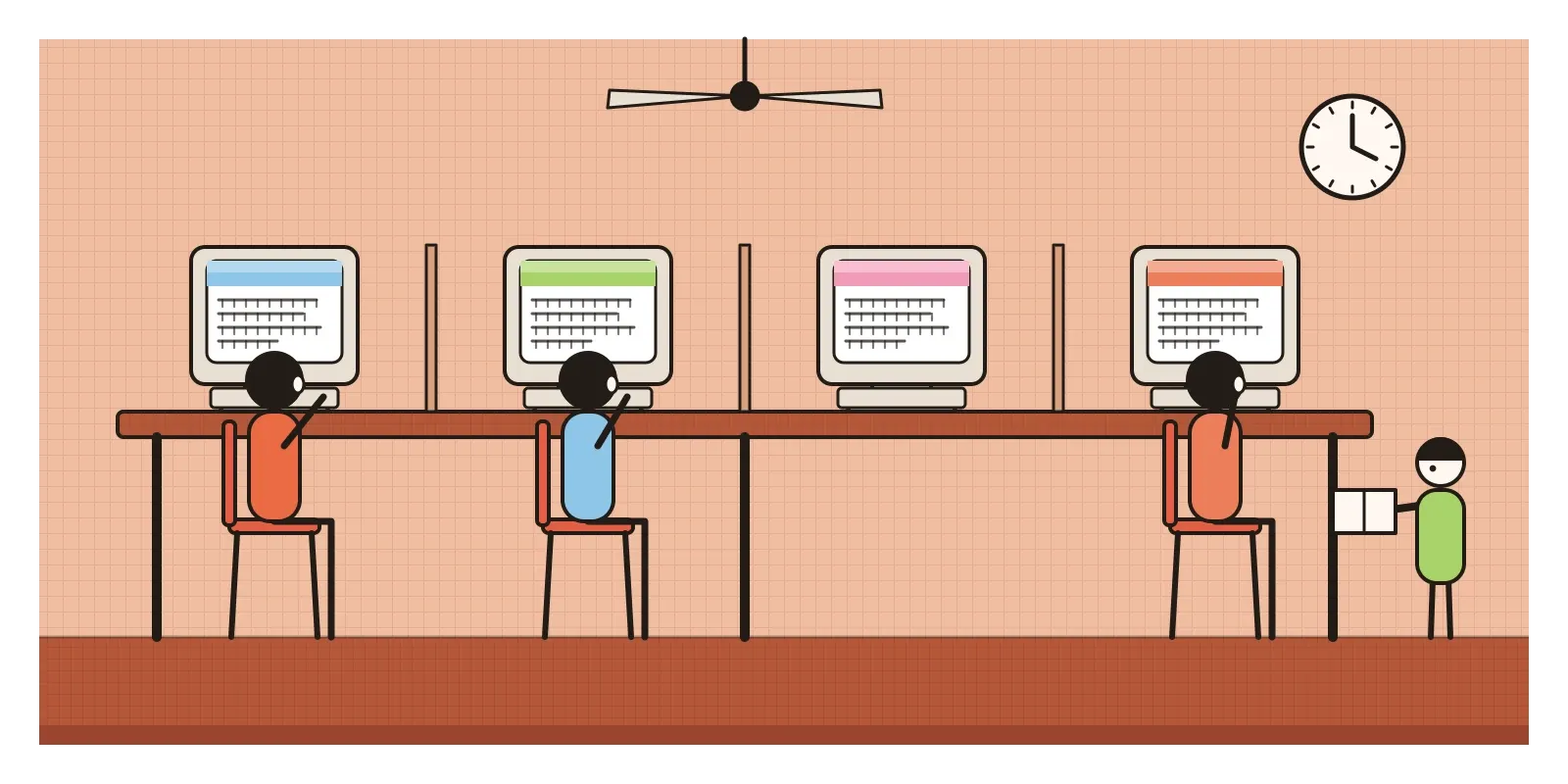
In India, the participatory side of Web 2.0 arrived ahead of most of its gloss. For a lot of people the internet still meant a cyber café, a plastic chair, a shared computer and a clock running on your hour, and heavy images and reflections were a luxury on a slow connection. What spread fastest was the idea that anyone could publish. Around 2003, Alok Kumar started what is generally recorded as the first blog in Hindi, called Nau Do Gyarah, and he coined a Hindi word for a blog, chittha, which the small community that grew up around it adopted. Through the mid-2000s, bloggers writing in Hindi, Marathi, Bengali and Tamil helped each other with fonts, keyboards and free templates, and built directories so readers could find them. Most of their pages wore the same imported templates as everyone else's, gradients and rounded boxes included.
A later Indian example shows the Web 2.0 idea in commercial form. In July 2008, two young consultants at Bain in Delhi, Deepinder Goyal and Pankaj Chaddah, launched a restaurant-listing site called FoodieBay. Its value lay in menus and reviews gathered from many people, and in 2010 it was renamed Zomato. The look was never especially glossy, but the logic was pure O'Reilly: a site that got better the more people used it. The parallel I'd draw is a loose one. India's Web 2.0 was less about shiny buttons than about who got to write, and in which script.
Live updates, rounded corners and the perpetual beta
The gloss has gone, apart from occasional bursts of nostalgia that a later post on the Y2K revival will look at, but much of the rest is so normal now that it's invisible. Pages that update without reloading, the core of Ajax, are simply how the web works. The yellow fade lives on in every small highlight that flashes on a new message, and in the brief confirmation toasts that slide in after you save. Rounded corners became one line of CSS and then the default shape of almost every card, button and app icon. The hashtag, proposed on Twitter by Chris Messina in August 2007, is a descendant of the tag.
So was a habit of mind. O'Reilly wrote about the perpetual beta, software that's improved continuously in public instead of shipped as a finished box. Today almost every new AI feature appears with a small "beta" or "preview" label beside it, exactly as Gmail's did, and it carries the same mixed message: be patient, and also, you're part of the experiment. The lesson worth keeping from 37signals is the one their yellow fade taught. When something changes on a screen, show people what changed. That's as true of an AI agent editing a document as it was of a to-do list in 2004.
The critics came early. In a 2006 interview for IBM, Tim Berners-Lee, who invented the web, said Web 2.0 was a piece of jargon nobody could define, and that connecting people had been the point of the web from the start. The same year, the writer Nicholas Carr coined the phrase "digital sharecropping" for what he saw as the deal underneath the friendly buttons: users did the work of writing, filming and tagging, and a few companies owned the fields and kept most of the harvest. Time's mirror flattered its readers. It didn't mention the advertising business that would be built on what they shared, or the privacy rows that followed.
The visual style had its own problems. It became a uniform almost overnight, so a whole generation of start-ups with different purposes looked interchangeable, and parody sites appeared that generated a Web 2.0 company name and logo for you, reflection included. The gloss was decoration presented as dimension. Its buttons looked physical without behaving like anything physical. When the iPhone arrived in 2007, the shine moved from the browser onto the phone, where it thickened into leather, wood and felt. In the next post, on skeuomorphism, I'll look at that heavier, more literal style, and at why its makers thought it was helping.
Look for the reflection
To see Web 2.0 for yourself, use the Internet Archive's Wayback Machine to visit the homepage of a web service you use today as it looked around 2006 or 2007, and count the gradients, reflections and starbursts. Then look at the same page now. Most of the gloss will have gone, and most of the ideas will still be there. Andrew Keen's The Cult of the Amateur (2007) is a sharp, one-sided counterweight to the optimism of the time. And for a small exercise, design a single button twice: once with a mid-2000s gradient and highlight, once as a flat shape, and ask a friend which one they would press.
The mirror on that Time cover was a cheap piece of film, and it gave everyone a slightly distorted face. That turns out to be a fair picture of the whole style: shiny, flattering, genuinely exciting about what ordinary people could make, and a little blind to who would end up owning the reflection.
Further reading: Darcy DiNucci, "Fragmented Future" (1999) · Tim O'Reilly, "What Is Web 2.0" (2005) · Jesse James Garrett, "Ajax: A New Approach to Web Applications" (2005) · Douglas Bowman, "Sliding Doors of CSS" (2003) · Andrew Keen, The Cult of the Amateur (2007)
A reply toThe crowded portals, banner adverts and Flash intros of the dot-com web.