Skeuomorphism
Why screens spent a decade dressed as leather, wood, felt and tape, and what that costume was for.
Skeuomorphism
A tape deck that played podcasts
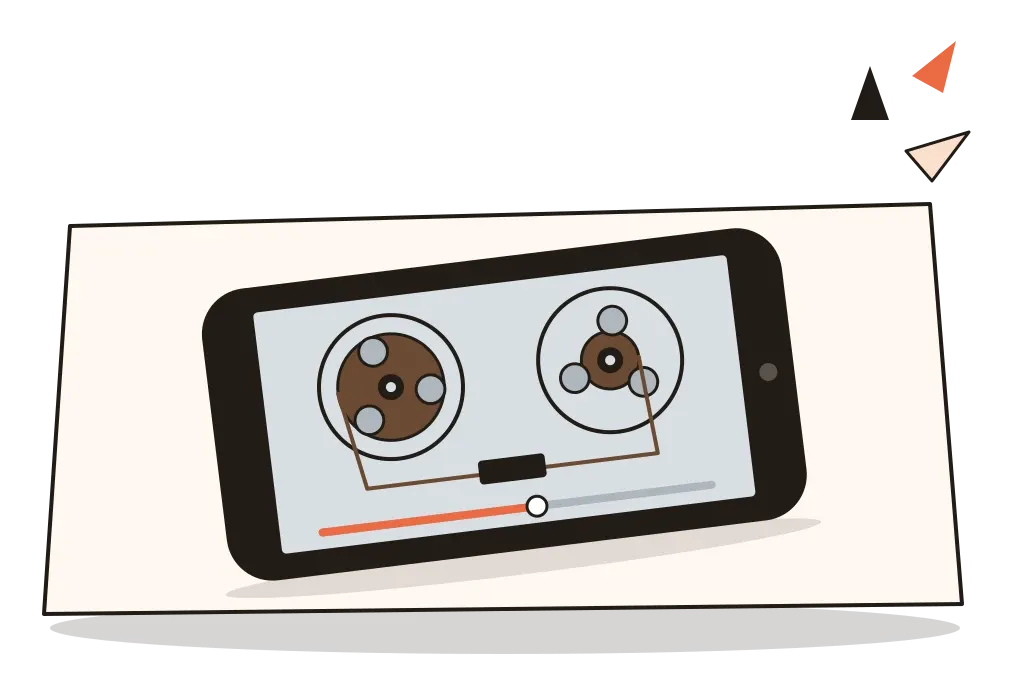
In June 2012, Apple released a new app for listening to podcasts. When you pressed play, the screen didn't show a simple progress bar. It showed a reel-to-reel tape recorder, the kind of machine found in radio studios and wealthy living rooms in the 1960s, with two spools of brown tape, one feeding the other. As the episode played, the reels turned. As it went on, tape visibly wound from the left reel onto the right one. If you dragged forward to skip, the reels spun fast, as if you'd pressed fast-forward on the real thing.
It was beautifully drawn and almost universally mocked. Technology writers called it pointless, and plenty of people noticed the obvious problem: most of the people listening to podcasts on a phone in 2012 had never touched a reel-to-reel recorder in their lives. The metaphor was supposed to make a new thing feel familiar, but it borrowed its familiarity from an object that had left most homes decades earlier. In an update in early 2013, the tape deck disappeared, replaced by something much plainer. A few users said they missed it.
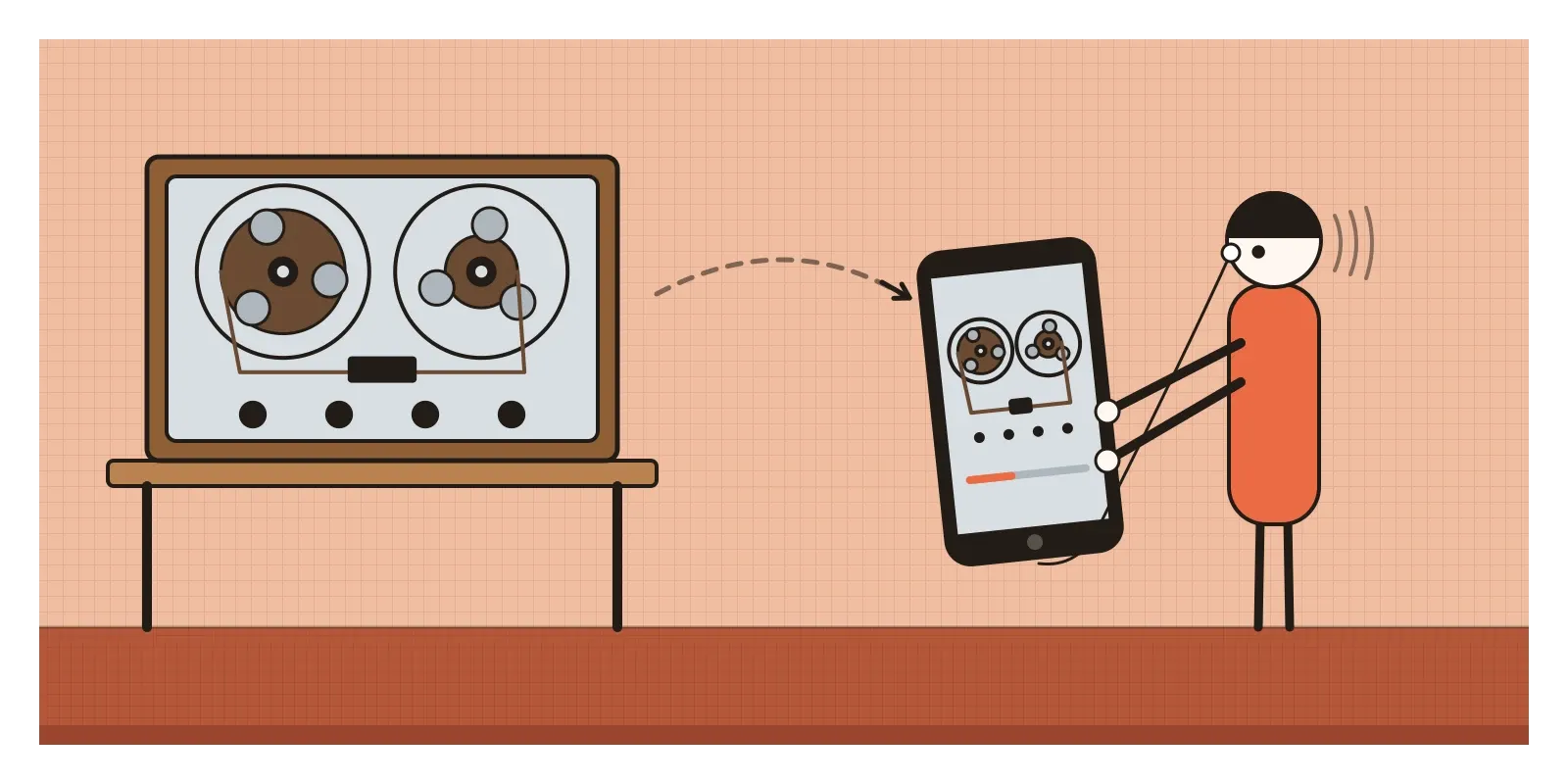
That spinning tape was one of the last and most extreme examples of skeuomorphism, the style in which digital interfaces imitate the look, and sometimes the behaviour, of physical objects: stitched leather, wood grain, green baize, paper with torn edges, brushed metal knobs. For roughly a decade, from the mid-2000s to 2013, it was the dominant look of consumer software, especially on phones. In the post on form follows function I described how Apple's leather-bound calendar and yellow notepad were swept away in 2013. Here I want to look at where the style came from, what it was trying to do, and why its ghost is still on your screen.
A word from 1889
The word is much older than any computer. In 1889, an English doctor and antiquarian called Henry Colley March gave a paper to the Lancashire and Cheshire Antiquarian Society on the meaning of ornament, and in it he introduced the term skeuomorph, from the Greek skeuos, a vessel or tool, and morphe, shape. Some sources date the printed paper to 1890. March was interested in prehistoric objects that kept the marks of an older material or technique after the reason for those marks had gone: clay pots decorated with patterns that copy the weave of baskets, or the stitching on a leather bottle, or the cords that once tied a container together. The pattern had stopped doing any work, but people kept it, because that's what a pot was supposed to look like.
Once you have the word, skeuomorphs turn up everywhere in the history of making. Archaeologists have long argued that some of the details of Greek stone temples remember the timber buildings that came before them. In the post on ancient Indian art I described the great prayer hall at Karla, where builders carved a vault from solid rock and then fitted teak ribs underneath it, imitating a wooden roof that wasn't holding anything up. A new material arrives, and for a while it dresses up as the old one, partly from habit and partly to reassure people that it's the same kind of thing.
Computers did the same. Through the 1980s and 1990s, personal computers borrowed the language of the office, with desktops, folders, documents and a waste bin, which the post on pixel art and early computer graphics looks at. But much software was still a world of abstract grey boxes, and to many people outside offices it felt cold and alien. Skeuomorphism replied by bringing the familiar world inside the screen. Then, in 2007, a phone arrived that was almost entirely a sheet of glass. With no physical buttons to press, interfaces had to teach people how to touch, and realistic objects looked like a natural way to do it.
Rooms, racks and wooden shelves
The most literal attempt came early and failed. In March 1995, Microsoft released Microsoft Bob, a program that replaced the usual desktop with a cartoon house. You entered rooms with fireplaces, desks and bookcases, and clicked on a calendar on the wall or a letter on the desk to open the matching program, guided by animated helpers including a dog called Rover. It was meant for people who found computers frightening. Reviewers found it patronising and slow, and it was quietly dropped within about a year, though Rover reappeared years later as the search assistant in Windows XP.
Music software had more success, because its users already knew the machines being copied. In 2000, the Swedish company Propellerhead released Reason, a program that showed a rack of virtual synthesisers, drum machines and effects units, all with realistic knobs, faders and little glowing lights. Press a key and the whole rack turned round to show its back panel, where you could drag virtual patch cables from one socket to another, and they sagged and swung as if they had weight. For musicians who had spent years in studios, it was instantly readable. Audio software still looks like this today, and for that audience it still works.
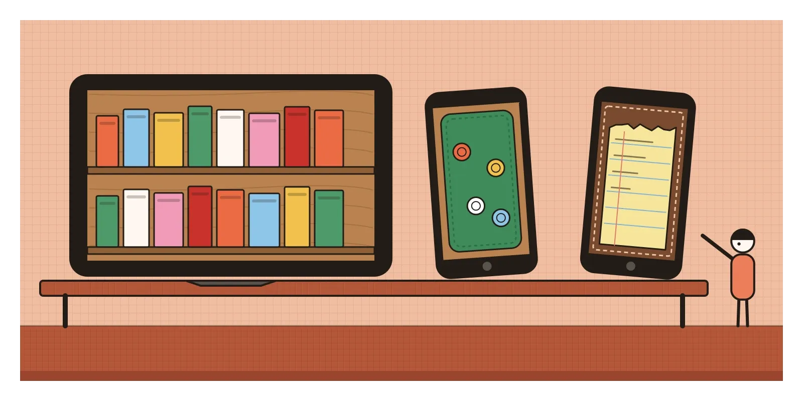
On phones and tablets, the style reached its height between about 2009 and 2012. Apple's iBooks app, in 2010, put your books on a wooden bookshelf, and turning a page curled it over with a soft shadow under the fold. Game Center, the same year, was dressed as a casino table in green felt with a polished wooden rim. Newsstand, in 2011, showed magazines on a wooden shelf. The iPhone's calculator was widely noticed for resembling Braun calculators designed under Dieter Rams, whose work I mentioned in the post on form follows function. Countless third-party apps followed, so that a weather app might look like a brass barometer and a notes app like a ring binder. Inside Apple, the style was associated with Scott Forstall, who ran iOS software, and with Steve Jobs's own taste, though accounts of who wanted exactly what vary.
Stitches, shadows and pressed-in type
Skeuomorphic interfaces are easy to spot. Surfaces have materials, and the materials have texture: leather with stitching around the edge, linen with a fine weave, wood with visible grain, paper with a torn top edge where a sheet has been ripped from a pad. Light comes from above, as I described in the post on light, shade and rendering, so buttons are lit on top and shadowed underneath, and panels cast shadows onto what's behind them. Text is often made to look pressed into the surface, with a one-pixel white line just below each letter, an effect designers called letterpress or embossing.
Controls look like their physical ancestors. A volume control is a metal knob with knurled edges. An on-off setting is a sliding switch with a shiny thumb. Lists sit on lined paper. Motion and sound complete the illusion: pages turn and curl, reels spin, a camera app plays the sound of a mechanical shutter, a keyboard clicks. The whole point is that you shouldn't have to learn anything new. You should recognise what to do.
It's worth separating two ideas that often get mixed together. A skeuomorph in Colley March's strict sense is a leftover, a feature that once had a job and now survives as decoration, like a shutter sound on a camera that has no shutter. A metaphor is different: a deliberate comparison that helps you understand a new thing through an old one, like a folder. Good skeuomorphic design used metaphors that taught something. Bad skeuomorphic design piled on leftovers for their own sake, like that tape deck.
A red cloth ledger and a tablet
One of the clearest recent skeuomorphs I know of happened in the Indian Parliament. For decades, India's finance ministers carried their budget papers in a briefcase, a custom inherited from Britain, where chancellors hold up a red despatch box on budget day. Even the word budget remembers an object. It comes, through English, from the old French bougette, a small leather bag. On 5 July 2019, presenting her first budget, Nirmala Sitharaman arrived instead with her papers wrapped in red cloth tied with string, in the style of a traditional bahi-khata, the account book used by Indian merchants for generations, with the national emblem on the front. She said it was very Indian and easier to carry, and the government framed it as a move away from a colonial habit.
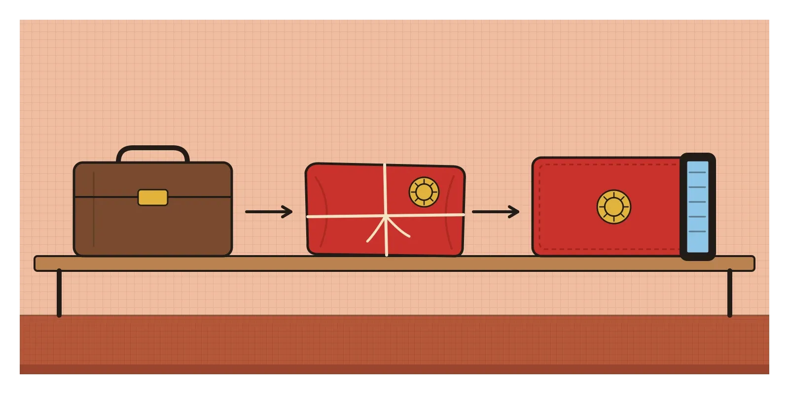
The skeuomorph arrived two years later. Because of the pandemic, the budget of February 2021 was the first to be fully paperless. Sitharaman read her speech from a tablet, and the tablet came in a red cover with a gold emblem, shaped and coloured like the cloth ledger. A glass screen had been dressed as a paper account book, which had itself replaced a leather case. It's exactly what Colley March described: the new thing borrows the look of the old one, not because the cloth does anything for the tablet, but because it carries meaning that a plain black device couldn't. Indian bookkeeping apps do the same in a quieter way, often naming themselves after the khata, the ledger, that shopkeepers already trusted.
Switches, shutters and three little dots
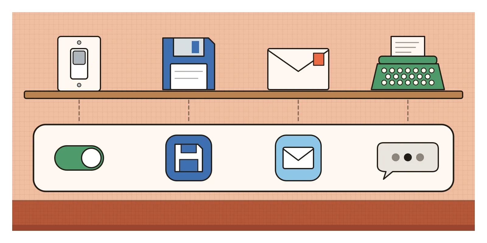
Flat design pushed out the textures, but skeuomorphism never really left. The on-off toggle on your phone is still a little sliding switch. The icon for saving a file in many programs is still a floppy disk, an object that plenty of people using it have never held, and the icons for phone, mail and shopping are still a handset, an envelope and a trolley. Phones still play a shutter sound. And in the post on texture I described how some trackpads and phones fake the feeling of a physical click with a precise vibration. The realism moved from the eye to the ear and the hand.
AI products are full of skeuomorphs too, and some deserve more thought than they get. Many chat assistants show three animated dots while they work, borrowed from messaging apps, where the dots meant a friend was typing. Answers often appear word by word, as if someone were writing them out. These touches make a statistical system feel like a person on the other end of a conversation. That can make a tool easier to approach, but it's also a metaphor that can mislead, and I think designers should choose it deliberately rather than by default.
The case against skeuomorphism was made loudly around 2012. Critics called it kitsch, fake luxury, leather that was never leather. Its metaphors aged badly, as the tape deck showed. They also over-promised: an address book that looks like a book suggests you can flip through it like one, and when it doesn't behave that way, the costume becomes a lie. Every app chose its own material, so a phone became a cabinet of mismatched curiosities. Textures and heavy shadows took up space on small screens, cost time to design for every new screen size, and sometimes made text harder to read. And the original justification, that people needed real-world clues to understand touchscreens, faded as a generation grew up swiping glass.
The end came quickly. In October 2012, Apple announced that Scott Forstall was leaving and that Jony Ive, its head of industrial design, would also lead the design of its software. The following year's redesign, which I described in the post on form follows function, stripped out almost every texture. In the next post, on flat design, I'll look at that reply, which began not at Apple but at Microsoft, and was partly inspired by the signs in airports and on public transport.
Find the old object inside the new one
The best way to see skeuomorphism is to hunt for it. Go through the icons and controls on your own phone and, for each one, name the physical object it remembers and ask whether you have ever used that object. Then open any music production app and look for knobs, meters and patch cables. If you're near Lonavala, visit the caves at Karla and Bhaja and look up at the carved rafters, a two-thousand-year-old version of the same instinct. For reading, Don Norman's The Design of Everyday Things explains why some metaphors help and others confuse, and N. Katherine Hayles's How We Became Posthuman has a thoughtful passage on skeuomorphs as threshold objects that make change feel safe.
The reel-to-reel tape deck in that podcast app failed because it borrowed comfort from a machine its users didn't remember. The red cover on the budget tablet worked, at least as theatre, because everyone watching knew what a bahi-khata meant. The lesson isn't that imitation is good or bad. It's that a metaphor only helps if the person on the other side already knows the original.
Further reading: H. Colley March, "The Meaning of Ornament, or its Archaeology and its Psychology" (1889) · N. Katherine Hayles, How We Became Posthuman (1999) · Don Norman, The Design of Everyday Things (revised edition, 2013) · Brenda Laurel, Computers as Theatre (1991)
A reply toThe abstract grey boxes of early software, and the blank glass of the first touchscreens.