Vorticism and Orphism
Two brief offshoots of Cubism, one all hard diagonals in London, one all singing colour in Paris.
Vorticism and Orphism
A pink magazine that shouted
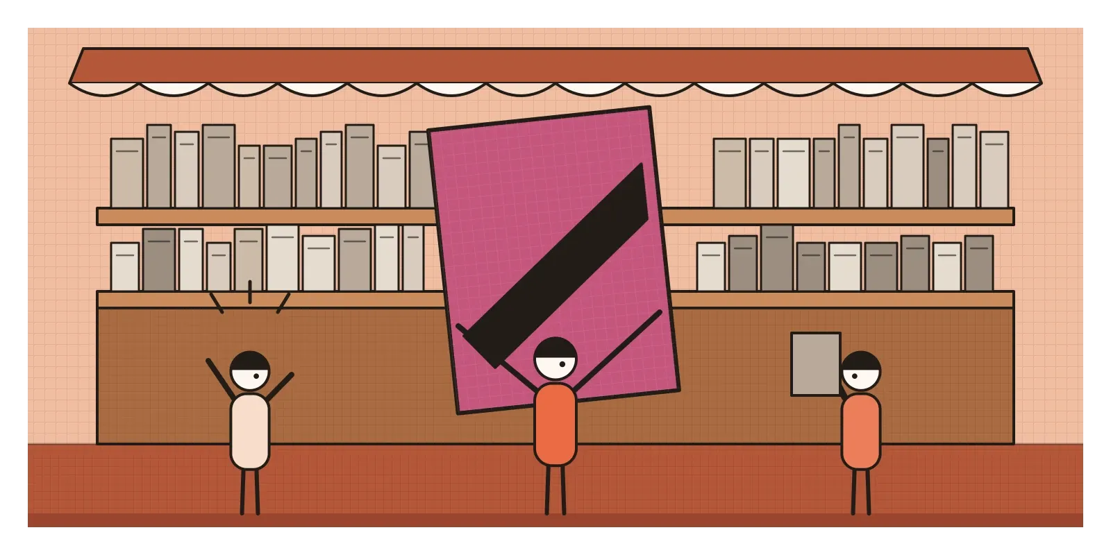
In early July 1914, London's booksellers took delivery of a magazine that looked like nothing else on their shelves. It was oversized and heavy, with a cover in a loud pinkish purple usually described as puce, and a single word in fat black capitals running diagonally across it: BLAST. Inside, huge blocky type was stacked in lists like a railway timetable. One list blasted things, the next blessed them. Among the blasted were the English climate and the whole Victorian age, which the magazine dismissed by its dates, 1837 to 1900. Among the blessed were English ports and ships and, for no obvious reason, hairdressers. The cover was dated 20 June 1914. Eight days after that date, Archduke Franz Ferdinand was shot in Sarajevo, and within six weeks Britain was at war.
The magazine was edited by the painter and writer Wyndham Lewis, and it was the manifesto of a movement the poet Ezra Pound had just named Vorticism. It lasted about as long as the war allowed: two issues of BLAST and one exhibition in London. In Paris, a similarly brief and brilliant offshoot of Cubism had already been given a name, Orphism, by the poet Guillaume Apollinaire. This post is about both: two small movements that took Cubism's broken planes and pushed them in opposite directions, one towards hard-edged machine energy, the other towards pure, glowing colour.
Two cities arguing with Cubism
Both movements grew out of the years around 1912 to 1915, when Cubism, which has its own post in this series, had become the language every ambitious young painter in Europe wanted to speak, and argue with. Picasso and Braque's Cubism was mostly brown, grey and still: guitars, bottles and newspapers on café tables. The next wave wanted to make its splintered planes move, blaze with colour, or speak of the city rather than a tabletop.
In London, the art world was still absorbing the two Post-Impressionist exhibitions the critic Roger Fry had organised in 1910 and 1912. Lewis worked briefly at Fry's Omega Workshops, a design studio in Bloomsbury, and walked out after a row in October 1913. In the spring of 1914 he and his allies set up their own base, the Rebel Art Centre in Great Ormond Street, paid for by the painter Kate Lechmere. In June 1914 the Italian Futurist Filippo Tommaso Marinetti and the painter C. R. W. Nevinson published a manifesto naming Lewis's circle as English Futurists without asking them. They turned up at Marinetti's next London lecture to heckle.
That quarrel explains a lot. The Vorticists shared the Futurists' love of machines and cities but disliked their blur and their worship of speed. Pound described the vortex as a point of maximum energy, the still, concentrated centre of a whirlpool rather than the rush of water around it.
Paris took the opposite road. In October 1912, at the large Section d'Or exhibition of Cubist painting, Apollinaire gave a lecture in which he described a new kind of "Orphic" Cubism, painting made from elements the artist invented rather than copied from the visible world, closer to music than description, named after Orpheus, the musician of Greek myth. Robert Delaunay, the painter most associated with it, preferred his own word, "simultaneous", taken from the chemist Michel Eugène Chevreul's law of simultaneous contrast, the way colours change each other when placed side by side, which I described in the post on colour harmonies.
Rock drills, windows and a cradle quilt
Lewis's own paintings from those years are the clearest picture of Vorticism. The Crowd, painted around 1914 to 1915, is a huge canvas of towering red, grey and ochre blocks, like the walls of a city of tenements, with tiny, jointed stick figures marching through the gaps. Workshop, from the same years, is all slanting planes and diagonal struts, like scaffolding seen from an awkward angle.
The sculptors were just as fierce. Henri Gaudier-Brzeska, a young Frenchman living in London, carved a massive marble Hieratic Head of Ezra Pound in 1914, the poet's face reduced to a few geometric slabs. He joined the French army and was killed in action in June 1915, aged twenty-three. Jacob Epstein made Rock Drill between 1913 and 1915, a white plaster figure like a robot with a visor for a face, sitting astride a real, second-hand mining drill. After the slaughter of the war he dismantled it, cut the figure down to an armless half-length torso and cast that in bronze.
Vorticism also had women at its centre, which its later histories often forgot. Helen Saunders and Jessica Dismorr signed the BLAST manifesto and showed at the one Vorticist exhibition, at the Doré Galleries in June 1915. Much of Saunders's work is lost. Outside the group, David Bomberg refused to join, but his In the Hold, from 1913 to 1914, a scene of dockers in a ship's hold shattered into a grid of bright triangles, is one of the most Vorticist pictures ever painted. Edward Wadsworth later supervised dazzle camouflage on ships in Liverpool and Bristol, the story I told in the post on figure and ground. In 1916 and 1917 the photographer Alvin Langdon Coburn clamped three mirrors together into a kind of kaleidoscope and made what Pound called vortographs, among the first deliberately abstract photographs.
In Paris, Robert Delaunay began his Windows series in 1912: canvases of overlapping, translucent panes of colour, like light seen through glass, which Apollinaire answered with a poem of the same title. Delaunay then painted circular forms, discs of concentric rings divided into quarters of contrasting colour, and his Homage to Blériot of 1914 sets the pioneer aviator among wheeling discs of colour like propellers and suns. The Czech painter František Kupka showed Amorpha, Fugue in Two Colours, a canvas of looping red and blue bands, at the Salon d'Automne in 1912, one of the first abstract paintings shown in public in Paris.
The most surprising Orphist work, though, wasn't a painting at all. In 1911, when her son Charles was born, Sonia Delaunay made him a cot quilt pieced from scraps of fabric in blocks and strips of colour, like the peasant blankets she remembered from her childhood in Ukraine and Russia. She said later that it was where her abstract work began. In 1913 she and Robert went dancing at the Bal Bullier, a dance hall in Montparnasse, she in a "simultaneous dress" she'd pieced from patches of coloured fabric. That same year she painted the colour for La Prose du Transsibérien, a long poem by Blaise Cendrars about a train journey across Russia, printed as a single fold-out sheet about two metres tall with her flowing bands of colour running beside the text.
Wedges for London, circles for Paris
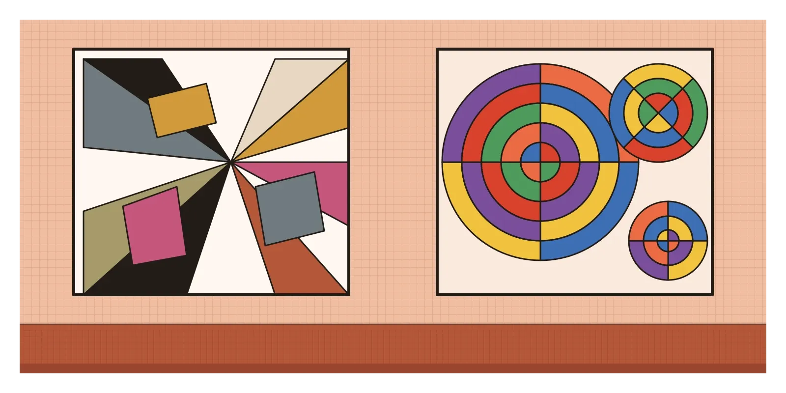
Put a Vorticist picture beside an Orphist one and the difference is immediate. Vorticism is built from straight lines: wedges, diagonals, stepped blocks, interlocking angular planes that converge on a hard centre. Figures become jointed, armoured or mechanical. The colours are often sour and urban, black, khaki, ochre, rust and slate, cut with that acid pink. Even the typography of BLAST follows the rule, heavy black sans-serif type stacked like steel girders, a decade before the New Typography, which has its own post, made such layouts respectable.
Orphism is built from curves: discs, rings, arcs and overlapping translucent planes. Its colours are pure, bright and placed in pairs that make each other vibrate, orange against blue, red against green, yellow against violet. The movement comes from rotation and light, as if the canvas were spinning slowly, and its subject is often colour itself.
One heard modern life as the clang of a machine shop, the other as the hum of electric light.
Patchwork from Sindh to Montparnasse
I haven't found a direct Indian connection to either movement. The closest Indian artist to these years of prismatic, faceted painting is Gaganendranath Tagore, whose work I wrote about in the post on Cubism. But Sonia Delaunay's cot quilt sends me straight to an Indian tradition with a family resemblance: the ralli quilts of Sindh, Kutch, and parts of Rajasthan and Punjab.
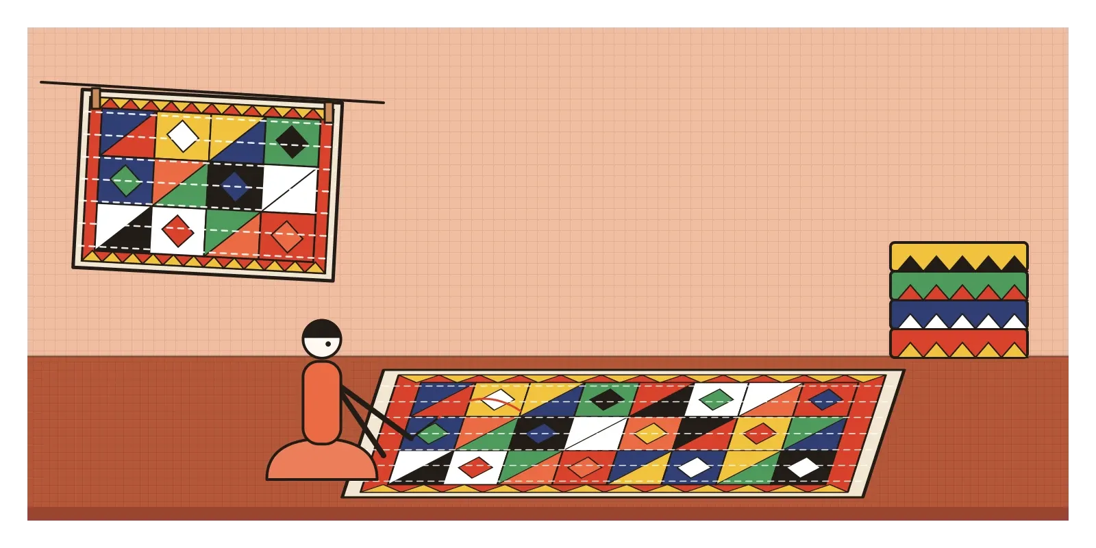
Rallis are made by women, traditionally for their households and their daughters' dowries, from layers of worn cloth held together with long lines of running stitch. The top layer is pieced or appliquéd from scraps into squares, triangles, strips and sawtooth borders, in strong colours: red, yellow, indigo, green, black and white. The region was split by Partition, so the same patterns are stitched on both sides of the border.
The parallel is loose, and I want to be careful with it. There's no evidence that Sonia Delaunay ever saw a ralli, and the women who make them aren't trying to illustrate a theory of colour. But the two meet at a point the Paris art world took decades to admit: some of the boldest abstract colour in the world was being made at home, by women, with leftover cloth. Sonia's quilt is now in the Centre Pompidou and has a place in the history of modern art. Rallis have almost always been anonymous. Looking at the two together is a good way to ask why one became art and the other stayed craft, a question I explored in the post on design, art and craft.
Rings on your wrist, a car in colour blocks
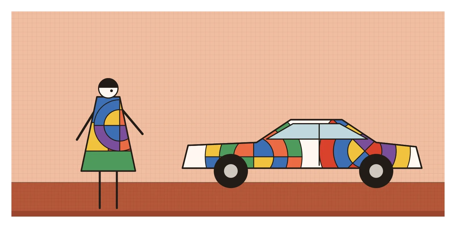
Orphism's afterlife is everywhere colour does the talking. Sonia Delaunay was perhaps the first modern artist to treat painting, textiles, fashion, book design and interiors as one practice. She designed printed silks in the 1920s, and in 1967 she painted a Matra sports car in blocks of colour. In 1964 she became, by most accounts, the first living woman artist to have a retrospective at the Louvre. Every artist collaboration on a scarf or a sneaker follows a road she helped open.
Delaunay's discs also live on, by coincidence rather than descent, in the concentric coloured rings of fitness and progress trackers. They work on the same pleasure, colour moving round a centre. The more useful lesson is Chevreul's: colours change their neighbours. Two saturated complementary colours at equal brightness will make an edge shimmer, which is thrilling in a painting and painful in a button label. When I check colour in an interface, I'm checking simultaneous contrast as much as any accessibility ratio.
Vorticism left a different trace. BLAST's heavy, stacked, shouting type sits behind a century of protest posters, zines, record sleeves and the deliberately raw websites that designers sometimes call brutalist. And Coburn's vortographs are early ancestors of every kaleidoscope filter on a phone.
Blasted by the war
The war did the critics' work. Gaudier-Brzeska was dead within a year of BLAST, the philosopher T. E. Hulme, the movement's most serious critic and ally, was killed in 1917, and Lewis himself served as an artillery officer and then a war artist. The second issue of BLAST, the "War Number" of July 1915, was the last. Lewis's later politics did lasting damage too: in 1931 he published an admiring book about Hitler, which he retracted at the end of the decade.
The movement's history was also bent by its leader. In 1956, when the Tate staged an exhibition on Lewis and Vorticism, he wrote that Vorticism had essentially been what he himself did and said at the time. William Roberts answered with angry pamphlets, and Saunders and Dismorr faded from the story for decades.
Orphism's problems were different. The label was a poet's, and most of the painters disliked it. Robert Delaunay and Kupka quarrelled over who had reached abstraction first. Sonia's work was long filed under "decorative", a word that did a lot of gendered work in the twentieth century, while Robert was treated as the theorist, though she outlived him by almost forty years and kept the ideas moving. By the early 1920s both movements had dissolved into other things.
The next reply came from artists who thought all this was talking to the wrong people. Diego Rivera spent years in Paris painting Cubist pictures before going home to Mexico, where he and others decided that painting belonged on public walls, telling the history of a revolution to people who might never enter a gallery.
To see these movements for yourself this week, look up Tate's online collection, which holds Lewis's Workshop and The Crowd, Bomberg's In the Hold and Epstein's bronze torso from Rock Drill. The Centre Pompidou's website shows Sonia Delaunay's cot quilt. If you're in Gujarat, look for rallis in Kutch and in Bhuj's craft markets, and ask who made them. Then try two small exercises. Cut a circle of card, divide it into rings and quarters, colour neighbouring segments in complementary pairs, push a pencil through the centre and spin it. Then arrange a dozen sharp paper wedges so they all point to one spot, and feel the difference between a whirl and a vortex.
And think back to that pink magazine landing in London's bookshops in July 1914, blessing hairdressers and blasting the climate, weeks before the world it was shouting at blew apart. In the next post, on Mexican Muralism, art leaves the magazine and the gallery and climbs onto the walls of a nation.
Further reading: Richard Cork, Vorticism and Abstract Art in the First Machine Age (1976) · Mark Antliff and Vivien Greene (eds), The Vorticists: Manifesto for a Modern World (2010) · Paul Edwards, Wyndham Lewis: Painter and Writer (2000) · Sherry A. Buckberrough, Robert Delaunay: The Discovery of Simultaneity (1982) · Anne Montfort and Cécile Godefroy (eds), Sonia Delaunay (2014)
A reply toCubism's brown, static still lifes, and Futurism's claim to own the machine age.