
Vaporwave
How slowed-down muzak, marble busts and old computer screens became the internet's strangest kind of nostalgia.
Vaporwave
Diana Ross, slowed down until she melts
On 9 December 2011, a small independent label called Beer on the Rug put an album up for download on Bandcamp. It was called Floral Shoppe, and it was credited to Macintosh Plus, one of many names used by a young American producer who also recorded as Vektroid and is now known as Ramona Langley. The track titles were in Japanese. The cover was a collage: a pink background, a black and white checkerboard, a photograph of a classical bust of the Greek sun god Helios and a screenshot of the New York skyline with the Twin Towers still standing.
The second track is the one people remember. It takes Diana Ross's 1984 recording of "It's Your Move", a glossy, mid-tempo pop song, and slows it down until her voice drops and drags. A phrase loops, stutters and starts again. The drums go soft, the backing turns to syrup, and the whole thing sounds like a song you half remember from a shopping mall, heard through a wall, many years later. Hardly anyone noticed at first. Within a year it was being passed around, mocked and turned into memes, and it is now usually described as the album that defined a genre.
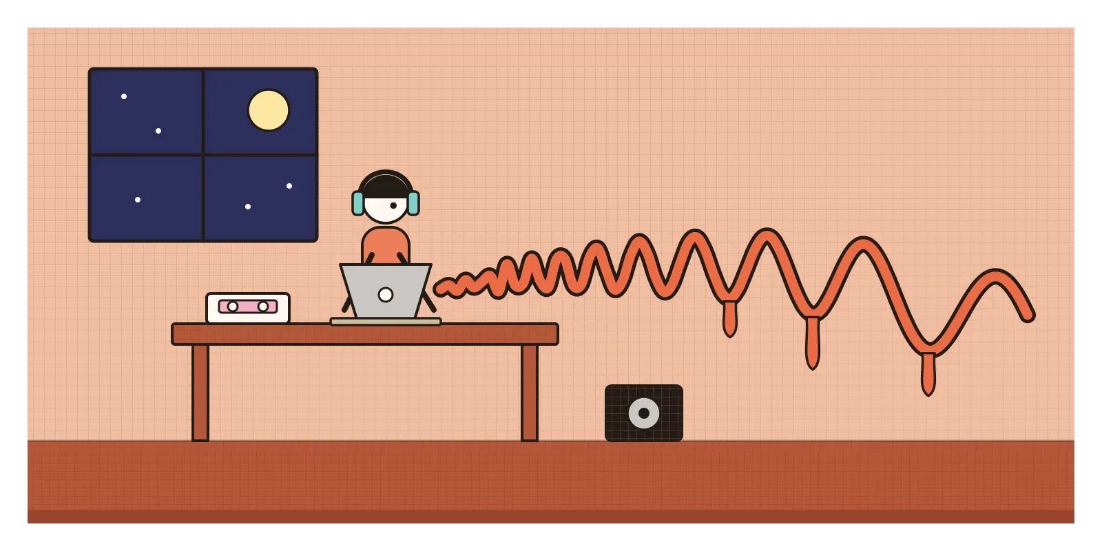
That genre was vaporwave: an internet microgenre of music and images, born in the early 2010s, built from slowed, looped samples of 1980s and 1990s smooth jazz, lift music, adverts, corporate training videos and early computer graphics. The music was always niche. The look, a pastel mix of marble statues, palm trees, old operating systems and Japanese text, escaped the music and spread across the internet, and designers are still borrowing from it.
After the crash, inside the browser
Vaporwave grew up in the years after the financial crash of 2008. A generation that had been promised a smooth, prosperous digital future was graduating into recession, debt and the Occupy protests of 2011. At the same time, the tools for making and sharing music had become almost free. Anyone with a laptop could slow down a song, add echo, loop it and upload it the same evening to YouTube, SoundCloud or Bandcamp. Many of the producers were anonymous and changed names constantly.
What they replied to was a particular kind of optimism. In the 1980s and 1990s, corporations sold the future through sound and image: the soothing music in hotel lobbies and lifts, the bright jingles of adverts, the start-up chime of a new computer (Brian Eno composed the short start-up sound for Windows 95), the shiny 3D logos of the early web. Vaporwave took those materials and played them back slowly, so that the promise sounded hollow, sad or simply strange. It also pushed further the hazy, half-remembered childhood sounds of chillwave and hypnagogic pop, styles of around 2009, until nostalgia tipped into irony.
The name is a pun on vaporware, the software industry's word for a product that is announced with fanfare and never actually released. The earliest known use of "vaporwave" is in a blog review from October 2011, and one producer of the scene, Robin Burnett of the project Internet Club, is usually credited with coining it, though, as with most internet words, nobody can be quite sure. The critic Simon Reynolds had just argued, in Retromania (2011), that pop culture was addicted to its own past. Vaporwave seemed to prove him right and mock the addiction at once.
A cassette, a ringtone album and a pink bust
Three records are usually named as the beginning. The first is Chuck Person's Eccojams Vol. 1, released in August 2010 by the American musician Daniel Lopatin, better known as Oneohtrix Point Never, under a joke name. It came out on a hundred cassettes from a tiny label. Lopatin had been posting short videos to YouTube in which he took a few seconds of a soft-rock hit, such as Toto's "Africa", slowed it, looped it and drenched it in echo until it became something between a lullaby and a lament. The cassette's artwork borrowed from Ecco the Dolphin, a 1990s video game, which is one reason dolphins swim through so much vaporwave imagery. His "eccojams" became the basic technique of the whole genre.
The second is Far Side Virtual, released by James Ferraro in October 2011. Instead of slowing down old songs, Ferraro composed bright, plastic music out of the kinds of sounds a computer or phone makes: ringtones, notification chimes, the cheerful bleeps of online worlds and video-chat software. It sounded like an advert for a future made of pleasant transactions, and it was hard to tell whether he loved that future or feared it. The third is Floral Shoppe, which put the pieces together: slowed samples, corporate gloss, Japanese titles and a cover that became the genre's flag.
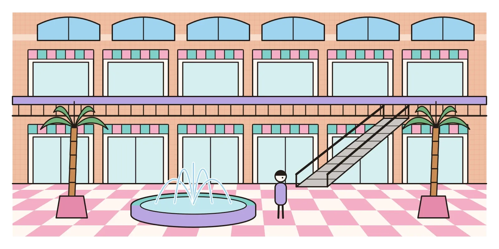
In 2012 the British critic Adam Harper wrote an essay for the music magazine Dummy that gave the scene its best-known description. He imagined vaporwave taking place in a "virtual plaza", a glossy digital shopping centre where every surface is an advert, and he wondered whether its producers were sarcastic critics of consumer technology or its willing accomplices. Then the genre split. Mallsoft sounded like an empty shopping mall, all fountains, footsteps and distant lift music. Future funk, led by producers such as Macross 82-99, sped things up and sampled 1980s Japanese city pop. In 2015 the duo 2814 released Birth of a New Day, a slow, rainy, night-time album that many listeners treat as the genre at its most beautiful, and the same year a harder, faster offshoot called hardvapour appeared, as if to answer the gentleness.
Marble, palm trees and a broken window
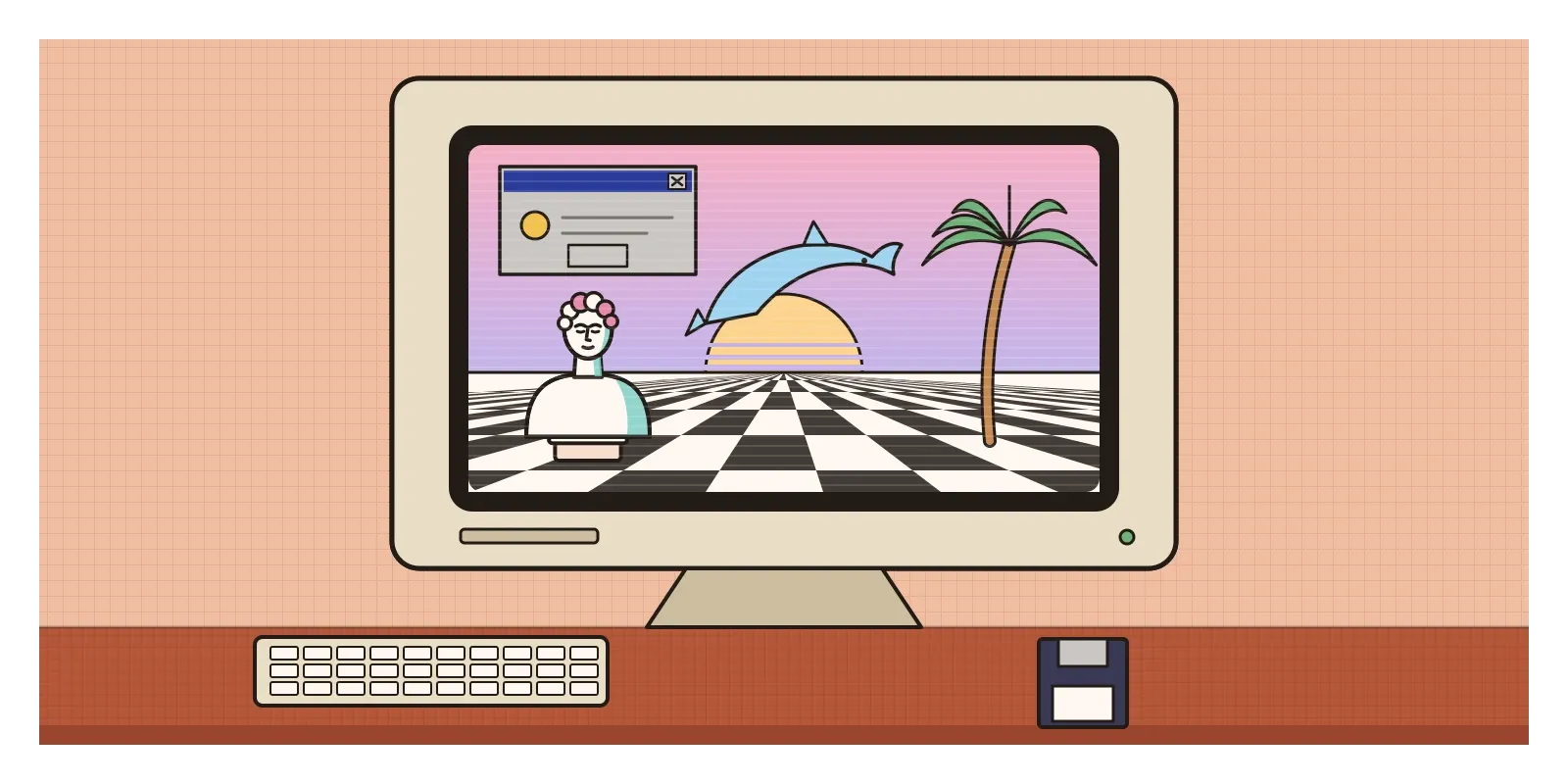
You can recognise vaporwave imagery in a second, and almost all of it is borrowed. Classical busts, usually Greek or Roman, lifted from stock photographs or cheap 3D models, stand for permanence and taste, and look absurd floating in pink space. Palm trees, dolphins, marble and fountains come from brochures, hotel lobbies and screensavers. Windows 95 supplies grey dialogue boxes and pixelated cursors, VHS tapes the wobbling tracking lines. Japanese characters appear everywhere, often in titles, along with a peculiar kind of spaced-out English in which each letter sits in a wide box. These are the full-width forms of the Latin alphabet, made so Latin letters line up with Chinese and Japanese characters, used here purely for the look.
Read with a designer's eye, the colours are the giveaway: pale pink, mint, lilac and cyan, close to the default colours of early screens and printers. Space is shallow and stagey, often an endless checkerboard floor running to a flat horizon, which is borrowed from early computer graphics demonstrations. Composition is collage rather than design. Things float and repeat without any grid, low resolution becomes a texture, and the typefaces are the defaults of office memos. Some of the shapes and squiggles come straight from the Memphis Group, which I wrote about in the post on Memphis, and the sunset over a glowing grid belongs more to vaporwave's cousin synthwave, a separate genre of 1980s-style synthesiser music.
What holds all this together is a mood rather than a rule. Vaporwave images look like the future as it was imagined by a marketing department around 1993, seen again after that future failed to arrive. The British writer Mark Fisher, borrowing a word from the philosopher Jacques Derrida, called this kind of haunting by lost futures hauntology, and although he wrote mostly about other music, his idea fits vaporwave closely. The pictures are cheerful on the surface and melancholy underneath, like an abandoned shopping centre with the music still playing.
Slowed, reverbed and sung in Hindi
Vaporwave itself was mostly made in North America and Europe, and its nostalgia was for a very American kind of consumer life: big malls, cable television, suburban computers. For many Indian listeners those images carry no childhood memory. India's malls mostly arrived after the economic reforms of 1991, so the "dead mall" is not a ruin of our youth but something still being built. If an Indian vaporwave existed, its materials would be different: the yellow STD booths, the cassettes of film songs, the hush before a Doordarshan programme. As I mentioned in the post on Indian design education, the story goes that even the Doordarshan logo came out of a student studio at NID.
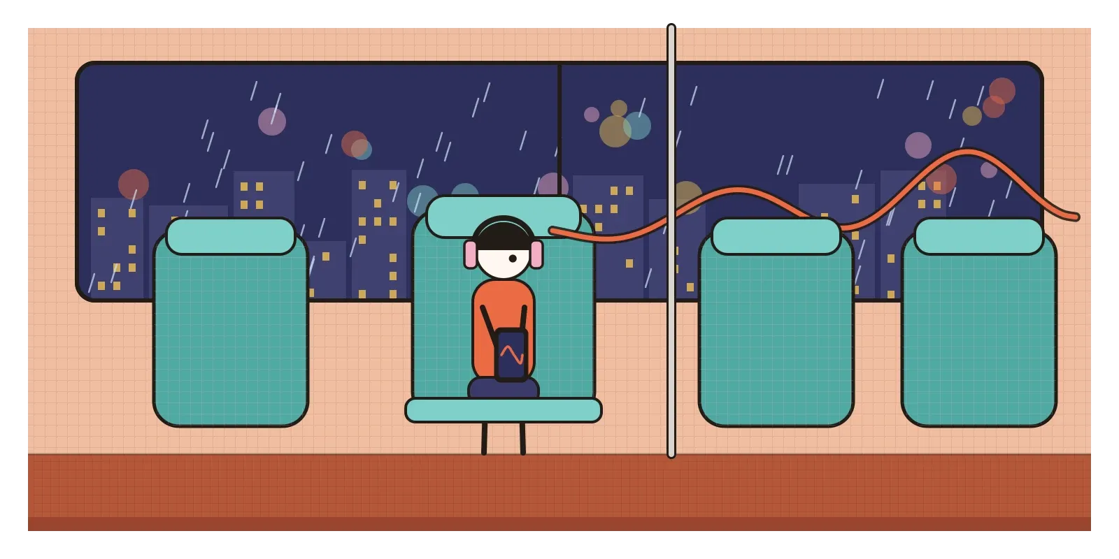
Where vaporwave's technique really did reach India is through one of its descendants. From the late 2010s, YouTube filled with versions of Hindi film songs labelled "slowed and reverb" or "lofi": romantic hits from the 2000s and 2010s played slower and lower, soaked in echo, often over a looping animation of a rainy window, a city at night or a train. Many are made by fans with free software, and some have millions of views. Their ancestry runs as much through the slowed-down Houston hip-hop of the 1990s, called chopped and screwed, as through the eccojams, so calling them vaporwave would be a stretch. But the gesture is the same: take a familiar, glossy song, slow it until it sounds like a memory, and listen to it alone at night. That a tiny American scene's technique ended up soundtracking commutes in Pune and exam revision in Patna says a lot about how styles now travel.
Nostalgia as a design material, and its limits
Designers took a lot from vaporwave, often without knowing it. It showed that nostalgia can be used as a material, like colour or type, and brands were quick to notice. In 2015 MTV International changed its on-screen look to something close to vaporwave and seapunk, and the drinks brand Arizona, whose pastel iced tea cans had become a vaporwave in-joke, later put that can design on trainers made with Adidas. Pastel gradients, chrome lettering, retro operating-system windows on portfolio websites and grainy, low-resolution textures in social media graphics all owe it something, and the revival of early-2000s styles that I describe in the post on the Y2K revival grew partly out of it. The study-music livestreams, with their looping animated scenes, are a gentler relative. Today, typing "vaporwave" into an AI image tool produces a pink bust and a palm tree in seconds: the style has become a preset.
The deeper lesson is about sampling. Vaporwave was made almost entirely from background material no one is meant to notice, hold music, stock photos, default fonts, and by slowing it down and moving it to the foreground, it made people see the commercial world they lived inside. Any designer can use that trick on a familiar product: slow it down, take it out of context, and look at what it was quietly assuming.
The trouble is that irony is hard to hold on to. Vaporwave mocked consumer culture by imitating it so closely that the imitation was easy to sell, and within a few years its look was selling trainers, television channels and fast fashion. The scene's predecessor, seapunk, a Tumblr style of aquatic colours and early web graphics, was taken up in late 2012 in music videos and performances by famous pop stars, and its creators complained that their underground had been strip-mined. Worse was to come. From around 2015, far-right groups online borrowed the same synthesiser music, statues and sunsets for propaganda, a style that became known as fashwave, using the classical bust's air of lost greatness for their own purposes. A style built from ironic quotation has no fixed meaning; whoever uses it next decides what it says.
There are other criticisms. Most of the samples were used without permission, which made the music legally fragile. The constant use of Japanese text, often by Western producers who couldn't read it, treated Japan as an exotic backdrop, a fantasy of the 1980s bubble economy rather than a real country. In design terms, vaporwave was a reply that never quite became a proposal: brilliant at showing what was hollow, less interested in what should replace it.
Listen to something slowly this week
You don't need a museum for vaporwave. Listen to Floral Shoppe and Far Side Virtual side by side, then put on a slowed-and-reverb version of a Hindi film song you know well and notice what changes when the tempo drops. Grafton Tanner's short book Babbling Corpse is a clear guide. For an exercise, take an everyday piece of commercial design, a hotel brochure, a bank's homepage, a phone's default wallpaper, and redesign it at half speed: enlarge one small detail, repeat it, strip away the words and see what feeling is left.
A pop song from 1984, slowed until it sounded like a memory, was enough to start a style. It didn't last long as a scene, but it taught a generation of designers that the background of a culture can become its subject. In the next and final post of this section, on Contemporary Indian Design, I come home, to the studios, workshops and craftspeople who have been answering the question of what modern Indian design should look like since the 1990s.
Further reading: Grafton Tanner, Babbling Corpse: Vaporwave and the Commodification of Ghosts (2016) · Adam Harper, "Comment: Vaporwave and the pop-art of the virtual plaza" (2012) · Simon Reynolds, Retromania: Pop Culture's Addiction to Its Own Past (2011) · Mark Fisher, Ghosts of My Life (2014)
A reply toThe glossy corporate muzak, adverts and computer graphics that sold the future in the 1980s and 1990s.