The New Typography
How a young Leipzig typographer told a whole trade to stop centring, drop the ornament and let pages work.
The New Typography
A trade journal that looked like a poster
In October 1925, the printers and compositors of Germany's book printers' union opened their journal, Typographische Mitteilungen, and found something none of them had asked for. It usually looked like what it was, a sober trade magazine. This special issue looked more like a poster. Its title, elementare typographie, was set entirely in small letters. Its pages were built from heavy black bars, blocks of plain sans-serif type pushed off-centre, wide stretches of empty paper and a second colour, red, used like a warning light. It reproduced work by Russian, Hungarian and Bauhaus designers that most German compositors had never seen, and it set out a short list of numbered principles for a new way of printing.
The issue was edited by a 23-year-old from Leipzig who, out of sympathy for the Russian avant-garde, was signing himself Iwan Tschichold. Plenty of readers were baffled, and some were angry. But the issue went straight into the print shops, into the hands of the people who actually set type, and within a few years the ideas in it had a name, die neue Typographie, the New Typography.
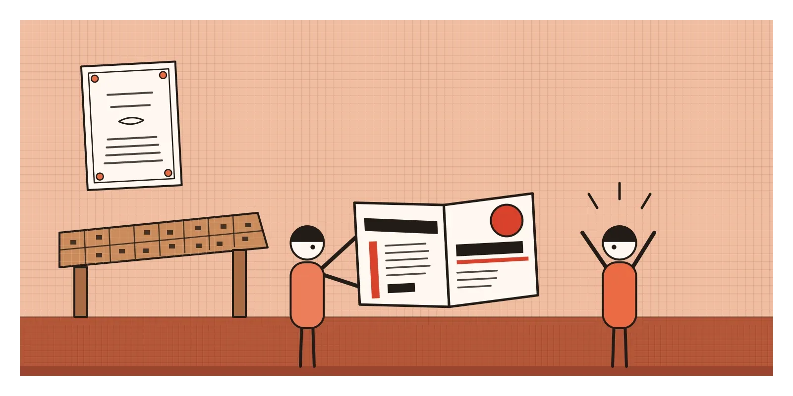
The New Typography was the movement, roughly from the mid-1920s to the mid-1930s, that tried to rebuild printed communication for the machine age. Its designers threw out centred layouts and decorative borders, preferred sans-serif type, arranged pages asymmetrically around what they had to say, and treated white space, photographs and thick printed rules as working parts of a design rather than decoration. Its centre was Germany, but it was a conversation between a few dozen designers from Moscow to Delft, most of whom knew each other's work through magazines and the post.
Centred, ornamented and out of date
To see what Tschichold was replying to, picture the job printing of the early 1920s: a wedding card, a shop's price list, a theatre programme. Almost everything was centred on the page, line under line, like the title page of a Renaissance book. Printers kept drawers of decorative borders and flourishes, and a shop might mix half a dozen typefaces on one handbill to show off its range. German text was still commonly set in Fraktur, the broken blackletter descended from the Gothic scripts I wrote about in the post on Gothic, with roman type reserved for foreign words and scholarly books. The finest printing of the day looked backwards too. Inspired partly by William Morris and the Arts and Crafts movement, German private presses were making beautiful hand-set books in the manner of the fifteenth century.
Meanwhile the world outside the print shop had changed. Weimar Germany was a world of cinemas, illustrated magazines, advertising and fast rotary presses. Tschichold had come out of the traditional world himself. He was the son of a Leipzig sign-writer, trained as a calligrapher and taught himself lettering partly from Edward Johnston's handbook. Then, in the late summer of 1923, he visited the great Bauhaus exhibition in Weimar, which has its own post in this series, and saw printed matter by László Moholy-Nagy and others that made everything he'd learned look like fancy dress.
A Russian, a Hungarian and a handbook
The first spark came from Russia. In 1923 El Lissitzky published a single page of short, numbered propositions called "Topography of Typography" in Kurt Schwitters's magazine Merz. In paraphrase, it said that printed words are taken in by the eye, not the ear, that the arrangement of type should do the work of a speaker's voice and gestures, and that a book should be designed as a sequence of spaces, more like a film than a wall of text. His book of Mayakovsky's poems, For the Voice, from the same year, belongs to the post on Constructivism, but its influence ran straight into Tschichold's journal.
At the Bauhaus, Moholy-Nagy coined the word typophoto in 1925 for a new combination of type and photograph, arguing that a photograph could say some things more exactly than words. That year the school moved to Dessau, and a young former student, Herbert Bayer, took charge of its printing and advertising workshop. Bayer drew a geometric "universal" alphabet with no capital letters at all, and the Bauhaus began printing its letters, leaflets and catalogues entirely in lowercase. A note at the foot of its letterhead explained the reasoning: we write everything small because it saves time, and why have two alphabets when one says the same thing? In German, where every noun takes a capital, that was a provocation.
Tschichold turned all of this into a handbook. Die neue Typographie, published in Berlin in 1928, was a small, practical book written for working printers, with chapters on letterheads, envelopes, business cards, posters, advertisements and books. It championed the new German standard paper sizes, a story that belongs to other posts, and showed how a letterhead or a form could be laid out logically around them. By then Tschichold was teaching in Munich, at the printing school run by Paul Renner, whose geometric sans-serif Futura was released by the Bauer type foundry in Frankfurt in 1927. Bauer advertised it, in so many words, as the typeface of the age.
Others reached the same place by their own routes. In Delft, Piet Zwart designed catalogues for the Netherlands Cable Works, slamming huge letters, photographs of cable and diagonal blocks of type together, and called himself a "typotekt", half typographer, half architect. In Hanover, Schwitters founded the ring neue werbegestalter, a circle of new advertising designers who exhibited their work together from 1928, with Tschichold, Zwart and several others as members. Their medium was ordinary printed matter: price lists, catalogues and cinema posters.
Bars, white space and one alphabet
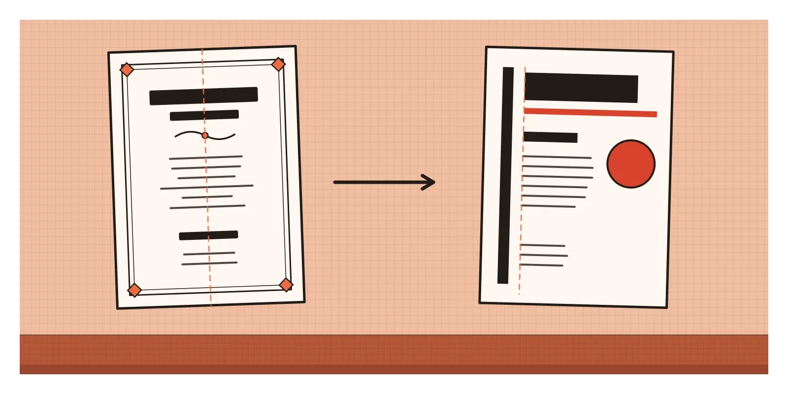
You can usually spot a piece of New Typography from across a room. Start with the axis. Instead of balancing every line on an invisible centre line, the designer lines things up along one or two vertical edges, often well off-centre, and lets the right-hand ends of lines fall where they will. (I wrote about Tschichold's case for asymmetry, and his later change of heart, in the post on balance.) The page is held together by tension between a few strong elements, a large block here, a small one there, rather than by mirror symmetry.
Then look at the type. It's usually a grotesque, the old printers' name for a sans-serif, or one of the new geometric faces like Futura, in a small number of sizes and weights that do the work ornament used to do. The most important thing is biggest or heaviest. Then there are the rules, thick black or red bars that underline, divide or point, sometimes running on a diagonal, an idea borrowed from the Russians. The palette is usually black and red on white or cream. Photographs replace drawn illustration, often cropped tightly and cut against type. Lowercase is common. And the empty paper isn't left over. It's designed, a field of space that pushes the elements apart and makes them easier to read.
Underneath the look sits a belief that's still the first lesson in most typography courses. The job of type is to communicate, and every choice, from the size of a heading to the position of a date, should follow from what the reader needs to find first. Tschichold thought this was the opposite of a style. In time, of course, it became one.
Scripts that never had capitals
The New Typography had no Indian branch that I know of, and its makers thought almost entirely about the Latin alphabet. But two Indian parallels help me see it more clearly. The first is loose. Bayer's argument for a single alphabet would have puzzled a reader of Devanagari, Bengali or Tamil, because Indian scripts never had capitals in the first place. Emphasis has always come from size, weight, colour or position, exactly what the New Typography asked of Latin type. And Devanagari and Bengali come with something Tschichold's generation added by hand: the shirorekha, the horizontal headline from which the letters of a word hang. Every line of Hindi or Bengali text is underlined from above by a built-in rule.
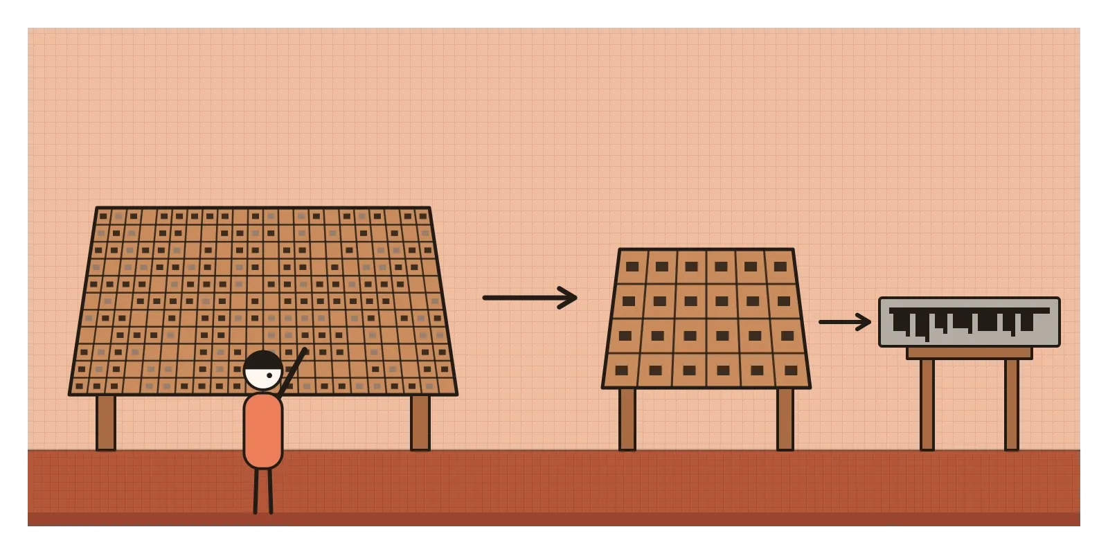
The second parallel is closer to the movement's real engine, which was the machine. Setting Indian scripts by hand had always been slow, because a Bengali type case needed hundreds of separate sorts for conjunct consonants and vowel signs, far more than a Latin one. When Linotype adapted its line-casting machines for Bengali in the 1930s, a project the historian Fiona Ross has traced in detail, with the linguist Suniti Kumar Chatterji among its advisers and the Calcutta newspaper Anandabazar Patrika as an early user, much of the work was reduction: breaking letters into fewer, recombinable parts so that a keyboard could handle them. It was an elementary typography of a different kind, forced by the machine rather than argued in a manifesto, and it raised the same quarrel the German compositors had, between efficiency and the familiar shapes of a tradition.
That quarrel is still alive. Indian type foundries such as the Indian Type Foundry, set up in Ahmedabad in 2009, and Mumbai's Ek Type design fonts that have to look right in Devanagari, Gujarati or Tamil beside a Latin sans-serif on the same phone screen.
Every landing page owes it something
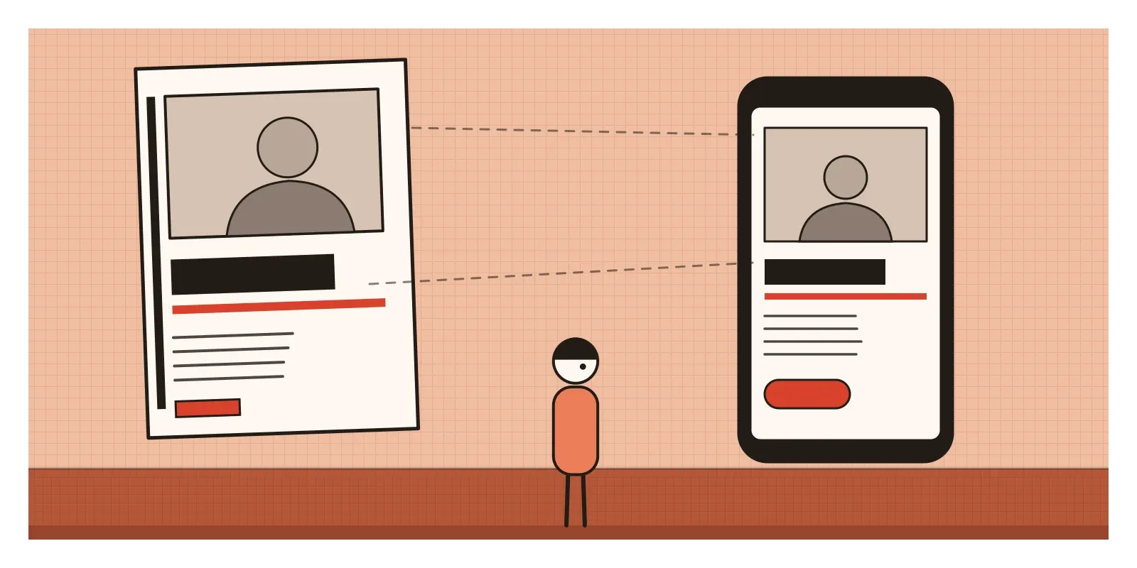
Open almost any app or website and you're looking at the New Typography's descendants. Headings are aligned to the left edge, not centred. Text is set in a sans-serif. Hierarchy comes from size and weight, with one large, heavy headline and smaller, lighter supporting text. A single strong accent colour does the job Tschichold gave to red. A hero image sits against a headline in exactly the combination Moholy-Nagy called typophoto.
Futura has had a particularly long life. It's on the plaque Apollo 11 left on the Moon in 1969. In 2009 IKEA replaced its customised Futura with Verdana, a typeface designed for screens, and the change caused a small storm among designers, which shows how attached people had become to a 1920s German sans-serif.
The deeper lesson is about decisions. The New Typography insisted that layout is an argument about priority: what should a reader see first, second and third? That's the question I find myself asking whenever an AI layout tool hands me a dozen polished variations. They've absorbed the movement's surface, the left-aligned sans-serif and the bold bar. Whether they put the right thing first is still a human judgement.
Rules that needed breaking
The New Typography's own politics caught up with it fast. To the Nazis, who took power in early 1933, modernist design was "cultural Bolshevism", and Tschichold's Russian sympathies made him an obvious target. In March 1933 he was arrested in Munich and held in so-called protective custody for several weeks, and his teaching post was taken away. Renner, who had criticised the regime, was dismissed from his school too. That summer the Tschicholds left for Basel, where he lived and worked for most of the rest of his life. Then came a twist. For years the regime promoted blackletter as the true German script, then in January 1941 it abruptly banned it, with an official circular claiming, falsely, that the old letters were Jewish in origin. The real reason seems to have been practical: roman type could be read across the occupied countries. Typefaces are never as neutral as they look.
The movement's other weakness was its certainty. Its makers, almost all men, wrote about the one correct way to lay out a page. In 1946, in Switzerland, Tschichold and the artist and designer Max Bill had a fierce public argument in print. Bill accused Tschichold of abandoning modernism. Tschichold, who had returned to centred, classical layouts for books, replied that the New Typography's absolutism reminded him of the authoritarian thinking he had escaped. Then, from 1947 to 1949, he went to London and redesigned Penguin's paperbacks, around five hundred titles, with a strict set of house rules and a quietly traditional look. Bill and the Swiss designers after him took the asymmetric side of the argument and built it into grids, a reply that belongs to the post on the Swiss Style.
To see the New Typography for yourself this week, look at the online collections of the Museum für Gestaltung in Zurich or the Museum of Modern Art in New York, both of which hold Tschichold's posters. Read Ruari McLean's English translation of The New Typography, which is still surprisingly practical. Then try a small exercise. Take a centred invitation or event poster, the kind with everything stacked on a centre line, and reset it with one strong left edge, one heavy rule, one red element, two type sizes and no ornament. Then decide honestly which reads better. Sometimes it's the centred one, which is the point Tschichold himself came round to.
I keep thinking of those compositors in 1925, opening their union journal and finding a page that looked like a poster for a world they hadn't quite joined yet. In the next post, on the International Style, the same ideas, flat surfaces, no ornament and a free, asymmetric plan, leave the page and become buildings.
Further reading: Jan Tschichold, The New Typography, translated by Ruari McLean (1995) · Christopher Burke, Active Literature: Jan Tschichold and New Typography (2007) · Robin Kinross, Modern Typography: An Essay in Critical History (1992) · Christopher Burke, Paul Renner: The Art of Typography (1998) · Fiona Ross, The Printed Bengali Character and Its Evolution (1999)
A reply toCentred, ornamented printing that dressed every handbill like a Renaissance title page.