The International Style
How a 1932 museum show turned Europe's new white, flat-roofed buildings into a style the whole world could copy.
The International Style
Houses on plinths in a Fifth Avenue office block
In February 1932, the Museum of Modern Art in New York, then not quite three years old and renting rooms in an office building on Fifth Avenue, opened an exhibition called Modern Architecture: International Exhibition. Visitors walked between plinths carrying scale models of buildings most Americans had never heard of: a white villa raised on thin columns outside Paris, a house in Czechoslovakia with glass walls, a school for designers in Dessau. Around them hung large photographs of flat roofs, long horizontal windows and smooth plastered walls, including rows of workers' housing in Rotterdam. There were a few American projects too, including a skyscraper going up in Philadelphia and, slightly awkwardly, a design by Frank Lloyd Wright, who didn't much like being grouped with the Europeans.
The show was put together by two young men. Henry-Russell Hitchcock was a 28-year-old architectural historian. Philip Johnson was 25, wealthy and not yet an architect. With a preface by the museum's director, Alfred Barr, they also published a book, The International Style: Architecture Since 1922, which reduced the new architecture to three principles: think of a building as volume, not mass; organise it by regularity rather than by symmetry around a central axis; and avoid applied decoration. The exhibition then toured the United States for several years.

The International Style is the name that stuck, thanks to that show, for the modernist architecture that emerged in Europe in the 1920s and spread across the world after the Second World War: white or glass boxes, flat roofs, open plans, thin structural frames and no ornament at all. It's easy to forget that the label was a curator's invention. The architects themselves mostly called their work "new building", and many of them thought of it as a social programme rather than a look.
Steel frames dressed in borrowed stone
What did it reply to? Above all, to the idea that a modern building should wear the costume of an older one. In the post on Art Nouveau, I described how nineteenth-century architects worked by revival. By the 1920s revival styles were still everywhere, taught in the tradition of the École des Beaux-Arts in Paris, where students learned grand symmetrical plans and classical facades. New York's skyscrapers had steel skeletons, but most were dressed in Gothic spires, Renaissance cornices or, by the late 1920s, the zigzags of Art Deco. The structure did the work and the stone did the talking.
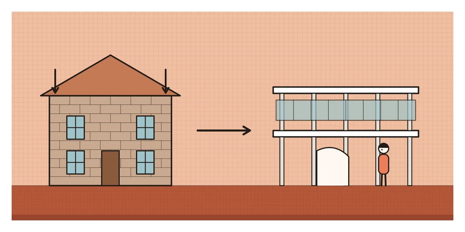
The new architects wanted the structure to speak for itself. Reinforced concrete and steel frames meant that walls no longer had to hold a building up, so they could be thin, made of glass or left out altogether. Factories, grain silos and ocean liners, which nobody had thought of as architecture, looked to them more honest than any bank. And there was a pressing social reason. After the First World War, Germany and the Netherlands faced desperate housing shortages, and city governments in Frankfurt, Berlin and Rotterdam commissioned large estates of plain, standardised, sunlit flats. The movement grew out of the Deutscher Werkbund, the Bauhaus and De Stijl, which have their own posts, and it shared the New Typography's belief, which I wrote about in the last post, that form should follow purpose.
A villa on stilts and a wall of onyx
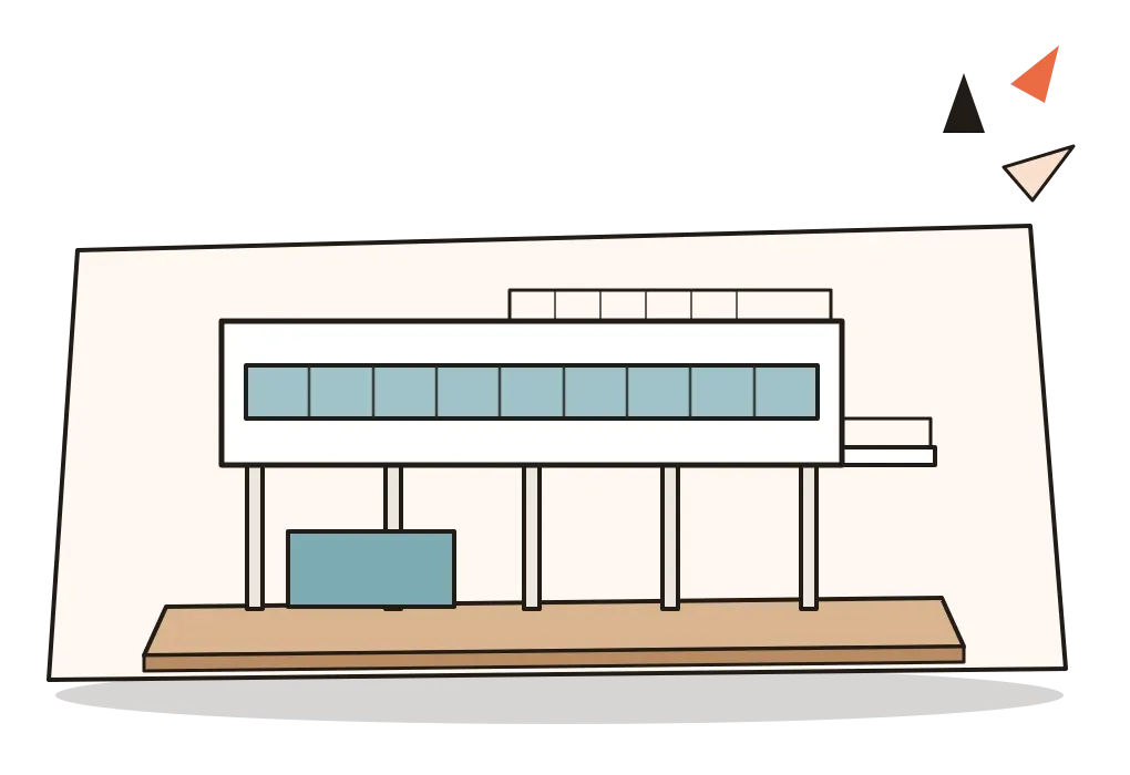
The building most people picture is the Villa Savoye at Poissy, west of Paris, designed by Le Corbusier with his cousin Pierre Jeanneret and built from 1928 to 1931 as a weekend house for Pierre and Eugénie Savoye. It's a white box lifted off a lawn on thin round columns, with a long strip window running all the way round. A car could drive underneath and turn in the curved ground floor, which was shaped around a motor car's turning circle. A ramp rises through the middle to a roof garden. It's almost a diagram of the "five points" Le Corbusier had published a few years earlier: columns instead of load-bearing walls, a free plan, a free facade, horizontal windows and a roof garden.
Ludwig Mies van der Rohe worked differently, with luxurious materials and very few of them. His German Pavilion for the Barcelona International Exposition of 1929 was a low, flat roof floating on slim chrome-clad steel columns, with freestanding walls of travertine, green marble and golden onyx sliding past each other so that inside and outside flowed together. It stood for less than a year before it was dismantled, and the version visitors see today is a reconstruction finished in 1986. Lilly Reich, Mies's partner in work and life for more than a decade, co-designed its interiors and, many historians now argue, much of the famous furniture, though for years the credit went to Mies alone. In Brno, the Tugendhat House of 1928 to 1930 had a living room with an onyx wall and huge windows that slid down into the floor at the touch of a mechanism.
In Rotterdam, J. J. P. Oud designed rows of low white workers' houses at the Kiefhoek estate, built from 1925 to 1930, which showed the style's social side. In Philadelphia, George Howe and William Lescaze's PSFS Building, a bank tower finished in 1932, became one of the first International Style skyscrapers in America. After the war, the style became the look of corporate power. Lever House in New York, finished in 1952 by the firm Skidmore, Owings and Merrill, was a slab of green glass above a raised courtyard, and Natalie de Blois, one of the firm's senior designers, did much of the work on it, though she was rarely credited at the time. A few blocks away, the bronze-and-glass Seagram Building of 1958 happened because Phyllis Lambert, the client's daughter, objected to her father's first design and persuaded him to hire Mies.
Volume, regularity and nothing added
Hitchcock and Johnson's three principles are still a good way to read these buildings. Volume, not mass, means the building looks like a light box of space wrapped in a thin skin, not a heavy pile of stone. The walls are smooth and flush, the windows set flat into the surface, and the corners sharp, so the whole thing reads like folded paper. Regularity, not symmetry, means the building is organised by the repeated rhythm of its structure, a grid of columns at equal spacing, rather than by a grand central entrance with matching wings. And no applied decoration means exactly that: the interest comes from proportion, material and the play of light and shadow, not from carving.
To that, add a short list of features. Flat roofs, often used as terraces. Ribbon windows or whole walls of glass. A free plan, where partitions can go anywhere because the columns do the holding up. Buildings raised on thin columns, called pilotis, so the ground can flow underneath. Cantilevers, where floors or balconies project beyond their supports. And a palette of white render, glass, steel and concrete, sometimes warmed by a single rich material like marble or wood. In the post on proportion systems, I wrote about Le Corbusier's Modulor and Chandigarh, which grew out of the same thinking.
An exile in Mysore who learned about the sun
The International Style reached India in a way the 1932 exhibition never imagined, through people. One of the most interesting was Otto Koenigsberger, a young German architect trained in Berlin in the modernist years, who left Germany after the Nazis came to power because he was of Jewish descent. In 1939 he came to India to work for the princely state of Mysore, where he served as chief architect and planner for nearly a decade, designing public buildings in Bangalore and elsewhere in the state. After Independence he worked for the central government on new towns for refugees from Partition, including Gandhidham in Kutch, and drew up the first plan for Odisha's new capital, Bhubaneswar, in 1948.
What India taught him was that the white box of the 1920s, designed for grey northern European skies, needed serious adjustment under a tropical sun. Large areas of unshaded glass turned rooms into ovens. Flat roofs soaked up heat and leaked in the monsoon. Good buildings here needed deep overhangs, sunshades, verandahs, cross-ventilation and walls that let air through, many of the things older Indian buildings had always done. Koenigsberger later led the Department of Tropical Architecture at the Architectural Association in London, which trained architects from across Asia and Africa, and his Manual of Tropical Housing and Building, written with colleagues and published in 1974, is still used in Indian architecture schools.

Other Indian architects met the style at its source. Achyut Kanvinde studied under Walter Gropius at Harvard in the 1940s and came home to design the clean concrete laboratories of the Ahmedabad Textile Industry's Research Association in the early 1950s. The great Indian replies, Chandigarh's sun-breakers and the regional modernism of Balkrishna Doshi and Charles Correa, belong to the post on Indian modern architecture. Another early experiment, a dormitory in Pondicherry, has its own story in the post on organic design.
The glass box on every skyline
Look at almost any city centre and you're looking at the International Style's children. The glass office tower, a regular grid of columns behind a smooth curtain wall of glass, is its most common descendant, from Manhattan to Bengaluru's tech parks and Gurugram's Cyber City. So is the open-plan office, a direct heir of the free plan. So are minimalist houses with flat roofs, white walls and floor-to-ceiling windows, and the white, gallery-like interiors of so many shops and cafés.
Digital design borrowed the attitude, if not the materials. The idea that a screen should be calm, regular and free of decoration, that its interest should come from proportion, spacing and a few good materials, in this case type and colour, is the International Style's credo translated into pixels. A layout grid is a column grid by another name. When I review an interface, the three principles still make a useful checklist: does it feel light and open, is it organised by a clear, repeated rhythm, and is anything stuck on that doesn't need to be there?

Rain in the hall
The style's critics have had plenty to say, and some of the earliest complaints came from its clients. In the autumn of 1936, Madame Savoye wrote to Le Corbusier that it was raining in the hall and on the ramp and that the garage wall was soaked, and the leaks went on for years. The 1932 exhibition itself had included a section on housing organised by the critic Lewis Mumford, but the book that made the style famous was about appearance, not about who the buildings were for. By naming a style, Hitchcock and Johnson turned a social programme into a look that could be applied to anything, including corporate headquarters and luxury houses. Johnson's own politics cast a long shadow too. Within a few years of the show he had left the museum for far-right causes and wrote admiringly of Nazi Germany, views he later disowned and apologised for.
The modernists had enemies on the right as well. In the 1930s, opponents of the Weissenhof housing estate built in Stuttgart in 1927 circulated a mocking postcard showing it as an "Arab village", complete with camels, which tells you as much about their racism as about the buildings. And the very word "international" hid a problem. A style designed for one climate and one kind of society was exported everywhere, often with little thought for heat, rain, local materials or how people actually lived. Air conditioning was the usual fix, and glass towers in hot cities still pay for it in energy every day, which is one reason India introduced an Energy Conservation Building Code in 2007.
One of the sharpest replies came, fittingly, from the same museum. In 1964 MoMA opened Architecture Without Architects, by the Austrian-American architect Bernard Rudofsky, a show of photographs of buildings made by ordinary people with no professional designers at all: cave towns, wind-catchers, granaries and hill villages that had solved the problems of climate and community for centuries. Brutalism, regional modernism and, later, postmodernism would all answer the glass box in their own ways.
To see the International Style for yourself this week, find the nearest glass office building and the nearest building from before the 1950s with verandahs or deep eaves, and visit both at three in the afternoon. Notice where the sun falls, where people stand and which one feels cooler. If you can, read Hitchcock and Johnson's short book alongside Rudofsky's. Then look again at those models on their plinths in 1932. They promised a single modern architecture for the whole world. What they actually showed was how much a building depends on where it stands. In the next post, I'll step back almost twenty years, to Vorticism and Orphism, two short-lived offshoots of Cubism.
Further reading: Henry-Russell Hitchcock and Philip Johnson, The International Style (1932) · Bernard Rudofsky, Architecture Without Architects (1964) · Kenneth Frampton, Modern Architecture: A Critical History (1980) · Otto Koenigsberger and others, Manual of Tropical Housing and Building (1974) · Terence Riley, The International Style: Exhibition 15 and the Museum of Modern Art (1992)
A reply toSteel-framed buildings dressed up in Beaux-Arts and revival facades of borrowed stone.