The Swiss Style
How Swiss designers of the 1950s built pages on grids, chose plain sans-serifs and tried to make design neutral.
The Swiss Style
A typeface drawn to beat a rival
In 1956, Eduard Hoffmann had a problem. He ran the Haas type foundry in Münchenstein, just outside Basel, which cast metal type for Swiss printers, and his customers were buying someone else's letters. The young Swiss designers everyone was talking about wanted Akzidenz-Grotesk, a plain sans-serif made by the Berthold foundry in Berlin since 1898. So Hoffmann asked Max Miedinger, a typographer who had worked as a salesman for Haas, to draw a new grotesque, the old trade name for a sans-serif, that would be cleaner and more even than the German one.
For about a year the two of them worked through drawings and test castings. Hoffmann pasted proofs into notebooks, comparing each trial letter with Akzidenz-Grotesk, adjusting curves, tightening the spacing and making the small letters taller so that text looked dense and calm. The result, Neue Haas Grotesk, was shown in 1957. In 1960 Haas's German parent company, Stempel, wanted a name that would sell abroad and chose Helvetica, from Helvetia, the Latin name for Switzerland. Hoffmann and Miedinger reportedly weren't keen on naming a typeface after a country. Within a decade it was everywhere.
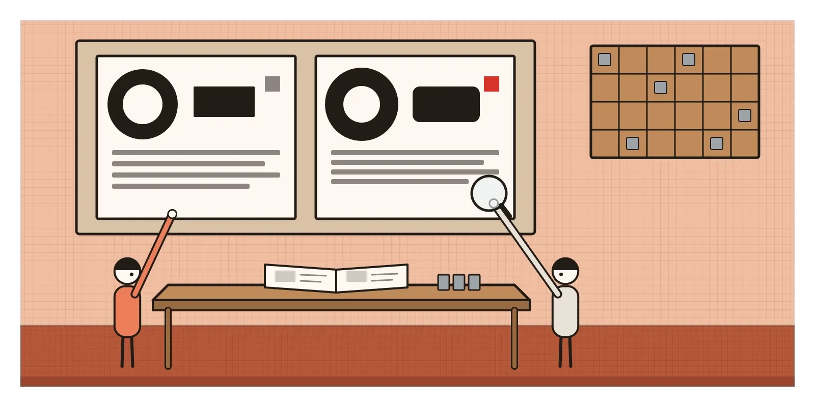
That story, a typeface designed to be more neutral than its competitor, is a good way into the Swiss Style, which Americans later called the International Typographic Style. From the early 1950s until the late 1960s, designers in Zurich and Basel built posters, books and corporate graphics on mathematical grids, set text in plain sans-serifs aligned to the left, replaced illustration with photography and tried to make communication as clear and objective as possible. Few design movements have travelled so far.
A neutral country with three languages on every label
Switzerland had stayed out of the Second World War, and in 1945 its factories, banks and printing works were intact while much of Europe was rubble. Its chemical and pharmaceutical companies, especially in Basel, were growing fast and needed advertising, packaging and instructions that could cross borders. The country also had three main official languages, German, French and Italian, plus Romansh. A poster, a timetable or a medicine box often had to say the same thing two or three times, side by side. That's a good reason to want type that stays out of the way.
The roots go back to the 1920s. Ernst Keller, who taught at the Zurich school of applied arts from 1918, trained a generation to think of design as problem-solving. Max Bill had studied at the Bauhaus and brought back its geometry. Jan Tschichold, whose story I told in the post on the New Typography, had lived in Basel since fleeing the Nazis in 1933. As that post describes, Tschichold later turned against his own rules and went back to centred, classical layouts, and Bill publicly attacked him for it. The Swiss designers took Bill's side and kept the asymmetry.
What they replied to was also local. Switzerland had a celebrated poster tradition of its own, bright, witty pictures of a single object, a shoe or a cigar, painted large with a short slogan, by artists such as Herbert Leupin. The new designers thought this was charming but persuasive in the wrong way. Fresh from a war fought with propaganda, they wanted information rather than seduction. Historians disagree about exact dates. Some begin the style with Bill's work of the 1930s; most date its height to the 1950s and 1960s.
Concert posters, theatre posters and a book of grids
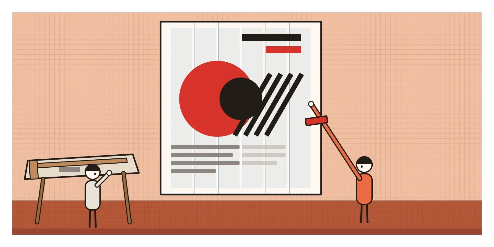
In Zurich, the leading figure was Josef Müller-Brockmann. From the early 1950s he designed posters for the Tonhalle, the city's concert hall, in which arcs, circles and bars of colour are arranged with a mathematical rhythm meant to feel like music, and the concert details sit in a tight block of small sans-serif type. His public safety posters used stark black-and-white photographs instead of drawings. In 1958 he and three colleagues, Richard Paul Lohse, Hans Neuburg and Carlo Vivarelli, launched the magazine Neue Grafik, printed in German, English and French on a strict grid, which spread the style abroad. His book Grid Systems in Graphic Design (1981) is still the clearest manual of the method.
In Basel, two teachers at the city's school of design shaped thousands of students. Armin Hofmann made theatre posters for the Basel Stadttheater out of stark contrasts of black and white, a few letters and a single bold shape, and set out his teaching in the Graphic Design Manual (1965), full of exercises with dots, lines and simple forms. Emil Ruder taught typography as a matter of texture and rhythm. In Typographie (1967) he treated the white space inside and around letters as carefully as the black.
The other famous typeface of 1957 came from a Swiss designer working in Paris. Adrian Frutiger's Univers, made for the foundry Deberny & Peignot, was planned from the start as a family of twenty-one weights and widths. Instead of names like Bold Condensed, Frutiger gave them two-digit numbers, so that 55 was the regular and the digits told you how heavy and how wide each one was. Ruder loved it.
Women worked in the style too, though the histories took a long time to notice. Lora Lamm, trained in Zurich, went to Milan in the 1950s and made playful, colourful posters for the department store La Rinascente and the tyre company Pirelli. Rosmarie Tissi, a partner in the Zurich studio Odermatt & Tissi from 1968, pushed the style towards freer, more surprising shapes.
Flush left, ragged right, nothing extra
The surest test is to draw lines along the edges of every block on the page. On a Swiss design, they line up. Everything sits on an invisible grid of columns and rows, and the grid decides where text, pictures and white space go. Layouts are asymmetric: the main weight is often off to one side, balanced by empty space rather than mirrored.
Text is set in a sans-serif such as Akzidenz-Grotesk, Helvetica or Univers, aligned to the left with a ragged right edge, because that keeps the spacing between words even. There's no ornament and usually no drawing. When a picture is needed, it's a photograph, often black and white, cropped hard. Hierarchy comes from size, weight and position rather than decoration, so a page may use only one typeface in two or three sizes. Colour is limited, often black, white and a single red, the red of the Swiss flag. White space isn't leftover; it's part of the structure. And sometimes the type becomes the image, a huge word or number filling the poster as a shape.
Three scripts on one station board
The Swiss Style reached India through teaching. In the mid-1960s, Armin Hofmann and his wife Dorothea, also a designer, spent time teaching at the new National Institute of Design in Ahmedabad, whose story has its own post shortly. One of their students was Mahendra Patel. He went on to study in Basel in 1968, then worked with Adrian Frutiger in Paris around 1970 and 1971, where he collaborated with Frutiger on typefaces for Devanagari and Tamil. Back at NID he taught typography for decades and designed logos, signs and letterforms for Indian scripts. In 2010 he received the Gutenberg Prize from the International Gutenberg Society and the city of Mainz, the first Indian designer to do so.
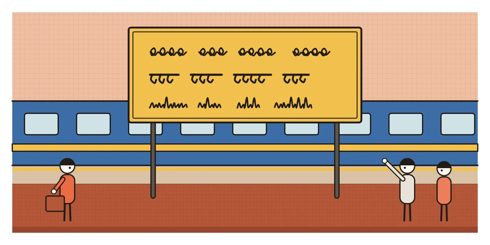
Patel's work points to the place where the Swiss idea meets India and strains. Look at a railway station sign in most Indian states and you'll find the name in three scripts, the regional language, Hindi and English, stacked one above the other. Switzerland's multilingual design is the closest European cousin to this, but there's a big difference. German, French and Italian all use the Latin alphabet, so one neutral typeface serves them all. Devanagari hangs from a headline, Tamil letters are wide and rounded, and Bengali, Gujarati and Telugu each have their own rhythms. Put a crisp Helvetica above a clumsy, mismatched Devanagari and the sign isn't neutral at all; it quietly tells you which language was designed and which was an afterthought.
Getting it right means designing type families together across scripts, matched in weight, height and colour on the page, the work of Indian type foundries that I mentioned in the post on the New Typography. In that sense India took the Swiss ideal of a calm, consistent page more seriously than the Swiss had to.
The grid under every screen
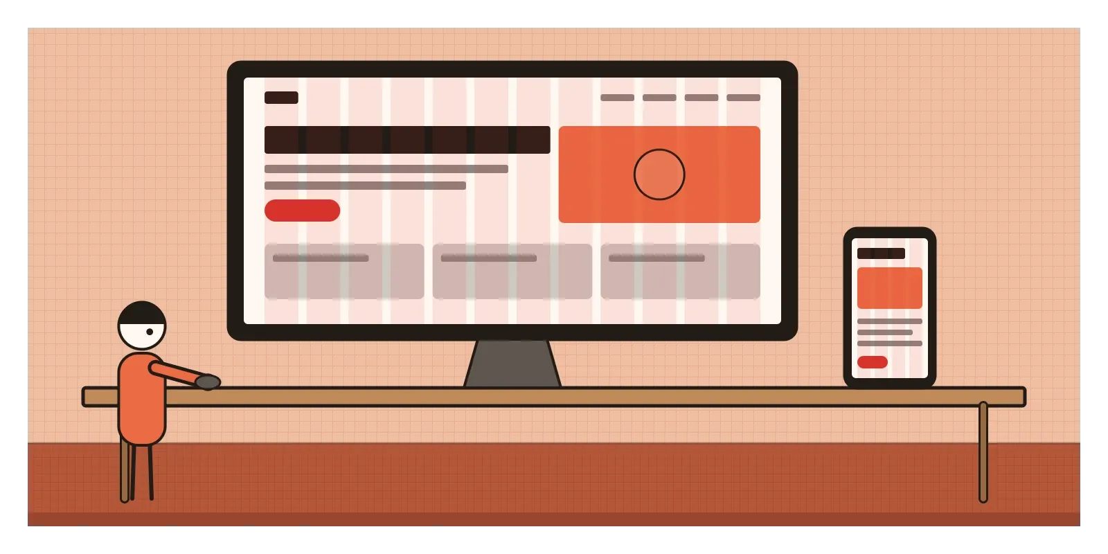
If you design screens, you work in the Swiss Style every day. The twelve-column layout grid in Figma, the column systems built into CSS frameworks and the spacing scales in design systems are direct descendants of Müller-Brockmann's grids. So is the habit of aligning everything to a few shared edges, setting text flush left and building hierarchy with weight and size rather than boxes and borders.
Helvetica's own career is extraordinary. In the 1960s and 1970s it became the face of corporate logos, airlines and public signs, and New York's subway signs eventually moved to it. Apple used it as the iPhone's system font until 2015, when it was replaced by Apple's own San Francisco. In 2007, for the typeface's fiftieth birthday, Gary Hustwit's documentary Helvetica made a sans-serif into a film star. Around 2010 the type designer Christian Schwartz released a digital revival of the original Neue Haas Grotesk, for designers who felt that decades of adjustments for machines had worn Helvetica smooth.
The style also lives in AI layout tools. Ask one for a clean, professional poster and you'll usually get a sans-serif, flush left, on a grid, with a single accent colour. That isn't an accident. The Swiss designers turned good layout into rules simple enough to teach, and rules are what machines learn most easily. What the rules can't tell you is which piece of information matters most to this reader, which was always the designer's job.
The myth of the neutral page
The Swiss Style's biggest claim was that design could be objective, and that's also its weakest point. A grid, a sans-serif and a black-and-white photograph are choices, and they carry a mood: modern, efficient, Western, corporate. By the 1970s the same look sold banks, oil companies and governments, and critics argued it had become the uniform of power, cold and interchangeable. A typeface designed to say nothing in particular ended up saying "large organisation".
The neutrality was also narrower than it looked. It assumed the Latin alphabet and a European reader. And the movement's histories were written around a handful of men. In the country that produced it, women couldn't vote in national elections until 1971, and designers like Lamm and Tissi waited far longer than their colleagues for recognition.
The reply came from inside the Basel school. Wolfgang Weingart, who began teaching there in 1968, started breaking the grid apart, layering, tilting and spacing type in ways his teachers found shocking. That story, Swiss Punk and New Wave typography, has its own post later, as does Postmodernism, which made the neutral page a target.
To see the style for yourself, browse the online poster collection of the Museum für Gestaltung in Zurich, which holds many of these posters. Then look at your nearest railway station sign and ask which of its scripts was designed with the most care. For a small exercise, take a busy event poster and rebuild it on a six-column grid, with one typeface in two weights, everything flush left, one black-and-white photo and one red square. Then compare the two and notice what you had to throw away. I keep thinking of Hoffmann pasting proofs into his notebooks, letter against letter, chasing a neutrality that no typeface ever quite reaches. In the next post, on the Ulm School of Design, I'll follow these ideas to a German school that tried to turn rational design into a whole education.
Further reading: Richard Hollis, Swiss Graphic Design: The Origins and Growth of an International Style, 1920-1965 (2006) · Josef Müller-Brockmann, Grid Systems in Graphic Design (1981) · Emil Ruder, Typographie (1967) · Armin Hofmann, Graphic Design Manual: Principles and Practice (1965) · Lars Müller (ed.), Helvetica: Homage to a Typeface (2002)
A reply toThe illustrated, persuasive Swiss poster, and Tschichold's retreat to centred classical layouts.