Swiss Punk and New Wave Typography
How a German typesetter teaching in Basel shook the tidy Swiss grid loose, and why American students cheered.
Swiss Punk and New Wave Typography
A lecture with a question for a title
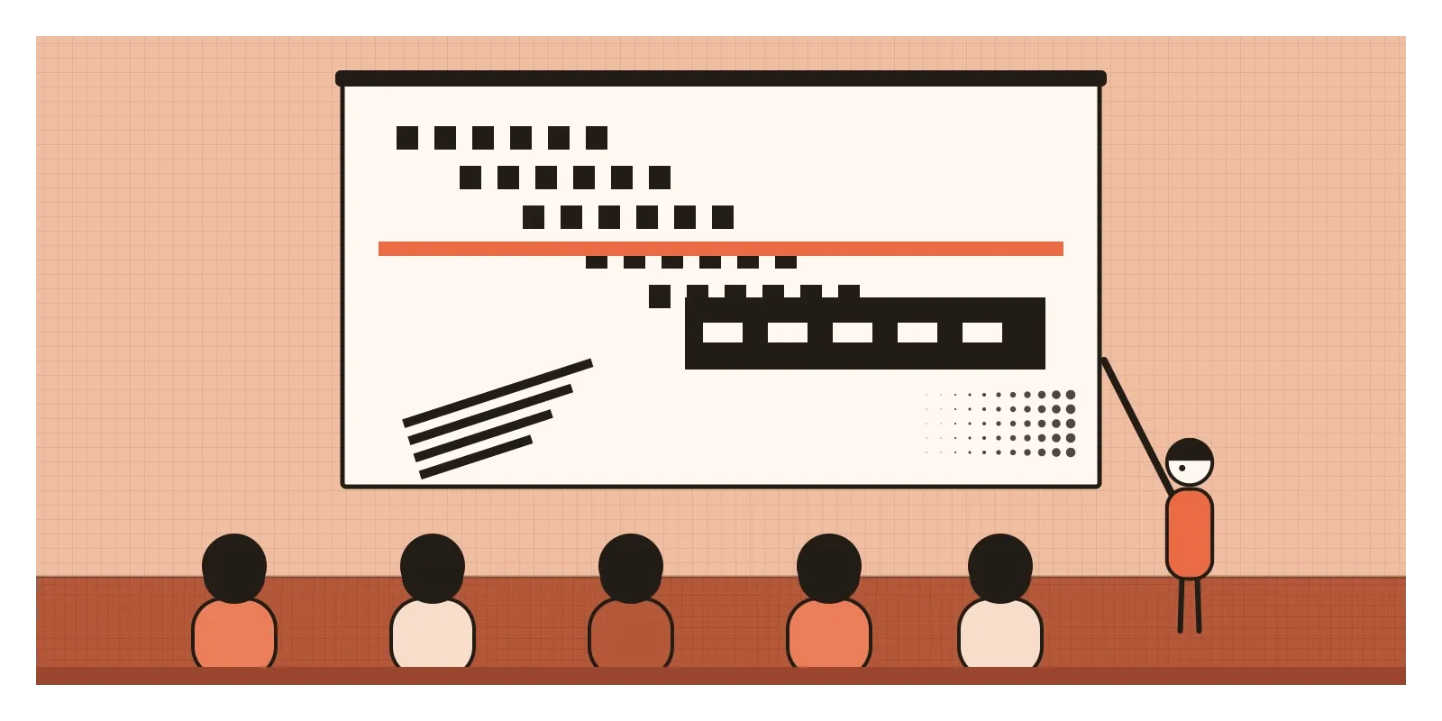
In the autumn of 1972, a 31-year-old German typographer arrived at the Yale School of Art in New Haven to give a lecture and run a workshop. Wolfgang Weingart had been invited by Dan Friedman, a young American on Yale's faculty who had been his student in Basel a few years before. Weingart was on a tour of design schools in Europe and the United States, and he carried a typewritten text that summed up four years of teaching. Its title was a question: "How Can One Make Swiss Typography?"
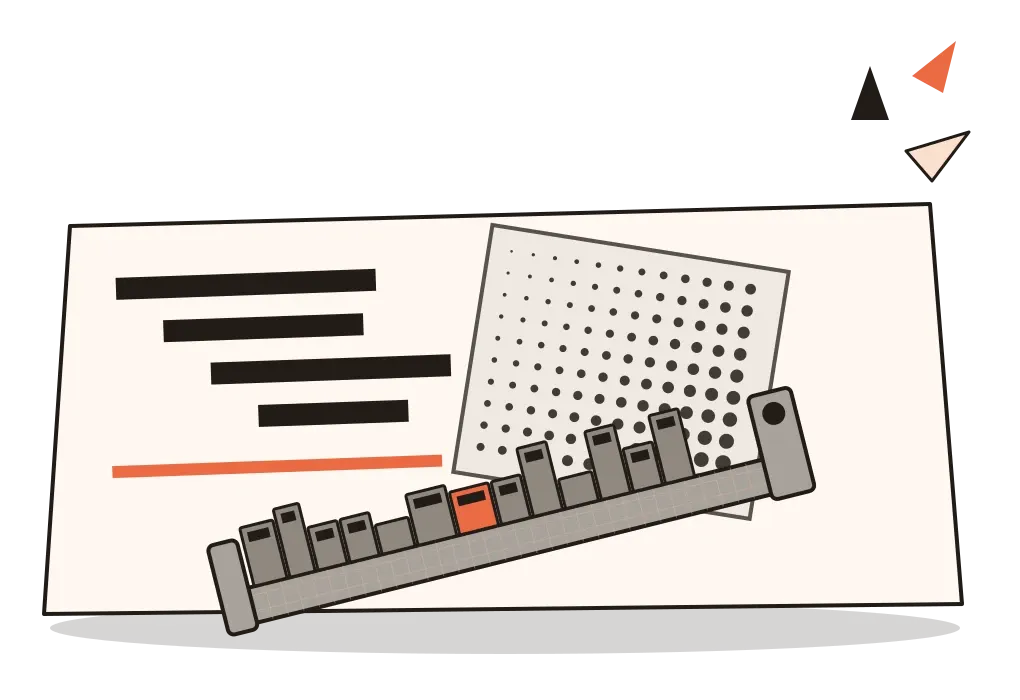
It was a strange thing to ask. His audience had been taught Swiss typography as something close to a law of nature: a strict grid, flush-left sans-serif type, generous white space and nothing extra. Weingart taught at the school in Basel where much of that law had been written. Yet the slides he showed looked as if someone had picked the Swiss style up and given it a hard shake. Words stepped down the page like staircases. Letters were spaced so far apart they barely held together. Thick black rules sliced through lines of type, and blocks of text sat at odd angles, as if a compositor had set them in a fit of mischief.
Weingart didn't see himself as an enemy of Swiss typography. He wanted to push it further than his own teachers had, and by most accounts the tour did exactly what he hoped. Friedman and others who heard him helped spread the approach through American schools, where it soon had a name, New Wave typography. Others, borrowing a word from the music of the same years, called it Swiss Punk. Both names describe one loose movement of the 1970s and early 1980s, which kept the Swiss Style's grid and sans-serif type but treated them as raw material to bend, layer and break, and which carried that attitude from Basel to Los Angeles and, in the end, onto the screen of the first Macintosh.
A grid that had become a uniform
To see what Weingart was replying to, think about where the Swiss Style had got to by the late 1960s. As I wrote in the post on the Swiss Style, it began as a principled, almost moral way of designing, with the grid as a tool for clarity and sans-serif type as a refusal of decoration. By the time Weingart arrived in Basel, it had also become the house style of international business. Airlines, banks and chemical companies all wanted the same clean, objective look. What had been radical in the 1950s was becoming a uniform.
Weingart came to it from the workshop floor. He was born in 1941 in the Salem valley in southern Germany, trained as a hand compositor, setting lead type letter by letter, and finished his apprenticeship in 1963. He moved to Basel to study at the Kunstgewerbeschule, where Emil Ruder and Armin Hofmann taught, and in 1968, at Hofmann's invitation, he began teaching typography there himself. That was the year students filled the streets of Paris and Berlin. Weingart was not a political designer, but he shared the restlessness.
Technology was changing under his feet too. Letterpress, printing from raised metal type, was giving way to phototypesetting and offset lithography, which printed from film. Weingart used the school's letterpress workshop as a laboratory, asking what lead could still do that the new machines couldn't, and later what film could do that lead never could.
A typesetter, a Californian and a teacher at Yale
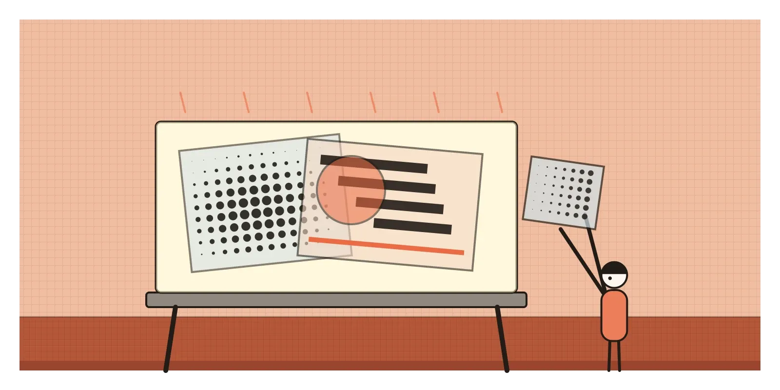
Wolfgang Weingart worked in two stages. In the late 1960s and early 1970s he pushed metal type to its limits, setting lines on steps, opening up the spaces between letters until a word became a row of separate shapes, mixing light and bold letters inside one word, and printing heavy rules and blocks of solid colour over and under the text. Some of these experiments were published in Typographische Monatsblätter, the Swiss printing trade journal, in 1970, and he sat on its editorial board for the next eighteen years. Later in the 1970s he turned to film. For a series of posters for the Kunstkredit Basel, a city fund for the arts, he layered sheets of film positives on a light table, enlarged the dots of halftone photographs until they became a visible texture, and sandwiched photographs, type and patterns into dense collages. Lead type had to sit on a flat bed. Film could float.
April Greiman, born in New York in 1948, studied in Basel around 1970 and 1971 with Hofmann and Weingart and took the lesson west. After moving to Los Angeles in 1976, she worked with the photographer Jayme Odgers on posters and magazine pages in which type, photographs and coloured shapes seemed to drift in deep space, as though the page were a stage rather than a flat sheet. In the early 1980s she ran the visual communication programme at the California Institute of the Arts. Then, in 1986, the Walker Art Center in Minneapolis asked her to design an issue of its journal Design Quarterly. Greiman, working on an early Macintosh, turned issue 133 into a single fold-out poster that opens to roughly the height of a person, titled Does It Make Sense?, built around a life-size digitised image of her own body, layered with pixelated pictures and a timeline. It's often called one of the first fully digital pieces of print design.
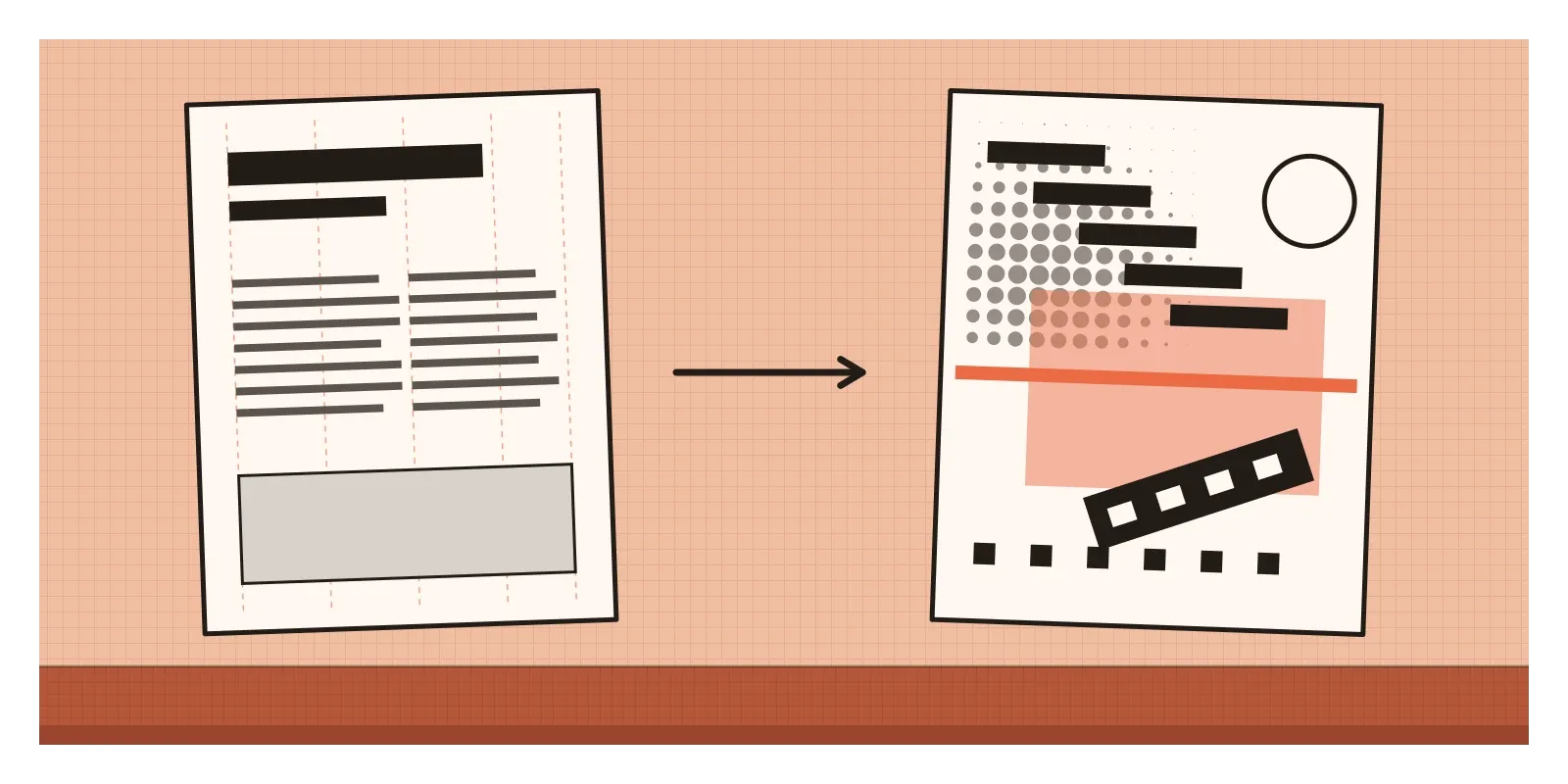
Dan Friedman, born in 1945, had studied at Ulm and then in Basel in the late 1960s, and as a teacher at Yale and elsewhere in the 1970s he set exercises that asked students to take a plain piece of text and push its arrangement step by step, from strict order to something close to chaos, and to decide where communication stopped. In 1994 he published Radical Modernism, a book arguing for a warmer, more playful modernism.
In Britain, a cruder cousin was being made at the same time. Punk graphics, most famously Jamie Reid's sleeves and posters for the Sex Pistols in 1976 and 1977, and the stapled, photocopied fanzines that sprang up around the music, used torn paper, cut-out letters and cheap copiers, a debt to Dada I described in the post on Dada. Designers such as Peter Saville and Malcolm Garrett soon brought a cooler version of that energy to record sleeves. Weingart's Basel students and London's punks didn't share a method, but they shared a target: the polished, tasteful, corporate surface.
Staircases, stripes and dots you can see
New Wave typography is easy to spot once you know that it's Swiss typography with the rules turned up loud. Start with the type itself. It's usually still a sober sans-serif, Akzidenz-Grotesk or Univers, the same faces the Swiss used. What changes is how it's handled. Letterspacing goes very wide or very tight, sometimes in the same line. Weights change mid-word. Lines step down in staircases or sit at an angle. Type is reversed out of black bars, white on black, and heavy rules, dotted lines and small squares punctuate the page.
Then look for layers. The Swiss page was flat and calm. The New Wave page overlaps type, image and pattern, with a grey screen of dots over everything. Halftone dots, normally invisible, are enlarged until they become a texture. Greiman added colour, gradients and floating shapes.
The most important thing is underneath. If you lay a grid over a Weingart poster, you'll usually find one. The order is still there, but it's been made visible and then disturbed, the way a jazz player bends a melody everyone knows. That's what separates the movement from simple mess. Its makers knew the rules very well.
A calligrapher in a Bombay ad agency
The Basel school did reach India, through the teachers and students who moved between Basel and the National Institute of Design in Ahmedabad, a story I told in the posts on the Swiss Style and Indian design education. But the closest Indian parallel to Weingart's restlessness that I know of came from somewhere else, and the parallel is loose. Raghunath Krishna Joshi, known as R. K. Joshi, was born in Kolhapur in 1936, studied at the Sir J. J. Institute of Applied Art in Bombay in the 1950s, and spent more than twenty years, from 1961 to 1983, as an art director at Ulka Advertising in Bombay. Then he moved to the Industrial Design Centre at IIT Bombay, where he taught calligraphy, type design and typography until 1996.
Alongside his day job, Joshi experimented with letters. He studied old manuscripts and inscriptions, and made calligraphic compositions in Devanagari and Roman in which letters were stretched, compressed, repeated and layered until a word became a picture of its own sound. He staged what he called multilingual happenings, mixing script with music, theatre and dance, to show people that Indian alphabets were something to see and hear, not just to read. Later he worked with the government's computing centre, C-DAC, and designed Indian-script fonts used in Microsoft Windows.
The difference matters. Weingart was escaping a modernism that had grown stiff. Joshi was trying to make Indian designers look again at scripts that print, advertising and early computers had treated as an afterthought. But both used experiment, play and the physical making of letters as a way of thinking, and both influenced a generation of students more through teaching than through any single famous piece.
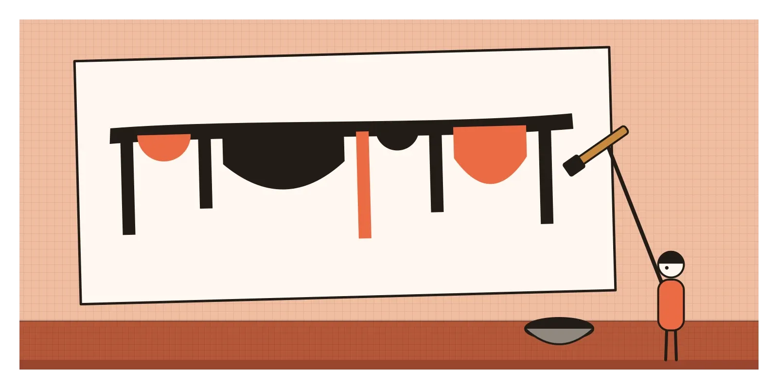
There's a practical lesson hiding here too. Many New Wave tricks assume the Latin alphabet, where every letter stands alone. Try spacing out a Hindi or Bengali word the Weingart way and you hit the shirorekha, the headline that joins the letters from above. Pull the letters apart and the word snaps. Designers working across scripts have to find other ways to make type shout, through weight, size, colour and layering, which are exactly the tools Joshi explored.
Your poster app has a stretch tool
Much of what New Wave designers did by hand is now a slider. Variable fonts let you change weight and width along a line. Motion designers make type step, stretch and overlap in title sequences and app onboarding screens, in a language of layering and tension that comes straight from Basel. The halftone dot as texture, the thick rule and the stacked, angled headline are staples of music posters today, and in the last decade there's been a full revival of Swiss Punk posters online.
The deeper inheritance is in teaching. Weingart insisted that students learn typography through process, through many quick variations of the same material, before they settle on one. For many years he also taught at Yale's summer programme in Brissago, in Switzerland, and his students went on to teach others. Design tools now routinely offer several arrangements of the same content side by side, which is a polite, automated version of a Weingart exercise. What they can't supply is his judgement about which experiment still communicates.
AI image tools can produce a "Swiss punk poster" in seconds. They copy the surface but miss the tension, which comes from knowing exactly which rule you're breaking and why.
Rules you have to know before you break them
Not everyone was charmed. To many older Swiss designers, the new work looked self-indulgent, a game played with type for its own sake, and readability did sometimes suffer. By the mid-1980s New Wave had also become a set of mannerisms, scattered triangles, squiggles and gratuitous dots, applied to corporate brochures by designers who had copied the look without the discipline. A movement that began by attacking the Swiss Style for becoming a uniform had become a uniform itself, in a matter of years.
It was also a movement of a small, well-connected circle, built around a few schools in Basel and the United States, and like much of design history it has been told mostly through men, with Greiman the obvious exception. And it questioned how text was arranged, rarely what the text said or whom it served.
What replied to it was the computer. Greiman's Macintosh poster showed the way, and in the late 1980s and 1990s designers working with new software and digital type took the layering and breaking much further, until legibility itself became the thing being questioned. That's the subject of the posts on Emigre and digital type and on grunge typography.
To see the work for yourself this week, search the online collection of the Museum für Gestaltung in Zurich, which holds many of Weingart's posters, and look at April Greiman's own website for Does It Make Sense?. Weingart's Typography: My Way to Typography shows his experiments in detail. Then try an exercise. Take one short line of text, an event name and a date, and set it ten different ways using only spacing, weight, one thick rule and position on the page, no images and no extra colours. Then try it with the same line in Hindi or Tamil and see which tricks survive.
I keep picturing those Yale students in 1972, looking at the slides of a teacher from Basel and realising that the rules they'd learned were not the end of typography but a starting point. In the next post, on street art and graffiti, the letters leave the page altogether and go out onto the walls and trains of the city.
Further reading: Wolfgang Weingart, Typography: My Way to Typography (2000) · April Greiman, Hybrid Imagery: The Fusion of Technology and Graphic Design (1990) · Dan Friedman, Radical Modernism (1994) · Rick Poynor, No More Rules: Graphic Design and Postmodernism (2003) · Philip B. Meggs and Alston W. Purvis, Meggs' History of Graphic Design (2016)
A reply toA Swiss Style that had hardened from a revolution into a corporate uniform.