Streamline Moderne
How 1930s designers wrapped trains, fridges and pencil sharpeners in the smooth curves of speed.
Streamline Moderne
Dawn in Denver, dusk on a stage
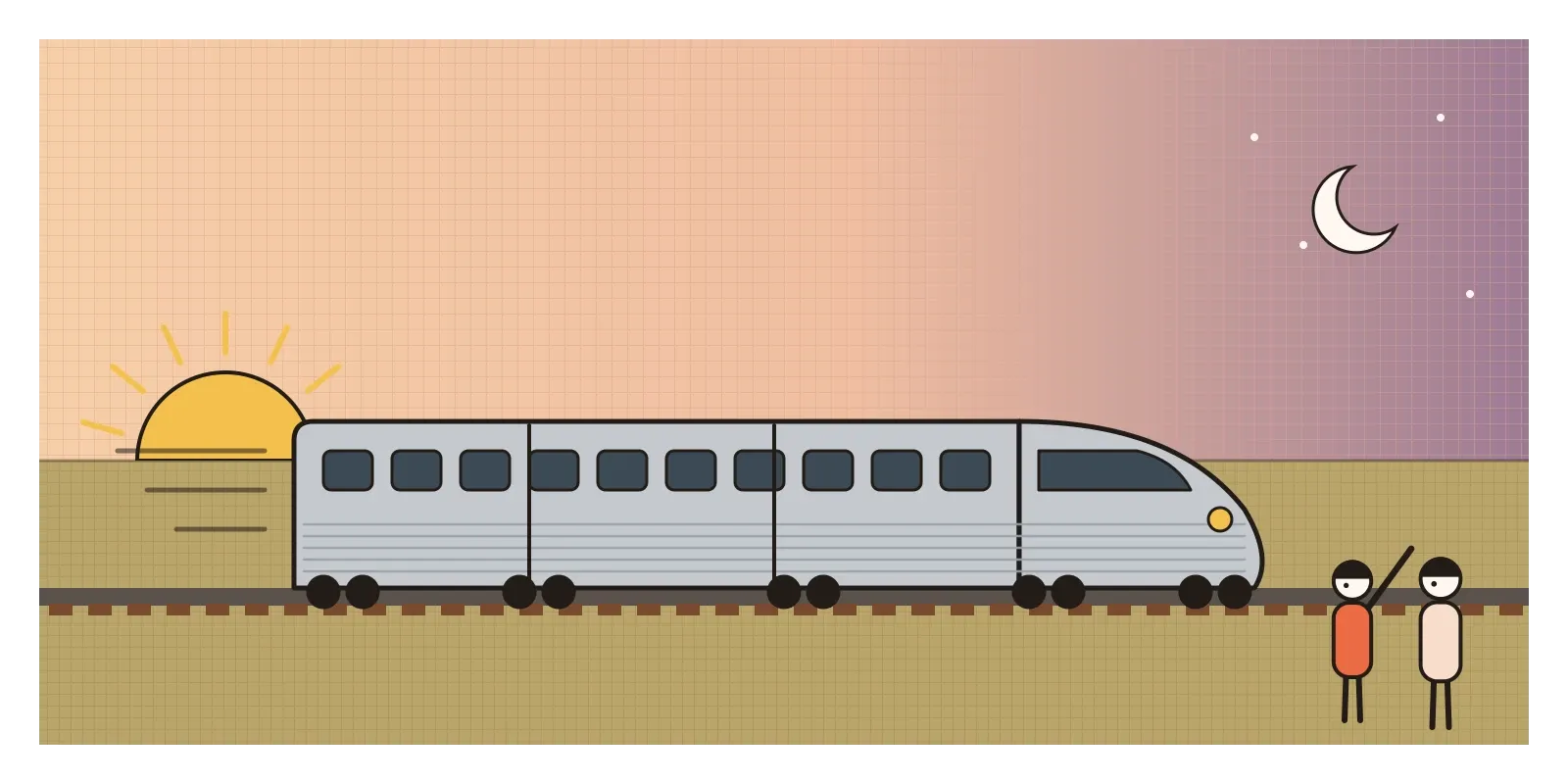
Just after seven in the morning on 26 May 1934, a short silver train left Denver, Colorado, heading east. It looked like nothing else on the rails. Its three cars were joined into one articulated unit, its body was made of fluted stainless steel, and its nose was a smooth, rounded shovel shape, like the front of a beetle. It was the Burlington Zephyr, built by the Budd Company of Philadelphia for the Chicago, Burlington and Quincy Railroad, and it was powered not by steam but by a diesel engine.
The plan was to run the whole way to Chicago, about 1,600 kilometres, without stopping. Crowds lined the track, and level crossings were guarded so that nothing could get in its way. The Zephyr touched about 180 kilometres an hour at its fastest and reached Chicago a little after eight in the evening, in roughly thirteen hours, less than half the time of the usual steam train. Then it rolled on to the Century of Progress world's fair on the lakefront and pulled onto the stage of a pageant about the history of transport, the newest machine in America arriving as the show's finale.
The Zephyr was a train, but it was also an advertisement for a look. Streamline Moderne was the style of the 1930s that borrowed the smooth, rounded, horizontal forms of fast machines, aeroplanes, airships and trains, and applied them to almost everything: buildings, cars, radios, refrigerators, toasters, even pencil sharpeners. It was mostly American, it grew out of Art Deco, and it gave birth to a new profession, the industrial designer.
Selling the future in a depression
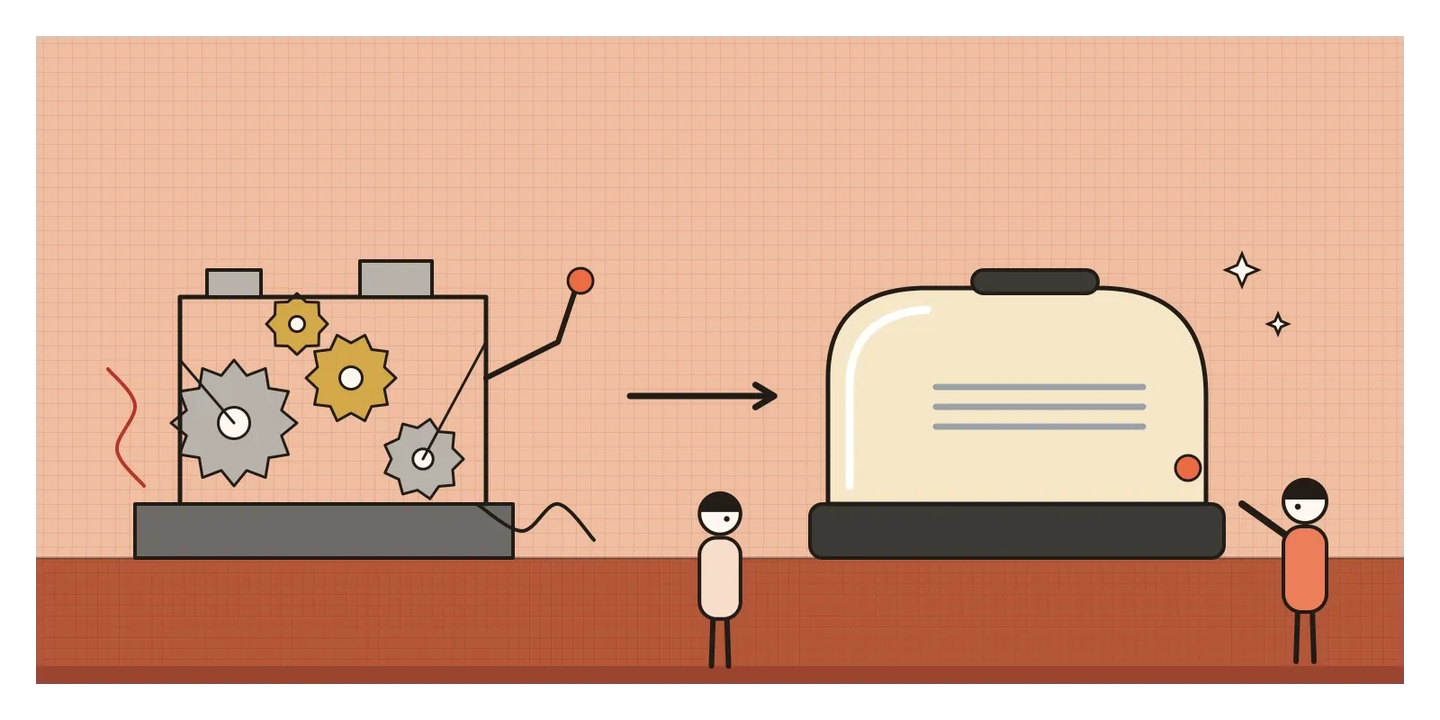
The style grew up in hard times. After the Wall Street Crash of 1929, American factories were full of products nobody could afford to buy. Manufacturers were desperate for anything that would make people spend, and a small group of designers, many of whom had started in advertising, theatre or shop window display, offered them a new idea: change the shell, and you can sell the same machine again.
They also had a story to tell. Engineers had learned from aircraft and wind tunnels that a teardrop shape, rounded at the front and tapering at the back, slipped through air with the least resistance. Streamlining was real science for a train or an aeroplane. For a toaster it was a metaphor, a way to make an object look modern, efficient and forward-moving, at a time when people badly wanted to believe that the future would be better than the present.
Streamline Moderne replied to Art Deco, which I wrote about in the last post, by stripping away its luxury. The ebony, ivory and sunbursts of Paris were too expensive and too fiddly for factories in a depression. What was left was the Deco love of glamour and machines, translated into simple curves that could be stamped from sheet steel or moulded in plastic. Historians draw the line between the two differently, and many buildings sit on both sides of it.
A teardrop that sharpened pencils
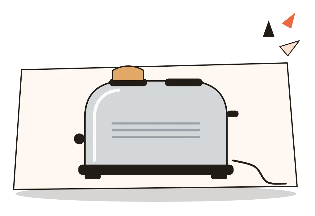
The most famous of the new designers was Raymond Loewy, a Frenchman who had moved to New York in 1919. His first big job, in 1929, was to tidy up a Gestetner duplicating machine, a clutter of gears and levers. He didn't change the mechanism. He wrapped it in a smooth shell with a neat base, and it sold better. In 1933 he designed a pencil sharpener shaped like a polished teardrop, as if it were meant to fly. It never went into production, but it has become the emblem of the whole style, streamlining applied to an object that never moves. His Coldspot refrigerator for Sears in the mid-1930s, with its rounded corners and strip of chrome, reportedly sent sales soaring. For the Pennsylvania Railroad he refined the welded body of the GG1 electric locomotive and designed the enormous, bullet-nosed S1 steam engine.
Norman Bel Geddes, a theatre designer, was the style's dreamer. His book Horizons (1932) was full of teardrop cars, ocean liners and an enormous flying-wing airliner, most of them never built. At the 1939 New York World's Fair, his Futurama for General Motors carried visitors in moving armchairs over a vast model of the America of 1960, crossed by motorways, and sent them out wearing a badge saying they had seen the future.
Henry Dreyfuss was the quieter one. He designed the New York Central Railroad's 20th Century Limited of 1938, from its locomotive with a finned, helmet-like nose to the cutlery in its dining car. His Model 302 telephone for Bell, a compact rounded base with the handset resting across its cradle, became the standard American phone for years. Dreyfuss cared less about speed than about fit, how things suited the human body, a concern he later wrote up in Designing for People (1955). Walter Dorwin Teague designed Kodak cameras and a standard Texaco filling station, and was, with Loewy, Dreyfuss and Bel Geddes, one of the founders of the profession.
Not everything streamlined succeeded. Chrysler's Airflow car of 1934, designed with help from wind tunnel tests, was genuinely more aerodynamic than its rivals, but buyers found its blunt, bulging nose strange, and it was dropped after a few years. The lesson, which Loewy later summed up as giving people the most advanced design they would still accept, was that a look could be too far ahead.
Three lines along the side
You can recognise Streamline Moderne from across a street. Corners are rounded, often in a big sweeping curve. Lines run horizontally, as if the object or building were moving sideways at speed, and the most common decoration is a group of three parallel "speed lines" in chrome, paint or raised plaster. Fronts are blunt and rounded, backs taper or step down. Surfaces are smooth and continuous, with seams and screws hidden, so that a fridge looks as if it were made in one piece.
The materials are the new industrial ones: chrome-plated steel, aluminium, stainless steel, Bakelite and other early plastics, enamel paint in cream, white, mint green or pale blue. In buildings, look for flat roofs, white or cream render, long bands of windows wrapping round curved corners, glass blocks, round porthole windows and thin metal railings borrowed from the decks of ships. American diners, bus stations and petrol stations of the 1930s are the classic examples. The difference from Art Deco is easy to see once you put them side by side: Deco reaches upwards, with stepped towers and sunbursts, while Streamline stretches sideways and smooths everything over.
Eyebrows over Bombay windows
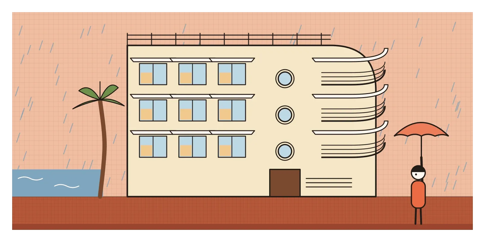
In India the style is easiest to see in Mumbai, on the same Art Deco streets I described in the last post. Many of the apartment blocks built along Marine Drive and in the newer suburbs in the late 1930s and 1940s look like ocean liners run aground: rounded corner balconies like the bow of a ship, round porthole windows on the stairwells, and parapets of thin horizontal railings. Over the windows run long, thin concrete ledges that locals call eyebrows.
Here the style did real work. In Miami or London, a horizontal ledge over a window is mostly decoration. In Bombay, it shades the glass from a fierce sun and throws off the monsoon rain, so the windows can stay open in a downpour. Indian architects and builders turned a borrowed look into something closer to a climate system, which is a nice reversal of the usual story of streamlining as pure styling. The curved corner balconies caught the sea breeze from more than one direction, and the porthole windows let light into stairwells without letting in much rain.
Its descendants turn up on Indian roads and rails too, though the link is looser. The Hindustan Ambassador, made in West Bengal from 1958 to 2014, was based on a British car, the Morris Oxford of the mid-1950s, whose rounded, bulbous body belonged to the late, softened end of the streamlined era. And in February 2019, Indian Railways launched the Vande Bharat Express, built at the Integral Coach Factory in Chennai, with a sloping aerodynamic nose that would have delighted Bel Geddes. In the Ambassador's case, at least, the curves had long stopped meaning speed and simply meant a car.
Smoothness as a promise
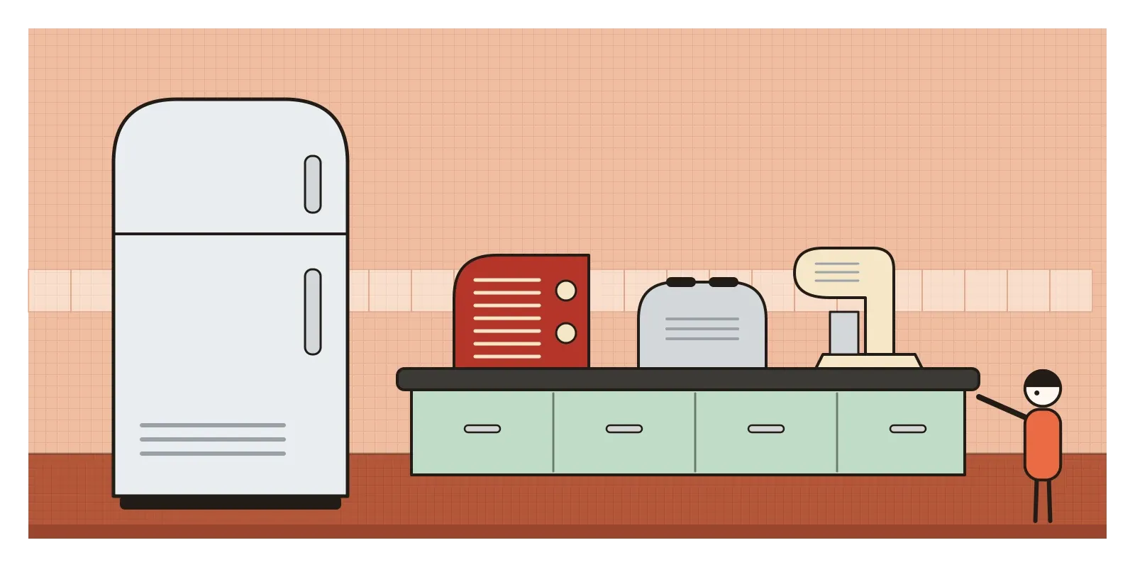
The rounded corner is everywhere. Phones, laptops, app icons and buttons have soft corners and seamless bodies, with the screws hidden and the joins minimised, which is Loewy's Gestetner shell taken to its limit. Cars are still sculpted in wind tunnels, and the electric ones, which need every bit of range, are smoother than ever. Kitchen appliances in retro pastels with chrome trim sell well precisely because they look like 1930s streamlining.
For designers, the style raises a question worth asking of any project: is this form doing work, or just signalling it? A sloping nose on a train at 160 kilometres an hour is engineering. The same slope on a pencil sharpener is a story. Both can be legitimate, since stories sell things and make people feel good about them, but it's worth knowing which one you're telling. Loewy's idea of the most advanced acceptable design is also still useful. It explains why new technologies so often arrive dressed as familiar ones: the first cars looked like carriages without horses, and early e-readers drew a page that seemed to turn. When you design something genuinely new, the familiar part of the form is often what lets people accept the rest. The question is how much of the old shell to keep, and when to let it go.
Styling, obsolescence and a segregated waiting room
Even in the 1930s, critics complained that streamlining was skin deep. Modernists, especially at the Museum of Modern Art in New York, saw it as "styling", a sales trick that dressed up a machine without improving it, and they contrasted it with the honest, functional design they admired from the Bauhaus. They had a point. A teardrop toaster doesn't toast better.
There was a deeper problem. In 1932 two advertising men, Roy Sheldon and Egmont Arens, published a book called Consumer Engineering, which argued that designers should help make people dissatisfied with what they already owned, so they would buy something new. The industrial designer Brooks Stevens later popularised the phrase "planned obsolescence" in the 1950s. Changing the shell every year to make last year's model look old is a habit that began here, and its cost in waste and landfill is still with us.
The style's promise of a smooth, shared future also had limits. Many of the gleaming new bus stations of the American South had separate waiting rooms for Black and white passengers, the future arriving with its old divisions intact. After the Second World War, streamlining softened into the boomerangs and tail fins of the atomic age, and a younger generation, who have their own posts, answered both its gloss and its waste.
To see Streamline Moderne for yourself this week, walk along Marine Drive or through the older parts of Dadar and look up for portholes, curved balconies and concrete eyebrows; then wait for the rain and see what the eyebrows do. The Pioneer Zephyr itself is preserved at the Museum of Science and Industry in Chicago. Or look around your kitchen and find the smoothest object in it, and ask whether its curves help it work or just help it sell. And think back to that silver train pulling onto a stage in Chicago after a day racing the sun, a machine that was also a performance. In the next post, on the New Typography, I'll turn from machines to the printed page, and to designers who wanted type to work as cleanly as an engine.
Further reading: Jeffrey L. Meikle, Twentieth Century Limited: Industrial Design in America, 1925-1939 (1979) · Donald J. Bush, The Streamlined Decade (1975) · Norman Bel Geddes, Horizons (1932) · Raymond Loewy, Never Leave Well Enough Alone (1951) · Henry Dreyfuss, Designing for People (1955)
A reply toArt Deco's costly ornament, and a Depression that needed old machines to look new enough to buy.