
Flat Design
How screens shed their leather and shine for solid colour, clean type and icons borrowed from public signs.
Flat Design
Big words running off the edge of the screen
On 15 February 2010, at the Mobile World Congress in Barcelona, Microsoft showed the world its new phone software, then called Windows Phone 7 Series. The company was badly behind. Apple's iPhone was nearly three years old, Android was growing fast, and Microsoft's own Windows Mobile looked like a shrunken desktop computer. Steve Ballmer introduced the phone, and Joe Belfiore, who led its design, walked the audience through it. What they saw looked like nothing else on a phone at the time.
There were no glossy icons, no textures and no shadows. The home screen was a column of flat, solid-coloured squares and rectangles, called live tiles, which showed fresh information on their faces, a new message or the next appointment. Inside the apps, headings were set in huge, thin, lowercase letters, so big that they ran off the right-hand edge of the screen, a hint that you could swipe sideways to see more. Content filled the screen, and the controls around it almost disappeared. The designers talked about letting people glance at the phone, get what they needed and put it away. The phone itself never caught on, and by 2017 Microsoft had effectively given up on it. But the look it introduced would, within three years, take over much of the industry.
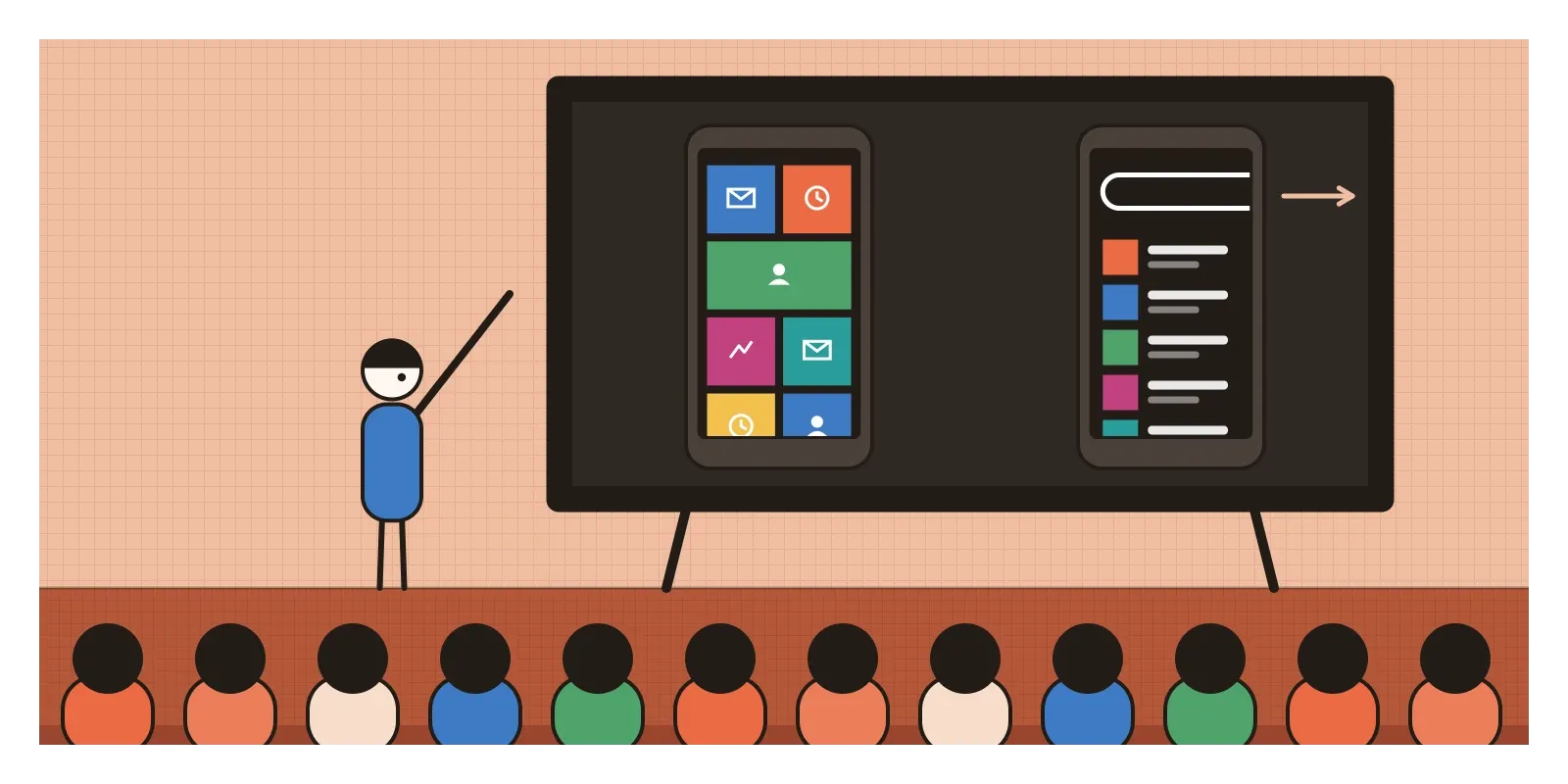
Flat design is the name for that look: interfaces built from flat areas of solid colour, simple geometric icons and clear typography, with no imitation of physical materials and little or no shading. It's usually dated from about 2010 to 2013, when Microsoft's style, Apple's iOS 7 and a wave of websites made it the default, though its roots go back much further, and arguments continue about where flat ends and the softer styles that followed begin.
From the subway map to the phone
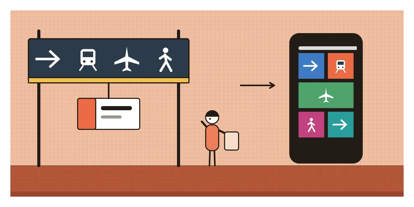
Microsoft's flat style hadn't come from nowhere. It had grown inside the company for several years, first in Windows Media Center and then in the Zune, the music player Microsoft launched in 2006 to compete with the iPod, whose software used large lowercase type and very little decoration. Internally the language was called Metro, and in 2011 a Microsoft design blog post titled "From transportation to pixels" explained the name. The team had looked at the signs in airports, railway stations and metro systems, which have to tell hurried strangers where to go, at a glance, without decoration. They named Massimo Vignelli's work for the New York subway and Josef Müller-Brockmann's Swiss posters among their references. As I described in the post on Swiss Style, that tradition prized grids, sans-serif type and the idea that clarity is a kind of politeness.
It was a reply on several fronts. Most directly, it answered the skeuomorphism of the previous post, the stitched leather, wood and felt. One of the principles Microsoft published for Windows 8 was to be "authentically digital", meaning that a screen shouldn't pretend to be a notebook or a bookshelf. It also replied to the gloss of the Web 2.0 years, which by 2010 looked dated. And there were practical pressures. Screens were multiplying in sizes and pixel densities. When Apple doubled the pixel density of the iPhone's screen in 2010, every texture and glossy button had to be redrawn at twice the size, and tablets and Android phones of every shape added more versions. Flat shapes could be drawn as vectors that scaled cleanly to all of them. By then, too, many people had used touchscreens for years. They no longer needed a picture of a switch to know where to tap, or so the designers believed.
Tiles, thin type and a stripped-down iPhone
Microsoft took the style furthest. Windows 8, launched in October 2012, replaced the familiar Start menu with a full screen of coloured tiles, the phone's language scaled up to desktops and laptops. Shortly before the launch, Microsoft stopped using the name Metro, reportedly because of a trademark dispute with the German retailer Metro AG, and began calling it simply the Windows or Microsoft design language. The Xbox, Office and Microsoft's websites followed.
Apple's turn came the next year. After Jony Ive took charge of software design, Apple unveiled iOS 7 in June 2013 and released it that September. I told the outline of that story in the post on form follows function, but some details matter here. Ive's team didn't simply remove textures. They replaced button shapes with plain coloured words, swapped detailed icons for thin outlined glyphs, set much of the interface in a very light weight of Helvetica Neue, and used translucent layers and motion to suggest depth instead of shadows. The home screen icons were redrawn with brighter colours, simpler shapes and soft gradients, which led some critics to say the result wasn't truly flat at all. Many designers hated the new icons at first. Within a year or two, most popular apps had redesigned themselves to match, because an app still wearing leather now looked abandoned.
The web had been moving the same way. Through 2012 and 2013, designers released free kits of flat buttons, sliders and icons for others to use, and Dribbble, the designers' showcase site, filled with flat illustrations. A brief fashion followed for long shadows, flat icons with a hard-edged shadow stretching away at forty-five degrees, as if lit by a low sun. Google, meanwhile, had been flattening its own products since a redesign in 2011, which the next post picks up.
Solid colour, clear type and no costume
Flat interfaces are easy to recognise. Colours are solid fills, often bright and saturated, with no gradients, bevels or highlights. Icons are reduced to simple geometric shapes, filled silhouettes or thin outlines of even weight, drawn so they read at small sizes, the kind of abstraction I described in the post on abstraction. Buttons are coloured rectangles or sometimes just coloured words. There are no textures, no stitching and no paper.
Because there's no shading to separate things, flat design leans on other tools. Typography does most of the work of hierarchy, with big contrasts in size and weight. Layouts sit on clear grids with generous space. Colour separates areas and marks what can be tapped. Motion often replaces shadow, so a panel slides in from the side to show where it came from. The Windows phrase for this approach was content over chrome, chrome meaning all the frames, bars and decoration around the content itself.
A typeface from Ahmedabad
India's clearest connection to flat design runs through its type. Flat interfaces lean on typography more than any style before them, because the letters have to do the work that shadows and textures used to do, and in the early 2010s designers wanted a particular kind of letter: geometric, even and friendly, built from near-perfect circles and straight strokes, in the tradition of Paul Renner's Futura from the 1920s. One of the most widely used answers came from Ahmedabad. The Indian Type Foundry, which I mentioned in the post on the New Typography, released a family called Poppins around 2014 as a free, open-source font through Google Fonts. Its Latin letters are credited to Jonny Pinhorn and its Devanagari to Ninad Kale, and the two scripts were drawn to sit together, with matching weights and the same rounded geometry.
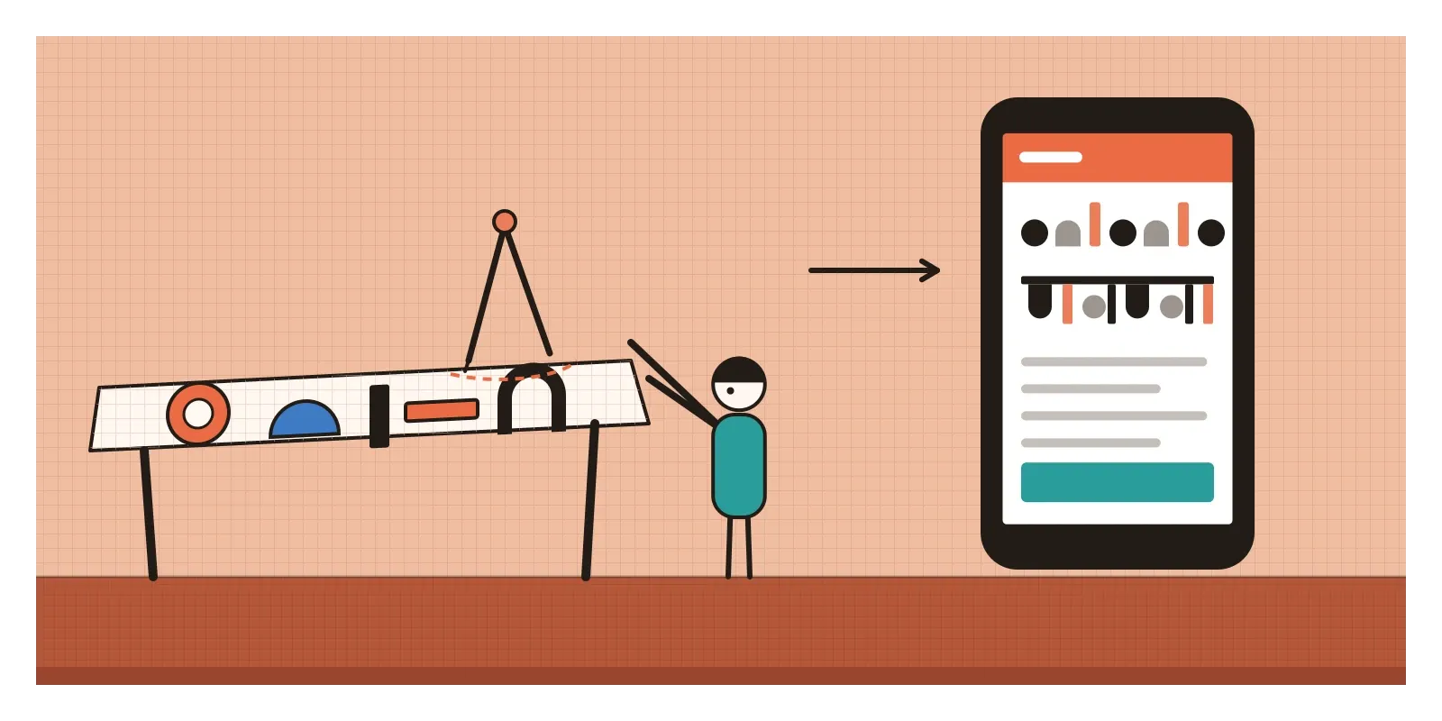
Poppins became one of the most used fonts on Google Fonts, and through the late 2010s it turned up on start-up landing pages, app onboarding screens and flat illustrations all over the world, often on sites whose designers had no idea it came from India. Part of its appeal was flat design's own: clear, open shapes that stay readable on cheap screens. Its Devanagari was a quieter achievement. Many Indian-language interfaces of the time paired a crisp Latin sans-serif with a Devanagari font from a completely different tradition, so a bilingual screen looked like two documents glued together. A family drawn as a pair let a Hindi and English screen speak with one voice.
India also had flat graphics long before phones. As I wrote in the post on visual literacy, the Election Commission's party symbols, simple pictures of everyday objects, have let voters who can't read choose a candidate since the first general election of 1951 and 1952. They work by the rules Microsoft's designers found in airport signs: recognisable at a glance, with no words, and never confused with a neighbour. The parallel with flat design is a loose one. Flat design was a style and the symbols were a necessity, but the necessity got there first.
Clean, fast and sometimes hard to see
Much of what flat design established is now simply how screens look. Icon sets drawn as simple vector shapes, design systems built from flat colour tokens, and brand logos redrawn without gradients or shine all come from these years. So does a certain clarity about what an interface is for: get out of the way, and let the content lead. Flat design also suited the cheap phones and slow connections on which millions of people came online in the 2010s, since simple shapes are light to load and quick to render. The style went beyond screens too. By the late 2010s, flat illustrations of people with long limbs, tiny heads and bright skin colours, sometimes nicknamed Corporate Memphis, were on the websites of half the technology companies in the world.
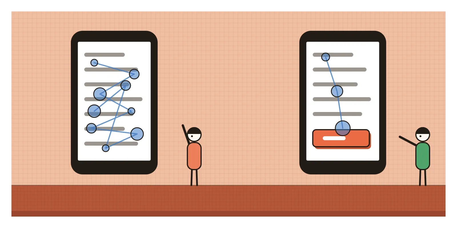
But flat design had a real weakness, and it showed quickly. When everything is flat, it's hard to tell what you can press. A word that's a button looks much like a word that isn't. When colour is the only clue, people with colour blindness lose even that, and so does anyone squinting at a phone in bright sunlight. Apple added an accessibility setting called Button Shapes in iOS 7.1, released in March 2014, which put back outlines and underlines around tappable text, a quiet admission that something had been lost. The very thin type of iOS 7 was hard for many people to read, especially older users, and Apple's own Bold Text setting became the usual advice. In 2017, the researcher Kate Moran at the Nielsen Norman Group published an eyetracking study in which people looking for a target on pages with weak visual signals spent on average about 22 per cent longer, with about 25 per cent more fixations, than on versions with clearer signals.
Windows 8's tiles were rejected by many desktop users, who missed their Start menu, and Microsoft brought it back, first partly in Windows 8.1 and then fully in Windows 10 in 2015. And as with any style that becomes a uniform, flat design made a great many products look alike. Critics pointed out that it had swapped one kind of fashion for another: skeuomorphism had pretended to be leather, and flat design sometimes pretended that removing information was the same as clarity.
Designers soon began putting a little depth back: subtle shadows to show what floats, slight colour shifts to mark what can be pressed. In the next post, on Material Design, I'll look at the most systematic attempt to do that, Google's idea that a screen could be made of paper and ink.
Take the shadows off and see what's left
You can test flat design's promise and its weakness in ten minutes. Take a screen you've designed, remove every shadow, border and gradient, and give it to someone who hasn't seen it. Ask them to tap everything they think is a button, and watch where they hesitate. Then add back the smallest cue that removes the hesitation. Next time you pass through a railway station or airport, look at the pictograms on the signs and notice how much they say with how little. Then open a type specimen site, set a sentence in Poppins in both Latin and Devanagari, and notice how the two scripts share their circles and strokes. For reading, Josef Müller-Brockmann's Grid Systems in Graphic Design shows the tradition Microsoft's designers drew on, and Moran's article is short and clear.
Those huge lowercase headings in Barcelona, running off the edge of the screen, were a promise that content mattered more than decoration. It was a good promise. Flat design's lesson is that removing the costume is only half the work. The other half is making sure people can still see what to do.
Further reading: Josef Müller-Brockmann, Grid Systems in Graphic Design (1981) · Microsoft Windows design team, "From transportation to pixels" (2011) · Kate Moran, "Flat UI Elements Attract Less Attention and Cause Uncertainty" (2017) · Kevin Mullet and Darrell Sano, Designing Visual Interfaces (1995)
A reply toSkeuomorphism's leather, wood and felt, and the leftover gloss of Web 2.0.