Rococo
How eighteenth-century France traded Baroque thunder for pastel colour, playful curves and private rooms.
Rococo
A slipper flying off in a garden
In October 1767, the French playwright Charles Collé wrote down a piece of studio gossip in his journal. A gentleman of the court, he said, had approached the history painter Gabriel-François Doyen with an unusual commission. He wanted a picture of his mistress on a swing, pushed by a bishop, with the patron himself placed where he could see her legs. Doyen, startled, turned it down and suggested someone else. The someone else was Jean-Honoré Fragonard, and the picture he painted is now one of the most famous in the Wallace Collection in London.
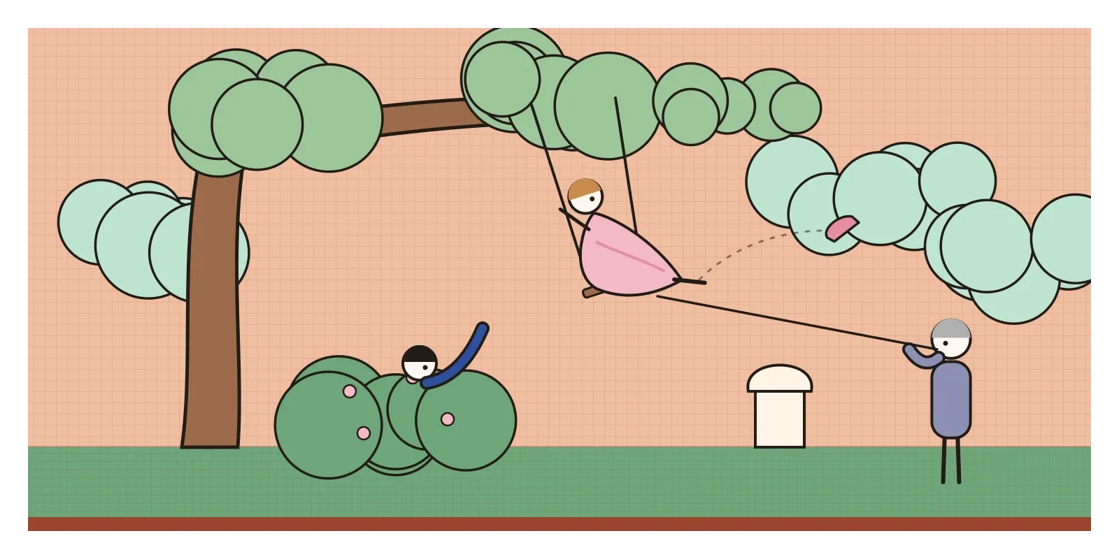
The Swing shows a young woman in a frothy pink dress at the top of her arc in a sunlit, overgrown garden. One pink slipper has flown off her foot and is sailing through the air. Below her, half hidden in a rose bush, a young man reclines and gazes up, his arm raised. Behind her, in the shadows, an older man works the ropes. Fragonard made him a layman, not a bishop. A statue of Cupid, finger to his lips, watches over it all. Collé never named the patron, and he has long been assumed to be a wealthy tax collector, although historians still debate it. In 2021 the painting was cleaned for the first time in over a century, and the yellowed varnish came off to reveal much brighter pinks and greens, and a scene even saucier than people remembered.
That painting is Rococo at its most famous: pretty, witty, a little scandalous and entirely private. Rococo is the style that grew up in France in the decades after 1715 and flourished from around 1730 to 1770, in painting, interiors, furniture, porcelain and ornament. It's light where the Baroque was heavy, intimate where the Baroque was public, and playful where the Baroque was solemn. Historians argue about whether it's a style of its own or the late, light-hearted phase of the Baroque, and both views have a point.
The king dies and Paris moves indoors
Louis XIV, the Sun King whose Versailles I described in the post on the Baroque, died in 1715 after more than seventy years on the throne. His heir was a five-year-old boy, and for eight years France was governed by a regent, Philippe d'Orléans, who preferred Paris to Versailles. Aristocrats followed him back to the city, where they built or refitted elegant townhouses, the hôtels particuliers. These weren't designed for state ceremony. They were for conversation, music, cards, flirting and small suppers, and they needed smaller rooms, softer light and furniture you could actually sit in comfortably.
Rococo was a reply to the Baroque grandeur of Louis XIV's court, its marble, its symmetry and its endless declarations of power. The new style kept the curves and the gold but made them smaller and lighter. Walls were panelled in pale wood painted white, cream or soft green, with gilded carving wandering around the edges. Ceilings were lighter, mirrors were everywhere, and the dark, heavy colours of the previous century gave way to pastels.
The name came later and wasn't kind. It seems to have started in the late 1790s as studio slang among the pupils of the painter Jacques-Louis David, who used it to mock anything old-fashioned and frilly. Most people trace it to rocaille, the rock-and-shell work used to decorate garden grottoes, which became one of the style's favourite motifs. Some add the Italian word for Baroque, though that link is disputed.
Parties in parks and a palace of mirrors
The painter who set the mood was Antoine Watteau. In 1717 he presented his reception piece to the Royal Academy in Paris, Pilgrimage to Cythera, a scene of elegantly dressed couples in a misty landscape on the island of love, either arriving or reluctantly leaving, depending on how you read it. The Academy had no category for it, so it invented one: the fête galante, a courtly outdoor party. Watteau's feathery brushwork, wistful couples and silky costumes defined a whole genre. François Boucher took it further, painting pink, plump, mythological goddesses and pastoral lovers for royal and aristocratic interiors, and designing tapestries and porcelain decoration. His portraits of Madame de Pompadour, Louis XV's mistress, a powerful patron of the arts, show her surrounded by books, flowers and silk, as a woman of taste.
Women were unusually central to the style, as patrons, as hostesses of the salons where taste was argued over, and occasionally as artists. The Venetian painter Rosalba Carriera became famous across Europe for her portraits in pastel, the soft powdery chalks that suited the Rococo palette perfectly, and on a visit to Paris in 1720 she was admitted to the Royal Academy.
Rococo reached its most dazzling form outside France. In the park of the Nymphenburg Palace in Munich, the architect François de Cuvilliés built the Amalienburg, a small hunting lodge finished in 1739, whose circular Hall of Mirrors is all silver plasterwork on pale blue, with vines, birds and musical instruments climbing between the mirrors. In the Bavarian countryside, the Wieskirche, a pilgrimage church built by Dominikus Zimmermann from 1745 to 1754, is plain white outside and a froth of white, gold and pastel inside, with a ceiling painted as an open sky. And in London, the cabinetmaker Thomas Chippendale published The Gentleman and Cabinet-Maker's Director in 1754, a pattern book that spread Rococo chairs, mirrors and tables, along with Chinese and Gothic variations, across Britain and its colonies.
S-curves, shells and pink
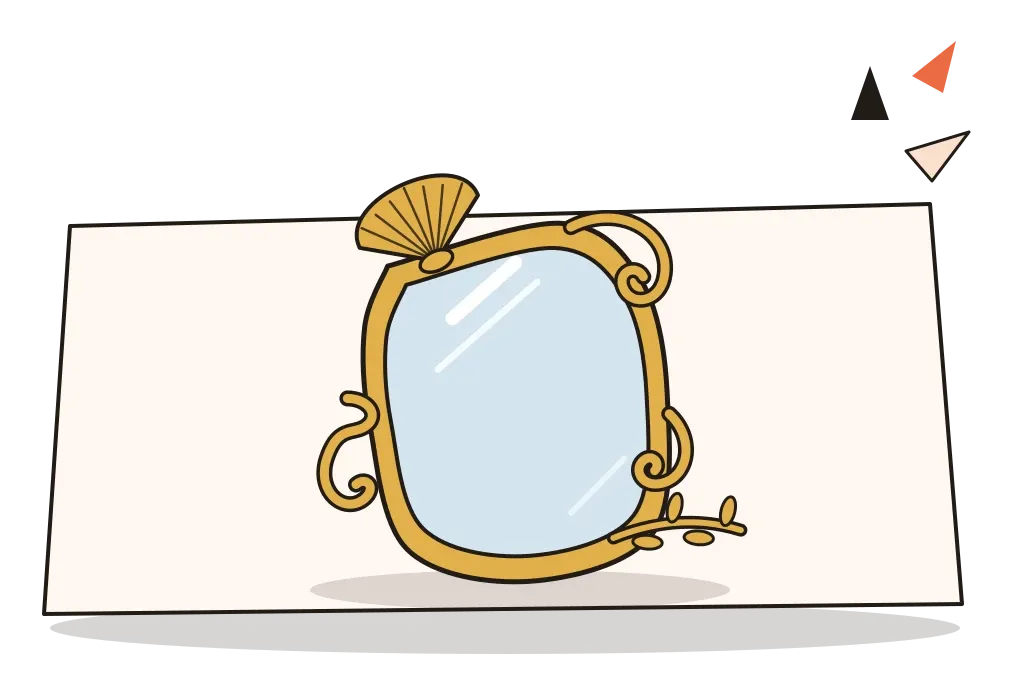
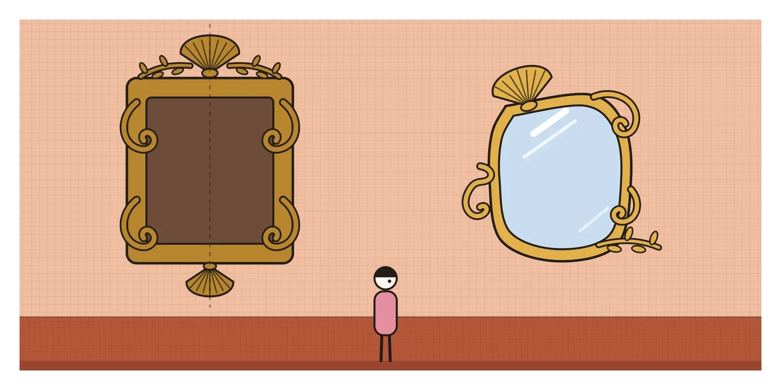
The single most useful thing to look for is asymmetry. Baroque ornament was grand but usually mirrored around a central axis. Rococo ornament curls off to one side. A cartouche, the decorative frame around a coat of arms or a mirror, might sprout a shell on its upper left and a spray of leaves on its lower right, with no matching partner. The basic units are the C-scroll and the S-scroll, curves that flow into each other like waves or shell edges. Designers like the goldsmith Juste-Aurèle Meissonnier published engravings in the 1730s of candlesticks, tureens and frames that seem to melt and twist as if they were made of sugar.
The palette is pale and warm: pink, powder blue, celadon green, ivory, lilac and lots of gold and silver. Surfaces are light and reflective, glazed porcelain, satin, mirror glass and white-painted wood. Natural motifs are everywhere, shells, flowers, vines, birds, monkeys and waterfalls, often mixed with chinoiserie, a European fantasy of China full of pagodas, parasols and imaginary figures. Scale shrinks. Rooms are smaller, furniture has curving cabriole legs, and the subjects of paintings are love, leisure, music and play rather than battles and saints. Brushwork is soft and feathery, figures are graceful rather than heroic, and the whole effect is of a pleasant afternoon that might go on forever.
The cotton France tried to ban
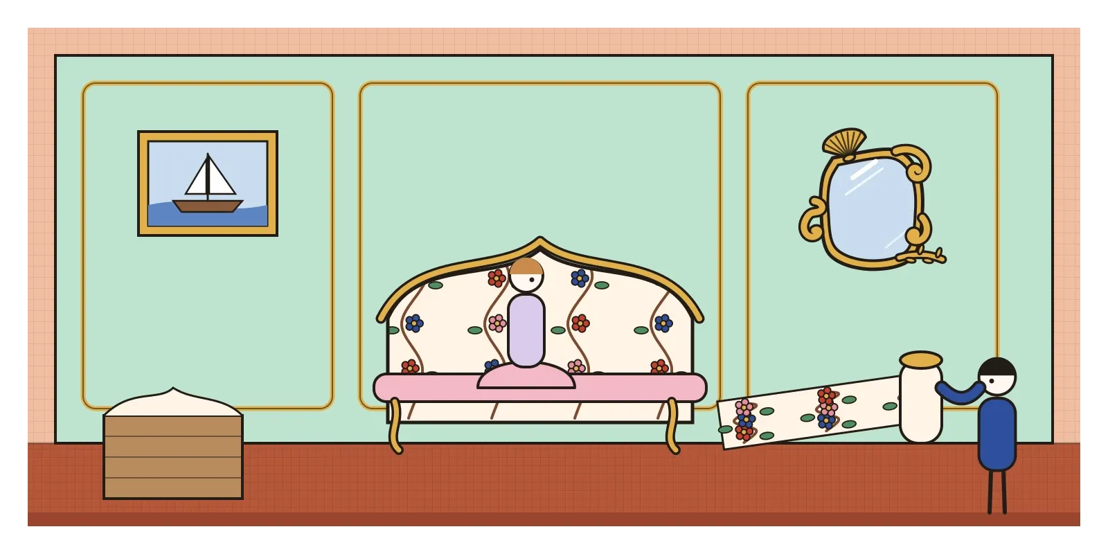
Rococo's light, flowered interiors had an Indian ingredient that Europe didn't always admit to. From the seventeenth century, the Dutch, English and French East India companies shipped huge quantities of painted and printed cotton from India's Coromandel coast and Gujarat. Europeans called it chintz, from the Hindi chheent, or in France simply indiennes. It was light, washable and covered in flowering branches and birds in colours that didn't run, thanks to the mordant dyeing techniques I described in the post on additive and subtractive colour. Nothing woven in Europe could match it, and it became a craze for dresses, bed hangings and wall coverings.
The craze was so strong that in 1686 France banned imported Indian cottons, and even local imitations, to protect its silk and wool producers. The ban lasted until 1759 and was widely ignored. Fashionable people bought smuggled chintz, and Madame de Pompadour is said to have furnished rooms with it. Within months of the ban being lifted, a German-born printer named Christophe-Philippe Oberkampf opened a works at Jouy-en-Josas near Versailles, and the printed cottons now known as toile de Jouy owed a great deal to techniques Europe had learned from India.
There's also a looser parallel worth naming. Around the same decades, as I wrote in the post on Rajput and Pahari painting, painters in Kishangarh and the Pahari courts were making delicate, lyrical scenes of lovers in gardens and groves. The resemblance is real on the surface, courtly love, elegant figures, flowering trees, but the meaning is different. Radha and Krishna's love was devotional, a picture of the soul's longing for the divine. Fragonard's lovers are just flirting.
Pastels, curves and the right to play
Rococo's clearest legacy for designers is its palette. Every few years, pastel pinks, mints and lilacs return to packaging, fashion and interfaces, from the pale pink that swept branding in the mid-2010s to the soft gradients many apps use today. The Parisian patisserie Ladurée built its identity on pastel boxes and gilded shopfronts in exactly this spirit, and supplied the macarons for Sofia Coppola's 2006 film Marie Antoinette, which turned the whole Rococo world into a sugary music video. But pastels carry a practical warning. White text on pale pink or mint almost always fails accessibility contrast standards, so a Rococo palette usually needs dark text and careful checking.

The second legacy is asymmetric balance. Rococo designers showed that a composition doesn't need a mirror line to feel settled, as I wrote in the post on balance. A heavy curl on one side can be answered by a lighter spray on the other. Many modern layouts work the same way, with an image off to one side and text balancing it on the other. The third is play. Rococo rooms were full of small jokes, hidden doors, monkeys dressed as people, mirrors that multiplied the candlelight. The small delights in a good product, a playful loading animation or a hidden surprise for a curious user, belong to that tradition, as long as they don't get in the way of the task.
Sugar, satin and the bill
Critics turned on Rococo while it was still in fashion. The philosopher Denis Diderot, reviewing the Paris Salons in the 1760s, attacked Boucher's paintings as pretty, artificial and morally empty, and called for art that would make people better. The style was the taste of a tiny, privileged class, and much of the wealth that paid for its mirrors and silks came from colonial trade, including sugar grown by enslaved Africans in the French Caribbean. Its women were celebrated mostly as ornaments, and even The Swing is, at heart, a picture commissioned by a man to show off his view of a woman. Chinoiserie, for all its charm, imagined Asia as a pretty fantasy rather than a real place.
The reply came from several directions at once. The excavations at Herculaneum and Pompeii, and a new enthusiasm for ancient Greece and Rome, made serious, sober classical forms fashionable again from around the 1760s. Then the French Revolution of 1789 swept away the world that had commissioned Fragonard, and he died in 1806 almost forgotten. Neoclassicism, which I'll come to in a later post, was in many ways the anti-Rococo.
To see it for yourself, the Wallace Collection in London holds The Swing along with superb Rococo furniture and porcelain, and in India the Salar Jung Museum in Hyderabad has a large collection of European decorative arts, including porcelain and furniture in the eighteenth-century French taste. To see the Indian side of the story, look for chintz and palampores in the textile galleries of museums like the Calico Museum of Textiles in Ahmedabad. For a small exercise, take a layout you've made with a strict mirror symmetry and rebuild it asymmetrically, so that one strong element on one side is balanced by several lighter ones on the other. Then choose a palette of three pastels and check every text colour against them for contrast. You'll learn quickly why Rococo saved its pastels for walls and not for words.
Fragonard's slipper has been in the air for more than 250 years and has never come down. That's the Rococo promise: a moment of pleasure that never has to end, at least until somebody sends the bill. In the next post, on ukiyo-e, I'll travel to Edo, where printmakers were picturing a floating world of pleasure of their own.
Further reading: Melissa Hyde, Making Up the Rococo: François Boucher and His Critics (2006) · Mary D. Sheriff, Fragonard: Art and Eroticism (1990) · Katie Scott, The Rococo Interior (1995) · Rosemary Crill, Chintz: Indian Textiles for the West (2008) · Donald Posner, Antoine Watteau (1984)
A reply toThe heavy, ceremonial Baroque grandeur of Louis XIV's Versailles.