
Responsive and Mobile-First Design
How web pages learned to rearrange themselves for any screen, and why designers began with the smallest.
Responsive and Mobile-First Design
Smart glass, and a client who wants an iPhone site
On 25 May 2010, the online magazine A List Apart published an article by the American web designer Ethan Marcotte with a plain title, "Responsive Web Design". It opened not with code but with buildings. Marcotte described an emerging field that some architects called responsive architecture: rooms that react to the people inside them, with walls that flex as a crowd approaches, lighting tied to sensors, and panes of smart glass that turn cloudy when too many people gather in a room. Why, he asked, couldn't a web page do the same, noticing the space it found itself in and rearranging itself to suit?
He was writing at a moment of mild panic in his trade. The iPhone had arrived three years earlier, the first iPad had gone on sale that April, and clients were starting to ask for "an iPhone website" alongside their normal one, with no obvious end to the list. Marcotte showed another way. He built a simple two-column page for an imaginary magazine whose columns and pictures were measured in proportions rather than fixed pixels, so they stretched and shrank with the window. Then, using a feature of CSS called media queries, he told the layout to change at certain widths. Below about 600 pixels, the two columns stacked into one. On a very wide screen, a strip of photographs spread into a single row. Drag the corner of the browser window and the page rearranged itself as you watched.
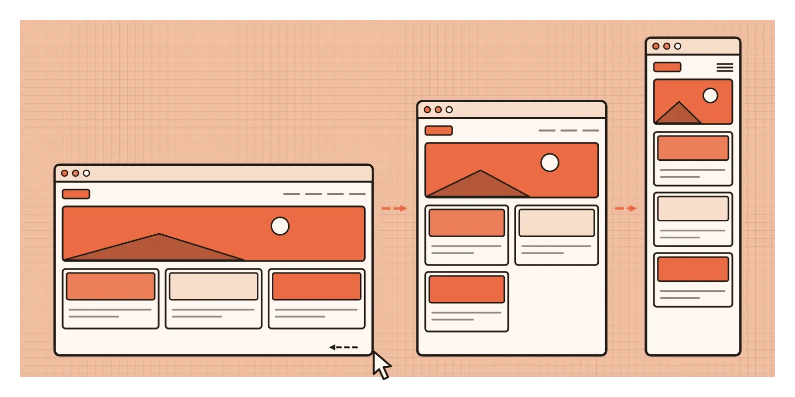
Responsive design is the practice of making one page, from one set of code, that adapts its layout to whatever screen it's shown on. Mobile-first design, its close companion, is the habit of designing for the smallest screen first and adding to the layout as the space grows. Together they're less a visual style than a change in what a designer makes. Not a fixed picture of a page, but a set of rules for how that picture should rearrange itself.
Best viewed at 800 by 600
For most of its first fifteen years, the web pretended to be paper. Designers trained in print wanted the control they were used to, so they fixed their pages at a set width in pixels and left empty margins around them. In the late 1990s, sites carried small badges announcing the screen size and browser they were "best viewed" in, as if visitors would rearrange their computers to suit. By the late 2000s, the convention had settled on grids about 960 pixels wide, which fitted inside most desktop screens and divided neatly into columns.
There had always been voices against this. In April 2000, the Australian developer John Allsopp wrote an essay in A List Apart called "A Dao of Web Design", which Marcotte later quoted. Allsopp argued that the web's flexibility, the fact that you never know how big the window or the text will be, wasn't a flaw to be suppressed but the nature of the medium. For a decade few people listened, because nearly everyone looked at the web on similar screens.
Phones broke that. The iPhone, announced in January 2007, showed the full desktop page shrunk onto a virtual canvas 980 pixels wide, and you pinched and double-tapped to zoom into the part you wanted. Apple added a small instruction, the viewport tag, that let a page ask the phone to use its real width instead, and companies began building separate mobile sites, often at an address starting with "m.", which usually offered less and were maintained by a different team.
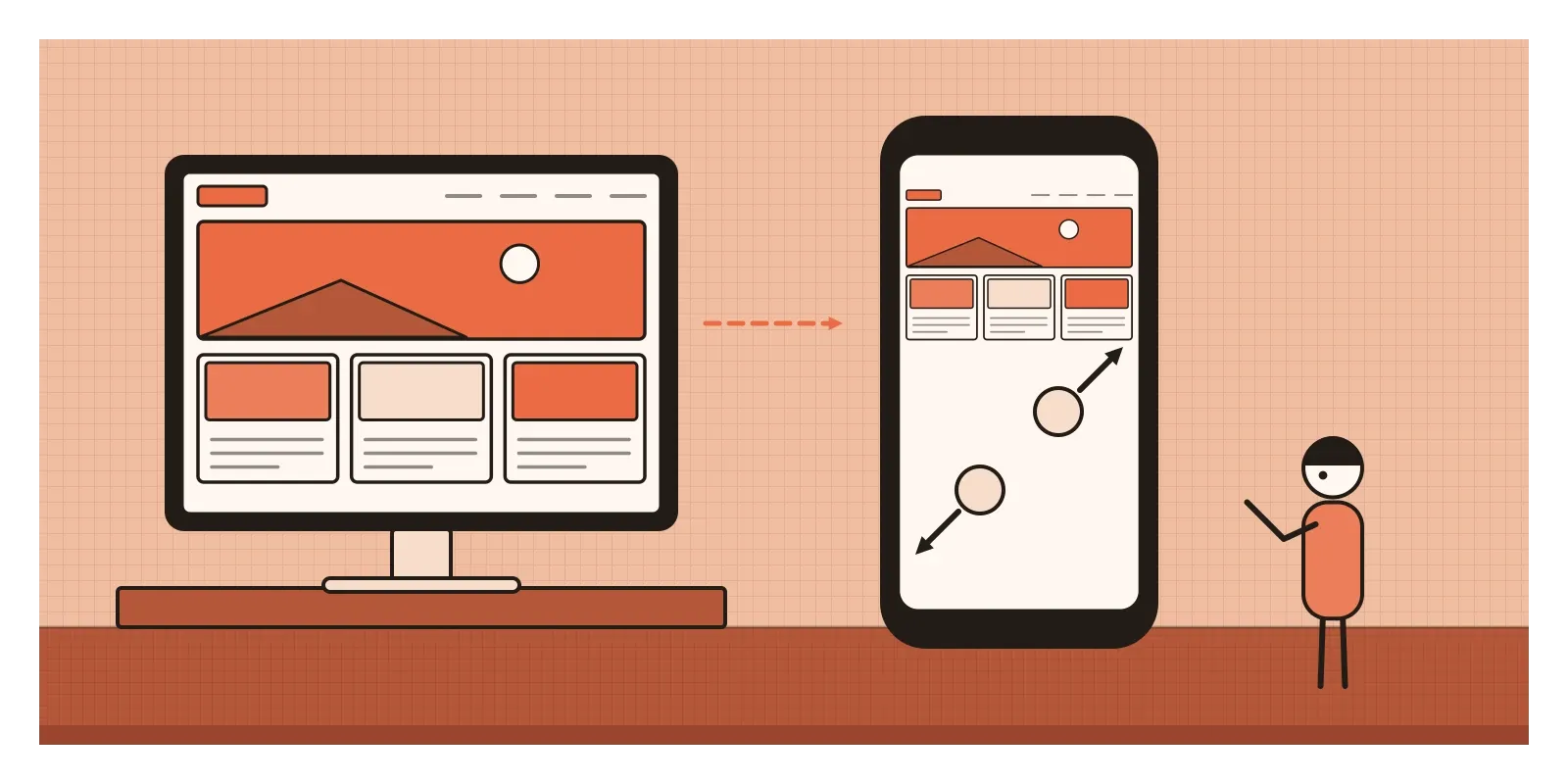
Responsive design replied to both habits at once, the fixed desktop page that ignored the phone and the second-class mobile site that ignored most of what the desktop page contained. It also helps explain the flat design and Material Design of the previous posts. Gradients, textures and pixel-perfect ornament are hard to stretch across a hundred screen sizes. Flat shapes, simple type and clear layers stretch easily.
A grid, a picture, a question and a newspaper
Marcotte's method had three ingredients, which he set out more fully in a short book, Responsive Web Design, in 2011. The first was a fluid grid, with columns sized as percentages of their container. The second was flexible images, pictures told never to grow wider than the column holding them. The third was media queries, small questions a style sheet can ask the device, such as how wide the window is, with different rules applied depending on the answer. None of the three was new. What was new was the recipe, and a name that gathered scattered tricks into one idea people could argue for in meetings.
The other half came from Luke Wroblewski, an American interaction designer who had led design work at Yahoo. He had been arguing since 2009 that companies should design for mobile first, and in 2011 he published a slim book called Mobile First. Phone use, he said, was growing so fast that it would soon be the main way many people met the web. A small screen forces a team to decide what actually matters, because there isn't room for everything a committee wants. And phones could do things desktops couldn't, such as knowing where you were, so starting with them opened possibilities rather than only taking things away. If something isn't important enough to earn a place on the small screen, perhaps it isn't important on the big one either.
The project that convinced many doubters was a newspaper. In September 2011, The Boston Globe launched a website designed by the Boston studio Filament Group with Marcotte: one responsive site for phones, tablets and desktops, with columns of news that multiplied as the window widened. It showed the approach could work for a large, busy, advertising-funded publication, not only a designer's portfolio. Free frameworks such as Bootstrap, released by two engineers at Twitter in 2011, soon made the method routine, and in April 2015 Google began favouring phone-friendly pages in its mobile search results, an update developers nicknamed "Mobilegeddon".
Reading a page that bends
Responsive design is unusual among the movements in this series because its signature isn't a look but a behaviour. The surest test is to change the width of the window and watch. A responsive page doesn't shrink like a photograph. It reflows: columns slide under one another, a row of three cards becomes a stack, images rescale, and a full navigation bar collapses into a single button. The widths at which the layout changes are called breakpoints, and a good designer places them where the content starts to look strained, not at the exact widths of this year's phones.
A look grew out of the behaviour, though. Because every block had to work as a full-width strip on a phone and as one column among several on a desktop, pages came to be built from stacked horizontal bands: a hero image with a headline, a row of three features each with an icon, a band of customer quotes, a big button, a footer. Body text grew larger and line spacing more generous. Links and buttons grew into thumb-sized targets. Navigation hid behind the three-line icon nicknamed the hamburger, usually traced back to the Xerox Star workstation of 1981. And layouts became more linear, because a single column forces you to decide the order in which everything will be read.
A country that met the internet on a phone
In India, mobile-first was never just a design philosophy. For hundreds of millions of people, the phone was the first and only computer they owned, and the web arrived in their hands rather than on a desk. For years that meant small screens, slow connections and expensive data, so pages had to be light as well as narrow. Then, in September 2016, Reliance Jio launched its 4G network with months of free data, and mobile data prices fell so sharply that within a few years Indians were among the heaviest mobile data users in the world.
Indian companies tested the idea to its limit. In May 2015, the fashion retailer Myntra shut its website and went app-only, and its parent company, Flipkart, shut its mobile website for the same reason. Neither bet held for long. Many first-time users had little storage on cheap phones and didn't want yet another app, and people still arrived from search results and shared links. Flipkart's answer, launched in late 2015 with help from Google's Chrome team, was Flipkart Lite, one of the first large examples of what came to be called a progressive web app: a responsive website that loads quickly on weak connections, keeps working offline and can sit on a phone's home screen like an app. The model it proved, the web as a light alternative to a heavy app, matters most where phones are cheap and connections uneven.

There's a quieter lesson in Indian languages, too. Scripts such as Devanagari, Bengali and Tamil usually need more vertical room than Latin letters, for the marks above and below the line, and translated labels are often longer than their English originals. A layout tuned with English placeholder text can break the moment the real Hindi or Tamil copy arrives, so in India designing responsively means testing real languages at real widths.
Everything bends now, and everything looks alike
Today responsive design is so normal that nobody bothers to name it. Design tools let you set constraints so a frame stretches and its contents behave, and design systems describe how each component changes as space changes. Since around 2023, all the major browsers have supported container queries, which let a component respond to the size of the box it sits in rather than the whole window, a natural next step from Marcotte's media queries. Accessibility guidelines require the habit, too. Since 2018, the Web Content Accessibility Guidelines have asked that content reflow into a single column at a width of 320 pixels, roughly what someone sees after zooming a desktop browser to 400 percent. Responsive layout turned out to be a matter of access, not just convenience.
The movement has real critics, though. The first complaint is that it made the web look the same. Once every site was assembled from the same flexible bands, often with the same frameworks, a bank, a bakery and a software company could share an identical shape. By the mid 2010s designers were grumbling about a web of interchangeable templates, and the next movement in this series grew partly out of that boredom. The second is weight. Phones were often sent the same large images, scripts and fonts as desktops and told to hide them, so pages grew heavier through the 2010s even as more people browsed on slow connections.

The third is that mobile-first sometimes slid into mobile-only, with desktop pages that are phone layouts stretched across a wide screen and important things buried behind the hamburger. Research by the Nielsen Norman Group has found that people use navigation they can't see less often than navigation they can, which is a polite way of saying out of sight is out of mind. And for all its talk of every screen, responsive design mostly meant every rectangular screen held by a sighted person.
Drag the corner of a window
To see it for yourself this week, open a news site on a laptop, grab the edge of the browser window and slowly drag it narrower. Watch for the breakpoints, the moments when columns jump under one another or the menu folds away, and ask whether each change happens because the content needed it or because a phone of that width happens to exist. Then compare a printed Indian newspaper with its phone version on the same morning. What moved to the top, what disappeared and what got bigger? For an exercise, redraw a screen you're designing at 320 pixels wide before anything else, deciding the reading order of every element. Whatever doesn't fit the small screen deserves a hard look on the big one.
Marcotte began with a pane of smart glass clouding over as a room filled up, a building noticing the people inside it. That's the idea that lasts. A responsive page isn't a picture squeezed into a frame. It's a design that pays attention to where it is and who's holding it. In the next post, on Brutalist web design, a scattered group of designers decided that all this smooth, well-behaved, interchangeable flexibility had become dull, and went looking for something rougher.
Further reading: Ethan Marcotte, "Responsive Web Design" (2010) · Ethan Marcotte, Responsive Web Design (2011) · Luke Wroblewski, Mobile First (2011) · John Allsopp, "A Dao of Web Design" (2000) · Michael Fox and Miles Kemp, Interactive Architecture (2009)
A reply toFixed-width pages built for one desktop screen, and the stripped-down separate sites made for phones.