Brutalist Web Design
Why some web designers in the 2010s chose raw HTML, clashing colours and deliberate awkwardness.
Brutalist Web Design
A creative director starts collecting rough websites
In 2014, Pascal Deville, a creative director at a Zurich advertising agency called Freundliche Grüsse, started a website that collected other websites. The ones he chose looked, by the standards of the day, wrong. Some were set entirely in the browser's default Times New Roman, with blue underlined links and grey buttons that looked as if nobody had styled them at all. Others were deliberately loud: clashing colours, enormous type crashing into pictures, tables with their borders on show, pages that scrolled sideways or flickered. He called his site Brutalist Websites, and it was itself almost bare, a long list of screenshots with a few words about who had made each one.
For two years it was a niche bookmark among designers. Then, in 2016, it was shared on Hacker News, the discussion site for programmers, spread quickly and was picked up by newspapers, which enjoyed the idea of websites that looked ugly on purpose. Deville had borrowed the name from the post-war architecture I wrote about in the post on Brutalism, which took its name from béton brut, raw concrete. His definition, roughly, was that Brutalism on the web was a younger generation's reaction against the lightness, optimism and frivolity of contemporary web design. He also insisted it was more a stance than a look.
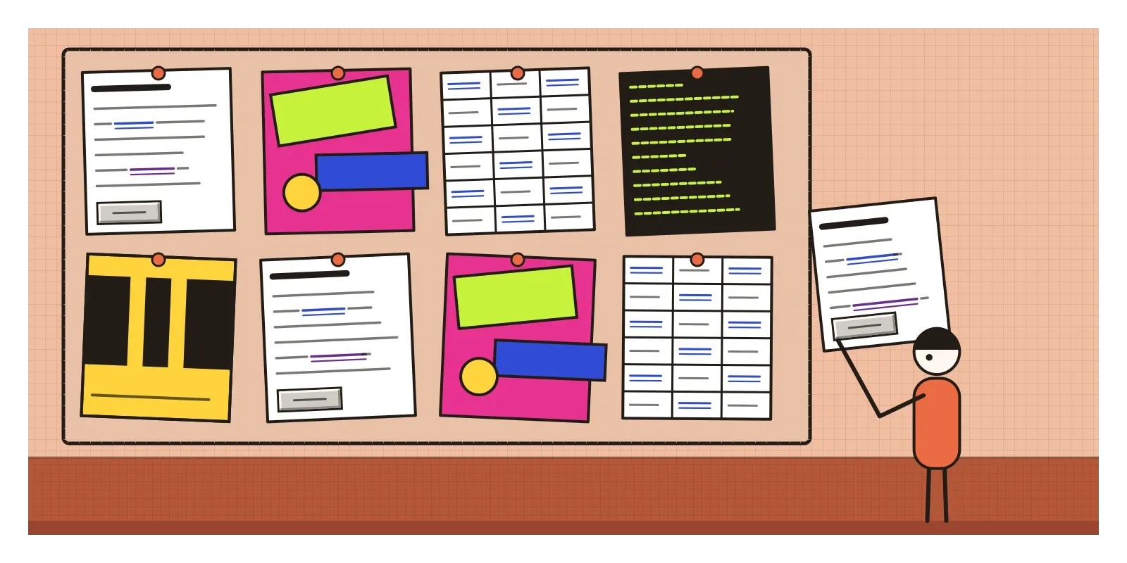
Brutalist web design is the name for a loose strand of websites, mostly from the mid 2010s to the end of that decade, that rejected the polish of mainstream web design. Some showed the raw materials of the web instead, plain HTML, default fonts and visible structure. Others threw good taste out of the window altogether. It was never a school with members. It was a mood that one collection gave a name to.
Tired of the smooth, smiling template
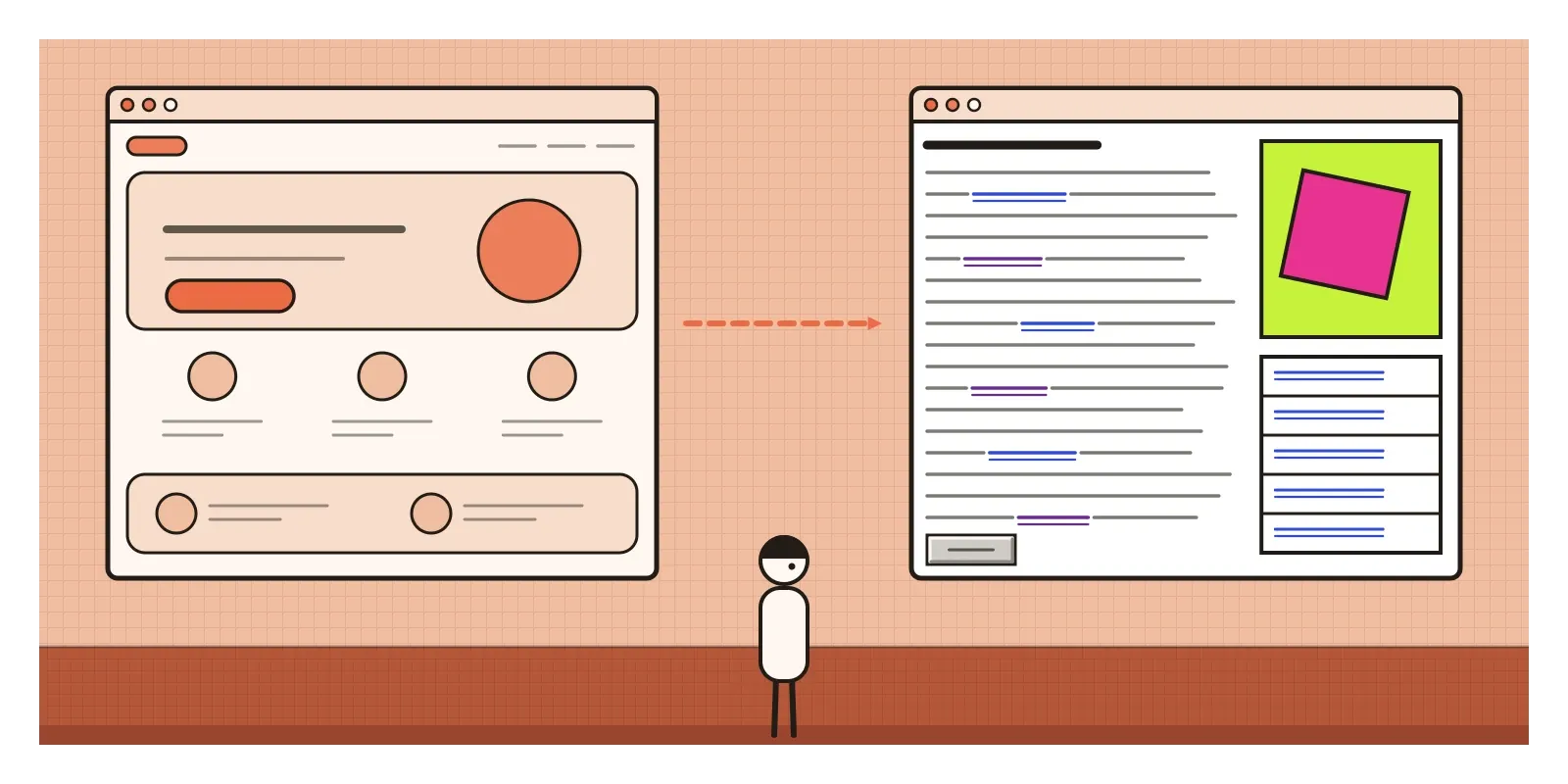
What it replied to is clear from the previous post. By the mid 2010s, responsive design, flat design and a handful of free frameworks had made the web very usable and very samey. A typical site opened with a full-width photograph and a confident headline, then a row of three icons with a sentence under each, then customer quotes beside round portraits, then a big rounded button. Website builders sold that pattern as ready-made themes. The pages were friendly, efficient and interchangeable, and they all seemed to smile at you.
Brutalist sites refused to smile. Many were made by designers, artists, students, small studios and musicians, people who weren't trying to sell software subscriptions and who wanted a website to feel like something a person had made. There was also an argument about honesty, borrowed loosely from the architects. The Brutalists of the 1950s wanted buildings to show their concrete and their structure instead of hiding them behind decoration. The web Brutalists wanted the same for HTML: show a link as a link, a table as a table and a page as a document in a browser, not as a glossy brochure pretending to be something else.
Classified ads, a school wiki and two artists breaking the browser
Some of the most admired examples weren't made in the 2010s at all. Craigslist, the classified ads site that grew out of an email list in San Francisco in the mid 1990s, has barely changed its look in decades: blue links on white, long lists of categories, almost no pictures. The Drudge Report, a much-visited American news aggregator, was for years just columns of headlines in a typewriter-style font. Berkshire Hathaway, Warren Buffett's company, has kept a famously bare home page of plain links. None of them was trying to be Brutalist. Their owners simply never saw a reason to redesign, and they became found objects for designers who admired how fast, clear and unpretentious they were.
The art-school version came from Yale. The website of the Yale School of Art, built by the New York studio Linked by Air, has long been a wiki that students and staff can edit, so its backgrounds, pictures and type change constantly and often clash. It looks chaotic, and it's meant to, a shared and unfinished surface rather than a polished front door. Much earlier, in the mid 1990s, the artist duo JODI, Joan Heemskerk and Dirk Paesmans, made web pages that seemed to break the browser itself, screens of flickering symbols and raw code. Their work is usually filed as net art rather than design, but it showed early on that the web's own glitches and materials could be the subject.
Later, the developer David Copeland set out a calmer version in a short set of guidelines on a site called Brutalist Web Design. His argument was that a website's real materials are its content, its hyperlinks and the browser, so a brutalist site should keep content readable on any screen, underline only links, make buttons look like buttons and stop fighting the browser's defaults. That's a much quieter idea than many of the sites in Deville's collection, and the two strands, raw honesty and loud anti-taste, ran side by side under the same name.
Default blue, hard borders, nothing eased in
The quieter kind of Brutalist site is easy to spot because it looks almost unstyled. The type is the browser's default serif, or a monospaced font like old computer code. Links are blue and underlined, and the ones you've visited turn purple. Text runs edge to edge or sits in a single narrow column. Borders on tables and boxes are visible, often a single hard black line. Pictures are dropped in at their natural size. There are no gentle hover animations, no rounded corners, no soft shadows and no stock photographs of smiling teams.
The louder kind keeps the rawness and adds collision. Look for colours that fight, acid green on magenta or pure blue on red. Enormous type that runs off the edge of the screen. Elements piled on top of each other or set at odd angles. The cursor replaced by an image. Pages that scroll sideways, play sound or move in jerky steps. The grid is often visible but broken on purpose. If the mainstream web of the time was a well-run shop, these sites were a zine, a gig poster or a notebook, and many owed as much to punk flyers and the grid-breaking typography of the 1970s and 1980s, which has its own post earlier in this series, as to concrete buildings.
There's a side you can't see from the screen, too. Deville argued that Brutalism applied to the code as much as the look, and many of these sites were written by hand, page by page, without the large frameworks and libraries that most commercial sites loaded. That often made them small and fast. A page of plain HTML can arrive almost instantly on a weak connection, while a polished template might make you wait for megabytes of scripts before showing a single sentence. In that sense the plainest Brutalist sites were honest about weight as well as appearance.
Plain by necessity
India has its own raw web, but almost none of it was made as a style. If you've ever checked exam results, a train booking or a government notice, you'll know the look: dense tables of blue links, bold text in several colours, small print, scrolling notices and lists that go on and on. Sites such as Sarkari Result, which gathers government job and exam announcements and is visited by millions of students and job-seekers, look closer to Deville's idea than many of the portfolios in his collection. They load quickly on cheap phones and slow connections, and they put every link on the page at once, which is exactly what someone checking a result at a crowded cyber cafe or on a bus wants.
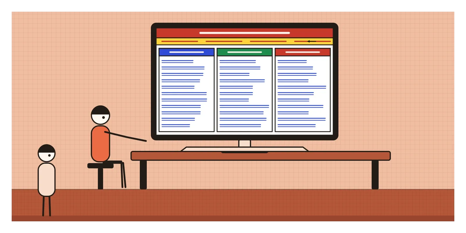
The parallel is loose, and I think the difference is the point. In Zurich or New York, a raw website was a choice made by people who could easily have had a polished one, and its roughness read as confidence. In India, a plain, crowded page usually signals the opposite, a small budget or a site nobody has had time to update. A brutalist portfolio shown to many Indian users might read not as daring but as broken, and perhaps as untrustworthy. Style depends on what the viewer has seen before. What the two kinds of raw site share is their real virtue, speed, density and nothing standing between a person and the information they came for.
Thick outlines, hard shadows and a protest that became a template
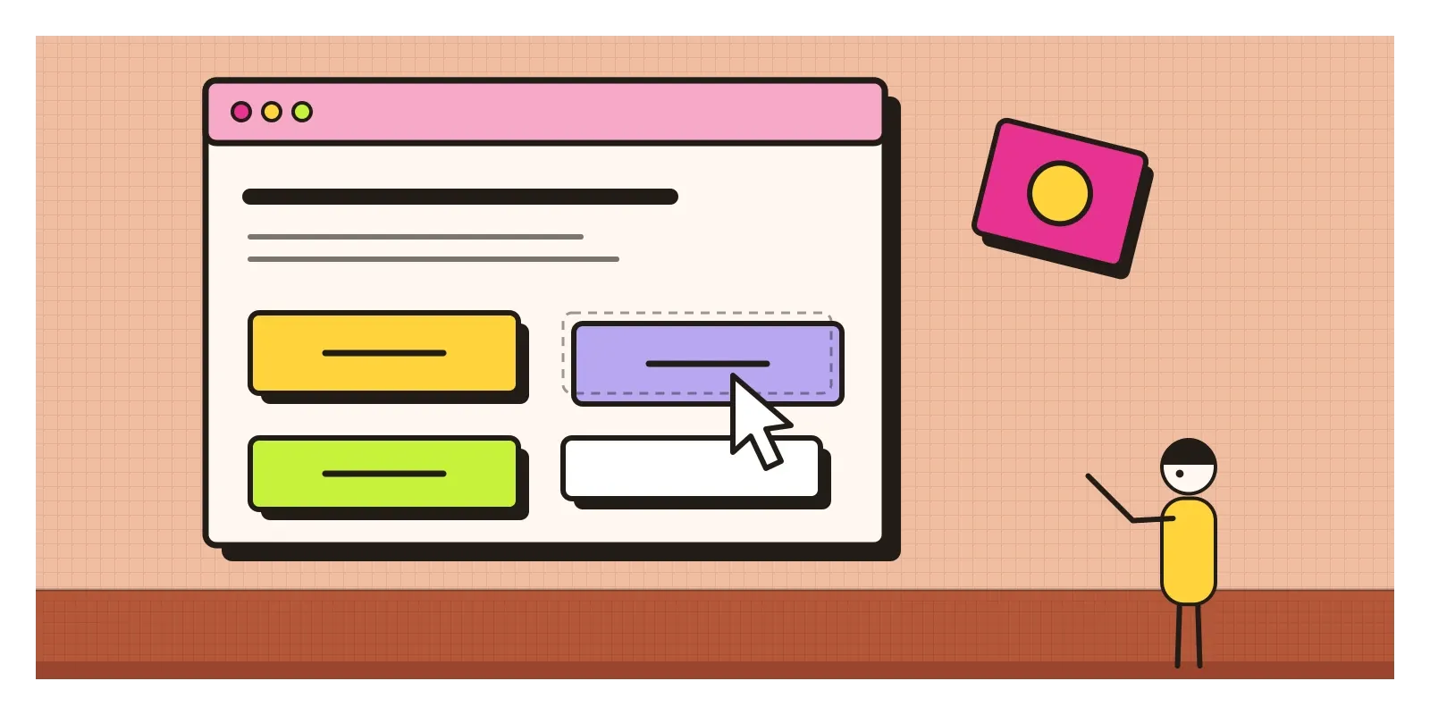
The loud strand faded around the end of the 2010s, but a tidier descendant, which I mentioned briefly in the post on Brutalism, is everywhere now. Usually called neo-brutalism, it keeps the thick black outlines, flat saturated colours, chunky type and hard shadows offset to one side with no blur at all, so that buttons look like blocks of card you could pick up. Gumroad, a site for selling digital products, was one well-known early adopter when it redesigned around 2021, and the look spread to start-ups, landing pages and design tools, with whole interface kits to download. It's far friendlier than the original: legible, organised and playful rather than hostile. Its lasting lesson for designers is that personality can come from structure itself, a border, a shadow, a grid you can see, rather than from decoration added on top.
That's also the sharpest criticism of the movement. A stance against templates became a template within a few years, sold as a theme like any other. The original wave had harder problems too. Many of its sites were difficult to use, with vibrating colour combinations, text you couldn't read, navigation hidden as a joke and sound that played without warning. Flashing and violently clashing colours can be genuinely uncomfortable for people with visual stress or migraine. And it was a luxury. The sites that could afford to be difficult were mostly portfolios, art schools, fashion labels and record labels, whose visitors were already committed. A bank or a hospital that made you hunt for the button would simply lose people.
Copeland's honest version holds up best, I think, because it was never about looking rough. It was about respecting the browser and the reader, and that's an idea any product team can use: before adding a single style, ask whether the plain page already works.
Turn the styles off
To see it for yourself this week, open a website you use often in Firefox and choose to view it with no page style at all, an option in the browser's View menu. Look at what's left: headings, paragraphs, lists and links in default type. That's the raw material the Brutalists wanted to show. Then browse Deville's collection and Copeland's short guidelines, and sort the sites you find into the two kinds, honest and loud. For an exercise, make a one-page site about something you love using only plain HTML and no style sheet, in under an hour. You'll be surprised how much a heading, a list and a link can carry, and you'll learn exactly where you miss design most.
Deville's collection began as a handful of screenshots of sites that looked wrong, and it ended up naming a decade's irritation with smooth, smiling websites. Like every reply in this series, it was answered in turn. In the next post, on neumorphism, designers went the opposite way, towards pale, pillowy interfaces where every button seemed moulded from the same soft plastic.
Further reading: Frank Chimero, "The Web's Grain" (2015) · Olia Lialina and Dragan Espenschied (eds), Digital Folklore (2009) · Rachel Greene, Internet Art (2004) · Reyner Banham, The New Brutalism: Ethic or Aesthetic? (1966)
A reply toThe smooth, smiling, interchangeable templates of the responsive web.