Psychedelic Design
How 1960s concert posters bent letters into flames, set colours humming and asked to be looked at slowly.
Psychedelic Design
A poster nobody could read
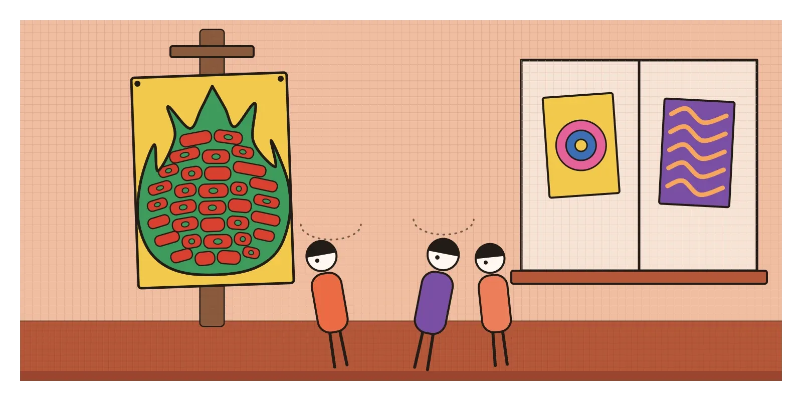
In the summer of 1966, a young designer called Wes Wilson was making posters for the Fillmore Auditorium, a dance hall in San Francisco where the promoter Bill Graham put on rock concerts every weekend. Wilson worked at a small print shop whose customers included Graham, and he had begun drawing every letter on his posters by hand. For a show by the Association and Quicksilver Messenger Service, he went further than before. He bent the band names, the dates and the name of the hall so that together they filled the shape of a tall, licking flame. All the words were there, but you had to work to find them.
Graham, the story goes, looked at it and said it was nice, but he couldn't read it. Wilson's answer was that this was exactly why people would stop and look at it. He was right. The posters went up on telegraph poles and in shop windows across the city, and people stood in front of them tilting their heads, some swaying from side to side as they followed the curling words. Many were peeled off and taken home within hours. The story reaches us second-hand, from interviews and recollections given years later, so the exact words are approximate. But everyone who tells it agrees on the point: a poster that took time to read was worth more than one that didn't.
That flame of letters is a good way into psychedelic design, the style of concert posters, record covers, light shows and underground magazines that came out of the 1960s counterculture, first in San Francisco and soon in London. It's built from hand-drawn lettering that swells and melts to fill a shape, colours chosen to clash and vibrate, and pictures borrowed from old engravings, Art Nouveau and Op Art, all packed in edge to edge. It took its name from psychedelic drugs, LSD above all, and it set out to look the way those drugs were said to make the world feel: alive, shimmering, endless and hard to pin down.
Ballrooms, light shows and a borrowed alphabet
In the mid-1960s, the Haight-Ashbury district of San Francisco was full of cheap rooms, students and musicians. LSD was still legal in California until October 1966, and a new kind of event grew up around it. In January 1966, the Trips Festival at the Longshoremen's Hall brought together bands, Ken Kesey's Merry Pranksters and the writer Stewart Brand for three nights of music and projections. Graham, who handled the business side, was by then starting regular dances at the Fillmore. Across town, a collective called the Family Dog, led by Chet Helms, ran dances at the Avalon Ballroom. Shows every week meant new posters every week, printed quickly and cheaply by offset lithography.
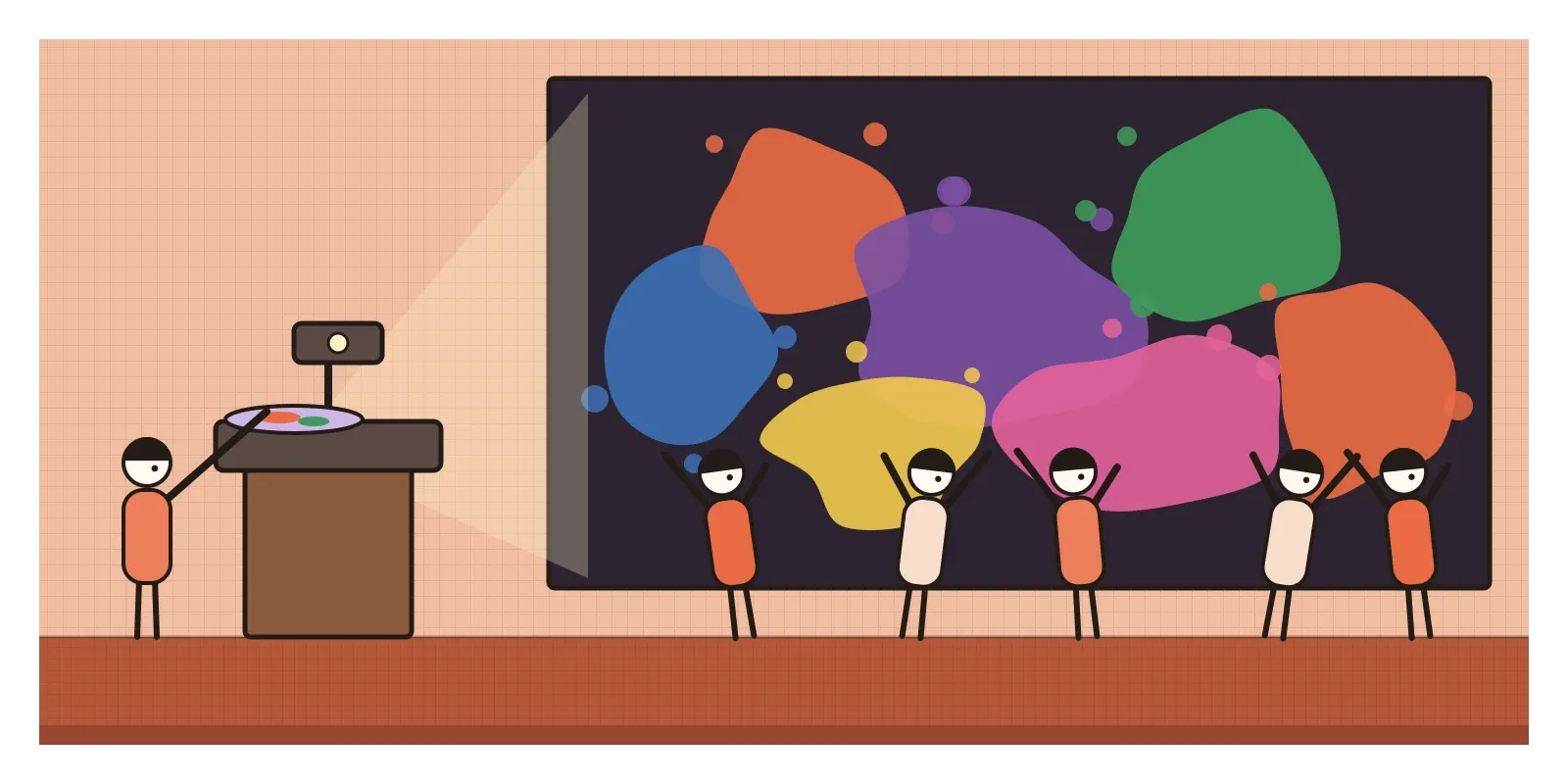
Inside the halls, the walls moved. Light-show artists such as Bill Ham put drops of coloured dye, oil and water between two curved clock glasses on an overhead projector, pressing and swirling them by hand so that huge blobs of colour slid and merged across the walls and the dancers. The posters were trying to do on paper what the light shows did in the room.
What all this replied to was the look of the parents' generation. By the early 1960s, good design meant the clean grid, plain sans serif type and fast, readable clarity of corporate modernism, the style I wrote about in the post on Swiss Style, The counterculture wanted none of it. Oddly, its way out was to go backwards. In London, a large Aubrey Beardsley exhibition at the V&A in 1966 put his curling black drawings back in front of young designers, and Mucha's posters, which I mentioned in the post on Art Nouveau, were reprinted for bedroom walls. Wilson's own lettering came from Vienna. He had seen the catalogue of a 1965 University of California exhibition of Jugendstil and Expressionist art, with a poster by Alfred Roller, one of the designers of the Vienna Secession, whose blocky letters filled every scrap of space. Wilson loosened Roller's alphabet and set it moving. Rejecting the clean modernism of their parents, these designers skipped back to their grandparents.
The Big Five, a library and an Albers student
Wilson was the first of a small group of San Francisco poster artists who came to be called the Big Five. Victor Moscoso was the one with formal training. Born in Spain, he had studied at Cooper Union and then at Yale under Josef Albers, whose colour experiments I wrote about in an earlier post. When he began designing for the Family Dog in the autumn of 1966, he noticed that the self-taught artists around him were doing well by ignoring everything he'd been taught. So he turned his lessons inside out. A poster was supposed to deliver its message in a glance, so he asked how long he could hold someone in front of it. Vibrating colours were supposed to be avoided, so he used them on purpose, setting a red against a green of the same lightness until the edge between them buzzed.
Rick Griffin, a cartoonist from the surfing magazines of southern California, brought a crisp line to winged eyeballs and lettering so ornate it read like a puzzle. Stanley Mouse and Alton Kelley worked as a pair and raided the San Francisco Public Library for old pictures. A skeleton crowned with roses, which they took from Edmund J. Sullivan's illustrations for an Edwardian edition of the Rubaiyat of Omar Khayyam, went onto a 1966 Avalon poster for the Grateful Dead and stayed with the band for decades. In July 1967, the Moore Gallery in San Francisco gave the five of them a show together, the Joint Show, one of the first times these throwaway street posters were treated as art.
After Wilson stopped working for Graham in 1967, many of the Fillmore posters were drawn by Bonnie MacLean, who worked in Graham's office and was married to him, in a style of her own. In London, Michael English and Nigel Waymouth, working as Hapshash and the Coloured Coat, screen-printed posters for the UFO club in fluorescent and metallic inks, and the Australian artist Martin Sharp drew covers for the underground magazine Oz and the swirling cover of Cream's album Disraeli Gears (1967). By 1968, the style had reached the cinema in Yellow Submarine, the Beatles' animated film, designed by Heinz Edelmann.
Letters that melt and colours that hum
Psychedelic design is the opposite of the Swiss poster in almost every way, which makes it easy to recognise. Start with the lettering. It's drawn, not set, and it behaves like a liquid poured into a mould. Letters swell, squeeze and stretch to fill a shape, often a circle, a flame or a body, so the gaps inside and between them shrink almost to nothing. The words stop being a label on the picture and become the picture.
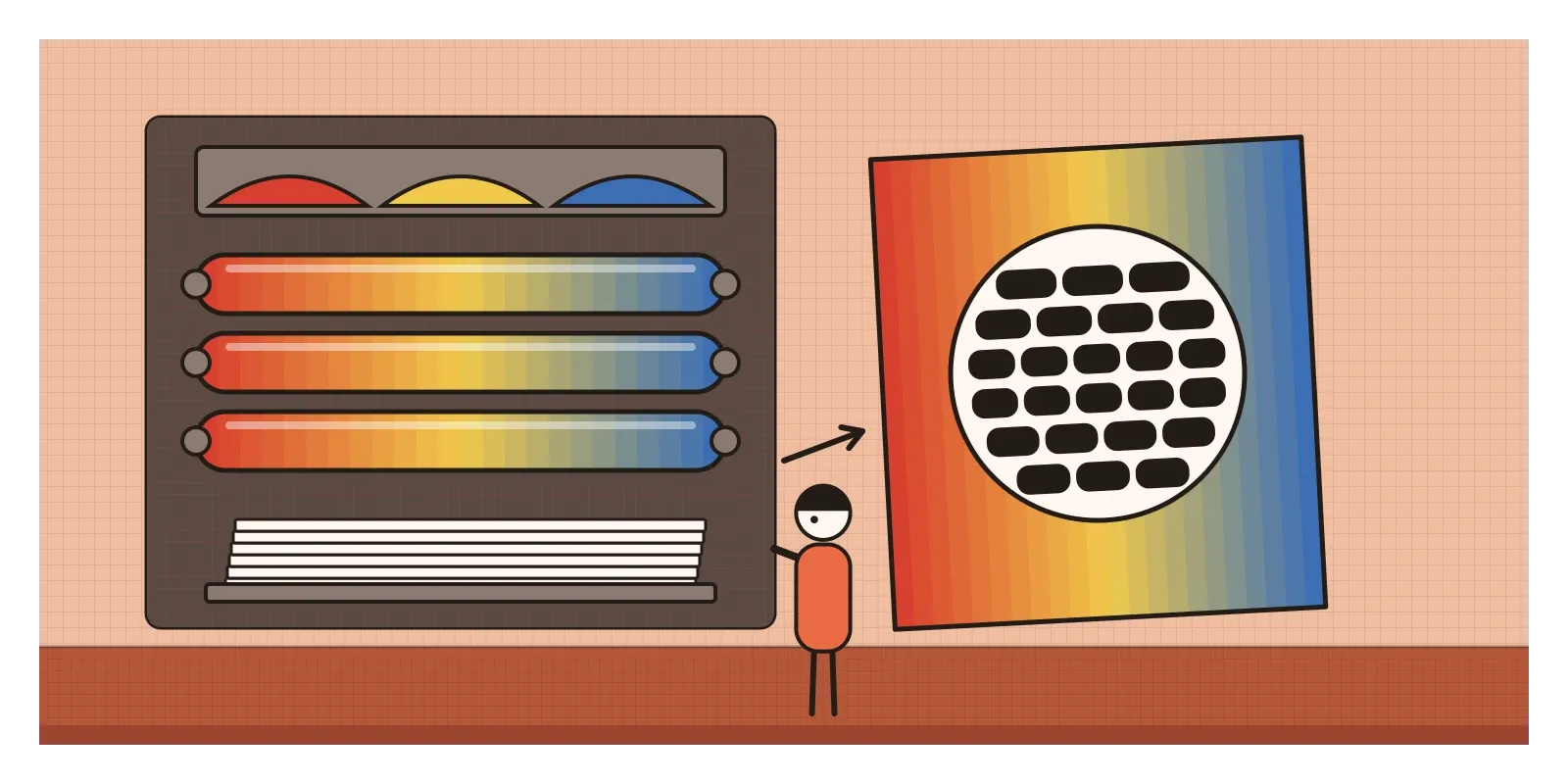
Then the colour. The classic trick is two complementary colours of the same value, red and green, orange and blue, violet and yellow, placed edge to edge. Because the eye can't separate them by lightness, the boundary seems to flicker, the effect Op artists had been exploring in the gallery. Fluorescent inks glowed under the ultraviolet black lights in the halls. Printers added a cheap trick of their own called the split fountain: two or three inks were laid side by side in the press's ink trough, and the rollers blended them into a rainbow gradient across the sheet, so that no two prints came out quite the same.
The pictures were mostly borrowed and collaged, with Victorian engravings, Art Nouveau women with flowing hair, old photographs, eyes, skulls, roses, mandalas and concentric rings all fair game. Layouts were usually symmetrical and centred, and almost nothing was left empty. Where a Swiss designer would use white space to make one thing clear, a psychedelic designer filled every corner to make you look again. Both are deliberate answers, to different questions.
A sitar at Monterey
India was everywhere in the counterculture, though it was mostly an imagined India. George Harrison played a sitar on the Beatles' "Norwegian Wood" in 1965, and in 1966 he travelled to India to study with Ravi Shankar. In June 1967, Shankar played a long afternoon set at the Monterey Pop Festival in California, and in 1969 he played at Woodstock, to young crowds who knew little of the tradition he had trained in for decades. He was uneasy about how much the music was being tied to drugs, and later said so plainly. Early in 1968 the Beatles went to the ashram of Maharishi Mahesh Yogi at Rishikesh, on the Ganga, where they wrote many of the songs for their next album. Paisley, the Kashmiri shawl motif I wrote about in the post on Indian aesthetic concepts, came back on shirts and dresses, and Indian block-printed cotton bedspreads became wall hangings in student rooms from California to London.
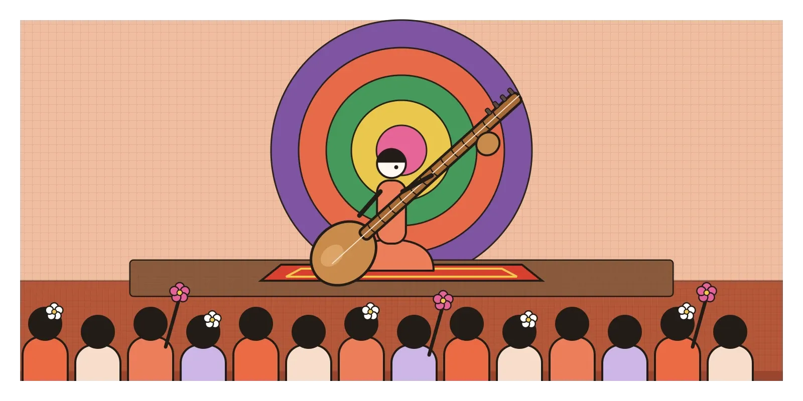
India looked back with a raised eyebrow. In 1971 Dev Anand made Hare Rama Hare Krishna, a Hindi film about the hippie scene in Kathmandu. Its message was disapproving, but its most famous song, "Dum Maro Dum", composed by R. D. Burman and sung by Asha Bhosle, borrowed the fuzzy guitars and woozy mood of the music it was warning against, and the film's look was full of the counterculture's colours. Indian popular images, from calendar prints to cinema hoardings, had in any case been saturated with colour long before San Francisco discovered it. The parallel shouldn't be pushed too far, though. Indian artists of the same years were drawing on Tantric diagrams for reasons of their own, which I'll come to in the post on Neo-Tantra.
From light shows to LED walls
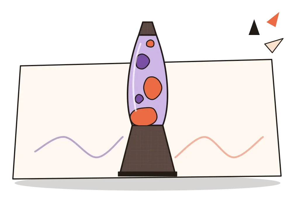
Psychedelic design never quite went away. Gig posters for indie bands and music festivals still bend letters into blobs and lay fluorescent colours side by side. The lava lamp, invented in Britain in 1963 by Edward Craven Walker, sat on countless student desks as a liquid light show you could plug in. Music visualisers such as Winamp's MilkDrop (2001) turned songs into swirling colour on screen, and the LED walls behind today's concert stages are liquid light shows with more pixels. In 2015, a Google engineer, Alexander Mordvintsev, released DeepDream, which made a neural network exaggerate the patterns it saw in a photo, and its images, crowded with eyes and dog faces, were instantly called psychedelic. AI image tools now produce the look on demand, and type tools with variable fonts and warp effects can bend a word into a flame in seconds, a job Wilson did by hand.
For anyone designing interfaces, the lasting lesson is Graham's complaint. On a screen people scan rather than read, and a label that makes them work is a bug. On a poster competing with a hundred others, the same difficulty can be a hook. Knowing which situation you're in is most of the job.
The style had real problems. It was legible mainly to insiders, which was part of its appeal and part of its snobbery, and it was sold off almost at once. By 1967 swirly lettering was selling soft drinks, and the designer Peter Max put his cosmic, cheerful version of it on clocks, ties and bedsheets. The Summer of Love that year brought tourists and runaways who overwhelmed the Haight, and by October residents were holding a mock funeral called the Death of the Hippie. The Big Five were all men, and artists such as Bonnie MacLean are remembered far less. And the borrowing went beyond old engravings: Native American photographs, Hindu gods and Tibetan mandalas were used as decoration by people who rarely asked what they meant. By the time the Fillmore West closed in 1971, the moment was over. Punk would later reply with photocopies and ransom-note letters, and the next post, on Conceptual Art, goes the opposite way entirely, giving up the dazzle, and sometimes the object, for an idea.
Stand still in front of it
If you can, see the posters themselves. The V&A in London holds a large collection of them, and so do several American museums,. In India, the old Beatles ashram at Rishikesh, inside the Rajaji Tiger Reserve, has been open to visitors since 2015, its domed meditation huts now covered in murals. For reading, Paul Grushkin's The Art of Rock reproduces hundreds of the posters, and Tom Wolfe's The Electric Kool-Aid Acid Test is a vivid, partisan account of the scene.
For an exercise, write a single word, your name will do, and redraw it so that it fills a circle completely, swelling some letters and squeezing others until there are no gaps left. Then colour it with a red and a green of the same lightness and watch the edges. Finally, hand it to someone and time how long it takes them to read it. You'll understand both Graham's complaint and Wilson's answer.
Graham couldn't read the flame. Sixty years later, it's the reason people still stop in front of it.
Further reading: Paul D. Grushkin, The Art of Rock: Posters from Presley to Punk (1987) · Christoph Grunenberg (ed.), Summer of Love: Art of the Psychedelic Era (2005) · Ted Owen and Denise Dickson, High Art: A History of the Psychedelic Poster (1999) · Tom Wolfe, The Electric Kool-Aid Acid Test (1968)
A reply toThe clean grid and quick, readable clarity of 1950s corporate modernism.