Postmodernism
How architects brought back columns, colour and jokes, and why the party ended in leaks and arguments.
Postmodernism
A street of plywood in an old rope factory
On 27 July 1980, the Venice Biennale opened its first international exhibition given over entirely to architecture. It was held in the Corderie of the Arsenale, the enormously long brick hall where the Venetian navy once made its ropes. The curator, the Roman architect Paolo Portoghesi, called the show The Presence of the Past, and he built a street down the middle of the hall. On each side stood ten full-size facades, each designed by a different architect, each about three storeys high, and each made by carpenters and plasterers from Cinecittà, the film studios in Rome. Behind every front was a small room of drawings and models. Portoghesi named the whole thing the Strada Novissima, roughly "the newest street".
It was a film set of a city that had never existed: arches, columns, gables and pediments from architects including Robert Venturi and Denise Scott Brown's firm, Michael Graves, Charles Moore, Hans Hollein, Léon Krier, Robert Stern and Arata Isozaki. A few of the people on the street, Rem Koolhaas and Frank Gehry among them, would soon head off in very different directions, but for one summer they shared an address.
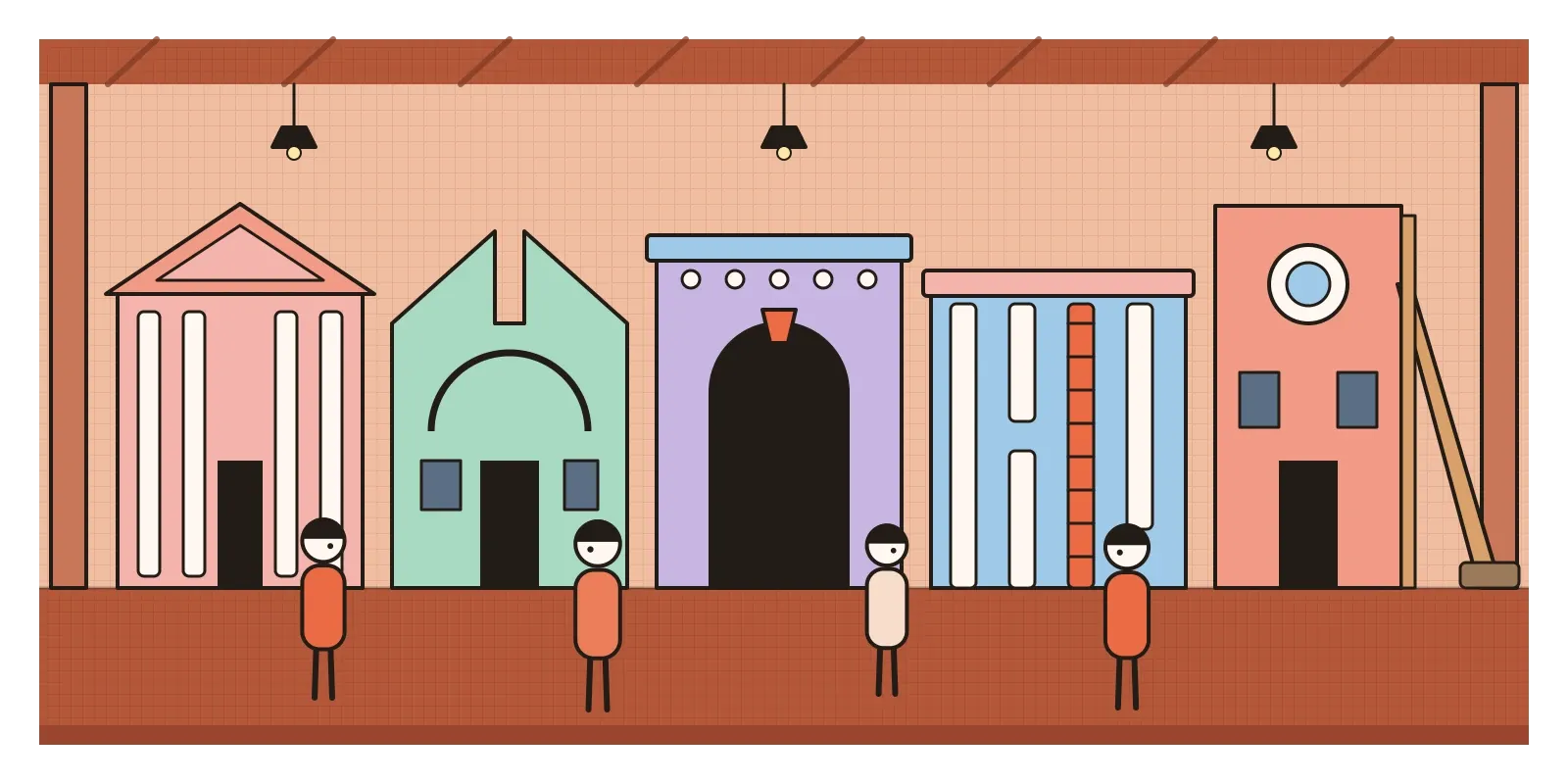
Portoghesi's street was the moment Postmodernism became a public spectacle. The word has meant different things in philosophy, literature and art, and historians argue about where it starts and stops, but in architecture and design it names a movement of roughly the late 1960s to the early 1990s that brought back everything modernism had thrown out: ornament, colour, historical styles, symbols, wit and a deliberate sense of irony. Its central belief was that buildings and objects always communicate something, so they might as well say it on purpose.
Tired of the glass box, and of being told what was good
What it replied to is easy to name. By the 1960s the International Style, which I wrote about earlier in this series, had won. Glass towers filled the business districts of every rich city. Brutalism had tried to give that architecture a rougher, more honest voice, and when the Pruitt-Igoe blocks in St Louis began to be dynamited in 1972, many people took it as a verdict on the whole modern project. The critic Charles Jencks put it most memorably in The Language of Post-Modern Architecture (1977), announcing that modern architecture had died in St Louis on 15 July 1972 at 3.32 pm. The precise time was his flourish rather than a record, and the blocks came down over several years, but the line stuck.
As I wrote in the post on form follows function, Robert Venturi had already fired the first shots in the 1960s, and with Denise Scott Brown and Steven Izenour he went on to defend the signs and sheds of the Las Vegas Strip. His most quoted building is the house he designed for his mother, Vanna Venturi, in Chestnut Hill, Philadelphia, finished in 1964. From the street it looks almost like a child's drawing of a house: a big gable split down the middle, windows placed a little unevenly, and a thin arch drawn across the front that doesn't hold anything up. It was a house that admitted it was a picture of a house.
There was a wider mood too. In 1979 the French philosopher Jean-François Lyotard published The Postmodern Condition, describing a growing distrust of grand stories that claim to explain everything, including the modernist story of steady progress through reason and technology. If no single style was true, then every style was available, and the history of architecture became a dressing-up box.
The results were cheerful, clever and sometimes very strange. In New Orleans, Charles Moore's Piazza d'Italia, finished in 1978 for the city's Italian American community, wrapped a fountain in curved screens of columns from every classical order, edged in neon tubes and topped with shiny metal capitals, around a stepped pool shaped like the map of Italy with Sicily at its centre. The office development it was meant to anchor never arrived, and by the turn of the millennium people were calling it the first postmodern ruin. In January 1979 Philip Johnson, the same man who had co-curated the 1932 exhibition that named the International Style, appeared on the cover of Time holding a model of his new skyscraper for AT&T in New York, designed with John Burgee. Its granite top was a giant broken pediment, and critics compared it to the top of a grandfather clock or a Chippendale cabinet.
In Portland, Oregon, Michael Graves's Portland Building, opened in 1982, was a squat cube of an office block painted in cream, terracotta and blue-green, with huge flat pilasters and a keystone the size of several floors. In Stuttgart, James Stirling's Neue Staatsgalerie, opened in 1984, set striped stone walls around an open-air circular court, then added fat pink and blue handrails and a wavy wall of green glass. Near the car park, a few blocks of stone lie on the grass as if they had fallen out of the wall, a joke that quietly reveals the stone is only a thin skin.
Columns that are in on the joke
Postmodern buildings usually want to be spotted. Start with the borrowed pieces: columns, pediments, arches, keystones, gables and mouldings, but rarely used the way a classical architect would use them. They're flattened into cut-outs, blown up to an absurd scale, split in half, painted pink, made of mirror glass or steel, or stuck on a facade where they hold nothing up. A column might stop short of the ceiling. A pediment might have a gap in its middle. The pleasure is in noticing the wrongness.
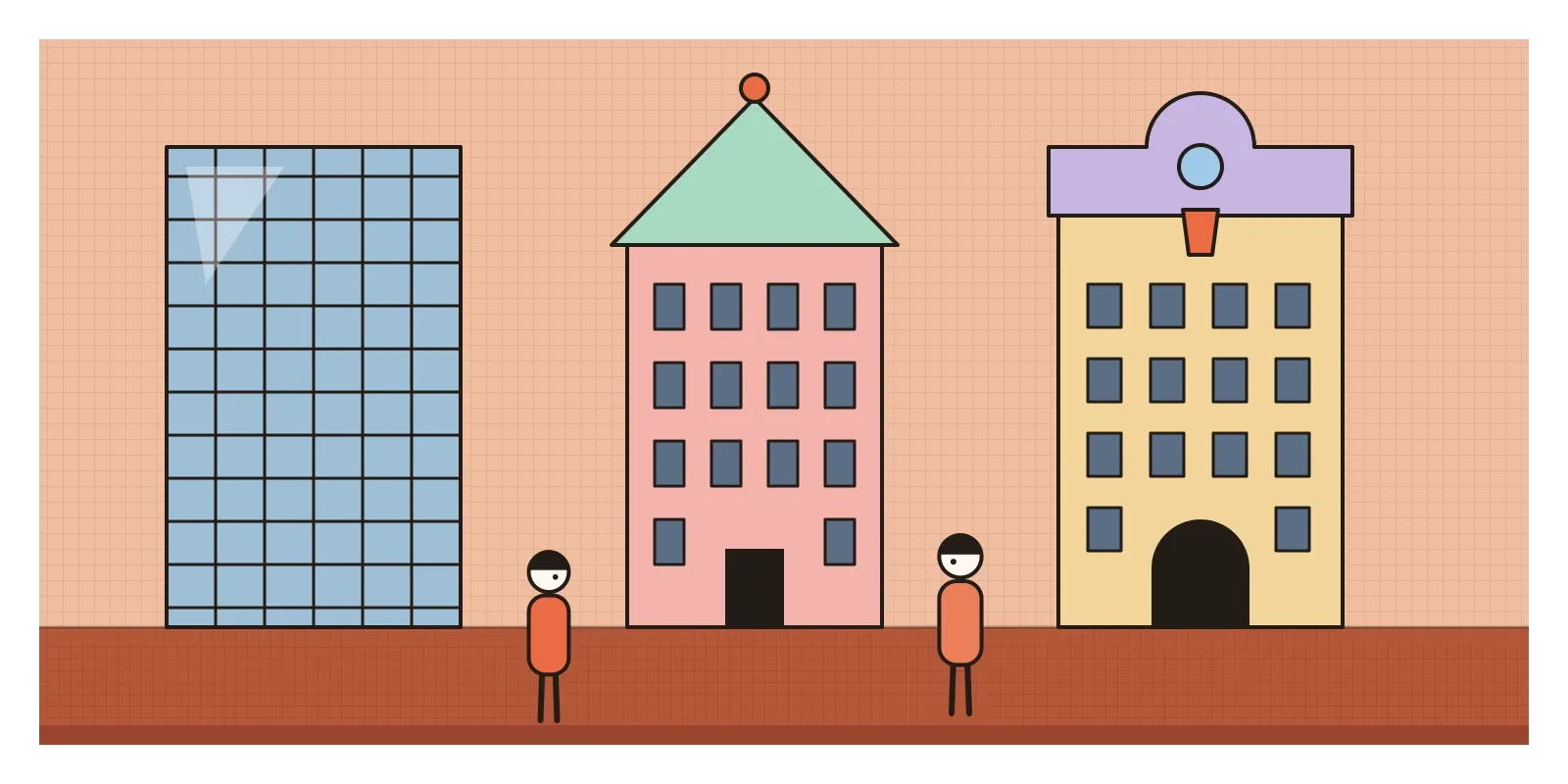
Then the colour. After decades of white, grey and glass, postmodern architects reached for salmon pink, mint, peach, lavender, terracotta and sky blue, often in flat blocks that make a building look like a drawing of itself. Symmetry came back, and front doors looked like front doors again. Tall buildings got tops again, often called hats: pyramids, gables, arches and spires to make them recognisable on a skyline full of identical flat roofs.
Underneath was an idea Jencks called double coding. A good postmodern building, he argued, speaks to two audiences at once. Ordinary passers-by get a friendly, familiar image, a house that looks like a house, a column that says "important building". Architects and critics get a second layer of quotations, jokes and references to history. The same approach spread to graphics and products: layered collages, mixed typefaces, pastel grids and fake marble.
Aeroplanes on Punjabi rooftops
India's closest relative to Postmodernism didn't come from architects at all. In the villages of the Doaba region of Punjab, around Jalandhar, Kapurthala and Hoshiarpur, families with relatives working abroad began from around the late 1970s to build large new houses, and to crown them with concrete water tanks shaped like something that mattered to them. There are aeroplanes, for the journeys that paid for the house, as well as footballs, eagles, horses, army tanks and lions, painted bright colours and set on the roof for the whole village to see. The photographer Rajesh Vora spent years documenting them across about a hundred and fifty villages.
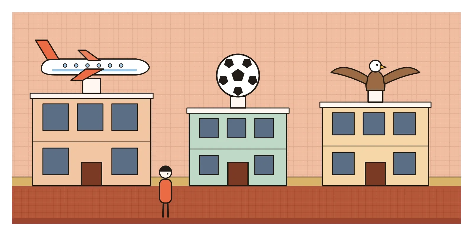
Venturi would have recognised them instantly. A water tank shaped like an aeroplane is a duck in his sense, a form that is itself the sign, and the whole house is an advertisement for a family's story. The Delhi architect and writer Gautam Bhatia gave this kind of taste a name, Punjabi Baroque, the title of his funny 1994 book, for the mansions of newly rich north Indian families that pile Greek columns, chalet roofs and Mughal arches onto one front. He sounds half mocking and half fascinated, much as Western critics felt about Las Vegas.
The parallel is real but should be held loosely. Postmodern architects in Europe and America studied popular taste as an idea and quoted it, often from a comfortable distance. In Punjab, and on the streets of most Indian towns, mixing styles was never a theory. It was simply what people did when they had money and something to say. Serious Indian architects of the 1980s were also turning to history, Charles Correa most famously with the Jawahar Kala Kendra in Jaipur, planned around an ancient nine-square diagram, but that story, and the question of whether he was ever a postmodernist, belongs to the post on Indian modern architecture.
Every remix owes it a little
Postmodernism's biggest gift to designers is permission. Permission to use colour, to borrow from the past, to make a joke, and to treat style as a language rather than a moral test. You can see it in hotel lobbies and cafés that mix terrazzo floors, arched mirrors and neon, in packaging that plays with retro typefaces, and in the steady revivals of the 1980s pastel palette in fashion and branding. Every brand guideline that talks about personality and tone of voice is, in a sense, double coding written down.
Interfaces are full of postmodern signs. The save icon in many apps is still a floppy disk, a picture of an object most young users have never held, kept because the sign works even after its meaning has drifted. Generative AI tools may be the most postmodern machines ever built. Type "a living room in the style of 1970s Milan, lit like a Dutch painting" and they will happily flatten all of history into a single collage, without any sense of which references belong together or why. Knowing the history of quotation, and its pitfalls, is now part of using those tools well.
Pastiche, puddles and a petition
Many critics thought the jokes shallow, the quotations lazy and the colours cheap, a stage set rather than architecture. In 1980 the philosopher Jürgen Habermas answered the Biennale's mood in a lecture defending modernity as an unfinished project, too valuable to abandon for nostalgia. In 1983 the historian Kenneth Frampton proposed what he called critical regionalism, a modern architecture rooted in a place's climate, light, materials and craft, rather than in images borrowed from a history book. Others noticed that the style fitted very comfortably with the property boom and corporate headquarters of the Reagan and Thatcher years. The irony that was meant to be subversive was easy to sell.

Some of the buildings also simply didn't work very well. The Portland Building leaked for decades, its small windows made dark offices, and in 2014 the city weighed demolition before rebuilding it inside a new watertight skin, finished in 2020 for around 195 million dollars. The Piazza d'Italia had to be restored twice. Postmodernism's fondness for thin, applied layers made it easy to build cheaply and hard to keep in good shape.
The movement also had a familiar blind spot. When the Pritzker Prize went to Robert Venturi in 1991, it ignored Denise Scott Brown, his partner in work and marriage and the co-author of their most important ideas. In 2013 two Harvard design students, Arielle Assouline-Lichten and Caroline James, started a petition asking the prize to recognise her retroactively. It drew many thousands of signatures, including Venturi's own, and the jury declined. The episode turned into a wider argument about how architecture credits the women in its partnerships.
By the end of the 1980s the energy had moved elsewhere. In 1988 the Museum of Modern Art in New York, once again with Philip Johnson involved, opened an exhibition called Deconstructivist Architecture, and the jokes gave way to fractured, tilting forms. Meanwhile, a quite different reply to the glass box had been growing alongside Postmodernism, one that dressed buildings not in history but in their own machinery.
Walk down your own Strada Novissima
If you're anywhere near Jalandhar, drive through the Doaba villages and count the aeroplanes on the roofs, then think about what each tank is saying and to whom. In Jaipur, visit the Jawahar Kala Kendra and notice how differently it borrows from the past. Wherever you are, look for the 1980s office blocks and shopping centres in your city, with their mirrored glass, arched entrances and coloured trims. Postmodernism is all around us, mostly unnoticed.
For an exercise, take a shop front or an app screen and list every reference it borrows. Then design a small facade or poster from three periods that shouldn't go together and see whether you can make the joke land for two audiences at once.
Portoghesi's street was made of plywood and plaster and taken apart after the show, which seems fitting for a movement that so loved the stage set, though versions of it travelled on to Paris and San Francisco. Twenty architects were each given a doorway and asked what architecture could say, and most of them answered by remembering. That is still the movement's best question for any designer: what does a new thing owe to the ones that came before it? In the next post, on High-Tech Architecture, I'll look at architects who answered the same tired glass box by turning buildings inside out and painting their pipes.
Further reading: Charles Jencks, The Language of Post-Modern Architecture (1977) · Glenn Adamson and Jane Pavitt (eds), Postmodernism: Style and Subversion, 1970-1990 (2011) · Jean-François Lyotard, The Postmodern Condition (1979) · Kenneth Frampton, "Towards a Critical Regionalism" (1983) · Gautam Bhatia, Punjabi Baroque (1994)
A reply toThe glass boxes of the International Style and modernism's strict ban on ornament.