Pop Art
How artists in London and New York turned adverts, comics and supermarket shelves into the subject of art.
Pop Art
A projector full of magazine pages
In 1952, a small group of young artists, architects and critics began meeting at the Institute of Contemporary Arts in London, then on Dover Street. They called themselves the Independent Group, and one of their first evenings belonged to the Scottish sculptor Eduardo Paolozzi. He arrived with a heap of pages torn from American magazines and fed them, one after another, into an epidiascope, an old kind of projector that could throw the image of a printed page onto a wall. Up came adverts for fridges and cars, cut-away diagrams of engines, pin-ups, robots, tinned food and panels from comics. By most accounts he said almost nothing to explain them, and the audience was baffled. The talk is remembered as Bunk, after Henry Ford's remark that history is bunk, though accounts of the evening differ.
Paolozzi had been collecting such pages since his years in Paris in the late 1940s. One collage from 1947, I Was a Rich Man's Plaything, puts the cover of a cheap confessions magazine beside a hand holding a pistol, and out of the gun comes a puff of smoke with the word "POP!" in it. It's often called the first work of Pop Art, though it was made years before anyone used the term.
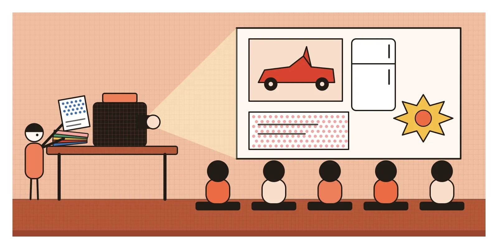
Pop Art is the name for what grew out of evenings like that one. From the mid-1950s to the late 1960s, mainly in Britain and the United States, artists took the pictures of mass culture, adverts, comics, packaging, film stars and pop music, and brought them into art, often using the methods of commercial printing to do it. It looked like fun, and often was, but underneath was a serious argument about what art could be about.
Fridges, not feelings
In Britain, the context was austerity. Food rationing didn't fully end until 1954, and America, seen through glossy magazines, looked like a land of impossible plenty. Official taste was strict. Bodies like the Council of Industrial Design, set up in 1944, told the public which chairs and teapots counted as good design. The Independent Group liked the opposite, Detroit cars with tail fins, science fiction films, advertising, and wanted to take it seriously rather than sneer at it.
In January 1957, the painter Richard Hamilton wrote a letter to the architects Alison and Peter Smithson, two other members of the group, listing what popular art should be. It has become famous: popular, made for a mass audience; transient and expendable, meant to be used up and forgotten; low cost and mass produced; young, witty, sexy, gimmicky and glamorous; and big business. The critic Lawrence Alloway is often credited with first using "Pop" for this kind of culture in the mid-1950s, though who said it first is disputed. A year earlier, for the 1956 exhibition This Is Tomorrow at the Whitechapel Gallery, Hamilton had made a tiny collage for the catalogue and poster, an imaginary modern living room crammed with a tape recorder, a vacuum cleaner, a tinned ham and a bodybuilder holding a giant lollipop with "POP" printed on its wrapper.
In America, the thing to reply to was Abstract Expressionism, which has its own post earlier in this section: huge, serious canvases full of the painter's gesture, meant to reveal an inner self. Jasper Johns had already painted flags and targets, things everyone knew, and Robert Rauschenberg glued newspaper and even a stuffed goat into his work. The generation that followed included several people who earned their living in commercial art. Andy Warhol drew shoe adverts. James Rosenquist painted billboards above Times Square. To them, the advertising world wasn't the enemy of art. It was their daily material.
A shop full of plaster pies
In December 1961, Claes Oldenburg rented a shopfront on East Second Street on the Lower East Side of Manhattan and called it The Store. He filled it with lumpy replicas of the things a cheap local shop might sell: slices of pie, sausages, shirts, all made of muslin dipped in plaster over chicken wire and painted in bright enamel straight from the tin. They had price tags and you could buy them. Later he made such things soft and enormous, and turning a small, ordinary thing into a big, strange one became one of Pop's favourite moves.
Around the same time, Roy Lichtenstein began painting single panels from romance and war comics, enlarged to the size of a museum canvas. He redrew and simplified them and painted in the printed dots that cheap comics used for shading and skin tones, at a size you could count from across the room. A teary heroine, blown up and given that much care, became something you couldn't quite decide how to feel about.
Warhol's soup cans and his repeated film stars appeared in the post on rhythm and repetition, so here is another. In April 1964, at the Stable Gallery in New York, he filled the room with plywood boxes, silkscreened on every side to look exactly like the cardboard cartons that Brillo soap pads were shipped in, stacked as if in a warehouse. The joke has an extra layer. The real carton had been designed by James Harvey, a painter in the Abstract Expressionist mould who did commercial design to pay the bills. The gestural painter's day job ended up in the gallery, and his paintings didn't.
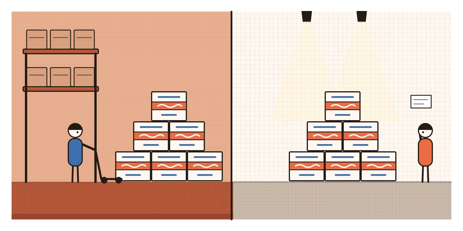
The philosopher Arthur Danto saw the show and couldn't shake it off. If a box in a gallery and a box in a supermarket storeroom can look identical, then what makes one of them art can't be anything you can see. In an essay that year called "The Artworld", he argued that it's a matter of theory and context, the world of ideas and institutions the object is placed in.
Pop wasn't only a men's club, though it was often presented as one. In London, Pauline Boty painted bright collages of film stars and pin-ups that questioned how women were pictured, and died in 1966, aged twenty-eight. In New York, the Venezuelan-American sculptor Marisol made witty, blocky wooden figures of families and celebrities. In Los Angeles, Corita Kent, a Catholic nun who taught art at Immaculate Heart College, screenprinted slogans lifted from supermarket packaging and road signs, set beside lines of scripture, in exuberant colour.
Dots you can count from across the room
Pop is easy to spot, and the easiest clue is that the image is borrowed. The Pop artist chooses it, crops it, enlarges it or repeats it. Colour tends to be flat and bright, often close to the primaries and the few strong inks of cheap printing, with thick black outlines holding everything in place.
The printed dot is the movement's signature, and it's worth understanding as a designer. Printing presses can't print grey or pale pink directly. They fake it with tiny dots of solid ink. In a halftone, used for photographs, the dots change size, big where the image is dark and small where it's light, so your eye blends them into smooth tones. In the older Ben-Day process, named after the American printer Benjamin Day, who developed it in the 1870s, the dots are an even tint laid over an area, which is how comics got their pink faces and blue skies. Lichtenstein's genius was to make you see the dots instead of the picture.
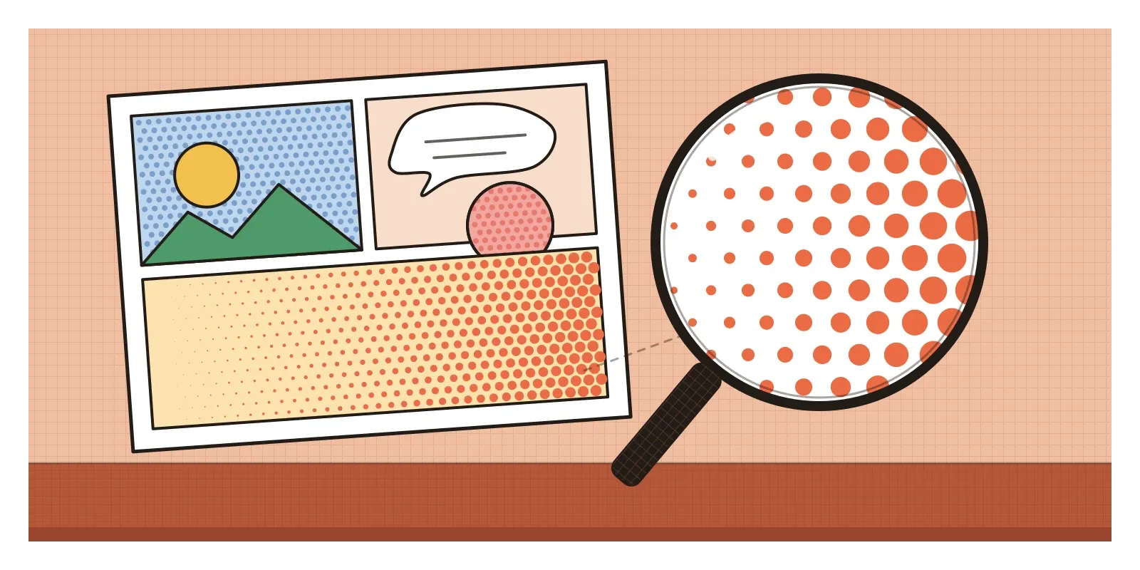
Other habits follow from the same source. Screenprinting, a stencil method used for posters and packaging, let Warhol repeat a photograph many times and enjoy the slips in registration where a colour landed slightly off. Words sit inside pictures as speech balloons, brand names and sound effects. And the tone is deadpan. A Pop work rarely tells you whether it loves its subject or mocks it, and that ambiguity is part of the design.
Gods from the bazaar, stuck on mirrors
The Indian story of Pop runs through Baroda. Bhupen Khakhar, born in Bombay in 1934, trained and worked as a chartered accountant, and in the early 1960s went to study art criticism at the Faculty of Fine Arts in Baroda. There he shared a flat with a young British artist, Jim Donovan, who introduced him to the Pop Art being made in London. Khakhar's first works took cheap bazaar prints of gods and goddesses, and collaged them onto mirrors and boards, adding painted marks and scribbles. His first solo show, at the Jehangir Art Gallery in Bombay in 1965, puzzled many viewers. Later he became known for paintings of ordinary men, tailors and watch repairers, in a flat, bright style that owed as much to bazaar art as to London. The critic Geeta Kapur has argued that Western Pop showed him a way back into Indian popular culture.
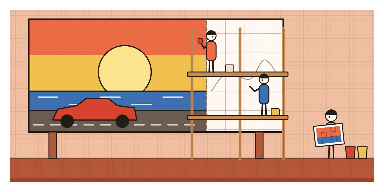
That points to a real difference. In London and New York, Pop artists discovered mass imagery as something new and slightly forbidden to bring into a gallery. In India, popular imagery was already everywhere, and much of it was still made by hand. As I wrote in the post on light, shade and rendering, Ravi Varma's prints had filled Indian homes with gods since the 1890s. In the 1960s, the giant hoardings outside Bombay's cinemas were painted by teams on scaffolding, working from squared-up photographs in the same bold outlines and flat colour that Lichtenstein was painting in New York.
Commerce here learned Pop's tricks quickly too. In 1966 the Bombay agency run by Sylvester daCunha, with the illustrator Eustace Fernandes, created a chubby little girl in a polka-dot dress for Amul butter, and the hoardings soon began commenting on the news with a pun and a cartoon. It's an advert that behaves like Pop Art, quick, topical, witty and meant to be replaced next week, and it has been running ever since.
A filter, a mirror or an advert?
Pop's influence on design was immediate, because it came from design in the first place. Record sleeves showed it first, from Peter Blake and Jann Haworth's crowded collage for the Beatles in 1967 to Warhol's peelable banana for the Velvet Underground the same year. Today brand illustration borrows halftone dots for texture, some websites use chunky outlines and hard offset shadows like a comic panel, and emoji are Pop's grandchildren: small, bright pictures of everyday things, made to be used up quickly. Generative AI tools offer "pop art" as a one-click preset, and it means the same few things, dots, primaries, outlines. What made Pop sharp was the choice of image and the jolt of moving it from a newsstand to a museum. A filter keeps the dots and loses the jolt.
From the start, critics asked whether Pop was criticising consumer culture or simply advertising it. The artists rarely answered, and Warhol seemed happy to blur art and business. Its picture of women was often crude, from Hamilton's pin-ups to Tom Wesselmann's Great American Nudes, while the women making Pop were sidelined until exhibitions such as Seductive Subversion in Philadelphia in 2010 and The World Goes Pop at Tate Modern in 2015, which also showed how much Pop was made in Latin America, Eastern Europe and Japan.
Then there's borrowing. Lichtenstein's paintings sell for enormous sums, while the comic artists whose panels he enlarged, such as Irv Novick and Russ Heath, were neither credited nor paid, and some said so publicly. Where homage ends and appropriation begins is an argument that matters again now that AI tools are trained on illustrators' work.
By the end of the 1960s, advertising had absorbed Pop's jokes. Replies came from several sides: Minimalism, its cool contemporary, removed the image altogether, and Conceptual artists questioned the object itself. In the next post, on Op Art, artists in the same decade took the flat, bright, machine-made look in another direction, making the act of seeing itself the subject.
Collect a week of junk
To see Pop close up, look for Khakhar's work at the Kiran Nadar Museum of Art in Delhi, or find the catalogue of Tate Modern's 2016 retrospective of his paintings. Then look at a painted shop sign, a truck back or an Amul hoarding the way the Independent Group looked at Detroit cars.
For an exercise, keep every wrapper, flyer and label that passes through your hands for a week. At the end, spread them out and pick the smallest, most ordinary one. Redraw one detail of it, a corner of the logo or a bit of a picture, at ten times the size, using only flat colour and dots. Notice how much you have to decide that the original designer decided without anyone noticing.
Paolozzi showed his magazine pages with almost no explanation, and that silence was the point. He was asking his audience to look at what they threw away as if it were worth looking at. For designers the question still stands: the things we make for quick use and quick forgetting are the pictures most people see most of the time.
Further reading: Lucy R. Lippard, Pop Art (1966) · Hal Foster, The First Pop Age (2012) · Arthur C. Danto, "The Artworld" (1964) · Sid Sachs and Kalliopi Minioudaki (eds), Seductive Subversion: Women Pop Artists, 1958-1968 (2010) · Timothy Hyman, Bhupen Khakhar (1998)
A reply toAbstract Expressionism's heroic brushstrokes, and the good taste that looked down on adverts and comics.