Op Art
How painters in the 1960s made pictures whose real subject was the eye looking at them.
Op Art
Her paintings in a shop window
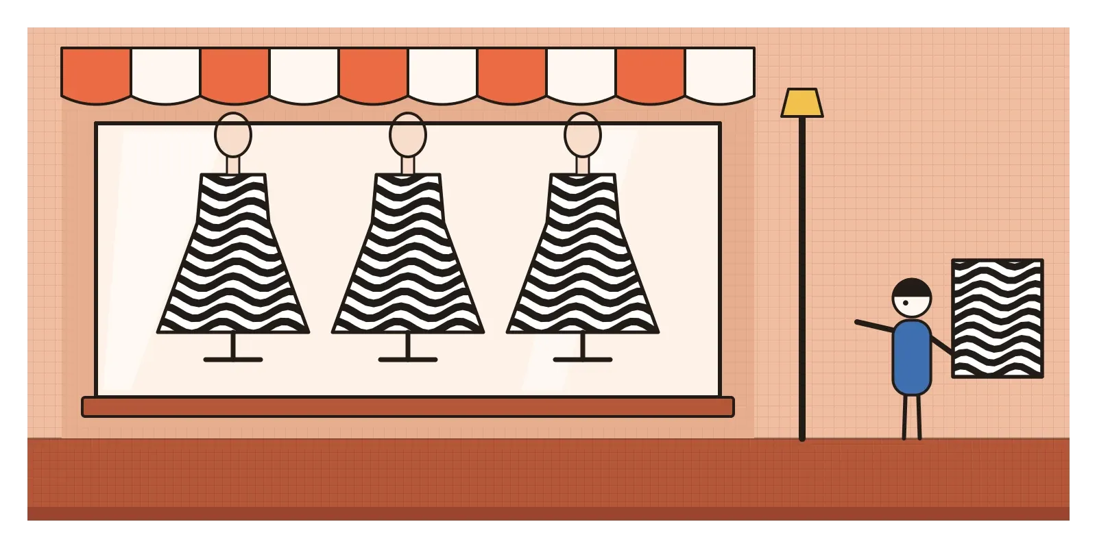
In February 1965, the British painter Bridget Riley flew to New York for the opening of The Responsive Eye at the Museum of Modern Art. It was a big moment for a painter in her early thirties. One of her black-and-white canvases, Current, a field of fine wavy lines that seems to ripple as you look at it, was on the cover of the catalogue. But on the way into the city, by her own later account, her heart sank. Along Madison Avenue, shop windows were full of dresses printed with black-and-white patterns that looked very like hers.
Some of the fabric had been made by Larry Aldrich, a New York dress manufacturer who also collected modern art and owned a Riley. He had turned several Op paintings into textile designs, apparently with the encouragement of the exhibition's curator, William Seitz, and Riley said she only found out when he invited a journalist to meet her at his showroom. She was horrified to see her work turned into fashion before it had even been shown, and tried to sue with the help of Barnett Newman's lawyer. Accounts differ about how far she got. What's clear is that before the exhibition had properly opened, the style it was meant to introduce had already escaped onto the street.
Op Art, short for optical art, is the name for abstract painting and sculpture, mostly from the late 1950s to the late 1960s, that uses precise patterns of lines, shapes and colours to make the eye see things that aren't there, movement, flicker, swelling, glowing edges and colours that aren't painted. Time magazine used the phrase in October 1964, a few months before the MoMA show, which Seitz described more soberly as perceptual abstraction. Its subject isn't a scene or a feeling. It's the act of seeing.
An answer to the dripping brush
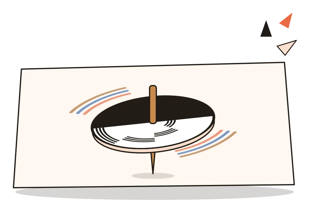
Op grew out of one strand of modernism and against another. The strand it grew from was the geometric, teachable abstraction of the Bauhaus and Constructivism. Josef Albers, whose colour exercises at Black Mountain College I wrote about in the post on the interaction of colour, had been showing for decades that colours change depending on their neighbours, and his work hung in The Responsive Eye. Behind him lay a century of perception science. In the 1860s, German scientists such as Ewald Hering and Johann Zöllner published diagrams in which perfectly straight lines look bent. In the 1890s an English toymaker, Charles Benham, sold a black-and-white spinning top that makes faint colours appear when it turns. Seurat's dots, which I wrote about in the post on Post-Impressionism, were another ancestor.
The strand it pushed against was Abstract Expressionism, with its big gestures and inner turmoil. Op artists wanted the opposite: impersonal, exact, planned surfaces where the drama happened in the viewer's eye rather than the artist's soul. Many believed this made their art more democratic: you didn't need art history to feel a canvas buzz, only eyes.
It was also a 1960s art in its technology. Fluorescent paints, new acrylics, plastics, mass printing and television all fed into it, and its makers liked art that could be reproduced and spread through the city.
The zebra, the ripple and the room you walk through
The movement's elder statesman was Victor Vasarely, born in Hungary in 1906. He studied in Budapest at a small school known as the Hungarian Bauhaus and moved to Paris in 1930, where he earned his living for years as a commercial graphic designer in advertising. In the 1930s he made studies of zebras built from nothing but curving black and white stripes, the animals appearing only where the stripes change direction. Over the following decades he developed a kind of visual alphabet of simple shapes, circles, squares and lozenges set inside coloured squares, which could be recombined endlessly, like type. He wanted art that could be manufactured and shared, not locked in a single precious canvas.
In April 1955, the Paris dealer Denise René opened an exhibition called Le Mouvement, bringing together artists interested in real and apparent motion, among them Vasarely, Alexander Calder, Marcel Duchamp, Jesús Rafael Soto and Yaacov Agam. Vasarely's text for it, printed on yellow paper and known as the Yellow Manifesto, argued that movement in art could come from the viewer's eye and body rather than from motors.
Riley arrived by a different route. Born in London in 1931, she studied at Goldsmiths and the Royal College of Art and worked for a time as an illustrator at an advertising agency. Around 1960, after copying Seurat to understand his colour, she began painting in black and white only: squares that seem to collapse into a fold, lines that ripple and flicker, discs that seem to tilt. She planned every canvas carefully in studies, and before long assistants helped paint them, which bothered critics who still expected the artist's hand. In the later 1960s she brought in colour, and in 1968 she won the international painting prize at the Venice Biennale, the first woman to do so.
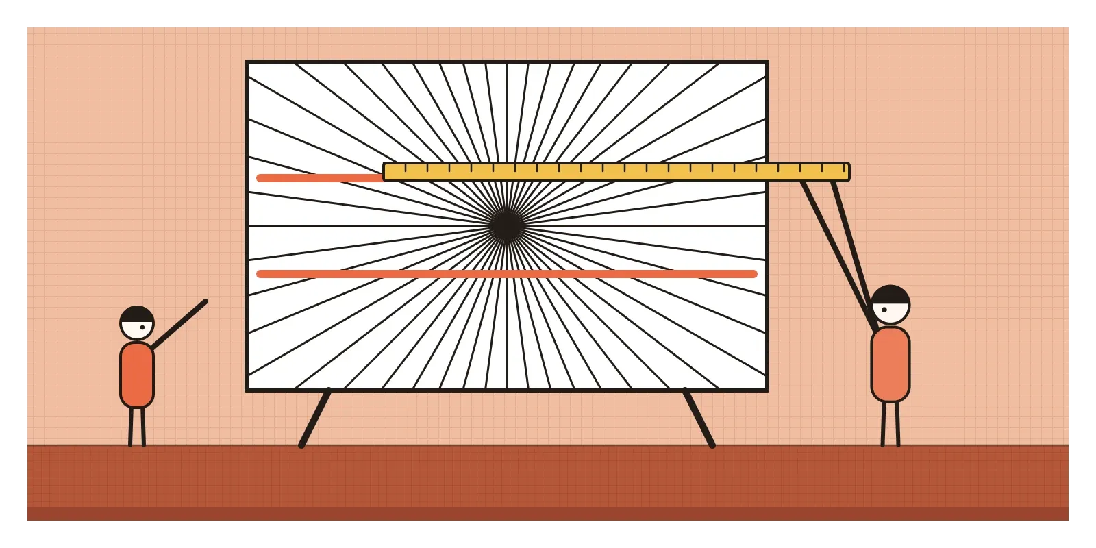
Some of the most inventive Op came from Venezuela. Soto, who moved to Paris in 1950, layered fine lines in front of patterned backgrounds so that the work shimmers as you walk past, and from the late 1960s made his Penetrables, rooms of hanging threads or tubes that you walk through. Carlos Cruz-Diez spent decades on what he called Physichromies, reliefs of thin coloured blades that change colour as you move. His enormous floor of coloured stripes at the international airport near Caracas, laid in the 1970s, became so loved that Venezuelans leaving the country photographed their feet on it.
In Paris, a collective called GRAV, the Group for Research in Visual Art, formed in 1960 around artists including Julio Le Parc and François Morellet. They distrusted the lone genius and the art market, made works with lights, mirrors and moving parts, and in 1966 took them onto the streets of Paris for a day, handing out optical objects to passers-by.
Shimmer, bulge and colours that aren't there
Op's tools are few and exact. The basic one is high contrast at a fine scale: black and white lines or shapes, close together, with edges as crisp as possible. When lines bunch together and spread apart, a flat surface seems to swell or sink. When a regular grid is gradually distorted, it seems to bulge towards you. When stripes are fine enough, the eye can't hold them still, and they flicker or shimmer. Some viewers see faint colours in black-and-white Op paintings, the same effect as Benham's top.
Colour Op works with the effects Albers taught. Two colours of equal lightness but very different hue, side by side, can seem to vibrate along their edge. A colour placed against different backgrounds can look like two colours. Thin lines of one colour inside another can tint the whole area. Underneath all of it is repetition and gradual change, a pattern set up and then bent step by step, which is why Op works often look like the output of an algorithm long before computers made art. The pattern is the content.
Loops around dots on a doorstep
There was no Op Art movement in India as such, and I don't want to invent one. But anyone who grew up in Tamil Nadu, or has walked down a street there early in the morning, has seen a living tradition that does some of the same things. A kolam is a drawing made fresh most mornings, traditionally by women, at the threshold of a house, using rice flour that trickles between finger and thumb. Many kolams start with a grid of dots. A single continuous line then loops around and between the dots, crossing and recrossing, never stopping, until it returns to where it began.
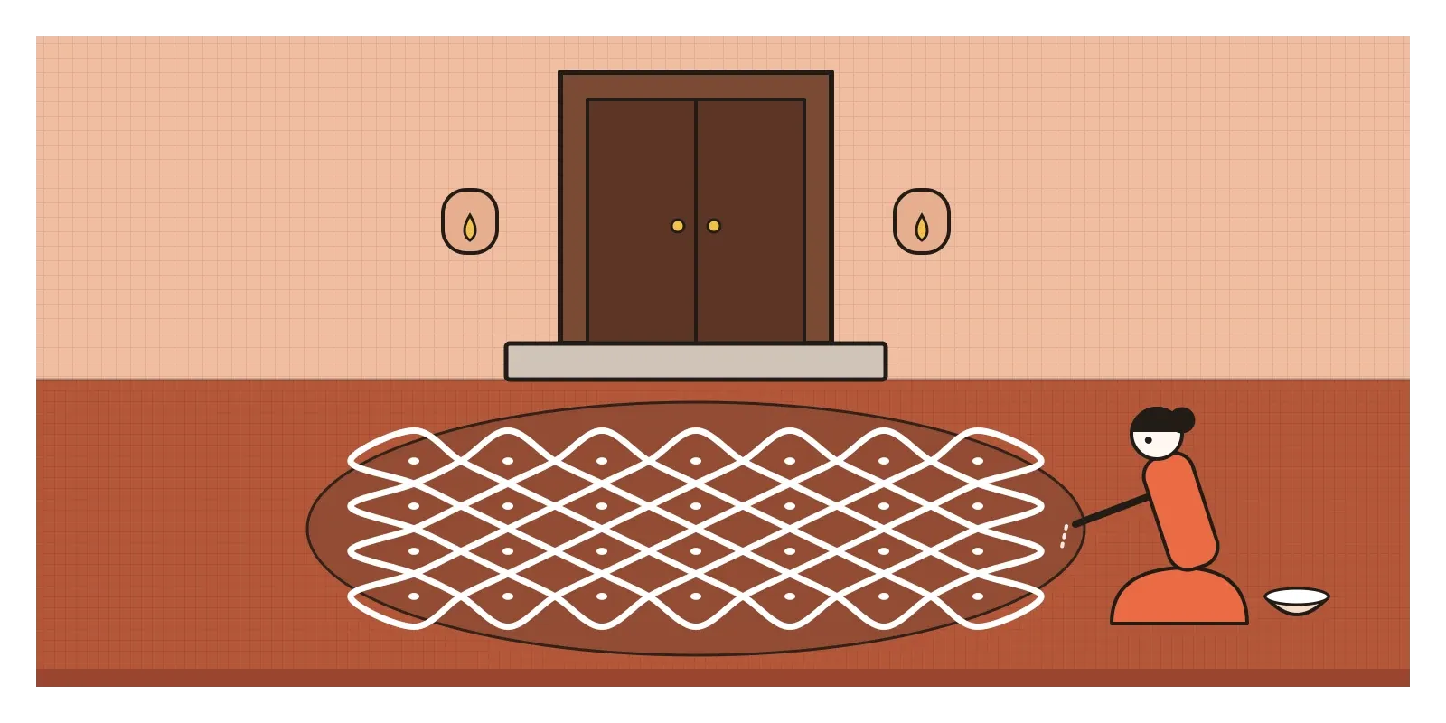
Look at a large, dense kolam and your eye does what it does in front of an Op painting. It can't settle on whether it's seeing lines, the spaces between them or the dots, and the pattern seems to turn and shimmer. The rules for making kolams are strict enough that in the 1970s the mathematician Gift Siromoney and his colleagues at Madras Christian College studied them as formal picture languages, describing how families of patterns could be generated by rules, a precursor of today's generative art. The difference from Op is important, though. A kolam is a ritual of welcome and care, made by hand to be walked over and swept away, not an experiment in perception for a gallery wall.
Indian textiles offer looser parallels. In ikat, from Pochampally in Telangana to Patan in Gujarat, threads are tied and dyed before weaving, so the pattern's edges blur and flicker. In Rajasthani leheriya, cloth is rolled and tied to make fine diagonal waves of colour. Neither was made to trick the eye, but both show that the shimmer of a repeated, slightly irregular stripe was familiar long before 1965.
Camouflage, moiré and the charge of gimmickry
Designers still use Op's discoveries, often without the name. When car makers test new models on public roads, they often wrap them in swirling black-and-white patterns so that spy photographers can't make out the shape of the body, the same trick of confusing edges that dazzle camouflage used on ships, as I described in the post on figure and ground. In 1972 Vasarely and his son Yvaral redrew Renault's diamond logo as a set of parallel lines that make the shape seem to turn.
Op also taught some hard lessons. Fine stripes and checks on camera can produce moiré, shimmering bands of false colour, which is why television presenters are still told to avoid narrow stripes and tight checks. The vision scientist Arnold Wilkins has shown that striped patterns of a certain size are uncomfortable for many people and can trigger headaches, and for people with photosensitive epilepsy, flashing and striped patterns can cause seizures. In December 1997, an episode of the cartoon Pokémon with rapidly flashing red and blue light sent hundreds of children in Japan to hospital. The web's accessibility guidelines now include limits on flashing content for exactly this reason. An interface that shimmers like a Riley painting isn't clever. It's a problem.
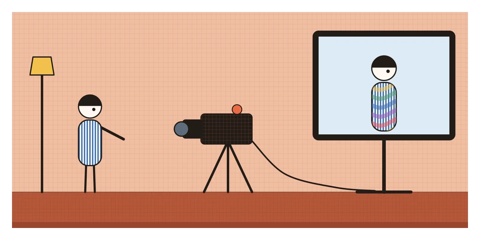
Critics in New York were often unkind about The Responsive Eye. Many dismissed Op as a gimmick, clever tricks with nothing behind them, closer to a fairground than to serious art. The speed with which fashion and advertising took it up seemed to prove them right. Within a year or two Op patterns were on dresses, record sleeves and television titles, and the fashion made the art look like a fashion too. Riley spent years insisting that her paintings were about sensation and perception, not decoration, and her long later career has largely won that argument.
There were deeper limits. Op claimed a kind of universal eye, the idea that everyone would see the same thing in front of the same pattern. In fact perception varies a great deal, with age, eyesight, culture and neurology, and some of Op's most dramatic effects are simply painful for some people. Its utopian hopes, art for everyone through multiples and street actions, mostly ended in posters and prints sold through the same market it had hoped to escape. And like most of the 1960s art world, it was dominated by men, with Riley a famous exception rather than a sign of change.
By the end of the decade, the moment had passed. Its vibrating colours flowed straight into psychedelic posters, which have their own post later in this section, and its rule-based patterns into early computer art. In the next post, on Metabolism, we leave the gallery for the city, where a group of Japanese architects were imagining buildings that could grow and change like living things.
Make a top and spin it
The simplest way to see Op for yourself is to make Benham's top. Draw a circle about the size of a CD, colour one half solid black, and on the white half draw a few short arcs at different distances from the centre. Glue it to card, push a pencil through the middle and spin it under a bright light. Most people see faint browns, reds or blues in the arcs, colours that aren't on the card at all, and the colours change when you spin it the other way. In Chennai or anywhere in the south, go out early one morning and watch a kolam being drawn. For reading, Riley's own essays, collected as The Eye's Mind, are clear, practical and wonderfully unpretentious.
Riley was angry about those dresses on Madison Avenue because they took the effect and threw away the looking. That's the lesson I'd keep from Op. Any designer can make a screen shimmer. The harder and more useful thing is to understand exactly what the eye is doing, so that when you use that power, you use it on purpose.
Further reading: William C. Seitz, The Responsive Eye (1965) · Bridget Riley, The Eye's Mind: Collected Writings 1965-2019 (2019) · Arnold Wilkins, Visual Stress (1995) · Margaret Livingstone, Vision and Art: The Biology of Seeing (2002) · Gift Siromoney, Rani Siromoney and Kamala Krithivasan, "Array Grammars and Kolam" (1974)
A reply toAbstract Expressionism's personal gestures, answered with impersonal patterns that happen in the viewer's eye.