Pixel Art and Early Computer Graphics
How designers learned to draw with tiny squares of light, and why the limits of early screens made such memorable pictures.
Pixel Art and Early Computer Graphics
A notebook from the art shop in Palo Alto
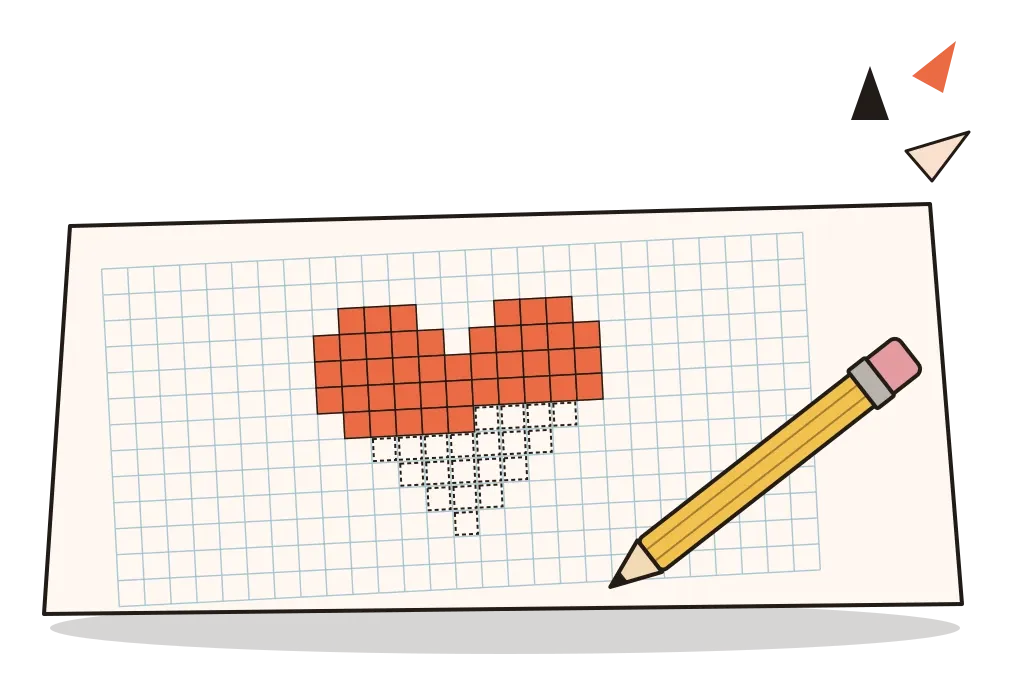
In 1982, a young artist called Susan Kare joined the small team at Apple that was building the Macintosh. She had a doctorate in fine arts and had worked as a sculptor, but she had never designed anything for a computer. Her friend Andy Hertzfeld, one of the Mac's software engineers, needed small pictures to stand for things on the screen, files, folders, tools and warnings, and the screen could only show tiny dots that were either black or white. He suggested she get the smallest graph paper she could find. So she went to University Art in Palo Alto and bought a grid notebook for about $2.50.
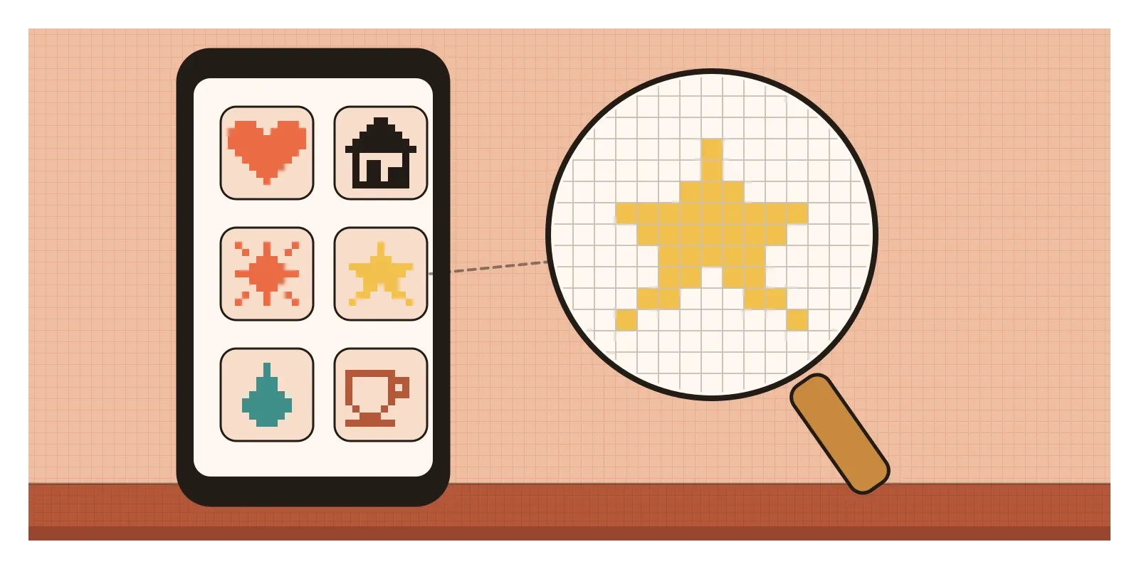
In that notebook, Kare drew icons by filling in squares. Each square was one dot on the screen, and each icon was usually a grid of 32 by 32 of them, 1,024 decisions about black or white. She drew a pair of scissors for cutting, a paintbrush, a pointing hand, a wristwatch to tell you to wait, a little bomb for when the system crashed and a smiling computer that greeted you when it started up. She has said the work reminded her of needlepoint, knitting patterns and mosaics. When the Macintosh went on sale in January 1984, its screen measured 512 by 342 dots, and her drawings gave millions of people their first sense that a computer could be friendly.
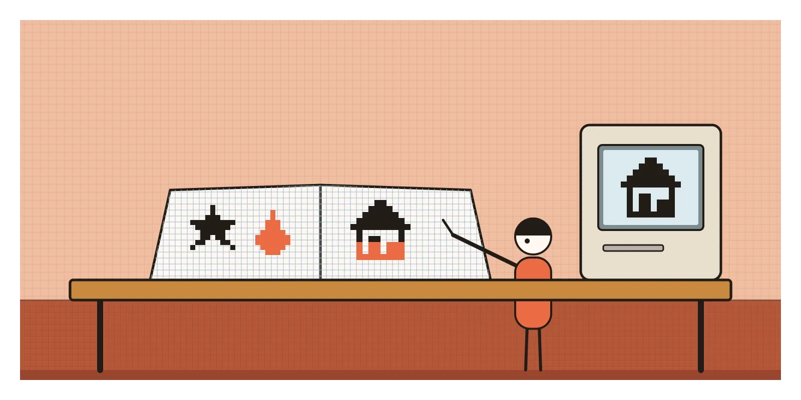
Those dots are called pixels, short for picture elements, the smallest squares of light a screen can control. Pixel art is the craft of making images by placing them one at a time, so that every square is a deliberate choice, and it grew out of the wider story of early computer graphics, roughly from the 1960s to the early 1990s, when computers first learned to show pictures at all. The phrase itself first appeared in print in 1982, in a short piece by Adele Goldberg and Robert Flegal of the Xerox research centre in Palo Alto, in the journal Communications of the ACM. Unlike most movements in this series, it wasn't started by a group with a manifesto. It was shaped by machines, and by designers who found beauty inside their limits.
Before a screen could hold a picture
For the first decades of computing, most screens and printers could show only text. Pictures were expensive, because storing an image means storing a value for every point in it, and memory cost a fortune. The first important graphics systems therefore drew lines rather than pictures. In 1963, a graduate student at MIT called Ivan Sutherland built Sketchpad, which let a person draw directly on a screen with a light pen, making lines and shapes that could be copied, moved and linked by rules. It's the ancestor of every computer-aided design tool, including the ones I use every day. The plotter drawings of the first computer artists belong to that world of lines too, and they have their own post, on computational and generative art.
The idea of a screen made of a grid of dots, each stored in memory, is called a bitmap, or raster. It became practical in research labs in the 1970s. At Xerox's Palo Alto Research Center, the Alto computer of 1973 had a bitmapped screen the shape of a sheet of paper, and around the same time the researcher Richard Shoup built SuperPaint, one of the first programs for painting on screen. The Xerox Star of 1981 put icons on an office desktop and, as I wrote in the post on abstraction, gave us the three-line menu symbol. Then, in the late 1970s, cheap chips brought bitmaps out of the lab and into arcades and living rooms. What the pixel replied to, then, was less a style than an absence: a computer that could only speak in words.
Invaders, a moustache and a looped square
Arcade games were where most people first met pixel art. In 1978 the Japanese company Taito released Space Invaders, designed by Tomohiro Nishikado. Its rows of descending aliens were each drawn in a handful of pixels and animated with just two frames, legs in, legs out. The screen was black and white, and many of the original cabinets added colour by laying strips of coloured film across the glass, so different bands of the screen glowed in different colours.
In 1981, Shigeru Miyamoto, a young designer at Nintendo, drew the hero of Donkey Kong, a carpenter first called Jumpman and later Mario, on a grid of about 16 by 16 pixels in a few colours. Miyamoto has explained that almost every feature came from the limits: a moustache because a mouth was too hard to show, a cap because hair was hard to animate, and overalls in a contrasting colour so that you could see his arms move. Few characters show so clearly how a constraint becomes a personality.
Back at Apple, Kare also drew the Mac's first typefaces as bitmaps, each letter built from pixels at fixed sizes. According to Hertzfeld's account, the team first named them after stations on a Philadelphia commuter line, until Steve Jobs insisted on world cities, which is how the Mac got Chicago, Geneva, New York and Monaco. Jobs also objected to putting the Apple logo on the command key, and Kare found a looped square in a book of symbols, where it marked places of interest, reportedly on Swedish campsite signs. It's still on Mac keyboards.
Home computers had their own famous limits. Britain's ZX Spectrum of 1982 showed 256 by 192 pixels but could only give two colours to each 8 by 8 block, so a character crossing a coloured background took on the wrong colours, a problem players called colour clash. Artists learned to design around it, often keeping moving figures in one colour. Nintendo's home console of 1983, the Famicom, later the NES, could use only a few dozen colours, with three plus transparency in each small sprite, and showed only a few sprites on any one line, so crowded scenes flickered. Every famous image of the period was designed inside rules like these.
Every square is a decision
The first thing to notice in pixel art is the edge. Curves are made of steps, and good pixel artists control those steps carefully, so that a line rises in regular, even jumps, one across and one up, or two across and one up, rather than in a ragged staircase. Outlines are usually one pixel wide. The palette is small, often a handful of colours chosen for that image, and colours are mixed not by blending but by dithering, a checkerboard of two colours that the eye reads as a third. Where a smooth edge is needed, artists add in-between pixels by hand, a manual version of what software now calls anti-aliasing.
Then notice the economy. Characters are recognised by their silhouettes, because there's no room for detail. Worlds are built from tiles, small squares of ground, wall and water that repeat like printed fabric, and animation uses as few frames as possible. It's a discipline of reduction, closely related to the abstraction I wrote about in the post on that topic.
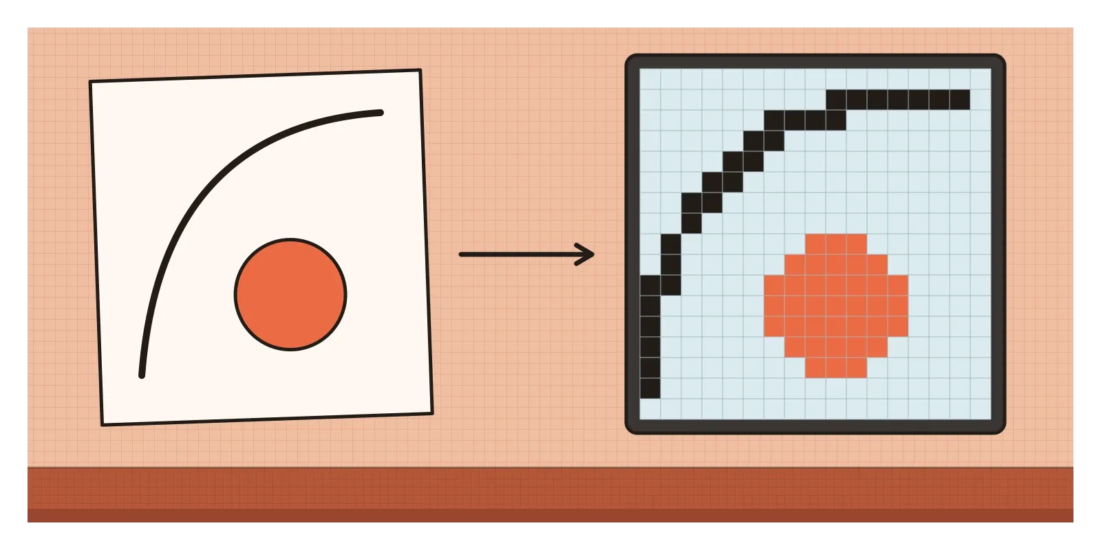
There's one complication worth knowing. Most early games were seen on cathode-ray tube televisions, which blurred each pixel into its neighbours and laid soft dark scanlines across the image. Many artists designed for that blur, so the crisp, square pixels we see in emulators today are sharper than the originals ever looked. Some of what we now love as the pixel look is really a modern way of seeing old pictures.
Counted thread in north Karnataka
The Indian parallel I find most convincing is much older than the computer. Kasuti is a counted-thread embroidery from north Karnataka, around Dharwad, Belagavi and Bagalkot. Nothing is drawn on the cloth first. The embroiderer counts the threads of the weave and places each stitch on that grid, so the fabric itself works like a sheet of graph paper. There are four main stitches: gavanti, a double running stitch, murgi, a zigzag that climbs in steps exactly like a pixel diagonal, negi, a darning stitch, and menthi, a small cross named after the fenugreek seed. Traditionally kasuti was worked on the borders and pallu of the black Chandrakala sarees worn by brides, and it's still often worked on Ilkal sarees, with motifs of temple towers, chariots, elephants, lotuses and parrots.
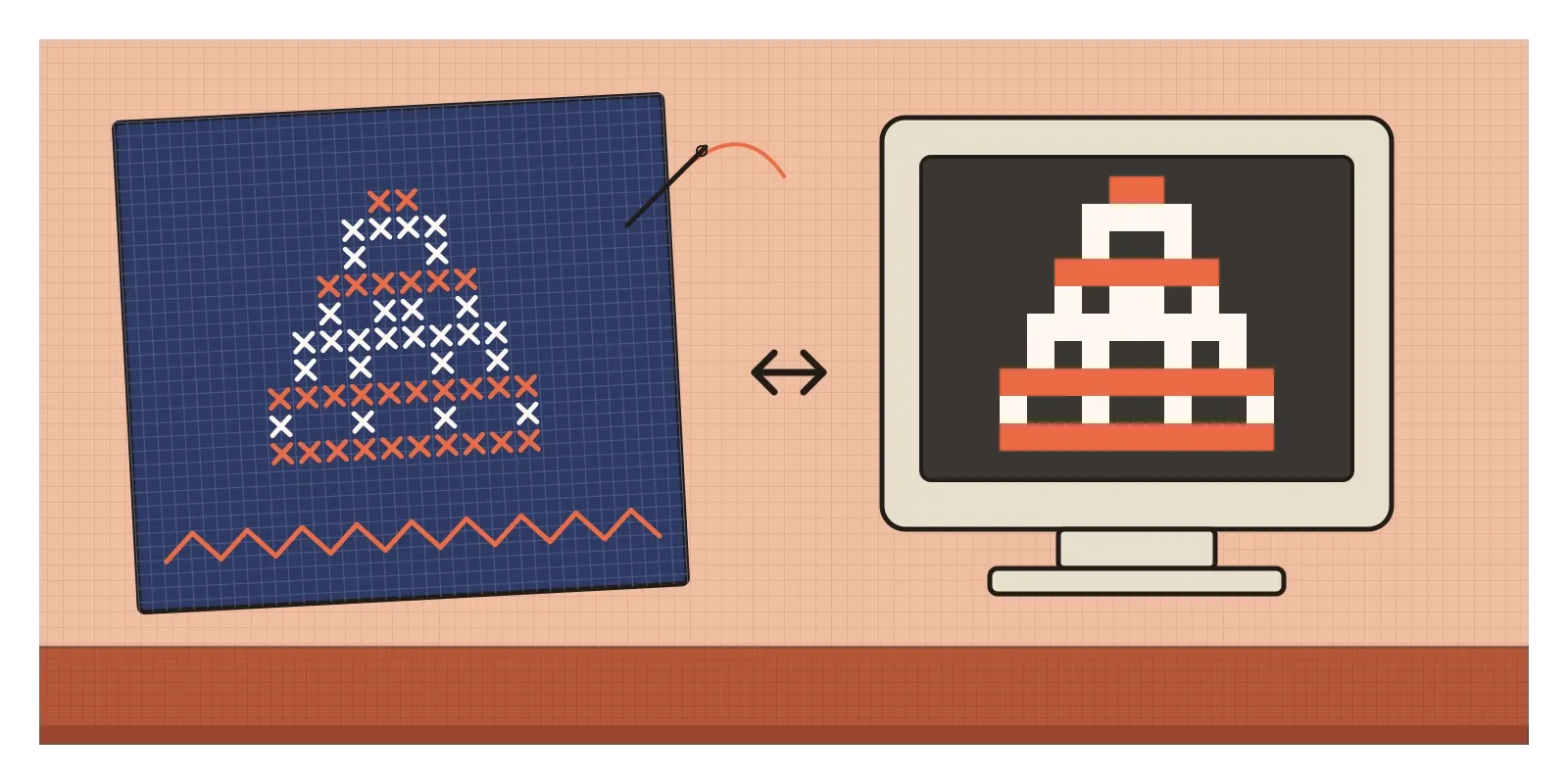
Kasuti and a Mac icon share a habit of mind: a picture built square by square on a fixed grid, with diagonals made of steps and every unit counted. When Kare compared her work to needlepoint, she was describing a kinship that Indian embroiderers would have recognised instantly. In the post on computational and generative art, the Banaras brocade designers who plot patterns on graph paper make a related point about Indian looms.
Pixels also had a harder Indian story. Early screens and their bitmap fonts were designed around the Latin alphabet, where most letters fit in a small, regular box. Devanagari, Bengali and Tamil need more vertical room for vowel signs above and below the line, and their conjunct letters are complex, so at a few pixels high they quickly turned into smudges. From the late 1970s, R. M. K. Sinha and his colleagues at IIT Kanpur worked on ways to process and display Indian scripts by computer, work that fed into the GIST technology later developed at C-DAC, and the problem of fitting a whole script into a tiny grid of dots is one you can still see today on the LED destination boards of Indian buses and trains, where Hindi, English and a regional script take turns in chunky, dotted letters.
From a smiling computer to emoji
Pixel thinking is still the foundation of interface design. Icon designers start on a pixel grid, often 24 by 24, and align lines to whole pixels so they stay sharp. Type designers spend weeks on hinting, instructions that tell a font how to snap to the pixel grid at small sizes. Favicons, the tiny images in a browser tab, are often 16 by 16, half the width of Kare's icon grids. In 1999 the designer Shigetaka Kurita drew 176 small pictures for the Japanese mobile service i-mode, each on a grid of 12 by 12 pixels. They were the first widely used emoji, and in 2016 the Museum of Modern Art acquired them.
Pixel art has also become a style chosen freely, long after the limits disappeared. Minecraft built a hugely popular world from blocky textures, and Stardew Valley, made almost entirely by one person, Eric Barone, showed in 2016 that a game in the old style could feel fresh. Brand illustrators use pixel art to signal fun, nostalgia or a certain kind of internet. AI image tools can now produce "pixel art" on request, and it's an interesting test of the eye: their pixels are often uneven in size, with smudged edges and too many colours. A pixel artist spots the fakes immediately, because real pixel art is a set of decisions, not a texture.
Who got to place the pixels
The limits that made pixel art inventive were also limits on who took part. Early computing and the games industry were overwhelmingly male, and Kare is remembered partly because she was so unusual. The pictures carried assumptions too: a strikingly large number of early games reduced women to a prize to be rescued at the top of the screen. The industry that made these images was known for gruelling crunch, long weeks of overtime before a release. And the hardware raced on so quickly that machines, and sometimes the art made for them, became obsolete within a few years, a cycle of waste that has only grown since.
What replied to pixel art was more of everything: higher resolutions, millions of colours and, from the mid-1990s, three-dimensional polygons in game consoles. By 2000, computer icons were being rendered like glossy photographs, with shadows, reflections and translucency, a look that belongs to the next posts, on Web 2.0 and skeuomorphism. The squares didn't disappear. They just got too small to see.
To see this for yourself this week, find an online emulator of the original Macintosh, which the Internet Archive offers in a browser, and click around Kare's desktop. Next time you're at a bus depot or railway station, look closely at an LED board and watch how each script squeezes into the dots. If you can, look at a kasuti border in a Karnataka handloom shop. Then try an exercise: on graph paper, draw an everyday object in 16 by 16 squares using only black, then again in 8 by 8. You'll find out quickly which details matter.
I like to remember that one of the most influential sets of computer images ever made began with a notebook from an art shop and a pencil. In the next post, on Web 2.0 aesthetics, the screen fills up with gloss, gradients and reflections.
Further reading: Andy Hertzfeld, Revolution in the Valley: The Insanely Great Story of How the Mac Was Made (2004) · Adele Goldberg and Robert Flegal, "Pixel Art" (1982) · Ivan Sutherland, "Sketchpad: A Man-Machine Graphical Communication System" (1963) · Nick Montfort and Ian Bogost, Racing the Beam: The Atari Video Computer System (2009) · Steven Levy, Insanely Great (1994)
A reply toScreens that could show only text and lines, and memory too costly to hold a picture.