Organic Design
Why mid-twentieth-century designers traded steel tubes and right angles for curves shaped by bodies, bones and trees.
Organic Design
Two winning chairs with cracks under the cushions
In 1940, the Museum of Modern Art in New York announced a design competition with an unusual title, Organic Design in Home Furnishings. It was run by Eliot Noyes, a young architect who had just become the museum's first curator of industrial design, and it came with a promise: a group of American department stores had agreed to manufacture and sell the winning designs, so that good modern furniture could reach ordinary living rooms. Two friends from the Cranbrook Academy of Art in Michigan, Charles Eames and Eero Saarinen, son of the academy's head, entered together, helped with the drawings by a young painter, Ray Kaiser, who would marry Charles the following year. They won first prize in both of the main living-room categories.
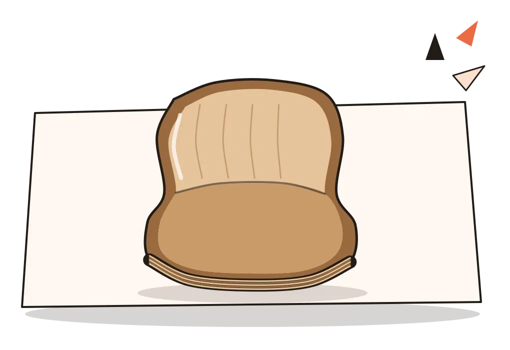
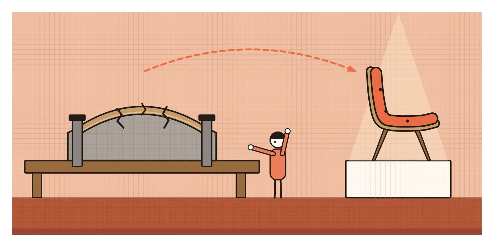
Their chairs looked like nothing else in the show. Each seat was a single thin shell of plywood, curved in two directions at once so that it cupped the body like a hand, with slender legs fixed to it by a new process that bonded rubber to wood. On paper it was a design for mass production. In practice nobody yet knew how to press plywood into curves that deep, and the war soon took the materials and factories away anyway. The chairs shown at the museum when the results opened in the autumn of 1941 were largely made by hand, and, according to most accounts, the shells cracked so often that the splits had to be hidden under padding and upholstery. The prize-winning future of furniture was, underneath, a cracked prototype in a nice cover.
Organic design is the name for that impulse, strongest from the 1930s to the 1950s, to shape furniture, objects and buildings after living things rather than machines: curves that follow the body, forms that look grown rather than assembled, natural materials left visible, parts that flow into one another. It was never a tight movement with a manifesto. It was a tendency that ran through architects, sculptors and furniture designers in Finland, America, Japan and elsewhere, and historians draw its edges differently. What they agree on is the question it asked. If the machine was the model for the 1920s, could nature be the model now?
Taking nature, not the machine, as the model
The word "organic" came into design through architecture, and in particular through Frank Lloyd Wright. He had trained under Louis Sullivan, whose "form follows function" I wrote about in its own post, and from the early 1900s he used "organic architecture" for buildings that seemed to grow out of their sites, with materials used as nature made them and inside and outside flowing together. His most famous example, Fallingwater, a weekend house built from 1936 to 1939 for the Kaufmann family of Pittsburgh, pushes its concrete terraces out over a waterfall, and the top of a boulder the family used to sit on rises through the living room floor in front of the fireplace. The Kaufmanns' son, Edgar Kaufmann Jr., later went to work at MoMA and championed modern design there, one of many small threads that tie this story together.
The tendency also grew out of dissatisfaction. The hard-edged modernism of the 1920s, with its chrome tubes, glass and white walls, which I'll look at properly in the next post, had promised to make life healthier and more rational. Many people found its furniture cold to touch, clinical to look at and unforgiving to sit in. In Finland, Alvar Aalto had already answered with chairs of bent birch plywood instead of steel, which MoMA showed in 1938. His story belongs to the post on Scandinavian Design, but he showed Americans that a modern chair could be warm. Organic design was also distinct from the Streamline Moderne of the same years. Streamlining borrowed curves from aeroplanes to make toasters look fast. Organic designers took curves from bodies to make chairs fit.
Noyes's own definition, in the competition catalogue, is worth paraphrasing because it's broader than "curvy". A design could be called organic, he said, when its parts were harmoniously organised into a whole according to structure, material and purpose, with nothing added for show. In that sense a well-made basket is organic. The curves were a consequence of the idea, not the idea itself.
A shell, a waterfall, a paper lantern
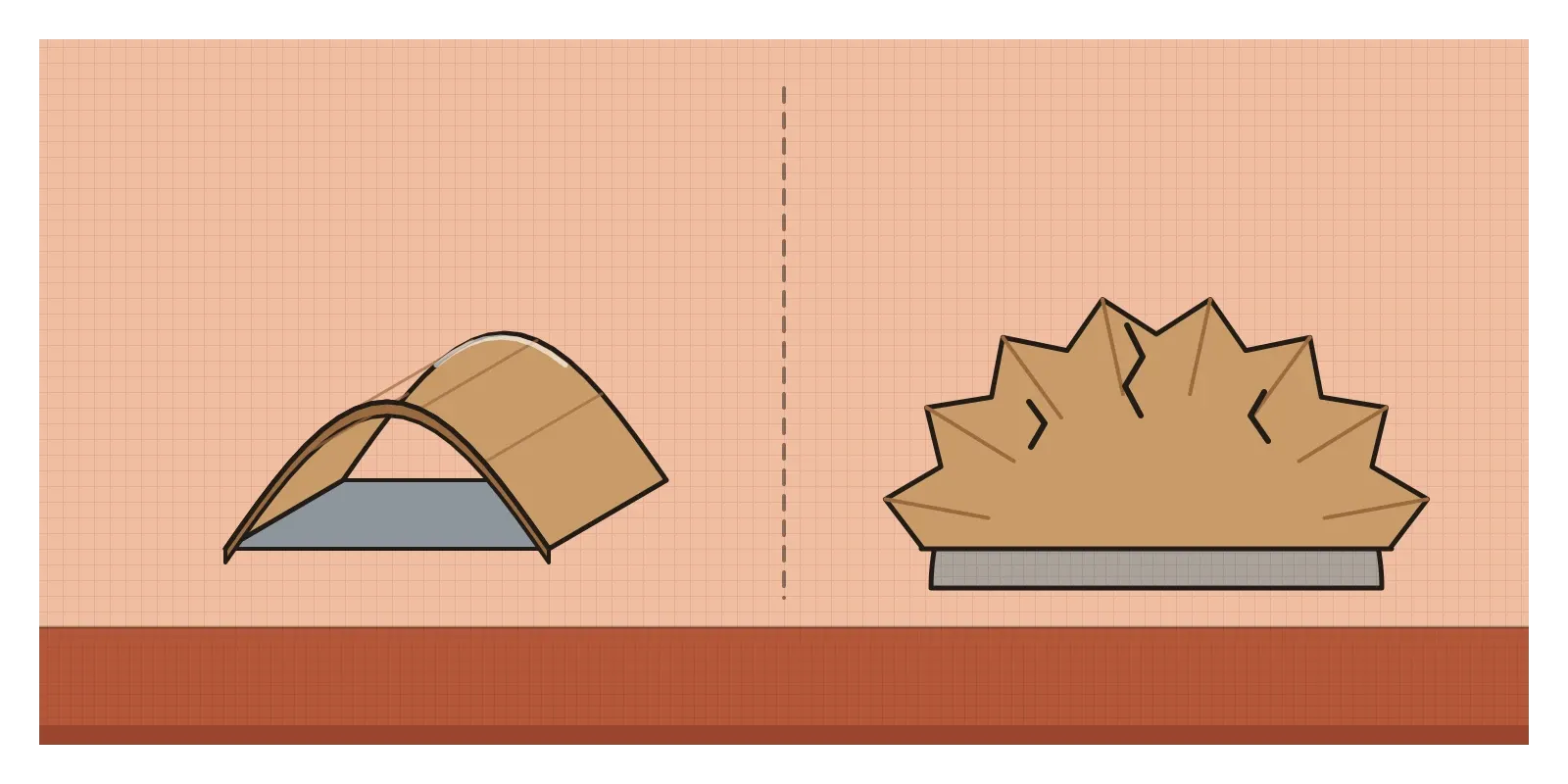
The key technical challenge was the compound curve. Bend a sheet of plywood in one direction, around a tube, and it behaves. Try to curve it in two directions at once, like a bowl or a saddle, and the layers wrinkle, split or spring back, because a flat sheet can't stretch to cover a dome. That's what defeated the 1941 prototypes, and what Charles and Ray Eames spent the war years learning to solve, a story I'll save for the post on Mid-Century Modern. But the ambition itself, one continuous surface shaped to the body, became the signature form of the period.
Isamu Noguchi, a Japanese-American sculptor who moved easily between art and design, brought a sculptor's eye to furniture. His coffee table of the late 1940s rests a heavy sheet of glass on two curved wooden pieces that lock together like bones in a joint, so you see the structure through the top. In 1951 he began working with lantern makers in Gifu in Japan on a family of lamps he called Akari, light in Japanese, made of mulberry-bark paper stretched over thin bamboo ribs. They fold flat, cost little and glow like a moon, and versions are still made by the same kind of workshops today.
Sculptors set much of the visual language. Jean Arp's smooth white forms, which look like pebbles or clouds caught halfway through changing shape, and Henry Moore's reclining figures, with holes that let space run through the body, made "biomorphic" shapes fashionable, shapes that suggest living things without copying any particular one. The Austrian-American architect Frederick Kiesler took that into rooms. For Peggy Guggenheim's New York gallery, Art of This Century, in 1942, he designed curved wooden pieces that could be a seat, a table or a stand for a painting depending on which way up you turned them.
Curves that start from the body
You recognise organic design first by its outlines. Straight lines give way to continuous curves, usually soft and asymmetrical, like a kidney, a boomerang, a leaf or a pebble. Seats are shells that cup the body. Table tops are free-form. Legs taper, and they meet the object they hold up with a slight swelling, the way a branch meets a trunk. Edges are rounded so that the eye and hand slide over them. Parts are few, and they tend to merge, the seat flowing into the back, the back into the arm.
The materials are usually warm and natural, or made to seem so: plywood with its grain showing, solid timber, cane, paper, wool upholstery, later moulded fibreglass. Colours lean to wood tones, off-whites and soft earth colours, with an occasional bright accent. In buildings you get local stone, wide overhangs, windows that wrap around corners towards the view and rooms that open into each other. The useful designer's habit underneath it all is to start from the body and the setting, not from a geometric shape. Rather than asking what box a chair should be, organic designers asked what shape a sitting person makes, and drew around that.
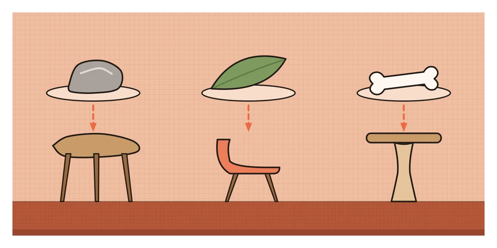
It's worth comparing this with Art Nouveau, which I wrote about earlier in this series. Both loved nature, but they used it differently. Art Nouveau took nature's decoration, stems, lilies and whiplash curves, and laid it over structure. Organic design tried to take nature's structure, the way a bone thickens where it carries load or a shell is strong because it's curved, and let decoration disappear.
A dormitory in Pondicherry
One of the most beautiful organic buildings of the period is in India, and few designers outside architecture know it. In the late 1930s, the Sri Aurobindo Ashram in Pondicherry, then a French territory, commissioned a dormitory for its members, later named Golconde. The architect was Antonin Raymond, a Czech-born American who had worked with Frank Lloyd Wright in Tokyo. He sent a young member of his office to supervise the work, George Nakashima, an American of Japanese descent trained as an architect. Golconde was built largely by the ashram's own members rather than a contractor, and it was finished in the mid-1940s. It is often described as one of the first modernist buildings in India.
What makes it organic is the way it works with the climate. The long concrete building is wrapped in rows of tilting louvres that can be angled to let the sea breeze through while keeping out the sun and rain, and its rooms are arranged for air to flow across them, so it stays cool without machines. Nakashima designed much of its furniture in teak, simple and carefully joined. He was drawn deeply into the ashram's life, took a spiritual name, Sundarananda, and left in 1939.
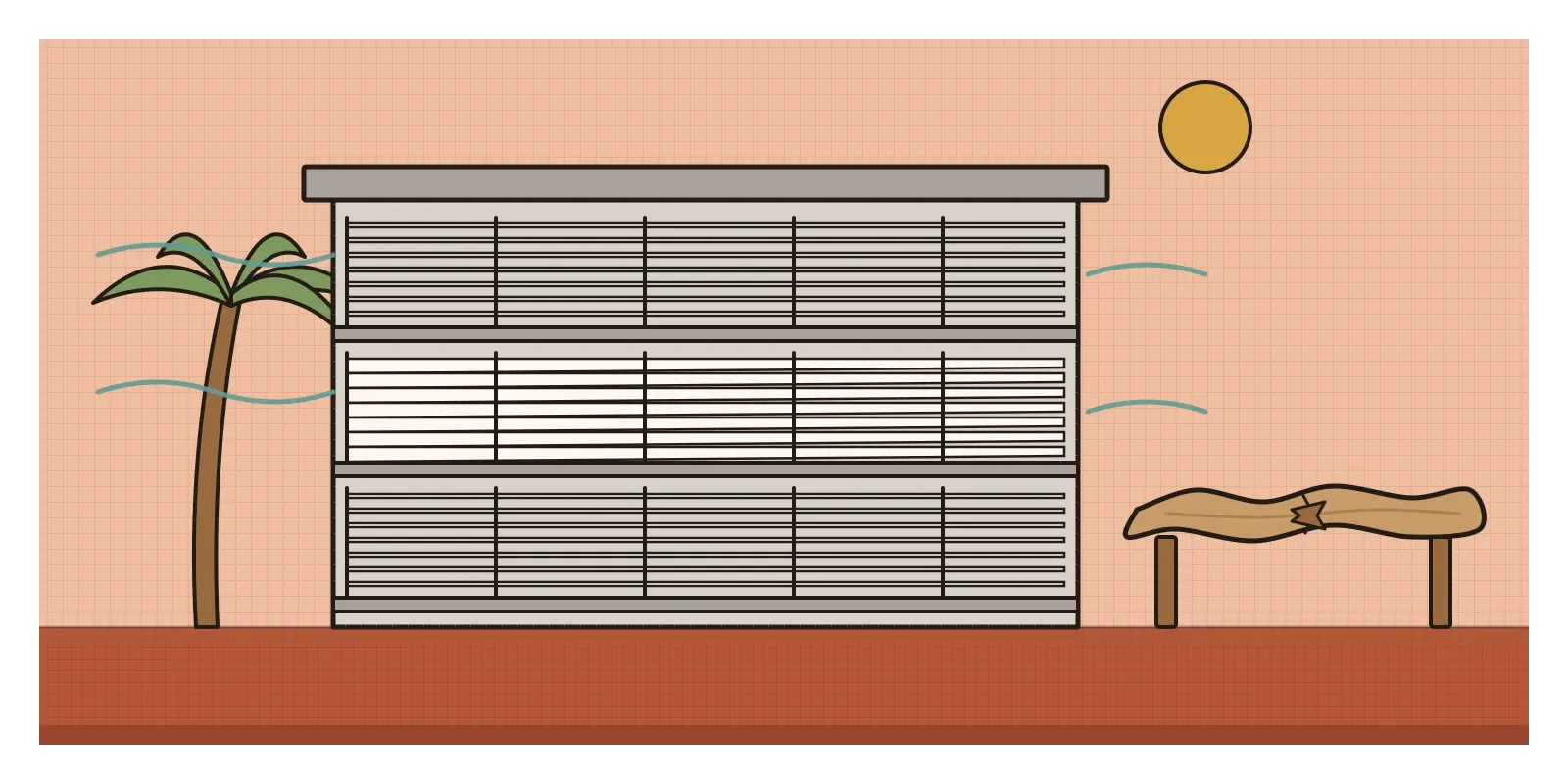
Back in the United States, Nakashima was interned with other Japanese Americans during the war, in a camp in Idaho, where a fellow internee taught him traditional Japanese joinery. Afterwards he settled in Pennsylvania and became famous for tables cut from single slabs of wood that keep the tree's natural edge, with small wooden butterfly keys set across the cracks to stop them spreading, an approach he described in his book The Soul of a Tree (1981). You can draw a line from Golconde's teak to those slabs. There's a looser parallel closer to home, too. Indian craftspeople have long shaped cane, reed and bamboo to the body, as in the hourglass moodha stool, without anyone calling it organic design.
Bones, branches and software
Much of what we touch every day is shaped by this idea. The curved backs of phones, the hump of a computer mouse, the moulded seat of a car or an office chair and the rounded corners of app icons all start from the hand or the body and smooth the transitions between surfaces. Ergonomics, the study of fitting objects to bodies, became a discipline in its own right in the same decades, partly through wartime work on cockpits and controls, and organic design gave it a visual language.
The idea of designing with nature has also come back in two newer forms. "Biophilic design", popularised by the biologist E. O. Wilson's book Biophilia (1984), argues that people do better in buildings with daylight, plants, natural materials and views, and it's now a common brief for offices and hospitals. And in engineering, generative design software can now grow a part rather than draw it, removing material wherever it isn't carrying load until what's left looks uncannily like bone or branching coral. In 2019 Philippe Starck, Kartell and Autodesk presented a chair, called A.I., whose form was generated this way. Noyes would probably have recognised it, a shape arrived at from structure, material and purpose, even if the designer was partly a computer.
When the curve became a cliché
Organic design had real limits. Its finest pieces were hard and expensive to make, which is why the 1941 winners never reached the department stores. The compound curve that defeated plywood was eventually conquered by moulded fibreglass and plastic, which made organic shapes cheap but much harder to repair or recycle. And as the style spread through the 1950s, the curve detached from the thinking. Kidney-shaped swimming pools, boomerang-patterned tabletops and amoeba ashtrays used organic outlines as pure decoration, the very thing the idea had set out to avoid.
Its heroes were mostly men, while the women in the studios were credited as helpers. Ray Eames's role in the competition entry and the work that followed was understated for decades, a story for the Mid-Century Modern post. And even the masterpieces had problems nature never has. Fallingwater's long concrete terraces began to sag, and it took a major structural repair around 2002 to stop them. The building famously leaked, too, as many Wright houses did.
The movement didn't so much end as get absorbed. Its shells were turned into mass-produced furniture by the American designers of the next decade, and by the 1960s plastic and Pop design had taken its curves somewhere wilder and cheaper. To see it for yourself, look at Golconde, which you can view from the street in Puducherry, at the Noguchi Museum in New York, whose website shows his lamps and tables, or simply at the chair you're sitting on. Then try this: sit on the floor, a stool and a sofa, sketch the outline your body makes in each, and design a seat from those outlines instead of from a rectangle. And remember those 1941 shells, prize-winning and quietly cracking under their cushions. The idea arrived before the means to make it. In the next post, on Modernism in Design, I'll step back to the steel-tube modernism these designers were answering, and to a kitchen in Frankfurt.
Further reading: Eliot F. Noyes, Organic Design in Home Furnishings (1941) · Frank Lloyd Wright, An Organic Architecture (1939) · Pat Kirkham, Charles and Ray Eames: Designers of the Twentieth Century (1995) · George Nakashima, The Soul of a Tree (1981) · Pankaj Vir Gupta, Christine Mueller and Cyrus Samii, Golconde: The Introduction of Modernism in India (2010)
A reply toThe hard right angles and cold chrome tubes of machine-age modernism.