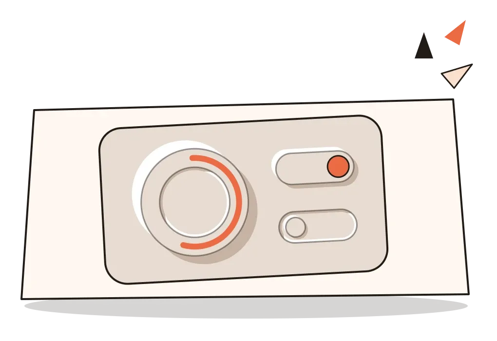
Neumorphism
The brief craze for soft, pale interfaces that seemed pressed out of the screen, and why it faded.
Neumorphism
A banking app moulded from one piece of plastic
In November 2019, the designer Alexander Plyuto posted a concept for a mobile banking app on Dribbble, the website where designers share images of their work. It wasn't a real product, just a few screens. But they looked unlike anything else on the site. The background was a pale, almost colourless grey, and the cards, buttons and dials weren't placed on top of it. They seemed to grow out of it, as if the whole screen had been moulded from one piece of soft plastic and pushed up from behind in places. A pale highlight sat along the upper-left edge of each element and a darker shadow along the lower right, so everything looked gently raised. Anything selected looked pressed in instead.
The post spread fast. It collected thousands of likes, a huge number by the standards of the site, and within weeks designers everywhere were making their own versions: calculators, music players, smart-home controls and weather apps, all in the same soft, milky relief. Plyuto's title called the shot skeuomorphic, and in the comments people tried out names for the new look. The one that stuck was neumorphism, a blend of "new" and "skeuomorphism".
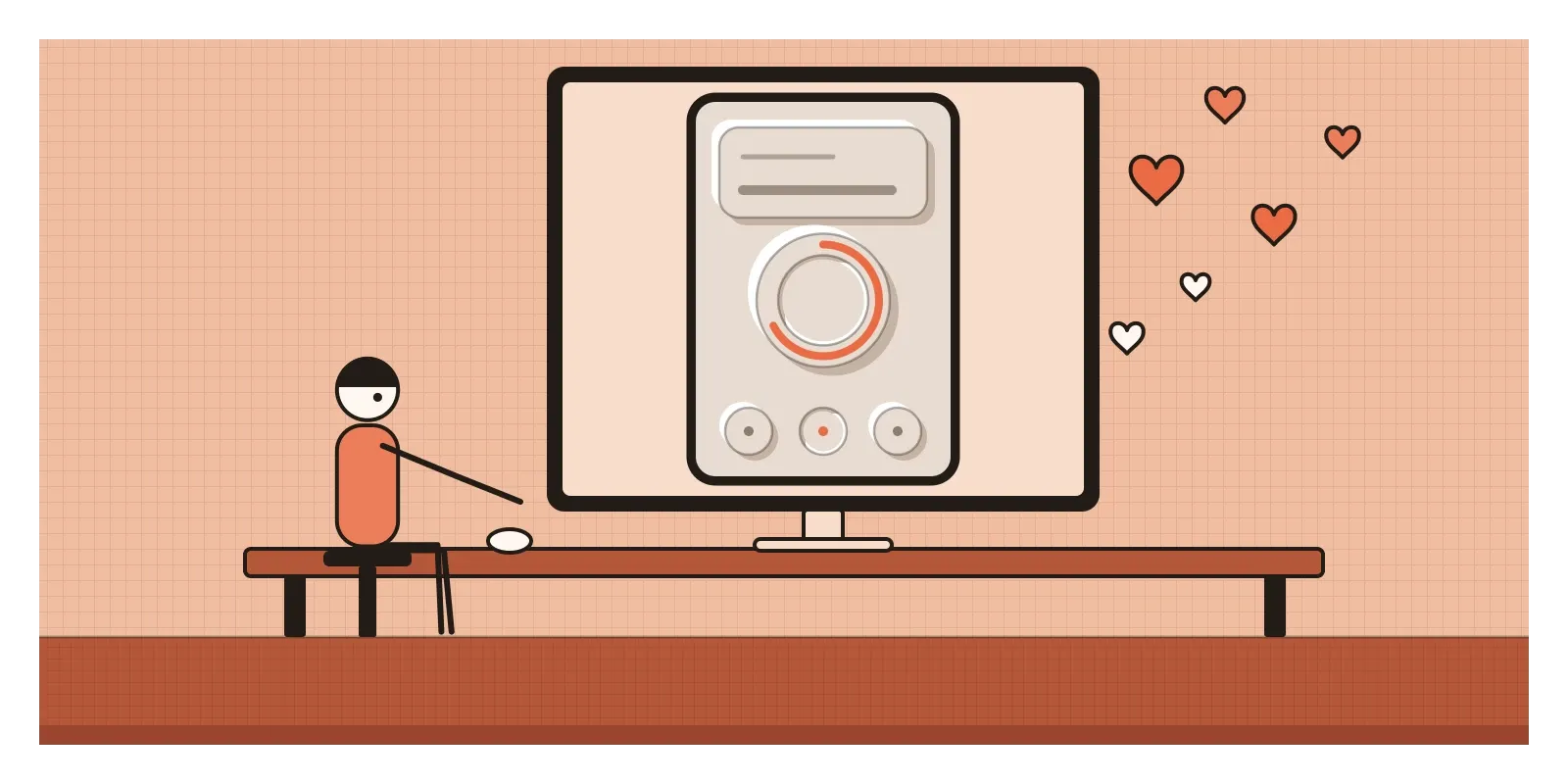
Neumorphism, sometimes spelled neomorphism and sometimes called soft UI, is an interface style in which elements are the same colour as their background and are shaped only by soft light and shadow, so they appear to rise out of the surface or sink into it. It flourished mostly in concept images between late 2019 and the end of 2020, which makes it one of the shortest-lived movements in this whole series.
Between flat colour and fake leather
It makes sense only against what came before. The posts on skeuomorphism and flat design traced the swing of the early 2010s, from interfaces that imitated leather, wood, felt and paper to the flat colours and simple shapes that took over around 2013. Material Design then found a middle path, with paper-like layers and shadows. By the late 2010s flat design was the default almost everywhere, and the previous post described the backlash it provoked from one direction, the raw, loud Brutalist web.
Neumorphism was a backlash from the other side. It kept flat design's minimalism, the single colours, simple shapes and lack of texture, but it brought back the sense of touch skeuomorphism had offered, the feeling that a button was a physical thing you could press. It didn't imitate any particular material, the way old calendar apps imitated stitched leather. It imitated something more abstract, a smooth, matte surface lit softly from one corner, like a moulded remote control or the casing of a kitchen appliance.
It was also a product of where it was born. Dribbble rewards images that look striking as small, still thumbnails in a feed, and neumorphism looked wonderful there. In 2013 the designer Paul Adams had written an essay called "The Dribbblisation of Design", which I mentioned in the post on Mannerism, about screens made to impress other designers rather than to work. Neumorphism became one of the clearest examples of what he meant.
A name in the comments and a page of sliders
The story of the name is tangled, and accounts differ. The most common version is that a designer called Jason Kelley suggested "neuomorphism" in a comment, and that Michal Malewicz, a Polish designer who runs the Hype4 studio and academy, dropped a letter and spread the word in an article called "Neumorphism in user interfaces" in late 2019. Malewicz's article did much of the work of turning one viral image into a recognisable trend. It explained how the effect was built and predicted it would spread, and it also warned, fairly, about its weak contrast.
Then the tools arrived. Free websites appeared that generated the code for a neumorphic element: you picked a background colour, dragged sliders for size, distance, blur and intensity, and the page handed you the two shadows ready to paste. Plug-ins for design tools and template kits followed. Because the effect was so easy to make, it spread mostly through concept work, portfolios and tutorials rather than shipped products. A few apps and smart-home dashboards adopted it. When Apple released macOS Big Sur in November 2020, with softer, rounder, more three-dimensional icons and controls, some designers saw an echo of the trend, though that was a broader return of depth rather than neumorphism itself.
Two shadows and a single colour
Neumorphism is easy to recognise and surprisingly precise to build. Everything starts with one background colour, usually a pale grey, off-white or soft pastel, never pure white or black, because the effect needs room for a lighter and a darker tone on either side. Each element is filled with exactly the same colour as the background. Its shape comes only from two shadows: a light one, almost white, offset towards the imagined light source, usually the top left, and a dark one, a deeper shade of the background, offset the opposite way. The result looks like a low plateau. Move both shadows to the inside of the shape and it looks like a hollow pressed into the surface, which designers used for selected buttons, text fields and switches.
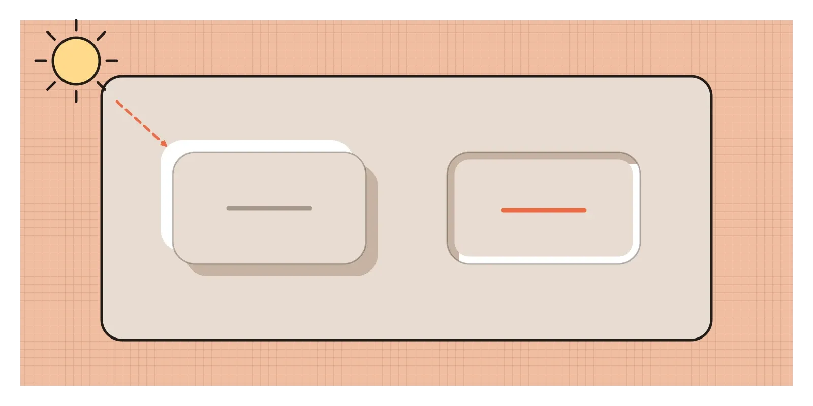
The rest of the vocabulary follows. Corners are generously rounded, and many elements are circles or pills. Colour is almost absent, with a single accent, often a gradient of blue or orange, saved for an active state or a progress ring. Type is small and light, usually a thin sans serif in mid-grey. Layouts are sparse, with lots of empty surface around a few large controls, because each element needs room for its shadows to spread. It is, in effect, the illusion I described in the post on light, shade and rendering, the circle lit from above that our brains read as a bump, turned into an entire interface.
On the web, the whole effect came down to a single line of code with two shadows in it, one light and one dark, which is partly why it spread so fast. But it also exposed something designers tend to forget when they work in static mock-ups. The shadows were tuned by eye for one background on one bright, calibrated monitor. Move the same button onto a slightly different grey, or onto a cheaper screen, and the balance that made it look moulded fell apart.
Mud walls in Kutch that catch the light
The closest Indian relative of neumorphism I know is far older and far more alive. In Kutch, in western Gujarat, the walls of the round mud houses called bhungas are often decorated with lippan kaam, relief work made from a dough of clay and dung that is shaped by hand into raised borders, lattices, trees, birds and geometric patterns. It's made mostly by women, from communities including the Rabari, Mutwa and Kumbhar, and each has its own repertoire of motifs. Like a neumorphic button, the relief is made of the same material as the wall it rises from, and it's often whitewashed the same colour, so the pattern exists as light and shadow across a single surface. It isn't only decoration, either. Makers and writers on the craft say the relief helps strengthen and insulate the mud walls, and the mirrors brighten interiors that have only small windows.
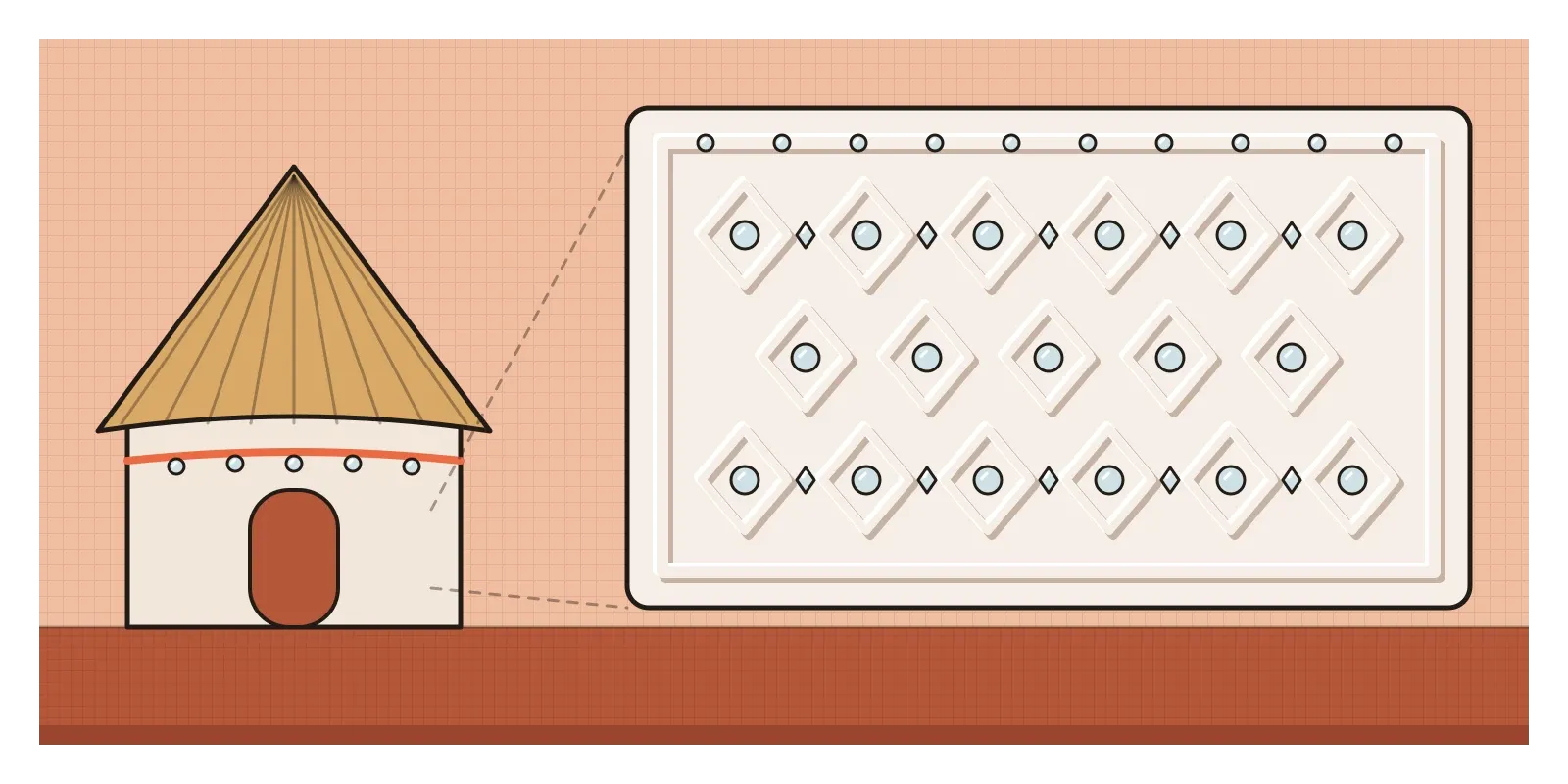
The difference is the mirrors. Into the clay, makers press small pieces of mirror, round, diamond-shaped or triangular, which catch the light from a lamp or a doorway and throw it back in bright points. They make the pattern readable even in a dim room and give the eye clear places to land. Neumorphism, by contrast, banished every strong highlight and every hard edge. The comparison is loose, and I don't want to push it too far, but I find it a useful lesson. A tradition that has lasted generations learned to pair soft relief with sharp, bright accents. A trend that lasted about a year tried to get by on softness alone.
Buttons that vanish in the sun
That softness was its downfall. Since 2018, the Web Content Accessibility Guidelines have asked that the visible edge of a button, a text field or any other control has a contrast of at least three to one against its surroundings. A neumorphic button, the same colour as its background and defined only by faint shadows, usually falls far short. People with low vision, ageing eyes or cheap screens can struggle to see where the buttons are. Even people with perfect sight had trouble telling states apart. Is this switch on or off, is this button pressed or disabled, when the only difference is whether a faint shadow sits inside or outside a pale shape? And phones aren't read in design studios. In bright Indian sunlight, on a budget screen with the brightness turned down to save battery, the subtle grey shadows simply disappear, and the interface becomes a blank sheet.
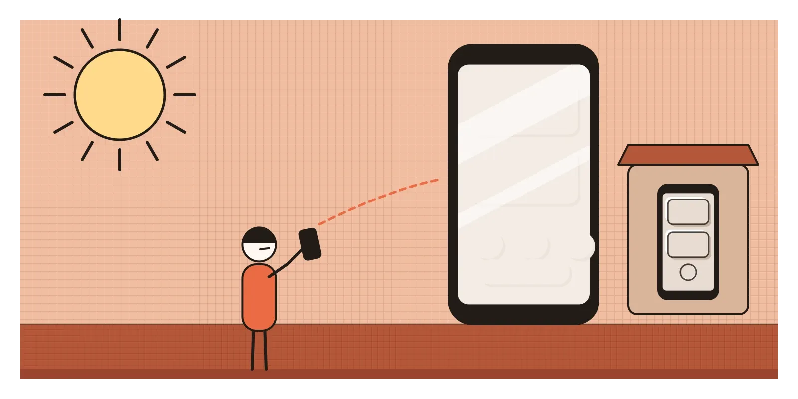
There were practical problems too. The style only works on a single flat colour, so it breaks as soon as you add photographs, maps or anything a user uploads. Dark versions are hard to get right. Long lists and dense data become a sea of identical pillows. And because the effect is purely decorative, it says nothing about what matters most on a screen. By the end of 2020 most designers had quietly moved on, and the trend became a standard example in talks about chasing novelty, which I touched on in the post on appeal to novelty.
Some of it is worth keeping. Soft shadows, used sparingly and paired with a clear outline or a strong accent, still make good controls on car dashboards, smart-home panels and the companion apps of physical products, where echoing the hardware helps. More importantly, neumorphism reminded a generation of flat designers that people like interfaces that feel touchable, a lesson the next movement took up in glass rather than plastic.
Press a real button
To see what neumorphism was imitating, find an old calculator, a television remote or a plastic light switch and look at it under a single lamp. Notice how the light falls on the raised keys, and how you know without thinking which ones can be pressed. Then try the bumps-and-dents experiment from the post on light and shade. For an exercise, build one neumorphic button in a design tool, check the contrast of its edge with any contrast checker, then look at it on your phone outdoors at noon. If you're ever in Kutch, look for lippan work in the villages and towns around Bhuj, where it's still made for homes as well as for hotels and shops, and notice how the mirrors change as you walk past.
Plyuto's banking app was never meant to ship. It was a picture of a feeling, the wish to touch a screen and feel something give. That wish was real and the picture was beautiful, but an interface has to be seen by everyone who uses it, in every kind of light. In the next post, on glassmorphism, designers tried again to give screens depth and presence, this time with frosted glass.
Further reading: Michal Malewicz, "Neumorphism in user interfaces" (2019) · Paul Adams, "The Dribbblisation of Design" (2013) · W3C, Web Content Accessibility Guidelines (WCAG) 2.1 (2018) · V. S. Ramachandran, "Perceiving Shape from Shading" (1988) · Don Norman, The Design of Everyday Things (2013)
A reply toFlat design's untouchable sameness, and the raw shouting of the Brutalist web.