Glassmorphism
How frosted, see-through layers became the 2020s answer to depth on screens, and what they cost.
Glassmorphism
Glass everywhere, and a notification nobody could read
On 9 June 2025, at its annual conference for developers, Apple announced the biggest change to the look of its software in more than a decade. Across the iPhone, iPad, Mac, Watch and television, buttons, menus, tab bars and panels would now be made of what the company called Liquid Glass, a translucent material that showed the content behind it, bent and brightened that content at its edges like a lens, and shifted its tint as you scrolled past colourful photographs or switched between light and dark. Apple said the design drew on its visionOS headset software, where panels float in front of your real room. To mark the change, every operating system jumped to the same version number, 26.
Within days of the first test version reaching developers, people were posting screenshots. A notification sitting over a busy wallpaper, its white text dissolving into the clouds behind it. A control panel whose icons blurred into the home screen underneath. Some of the complaints were simply about novelty, but many were about something real: text on a see-through surface is only as readable as whatever happens to be behind it. Apple adjusted the amount of frosting through the summer's test releases, and about two months after the public launch in September an update added a setting that let people choose between the original clear glass and a tinted, more opaque version.
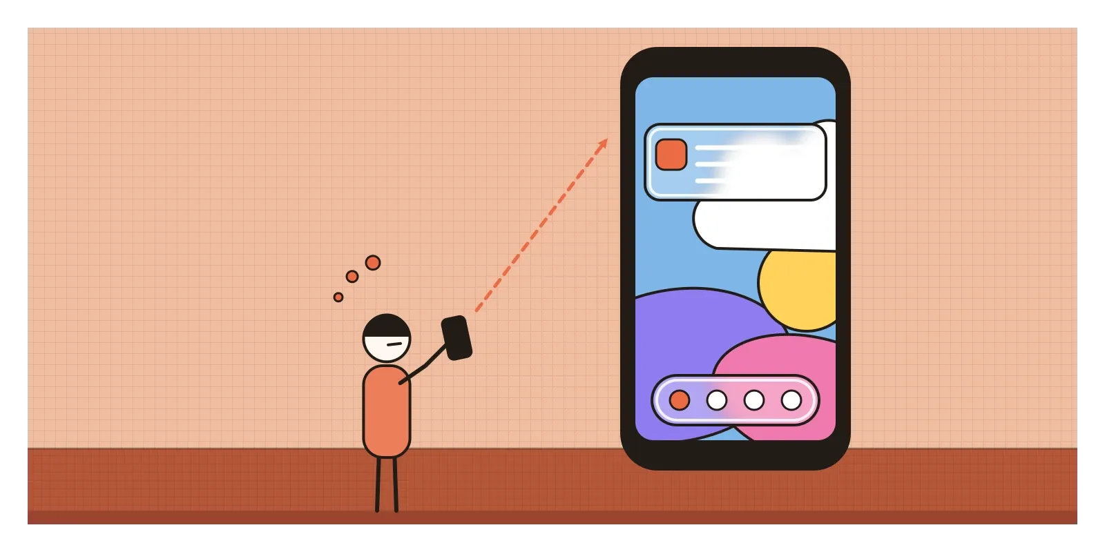
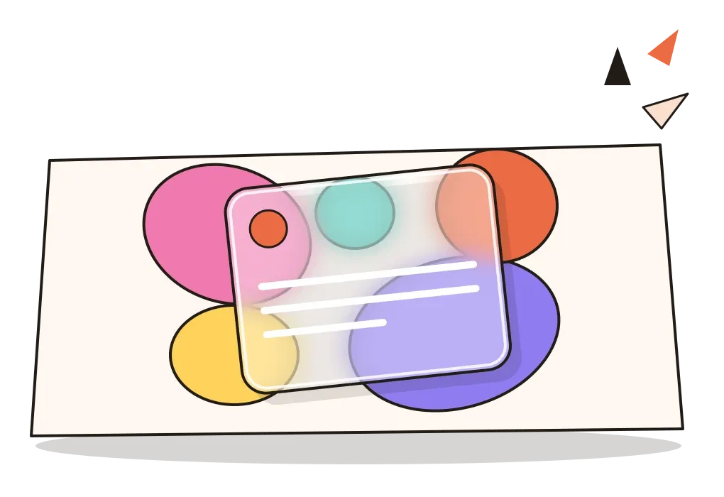
Liquid Glass was the latest and grandest version of a style designers had been calling glassmorphism since 2020. Glassmorphism describes interfaces built from translucent panels that blur whatever lies behind them, like frosted glass, usually with a pale tint, a thin bright edge and a colourful background showing through. It gives a flat screen depth by stacking layers you can partly see through, rather than by casting heavy shadows or imitating real materials.
From glassy window frames to a frosted sidebar
Glass had come and gone on screens before. When Microsoft released Windows Vista to the public in January 2007, its Aero interface gave every window a translucent, blurred frame, so you could see a ghost of the desktop behind each title bar. It needed a reasonably powerful graphics card, and it was dropped in Windows 8 in 2012 for the flat tiles described in the post on flat design. The following year, Apple's iOS 7, the very release that swept away leather and felt, kept one effect: its Control Centre and notification panels were blurred, translucent sheets that let the colours of the screen beneath glow through. Flat design, in other words, had glass tucked inside it from the start.
The style returned in force at the end of 2020, and it was a reply to the movement in the previous post. Neumorphism had tried to give interfaces a physical presence through soft, opaque, colourless plastic, and it failed because its buttons vanished into their background. Glass kept the idea of a physical surface but turned it inside out. Instead of hiding everything under one pale colour, it let colour in from behind, and it separated layers by blurring rather than by faint shadows. It also suited the screens of the time, bright and sharp enough, with fast enough graphics chips, to blur a moving background many times a second.
A name in late 2020 and a single line of code
Three things arrived almost together. In November 2020, Apple released macOS Big Sur, a redesign of its desktop software with translucent sidebars, a frosted menu bar and a new Control Centre made of floating, glassy panels. In the same month Michal Malewicz, the Polish designer whose article had helped name neumorphism a year earlier, published "Glassmorphism in user interfaces", gathering the frosted-glass look under one name, connecting it to Big Sur and setting out how to build it. And Dribbble filled with concepts of glass cards floating over glowing blobs of pink, violet and orange, for banking apps, music players and dashboards.
Microsoft had been heading the same way. Its Fluent Design System, introduced in 2017, included a material it called Acrylic, a semi-transparent, blurred texture for menus and panels, and Windows 11 in 2021 added Mica, a subtler surface faintly tinted by the colours of your desktop wallpaper. On the web, the key ingredient was a CSS property called backdrop-filter, which blurs whatever sits behind an element. Safari had supported it for years, and by 2022 every major browser did, so a frosted panel became one short line of code.
Blur, a pale tint and a bright edge
Glassmorphism is easy to recognise once you know its four ingredients. The first is background blur: whatever lies behind a panel, a photograph, a gradient, other windows, is softened so that its colours come through but its details don't. The second is a pale tint, usually white at somewhere between a tenth and a third of full strength, which lightens the blur and gives the text a more even surface to sit on. The third is a thin, semi-transparent white border, which catches the eye like the polished edge of a real pane. The fourth is something worth looking through, usually a vivid background of soft, overlapping colour shapes, because glass over a plain grey wall just looks grey.
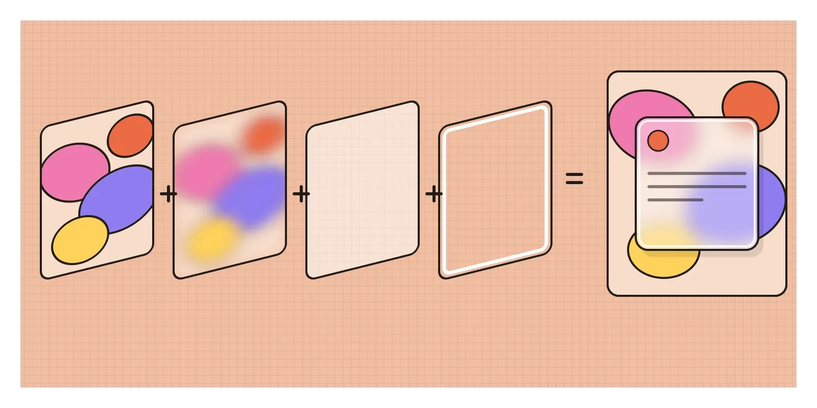
Around those ingredients sit the usual companions: generous rounded corners, a soft shadow to lift each pane off the one below, white or very dark text and thin line icons. Depth comes from stacking. A sidebar is one sheet of glass, a menu that opens over it is another, and a notification slides across both. Each layer blurs the ones behind it a little more, so your eye reads the order of the stack without being told. Liquid Glass added a few new tricks, such as edges that bend the content behind them like a lens and highlights that seem to catch the light as you move, but the grammar is the same.
It's worth remembering how old the physical version is. Frosted glass is made by roughening the surface of a pane so that it scatters light instead of letting it pass straight through, either by etching it with acid or by blasting it with sand, a process the American inventor Benjamin Chew Tilghman patented in 1870. Victorian offices, pubs and front doors used etched and frosted panes for exactly the reason designers use them now: to let light through while hiding detail, and to say where one space ends and another begins.
Windows of oyster shell in Goa
India has a much older answer to the same problem, and it isn't glass at all. In the old houses of Goa, especially in Panjim's Fontainhas quarter and in villages of Bardez, Tiswadi and Salcete, many windows are made of small squares of shell set into wooden lattices. The shells come from the windowpane oyster, whose flat, thin, pearly shell lets light through without being transparent. Locally the windows are known by names such as carepa. They seem to have arrived with the Portuguese, probably in the sixteenth century, and a French traveller, François Pyrard de Laval, described oyster-shell window panes in Goa in the early 1600s. Glass was expensive and hard to come by, and shell was right there in the estuaries.
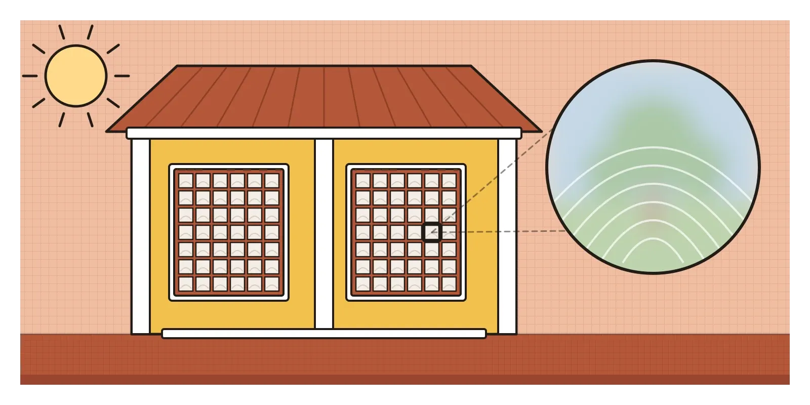
Stand inside a room with these windows and the effect is very like a glassmorphic panel. The harsh coastal sun becomes a soft, milky glow. You can see that the world outside is there, a shape moving past, the green of a tree, but not its detail, and people outside can't see in. The lattice of small panes even gives the light a gentle grid, rather like the thin bright border on a glass card. In the post on Islamic art I wrote about the stone jali, which solves the same problem with holes rather than translucency. Both are reminders that designing with partial visibility, letting some of the world through and holding the rest back, is an old skill, not a 2020s invention.
The shell windows are disappearing. Old houses are being pulled down or refitted with glass, the skill of cutting and fitting the shells is fading, and the oysters themselves have become scarce enough that, from what I've read, they are now protected. The windows that survive are among the most beautiful things in Goan architecture.
Glass needs something behind it
Glassmorphism's main weakness is built into its premise. A see-through panel has no fixed colour, so the contrast between its text and its surface changes with whatever is behind it. Accessibility guidelines ask that ordinary text has a contrast of at least four and a half to one with its background. On glass, that can be true over a dark photo and false over a white cloud a moment later as you scroll. Designers who use it carefully add a stronger tint, a darker scrim behind text, or more blur than the effect strictly needs, which is roughly what the tinted version of Liquid Glass does. Both Apple and Microsoft have long offered settings to reduce transparency for people who find it hard to read, which says something about how often it goes wrong.
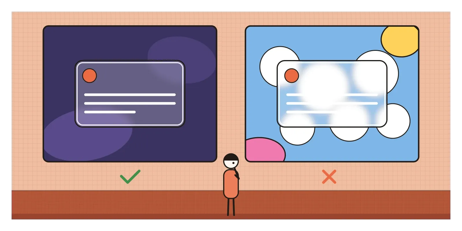
There are other costs. Blurring a moving background takes real computing power, which is why Vista needed a good graphics card and why heavy glass effects can make older or cheaper phones stutter and drain their batteries faster. On the web, a page full of frosted panels can feel sluggish. And in many concept images, the glass was doing very little work. A frosted card floating over a gradient blob looked rich in a thumbnail, but it often hid the structure of the interface rather than clarifying it, the same trap neumorphism fell into.
Where glass earns its place is in layering and in mixed reality. A translucent panel tells you there's something underneath it and roughly what, which is useful for menus, sheets and notifications that sit on top of your work for a moment. In a headset, where windows float in front of your actual room, see-through panels are close to a necessity, because a wall of opaque rectangles would cut you off from the world you're standing in. That's the strongest argument for Liquid Glass, and also why it's controversial on a phone, where nothing behind the panel needs to be seen.
Hold tracing paper over a photograph
To see how glassmorphism works, put a sheet of tracing paper or baking paper over a busy photograph in a magazine, then over a calm one. Notice how much easier it is to write on the paper over the calm picture, and how the busy one still shows through as patches of colour. That's the whole design problem in a minute. On your phone, find the accessibility settings that reduce transparency or increase contrast, switch them on for a day, and notice what you gain and lose. If you're in Goa, walk through Fontainhas in Panjim and look up at the windows, and visit the Houses of Goa Museum near Porvorim, set up by the architect Gerard da Cunha, to see how the old houses were built.
Apple's notification, dissolving into a wallpaper of clouds, showed the oldest truth about glass: it's only ever as good as what's behind it. Used for layers that need to show their context, it's a lovely and useful material. Used everywhere because it looks expensive, it becomes another kind of fog. In the next post, on the Y2K revival, designers raided the chrome, gradients and translucent plastic of the years around 2000, the era that Vista's glass grew out of, and found them fresh again.
Further reading: Michal Malewicz, "Glassmorphism in user interfaces" (2020) · Paul Scheerbart, Glass Architecture (1914) · Isobel Armstrong, Victorian Glassworlds: Glass Culture and the Imagination 1830-1880 (2008) · W3C, Web Content Accessibility Guidelines (WCAG) 2.1 (2018)
A reply toNeumorphism's opaque, colourless plastic, answered with coloured layers you could see through.