Neoclassicism
How Europe answered the frills of Rococo with columns, clean lines and stories of Roman duty.
Neoclassicism
Three brothers, three swords, three arches
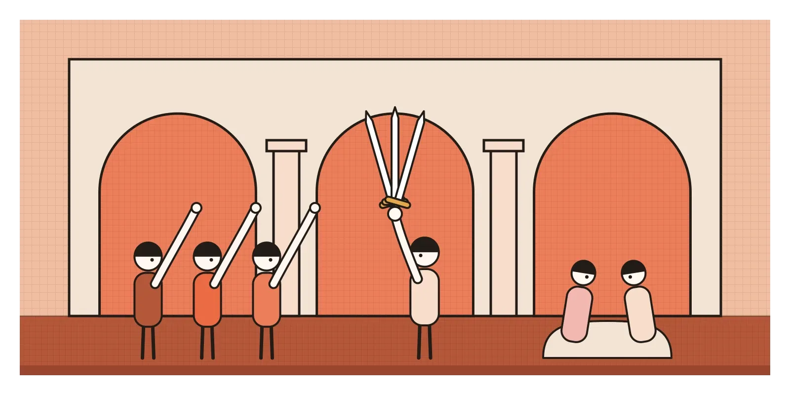
In the summer of 1785, visitors in Rome flocked to a French painter's studio. Jacques-Louis David, then in his mid-thirties, had come from Paris to paint a royal commission in the city he thought of as the source of serious art, and word had got around that the result was extraordinary. The canvas is well over three metres tall and four wide. On the left, three brothers stand in a row, legs braced, arms stretched out in a stiff salute. In the centre their father holds up three swords. On the right, the women of the family slump together in grief. Behind them, the room is almost empty: a stone floor, a plain wall and three round arches on sturdy columns, one framing each group.
The painting is The Oath of the Horatii. Its story comes from early Roman legend. Rome and a neighbouring city agreed to settle a war by a fight between three champions from each side, and the Horatii brothers are swearing to win or die. Their sister is engaged to one of the enemy champions. The oath itself doesn't appear in the ancient accounts, and David seems to have invented the moment, possibly with help from a stage version. When the painting reached the Paris Salon later that year, crowds gathered around it. It was reportedly larger than the commission had asked for, as if David knew it was meant to make a point.
The point was a style. Neoclassicism, "new classicism", was a movement in European and American art, architecture and design from roughly the 1750s to the 1830s that turned back to ancient Greece and Rome for models of clarity, order and moral seriousness. It covers paintings like David's, marble statues, country houses, government buildings, teapots and even typefaces. Its message was that art should be clear, calm and improving, and it was a direct reply to the style that came just before it.
Digging up the ancient world
The style it answered was Rococo, which has its own post earlier in this series: pastel interiors, curling gilt ornament, and paintings of aristocrats flirting on garden swings. By the 1750s, a growing number of critics found it frivolous. The French writer Denis Diderot, reviewing the Paris Salons, complained that François Boucher painted charm without truth. Underneath that complaint was the thinking of the Enlightenment, the belief that reason, simplicity and virtue should shape public life. A style made for private pleasure began to look like a symptom of a tired, decadent court.
At the same time, the ancient world was literally coming out of the ground. Excavations began at Herculaneum in 1738 and at Pompeii in 1748, the Roman towns buried by Vesuvius, and visitors could see real Roman wall paintings, furniture shapes and household objects for the first time. Wealthy young British and northern Europeans were making the Grand Tour to Italy, buying antiquities and engravings. Giovanni Battista Piranesi's etchings made Rome's ruins look colossal. In 1762 James Stuart and Nicholas Revett published the first volume of The Antiquities of Athens, with measured drawings of Greek buildings.
The movement's theorist was a German librarian, Johann Joachim Winckelmann. In a short essay of 1755, he argued that the only way for modern artists to become great was to imitate the Greeks, and he summed up Greek art in a phrase that became a slogan: "noble simplicity and quiet grandeur". He'd mostly seen Roman copies, not Greek originals, but the phrase stuck. Simplicity, calm and grandeur were exactly what Rococo seemed to lack.
Marble, plaster and a woman in the Academy
David became the movement's most powerful painter. After the Horatii he joined the French Revolution, and in 1793 painted The Death of Marat, showing the murdered revolutionary journalist slumped in his bath, a pen still in his hand, against a dark, empty wall. It's the same restraint turned into political mourning. Later he painted Napoleon, and the style followed power from republic to empire.
In sculpture, the Venetian Antonio Canova made marble look weightless. His Psyche Revived by Cupid's Kiss, carved between 1787 and 1793 and now in the Louvre, shows two figures whose arms form a ring around their nearly touching faces, a composition you can walk around and see change. In architecture, the Scottish architect Robert Adam built and remodelled country houses whose interiors used delicate low-relief ornament borrowed from Roman decoration, pale colours and carefully matched furniture and ceilings. At Kedleston Hall in Derbyshire, the south front is often said to be modelled on a Roman triumphal arch. Across the Atlantic, Thomas Jefferson designed the Virginia State Capitol in the 1780s after a Roman temple in Nîmes, in southern France, because he wanted the new republic to look like an ancient one.
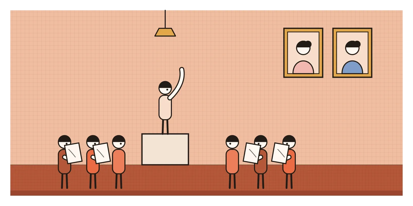
One of the most successful painters of the period was a woman. Angelica Kauffman, born in Switzerland in 1741, painted classical and historical scenes and portraits, and in 1768 she and the flower painter Mary Moser were among the founding members of the Royal Academy in London. The Academy's members were later painted together by Johann Zoffany, gathered around a nude male model in the life room. Kauffman and Moser aren't in the group. Because women weren't allowed to study the nude, they appear only as portraits hanging on the wall.
Neoclassicism also shaped everyday design. The potter Josiah Wedgwood, whose factory I mentioned in the post on design, art and craft, sold jasperware: matte stoneware in soft blue or green with white classical figures in relief, many designed by the sculptor John Flaxman. Teapots, vases and medallions brought ancient Greece onto middle-class mantelpieces.
Straight lines, quiet surfaces, thick and thin
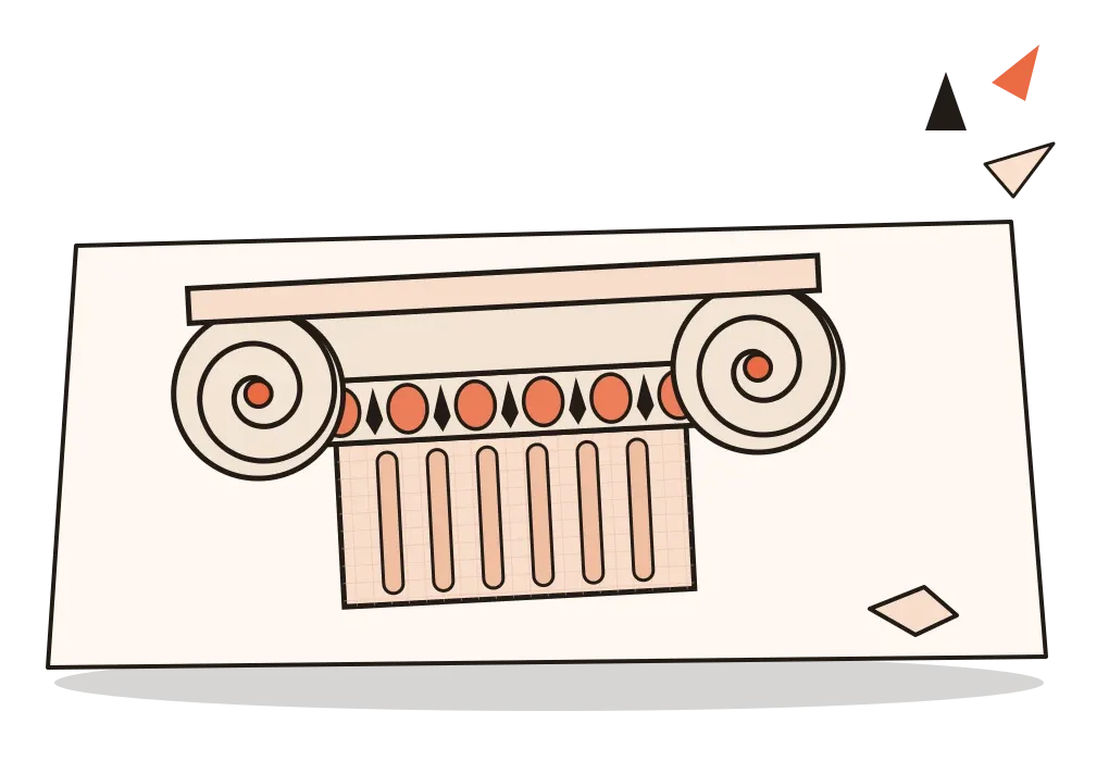
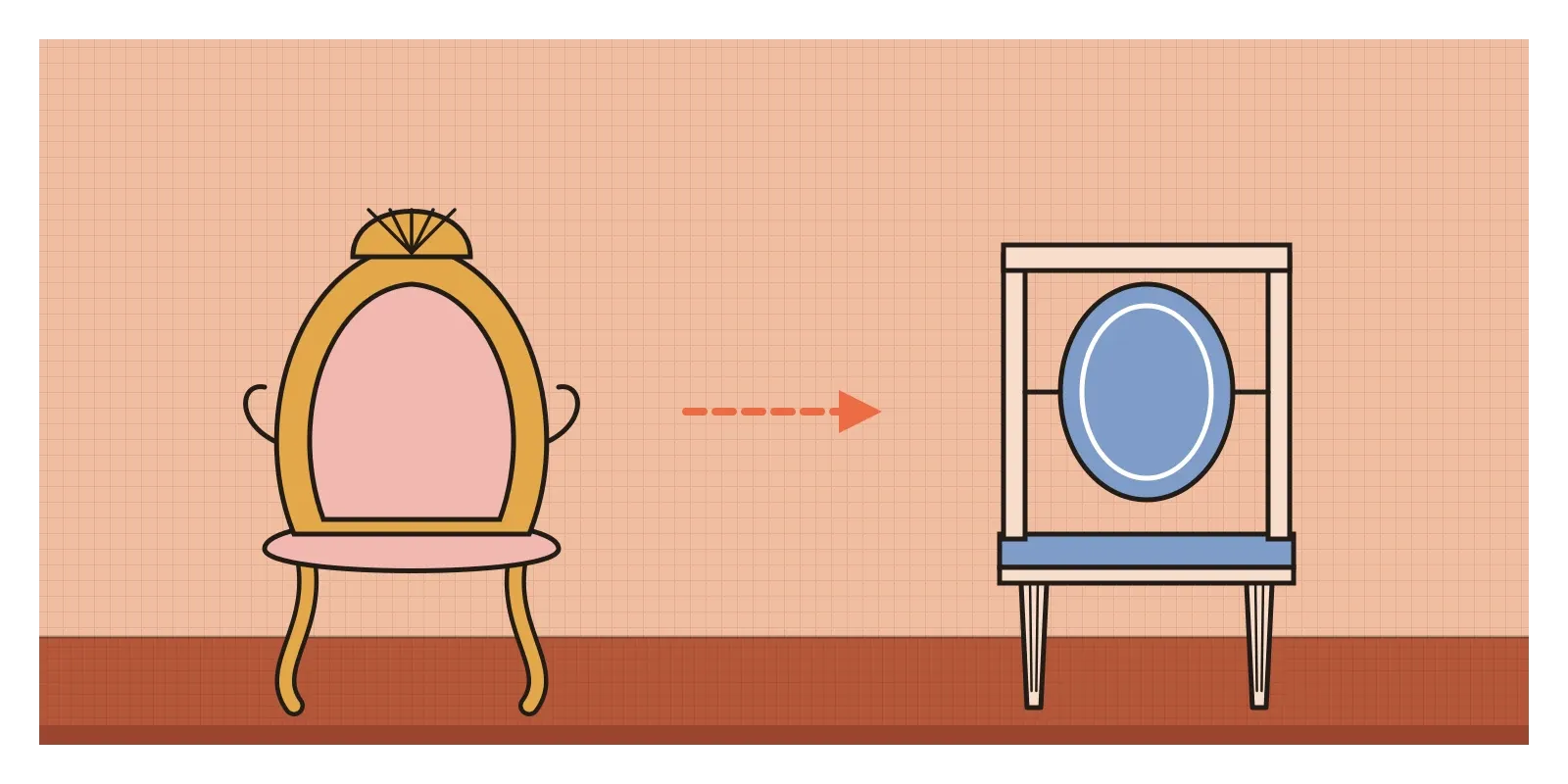
Neoclassicism is easy to recognise once you've seen Rococo next to it. Where Rococo curves, it straightens. Furniture legs become tapered and fluted, like miniature columns, instead of curving out like a deer's legs. Ornament flattens into shallow relief and is used in bands, panels and medallions rather than spreading everywhere. Buildings have a temple front, a triangular pediment over a row of columns, and symmetry is close to compulsory. In painting, figures are arranged across the canvas like a carved frieze, outlines are crisp, brushstrokes are hidden, and backgrounds are kept plain so nothing distracts from the story.
The palette is cool and controlled: white marble, stone, pale blue, sage green and touches of gold, rather than Rococo's pinks and gilt everywhere. Space is clear and shallow, like a stage. The mood is serious. Even a love story like Canova's is about stillness at the height of feeling rather than flirtation.
Typography changed too. In the late eighteenth century, the Didot family of printers in Paris and Giambattista Bodoni in Parma cut typefaces with extreme contrast between thick vertical strokes and hairline thin ones, with flat, unbracketed serifs, upright stress and lots of white space around them. They are now called Didones, from the two names. Set in generous margins, they gave a printed page the same crisp, marble-like quality as a Canova.
Columns on the Hooghly
Neoclassicism arrived in India with the East India Company, and it arrived as the architecture of power. In Calcutta, the Company's capital, Governor-General Richard Wellesley commissioned a new Government House, built between 1799 and 1803 to a design by Charles Wyatt, an engineer officer. It was based on Adam's Kedleston Hall: a central block with a domed hall and four curving wings, a grand flight of steps and a columned portico. It still stands as Raj Bhavan, the residence of the Governor of West Bengal. Calcutta's riverfront filled with porticoes and columns, enough for the city to be called the City of Palaces, and in Madras the Banqueting Hall, built in 1802 to a design by John Goldingham and now called Rajaji Hall, looks like a Greek temple placed on a raised base.
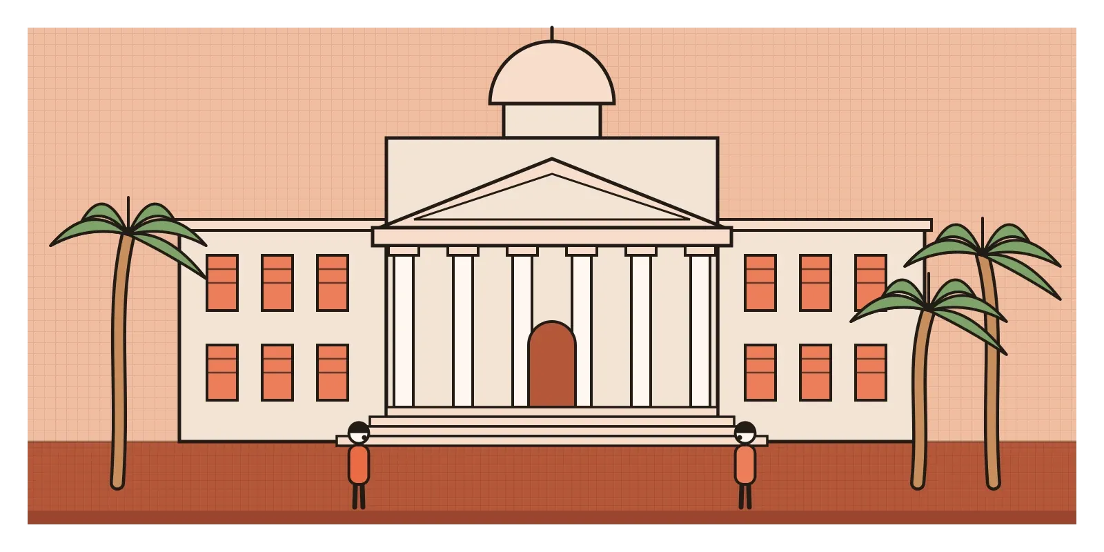
The message of these buildings was hard to miss. Columns borrowed from Rome said that the Company saw itself as the heir to an empire, governing by law and reason. Their builders were also adapting. Verandas, deep shade, high ceilings and louvred shutters were added for the climate, and much of the work was done by Indian masons and craftsmen whose names were rarely recorded.
Indian patrons took up the style for their own reasons. In 1835 Raja Rajendra Mullick built the Marble Palace in north Calcutta, with Corinthian columns, marble floors and a collection of European sculpture and paintings, a statement that a wealthy Bengali family could be as cosmopolitan as any Company official. For India, Neoclassicism was never just about ancient Greece. It was about who got to claim its authority, and later, in the post on Company painting, I'll look at how Indian painters were working for the same patrons at the same time.
Why banks still wear columns
Neoclassicism's most lasting idea is that a style can signal trust. That's why so many banks, courts, parliaments, universities and museums, in India and almost everywhere else, still use columns, pediments and wide flights of steps. The forms say permanence, law and seriousness. Brands do the same thing on a smaller scale. A logo built around a column, a laurel or a temple front borrows that borrowed authority, which is why you see so many of them on law firms, insurers and old financial institutions.
Didone typefaces are the clearest trace in graphic design. Fashion magazines and luxury brands use them for mastheads and logotypes because the sharp contrast feels elegant and expensive. For product designers, they come with a warning. Those hairlines look beautiful large and in print, but at small sizes on screens they can thin out and almost vanish, so Didones work best as display type, with a sturdier face for body text. More generally, the movement taught an idea every design system now relies on: a limited, consistent vocabulary of forms, used with restraint, makes a whole range of things, from buildings to teapots, feel as if they belong together.
The trouble with pure white marble
The movement's central ideal rested on a mistake. Winckelmann and his followers admired the pure white of ancient marble, but ancient sculpture and architecture were usually painted in strong colours, which I wrote about in the post on ancient Greek art. Over time, the ideal of whiteness became tangled up with ideas about race. Eighteenth-century writers measured human faces against statues like the Apollo Belvedere, and later race science used such comparisons to rank people, with the white statue at the top. Classical forms also served slavery and empire. Jefferson's own house at Monticello, with its domed, columned front, was built and run by enslaved people, and the same columns that stood for liberty in Virginia stood for conquest in Calcutta. Women like Kauffman were admired but kept outside the rooms where the rules were made.
The style's politics were flexible to the point of emptiness. David painted for the king, then for the Revolution, voted for the king's execution, and finally painted Napoleon's coronation. Under Napoleon, Neoclassicism became the grand Empire style, all eagles, laurels and gilt bronze. By the early nineteenth century, a younger generation found its calm and its rules suffocating. They wanted feeling, nature, darkness and the sublime, and that reply, Romanticism, is the subject of the next post.
To see it for yourself in India, walk past Raj Bhavan in Kolkata and look at how its portico organises the whole front, then visit the Marble Palace if you can (check the current visiting rules first), or look at Rajaji Hall in Chennai. In any city, find one building with a temple front, a bank, a court or a college, and count the columns and the steps. Then do a small design exercise. Take a page you've made and redesign it with only symmetry, one serif typeface and one colour. It will look calm, serious and a little cold, which is exactly what David wanted the Horatii to feel like: three arches, three swords and nothing extra.
Further reading: Hugh Honour, Neo-classicism (1968) · David Irwin, Neoclassicism (1997) · Thomas Crow, Painters and Public Life in Eighteenth-Century Paris (1985) · Philip Davies, Splendours of the Raj: British Architecture in India, 1660 to 1947 (1985)
A reply toThe pastel curls and private pleasures of Rococo.