Minimalism
How artists in 1960s New York stripped art down to plain, factory-made forms, and why it still shapes our rooms and screens.
Minimalism
A pile of bricks on the front page
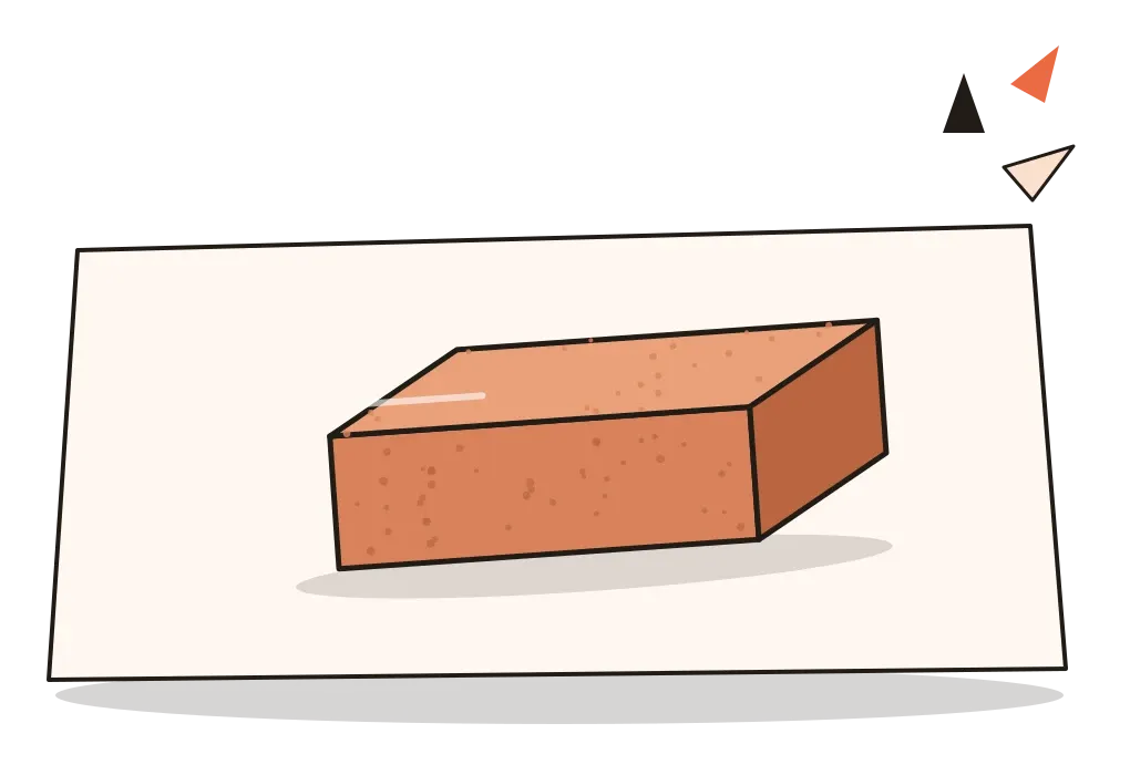
On 15 February 1976, the business pages of the London Sunday Times ran a short article about something the Tate Gallery had bought four years earlier. It was a work by the American sculptor Carl Andre called Equivalent VIII: 120 ordinary firebricks, laid flat on the floor in a low rectangle two bricks deep. That was all. No carving, no glue, no plinth. Within days the story was everywhere. Newspapers printed photographs of the bricks, headline writers had a field day, and the Tate was accused of wasting public money on rubbish. Later that month a visitor splashed the bricks with blue dye.
The story behind the work made it stranger. Andre had first made eight floor pieces from the same number of bricks in 1966, each arranged in a different rectangle, which is why they were "equivalent". They didn't sell, so the story goes, he returned the bricks to the brickworks for a refund and later bought new ones when the Tate wanted the piece. The Tate kept it, and it has been shown many times since. Fifty years on, it's still the work people mean when they say modern art is a con.
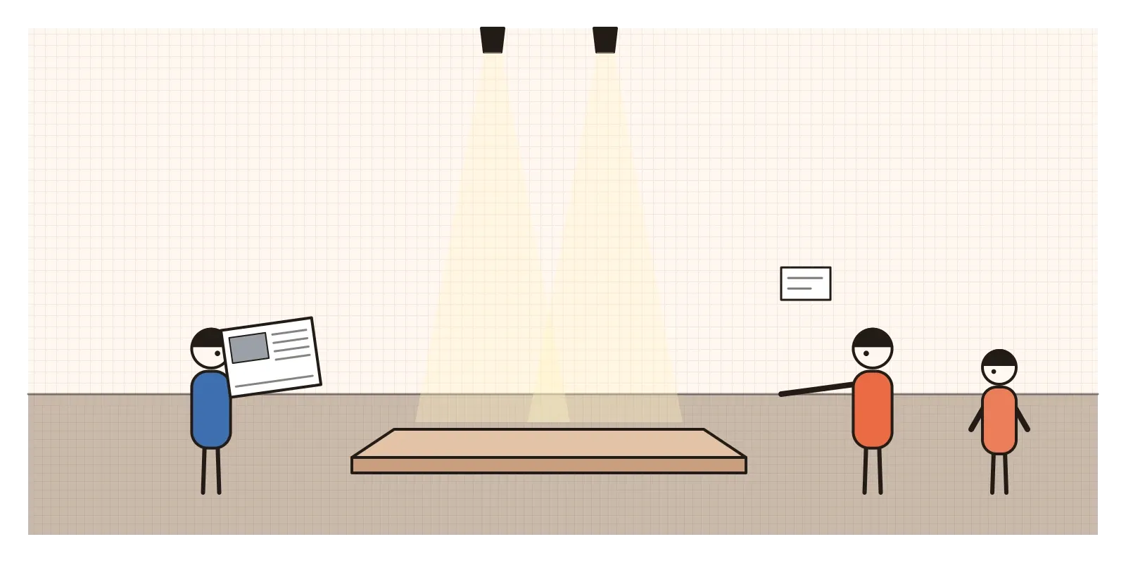
Minimalism is the name for the art the bricks belonged to. It took shape in New York in the early 1960s, mostly in sculpture, and it reduced art to simple geometric forms, often repeated, often made from industrial materials or by factories, with no hidden meaning, no story and as little sign of the artist's hand as possible. The word was given to it by critics, and most of the artists disliked it. But it stuck, and it has since spread far beyond art, to rooms, products, websites and a whole way of living.
What you see is what you see
Like Pop and Op, which have their own posts in this section, Minimalism was a reply to Abstract Expressionism. By 1960 the heroic, gestural painting of Pollock and de Kooning had become the official style of American art, and its talk of inner struggle and the sublime had begun to sound like a pose. Younger artists wanted something cooler, plainer and more honest.
The first clear sign was a young painter, Frank Stella. In 1959, aged twenty-three, he showed a series of black paintings at the Museum of Modern Art, made of bands of black house paint separated by thin lines of bare canvas, following the shape of the canvas inward. There was no gesture and no depth, just a pattern that could be described in a sentence. Asked about it in a 1964 interview, he said that what you see is what you see, and that line became Minimalism's motto.
The other reply was to a European idea of composition, balancing different parts against each other in a carefully adjusted arrangement. The Minimalists called this relational and wanted to get rid of it. Their answer was the single form, or the same form repeated, one thing after another, with nothing to balance. This is also where they owed a debt to earlier modernists such as the Constructivists and to Malevich's square, which I wrote about in the post on abstraction, though they were wary of the spiritual claims those artists had made.
Boxes from a sheet-metal shop
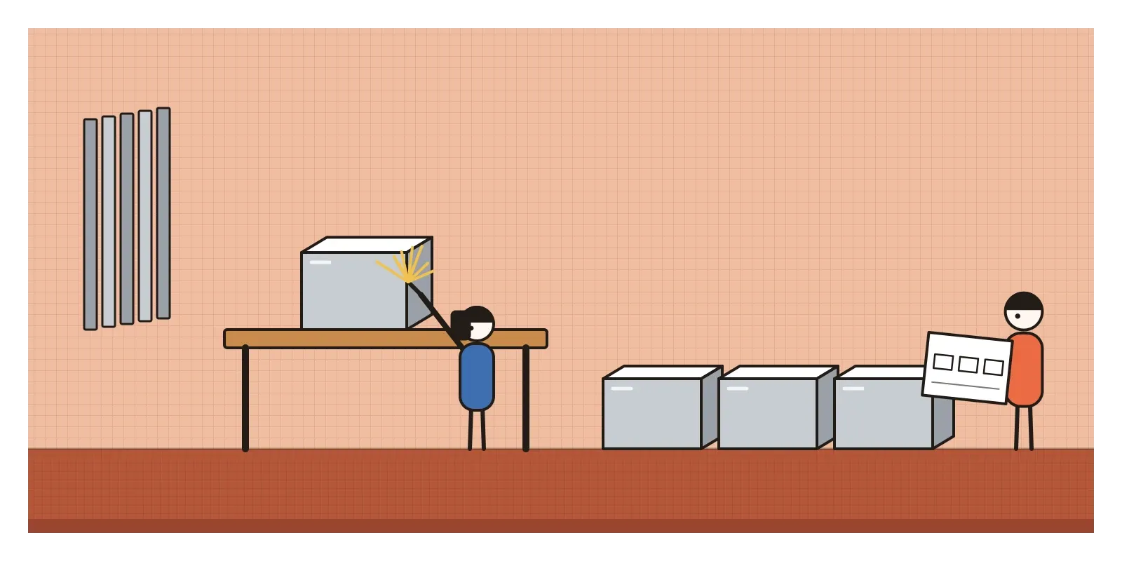
Donald Judd was Minimalism's sharpest writer as well as one of its main artists, though he hated the label. In his 1965 essay "Specific Objects", he argued that the most interesting new work was neither painting nor sculpture but real things in real space. He made boxes and stacks: identical units of galvanised iron, aluminium, coloured Plexiglas or plywood, fixed to a wall at equal intervals from floor to ceiling, or set out in rows on the floor. He drew precise plans and had the works made by professional fabricators, including a family metalworking business in New York. Later he moved to Marfa, a small town in the Texas desert, bought a former army fort and filled two old artillery sheds with a hundred aluminium boxes, each the same outer size and each different inside.
Dan Flavin worked with something even more ordinary: the fluorescent tube from the hardware shop. In 1963 he fixed a single yellow tube to his studio wall at a forty-five degree angle and dedicated it to the sculptor Constantin Brâncuși. From then on he used only standard tubes in standard colours and lengths, arranged in corners, across doorways and in long rows, turning whole rooms into fields of coloured light. Robert Morris made large plain forms in grey-painted plywood and wrote that the viewer's movement around them, the changing view and the size of the room, was part of the work. Andre laid plates of metal and bricks on the floor that you were allowed to walk on.
Women were part of it from the start, though they were less often named. Anne Truitt made tall painted wooden columns whose colours change from face to face. Agnes Martin, who moved to New Mexico in 1967, painted pale square canvases covered with fine pencil grids, which she described as being about innocence and happiness rather than geometry. Jo Baer painted large white canvases with bands of colour pushed to the edges.
In April 1966, the exhibition Primary Structures at the Jewish Museum in New York, organised by Kynaston McShine, brought dozens of these artists together and made the new art impossible to ignore. The same years saw a parallel in music: Steve Reich, Philip Glass and others building long pieces out of short repeated patterns that shift slowly over time.
One thing after another
Minimalist art is easy to recognise and surprisingly hard to look at properly. The forms are geometric, usually cubes, boxes, bars, grids and rectangles, with no decoration. They're often repeated in identical units, at equal intervals, in an order you can see at a glance. In many of Judd's wall stacks, the gap between boxes is the same height as a box, so the empty spaces count as much as the solid ones, which is a lesson in spacing any layout designer will recognise. Materials are industrial and left as they are: steel, aluminium, copper, brick, plywood, Plexiglas, fluorescent light. Colour, if there is any, is the colour of the material or a flat, factory finish. There's no plinth, and often no frame. The work sits on the floor or the wall, in the same space you're standing in.
The real subject is often that space, and you. A Minimalist room makes you aware of your own size, of where you're standing, of how light falls, of how long it takes to walk past a row of identical forms. That's why photographs of it are so disappointing. As a designer, I find it a useful school in restraint: every element is visible, so every decision about size, spacing and material shows. There's nowhere to hide a bad proportion.
Ruled lines in Baroda
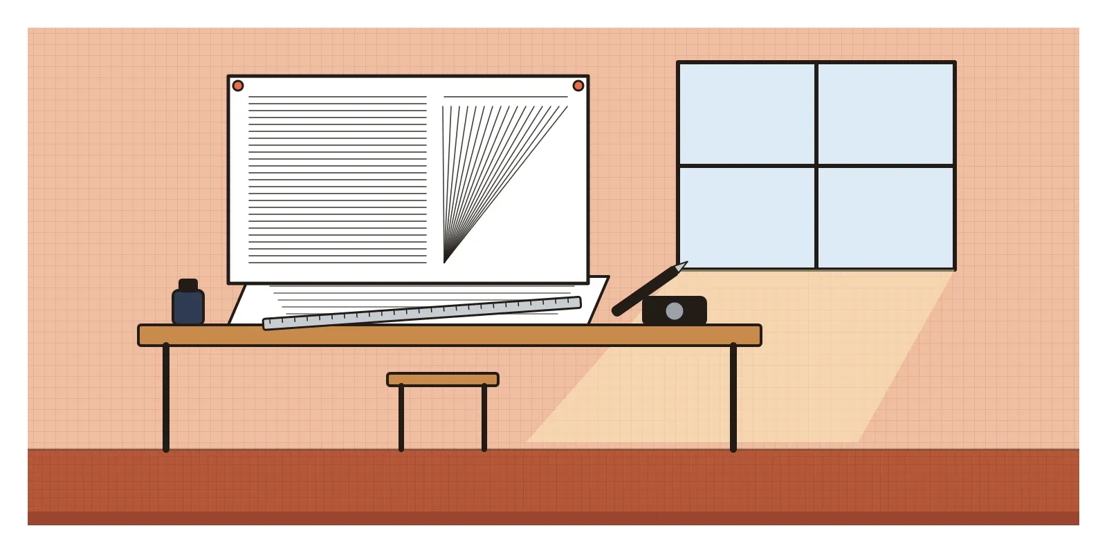
India's closest kindred spirit to Minimalism was Nasreen Mohamedi, and she arrived at something like it by her own path. Born in Karachi in 1937 and raised in Bombay, she studied at St Martin's School of Art in London in the 1950s and then in Paris. By the late 1960s she had abandoned colour and figurative references and was making small drawings in ink and graphite on paper: fine, ruled lines, sometimes thousands of them, set in grids, diagonals and fans that seem to vibrate on the page. She taught at the Faculty of Fine Arts in Baroda from 1972, and she kept diaries and took photographs of light, shadows, buildings, paving, the sea, which read like studies for the drawings.
She is often compared with Agnes Martin, and the comparison is fair as far as it goes: both made quiet, precise line drawings that ask for patience. But Mohamedi's sources were her own. She was drawn to the geometry of Islamic architecture, and her photographs and diaries suggest a practice closer to meditation than to the New York argument about objects and factories. She died in 1990, and for years her work was known mostly to Indian artists and critics. A large retrospective in 2015 and 2016, shown in Madrid and then at the Met Breuer in New York, co-organised with the Kiran Nadar Museum of Art in Delhi, finally made her famous outside India.
Zarina Hashmi, born in Aligarh in 1937, is another artist often mentioned here. Her woodcuts of houses, maps and borders use very few lines and large areas of blank paper, though her subject, home and exile after Partition, is far from the impersonality the New York Minimalists wanted.
From white cubes to white screens
Minimalism's biggest influence on design came through its look rather than its argument. White walls, bare concrete and timber, rooms with almost nothing in them, products reduced to a few clean volumes and lots of empty space around a logo all draw on it. Judd himself designed furniture, simple chairs and tables in plywood and pine, and insisted they were furniture, not art. In Japan, Muji started in 1980 as a range of unbranded, plainly packaged goods. The product language of Apple and, before it, Dieter Rams's work at Braun, which I wrote about in the post on form follows function, belong to the same family, although Rams came from a different tradition.
Interfaces took the vocabulary too. Generous white space, a strict grid, one typeface, a single accent colour and as few elements as possible is the default style of most product design today, including many of the AI tools I use. The good version of this is clarity. The bad version is a screen so empty you can't tell what to do next.
Minimalism had serious critics from the start. In 1967 the critic Michael Fried argued, in an essay called "Art and Objecthood", that Minimalist work was theatre rather than art, because it depended on the viewer's presence. Others pointed out that the plain, empty gallery the work needed, the white cube that Brian O'Doherty wrote about in the 1970s, was itself an expensive, exclusive kind of room. The artists who were celebrated were mostly white men, and Andre's later trial and acquittal over the death of the artist Ana Mendieta in 1985 led to protests that still follow his work. Today's lifestyle minimalism has its own blind spot: an empty room only looks calm if you can afford to store or replace everything you leave out.
By the late 1960s younger artists were replying. Eva Hesse and others, later called post-minimalists, kept the repetition but used soft, sagging latex, rope and fibreglass that looked made by hand. Conceptual artists dropped the object altogether. In the next post, on Psychedelic Design, the reply is louder still: swirling type and clashing colour from the counterculture.
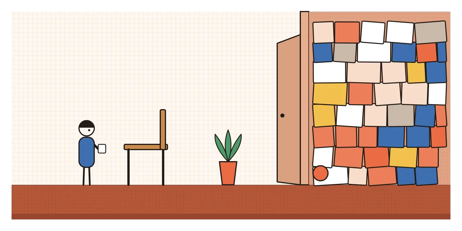
Take things away until it breaks
To see Minimalism in India, look for Nasreen Mohamedi's drawings at the Kiran Nadar Museum of Art in Delhi, and stand close enough to see the individual lines. If you travel, Dia Beacon outside New York and the Chinati Foundation in Marfa show the big American works in rooms built for them. Kyle Chayka's The Longing for Less is a readable history that links the art to today's lifestyle minimalism.
For an exercise, take a screen you've designed and remove one element at a time, a label, a divider, an icon, a colour, until it stops working. Put the last thing back. That's your minimum, and it's usually more than the trend suggests and less than you started with. Then do the opposite with a physical object: put one plain thing, a brick, a cup, a book, on an empty table and look at it for five minutes.
The newspapers in 1976 asked what the bricks were for. The bricks never answered. They just lay there on the floor, asking to be looked at where they were, as they were, which is a harder request than it sounds.
Further reading: Donald Judd, "Specific Objects" (1965) · Michael Fried, "Art and Objecthood" (1967) · James Meyer, Minimalism: Art and Polemics in the Sixties (2001) · Brian O'Doherty, Inside the White Cube (1986) · Kyle Chayka, The Longing for Less (2020)
A reply toAbstract Expressionism's grand gestures and the careful balancing of European composition.