
The Memphis Group
How a few designers in Milan turned plastic laminate and bad taste into the most talked-about furniture of the 1980s.
The Memphis Group
A record nobody got up to change
One evening in December 1980, a group of designers gathered in Ettore Sottsass's flat in Milan. Sottsass was sixty-three, famous for his work for Olivetti and restless as ever. Most of the others were in their twenties or early thirties: Michele De Lucchi, Aldo Cibic, Matteo Thun, Marco Zanini, the English designer George Sowden, and two young Frenchwomen, Martine Bedin and Nathalie Du Pasquier. Sottsass's partner, the writer Barbara Radice, was there too. They talked about making a new collection of furniture and objects together, something that would break completely with what Italian design was supposed to look like.
On the turntable was Bob Dylan's 1966 song "Stuck Inside of Mobile with the Memphis Blues Again". The story goes that it played over and over because nobody got up to change the record, and by the end of the night the group had its name. Memphis also happened to be the name of the capital of ancient Egypt, which pleased people who liked a double meaning. Like most founding legends it has been polished in the retelling, and accounts disagree about the exact date, but everyone agrees on the song.

Nine months later, on 18 September 1981, during the Milan furniture fair, the first Memphis collection opened at Arc '74, a gallery run by Brunella and Mario Godani. So many people turned up that the crowd spilled into the street. Inside were bookcases, tables, lamps, chairs, clocks and ceramics that looked like toys, robots, temples and cartoons, covered in clashing patterns and made largely from plastic laminate, the shiny material of cheap kitchen counters and coffee bars.
The Memphis Group was a Milan design collective active from 1981 until about 1987, when it wound down. Its aim was to free design from the idea of good taste, to show that furniture could be funny, emotional, decorative and loud, and that the rules of modernist design were a style like any other.
From the beautiful black box to a bookcase robot
By 1980 Italian design was the most admired in the world. Companies like Olivetti, Cassina, Artemide, Kartell and Alessi made elegant, intelligent, beautifully engineered products, and the language of "good design", calm geometry, honest materials and restrained colour, was taught everywhere from Ulm to Ahmedabad. Sottsass had helped make that reputation. His red plastic Valentine portable typewriter for Olivetti, designed with Perry King in 1969, is in museum collections around the world.
But he and others had been chafing against it for more than a decade. The radical design groups of the late 1960s and 1970s, the subject of an earlier post in this series, had attacked consumer culture with drawings, manifestos and impossible projects. In 1976 Alessandro Guerriero founded Studio Alchimia in Milan, and its leading figure, Alessandro Mendini, took found furniture and redecorated it, most famously an old-fashioned armchair painted all over in coloured dots like a pointillist painting, his Proust armchair of 1978. Sottsass worked with Alchimia for a while, then broke away. He wanted to make new objects, in quantity, that people might actually live with, not just gallery jokes.
Memphis also grew up alongside Postmodernism in architecture, which I wrote about two posts ago. It shared the same appetite for colour, ornament and borrowed references, and many people simply call it postmodern design. The difference was tone. The architects quoted history. Memphis quoted the suburban kitchen, the comic book, the 1950s diner, the toy shop and the street.
The piece everyone remembers is Sottsass's Carlton room divider of 1981, a tall, symmetrical shelving unit covered in multicoloured laminate, with shelves that stick out at angles like arms and a small figure-like top, so that it looks less like a bookcase than a totem or a robot. It holds very few books, at least not comfortably, and that is part of the point. Sottsass also designed laminate patterns for the Italian manufacturer Abet Laminati, including one from 1978 called Bacterio, a field of wriggling black shapes that looks like germs under a microscope.
Martine Bedin's Super lamp of 1981 is a half-moon shape on little wheels, studded with coloured bulbs, which she imagined as a pet you could pull along the floor. Michele De Lucchi's First chair of 1983 balances a disc seat, a hoop-shaped back and two black balls for armrests on a thin metal frame. The Japanese designer Masanori Umeda's Tawaraya of 1981 is a small platform for sitting and sleeping built inside a boxing ring. The Los Angeles ceramicist Peter Shire made chairs with wildly lopsided backs, and Shiro Kuramata contributed tables in terrazzo speckled with coloured glass. Nathalie Du Pasquier and George Sowden designed the busy, jazzy prints that covered textiles, laminates and walls, Du Pasquier drawing on African textiles, comics and her own travels.
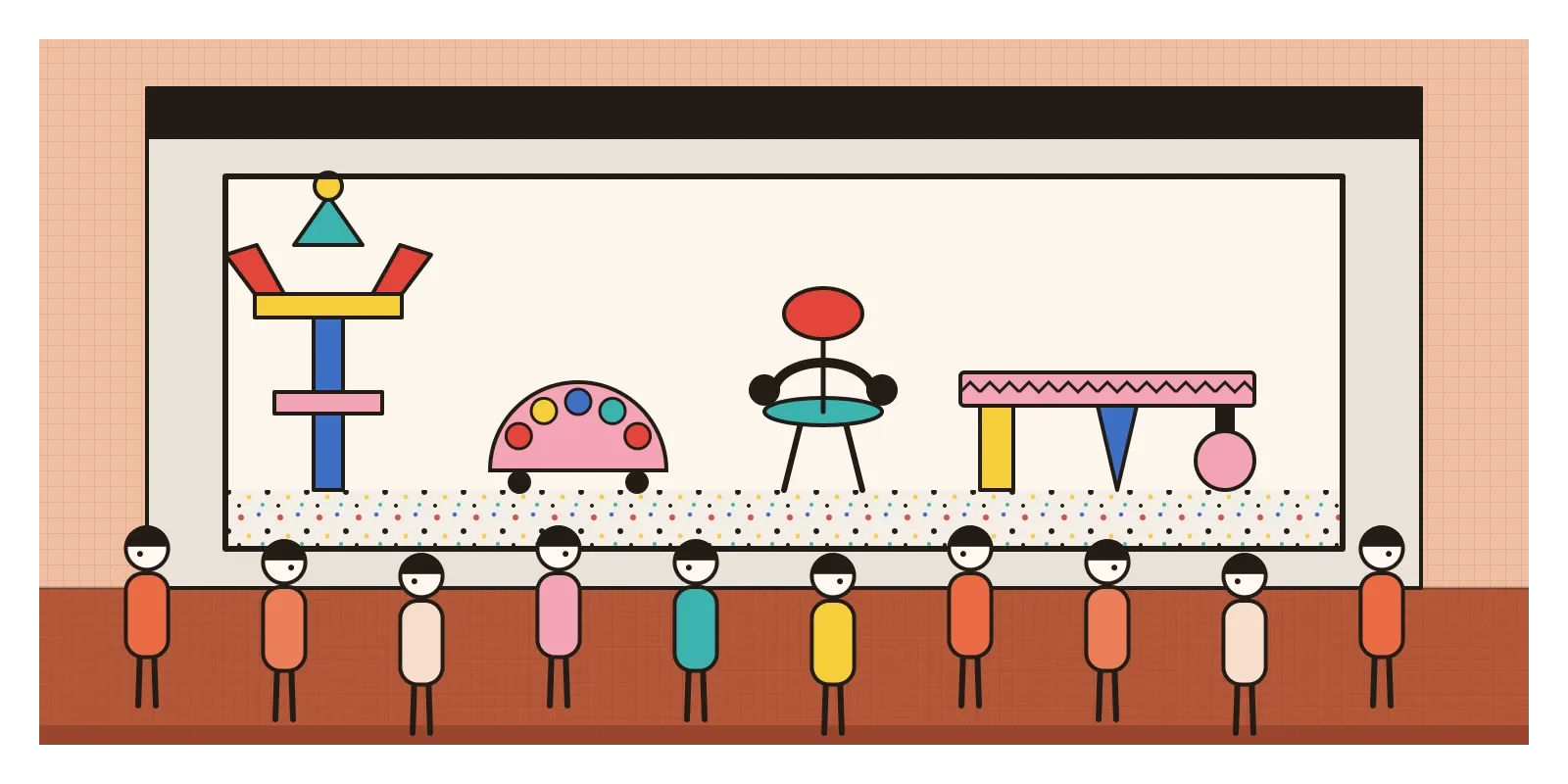
The collections were produced in small batches and sold through galleries, and they attracted famous collectors. David Bowie gathered more than a hundred pieces, and when his collection was auctioned at Sotheby's in London in 2016, a Carlton divider sold for many times its estimate. Barbara Radice, meanwhile, became the group's chronicler, and her 1984 book about Memphis is still the best account from the inside.
Squiggles, speckles and a pink ball on a leg
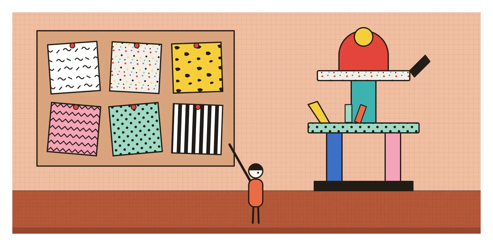
Memphis is one of the easiest movements to recognise, which was part of its success. Start with the surfaces. Patterns are printed onto laminate and used everywhere, often several on one object: black squiggles on white, speckles like terrazzo, dots, zigzags, stripes and blotchy bacteria shapes. Colours are bright and deliberately mismatched, with pink next to mint, yellow next to black, red next to turquoise, usually without much shading or texture.
Then the forms. Pieces are assembled from simple geometric parts, cylinders, spheres, cones, slabs and arches, stacked like a child's building blocks. Legs on the same table might be different shapes and colours. Objects are often symmetrical overall but odd in their details, like a face. Many look like characters, with heads, arms and feet. Cheap materials sit beside expensive ones, laminate beside marble or glass, which mocked the old idea that materials have a natural rank. And decoration covers structure instead of following it. The modernist rule that form should express function is turned upside down: the surface comes first, and the object is built to carry it.
Sottsass in India, and Sunmica in every kitchen
The Indian connection in Memphis runs through Sottsass himself. In 1961 he travelled to India, and soon after his return he fell seriously ill with a kidney disease. Olivetti helped send him to Palo Alto in California for treatment, and while he recovered he made a series of black and dark-glazed ceramics he called Ceramiche delle Tenebre, ceramics of darkness. After he recovered he made a set of plates called Offerings to Shiva, and later in the 1960s series of ceramics named Tantra and Yantra, translating the circles and triangles of Hindu ritual diagrams into stacked, glazed forms. He went back to India many times, and he often talked about objects as things that shape the rituals of everyday life rather than tools that simply work. Memphis's totems and altar-like cabinets owe something to those journeys, and to the same Tantric diagrams that Indian painters of the time were exploring, which have their own post in this series.
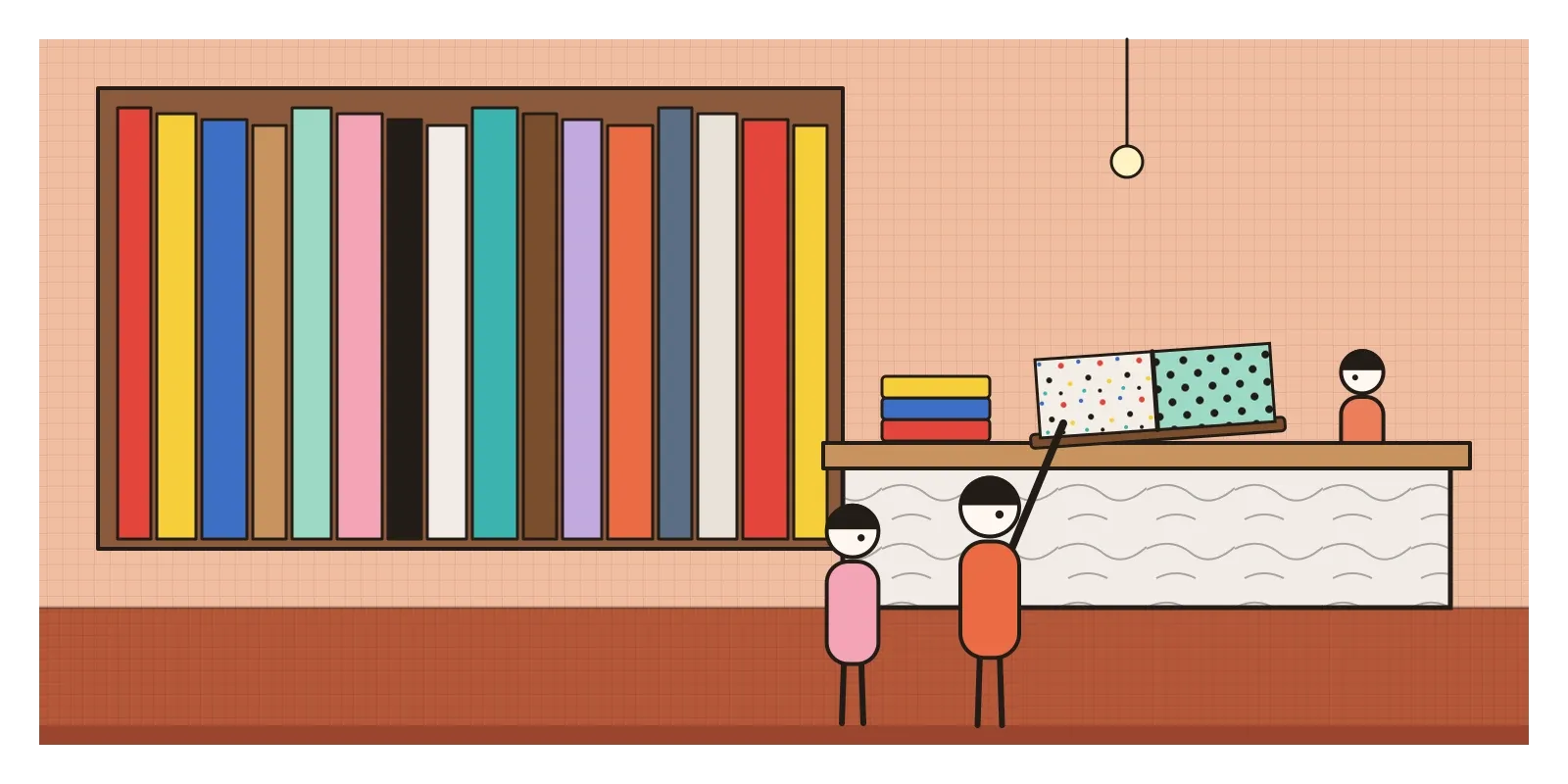
There's a more everyday parallel too, though it should be held loosely. In much of India, plastic laminate is simply called Sunmica, after a brand that became so common from the 1960s onwards that its name stands for the material, the way Xerox once stood for photocopies. Walk into any hardware shop and you can flip through heavy sample books of Sunmica in marble prints, wood grains, sparkles and bright colours, for kitchen cabinets, shop counters, dressing tables and school desks. Indian homes and bazaars used laminate boldly and without embarrassment long before anyone in Milan made it fashionable, mostly for its price and toughness rather than as a statement. Memphis took the same cheap, wipe-clean surface that ordinary households loved and that tasteful designers looked down on, and put it in galleries. Whether that was a celebration of popular taste or a sophisticated joke at its expense is still argued about.
Confetti, characters and colour
Memphis has come back more often than almost any design movement. Its squiggles, confetti shapes and pastel-and-black palettes returned on clothes, trainers, wallpaper and packaging through the 2010s, and furniture brands revived some of the original pieces and patterns. The flat, colourful style of corporate illustration that spread across tech websites in the late 2010s even picked up the nickname Corporate Memphis, as I mentioned in the post on Mannerism, though its bendy figures owe more to marketing than to Sottsass.
The deeper lesson is that objects can have personality, and that people form relationships with things that make them feel something. You can see it in products that come in bold colours by default, in furniture that looks like a character, and in interfaces that use playful illustration, confetti when a task is done or a cheeky empty state to soften a frustrating moment. Used well, this is Memphis's gift. Used badly, it's decoration stuck on to distract from a product that doesn't work. Memphis's own question is a good one to ask in a design review: what feeling is this object for, and is it honest about it?
Shelves that don't hold books
Memphis was mocked as much as it was admired. Critics called it kitsch, a joke that ran out of punchlines, and a fashion for rich collectors dressed up as a revolt against the establishment. The pieces were hard to use and surprisingly expensive, made in small runs from materials that were meant to be cheap. Laminate chips, and some pieces have aged badly. Its global borrowing raised questions too. African textiles, Aztec-looking pyramids and Indian ritual forms were mixed into a Milanese style, often with little interest in what they meant to the people who made them.
The story is also told mostly through Sottsass, though the group was young and unusually international, and several of its most lasting designs came from women. Bedin, Du Pasquier and Radice shaped the group's look and its legend, and Du Pasquier's patterns are probably its most copied work. Sottsass himself left in 1985, and the group wound down in 1987 and 1988, partly because it had always meant to be short-lived. By then its look was everywhere, from pop videos to shopping malls, which is usually a sign that a movement is over. The next generations replied in very different ways, with the quiet, witty conceptual objects of Dutch design in the 1990s and a return to calm minimalism.
Make your own Memphis this week
You can see original Memphis pieces at the Victoria and Albert Museum and the Design Museum in London, at the Vitra Design Museum near Basel, and in many museum collections online. In India, the easiest place to feel it is a laminate shop. Ask for the sample books, find the loudest pattern and the calmest wood grain, and hold them side by side.
For an exercise, make a small object or a poster from three clashing patterns and five simple shapes, a cylinder, a ball, a cone, a slab and an arch, and give it a personality without adding a face. Then make a second version with only one pattern and see which one feels more alive.
The Dylan song that named the group is about being stuck, and the designers in Sottsass's flat that night felt stuck inside a set of rules about good taste. They got out by playing a different record. In the next post, on Emigre and digital type, I'll stay in the 1980s but move to California, where the first Macintosh gave a young designer a screen full of pixels and a chance to break a different set of rules.
Further reading: Barbara Radice, Memphis: Research, Experiences, Results, Failures and Successes of New Design (1984) · Richard Horn, Memphis: Objects, Furniture and Patterns (1985) · Ronald T. Labaco (ed.), Ettore Sottsass: Architect and Designer (2006) · Glenn Adamson and Jane Pavitt (eds), Postmodernism: Style and Subversion, 1970-1990 (2011)
A reply toThe tasteful, rational "good design" of postwar Italian and German modernism.