Emigre and Digital Type
How a small magazine in California treated the early Macintosh as a new material and rewrote the rules of type.
Emigre and Digital Type
A typeface built one dot at a time
In 1985, in Berkeley, California, a young designer named Zuzana Licko sat in front of one of the first Apple Macintosh computers and began building letters out of dots. The machine's black and white screen was about nine inches across and measured 512 by 342 pixels. Each pixel was either on or off. There were no smooth curves, no shades of grey, and the printers of the day were nearly as crude. Most people saw those limits as a temporary embarrassment.
Licko saw them as a material. Using a simple font-editing program, she designed typefaces that made no attempt to hide their squares: Emperor, Oakland, Emigre and Universal, alphabets of chunky stepped strokes, each drawn to work at one particular size on that screen. Born in Bratislava in 1961, she had just finished studying at Berkeley. Her husband, the Dutch designer Rudy VanderLans, needed type for a magazine he had started the year before with two Dutch friends, Marc Susan and Menno Meyjes. Because all three were immigrants, they called it Emigre.
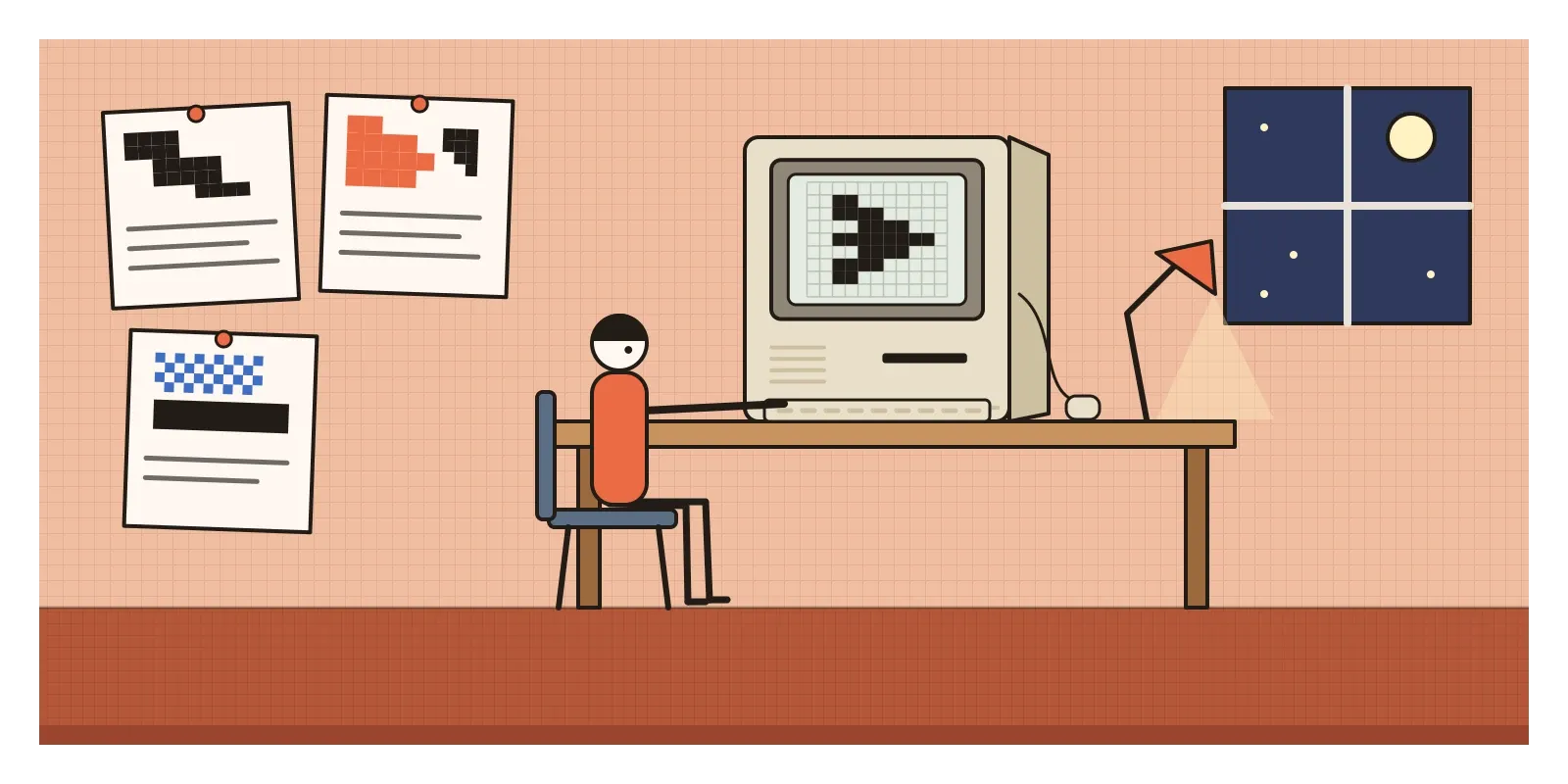
Licko's letters started appearing in the magazine, readers asked where they could buy them, and the couple began selling fonts under the name Emigre. The magazine and the font company became the centre of a loose movement of designers who treated the personal computer not as a faster typesetting machine but as a new medium with its own character.
That's what I mean in this post by Emigre and digital type: the burst of experimental type and layout from about 1984 to the mid-1990s, when a cheap desktop computer put type design into ordinary hands and a small group of designers used it to question what type should look like and who was allowed to make it.
From a foundry's vault to a beige box
For five hundred years, making a typeface was a heavy industry. Every letter in every size of metal type began as a steel punch, and even after photographic typesetting took over in the 1970s, fonts belonged to a few large companies like Linotype and Monotype, sold with their own expensive machines. A new typeface took years, and very few designers ever got to make one.
Then, within about two years, the whole chain came apart. The Macintosh arrived in January 1984. In 1985 Apple launched the LaserWriter printer, which used Adobe's PostScript language to describe pages and letters as mathematical outlines, and the company Aldus released PageMaker, a program for laying out pages on screen. Aldus's founder, Paul Brainerd, called the combination desktop publishing, and the name stuck. In 1986 a program called Fontographer let anyone with a Mac draw their own outline fonts and sell them. The typesetter, the paste-up artist and the proof had all moved onto one desk.
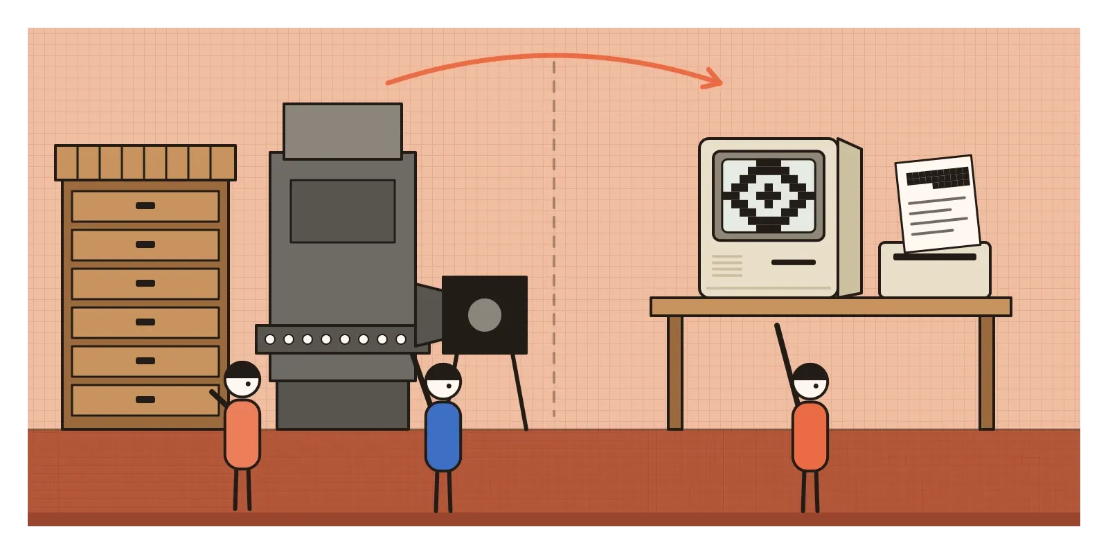
The style the computer was expected to serve was modernist. The Swiss style had taught that type should be neutral and almost invisible, set on a strict grid. As I wrote in the post on Swiss punk and new wave typography, Wolfgang Weingart and April Greiman had already begun breaking that grid by hand and on film in the 1970s, and Greiman was experimenting on an early Mac by 1986. Emigre took the next step. Where the old guard saw a faster way to do modernist typography, Emigre asked what typography the computer itself wanted to make.
Bitmaps, templates and the Cranbrook crowd
Licko kept pushing at the limits of each new technology. When laser printers arrived, she designed Matrix in 1986, with very few points in each letter so that it printed quickly on slow, memory-starved printers, keeping the angular feel of her bitmaps. Much later, in 2001, she gathered her early screen alphabets into a family called Lo-Res. But she also surprised her followers. In 1996 she released Mrs Eaves, a soft, generous revival of John Baskerville's eighteenth-century type, named after Sarah Eaves, Baskerville's housekeeper and later his wife. It became one of Emigre's best sellers, and showed that the experiment had always been about understanding a medium, not just about looking rough.
VanderLans, meanwhile, turned the oversized magazine into a laboratory. He designed almost every issue differently, showing new typefaces in action and publishing designers who were arguing about where graphic design was going.
Many of them came from two schools. At the Cranbrook Academy of Art near Detroit, Katherine McCoy, who led the design department with her husband Michael from 1971 to 1995, encouraged students to read French literary theory and to treat a page as something a reader actively interprets rather than passively receives. Further west, the California Institute of the Arts, known as CalArts, became the other hub. Jeffery Keedy taught there and designed Keedy Sans, a sans-serif whose letters seem to disagree with each other about how they should be built. Ed Fella, who had spent decades as a commercial artist in Detroit before studying at Cranbrook in his late forties, drew wobbly, hand-made lettering for small gallery flyers, some of which Emigre later published as fonts.
The emblem of the moment is probably Template Gothic, released by Emigre in 1990 and designed by Barry Deck, then a student at CalArts. Deck based it, the story goes, on lettering he saw on a sign in a laundromat, drawn with a plastic stencil. Its slightly melted corners are the marks of a cheap tool faithfully copied into a precise digital outline. Within a few years it was on album covers and club flyers everywhere.
Layers, pixels and the reader doing the work
You can usually spot work from this period in a few seconds, even without knowing who made it. Look first at the letters themselves. Some are frankly digital: stepped bitmap curves, jagged diagonals, letters built from squares or from very few straight segments. Others go the opposite way and imitate the hand, with uneven strokes, odd mixtures of upper and lower case, and letters from different families sitting side by side in one word. Very few look neutral. A typeface is treated as a voice with an accent, not a clear window.
Then look at the page. Text is layered over text and over images, often in several colours or tints. Columns tilt, overlap or run at different widths. Sizes jump wildly, so that a single word can be enormous and the article beside it tiny. Rules, bars and blocks of solid colour cut across the layout. Margins and gutters, the quiet spaces that the Swiss grid protected, are often filled in. And the screen itself shows up in the print: visible pixels, coarse halftone dots, the soft gradients and sharp cut-outs of early software.
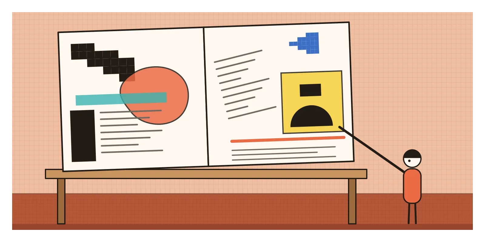
Behind the look is an idea about reading. Licko put it in one memorable line: "We read best what we read most." Legibility, in her view, is a habit rather than a fixed property of certain shapes. That made strange typefaces less of a crime and more of a proposal.
Devanagari on borrowed keys
While Emigre was playing with the limits of a Latin alphabet on screen, Indian engineers and designers were facing a more basic problem. The early personal computers simply couldn't handle Indian scripts. They join consonants into conjuncts, attach vowel signs on every side of a letter and often hang everything from a headline bar. None of that fitted into a system built around twenty-six letters set one after another.
Several answers came at once in the 1980s. A team at IIT Kanpur developed what became known as GIST technology, for displaying and printing Indian scripts, and in 1988 the work moved to the new Centre for Development of Advanced Computing, C-DAC, in Pune. Around the same years, Indian committees worked out a shared code for the scripts, ISCII, which the Bureau of Indian Standards adopted in 1991, along with a keyboard layout called INSCRIPT that put the same sounds on the same keys across different scripts. The idea was elegant: because most Indian scripts descend from the same ancient Brahmi family, one code table could serve them all, and text could be switched from one script to another automatically. When the Unicode standard was drawn up a few years later, its Devanagari section was based on ISCII.
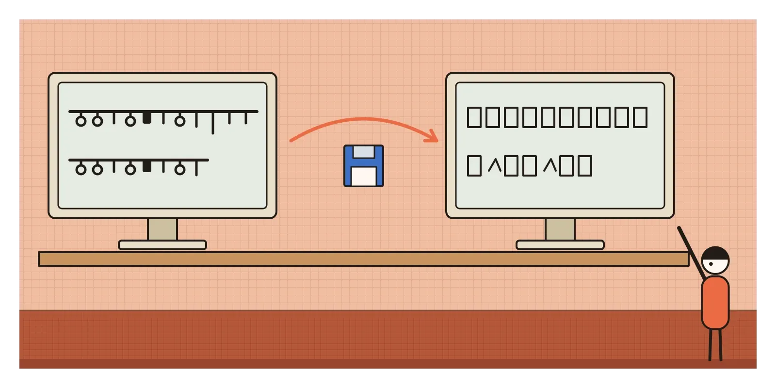
In everyday offices, though, a cruder solution won for a long time. Commercial Hindi fonts, of which Kruti Dev is the best known, simply drew Devanagari shapes on top of the codes normally used for Latin letters. The screen showed Devanagari, but the file stored ordinary Latin letters. As long as everyone had the same font, it worked. Send the file to someone without it, and a Hindi document turned into a string of meaningless English characters. Some government typing tests have still asked candidates to type in Kruti Dev in recent years, long after Unicode made it unnecessary.
The parallel with Emigre is loose but revealing. In California the question was taste: should digital type imitate the past or find its own look? In India it was access: could millions of people write in their own scripts on a machine at all? The second question was harder, and in many ways more important.
Every independent foundry owes it a little
The most direct legacy of Emigre is a business model. Before 1985, type came from a few large companies. Emigre showed that two people with a computer could design fonts, sell them directly and build an audience through their own publication. Today there are hundreds of small independent foundries around the world, including Indian ones like Indian Type Foundry and Ek Type, and free libraries like Google Fonts, and most of them work in a way Emigre would recognise.
The second legacy is the habit of designing for the medium. Licko's bitmaps came from asking what a screen could do well, and that question never went away. It's there in fonts carefully tuned to stay sharp on low-resolution displays, in the pixel fonts of games and retro interfaces, and in variable fonts, introduced in 2016, which pack a whole range of weights and widths into one file so that type can adjust smoothly to a screen. Choosing a typeface for an interface is still less about the specimen and more about how it behaves at small sizes, on cheap phones and in more than one script, exactly the kind of practical question Emigre treated as creative.
The third legacy is permission. Emigre helped establish that type can carry personality and that a layout can make demands on its reader. Expressive display faces, editorial websites that play with scale and layering, and brands with their own custom typefaces all lean on it. AI tools that generate letterforms in seconds make the old Emigre question urgent again: once anyone can make a font, what is a font for?
The legibility wars, and a grid of your own
Emigre made enemies, and some of their arguments still stand. Established designers saw the new work as self-indulgent and unreadable, a fashion for designers that ignored the people who actually had to read the words. Massimo Vignelli, one of the great Italian modernists, is often quoted as dismissing it as garbage in an interview around 1991. The legibility debates of the early 1990s were fierce and sometimes personal. The theory imported at Cranbrook could feel like a conversation for graduate students, not readers.
There were quieter limits too. The movement was overwhelmingly American and European, and its debates assumed the Latin alphabet. Most of the world's scripts weren't even properly supported on the machines Emigre celebrated, and the experiments rarely asked who was being left out. And the look was easily copied, until layered type became an advertising cliché. Emigre itself changed format several times and published its last issue, number 69, in 2005, by which time its ideas had either been absorbed or overtaken by the web. The sharpest reply came from grunge typography, which treated legibility as optional, and later from a long return to clean, quiet type on screens.
To see it for yourself this week, look up scans of Emigre online and the specimens on the Emigre website, and compare Licko's Lo-Res with Mrs Eaves. Then draw a capital letter on a grid of sixteen by sixteen squares and notice how many decisions a single curve demands. Next, find an old Hindi PDF from a government website, copy a paragraph and paste it into a plain text editor. If it turns into a jumble of English letters, you're looking at a legacy font, the Indian version of the same problem Licko faced in Berkeley.
Licko's squares were never meant to stay. Screens got sharper, and she moved on to curves as delicate as Baskerville's. What lasted was the attitude she brought to that first small screen: treat every new tool as a material with a grain of its own, and ask what it's good at before you ask it to pretend. In the next post, on Deconstructivism, I'll move from the page to the building, where architects in the late 1980s were breaking their own grids apart.
Further reading: Rudy VanderLans and Zuzana Licko, with Mary E. Gray, Emigre: Graphic Design into the Digital Realm (1993) · Rudy VanderLans (ed.), Emigre No. 70: The Look Back Issue (2009) · Rick Poynor, No More Rules: Graphic Design and Postmodernism (2003) · Ellen Lupton and J. Abbott Miller, Design Writing Research: Writing on Graphic Design (1996)
A reply toNeutral modernist type, and the belief that a new machine should simply imitate the old ones.