Material Design
Google's idea that a screen could be built from a magical kind of paper, and the design system that followed.
Material Design
Paper icons and crumpled printouts
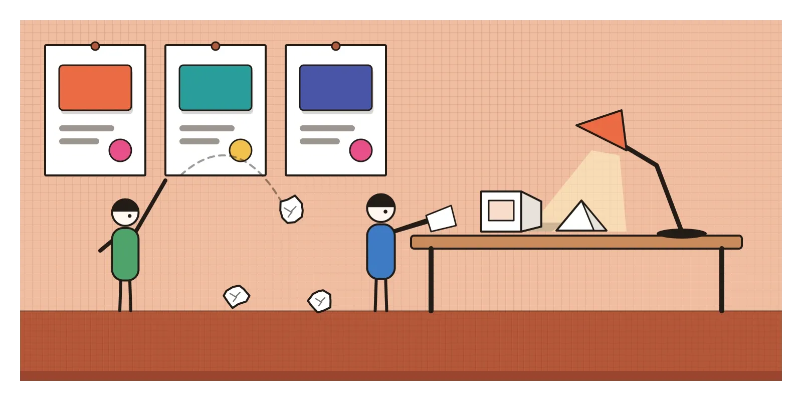
In the months before Google's developer conference in June 2014, a small group of designers at Google were spending a surprising amount of time with real paper. According to Zach Gibson, one of the designers involved, who later wrote about it for Google's design site, the team cut and folded product icons out of paper so they could see how light fell across the folds and what kind of shadows the layers cast, and then used what they saw to decide how shadows should be drawn on screen. They studied how sheets of paper move, sliding into place rather than spinning, and turned their observations into rules. Every morning they printed their work on huge sheets and pinned them to the wall for review. At the end of the day they tore them down, crumpled them up and threw them at each other. A lot of time, Gibson remembered, went on refilling ink cartridges and queueing for the printer.
On 25 June 2014, at Google I/O in San Francisco, Google's vice-president of design, Matías Duarte, presented what all that paper had been for. It was called Material Design, a single visual language for Android phones, the web and everything else Google made. The interface, Duarte explained, would be built from a digital material inspired by paper and ink, with one important difference: unlike real paper, it could grow, shrink, split apart and join together again. At the same conference Google showed Android running on watches, cars and televisions, and a single language that could stretch across all of them was much of the point.
Material Design is both a style and a system. As a style, it's recognisable by flat, bold colour, sheets that sit at different heights with soft shadows beneath them, and motion that seems to have weight. As a system, it was one of the first design languages published openly and in exhaustive detail, with rules for colour, type, spacing, motion and components that anyone could follow. I've already written about parts of it: its elevation and shadows in the posts on form, figure and ground, and light, shade and rendering, its eight-point spacing in the post on proportion systems, and its later colour engine in the post on colour harmonies. Here I want to look at where it came from and what it meant.
A middle path between leather and nothing
In 2011, Google's products didn't look like they came from the same company. Gmail, Search, Maps and dozens of other services had grown up separately, each with its own look, and Android was a patchwork of its own. When Larry Page became chief executive in 2011, he pushed for a unified, cleaner look across Google's main web products, a redesign known inside the company as Kennedy. Android got its own overhaul in the same years. Duarte had joined Google in 2010 after designing interfaces at Danger, which made the Sidekick phone, and at Palm, where his team's webOS had organised running apps as a stack of cards you could flick away. At Google he led a darker, sharper Android look called Holo, introduced in 2011, with electric blue accents and a new typeface, Roboto, drawn by Christian Robertson.
Material was a reply to two things at once. It replied to the flat design of the previous post, which had thrown away the shadows and depth that helped people understand what sat on top of what and what could be pressed. And it replied, more quietly, to skeuomorphism. Material didn't imitate any particular object, no leather and no tape decks. It imitated the physics of a general material, how surfaces stack, catch light and move, and then let that material do impossible things. It was a middle path: flat colour and clean type, with just enough depth to make the structure readable.
Roboto, a ripple and a sheet that grows
The 2014 guidelines set out three ideas, which Google described as material being the metaphor, design being bold, graphic and intentional, and motion providing meaning. In practice, that meant some very specific inventions.
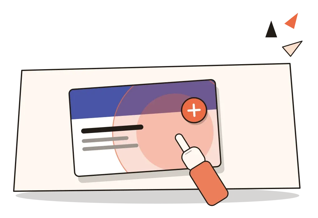
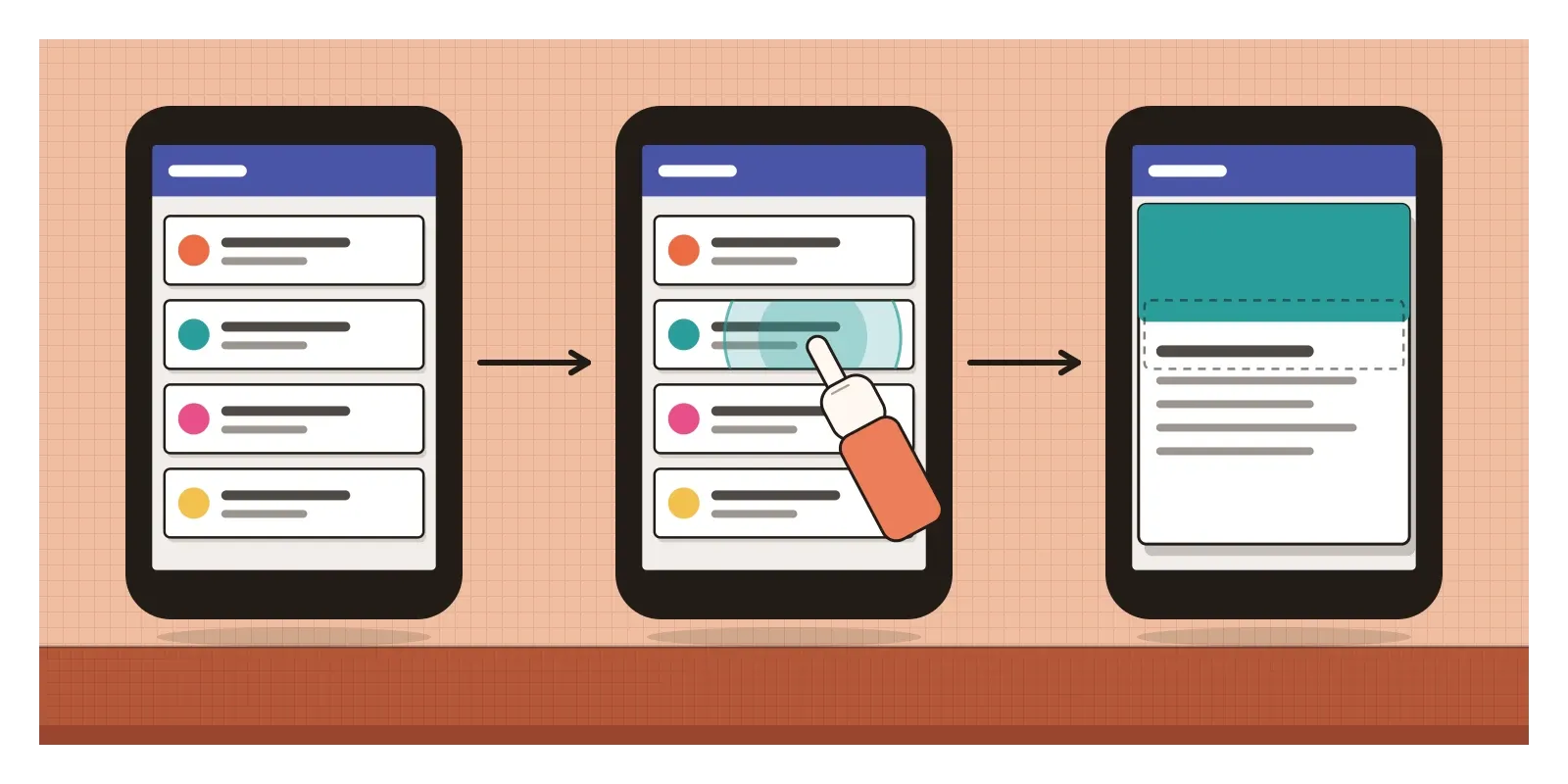
The most memorable was the ink ripple. When you touched a button or a list item, a circle of colour spread outwards from the exact point under your finger, like a drop of ink landing on paper, and faded. It answered the oldest problem of touchscreens, the lack of a physical click, with a visible one, and it showed where the system thought you had touched. Motion followed the same logic. Tap a small card in a list and it would grow into a full screen from that spot, so you could see where the new screen had come from and where it would go back to. Things entered and left with easing, speeding up and slowing down like objects with mass, rather than sliding at a constant speed.
Roboto was revised for the new system and became the voice of Android. The guidelines included a full colour palette, each hue from red to blue grey given a ladder of tints and shades numbered from 50 to 900, with brighter accent versions, so that a team could choose a primary colour and an accent and know which lighter and darker versions to use for every surface. Android 5.0, called Lollipop, brought the whole system to phones from November 2014, and Google rebuilt its own apps one by one. Inbox, a reimagined Gmail launched that autumn, was an early showcase. Polymer and later Material Design Lite and Material Components brought the same parts to the web and other platforms.
Bold colour, keylines and a round button
Material screens of the mid-2010s are easy to spot. A strong, saturated colour fills the bar at the top, with a contrasting accent used sparingly for the most important action. Big photographs run edge to edge and the bar on top sometimes shrinks or disappears as you scroll. Content sits on white cards with gently rounded corners and soft shadows. Type follows a fixed scale of named sizes, from large display headings to small captions, so that hierarchy stays consistent from app to app. Text in lists lines up on a few fixed vertical lines called keylines, measured from the left edge, which gives every screen the same calm rhythm. Icons are simple, geometric and drawn on a shared grid. A round floating button, usually in the accent colour, hovers above the content in the lower corner.
What sets Material apart from plain flat design is that every surface has a height. Shadows are never decorative. They tell you what's on top, what moves with what, and what will disappear when you're done with it.
The first interface for millions
For a great many people in India, Material Design wasn't a style that replaced another style. It was the first visual language of computing they ever learned, because their first computer was an Android phone. On 15 September 2014, a few months after I/O, Google launched Android One in New Delhi, a programme of cheap phones built to a shared design with Indian makers Micromax, Karbonn and Spice, priced at around 6,400 rupees. Android One wasn't a huge commercial success, but cheap Android phones went on to dominate the Indian market, and through the second half of the 2010s, as data became far cheaper, many millions of people came online for the first time on screens built from Material's cards, ripples and round buttons.
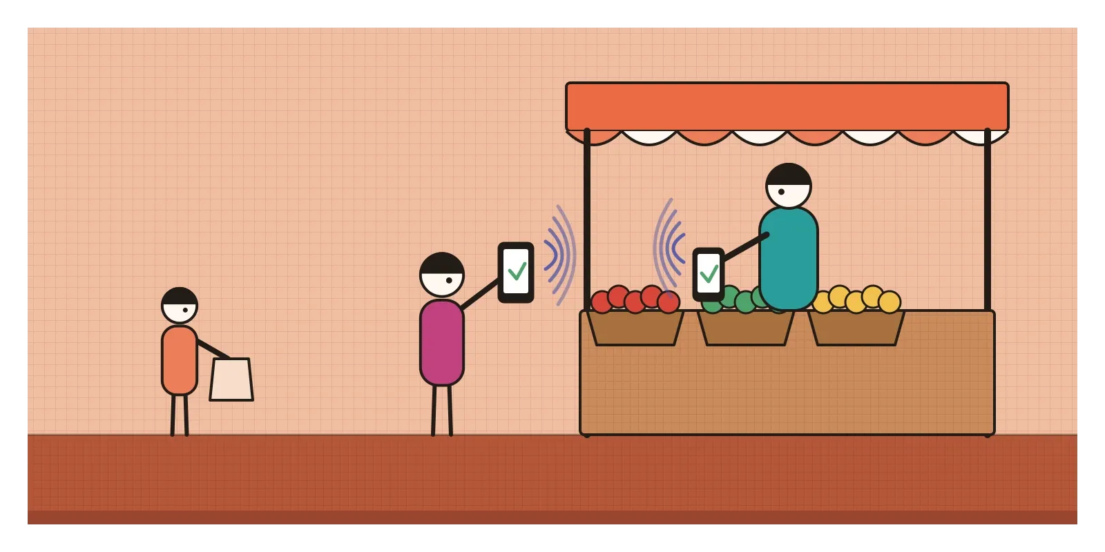
Google also began designing for India first. In September 2017 it launched a payments app called Tez, Hindi for fast, built on India's UPI system for bank transfers. Its interface followed Google's design language, but its cleverest feature came from local needs. Cash Mode let two people standing near each other pay without exchanging phone numbers or bank details. Their phones found each other by playing a short ultrasonic tone, too high for people to hear, and listening for it. Tez was renamed Google Pay in 2018. It's a good example of a global design system meeting a particular place: the cards and colours came from California, while the problem being solved, paying a stranger without revealing your number, came from Indian streets and markets.
Design systems, and the risk of looking like Google
Material's biggest legacy may be the idea of a public design system itself. Before 2014, most companies kept their interface guidelines private. Material showed what it looked like to publish a complete language, with principles, measurements, components, code and examples, and to keep updating it. Its motion ideas, easing curves and transitions that show where a screen came from, are now standard on every major platform. Today almost every large software company has a design system with its own website, and design tokens, components and documentation are a normal part of a designer's job. AI tools that generate interfaces lean heavily on documented systems like Material, because a system written down in detail is something a model can follow, and because it turns a thousand small decisions into defaults.
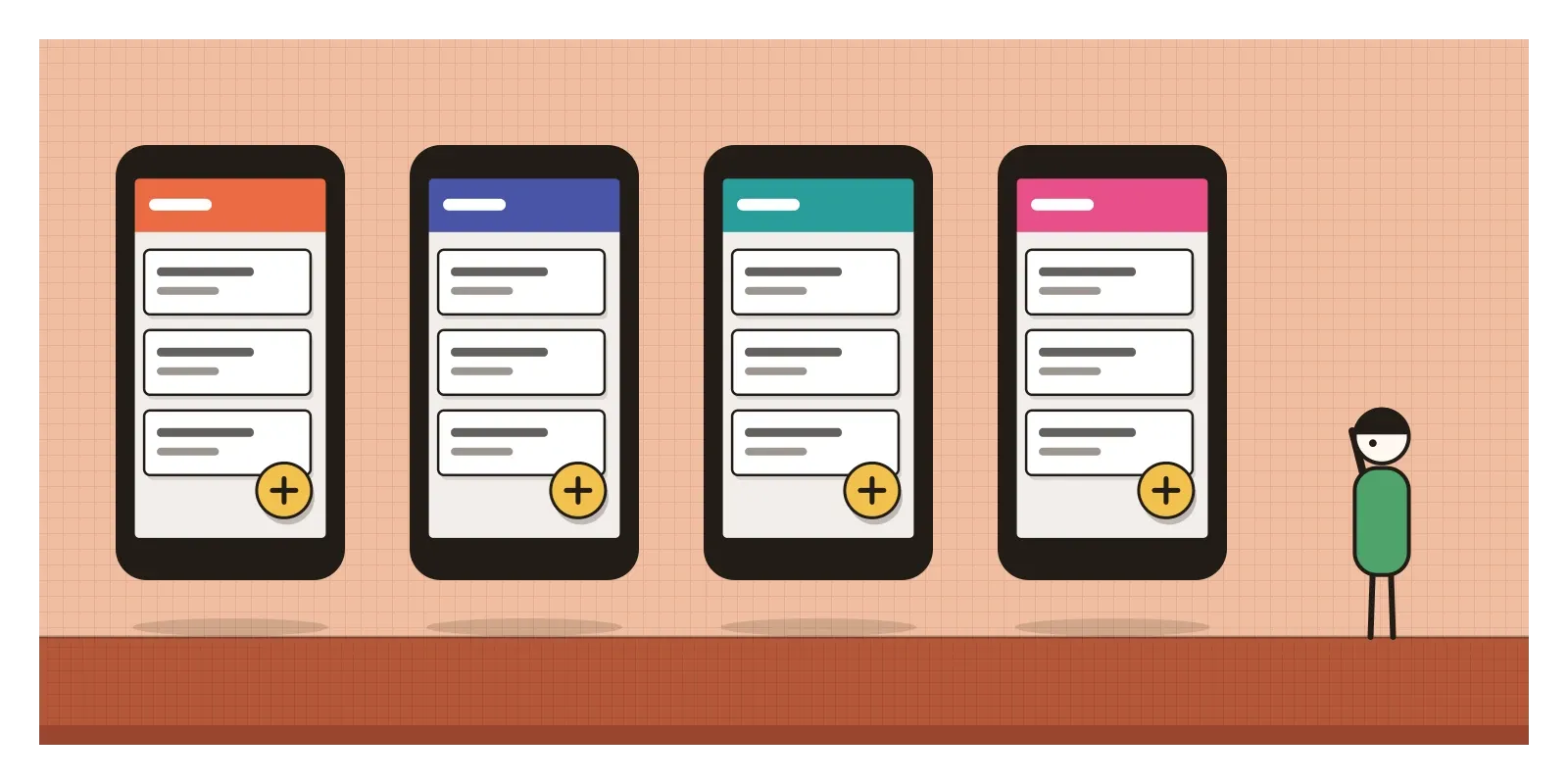
That's also the problem. Within a couple of years, apps from many different companies looked like Google's own, with the same colour bars, the same round button and the same ripple, and some brands felt they had lost their identity. Some of the system's own patterns were questioned. The navigation drawer, a menu that slides in from the side behind an icon of three lines, hid important sections where people didn't look, and Google added a bottom navigation bar to the guidelines in 2016. The round floating button was copied onto screens that had no single main action. Some of the bright palette combinations, white text on pale yellow or light green, were too low in contrast to read comfortably. And because Apple never adopted Material, teams building for both iPhone and Android had to choose between two designs and one design that felt foreign on half their users' phones. Many ended up building a third, private language that borrowed from both.
Google itself kept revising. In 2018 it introduced Material Theming, encouraging companies to adapt the system's shapes, colours and type to their own brands, while redesigning its own apps in a quieter, whiter style that many users found bland. In 2021 came Material You, with colours drawn from your wallpaper, and in 2025 Material 3 Expressive, with bouncier shapes and stronger colour. A design system, it turned out, is never finished. In the next post, on responsive and mobile-first design, I'll step back a little in time to the idea that made all of this necessary: designing one interface for every size of screen.
Fold a paper icon under a lamp
You can see Material at work on almost any Android phone. Tap a list item slowly and watch the ripple start under your finger, then open something and notice where it grows from. For a better sense of what the designers were doing, try their exercise yourself. Cut a simple icon shape out of stiff white paper, fold one edge, lay a second shape on top of it, and put the whole thing under a desk lamp. Move the lamp and watch how the shadows change with the height of each layer. Then read the original Material guidelines, which Google keeps online, and Alla Kholmatova's Design Systems for a broader view of how systems like it are built and kept alive.
Those printouts crumpled up and thrown across a room in 2013 and 2014 became, within a few years, the most widely used visual language on Earth. It's a good reminder that even a system that would end up on billions of screens began with people looking hard at a piece of paper under a light.
Further reading: Google, Material Design guidelines (2014, continually revised) · Alla Kholmatova, Design Systems (2017) · Brad Frost, Atomic Design (2016) · Don Norman, The Design of Everyday Things (revised edition, 2013)
A reply toFlat design's lost sense of depth, and Google's own patchwork of mismatched products.