Japonisme
How cheap Japanese prints and objects taught European artists to crop, flatten and leave space empty.
Japonisme
A sketchbook in the packing straw
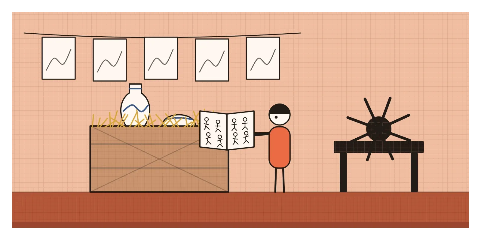
Around 1856, a young French printmaker called Félix Bracquemond was working in the Paris shop of Auguste Delâtre, a printer who pulled etchings for many of the artists of the day. In the shop, so the story goes, Bracquemond noticed a small, soft-covered Japanese book that had arrived as padding around a shipment of porcelain. It was a volume of the Manga by Katsushika Hokusai, a collection of thousands of quick drawings of people, animals, plants, gods, waves and everyday life. Bracquemond was so taken with it that he carried it about with him and showed it to anyone who would look.
The packing-straw detail may be too neat to be true. The story was told decades later, and Japanese prints and books were already reaching Paris through other routes. But what happened next is well documented. Within ten years, Bracquemond had designed a dinner service for the Paris ceramics dealer Eugène Rousseau, shown at the Exposition Universelle of 1867, decorated with birds, fish, crabs and insects lifted from Hokusai's pages and scattered across the plates without frames, as if they'd landed there by chance. Soon many of the artists he showed the book to were collecting Japanese prints themselves.
That obsession had a name by 1872, when the critic Philippe Burty called it japonisme. It describes the wave of Japanese influence on European and American painting, prints, posters, furniture, ceramics and fashion, roughly from the 1860s to the early 1900s. It had no manifesto or membership. It was a shared discovery, passed between painters, dealers and designers, that changed how a generation composed a picture. I wrote about the prints themselves in the post on ukiyo-e. This post is about what Europe did with them.
A door opens, and a shop fills up
For more than two centuries, Japan's rulers had kept foreign contact to a minimum, allowing only limited trade with Dutch and Chinese merchants through the port of Nagasaki. In 1853 and 1854, American warships under Commodore Matthew Perry forced the country to open, and treaties signed in 1858 opened ports to traders from the United States, Britain, France and others. Within a few years, Japanese goods were pouring into Europe. A collection of Japanese objects put together by the British diplomat Rutherford Alcock was shown at the International Exhibition in London in 1862. At the Paris exhibition of 1867, Japan exhibited officially for the first time. Shops selling fans, lacquer, kimonos, ceramics and prints opened on the rue de Rivoli in Paris, and artists including James McNeill Whistler and James Tissot were among the early customers.
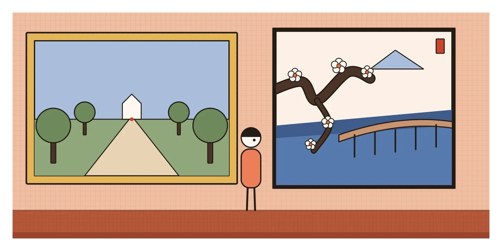
The timing mattered because European art was ready for an argument. The art academies and the official Salon taught a fixed set of rules: a single viewpoint with perspective lines converging on the centre, smooth modelling from light into shadow, balanced and symmetrical compositions, and serious subjects from history and myth. I wrote about the Salon des Refusés in the post on critique. Japanese prints broke almost every one of those rules and still looked astonishingly good. They used flat colour, strong outline, off-centre compositions, high viewpoints and ordinary subjects: a rainstorm on a bridge, a woman fixing her hair, a fish on a plate. To painters already restless with the academy, they were proof that another way of making pictures worked.
Kimonos, bridges and copied plum trees
Some of the early responses were little more than dressing up. In 1876, Claude Monet painted his wife Camille in a vivid red kimono embroidered with a samurai warrior, holding a fan and standing against a wall scattered with more fans. La Japonaise, now in the Museum of Fine Arts in Boston, is really a European painting with Japanese props. The deeper influence came later and quieter. Monet built a Japanese-style footbridge over the water garden he dug at Giverny in the 1890s, and the Japanese prints he collected still hang on the walls of his house there.
Whistler absorbed the lessons more fully. In his Nocturne: Blue and Gold, Old Battersea Bridge, painted in the early 1870s, the Thames at night is a veil of blue, and a single wooden pier of the bridge rises tall and dark through the middle of the picture, much higher than it really was, the way bridges loom in Hiroshige's prints. Whistler also stopped signing his paintings with his name and used a small butterfly monogram, placed carefully in the composition like the seal on a Japanese print.
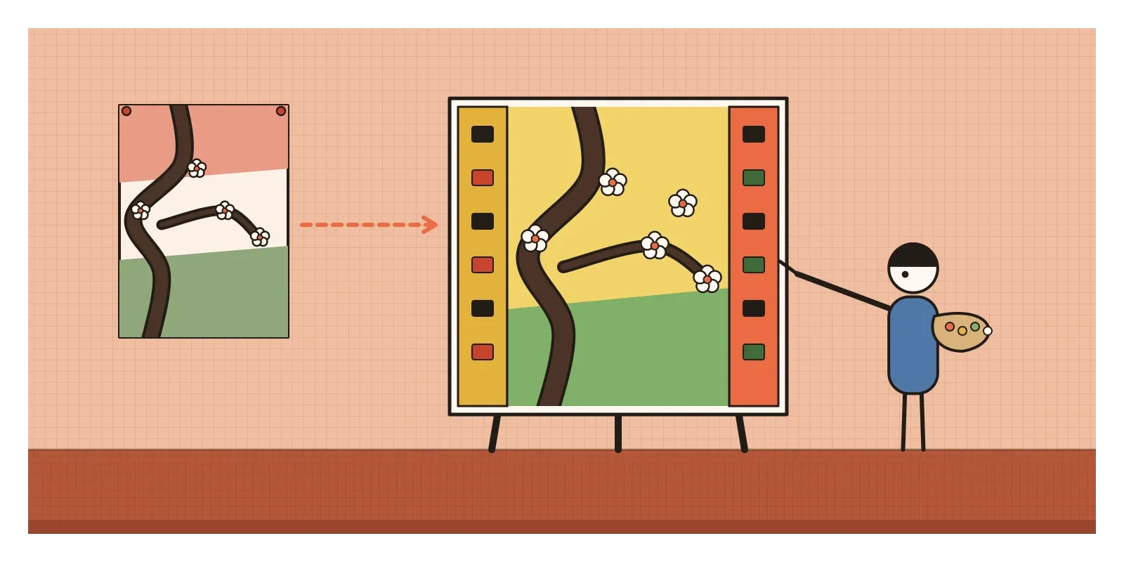
Vincent van Gogh went furthest. In Paris in 1887, he and his brother Theo bought hundreds of cheap Japanese prints, many from the stock of the dealer Siegfried Bing, and their collection is still at the Van Gogh Museum in Amsterdam. That year Van Gogh painted copies in oil of two prints by Hiroshige, a plum orchard with a dark, twisting trunk cutting across the front of the picture and a bridge in a sudden rainstorm. He enlarged them, turned the colours up and added borders filled with Japanese characters copied from other prints, which he couldn't read. When he moved to Arles the following year, he wrote to Theo that he wanted to see the south of France as if it were Japan.
In 1890, Bing organised a huge exhibition of Japanese prints at the École des Beaux-Arts in Paris. Mary Cassatt, an American painter living in Paris, went more than once, and the next year she showed a set of ten colour prints of women in ordinary domestic moments, bathing a child, writing a letter, trying on a dress. They have flat areas of soft colour, patterned fabrics set against patterned walls, and clean, confident outlines, and they are some of the most direct and successful translations of the Japanese print into a Western technique. In the same years, Henri de Toulouse-Lautrec was designing posters for Paris cabarets with flat silhouettes, cropped figures and a round monogram that worked like a seal.
Cropped, flat and off-centre
What all these artists took was less a set of motifs than a way of arranging a picture. Japonisme is easiest to recognise in its compositions. The main subject sits off-centre, often pushed to one side or to a corner. The edge of the picture cuts things off, a figure half out of frame, a boat sliced by the border, the trunk of a tree passing so close to the viewer that only a piece of it shows. The viewpoint is often high, looking down on a street or a river, so the horizon rises near the top or vanishes altogether. Large areas are left empty: a plain sky, a stretch of water, a bare wall.
Colour is laid down in flat areas with strong outlines, rather than modelled softly from light to dark. Pattern sits against pattern, a striped kimono against a flowered screen, with little concern for depth. Formats change too. Tall, narrow pictures borrowed from hanging scrolls and pillar prints suddenly appear in European painting and in posters. Then there are the motifs, the easiest part to copy and the least interesting: fans, kimonos, cranes, irises, bamboo and waves. In design, the British designer E. W. Godwin made slender, black-lacquered sideboards in what he called an Anglo-Japanese style, all straight lines and empty space, and Christopher Dresser, who visited Japan in 1876 and 1877, wrote one of the first serious European books on Japanese design.
I'd add one more trait, which is attitude. Japanese prints showed European artists that ordinary life, a laundress, a cat or a sudden shower, was a fit subject for art. That idea fed Impressionism, which I wrote about in its own post, and much of what came after.
Asia is one, said a visitor to Calcutta
India's connection with Japan in these years ran along a completely different line, and it's one of my favourite counterpoints in this whole series. In 1902, Okakura Kakuzō, a Japanese art historian who had helped found the Tokyo School of Fine Arts, came to India for most of a year. He met Swami Vivekananda, stayed with the Tagore family in Calcutta and finished a book, The Ideals of the East, published in London in 1903, whose first line is "Asia is one." In it he argued that India, China and Japan shared a common spiritual and artistic inheritance that had nothing to learn from Western materialism. The following year, two of the most gifted painters of his circle, Yokoyama Taikan and Hishida Shunsō, came to Calcutta, painted alongside Abanindranath Tagore and his circle and exchanged techniques.
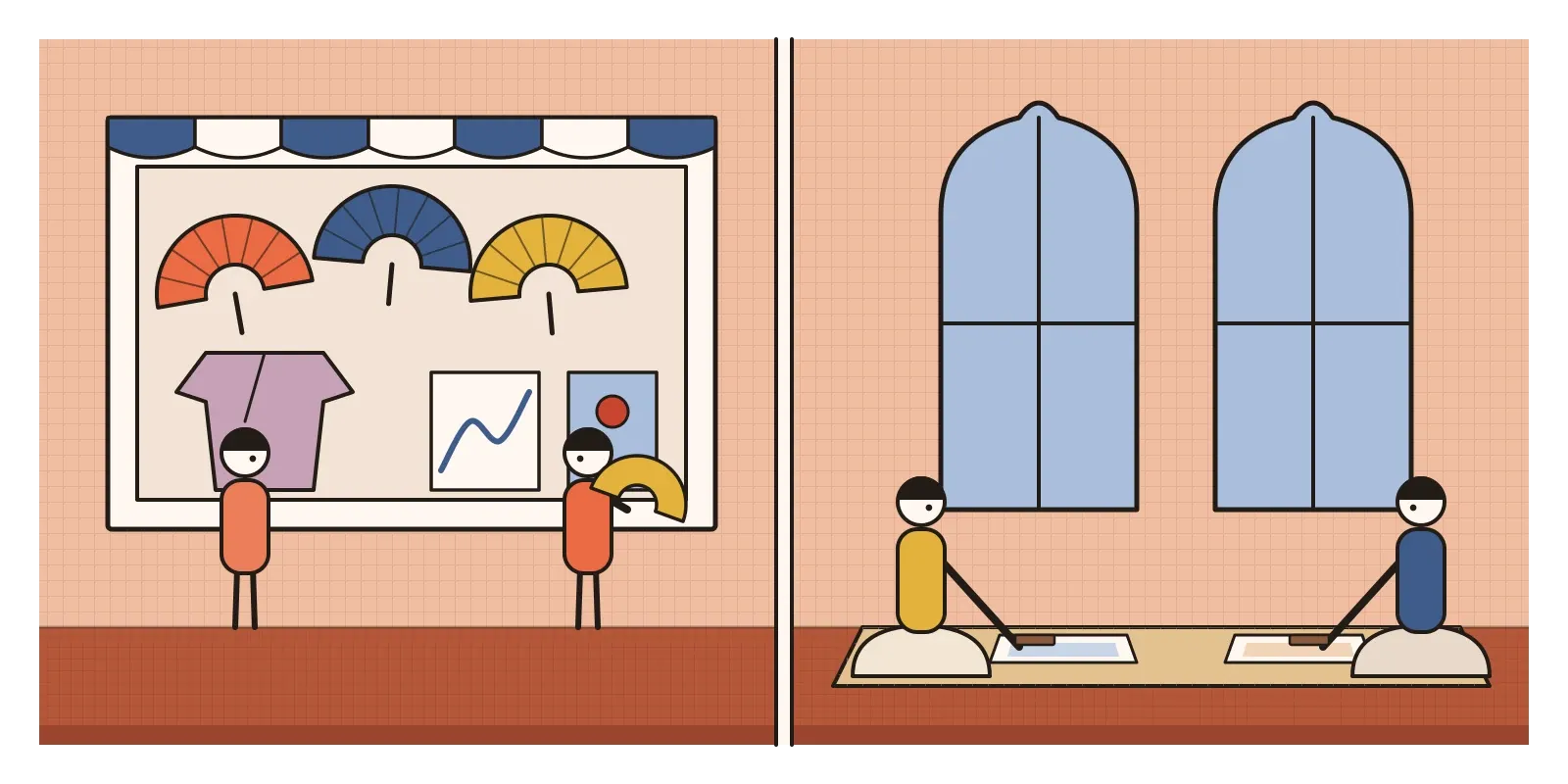
Set this beside Paris and the contrast is sharp. European Japonisme was mostly a one-way trade in objects: Japanese things were bought, collected and copied by artists who rarely met a Japanese painter. The Calcutta exchange was between artists who saw each other as equals and allies against Western academic taste, which is exactly the taste I'll come to in the next post, on Raja Ravi Varma. What came of those meetings belongs to the post on the Bengal School. Here, it's enough to notice that the same Japanese art was being used to answer two quite different questions, in Paris how to make Western painting modern, in Calcutta how to make Indian painting Indian again.
The habit of the empty corner
Designers still use Japonisme's lessons every day, usually without knowing where they came from. Asymmetric layouts, generous white space and a single strong image pushed to one side are basic tools of modern graphic and web design. So is cropping. A product photograph that lets a shoe or a phone run off the edge of the frame, or a hero image that shows only part of a face, feels dynamic for exactly the reason Degas's cropped dancers did. The flat colour and firm outline of the Japanese print passed through Lautrec's posters into the long tradition of poster design and, much later, into flat interface icons.
There's also a lesson about marks. Japanese families and businesses had used mon, simple circular crests of flowers, leaves and geometric shapes, for centuries Crest designs, and the paper stencils used to dye kimono cloth, were collected and studied by European designers. The crests look strikingly like modern logos, and Whistler's butterfly was a Western artist's mark made in the same spirit. A good test for any logo is still the one a mon passes: can it be recognised in a single colour, at the size of a fingernail?
A Japan that never existed
The trouble with Japonisme is that it was in love with a Japan that was largely imaginary. Gilbert and Sullivan's comic opera The Mikado, which opened in London in 1885, and Puccini's Madama Butterfly in 1904 presented Japan as a quaint, decorative, childlike place of fans and geishas. The artists who made the prints so admired in Paris were often anonymous to their buyers, and the prints themselves were regarded in Japan as cheap popular products, closer to posters and magazines than to fine art. Europeans were building their idea of "Japanese art" from the throwaway end of the market while knowing little about the painting, calligraphy and architecture that Japan itself valued most.
The timing is also ironic. Europe fell for a timeless, traditional Japan at exactly the moment Japan was industrialising at speed, adopting Western dress, railways and armies, and making objects specifically to suit Western taste for export. Within a generation it was building an empire of its own, taking Taiwan in 1895 and annexing Korea in 1910. Okakura's dream of a united Asia was later bent into propaganda for that empire, and when Rabindranath Tagore lectured in Japan in 1916, he warned his hosts against the aggressive nationalism he saw growing there and was coolly received.
By the 1910s, Japonisme had dissolved into the movements it had fed, especially Art Nouveau, Post-Impressionism and the early modernists. In Japan itself, the reply came later, from the folk craft movement of the 1920s, which looked away from both Western taste and export wares to the everyday objects of ordinary makers. I'll come back to that in the post on Mingei.
To see Japonisme for yourself, compare two pictures side by side: a European academic landscape and a Hiroshige print, both easy to find in museum collections online. Then try the exercise the Paris painters taught themselves. Take a photograph of your street from a window above it, then crop it three ways: once centred, once with the subject pushed to a corner, once with something in the foreground cut off by the edge. Notice which one holds your eye longest. That's the discovery Bracquemond was passing around in a little book from the packing straw, that the edge of the frame and the empty corner are part of the picture too. In the next post, on Raja Ravi Varma and Indian academic realism, the borrowing runs the other way, as an Indian painter takes up the oil paint and perspective that Paris was busy questioning.
Further reading: Siegfried Wichmann, Japonisme: The Japanese Influence on Western Art Since 1858 (1981) · Klaus Berger, Japonisme in Western Painting from Whistler to Matisse (1992) · Gabriel P. Weisberg and others, Japonisme: Japanese Influence on French Art 1854-1910 (1975) · Okakura Kakuzō, The Ideals of the East (1903) · Christopher Dresser, Japan: Its Architecture, Art and Art Manufactures (1882)
A reply toThe fixed viewpoint, centred balance and polished finish taught by Europe's art academies.