Insular and Illuminated Manuscripts
How monks on the edge of Europe turned the pages of a book into pattern, colour and light.
Insular and Illuminated Manuscripts
A gospel book under a sod of turf
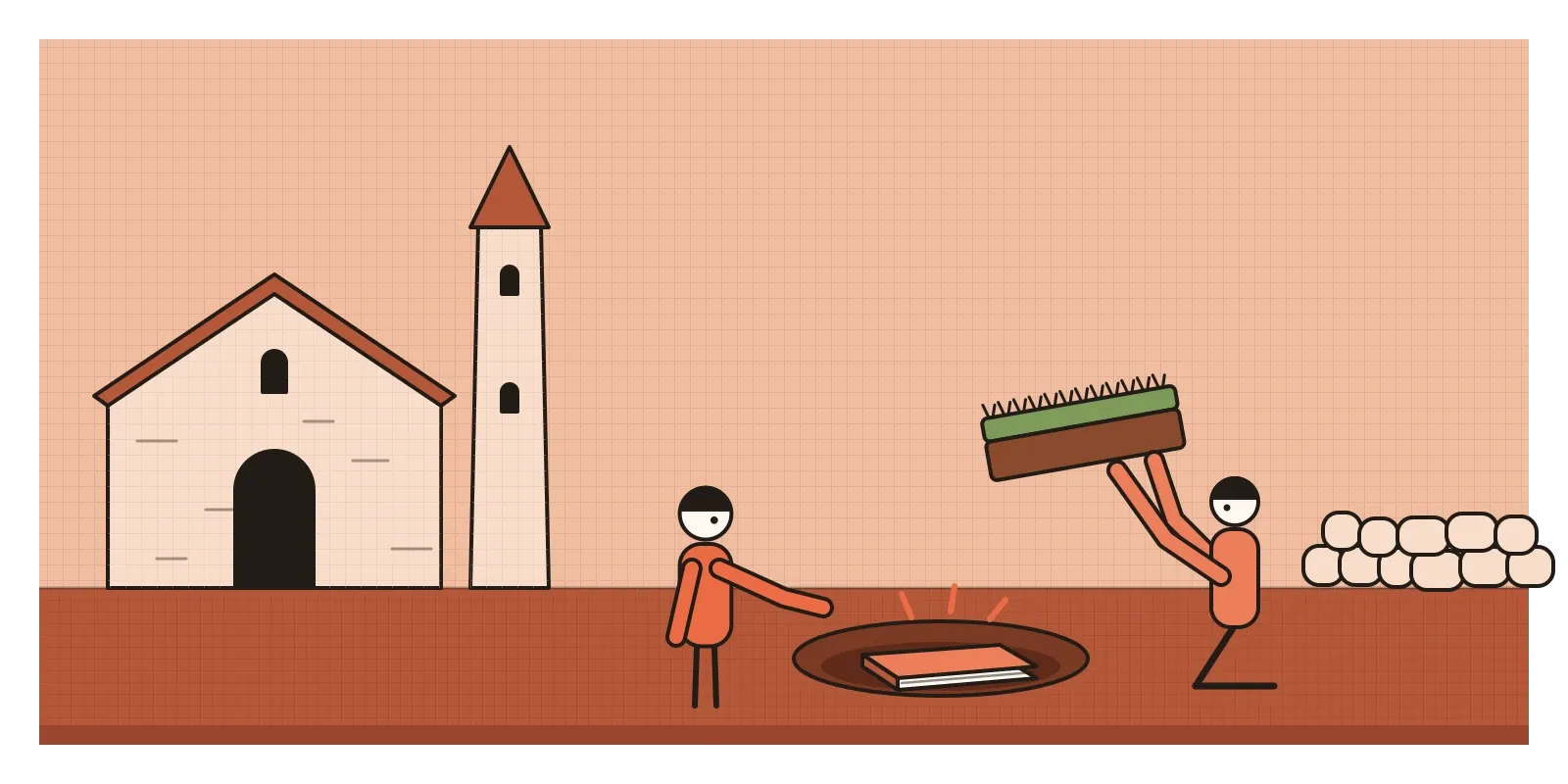
Sometime in 1007, according to the medieval chronicle known as the Annals of Ulster, thieves broke into the western sacristy of the great stone church at Kells, in what is now County Meath in Ireland, and carried off the great Gospel of Colum Cille, which the chronicler called the most precious object in the western world. They weren't interested in the words. They wanted the shrine it was kept in, a cover worked in gold and probably set with jewels. Two months and twenty nights later the book turned up again, stripped of its gold and hidden under a sod of turf. (Some editions of the annals put the entry under 1006, and it's the only account we have.)
Most historians think that battered book is the one we now call the Book of Kells, which has been at Trinity College Dublin since the 1660s. Around 340 leaves survive. Some scholars suspect the leaves missing from its beginning and end were torn away when the thieves ripped it out of its cover. The gold on the outside was worth stealing. The painting on the inside was beyond price, but nobody could sell it.
This post is about books like that one. An illuminated manuscript is a handwritten book decorated with colour and often with gold or silver, from the Latin illuminare, to light up. Insular art is the name historians give to the style made in Ireland and Britain from roughly 600 to 900, from the Latin insula, island. The word is partly a truce, because scholars have argued for a century over whether particular books are Irish, Scottish or English, and "Insular" lets them describe the style without settling the quarrel. I've placed this post after the ones on Romanesque and Gothic, a little out of order, because book painting ran right through the Middle Ages, and I'll follow it as far as the Gothic books of hours.
Missionaries, Vikings and the jeweller's eye
Christianity reached Ireland in the fifth century and grew around monasteries rather than cities. In about 563 the Irish monk Columba, Colum Cille in Irish, founded a monastery on Iona, a small island off the west coast of Scotland, and in 635 a monk from Iona called Aidan founded another on Lindisfarne, off the coast of Northumbria. These communities needed gospel books, and their models came from the Mediterranean, carried north by missionaries: late Roman books with calm columns of text and evangelists painted as solid, robed figures in believable rooms.
The monks didn't copy that look. They answered it in the visual language they already knew best, which was metalwork. For centuries, Celtic craftsmen had decorated bronze and gold with swirling spirals and trumpet shapes, and Anglo-Saxon jewellers had perfected bands of interlaced animals. The great gold belt buckle from the Sutton Hoo ship burial, made in the early seventh century and now in the British Museum, is covered in tiny beasts biting and knotting through each other. Insular painters brought exactly that eye to the page. The result is a reply in two directions at once: the shape and purpose of the Roman book, rewritten as if a goldsmith had been asked to make it.
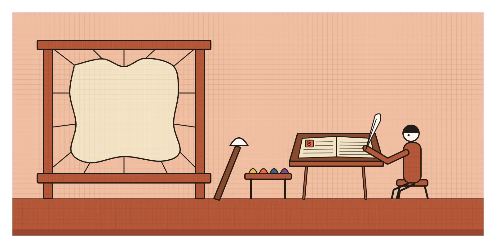
It was slow, costly work. The pages are vellum, calfskin soaked, scraped, stretched on a frame and dried, and a big gospel book could swallow the skins of well over a hundred calves. The scribes wrote with goose or swan quills in iron gall ink. Their colours came from minerals, plants and lichens: yellow orpiment, red lead, greens, and a purple made from lichen. A study of the Book of Kells using Raman spectroscopy, published in 2009, found that its blue was indigo, not the costly lapis lazuli that writers had long assumed. Vikings raided Lindisfarne in 793 and Iona several times after that, and many scholars think the Book of Kells was begun on Iona and carried to Kells, where the Iona community built a new monastery in the early ninth century.
Three books that rewrote the page
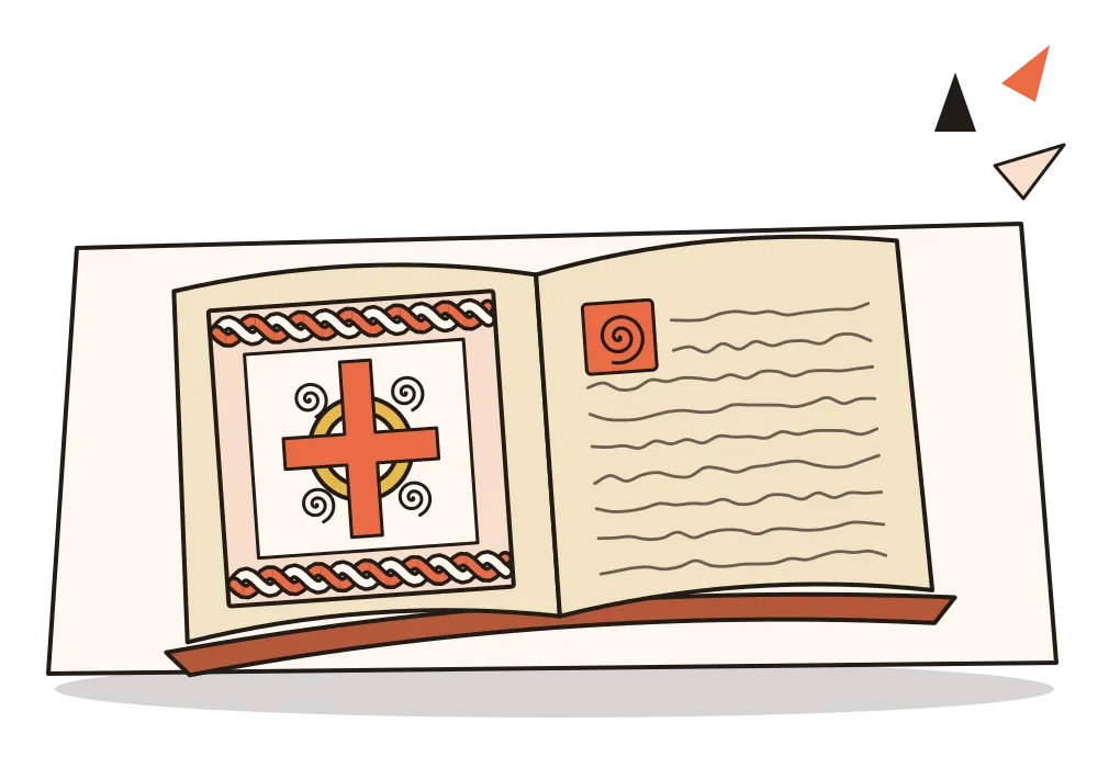
The Book of Durrow, usually dated to the second half of the seventh century and also now at Trinity College Dublin, is the earliest fully decorated Insular gospel book we have. It introduced one of the style's great inventions, the carpet page: a whole page given over to pattern, with no words at all, like a rug laid before the start of a Gospel. Its palette is small, mostly red, yellow, green and a dark brown-black, and its symbol for Matthew, a man, has a body like a stiff, chequered bell, more like an enamelled box than a person.
The Lindisfarne Gospels, made at the start of the eighth century and now in the British Library in London, go much further. Around the middle of the tenth century a priest called Aldred added a note at the back saying the book was written by Eadfrith, bishop of Lindisfarne, who died in 721, bound by his successor Ethelwald, and decorated with metalwork by a hermit called Billfrith. Scholars broadly trust the note, which would mean one man wrote and painted almost the whole book, a staggering amount of work. Its great initials are outlined in thousands of tiny red dots, and its carpet pages pack crosses and knotted birds into perfectly balanced frames. On some leaves you can still find pinpricks and ruled lines, the traces of the geometry beneath the pattern.
The Book of Kells, made around 800, is the most extravagant. Its most famous page opens the story of the birth of Christ with the two Greek letters that begin his name, swollen until they fill almost the whole leaf with spirals, knots and faces. Look closely and the page is full of small surprises: an otter holding a fish, a pair of cats with mice at their feet, moths tucked into the curves. Gerald of Wales, a twelfth-century writer, described a gospel book he saw at Kildare as so intricate that you might think it the work of an angel rather than a man. He wasn't describing Kells, but the line has been attached to it ever since, and you can see why.
Reading a page as if it were a brooch
Start with the interlace, ribbons that weave over and under each other and never seem to end. In good Insular work the rule is strict: every crossing alternates, over, under, over, under, so you could pull the ribbon tight in your head. Around the interlace you'll find trumpet spirals and three-armed whirls called triskeles, inherited from Celtic metalwork, and long animals whose bodies knot together, often biting their own tails or each other's legs. Colour is flat, with no shadows, and people become pattern too, with hair in tidy coils and robes in stripes.
The page itself is designed as a sequence. A Gospel might open with a carpet page, then a portrait or symbol of the evangelist, then a huge first word whose letters get smaller and smaller until they settle into ordinary script, a shrinking effect scholars call diminuendo. The text is written in a rounded, upright script called Insular majuscule, and there's often a fear of empty space: if a gap appears, something fills it.
After 800, other workshops replied in other accents. At Charlemagne's court, scribes developed Carolingian minuscule, a clear, evenly spaced small script that's an ancestor of our lower-case letters. And in the Gothic centuries, the private book of hours put painting into the hands of rich laypeople. The most famous, the Très Riches Heures made by the Limbourg brothers for the Duke of Berry from around 1411, has calendar pages showing ploughing, feasting and castles under deep blue skies. The brothers all died in 1416, probably of plague, and the book was finished decades later by another painter.
Palm leaves at Nalanda
In the same centuries, under the Pala kings who ruled Bengal and Bihar from around the eighth to the twelfth century, the great Buddhist monasteries of Nalanda and Vikramashila copied texts such as the Perfection of Wisdom in Eight Thousand Lines, the Ashtasahasrika Prajnaparamita. They wrote on palm leaves, long narrow strips with a cord threaded through holes to keep them in order, stacked between painted wooden boards.
The parallels with Kells are real. Both were made by monks, both treated the book as a holy object as well as something to read, and the Prajnaparamita text was itself venerated, even personified as a goddess. Both suffered when their monasteries were attacked. Nalanda and Vikramashila were sacked around 1200, and the tradition carried on mainly in Nepal and Tibet.
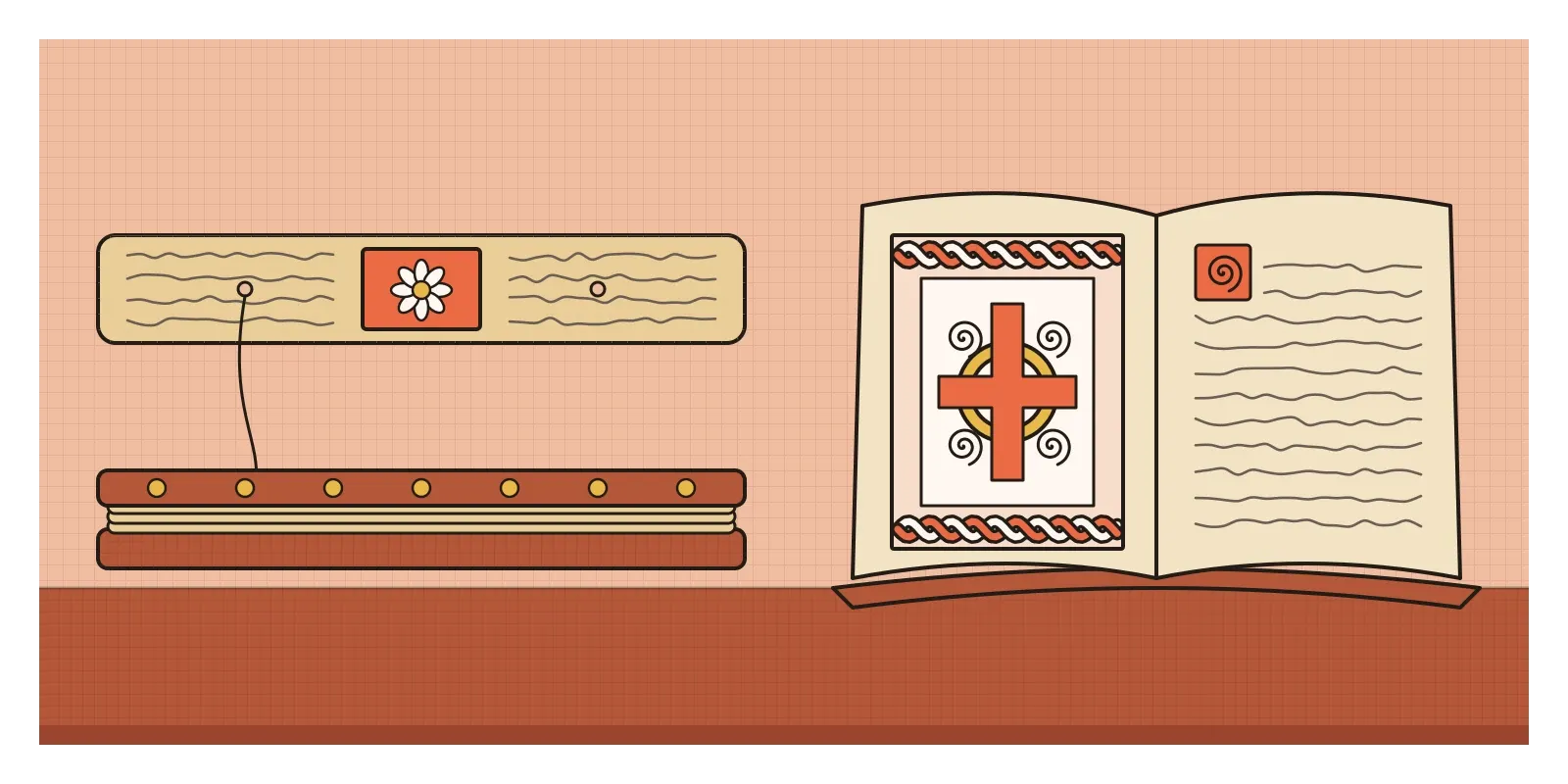
The differences are just as instructive, and most of them come from the material. A palm leaf is a few centimetres tall, so Pala painters set small, almost square panels of the Buddha's life and of deities into the lines of text, outlined crisply and filled with rich colour, often on red grounds. There was no room for a carpet page. A vellum codex has broad pages that can be given over entirely to pattern, so the Insular painters made pattern the main event. Same century, same devotion, a different shape of surface, and a different idea of what a sacred page should look like. The format decided the design long before the designer did.
The space bar, the drop cap and a cartoon
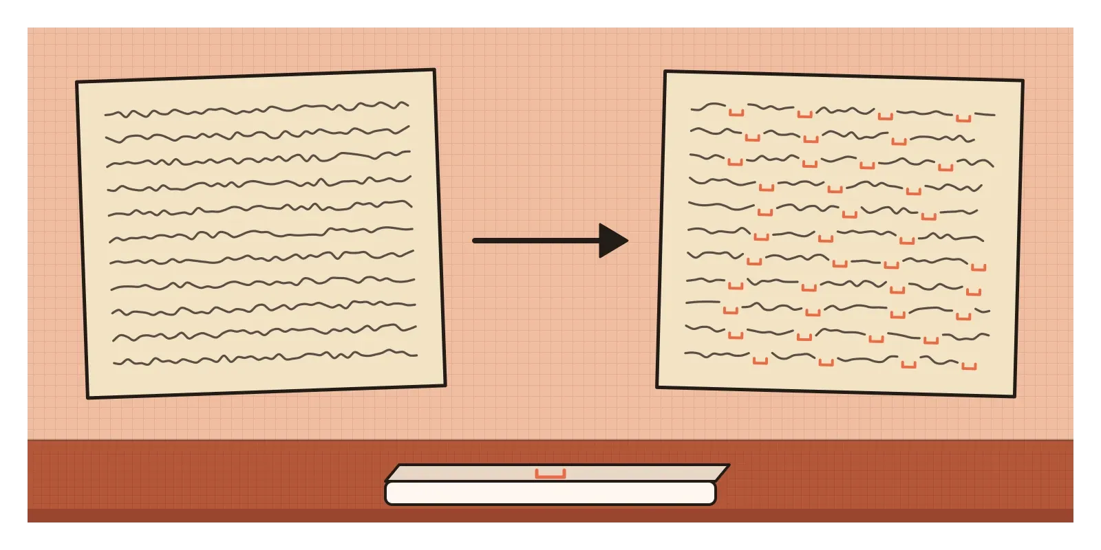
One of the most useful things Insular scribes gave us is invisible. Roman books were usually written with no gaps between words, a style called scriptio continua. In his 1997 book Space Between Words, the historian Paul Saenger argued that Irish scribes began separating words in the seventh century because Latin was a foreign language to them, and spaces made it easier to read. Not everyone accepts his larger argument that spacing changed how people read, but every time you press the space bar you're using an idea those scribes helped spread.
The diminuendo lives on as the drop cap, the large first letter that still opens magazine features, book chapters and long reads on the web. It works for the same reason it worked in Kells: it marks a clear entrance and then steps down gently into the body text. Carpet pages are cousins of the title spread, the full-bleed opener and even the splash screen, pages whose only job is to say that something important is beginning.
Insular ornament had a second life in the nineteenth-century Celtic Revival, and it's still everywhere in tattoos and souvenirs. In 2009 the Irish studio Cartoon Saloon released The Secret of Kells, an animated film whose flat colour and dense pattern borrow directly from the book, and it was nominated for an Academy Award. For anyone working with generated ornament, interlace is also a good test. The strict over-under rule is easy to break, and a knot that breaks it looks wrong even to people who can't say why.
Lost names, lost calves and an open book
For all their beauty, these books leave a lot out. Almost all their makers are anonymous, and Eadfrith is named only because someone wrote him down two centuries later. We picture lone monks, but books were made by teams, and women took part too. In 2019, researchers reported finding particles of ultramarine in the dental plaque of a woman buried at a small religious community in Germany, probably between 1000 and 1200, which suggests she was licking a brush loaded with costly pigment while painting manuscripts. The books were also luxury objects made for display. The Book of Kells is full of copying slips, which suggests it was meant to sit on the altar more than to be read, and every page cost an animal's life.
The Insular style faded with the Viking raids and was answered by the clarity of Carolingian books, which looked back to Rome. Handmade books carried on for centuries, until printing in the 1450s made them a luxury rather than a necessity. In the next post, on Persian miniature painting, we'll meet the other great tradition of the painted book, made in royal workshops rather than monasteries.
If you can get to Dublin, the Book of Kells is on show at Trinity College, open at a different page every so often. In India, the National Museum in New Delhi has manuscripts on palm leaf and paper, and it's worth comparing how each fits its pictures to its pages. For a small exercise, take a strip of squared paper and draw a simple interlace border, making sure every crossing goes over, under, over, under. It's slower than it looks. Then think of the thieves at Kells, who took the gold and threw the pages into a field. A thousand years later, it's the pages people queue to see.
Further reading: Bernard Meehan, The Book of Kells (2012) · Michelle P. Brown, The Lindisfarne Gospels: Society, Spirituality and the Scribe (2003) · Christopher de Hamel, Meetings with Remarkable Manuscripts (2016) · Paul Saenger, Space Between Words: The Origins of Silent Reading (1997) · Jeremiah P. Losty, The Art of the Book in India (1982)
A reply toThe calm, classical gospel books of the Mediterranean, rewritten in the language of Celtic and Saxon metalwork.