Grunge Typography
How a few 1990s magazine designers made type messy, loud and hard to read, on purpose.
Grunge Typography
An interview nobody could read
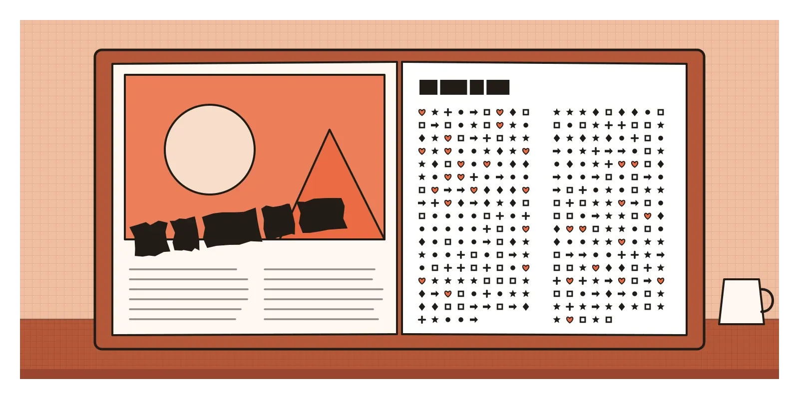
In the mid-1990s, readers of Ray Gun, a music magazine published in Los Angeles, turned to an interview with the singer Bryan Ferry and found they couldn't read it. The text was all there, column after column, but every letter had been replaced by a symbol: stars, arrows, pointing hands, crosses, scissors, little circled numbers. The magazine's art director, David Carson, had set the whole interview in Zapf Dingbats, a typeface made entirely of ornaments and symbols that came installed on most computers of the time. As Carson has told the story many times since, he found the interview dull and thought this was a more honest way of presenting it. For readers who still wanted the words, the interview was printed in an ordinary typeface elsewhere in the issue.
It's the most famous single page in the history of what came to be called grunge typography, and it sums up the style well. It's funny, a little rude and completely deliberate. It treats type as something to look at before it's something to read, and it assumes the reader is in on the joke.
Grunge typography is the name for a style of graphic design that peaked in the first half of the 1990s, mostly in American and British magazines, music packaging, advertising and posters. Its letters are distressed, smudged, photocopied, overlapped, cut off and scattered across the page, and its layouts throw out the grid. The name borrowed the label of the Seattle rock music of the same years, though the designers didn't come from Seattle and many disliked the word.
Flannel, skateboards and a Mac on every desk
Grunge type was a reply, first of all, to the clean, confident modernism that had ruled graphic design since the 1950s. The Swiss style, which has its own post in this section, had taught a generation that type should be orderly, set on a strict grid in neutral sans serifs like Helvetica, and that the designer's job was to get out of the way. The idea goes back further. In a talk in London in 1930, later printed as "The Crystal Goblet", the typographer Beatrice Warde compared good type to a clear wine glass: you should see the wine, not the glass. By the 1980s that ideal had become the house style of banks, airlines and corporations, and to many young designers it looked like the visual language of people in suits.
The second thing grunge replied to was the computer itself. As I wrote in the post on Emigre and digital type, the Apple Macintosh, PostScript fonts and page layout software arrived in the mid-1980s and put a whole print shop on a desk. By the early 1990s, cheaper machines, scanners, photocopiers and programs like Photoshop and Fontographer let designers do the opposite: scan dirty textures, distort letters, layer twenty images on a page and make their own typefaces in an afternoon.
Then there was the culture around it. Skateboarding, surfing, alternative rock, rave and club scenes all had their own homemade graphics, from photocopied flyers to hand-drawn record sleeves, which drew on the punk fanzines of the 1970s. In September 1991 Nirvana's album Nevermind took Seattle grunge into the mainstream. Its fans were ready for magazines that looked the way the music sounded.
A surfer, a box of disks and a wobbling font
David Carson came to design sideways. He had studied sociology, taught school and been a competitive surfer in California before he began laying out magazines in the 1980s, first on Transworld Skateboarding and then, from 1989, on Beach Culture, a surfing magazine that lasted only a few years but won a surprising number of design awards. He had little formal training, and he has always said that this helped: he didn't know which rules he was breaking. In 1992 the publisher Marvin Scott Jarrett launched Ray Gun and hired Carson as its art director. For about three years he redesigned the magazine issue by issue, with headlines broken across photographs, columns of text that slanted, overlapped or ran into the gutter, page numbers enlarged into decoration and captions shrunk almost to nothing. In 1995 a book of his work, The End of Print, written with Lewis Blackwell, became one of the most widely read design books of the decade.
In London, Neville Brody had already made his name in the 1980s designing the style magazine The Face with hand-drawn, geometric headline type. In 1991 he and Jon Wozencroft started FUSE, a publication sold as a box containing a floppy disk of new experimental typefaces and a set of posters made with them. Each issue had a theme, and many of the fonts were barely fonts at all: letters built from fragments, noise, scratches or symbols. FUSE was less about what a reader could read than about what a typeface could be.
The cleverest idea came from two young Dutch designers, Erik van Blokland and Just van Rossum, who worked together as LettError. In 1990 they released a typeface called Beowolf whose outlines were programmed to wobble at random every time it was printed. No two copies of the same word were exactly alike. It took the oldest promise of printing, that every copy is the same, and broke it inside the machine. Many of the distressed fonts that flooded the decade were simply scans of dirty, damaged letters. Beowolf was something stranger, a font that behaved a little like a hand.
Smudges, overlaps and type off the edge
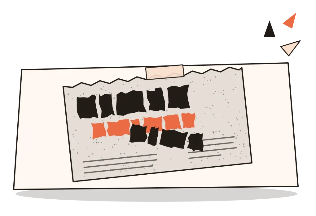
Grunge typography is easy to recognise once you know what to look for. The letters themselves are damaged: blurred by photocopying, chewed at the edges, stamped, scratched, typed on a broken typewriter or traced from stencils. Several different typefaces appear on the same page, sometimes in the same word. Text overlaps text and sits on top of busy photographs, often in colours close enough to the background to be hard to separate.
The layout breaks the grid on purpose. Columns slant, run into each other or vanish off the edge of the page. Lines are spaced too tightly or too loosely. Words are enlarged until only part of them fits, or shrunk until they're nearly invisible. Headlines are cut in half. The traditional signals of hierarchy, a big title, a clear first paragraph, a neat caption under each picture, are scrambled, so the reader has to work out the order for themselves.
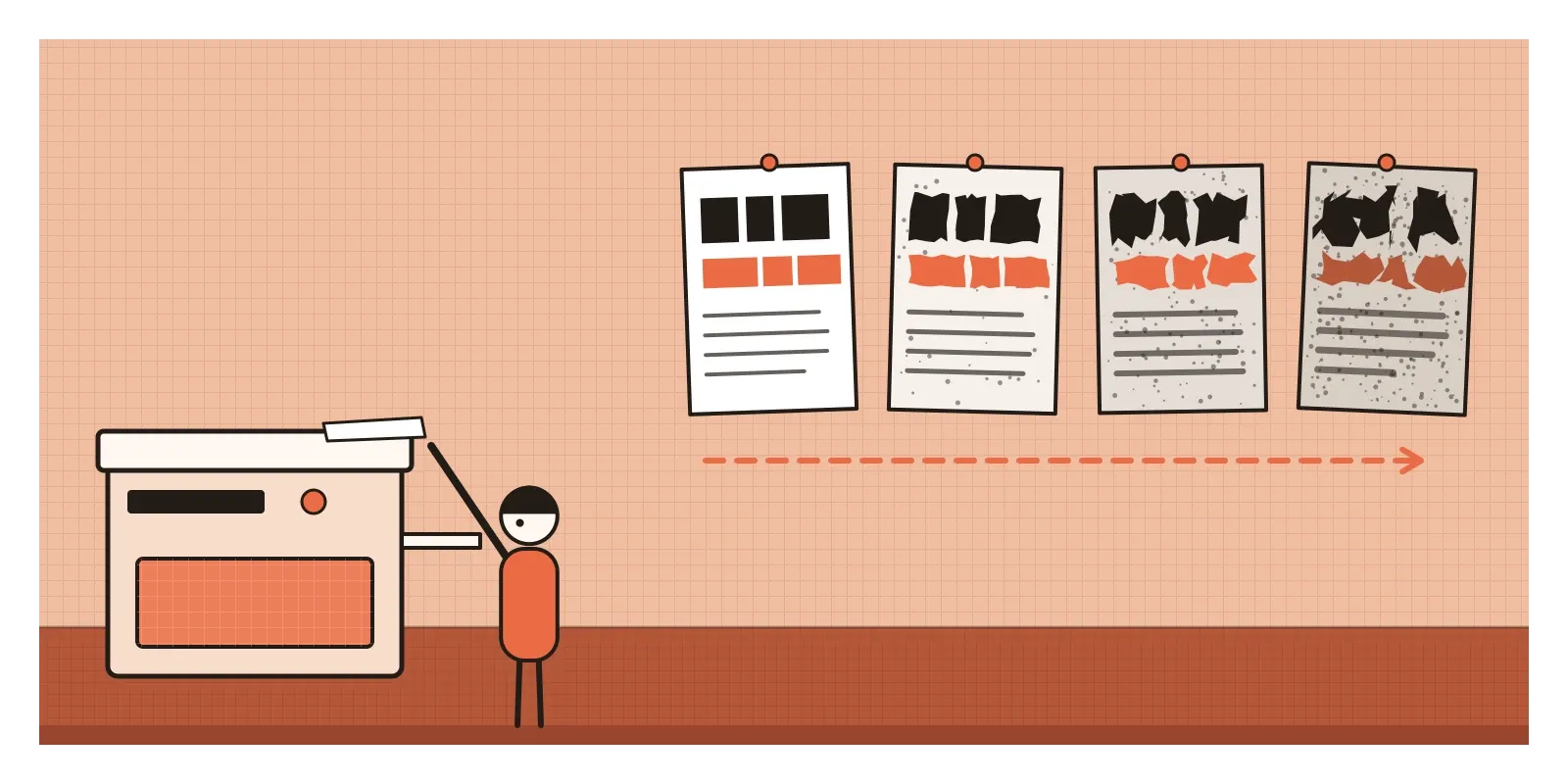
The materials matter too. Grunge designers loved the marks of process, the grey speckle of a cheap photocopy, the jagged pixel edge of a low-resolution scan, the fold of a fax, tape and staples, coffee rings. Much of it was made on the newest computers but was designed to look as if it had been made in a garage. For a designer, the useful thing to study is how much of it still works. Look closely at a good Carson spread and you'll often find an underlying order, a single strong image, a rhythm of large and small, that keeps the chaos from falling apart. The bad imitations had only the chaos.
Painted by hand, from shop boards to music television
Grunge typography didn't come from India, and it didn't take root here in its American form. What arrived in the 1990s was its mood. After the economic reforms of 1991, satellite television reached Indian homes, and with it music channels aimed at young viewers. Channel V, which began broadcasting on Star TV in the mid-1990s, became known for an irreverent, jokey, deliberately rough-edged style in its promos and characters, and Indian advertising for soft drinks, jeans and motorbikes borrowed some of the same scratchy energy. It was grunge as a borrowed attitude rather than a design movement, and it faded with the decade.
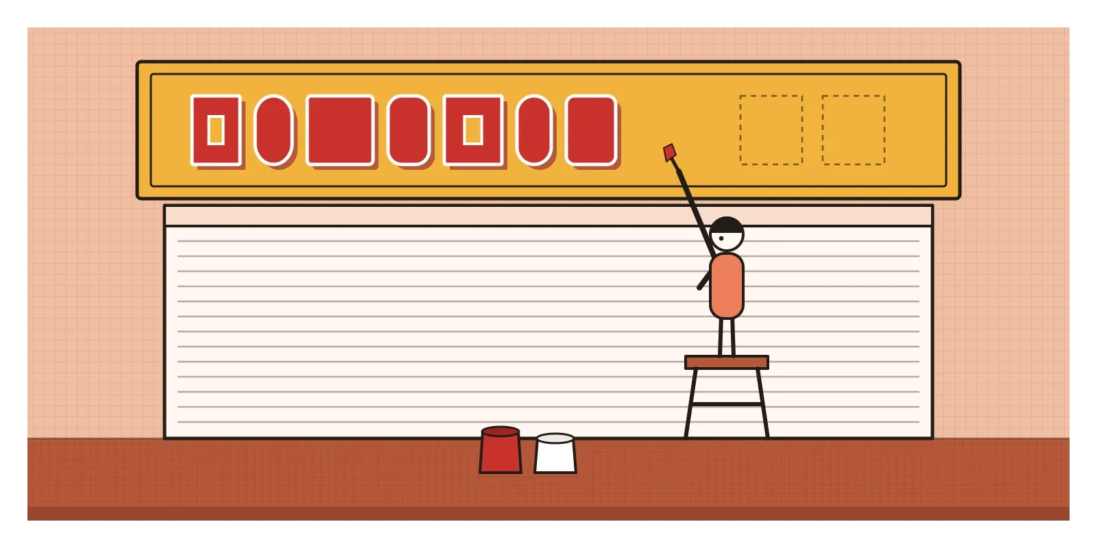
The more interesting link is the opposite one. Western grunge designers worked hard, with expensive machines, to make letters look imperfect and handmade. India already had a living tradition of imperfect, handmade letters everywhere: the painted names on shop boards, the bold lettering on the backs of lorries, film hoardings, wall advertisements and election slogans, all painted by professional sign painters, each with a recognisable hand. From the late 1990s, cheap digital printing on vinyl flex began to replace much of that work, and many painters lost their trade.
In 2013 the Delhi artist and designer Hanif Kureshi started a project called HandPaintedType, working with sign painters in different cities to turn their lettering into digital typefaces so that their styles wouldn't disappear. It's a useful mirror for grunge. Carson's generation broke clean type to make it feel human. Kureshi's project took type that was already human and found a way to keep it, without cleaning it up.
Scratched titles, and the case against ugly
Grunge typography's most famous descendant is probably a film title sequence. For David Fincher's Se7en in 1995, Kyle Cooper made the opening credits from jittery, hand-scratched lettering flickering over close-ups of a killer's notebooks, and a generation of horror films, video games and music videos copied it. Distressed and handmade type is now a standard tool, used whenever a brand, a festival or a band wants to look raw, independent or young. Experimental typefaces like Beowolf also pointed towards today's variable and generative fonts, which change shape in response to code, and to the random textures and glitches that AI image tools can now add with a single word in a prompt.
The deeper lesson is about legibility. Carson argued that a page people want to explore communicates better than a page they skim, and for Ray Gun's readers, young fans who read every word about their bands, he was often right. In interfaces, though, legibility is not a style choice. People are reading a bank statement, a medicine label or a train timetable in a hurry, on a small screen, sometimes with poor eyesight or dyslexia. The useful habit I take from grunge is to ask who the reader is and how hard they're willing to work, and to save the wild type for places where the answer is "very".
The critics were sharp. In 1992 Paul Rand, the elder statesman of American corporate design, attacked the new work as confusion and chaos. In 1993 Steven Heller wrote an essay in Eye magazine called "Cult of the Ugly", arguing that much of the experimental type of the time was self-indulgent and that ugliness had become a style in its own right. Accessibility campaigners would later add that layered, low-contrast text shuts out exactly the people who already struggle to read. And the world it came from was narrow: most of the celebrated designers were young white men, and its rebellion was quickly sold back to its readers.
That was what really ended it. By the mid-1990s, grunge fonts were sold on cheap CD-ROMs, and torn, distressed type appeared in advertising for sportswear, soft drinks and cars. Once a bank could use it, it no longer meant anything. Ray Gun closed in 2000. The replies came from several directions at once: a return to clean, calm modernism, the first web designers working within very tight limits, and a quieter, wittier way of questioning design that was taking shape in the Netherlands.
Make a page you have to work for
To see the Indian side of this story, walk down any market street and look at the painted shop boards and lorry backs that are left, and photograph the ones that are clearly by one painter's hand. Hanif Kureshi's HandPaintedType is online, and you can download the typefaces and compare them with the walls they came from. For the original work, Lewis Blackwell and David Carson's The End of Print is still easy to find secondhand, and Rick Poynor's No More Rules places it in the bigger story of design in the 1980s and 1990s.
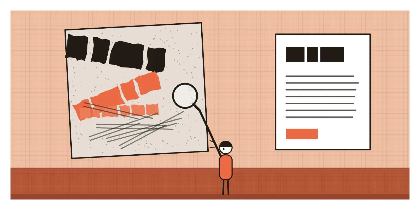
For an exercise, take a short text you know well, a song lyric you like or a paragraph from a book, and design it twice on one sheet. First set it as clearly as you can. Then set it so that the layout says what the words feel like, using a photocopier, scissors, tape and two or three typefaces, and let it become hard to read. Show both to a friend and ask which one they remember. Then ask which one they could read on a bus.
Carson's Bryan Ferry interview was a joke, but it was also a question: what is a page for? Grunge typography answered that a page could be an experience before it was a message. It was wrong about a lot of pages. It was right about some. In the next post, on Dutch Design, the questioning moves from the page to the object, with a lot more dry humour.
Further reading: Lewis Blackwell and David Carson, The End of Print: The Graphic Design of David Carson (1995) · Rick Poynor, No More Rules: Graphic Design and Postmodernism (2003) · Steven Heller, "Cult of the Ugly", Eye (1993) · Beatrice Warde, The Crystal Goblet: Sixteen Essays on Typography (1955) · Jon Wozencroft, The Graphic Language of Neville Brody (1988)
A reply toThe clean, invisible typography of Swiss modernism and its corporate grid.