Deconstructivism
How a 1988 museum show gave a name to tilted, fractured buildings, and why architects still argue about it.
Deconstructivism
Seven architects and a borrowed word
On 23 June 1988, an exhibition called Deconstructivist Architecture opened at the Museum of Modern Art in New York. It was small: drawings, models and site plans for ten projects by seven architects, most of them unbuilt. Visitors first walked through a room of Russian avant-garde paintings and sculptures from the museum's own collection, then into galleries full of models that looked as if they had been dropped and glued back together. There were leaning walls, roofs breaking open and plans like spilled matchsticks.
The names on the walls were Frank Gehry, Daniel Libeskind, Rem Koolhaas, Peter Eisenman, Zaha Hadid, Bernard Tschumi and the Viennese partnership Coop Himmelblau. Most were barely known outside architecture schools. Philip Johnson, then 81, had co-organised the same museum's 1932 show that named the International Style, which has its own post in this section. More than half a century later he was back, with a young architect and Princeton lecturer from New Zealand, Mark Wigley, as his co-curator, and he was once again announcing what came next.

The title was a hybrid. It joined Constructivism, the Russian movement of the 1920s I wrote about earlier in this section, to deconstruction, a way of reading texts developed by the French philosopher Jacques Derrida, which looks for the hidden contradictions that hold a text together. Deconstructivism is the name that stuck for the architecture the show presented: buildings made of fragments, diagonals, warped planes and colliding volumes, designed to unsettle the calm, orderly geometry that modern architecture had promised. In the museum's own fact sheet, Johnson described what these architects offered as "the pleasures of unease". It was never really a movement, and almost every architect in the show said so, but the name has followed them ever since.
Tired of perfect boxes, tired of pediments
By the late 1980s architecture was stuck between two answers, and many young architects disliked both. The first was modernism, the white cubes, glass towers and right angles of the International Style, which had become the default style of offices and housing estates everywhere. The second was Postmodernism, the reply I wrote about a few posts ago, which brought back columns, arches, pediments and jokes. By 1988 it was everywhere too, and Johnson himself had designed one of its most famous buildings, the AT&T tower in New York with its broken pediment on top. To a younger generation, it decorated the box without questioning it.
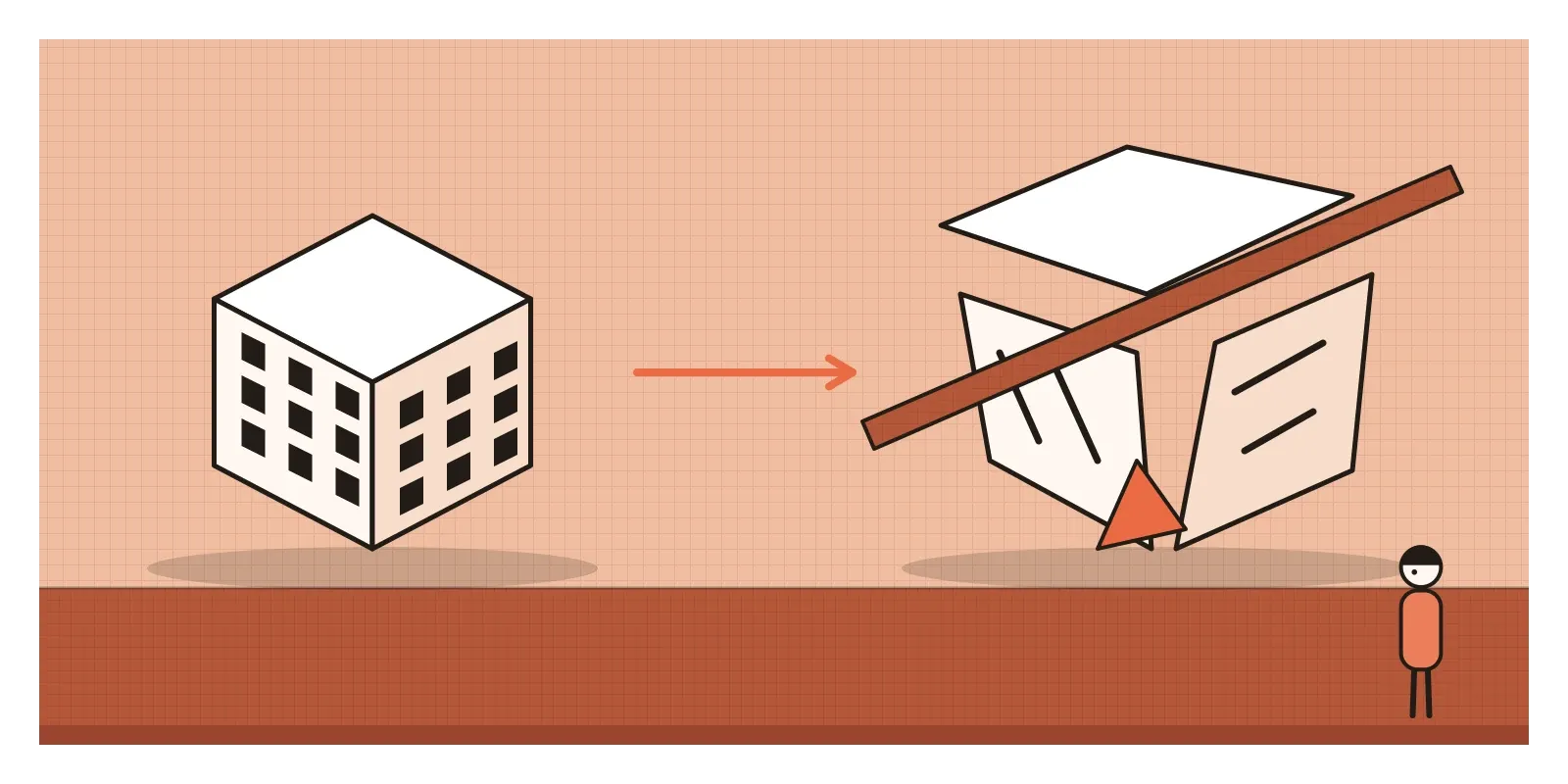
The Deconstructivists wanted to attack the box itself. Wigley's catalogue essay argued that these architects weren't adding decoration or quoting history. They were disturbing the pure form from the inside, showing the instability that the tidy modernist cube had covered up. That's why the show began with the Russians, whose tilted, colliding forms had aimed at a new perfection. The new architects, the curators argued, turned the same forms against perfection.
Competitions, many of them never built, let these architects publish wild ideas as drawings and paintings long before anyone paid for them. And in architecture schools Derrida was being read, sometimes carefully and sometimes not. Eisenman and Tschumi actually worked with him on a garden for Paris. Most of the others had read little of him, which critics would point out at once.
A wrapped bungalow, a fire station and a museum of voids
The oldest project in the show was a house. In 1977 Frank Gehry and his wife Berta bought an ordinary two-storey bungalow, built in the 1920s, on a corner in Santa Monica, and Gehry began rebuilding it the next year without taking the old house away. He wrapped it in a new outer layer of corrugated metal, plywood and chain-link fencing, the materials of builders' yards and car parks, and let tilted glass boxes burst through the corners. From the street you could see the old house trapped inside the new one. Some neighbours were furious. As I wrote in the post on sketching as thinking, Gehry's later buildings, including the Guggenheim Museum in Bilbao, began as loose scribbles and paper models. The house in Santa Monica is where that habit of breaking things open first became architecture.
Zaha Hadid, born in Baghdad in 1950 and trained in London, was represented by The Peak, her winning entry in a 1983 competition for a leisure club in the hills above Hong Kong. It was never built, but her paintings of it, long slabs and beams exploding across the hillside, made her name. As I mentioned in the post on Suprematism, she had begun as a student by turning one of Malevich's architectural models into a building. Her first major built work came in 1993: a small fire station for the Vitra furniture company in Weil am Rhein, Germany, made of sharp concrete planes that lean, slide and narrow to a point. The fire brigade didn't stay long, and the building now shows chairs. In 2004 she became the first woman to win the Pritzker Prize, architecture's best-known award.
Daniel Libeskind had built almost nothing in 1988. A year later he won the competition for an extension to the Berlin Museum to house its Jewish collections. The building, finished in 1999, is a long zinc-clad zigzag slashed with narrow, angled windows. Inside, the plan is cut through by tall empty spaces called voids, concrete shafts you can see but often can't enter, which stand for what was lost in the Holocaust. Before any exhibits arrived, crowds came to walk through it empty.
The others pushed the same ideas in different directions. Coop Himmelblau, founded in Vienna by Wolf Prix and Helmut Swiczinsky, had issued a 1980 manifesto with a title usually translated as "Architecture must burn", and their rooftop extension for a law firm on Falkestrasse in Vienna, finished in 1988, is a jagged tangle of glass and steel that seems to have struck the old building like lightning. Bernard Tschumi's Parc de la Villette in Paris, from a 1982 competition, scattered bright red steel pavilions, which he called follies, across a park on a regular grid, then cut it with walkways that ignore the grid. Peter Eisenman's Wexner Center for the Arts at Ohio State University, opened in 1989, collides two street grids that don't line up and runs a white steel scaffold through the building as if it were never finished.
Walls that lean and corners that won't meet
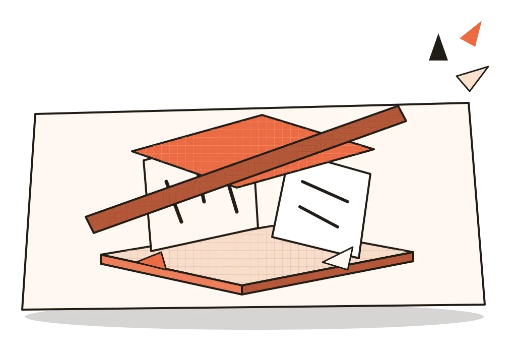
Look first at the angles. Almost every building you live and work in is made of right angles. Deconstructivist buildings avoid them. Walls lean, floors tilt, windows are cut as slashes and slivers, and corners meet at acute angles or don't meet at all. The overall form looks fragmented, as if several buildings had crashed into each other and been left where they stopped.
Then look at the layers. Many of these buildings show more than one system at once: an old house inside a new skin, two grids laid over each other, a scaffold that looks temporary running through something permanent. Surfaces are often industrial and sometimes unexpected: corrugated metal, chain-link fence, raw concrete, zinc and, later, titanium and stainless steel. The drawings, often as important as the buildings, are exploded views and paintings rather than tidy sections.
Underneath the drama, almost all of it depended on structural engineers and, from the 1990s, on computers that could model surfaces too complex to draw by hand. As a designer, the thing I notice most is how carefully planned the chaos is. A wall that looks as if it fell over has been calculated to the millimetre, which is a useful reminder that looking spontaneous is a design decision, and usually an expensive one.
Breaking the box in Ahmedabad
I want to be honest about India here. There was no Deconstructivist moment in Indian architecture in the late 1980s and 1990s. The style needed big budgets, specialist engineering and imported cladding, and Indian architects of that generation were mostly working on other problems, housing, climate and cheap materials, as I wrote in the post on Indian modern architecture.
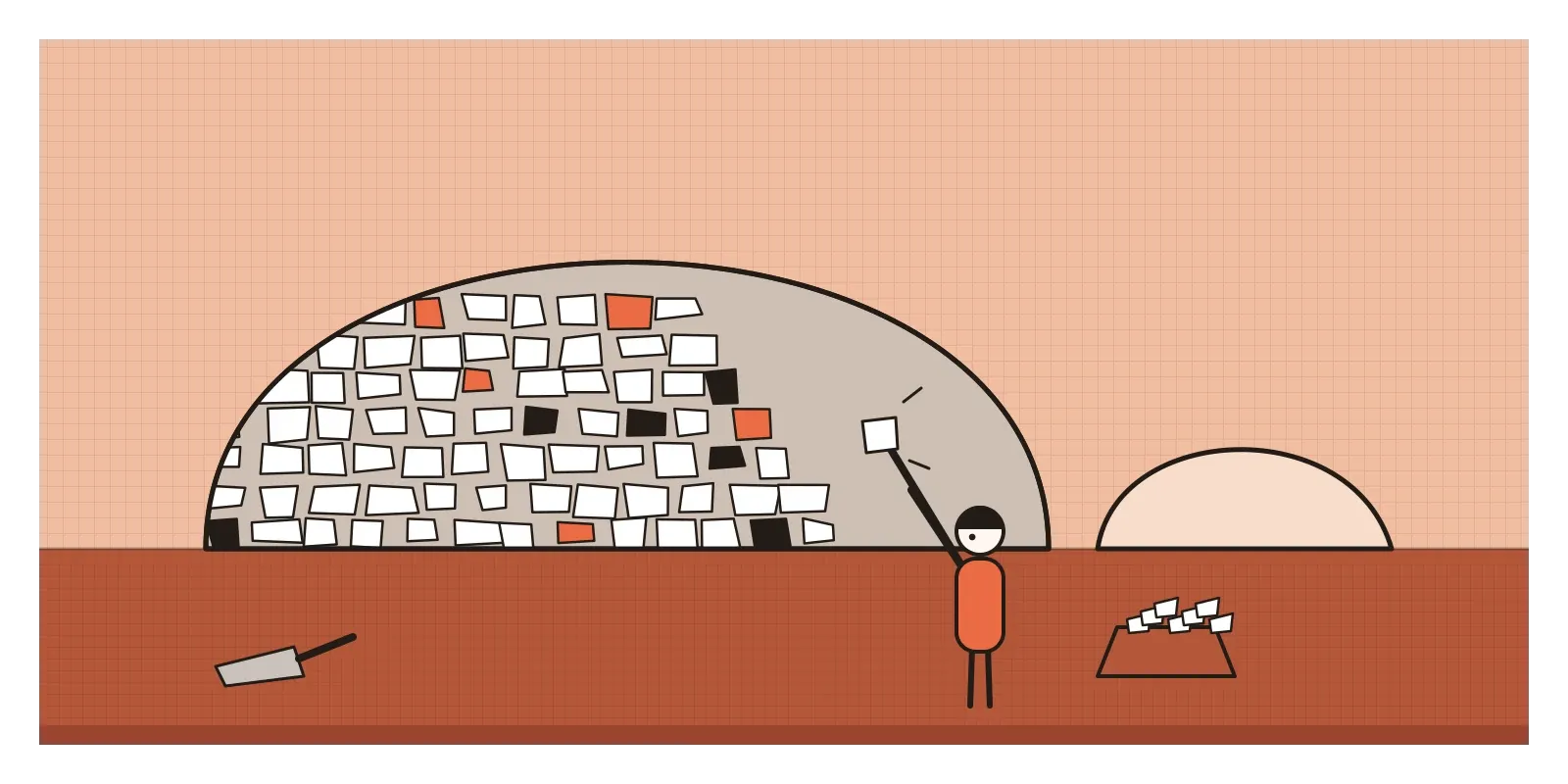
What you can find is an Indian architect breaking the box at the same moment, for different reasons and in a very different way. Between 1992 and 1995, Balkrishna Doshi built an underground gallery in Ahmedabad for the paintings of M. F. Husain, now called Amdavad ni Gufa, the cave of Ahmedabad. The roof is a cluster of low, swelling domes that rise out of the ground like the backs of turtles, supported inside on tilted, tree-like columns, and covered in a mosaic of broken white china. The domes are a thin shell of ferrocement, a cheap, strong mesh of steel and mortar. The forms are often said to have been worked out with help from a computer, but the building itself was made by hand, by local workers, with broken crockery for its skin.
The comparison is loose, and I don't want to push it. Doshi wasn't trying to unsettle anyone, and his sources were caves, Buddhist rock-cut halls, earth mounds and the need to stay cool in an Ahmedabad summer, not Russian paintings or French philosophy. In Bilbao and the cities that copied it, free-form architecture became a sign of wealth, made with titanium and aerospace software. In Ahmedabad, a free form came out of a cave, a mesh of steel and a heap of broken plates.
From titanium to tilted cards on a screen
Deconstructivism's biggest legacy is that it made the strange building normal. When the Guggenheim Museum Bilbao opened in October 1997, a declining industrial city suddenly had a building people flew across the world to see, and the phrase "the Bilbao effect" entered the language of city planners. For twenty years, cities everywhere commissioned signature buildings hoping for the same result. Hadid's office went on to develop what her partner Patrik Schumacher, in a 2008 manifesto, called parametricism, flowing forms generated by software rules.
The vocabulary spread well beyond buildings. In fashion, designers such as Martin Margiela and Rei Kawakubo were taking garments apart in the same years, leaving seams on the outside and linings showing. In graphic and interface design, broken grids, overlapping images, cards tilted a few degrees and text that runs across the edge of a picture all borrow some of the same unease. The lesson is the same as in the buildings: one deliberate break reads as energy, and three read as a mistake.
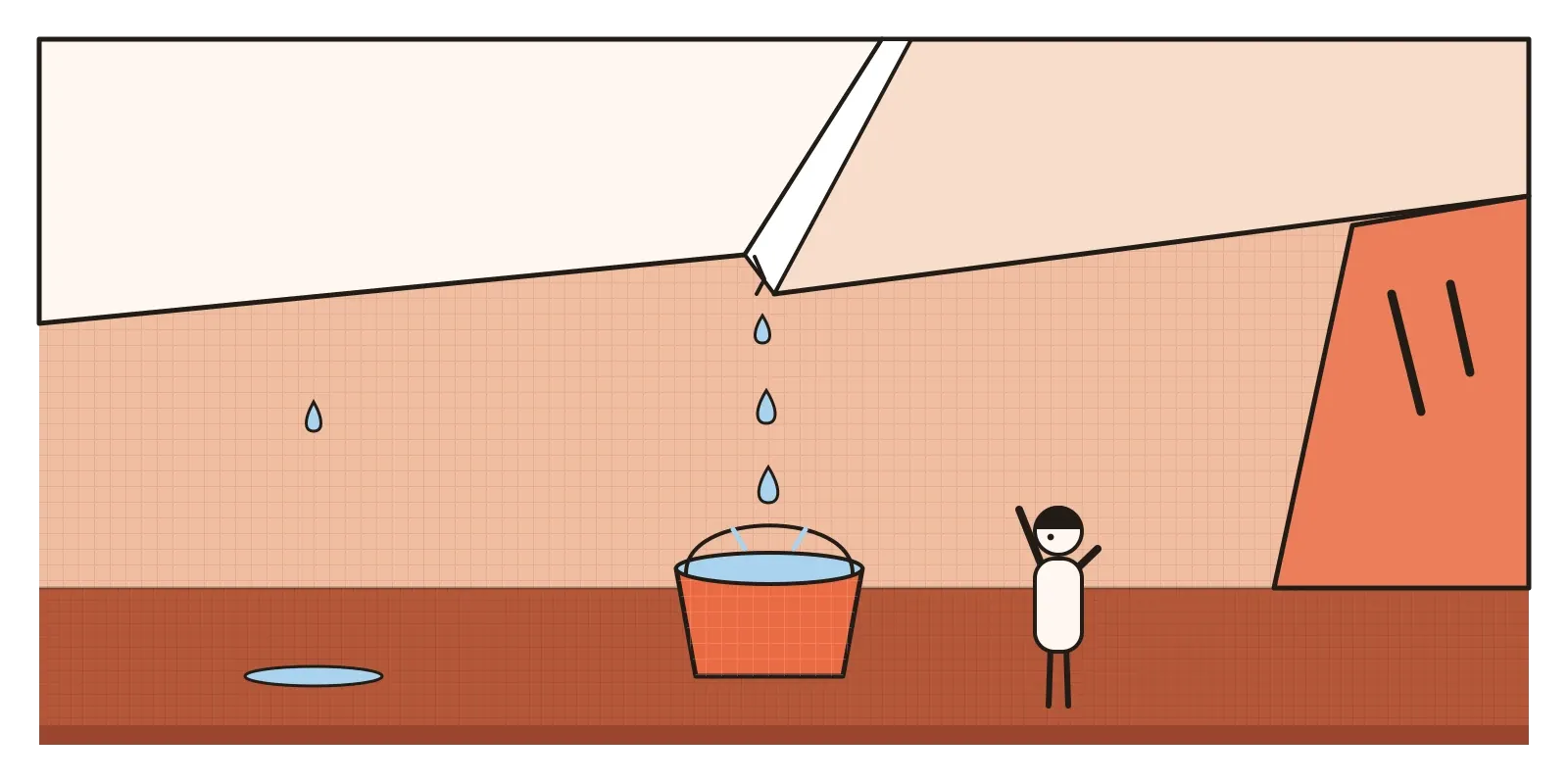
The critics were there from the first week. Many reviewers condemned the show less for the work than for its claims: seven very different architects had been packaged as a movement, and Derrida's philosophy borrowed as a label by people who hadn't read much of it. Wigley had written that this wasn't a new style, yet it became one, copied as a set of tilted shapes. The buildings could also be expensive and hard to maintain. Gehry's Stata Center at the Massachusetts Institute of Technology, opened in 2004, became famous for leaks and cracks, and in 2007 MIT sued his firm and the builder; the case was settled.
There were bigger questions too. Only one of the seven was a woman, and Hadid spent much of her career describing the prejudice she met. The signature building became a tool of branding for cities, corporations and governments, some of them repressive, and the human cost of building them, especially on construction sites in the Gulf, became a fierce argument in the 2010s. The next replies came from several directions: architects who turned to quieter, more sustainable buildings rooted in their place, and, on the page, a generation of graphic designers who broke type the way these architects broke buildings.
Stand somewhere slightly uneasy
To see the Indian side of this story, visit Amdavad ni Gufa, near CEPT University in Ahmedabad, on a hot afternoon and notice how cool and how strangely curved it is inside. If you travel, the Jewish Museum in Berlin and the Vitra Campus at Weil am Rhein, near Basel, are the clearest places to feel what the 1988 show was about. The original catalogue, Deconstructivist Architecture by Philip Johnson and Mark Wigley, is short and still readable.
For an exercise, take a small cardboard box and a craft knife. Cut one face off and put it back at a tilt. Slice another face in two and slide the halves apart. Draw the result and ask which cut made it more interesting and which just made it broken. Then try the same on a layout: rotate one element a few degrees, and only one.
In the summer of 1988, Johnson sent visitors past the Russian paintings and into rooms of broken models, and told them unease could be a pleasure. Some of those models became the most photographed buildings of the next thirty years. Others stayed on paper. In the next post, on Grunge Typography, the same urge to break things apart arrives on the printed page.
Further reading: Philip Johnson and Mark Wigley, Deconstructivist Architecture (1988) · Mark Wigley, The Architecture of Deconstruction: Derrida's Haunt (1993) · Kenneth Frampton, Modern Architecture: A Critical History (4th edn, 2007) · Daniel Libeskind, Breaking Ground (2004) · William J. R. Curtis, Balkrishna Doshi: An Architecture for India (1988)
A reply toThe perfect white box of modernism and the borrowed columns of Postmodernism.