
Early Web Design
How the first web designers turned grey pages, tables and tiny GIFs into a medium of their own.
Early Web Design
An email asking for pictures
On 25 February 1993, a 21-year-old undergraduate at the University of Illinois called Marc Andreessen sent a message to www-talk, the mailing list where the few dozen people building the World Wide Web discussed how it should work. He proposed a new tag for HTML, the simple markup language that web pages are written in. It would be called IMG, and it would let a page show a picture right there among its text, pulled from a separate image file. Others on the list, including the web's inventor, Tim Berners-Lee, wondered whether a more general way of embedding any kind of media would be better. Andreessen and his colleague Eric Bina, who were writing a browser called Mosaic at the National Center for Supercomputing Applications, didn't wait. They built the tag into Mosaic, and as Mosaic spread across universities and offices that year, pictures arrived on the web with it.
Until then, the web had been almost entirely words. Berners-Lee had proposed it at CERN, the physics laboratory near Geneva, in 1989, as a way for scientists to share documents, and the first website, put online there around the turn of 1991, was a page of plain text and links explaining what the web was. Andreessen's tag turned that library into something closer to a magazine, and it set off the strange, inventive, often clumsy period we now call early web design.
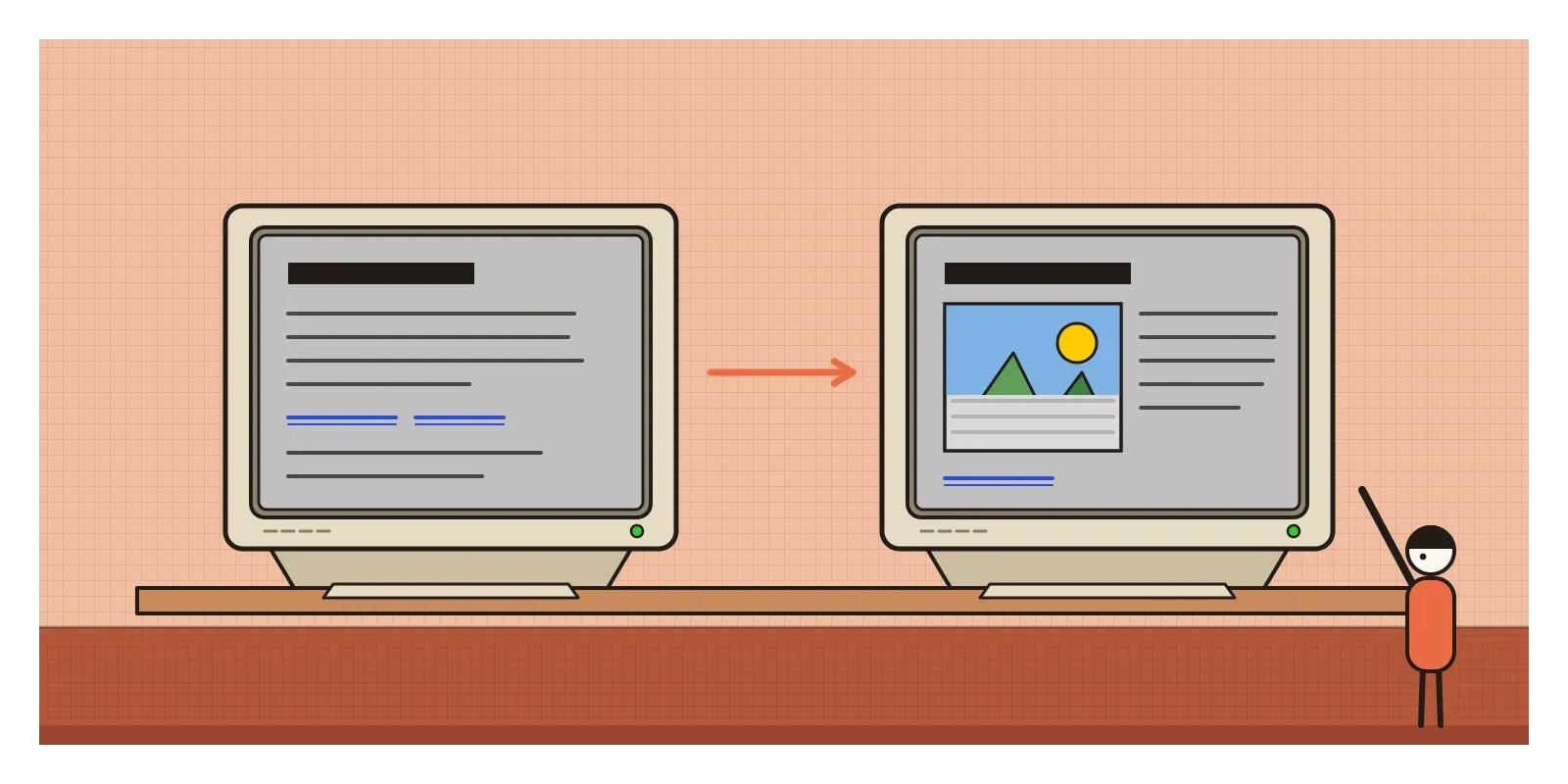
Early web design is the name for the way websites looked and were made from about 1993 to the early 2000s, before style sheets were widely supported, when designers bent a language meant for structured documents into a tool for layout. Its boundaries are loose. Some people end it with the dot-com crash of 2000 and 2001, others with the arrival of web standards a few years later. What defines it is a feeling of making do: grey pages, blue links, tiled backgrounds, animated GIFs and a toolbox of clever hacks.
A grey page built for physicists
HTML was designed to describe what each part of a document was, not what it looked like. You marked a line as a heading, a paragraph or an item in a list, and the reader's browser decided how to show it. That was a deliberate choice. Berners-Lee wanted any document to be readable on any computer, from a powerful workstation to a plain text terminal. In Mosaic, the result was a page with a grey background, black text in a typeface like Times, and links in blue, underlined. Every page on the web looked roughly the same.
The designers who arrived from 1994 onwards came from print, advertising and the CD-ROM multimedia of the early 1990s. They were used to deciding exactly where every word and picture went, and the web gave them almost no control. They couldn't choose fonts, beyond what was installed on the reader's computer. They couldn't set columns or margins. Most readers had screens 640 pixels wide, many of them able to show only 256 colours, and dial-up modems so slow that a single large picture could take half a minute to appear. Early web design was a reply to both of the things that came before it: to the plain grey page of the scientists, which designers found ugly, and to the total control of print, which they couldn't have.
Netscape, tables and a transparent pixel
In 1994 Andreessen left Illinois and co-founded the company that became Netscape with the entrepreneur Jim Clark. Its browser, Netscape Navigator, released at the end of that year, quickly became the way most people saw the web, and it added its own tags without waiting for anyone's agreement. Designers could now centre text, give a page a background colour or a tiled background image, and change the size and colour of type. Netscape also added a tag that made text blink on and off. According to a story told by the Netscape engineer Lou Montulli, it began as a joke over drinks and was built by a colleague overnight. It became one of the most hated effects on the web.
The biggest change came from a feature meant for something else. Tables, added to Netscape in 1995, were intended for rows and columns of data. Designers realised they could use invisible tables to cut a whole page into a grid, putting a menu in one cell, text in another and an image in a third. Pictures were sliced into pieces in Photoshop and reassembled cell by cell like a jigsaw. Frames, in 1996, split the browser window into separate panes, usually a fixed menu on the left. In the same year, animated GIFs, small looping pictures, began to spin, flash and wave on millions of pages.
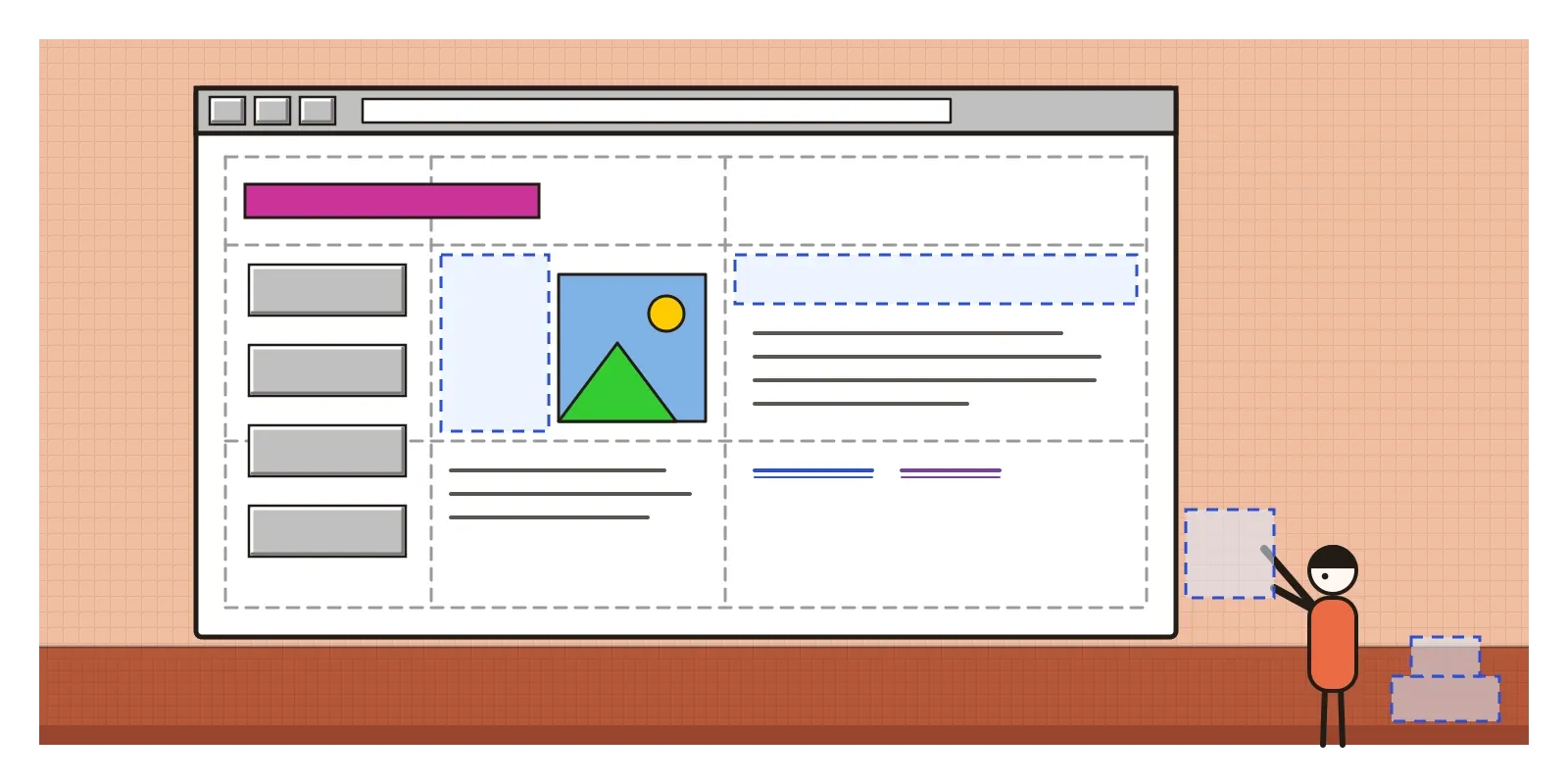
The designer who gathered these tricks into a method was David Siegel, whose book Creating Killer Web Sites came out in 1996 and was hugely popular. Its best-known trick was the single-pixel GIF: a transparent image one pixel square, which could be stretched to any width or height to push text and pictures exactly where you wanted them. Siegel also taught designers to set headlines as images, so they could use any typeface they liked. Within a year or so he had changed his mind, and he wrote an essay saying, in effect, that the web was ruined and he had helped ruin it, because pages built from tricks were hard to search, slow to load and impossible for many people to read.
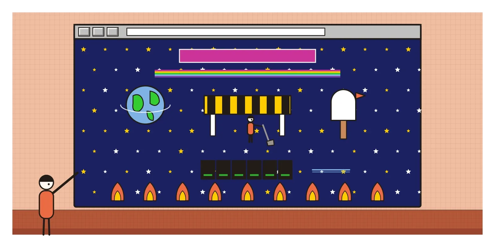
By the late 1990s, many big sites were built in Flash, a plug-in from Macromedia that played animation, sound and interactive graphics inside the browser. Whole sites opened with long animated introductions, and the most clicked button on many of them was the one labelled "skip intro". The promotional site for the film Space Jam, launched in 1996, with its starry black background and navigation buttons shaped like planets, stayed online almost unchanged for about twenty-five years, a time capsule people still visit.
Tiled stars, hit counters and 216 colours
You can recognise an early web page in a second. The background is grey, or a tiled texture: stars, clouds, marble, paper or a repeated logo, often so busy that the text on top is hard to read. Much of the content is centred. Type is Times New Roman, Arial or, from 1996, Verdana and Georgia, two typefaces Matthew Carter designed for Microsoft specifically for low-resolution screens. Links are blue and underlined and turn purple once visited. Horizontal lines divide everything. Buttons are bevelled to look like raised plastic.
Colour was set by the limits of the machine. Because many computers could show only 256 colours, and Macs and PCs shared only some of them, designers kept to a "web-safe" palette of 216 colours, made from six evenly spaced levels each of red, green and blue, which displayed without speckling on almost any screen. The look was bright, flat and slightly harsh, with a lot of pure blue, lime and magenta.
The other face of the early web was amateur. GeoCities, founded in 1994, gave anyone a free homepage in a themed "neighbourhood", and millions of people built pages about their families, their pets, their favourite bands and their faith. They decorated them with animated GIFs of spinning globes, flames, mailboxes and dancing babies, "under construction" signs with little road workers, hit counters, guestbooks, music that started playing on its own, and badges announcing which browser the page was best viewed in. The net artist Olia Lialina later called this the vernacular web, the web's folk art, and argued that it deserved to be studied as seriously as anything made by professionals.
A dial tone on Independence Day
In India, the public web arrived on 15 August 1995, Independence Day, when the government-owned Videsh Sanchar Nigam Limited, VSNL, opened internet access to the public in a handful of big cities. Accounts were expensive, phone lines were scarce and noisy, and connections were slow even by the standards of the time. For many people the web first meant an office, a college computer lab or, later, a cyber café, and a page that appeared slowly, line by line, while the phone line was busy for the whole household.
Those conditions shaped Indian web design from the start. Indian sites had to be light, because heavy pictures simply didn't load. One of the first Indian portals, IndiaWorld, was started in 1995 by Rajesh Jain, and Rediff, founded by Ajit Balakrishnan, went online in 1996. Both served Indians abroad as much as at home, with news, cricket scores and later email, laid out in the same dense tables of text and small images as American portals of the time.
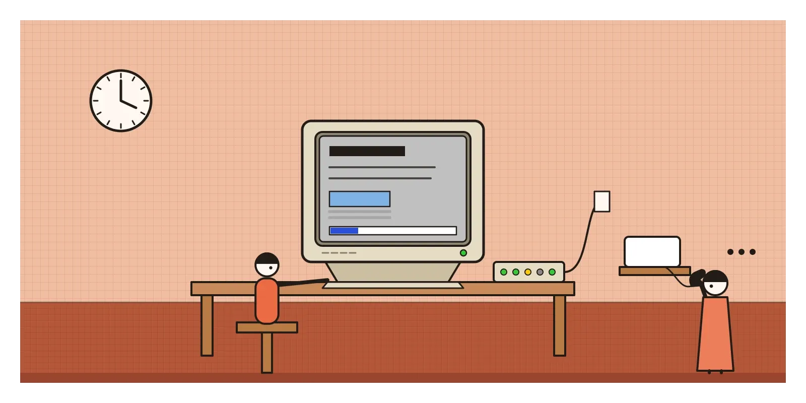
Indian-language sites faced a harder problem. As I wrote in the post on Emigre and digital type, there was not yet a common standard for Indian scripts on computers, so many Hindi and other Indian-language news sites either showed their headlines as pictures of text or asked readers to download and install the site's own font before anything made sense. Siegel's trick of setting type as images, a style choice in America, was a necessity here. It's a useful reminder that the limits of early web design were felt very unevenly across the world.
From spacer GIFs to style sheets
The early web's habits are still with us. Blue underlined links remain the clearest signal on a page that something can be clicked. The idea of designing for the smallest screen and slowest connection, forced on designers by 640-pixel monitors and dial-up, returned with mobile phones and is now standard practice. Animated GIFs survived the death of almost everything around them and became a language of their own in messaging apps. A wave of nostalgia has brought back the homemade look, from personal sites with tiled backgrounds and guestbooks to retro interfaces that copy bevelled buttons and pixel fonts on purpose. Even today's AI website builders, which produce a page from a prompt, are answering the same question the early designers faced: how much control should the maker have, and how much should the reader's device decide?
The criticism was strong at the time. Pages built from tables, spacer GIFs and pictures of text were a disaster for blind people using screen readers, which read out table cells in the wrong order and couldn't read text that was really an image. They were slow, hard for search engines to understand and fragile when anything changed. The browser wars between Netscape and Microsoft's Internet Explorer meant that sites often worked properly in only one browser. Flash locked content inside a plug-in that search engines couldn't read and that later became a security risk. And the web of the 1990s was overwhelmingly English-speaking and designed for people with fast connections and new computers.
The reply came in the form of standards. Cascading Style Sheets, CSS, proposed by Håkon Wium Lie and developed with Bert Bos at the World Wide Web Consortium, became a recommendation in December 1996. It finally separated how a page looked from what it contained, as Berners-Lee had always intended. Browsers were slow to support it, so in 1998 a group of designers and developers formed the Web Standards Project to press the browser makers. Jeffrey Zeldman's book Designing with Web Standards, in 2003, persuaded a generation to throw away their spacer GIFs. When Yahoo, which had bought GeoCities in 1999, closed it in 2009, volunteers from Archive Team raced to save as many of its pages as they could, and much of the amateur web survives only because they did.
View source
To see the early web for yourself, open the Internet Archive's Wayback Machine and look up a website you use every day as it was in the late 1990s, or look for Rediff as it was in 1997. The Space Jam site from 1996 is still online. Olia Lialina and Dragan Espenschied's project One Terabyte of Kilobyte Age posts screenshots of rescued GeoCities pages and is a good way to lose an evening.
For an exercise, build a single page with nothing but HTML: no style sheet, no scripts, no web fonts. Use only the browser's default look, a table for layout and colours from the 216. Then open it on the oldest, slowest phone you can find. Notice what you miss, and what you don't. And on any page you like, right-click and choose "view source": early web designers learned their craft almost entirely by reading each other's code that way.
In February 1993, a student asked a mailing list for a way to put a picture on a page, and within a few years millions of people were stretching invisible pixels and tiling stars behind their words. The early web was clumsy, slow and often unreadable, and it was also the most open publishing medium anyone had ever built. In the next post, on Swiss Punk and New Wave Typography, we step back to the 1970s, when designers in print first began to break the grid on purpose.
Further reading: Tim Berners-Lee, Weaving the Web (1999) · David Siegel, Creating Killer Web Sites (1996) · Jeffrey Zeldman, Designing with Web Standards (2003) · Olia Lialina, "A Vernacular Web" (2005) · Olia Lialina and Dragan Espenschied (eds), Digital Folklore (2009)
A reply toThe plain grey, text-only pages of the first web, built for physicists, and the total control of print.