Chinese Ink Painting and Calligraphy
How a brush, a stick of ink and a sheet of paper became a whole philosophy of line, space and spirit.
Chinese Ink Painting and Calligraphy
Wine cups on a winding stream
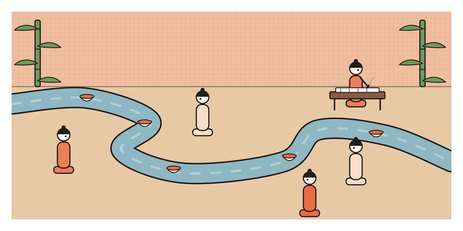
In the spring of 353 CE, on the third day of the third month, a group of around forty scholars and officials met at the Orchid Pavilion, near present-day Shaoxing in eastern China, for a festival of washing away bad luck by the water. They sat along the banks of a winding stream and floated cups of wine down it. Whenever a cup stopped in front of someone, he had to compose a poem on the spot or drink as a forfeit. By the end of the day they had a collection of poems, and their host, a calligrapher and official called Wang Xizhi, wrote a preface for it. In a little over three hundred characters, he described the bamboo, the clear stream and the pleasure of the company, and then turned to how quickly such days pass, and how people in the future would read his words as he read those of the past.
That sheet, the Preface to the Orchid Pavilion Poems, became the most admired piece of calligraphy in Chinese history. Tradition says Wang wrote it slightly tipsy and could never match it again, and that one common character appears about twenty times, each written differently. The original doesn't survive. The story goes that the Tang emperor Taizong, who reigned in the seventh century, obtained it by sending an official to trick it out of a monk's keeping, and had it buried with him. What we have are tracing copies, the most famous now in the Palace Museum in Beijing. In 1965 the scholar Guo Moruo even argued that the text itself was a later invention, a claim that set off a long debate. A copy of a lost original, endlessly copied again, is a fitting start for a tradition in which copying a master's hand was the way you learned.
Chinese ink painting and calligraphy are two branches of one art: making marks with a soft brush and black ink on silk or paper. They developed over more than two thousand years, and the painting tradition that matters most here, landscape and the scholar's painting, took shape between roughly the tenth and fourteenth centuries.
Four treasures on a scholar's desk
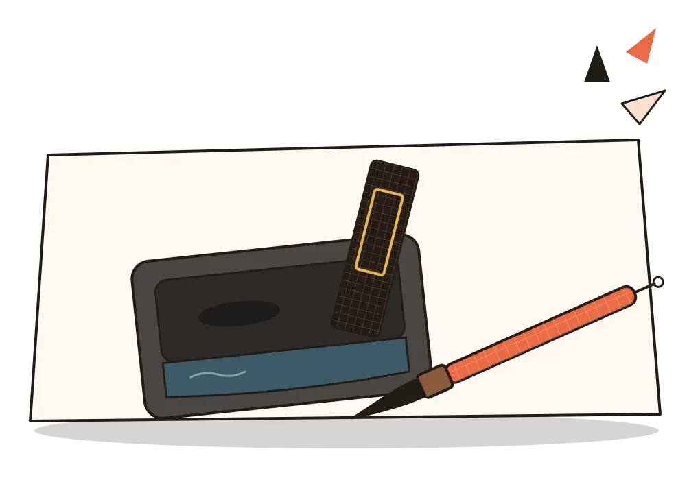
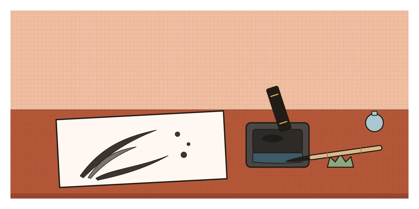
Everything starts with the tools, known as the Four Treasures of the Study: the brush, the ink, the paper and the inkstone. The brush is a bundle of animal hair set in a bamboo handle, tapering to a fine point. Pressed down, it makes a broad mark; lifted, a hair-thin one, all within a single stroke. The ink comes as a solid stick made from soot and glue, which you grind with a little water on a flat stone. Thick and freshly ground, it's a glossy black; diluted, it spreads into every grey in between. Paper, invented in China around the second century BCE and improved over the following centuries, soaks up wet ink instantly, so you can't erase or paint over a mistake. Every stroke is final.
Early Chinese painting was often brightly coloured, made by professional artists for tombs, temples and the court. Around the sixth century, the critic Xie He set out six principles for judging it. The first, usually translated as "spirit resonance" or "vitality", asked whether a painting felt alive. The second asked about the "bone method" of using the brush, the strength and structure of the line. Accurate likeness and colour came further down the list. That order explains a great deal about what followed. Over the next centuries, scholar-officials, men trained in the classics and in calligraphy, began to paint for themselves and their friends, mostly in ink. In the eleventh century the poet Su Shi wrote, roughly, that judging a painting by its likeness is the view of a child. Ink monochrome became the art of the educated amateur, and in many ways a reply to the polished, coloured work of court professionals.
Mountains you can walk into
Look at Fan Kuan's Travellers among Mountains and Streams, painted around 1000 and now in the National Palace Museum in Taipei, and you'll see why landscape became the great subject. It's a hanging scroll about two metres tall. A huge mountain fills the upper part, built up from thousands of tiny dabs of the brush that look like raindrops on rock, with a thin waterfall down one side. At the bottom, small enough to miss, a train of mules and travellers moves along a path. The scale is the point: people are tiny in a world far larger than them. In 1958 a curator found Fan Kuan's signature hidden among the leaves of a tree in the bottom right corner.
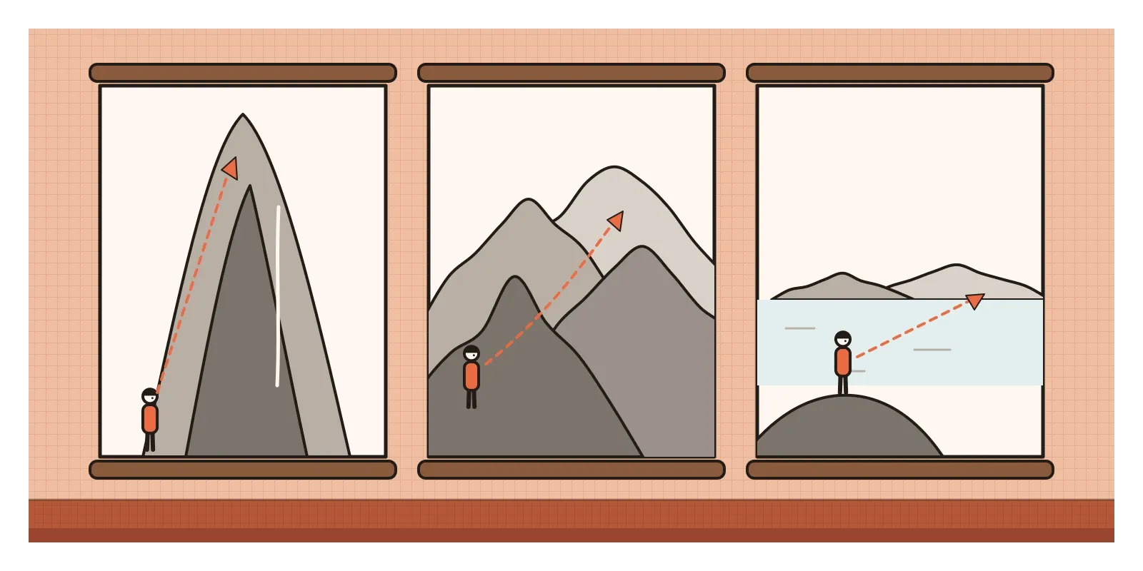
A few decades later, Guo Xi painted Early Spring, dated 1072, a swirling mountain landscape of mist and twisted trees. His son compiled his teachings in an essay that describes three ways of seeing a mountain: looking up from its foot, which he called high distance; looking from in front of it into the valleys behind, deep distance; and looking across a flat stretch from a nearby hill to faraway peaks, level distance. Instead of the single fixed viewpoint I described in the post on perspective drawing, a Chinese landscape lets the eye wander, climbing and travelling through the picture.
In the thirteenth century, a Chan Buddhist monk called Muqi painted Six Persimmons, now in the Daitoku-ji temple complex in Kyoto. It's exactly what it says: six fruits in a row on blank paper, some in solid black ink, some in pale grey outline, with a few quick strokes for their stalks. It's one of the most quietly powerful pictures I know, and it was largely ignored in China and treasured in Japan. And in 1350 Huang Gongwang finished Dwelling in the Fuchun Mountains, a long handscroll of riverbanks and hills that took him several years. In 1650 its dying owner ordered it burned, a relative pulled it out of the fire, and it survives in two pieces, one in Hangzhou and the longer one in Taipei. In 2011 the two halves were shown together for the first time in more than three centuries.
Bone, breath and the white of the paper
The first thing to read is the stroke itself. Calligraphers learn to begin a stroke by pressing the brush in against its direction and to end it by lifting and turning, so each line has a definite start, a body and a finish. Good strokes look like they have bones inside them. Masters were judged by the energy that seems to run through a line from beginning to end, and the same brushwork vocabulary carries over from writing to painting. Bamboo leaves, orchid stems and pine needles are painted almost like characters.
Then look at the ink. Painters talk about many tones of ink, from dense, glossy black to the faintest wash, and about dry brushwork, where a nearly empty brush leaves broken, scratchy marks that suggest the texture of rock or bark. Colour, when it appears, is usually light and secondary.
Finally, look at what's left out. Large areas of silk or paper are left blank to stand for mist, water, sky or simply air. The Chinese term is liubai, leaving white, and in the post on space I wrote about the old idea that emptiness is what makes a cup useful. Writing is part of the picture too. Poems and comments written onto the painting, by the artist and by later owners, and the small red seals they stamped, are all part of the composition, which is why famous scrolls often carry dozens of them.
A poet's journey east
India's link with this tradition goes back to Buddhism, which travelled from India into China from around the first century CE, along with Indian images, monks and texts. Chinese pilgrims came the other way, most famously Xuanzang, who studied at Nalanda in the seventh century. The ink tradition itself, though, was largely a Chinese development, and India's own writing traditions used different tools: reed pens for Persian and later Urdu, and on palm leaves in the south, a metal stylus that scratched the letters into the leaf. The parallel is loose.
The more direct connection is modern. In 1924 Rabindranath Tagore made a lecture tour of China, and the painter Nandalal Bose travelled with him. Bose studied the brushwork he saw, and his later ink drawings, quick and sure, often catching a whole animal or figure in a few strokes, owe something to that journey, which also took him to Japan. In 1937 Tagore's university at Santiniketan opened Cheena Bhavana, a centre for Chinese studies, led by the scholar Tan Yun-shan. A couple of years later the Chinese painter Xu Beihong spent time there, painting and exhibiting. For a few decades, Santiniketan was one of the places where Indian and Chinese artists actually watched each other work.
From scrolls to system fonts
Every time you read Chinese, Japanese or Korean on a screen, you're looking at a descendant of these brushes. Chinese type designers still talk about two main families. Kai, or regular script, typefaces are based directly on brush-written characters. Song, or Ming, typefaces grew out of woodblock printing from the Song dynasty onwards, when carvers made the brush forms more regular, with thin horizontals, thick verticals and a small triangular bump at the end of a stroke, a remnant of the brush pressing down. Designing a full Chinese typeface means drawing thousands of characters, which is one reason so few exist compared with Latin fonts.
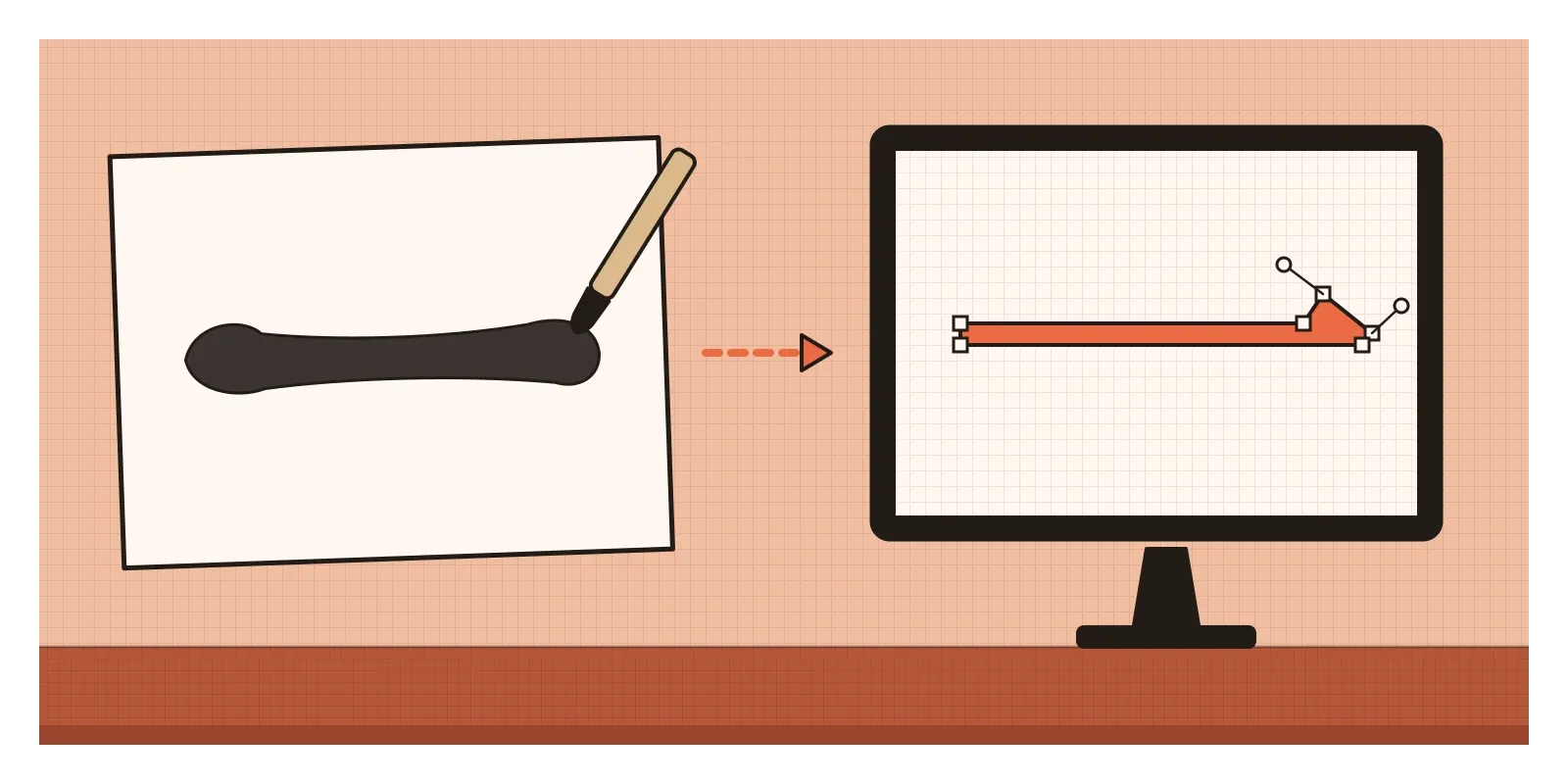
The ideas travel further than type. Pressure-sensitive brushes in digital drawing apps, where a stroke thickens as you press and tapers as you lift, are imitating exactly what a calligraphy brush does. Generous white space in an interface is a modern relative of liubai. And the habit of judging work by its "spirit resonance", whether it feels alive, is still a better test of a logo or an animation than whether every detail is correct. Even the way owners stamped seals and wrote comments across a scroll feels familiar to anyone who has watched a design file fill up with comment threads.
A gentlemen's art, and who it left out
The literati ideal had a snobbish side. Scholar painters set themselves up as cultivated amateurs and looked down on professional painters who worked for money, even though many were superb. In the early seventeenth century Dong Qichang divided the history of painting into a Southern school of inspired scholars and a Northern school of mere technicians, a scheme that shaped taste for centuries and was unfair to many artists. Women were mostly shut out, with rare exceptions such as Guan Daosheng, who painted bamboo in the thirteenth and fourteenth centuries. And the deep respect for copying old masters could harden into repetition. Even the eighteenth-century Qianlong emperor, who stamped and wrote on hundreds of famous paintings, is said to have mistaken a copy of the Fuchun scroll for the original and dismissed the real one as a fake. In the early twentieth century, reformers such as Kang Youwei and Chen Duxiu attacked traditional painting as stale and called for realism, and Xu Beihong brought back Western-style drawing. Ink painting didn't end. It kept answering back, and still does.
To see it this week, you won't find much classical Chinese painting on display in India, so look online at the National Palace Museum in Taipei, which shares high-resolution images of Fan Kuan and Guo Xi. Or visit Santiniketan and Kala Bhavana to see Nandalal Bose's brushwork. Better still, buy a cheap Chinese brush and a bottle of ink, and paint six simple fruits in a row, some dark, some pale, with nothing else on the page. Then try writing one long stroke, pressing in, moving and lifting out, twenty times. Somewhere around the tenth, you'll start to understand what those scholars at the Orchid Pavilion were admiring. In the next post, on Byzantine art, I'll go west again, to a tradition that turned walls into light with gold.
Further reading: Michael Sullivan, The Arts of China (1973) · James Cahill, Chinese Painting (1960) · Wen C. Fong, Beyond Representation: Chinese Painting and Calligraphy, 8th-14th Century (1992) · Yuehping Yen, Calligraphy and Power in Contemporary Chinese Society (2005) · Tansen Sen, India, China, and the World: A Connected History (2017)
A reply toThe bright, carefully coloured painting of court professionals, answered with ink and a scholar's brush.