
Baroque
How seventeenth-century Europe used light, movement and theatre to make art you feel in your body.
Baroque
A dome that isn't there
Walk into the church of Sant'Ignazio in Rome, look for a small marble disc set into the floor of the nave, stand on it and look up. Above the crossing, where the nave meets the transepts, a tall dome rises on columns and arches, light falling through its windows, its coffers shrinking towards the top. It's entirely flat. In 1685, the Jesuit lay brother and painter Andrea Pozzo painted it on a huge circular canvas, around seventeen metres across, because the real dome the church was designed for had never been built. Money and a long dispute with the family who had founded the church got in the way. Pozzo offered an illusion instead.
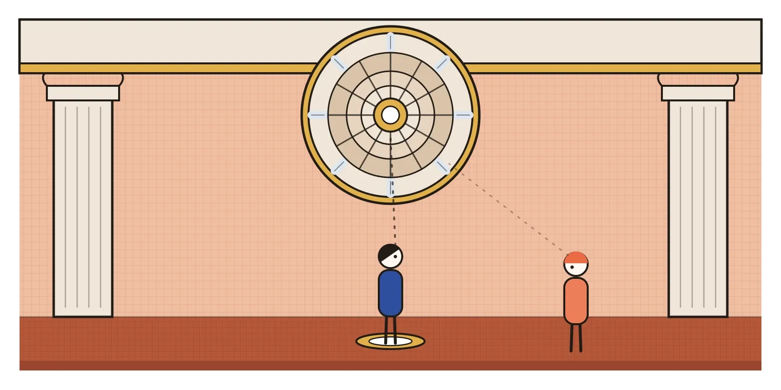
Step off the disc and walk forward, and the dome starts to lean and buckle, because the perspective only works from one place. Another marker gives the best view of Pozzo's ceiling fresco over the nave, painted a few years later, where the walls of the church seem to carry on upwards into an open sky full of saints and clouds. Contemporaries were impressed and also uneasy, and some worried the canvas would darken. The one there today is a later replacement of Pozzo's original. But the idea still works: you stand where the artist tells you to, and the building opens into heaven.
That's the Baroque in one gesture. It's the style that dominated European art and architecture from around 1600 to the middle of the eighteenth century, beginning in Rome and spreading across Catholic Europe and its colonies, with its own quieter versions in the Protestant north. It wanted to overwhelm you, using light, movement, scale and every art at once, so that you didn't just understand a picture or a building, you felt it.
An answer to Luther, and to the Renaissance
The Baroque grew out of a crisis. In 1517 Martin Luther's protest against the sale of indulgences, partly raised to rebuild St Peter's in Rome, split Western Christianity. Protestant reformers attacked religious images, and in parts of northern Europe churches were stripped of statues and paintings. The Catholic Church answered at the Council of Trent, which met on and off from 1545 to 1563. Its decree on images said that religious art should teach clearly and move people to devotion. The new Jesuit order, founded in 1540, became one of the great patrons of that kind of art, which is why Pozzo was painting ceilings for them.
It was also a reply to art itself. The Renaissance had prized balance, clarity and calm. Mannerism, as I wrote in the post on it, had stretched that into elegance and puzzles for connoisseurs. The Baroque wanted something more direct: real-looking bodies, strong emotion and stories anyone could follow, made as dramatic as possible. Absolute monarchs soon wanted the same effect for themselves. Louis XIV's palace at Versailles, with its Hall of Mirrors finished in the 1680s, used Baroque splendour to make the king look like the centre of the universe.
The word itself started as an insult. One common theory traces it to the Portuguese barroco, an irregular, misshapen pearl, though other origins have been proposed. Eighteenth-century critics used it for anything they found bizarre and overdone. Only in 1888 did the Swiss historian Heinrich Wölfflin, in a book called Renaissance and Baroque, treat it as a serious style with its own logic.
Marble that swoons and a colonnade that hugs
Caravaggio, whose Calling of Saint Matthew I described in the post on emphasis and focal point, gave Baroque painting its raking light and its ordinary, dirty-footed saints. But the artist who defined the Baroque in Rome was Gian Lorenzo Bernini, sculptor, architect and stage designer. His marble David, made in the early 1620s, isn't the calm, waiting hero of the Renaissance. He's twisting mid-throw, biting his lip, and you have to stand in his line of fire to see his face.
Bernini's Ecstasy of Saint Teresa, made between 1647 and 1652 for the Cornaro Chapel in Santa Maria della Vittoria, is the purest example of his idea of joining architecture, sculpture and painting into one experience. The saint sinks back in rapture on a cloud as a smiling angel lifts a golden arrow. Gilded rays fall behind them, lit by a window hidden above, so real daylight seems to pour down from heaven. On the side walls, marble members of the Cornaro family lean out of what look like theatre boxes, watching the scene with you. Outside St Peter's, Bernini built the great colonnade between 1656 and 1667, two curving arms of columns that reach out around the piazza. He is often said to have compared them to the arms of the Church embracing the faithful.
Bernini's great rival, Francesco Borromini, made architecture move. His tiny church of San Carlo alle Quattro Fontane in Rome has a facade that ripples in and out like a curtain and an oval dome whose coffers shrink towards the lantern to make it look higher than it is. Artemisia Gentileschi, one of the very few women to build a major career in the period, painted Judith Slaying Holofernes around 1620 with a violence and physical conviction that still shocks. In 1616 she became the first woman admitted to Florence's academy of artists.
In the Protestant north, the Baroque looked different. Rembrandt's Night Watch of 1642 turned a group portrait of an Amsterdam civic guard company into a burst of movement and light, with figures striding out of shadow. In Madrid, Diego Velázquez painted Las Meninas in 1656, a picture of the young Spanish princess and her attendants in which the painter himself stands at his canvas, and the king and queen appear only as a reflection in a mirror at the back, as if they were standing exactly where you are.
Diagonals, spotlights and edges that won't stay put
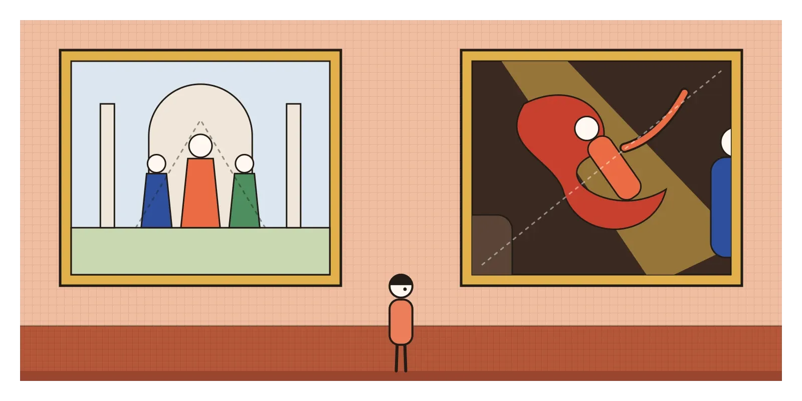
Wölfflin gave us a useful checklist by contrasting the two styles in pairs. Renaissance art, he said, is linear, built from clear outlines, while Baroque art is painterly, built from masses of light and shadow that merge. Renaissance compositions are arranged in flat layers parallel to the picture, while Baroque ones plunge diagonally into depth. The Renaissance is closed, contained within its frame, while the Baroque is open, with figures cut off by the edges as if the scene carries on beyond them. Renaissance pictures give every part equal clarity, and Baroque ones subordinate everything to one dominant effect.
In practice, look for diagonals. A Baroque painting or sculpture is rarely at rest. Bodies twist in spirals, drapery flies, and the main action runs corner to corner. Look for a single strong light picking out the important part and leaving the rest in shadow, the chiaroscuro I wrote about in the post on value. In buildings, look for curves instead of straight walls, facades that step forward and back, broken and scrolled pediments, columns twisted like barley sugar and domes painted with sky. Everything is designed for a moving viewer, or for one ideal viewing spot. Colour is rich and warm, gold is everywhere, and the effect is theatrical, because many of these artists also designed real stage sets, fireworks and festivals.
Rembrandt's Indian portraits
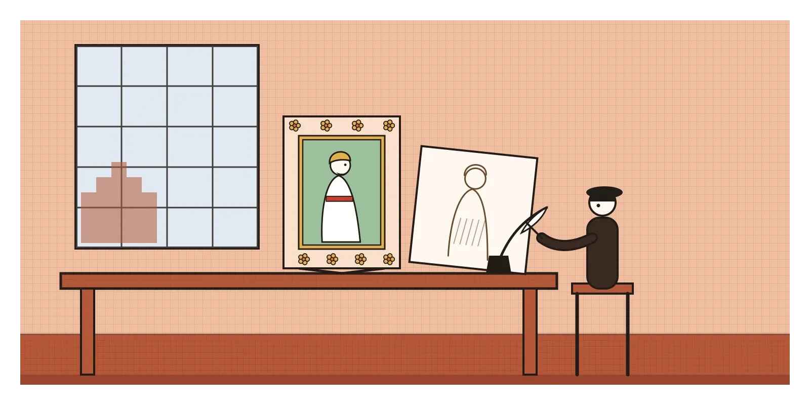
Baroque Europe and Mughal India were in touch, and the most striking evidence is in a set of drawings by Rembrandt. Some time around 1656 to 1661, he made a series of about two dozen small drawings in pen and ink, carefully copied from Mughal paintings that had reached Amsterdam, probably through the Dutch East India Company's trade. They show emperors and courtiers in profile, Akbar, Jahangir, Shah Jahan and his son Dara Shikoh, with their turbans, sashes and jewels. Rembrandt, a painter famous for the shifting light and drama I described above, sat down and studied the clear, still profiles of the Mughal style, as I described in the post on Mughal miniature painting. The J. Paul Getty Museum brought many of them together with Mughal paintings of similar compositions in an exhibition in 2018.
The influence also travelled the other way, through the Jesuit missions and through prints, and it reached India in solid form too. The Basilica of Bom Jesus in Old Goa holds the tomb of Saint Francis Xavier, a monument of jasper and marble made in Florence by the sculptor Giovanni Battista Foggini as a gift from Cosimo III de' Medici, Grand Duke of Tuscany, and installed in 1698. It's a genuine piece of Florentine Baroque standing in a Goan church. Goa's other churches show how the style changed when it was built by local hands in local laterite and lime, under a monsoon sky. These connections were real, but they were also built on trade and on Portuguese and Dutch ambitions in Asia, which is worth remembering when they are described simply as cultural exchange.
Stand here, look there
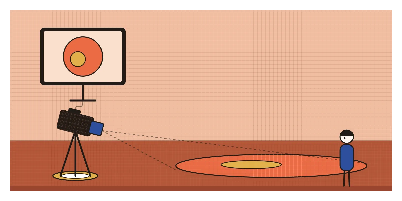
Pozzo's floor marker is the part of the Baroque that feels most like design. He accepted that his illusion could only be perfect from one place, so he told people where to stand. Every 3D artist who sets up a camera for a product render, and every architect who designs the view you get when you walk through a door, is making the same decision: where will the viewer be, and what should the scene look like from there? In interface design, we talk about the happy path, the sequence we expect most people to follow. The Baroque reminds us to design that path deliberately, and also to think about what the experience looks like when someone steps off the marble disc.
Bernini's David is a lesson in motion. He chose the moment just before the release, when energy is coiled and you can feel what comes next. Animators call this anticipation, and it's one of the principles Disney's animators described in their 1981 book The Illusion of Life. A button that squashes slightly before it springs, a card that leans back before it slides away, is borrowing the Baroque sense of a body about to move. And the Baroque idea of joining every art into one designed experience, light, space, sound and image working together, is close to what we now call experience design, from immersive exhibitions to the way a product launch event is lit and staged. Even AI image tools carry the style forward: "dramatic lighting" and "cinematic" are, very often, a request for Caravaggio and Bernini.
Splendour, and who paid for it
The Baroque was spectacular, and spectacle has a purpose. It was used to win back believers and to glorify kings, and its techniques were designed to overwhelm judgement as much as to inform it. That's why the same tools that make a chapel moving can make propaganda effective, and a modern interface manipulative. Its splendour was also expensive. A famous Roman joke claimed that the Barberini family, Pope Urban VIII's family, did what the barbarians hadn't, after bronze was stripped from the ancient Pantheon's porch, although most of that metal seems to have gone into cannons rather than into Bernini's canopy over the altar of St Peter's. Across Spain, Portugal and their empires, gilded churches were paid for with silver and gold mined in the Americas, much of it by forced Indigenous and enslaved African labour. And for every Artemisia Gentileschi, there were many women whose talent never reached a workshop.
In the eighteenth century, taste changed. In France especially, the heavy grandeur of Versailles gave way to something lighter, more private and more playful, and later in the century critics would turn against all of it in favour of classical restraint. In the next post, on Rococo, I'll look at the style that kept the Baroque's curves and gold but swapped its thunder for a whisper.
To see the Baroque in India, go to Old Goa and look at Foggini's tomb inside the Bom Jesus, then at the other churches nearby. If you can get to Rome, Sant'Ignazio and the Cornaro Chapel are a short walk apart. For an exercise this week, find the one spot in a room, a corridor or a street where everything lines up, a doorway framing a window framing a tree, and photograph it from there and from a step to the side. Then try the same on a screen you're designing: decide where the viewer's eye should stand, and make everything line up from there.
Pozzo's dome is still a flat canvas and still a dome, depending on where you stand. Baroque artists knew that and designed for it. So should we.
Further reading: Heinrich Wölfflin, Renaissance and Baroque (1888) · John Rupert Martin, Baroque (1977) · Howard Hibbard, Bernini (1965) · Mary D. Garrard, Artemisia Gentileschi: The Image of the Female Hero in Italian Baroque Art (1989) · Stephanie Schrader (ed.), Rembrandt and the Inspiration of India (2018)
A reply toThe calm balance of the Renaissance and the clever strain of Mannerism, both traded for drama anyone could feel.