Visual Literacy
Learning to read images as carefully as we read words.
Visual Literacy
The Pope never wore that jacket
In March 2023, a picture of Pope Francis spread across the internet. He was walking along in a huge, glossy white puffer jacket that looked like it came from a luxury fashion label, with a crucifix hanging on top. People shared it with delight and disbelief, and plenty of them believed it was real. It wasn't. The image had been made with the AI image generator Midjourney, and it was one of the first moments when a large number of people realised, all at once, that a photograph-like image could be completely invented and still feel true.
What interests me about that picture isn't really the technology. It's the fact that, when people looked closely afterwards, the clues were there. The hand holding a coffee cup was oddly shaped, the glasses merged strangely with the face, and some details of the crucifix chain didn't quite make sense. Most people simply didn't look that closely, because we rarely do. We read images in a fraction of a second, decide what they mean, and move on. That habit worked well enough when most images were made by cameras pointed at real things. It works much less well now. The skill of slowing down and actually reading an image, noticing what's there, how it's built and what it's trying to make you believe, has a name. It's called visual literacy, and I'd argue it has become one of the most important skills anyone can have, designer or not.

Reading pictures is a skill, not a given
The term "visual literacy" was coined in 1969 by John Debes, an American educator who helped found the International Visual Literacy Association around the same time. His point was simple and, at the time, a bit radical. Schools spent years teaching children to read and write words, but almost no time teaching them to read and make images, even though television, advertising and photography were becoming the main way people learned about the world. Debes argued that understanding images was a set of skills that could be taught, just like reading.
A few years later, in 1973, the designer and educator Donis A. Dondis published A Primer of Visual Literacy, which tried to lay out the basic grammar of images: dot, line, shape, direction, tone, colour, texture, scale, movement, and the way these combine through things like balance and contrast. If that list sounds like the first semester of design school, it's because it essentially is. Dondis's argument was that these elements work a bit like the letters and grammar of a language, and that once you understand them, you can read an image more consciously and make one more deliberately.
The book that changed how many people actually look at pictures, though, came from a different direction. In 1972, the art critic John Berger presented a BBC television series and book called Ways of Seeing. It opens with the line "Seeing comes before words", and goes on to argue that how we see is never innocent. What we know, what we believe and who taught us to look all shape what we notice in an image. Berger showed, for example, how oil paintings that look like neutral records of wealthy people and their possessions were often celebrating ownership itself, and how modern advertising borrowed the same tricks. His real lesson was that images are made by people with intentions, and that reading them well means asking who made this, for whom, and why.
We learn to see, and we learn different ways of seeing
One of the easiest ways to notice that seeing is learned is to look at images made under a different set of rules. Indian miniature paintings are a good example. In many Mughal, Rajput and Pahari paintings, the same character can appear several times in one picture, at different moments of the same story, a technique often called continuous narration. Important figures may be painted larger than everyone else, regardless of where they stand. Buildings can be shown from the front and from above at the same time, so you see both the courtyard and the walls. And in many devotional paintings, Krishna is painted blue, which every viewer raised with those stories understands immediately and anyone else might find puzzling.
Someone trained only in Western Renaissance perspective might look at these paintings and think the artists got perspective "wrong". But the artists weren't trying to copy what a single eye sees from a single point. They were trying to tell a story, show what mattered most, and give the viewer more information than a camera could. Reading them well means learning their conventions, the same way you learn the grammar of a new language. Once you do, they stop looking flat and start looking incredibly rich.
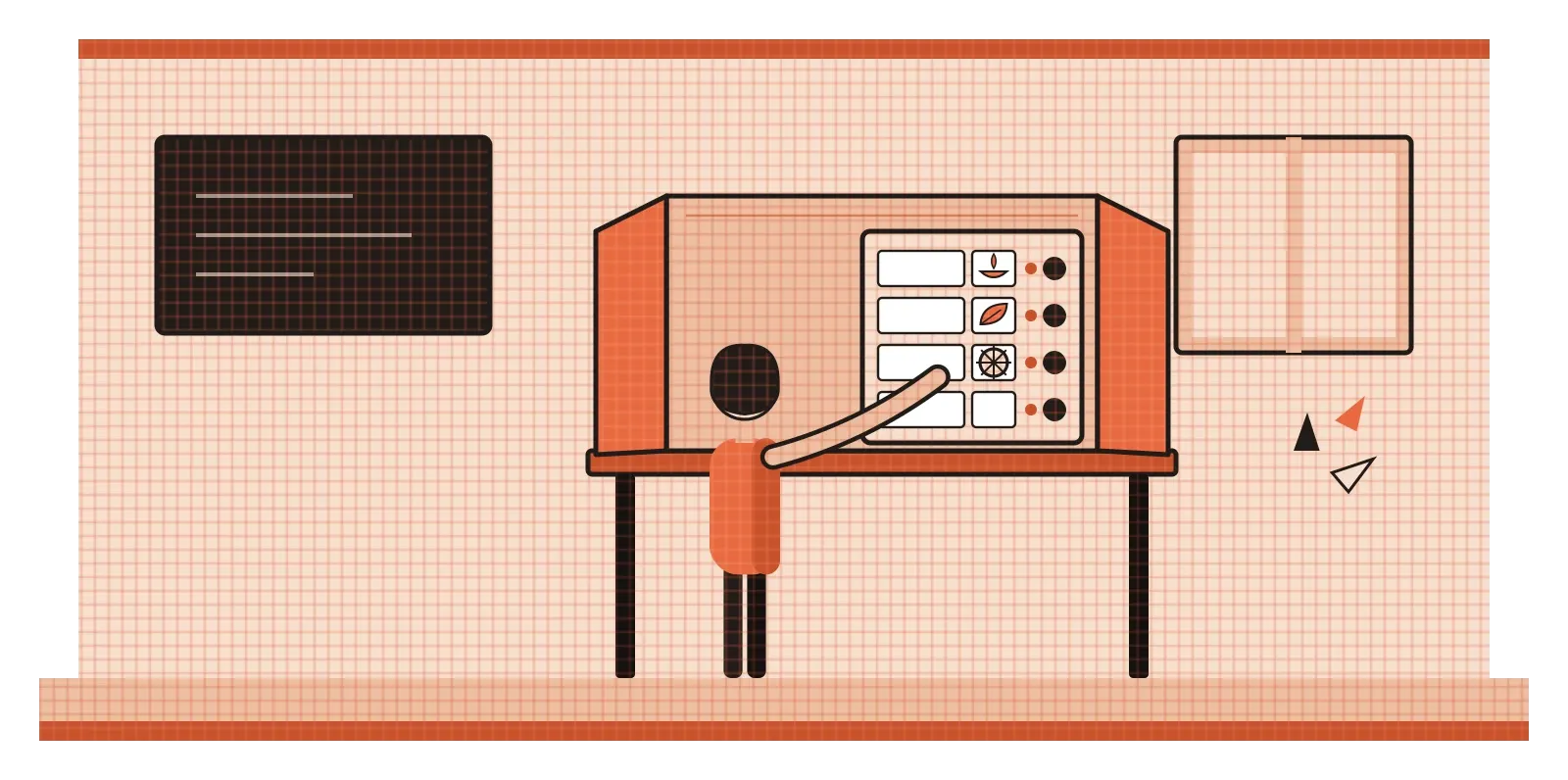
India also has one of the largest real-world examples of visual literacy in action. When the country held its first general election in 1951–52, fewer than one in five Indians could read. The Election Commission's solution was to give every party and many candidates a simple picture symbol, an everyday object that voters could recognise and remember without reading a word. That system is still in use. Symbols appear on ballot units next to candidates' names, and since 2015 they have been joined by candidates' photographs as well. It's a powerful reminder that images can include people that text leaves out. It's also a reminder of the responsibility that comes with designing them, because a symbol that is confusing or too similar to another one can quite literally change how people vote.
Every image is making an argument
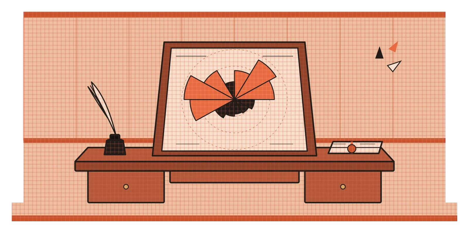
Charts are where this becomes very concrete. In 1858, Florence Nightingale, who had nursed British soldiers during the Crimean War, published a set of diagrams that changed public health policy. Using a kind of circular chart now called a polar area diagram, she showed month by month how many soldiers had died from wounds and how many had died from diseases that better hygiene could have prevented. The disease wedges were enormous next to the others. The numbers had existed in reports for some time, but presented as a picture, they were impossible to ignore, and they helped push the army and government towards sanitary reforms. Nightingale understood that a well-designed image could persuade people who would never read a table of figures.
The same power works in the other direction. A bar chart whose vertical axis starts at 90 instead of zero can make a tiny difference look like a dramatic gap. A map that colours whole regions by area rather than population can make a sparse region look far more important than a crowded one. Neither chart is technically lying, because the numbers are correct. The deception lives in the design choices. A visually literate reader learns to check the axes, the scale and what has been left out before reacting to the shape.
This is also a good place to clear up a myth that appears in a surprising number of design talks and marketing slides: the claim that the brain processes images 60,000 times faster than text. Nobody has been able to find a credible study behind that number, and it seems to have been repeated so often that people assume it must be true. What research does show is impressive enough on its own. In a 2014 study at MIT, the neuroscientist Mary Potter and her colleagues found that people could identify the gist of an image they saw for as little as 13 milliseconds. That speed is exactly why visual literacy matters. Images reach us before our critical thinking has time to catch up, so if we don't deliberately slow down, the image has already done its work.
A simple way to slow down when you look
The most practical method I know for reading an image comes from Edmund Feldman, an American art educator who, in the late 1960s, described a four-step approach to looking at art. It was designed for paintings, but it works on almost anything visual, from a poster to an app screen to a viral photo. The four steps are describe, analyse, interpret and judge, and the trick is to do them in that order without skipping ahead.
Describing means saying only what is literally there, as if you were explaining the image to someone on the phone. For the AI image of the Pope, that would be: an older man in white, a long white puffer jacket, a crucifix on a chain, a city street, a cup in one hand. No opinions yet. This step sounds almost too basic, but it's where most of the clues hide, because it forces you to look at every part rather than just the overall impression. Analysing means looking at how the image is built: where your eye goes first, what's in focus, how the light falls, what the colours are doing, how big things are in relation to each other. In the Pope image, you might notice that the light is unusually perfect for a candid street photo, and that the hand and the glasses don't quite hold together when you zoom in.
Interpreting means asking what the image is trying to say and why it might have been made. Is it a news photograph, an advert, a joke, a piece of propaganda? What does it want you to feel? In this case, the image plays on the surprise of seeing a religious leader in streetwear, which is exactly why it travelled so fast. Only then do you judge: is it true, is it fair, is it well made, does it work for its purpose? By the time you reach this step, you have far more to go on than your first reaction.
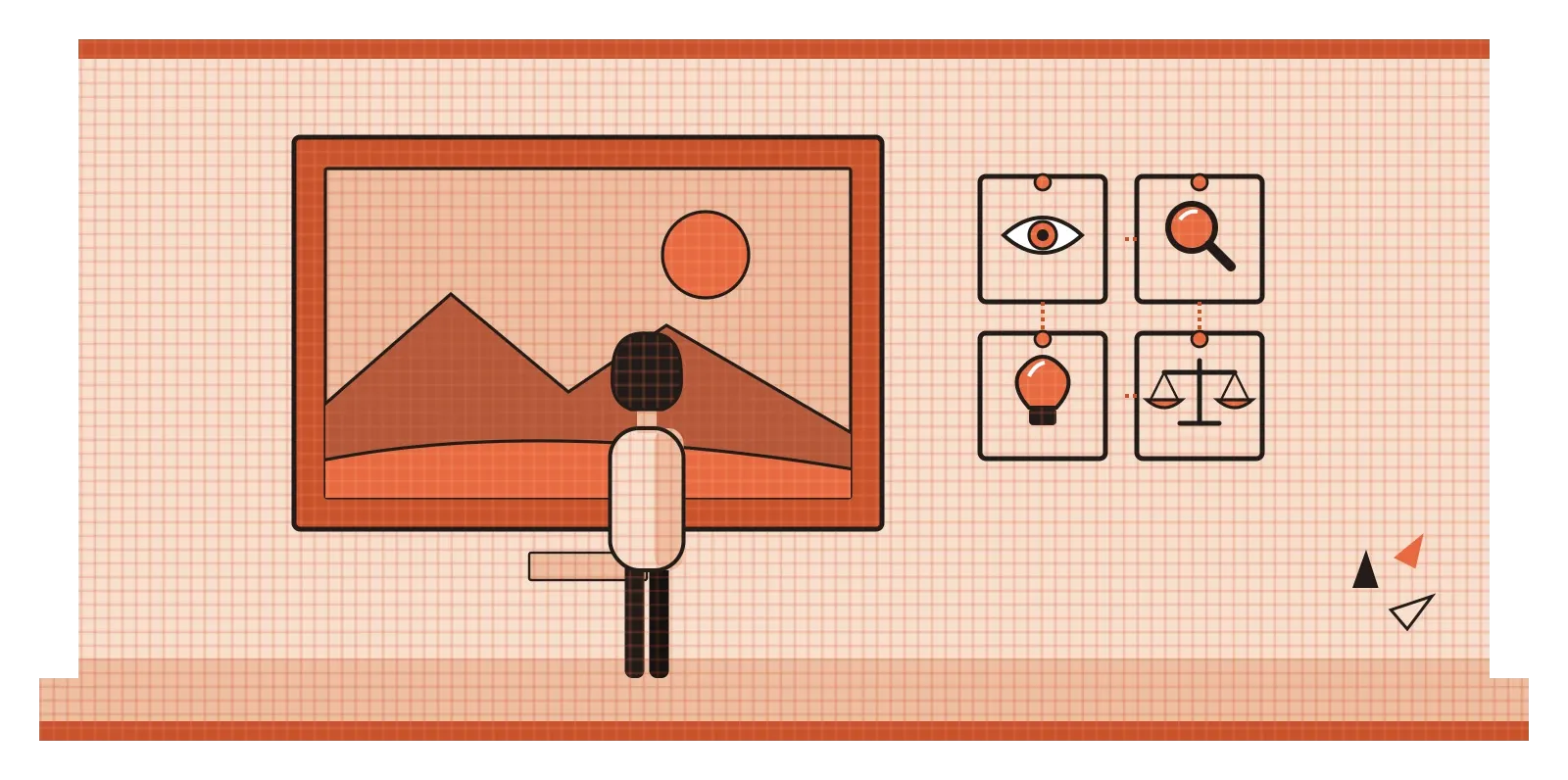
I find this especially useful in design reviews. Teams often jump straight to judgement with comments like "I don't like it" or "it feels off". Walking back through description and analysis first usually reveals what is actually causing that feeling, which is far more useful to the designer than a verdict.
Designers write in images, so we should read them best
For most people, visual literacy is a defensive skill. It helps you avoid being fooled by a doctored photo or a misleading chart. For designers, it's also the core of the job, because we spend our days writing in images. Every layout, icon, colour choice and illustration is a set of instructions to someone's eyes about what to notice first, what matters and what to do next. If we can't read our own work critically, describe it plainly, analyse how it's built and question what it's really saying, we end up communicating things we never intended. A button that looks disabled when it isn't, a warning that looks like decoration, or an illustration that quietly leaves certain kinds of people out are all failures of visual literacy, made by people who should know better.
It also matters more now than it did even a few years ago. With AI tools, anyone can produce a convincing image in seconds, which means the hard part of visual work is shifting from making images to judging them. The designers who will matter most are not necessarily the ones who can render the most beautiful picture. They're the ones who can look at a hundred generated options and say clearly which one works, which one misleads, and why.
The Pope in the puffer jacket was a harmless joke, and that's partly why it was such a useful wake-up call. It showed millions of people at once how easily a picture can fool us when we glance instead of look. Learning to look properly isn't complicated. It mostly means slowing down, describing before judging, and remembering that every image, including the ones we make ourselves, was put together by someone who wanted us to see something in a particular way.
Further reading: John Berger, Ways of Seeing (1972) · Donis A. Dondis, A Primer of Visual Literacy (1973) · Edmund Burke Feldman, Becoming Human Through Art (1970) · Mary C. Potter et al., "Detecting meaning in RSVP at 13 ms per picture" (2014)