Point
The smallest thing in design, and why it's never really small.
Point
It starts with dots on the doorstep
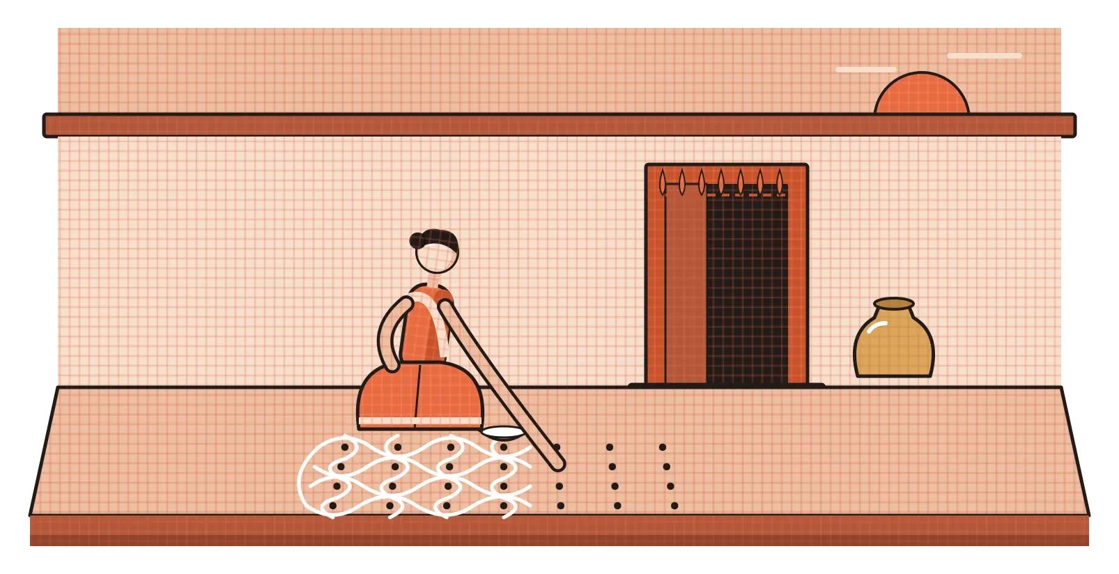
In many homes across South India, especially in Tamil Nadu, the day still begins at the front door. Early in the morning, someone sweeps the ground, sprinkles it with water and then crouches down with a pinch of rice flour or chalk powder. Before any of the elaborate patterns appear, they place a grid of small dots on the ground, evenly spaced, row after row. These dots are called pulli. Only then do the lines begin, curving around the dots, looping between them and closing back on themselves until a full kolam sits at the entrance. By the evening it has usually been walked over, smudged and swept away, and the next morning it starts again.
What I love about the pulli kolam is how honest it is about where design begins. The dots aren't decoration. They're the structure that everything else depends on. Move one dot and the whole pattern changes. Leave a dot out and the line has nothing to wrap around. It's a daily, very physical reminder of something designers learn in their first weeks of school and then rarely think about again: before there are lines, shapes or layouts, there is the point. It's the smallest element in visual design, and it turns out to carry a surprising amount of weight.
A thing with no size that you can still see
Mathematically, a point is a strange idea. Around 300 BCE, the Greek mathematician Euclid opened his Elements, the most influential geometry book ever written, with the definition "a point is that which has no part". In geometry, a point has position but no length, width or area. It marks a location and nothing else. You can't actually draw one, because the moment you put a pencil on paper, you've made a mark that has some size.
Designers work with the visible version. In design, a point is any mark small enough, relative to its surroundings, that we read it as a single spot rather than a shape. That definition depends entirely on context. A full stop on a page is a point. So is a star in the night sky, a city on a map, a lit window in a dark building seen from far away, or a red dot on a phone app. Blow any of them up and they become circles, shapes with edges and area. Shrink them back down and they return to being points. What makes something a point isn't its actual size. It's how it behaves in our eye against everything around it.
The artist who thought about this most carefully was Wassily Kandinsky. While teaching at the Bauhaus, he published a book in 1926 called Point and Line to Plane, where he treated the point as the most basic element of visual expression, the place where every image begins. He wrote about it almost like a sound. To him, a single point on an empty surface was the most concise form possible, something like a moment of silence that is still clearly there. His language can feel a bit mystical today, but the core observation holds up. Put one dot on a blank sheet of paper and it immediately stops being blank. The whole page now has a centre of attention, and a relationship between that dot and every edge around it.
Where you put it changes everything
A single point is simple, but where it sits is not. The psychologist and art theorist Rudolf Arnheim explored this in his 1954 book Art and Visual Perception. He described a small black disc placed inside a white square and showed how differently it feels depending on its position. In the exact centre, the disc looks calm and settled, as if it belongs there. Move it slightly off-centre and it starts to feel restless, as though it wants to move somewhere. Push it near an edge or a corner and it seems pulled towards that edge, creating tension. Arnheim argued that every frame has a kind of invisible structure, with lines running through the centre and along the diagonals, and that our eyes feel a point's relationship to that structure even when nothing else is on the page.
You can test this yourself in about ten seconds. Draw a square and put a dot right in the middle. Then draw another square and put a dot just a little above and to the left of centre. The second one feels like it's doing something, and the first one feels like it's resting. Nothing about the dot changed. Only its position did.
This is the simplest version of a principle that runs through all of visual design: a single element in an empty space becomes a focal point. It's why a map uses one bright marker to say "you are here", and why a lone dot of colour on an otherwise plain poster pulls your eye instantly. Typography is full of tiny points doing serious work too. A full stop tells you a thought has ended. The little dot above a lowercase i or j even has its own name, the tittle, and if you remove it, the letter becomes surprisingly hard to read. Points rarely look important, but take one away and you notice immediately.
Put enough points together and they become pictures
Things get even more interesting when you have lots of points. In the 1880s, the French painter Georges Seurat spent about two years on a huge canvas, A Sunday Afternoon on the Island of La Grande Jatte, built up from countless small dabs of pure colour placed side by side. Up close, it looks like a field of separate dots. Step back, and they merge in your eye into people strolling, sitting and holding umbrellas by the river. Seurat was interested in the science of colour and believed that letting the viewer's eye mix the colours, instead of mixing them on the palette, would make them more vivid. The technique became known as pointillism, and it showed something that the printing and technology industries would later depend on: our eyes are very willing to turn many small points into one smooth image.
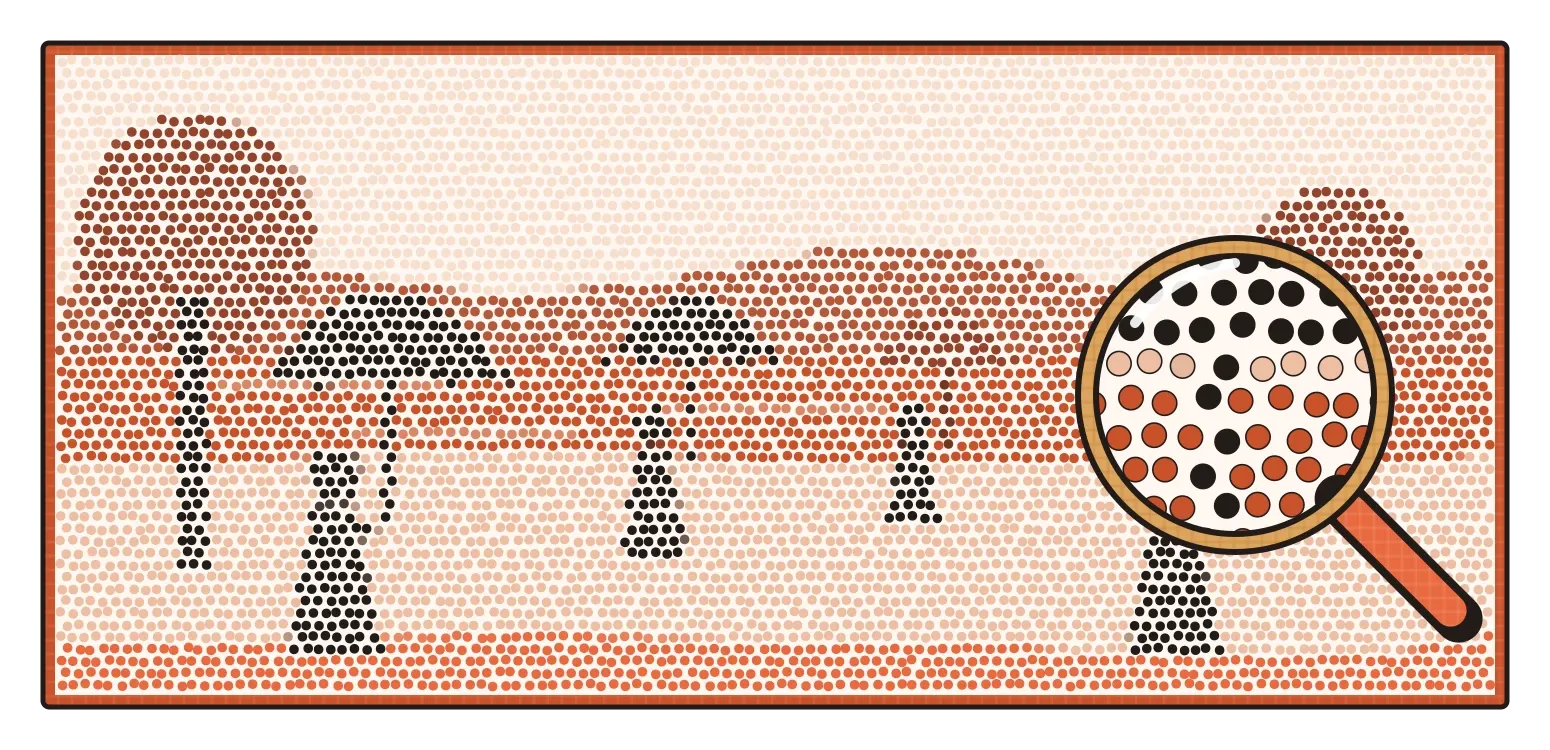
That's essentially how printed photographs work. From the late nineteenth century onwards, printers used halftone screens to break photographs into grids of tiny dots of varying sizes. Large dots close together read as dark areas, small dots spread apart read as light ones. Look at a newspaper photo through a magnifying glass and you'll still see them. Your phone screen does the same thing with light. Every image on it is made of pixels, a word that comes from "picture element", and each pixel is effectively a point of coloured light. The phrase "high resolution" simply means there are enough of these points, packed closely enough, that you stop noticing them.
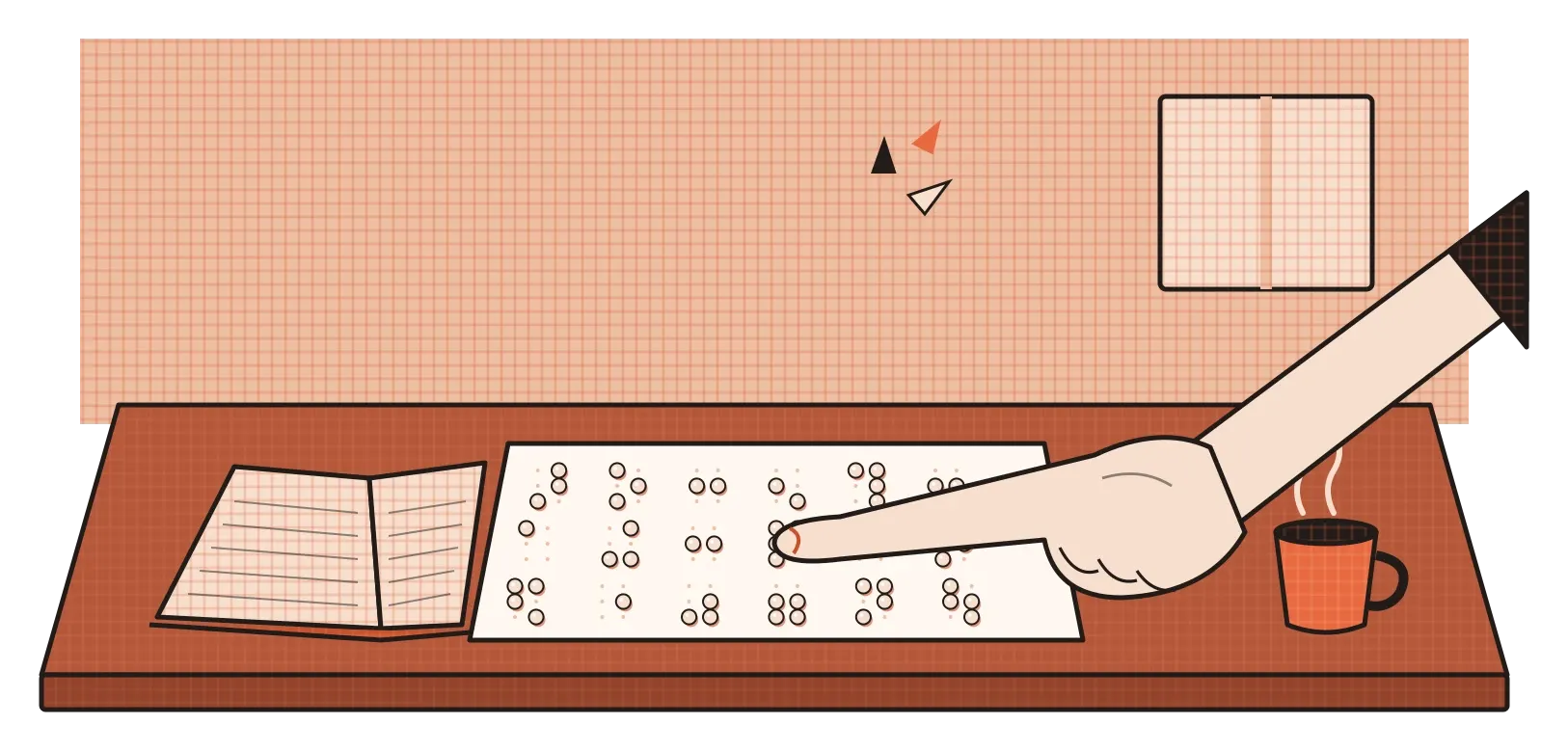
Points can also carry meaning on their own, without forming a picture. In 1829, a young Frenchman named Louis Braille, who had lost his sight as a child, published a system of reading and writing built from raised dots arranged in a small cell of up to six positions. Different combinations of dots stand for different letters, numbers and punctuation, and readers feel them with their fingertips. The system has since been adapted for many languages, including Indian scripts through a shared standard known as Bharati Braille. It's one of the clearest examples of how much information a handful of points can hold, as long as their positions are designed with care.
On screens, a single dot can carry a whole message
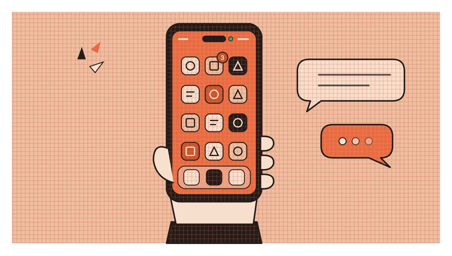
In digital products, the humble point has become one of the most powerful signals we have. Think of the small red dot on an app icon that tells you there's something unread. It's tiny, it has no words in it, and yet it can make people open an app almost reflexively. That power is exactly why designers should be careful with it. A notification dot that appears for every minor update trains people to feel a constant low-level urge to check, which is good for engagement numbers and often bad for the people using the product. The same small mark can be helpful or manipulative depending on when and why it shows up.
There are much better uses too. In 2020, Apple added a small coloured dot to the top of iPhone screens that appears whenever an app is using the camera or the microphone, green for the camera and orange for the microphone. It's a lovely piece of design. It takes up almost no space, it doesn't interrupt anything, and it answers a question people care deeply about: is something watching or listening to me right now? Other familiar examples include the green dot that shows a contact is online, and the three pulsing dots that tell you someone is typing a reply. Each one says a surprising amount with almost nothing.
Small, but never neutral
It's easy to treat the point as the most boring element of design, the thing you learn on day one before getting to more exciting topics like colour and typography. But almost everything in this post comes back to the same idea: a point is never neutral. Its position creates calm or tension. Its presence turns an empty space into a composition. Repeated, it can build a painting, a printed photograph or a digital screen. Arranged with care, it can carry an entire written language under a fingertip. And on a phone, a single dot can change how often someone picks the phone up.
For designers, that suggests a simple habit. Whenever you add a small mark, whether it's a notification badge, a bullet, a map pin or a decorative dot in an illustration, it's worth asking what it's doing to the viewer's attention. Is it pointing to something that genuinely matters, or is it just pulling the eye because it can? Small elements are easy to add and easy to overlook, which is exactly why they deserve the same care as the big ones.
The kolam on the doorstep gets swept away by evening, and the dots go with it. But the next morning, they come back first, before any of the curves and loops. I think that's the right order for designers to keep in mind as well. Get the points right, where they sit, how many there are and what they're anchoring, and the rest of the design has something solid to hold on to.
Further reading: Wassily Kandinsky, Point and Line to Plane (1926) · Rudolf Arnheim, Art and Visual Perception (1954) · Donis A. Dondis, A Primer of Visual Literacy (1973)