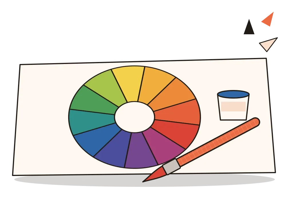
The Colour Wheel
How a straight band of light became a circle, and what primary, secondary and tertiary really mean.
The Colour Wheel
A poet, a box of prisms and a white wall
Around 1790, the German poet Johann Wolfgang von Goethe borrowed a set of glass prisms from Christian Wilhelm Büttner, a court official in the university town of Jena. Goethe was already famous for his novels and plays, but he had become curious about colour and wanted to repeat Isaac Newton's experiments for himself. Then, by his own account, he did nothing with them. The prisms sat in a box for months. When Büttner finally sent someone to collect them, Goethe grabbed one in a hurry, held it up to his eye and looked at a white wall. He expected the whole wall to burst into a rainbow, which is what he assumed Newton's theory predicted. It didn't. The wall stayed white. Colours appeared only along the edges, where the white wall met the dark frame of a window. Goethe later wrote that he said out loud, almost by instinct, that Newton's theory was wrong.
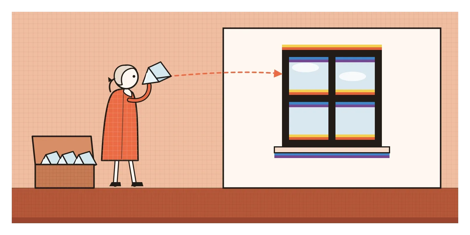
It wasn't. Newton's theory explains those coloured edges perfectly well, and physicists have never taken Goethe's attack on it seriously. But the moment sent him into nearly twenty years of experiments, which he published in 1810 as Zur Farbenlehre, known in English as Theory of Colours. And in one way Goethe was onto something. Newton had been studying light. Goethe was studying the experience of colour: afterimages, coloured shadows, the way some colours seem to call for others. To show those relationships, he drew a simple circle of six colours, with each colour sitting opposite the one it seemed to demand.
That circle is an ancestor of the tool this post is about. A colour wheel isn't a picture of light. It's a map. It arranges hues around a circle so that the relationships between them, which colours are mixed from which, which sit next to each other and which sit opposite, become something you can see at a glance.
Bending a straight line into a circle
In the post on colour, I described how Newton spread sunlight into a band of colours with a prism in 1666. That band is a straight line, with red at one end and violet at the other. So why do we draw colour as a circle? Newton himself was the first to do it. In Opticks, published in 1704, he took his seven colours and bent them around a circle, joining red back to violet, and used the diagram to estimate what colour you would get when different lights were mixed. He sized the segments by analogy with the intervals of a musical scale, which tells you the circle was partly an act of imagination. But the idea stuck because it matches something real about how we see.
Red and violet, the two ends of the spectrum, look related to us. Mix red and violet light, and you get purples and magentas, colours that appear nowhere in the rainbow. No single wavelength of light looks magenta. It exists only because our eyes and brain combine the two ends of the spectrum into something new. Physics leaves the band open at both ends. Our vision closes the loop.
The first colour wheels made for painters came later in the eighteenth century. One of the earliest printed in colour appeared in The Natural System of Colours, a short book by the English engraver Moses Harris, usually dated to around 1766. Harris started from three "primitive" colours, red, yellow and blue, and showed how the other hues could be mixed from them, arranged in a ring with each hue graded from deep to pale. After him, artists and thinkers kept redrawing the wheel. Goethe published his in 1810, the same year the German painter Philipp Otto Runge published a colour sphere, and dozens of versions have followed. They disagree about the details, but they share the basic idea.
Primary, secondary and tertiary
The wheel most of us meet at school is the painter's wheel, built on red, yellow and blue. These are called the primary colours, and the traditional claim is that they can't be mixed from any other colours, while every other hue can be mixed from them. Mix two primaries and you get the secondary colours. Red and yellow make orange, yellow and blue make green, and blue and red make violet. Each secondary sits halfway between its two parents on the wheel. Mix a primary with the secondary next to it and you get a tertiary colour, which is why tertiaries have double-barrelled names, red-orange, yellow-orange, yellow-green, blue-green, blue-violet and red-violet. Three primaries, three secondaries and six tertiaries give the familiar wheel of twelve. The version taught most widely today comes from Johannes Itten's 1961 book The Art of Color, and I'll come back to Itten properly in the post on his colour contrasts.
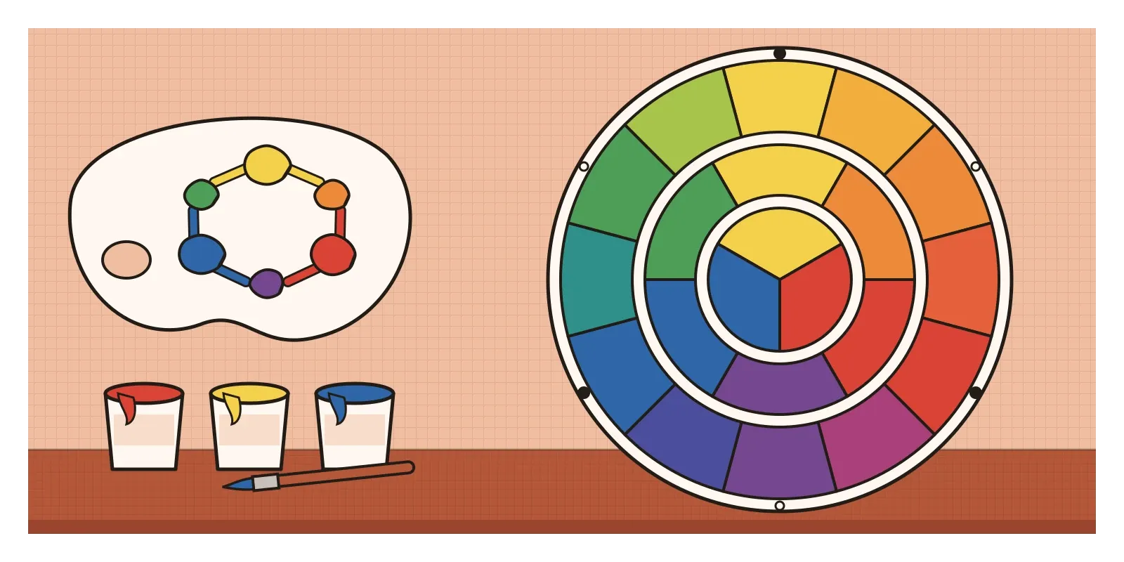
The terms aren't completely fixed. In some older British books on painting, "tertiary" meant something else, the dull olives, russets and browns you get by mixing two secondaries together. And the school wheel hides a small untruth. If you've ever tried to mix a clean, bright violet from a tube of red and a tube of blue, you'll know it usually comes out muddy. The same goes for many greens. Paint makers sell ready-made violets and greens partly because they can't be mixed as brightly from the traditional three.
That's because "primary" isn't a law of nature. It's a choice of starting points, and the best choice depends on what you're mixing. Printers mix inks using cyan, magenta and yellow, which are, roughly speaking, a clearer blue, a cooler pinkish red and a yellow, and these give far brighter greens and purples than red, yellow and blue do. Screens don't mix pigment at all. They mix light, and their primaries are red, green and blue. Each of these systems has its own wheel, its own primaries and its own secondaries, and the reasons they differ are the subject of the post after next, on additive and subtractive colour.
The painter's red, yellow and blue are a useful teaching tool and a long historical habit, not the only truth. A colour wheel is a model. Like a map, it's useful because it simplifies, and it becomes misleading the moment you forget that it does.
A painter's palette ground from stones
The painters who made miniature paintings for the Mughal court and for the Rajput and Pahari kingdoms, from roughly the sixteenth to the nineteenth century, never needed a colour wheel. Their palette was organised by material rather than by theory, and many of their colours came out of the ground. The most precious blue was ultramarine, ground from lapis lazuli mined in Badakhshan, in what is now Afghanistan. Everyday blues came from indigo. Reds came from cinnabar, a mercury ore, and from red lead. A brilliant yellow came from orpiment, a poisonous arsenic mineral, and greens from copper-based pigments such as malachite and verdigris. Black was made from lamp soot and white from ground shells or chalk. One famous yellow, called peori, comes with a story that it was made from the urine of cows fed on mango leaves. The story was first written down in the 1880s, and historians still argue about how much of it is true.
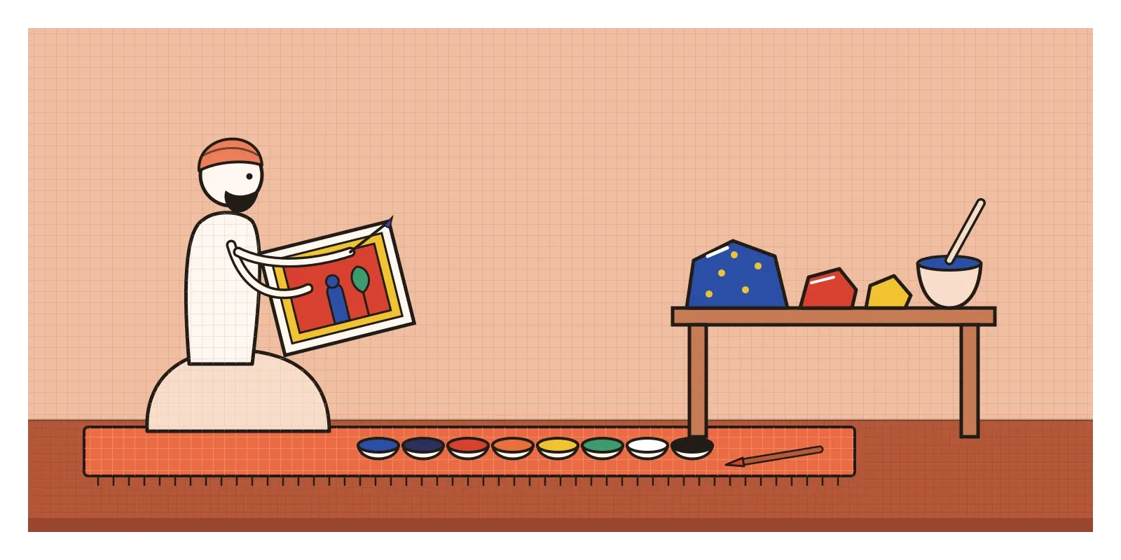
Apprentices could spend years grinding and washing these materials. Each pigment was mixed with a binder, usually a plant gum, and laid down in thin layers, and the finished painting was often burnished by rubbing it with a smooth stone so the surface glowed. Because many of these colours dulled or reacted when mixed, painters tended to use them pure and side by side: a red ground behind a figure in green, a band of yellow against deep blue, gold picked out on top. You can see this in the strong, flat colour fields of Mewar and Malwa painting, and in the cooler, more delicate palettes of the Pahari painters of Guler and Kangra.
What I find interesting is how close this comes to colour theory without ever using a diagram. A painter who knows that a particular red will dull if mixed, and that green comes from a different stone altogether, is thinking about colours as a set of separate starting points, which is exactly what primaries are. The theory of the wheel tries to find the smallest possible set of starting points. The miniature painter's palette was a larger, practical set, chosen for brilliance and permanence. Both are answers to the same question: which colours do I begin with?
The wheel hidden inside every colour picker
Every design tool has a colour wheel in it somewhere. Open the colour picker in Figma, Photoshop or the built-in picker on a Mac and you'll find a hue ring or slider, usually alongside a square for saturation and brightness. Under the hood, most of these pickers use models called HSL or HSB, which describe a colour by its hue, its saturation and its lightness or brightness. Hue is given as an angle around a circle, from 0 to 360 degrees, with red at 0, green at 120 and blue at 240. In CSS, the language that styles web pages, you can write a colour exactly that way. It's the colour wheel turned into a number.
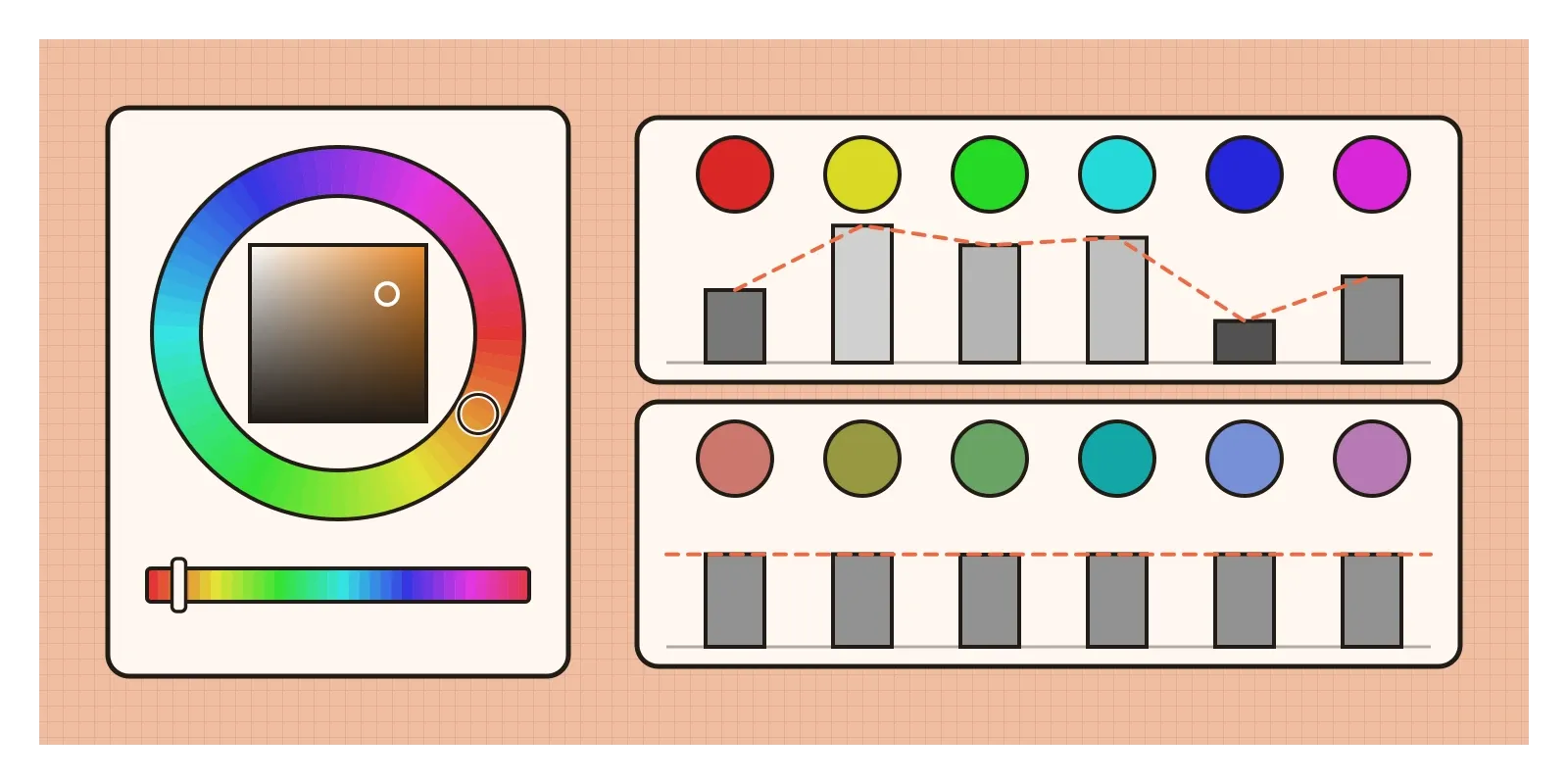
Two things are worth knowing about this digital wheel. The first is that it's built on the screen's primaries, red, green and blue, not on the painter's red, yellow and blue, so different colours end up opposite each other. On a painter's wheel, blue sits opposite orange. On a screen's wheel, blue sits opposite yellow, and red sits opposite cyan.
The second is that equal numbers don't give equal appearances. In HSL, a yellow and a blue with the same saturation and the same lightness value of 50 percent look nothing alike. The yellow is bright and glowing, and the blue is dark and heavy. It's the same lopsidedness Munsell noticed, which I described in the post on colour. HSL is a simple mathematical rearrangement of red, green and blue, and it ignores how the eye actually responds. Newer colour spaces try to fix this. One called Oklab, published by the engineer Björn Ottosson in 2020, and its wheel-shaped form, OKLCH, are now supported in modern browsers. In OKLCH, if you keep lightness fixed and turn the hue, the colours stay at roughly the same perceived lightness, which makes it much easier to build sets of colours for charts, tags or themes that feel even.
A practical habit follows from this. Whenever you generate colours by spinning around a wheel in a design tool, check them in greyscale as well. The hue may change smoothly while the lightness jumps all over the place, and it's the lightness, as the post on value showed, that decides what people can actually read.
Make a wheel with your own hands
The colour wheel is easy to dismiss as basic, but nearly everything in the next few posts depends on it. Colour harmonies, which I'll write about next, are really shapes drawn on the wheel. Warm and cool colours are its two halves. Itten's contrasts and Albers's experiments both assume you can quickly find a colour's neighbours and its opposite. The wheel is how you do that.
The best way to learn it is to make one. This week, get three paints, a red, a yellow and a blue, from the cheapest set you can find. Draw a circle divided into twelve segments, fill in the primaries first, then mix the secondaries and the tertiaries, and notice which mixes come out bright and which come out muddy. If you can, do it a second time with cyan, magenta and yellow, which some student paint ranges sell, and compare the greens and violets. Then open a design tool, fix the saturation and lightness and move only the hue, and watch what happens to the brightness of each colour.
Goethe never proved Newton wrong, and he seems never to have doubted that he had. But the question that began with a borrowed prism and a white wall was a good one. It wasn't really about what light is. It was about what colour does once it reaches us. His circle of six colours, each sitting opposite the one it seems to call for, is still being drawn, in sketchbooks, in textbooks and inside the colour picker on every screen.
Further reading: Johann Wolfgang von Goethe, Theory of Colours (1810) · Moses Harris, The Natural System of Colours (c. 1766) · Johannes Itten, The Art of Color (1961) · John Gage, Colour and Culture (1993) · Victoria Finlay, Colour: Travels Through the Paintbox (2002)