Colour Harmonies
Complementary, analogous, triadic and split-complementary, and why a harmony is a decision, not a guarantee.
Colour Harmonies
A café painted in red and green
In September 1888, Vincent van Gogh stayed up for three nights in the Café de la Gare in Arles, in the south of France, painting the room where he often ate and drank. The owners, Joseph and Marie Ginoux, kept it open all night, and it was the kind of place where travellers and people with nowhere else to go could sit until morning. Van Gogh painted it under the glare of the gas lamps, with walls of deep blood red, a green ceiling, a green billiard table throwing a long shadow across a yellow floor, and a few hunched figures at the tables. In a letter to his brother Theo, he explained what he was after. He had tried, he wrote, "to express the terrible passions of humanity by means of red and green". The painting, The Night Café, now hangs in the Yale University Art Gallery.
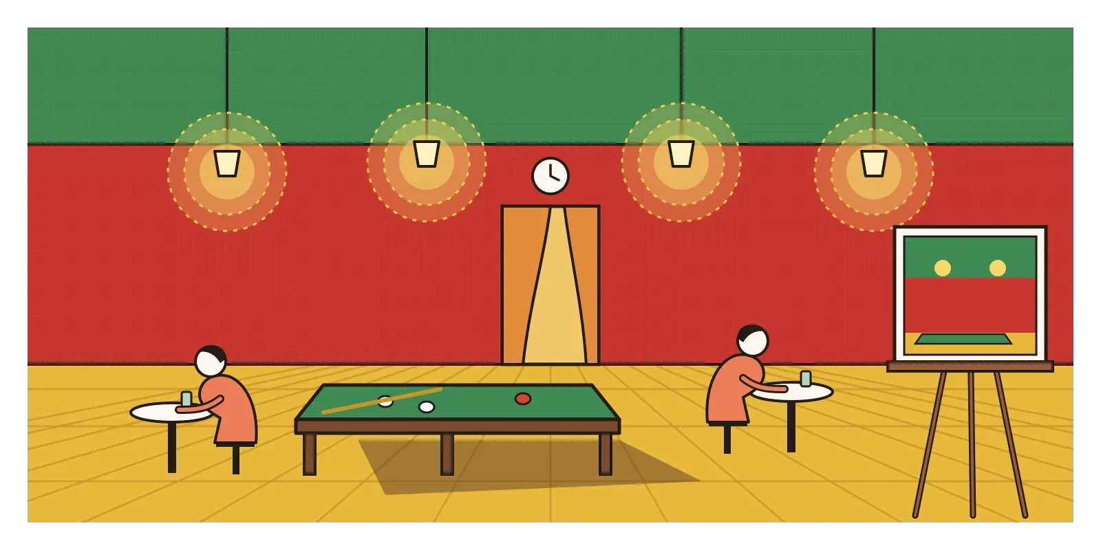
Red and green are complementary colours. They sit opposite each other on the colour wheel, and in most colour textbooks they're listed as one of the classic harmonies. Yet Van Gogh used them to make a room feel uneasy, even dangerous. In another letter about the painting, he described the café as a place where a person could ruin themselves, go mad or commit a crime.
That's the first thing to understand about colour harmony. It doesn't mean "pleasant". It means that the colours in a design have a clear, deliberate relationship with one another, so they feel like a set rather than an accident. What makes it a harmony is that it's been chosen. In this post I'll go through the main relationships designers use, complementary, analogous, triadic and split-complementary, how they work and where they stop working.
Harmony as a shape on the wheel
In the previous post, on the colour wheel, I described how hues can be arranged around a circle, with the primaries, secondaries and tertiaries in their places. Colour harmonies are simply shapes drawn on that circle. You pick one colour, then use a line, an arc or a triangle to find the others that go with it.
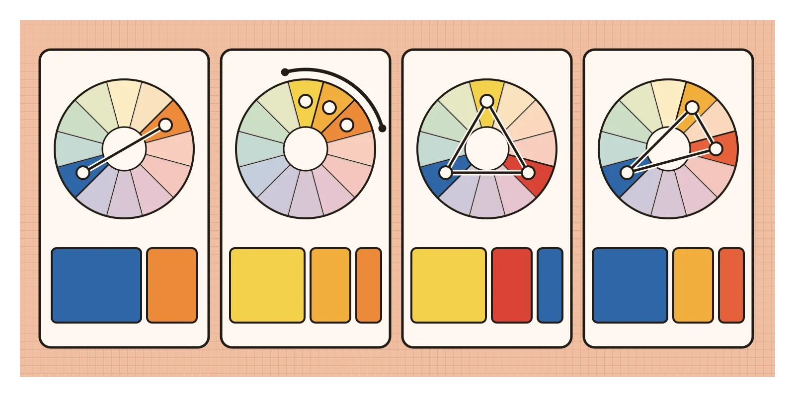
The simplest is the complementary pair, two colours directly opposite each other, like red and green, blue and orange, or yellow and violet. Because they're as far apart as two hues can be, complementaries make each other look stronger. A small orange boat on a blue sea seems to glow. Analogous colours take the opposite approach. They're three or so neighbours sitting side by side on the wheel, like yellow, yellow-orange and orange, or blue, blue-green and green. They share a hue in common, so they feel calm and unified, and they turn up constantly in nature, in autumn leaves, a sunset or the shallow water near a beach.
A triadic harmony uses three colours evenly spaced around the wheel, at the corners of an equilateral triangle. The painter's primaries, red, yellow and blue, are one triad, and the secondaries, orange, green and violet, are another. Triads are lively and balanced, and they work best when one colour leads and the other two support it. A split-complementary harmony takes one colour and, instead of its exact opposite, uses the two colours on either side of that opposite. Blue with red-orange and yellow-orange is one example. It keeps much of the punch of a complementary pair with less tension, which is why it's often suggested to beginners. There are others too, such as the square or tetradic harmony, which uses two complementary pairs at once, but these four are the ones you'll meet most often.
One warning carries over from the last post. These shapes give different answers on different wheels. On a painter's wheel, the complement of blue is orange. On the red, green and blue wheel inside a design tool, it's yellow. Neither is wrong. They're two maps of the same territory, and it helps to know which one you're holding.
Why some combinations hold together
In 1839, the French chemist Michel Eugène Chevreul, who directed the dyeing work at the Gobelins tapestry workshops in Paris, published a long book on colour that sorted harmonies into two broad families, harmonies of similar colours and harmonies of contrasting ones. That basic split is still how most designers think. His observations about how neighbouring colours change each other's appearance are a story for the later post on Josef Albers and the interaction of colour. A century after Chevreul, in 1944, the American researchers Parry Moon and Domina Eberle Spencer tried to go further and describe harmony with mathematics, measuring distances between colours in a colour space and predicting which intervals would please. Like many attempts to turn beauty into a formula, it never quite worked in practice.
More recent research suggests why. In 2011, the psychologists Karen Schloss and Stephen Palmer asked people to rate pairs of colours, separately, for how much they liked them and how harmonious they seemed. People tended to judge pairs of similar hues as the most harmonious, which fits analogous schemes. But which pairs they actually preferred depended a lot on lightness, and pairs with a clear difference between a lighter and a darker colour often did well. As I wrote in the posts on value and colour, value and saturation often matter more than hue. Two complementary colours at the same value can make their shared edge seem to vibrate, the effect I described in the post on contrast. The same two hues, one dark and one light, can sit together comfortably.
This is also why designers rarely use the colours of a harmony in equal amounts. A common rule of thumb, borrowed from interior decoration, is called 60-30-10: about sixty percent of a space in a dominant colour, thirty in a secondary colour and ten in an accent. Nobody seems quite sure who came up with it, and there's nothing magic about the numbers. But the principle behind it, that one colour should lead, is sound. A triad used in equal parts tends to look like a flag. The same triad with one colour dominant, one supporting and one used sparingly starts to look like a design.
Borders that refuse to blend
Some of the boldest colour harmonies I know are woven into silk in Kanchipuram, the temple town near Chennai in Tamil Nadu. Kanjeevaram sarees are known for their heavy silk, their gold zari thread and, above all, their colour combinations. The body of the saree is often one colour, and the border and pallu, the decorated end that falls over the shoulder, a strongly contrasting one. Think of a mustard body with a deep maroon border, a peacock green with a pink border or a magenta with a parrot-green border. Some sarees have two differently coloured borders, one on each edge, a style often called ganga-jamuna after the two rivers.

Technique makes these contrasts possible as much as taste does. In a traditional Kanjeevaram, the border is joined to the body using a method called korvai, in which the weft threads of the body and the border are interlocked by hand where they meet, instead of a single thread running across the whole width. That's why the border colour can be completely different from the body colour without a muddy transition between them. It's slow, skilled work, and it produces a garment built from crisp edges between strong hues, closer in spirit to Van Gogh's clashing complementaries than to the gentle analogous schemes many design books recommend.
I like this example because it complicates the rules. A Western colour guide might call pink with parrot green, or purple with mustard, too loud. In the weaving traditions of south India, these pairings are classics, refined over generations and full of associations with weddings, festivals and temples. The harmonies are real, but they were learned through practice, through what weaving families made and what buyers loved, not from a diagram. Kanchipuram silk was registered as a geographical indication, a legal mark of origin, in the mid-2000s, partly to protect that tradition from cheaper imitations. Colour harmony, it turns out, is partly geometry and partly culture, and I'll come back to the second half in the post on colour psychology and culture.
Letting software suggest the harmony
Digital tools have turned colour harmonies into buttons. Adobe Color, which began in 2006 as a web app called Kuler, lets you pick a base colour and choose a rule, analogous, complementary, triadic, split-complementary and so on. It draws the shape on a wheel and hands you the matching colours.
Google went further with Material You, the design language it introduced with Android 12 in 2021. Its dynamic colour feature takes the wallpaper you choose for your phone, extracts a source colour from it and generates a whole colour scheme for the interface, with a primary colour, a quieter secondary colour and a tertiary accent, each expanded into a range of lighter and darker tones. To make those tones behave predictably, Google built a colour space called HCT, for hue, chroma and tone, designed so that a colour's tone, and therefore its contrast with text, stays reliable whatever hue the wallpaper happens to give it. It's colour harmony done by algorithm, with readability built in.

For everyday product design, a few habits help. Use a harmony for brand and accent colours, and give most of the interface quiet neutrals, off-whites, warm greys and near-blacks, so the accent has room to do its job. Remember that interfaces also need functional colours, red for errors, green for success and amber for warnings, which won't always fit your chosen harmony. Rather than abandoning them, nudge their saturation or value so they belong to the same family without losing their meaning. And always check the contrast between text and background, as I described in the post on value, because a harmony that's beautiful in hue can still be unreadable in value.
The same thinking applies to data. A chart that needs to show categories works well with colours spread evenly around the wheel, close to a triad or a square, so each category is easy to tell apart. A chart that shows a range, like low to high temperatures, works better with an analogous run of neighbouring hues stepping steadily from light to dark. Choosing the harmony to match what the data means is one of the simplest ways to make a chart easier to read.
Rules as a starting point
Colour harmonies give you somewhere to start. A rule like "one colour, its two neighbours and a small accent of its opposite" narrows an endless choice to something you can work with. But they're a starting point, not a guarantee. Value, saturation, proportion and context decide whether a set of colours works, and, as Kanchipuram's weavers show, culture decides what people think "works" in the first place.
Here's an exercise for this week. Find a photograph, a painting or a film still whose colours you love. Pick out its four or five main colours with an eyedropper tool, place them on a colour wheel and see what shape they make. You'll often find a clear harmony hiding there, along with a surprise or two. Then design something small, a poster, a slide or a single app screen, using the same harmony in rough 60-30-10 proportions. Make a second version where the dominant colour and the accent swap places, and put the two side by side. The hues are identical, but the mood won't be.
Van Gogh's Night Café uses one of the most textbook harmonies there is, and yet nobody would call it soothing. He chose red and green not because a rule told him they belonged together, but because their clash said what he wanted to say about that room at night. That's the right way to use a harmony, as a deliberate relationship picked for a reason. In the next post, on additive and subtractive colour, I'll look at what actually happens when colours mix, on paper and on screens.
Further reading: Vincent van Gogh, The Letters of Vincent van Gogh, edited by Leo Jansen, Hans Luijten and Nienke Bakker (2009) · Michel Eugène Chevreul, The Principles of Harmony and Contrast of Colours (1839) · Parry Moon and Domina Eberle Spencer, "Geometric Formulation of Classical Color Harmony" (1944) · Karen B. Schloss and Stephen E. Palmer, "Aesthetic Response to Color Combinations: Preference, Harmony, and Similarity" (2011)