Sketching as Thinking
Why the most useful drawings in design are made to find an idea, not to show one.
Sketching as Thinking
A building that began as a scribble
In the 2006 documentary Sketches of Frank Gehry, made by his friend, the film director Sydney Pollack, there's a moment that surprises a lot of people the first time they see it. Gehry, by then one of the most famous architects in the world, sits down with a pen and a sheet of paper and starts to draw. What comes out doesn't look like architecture at all. It's a fast, looping tangle of lines, more like someone testing whether a pen works than a plan for a building. Yet sketches like these are where buildings such as the Guggenheim Museum in Bilbao, with its swirling curves of titanium, began.
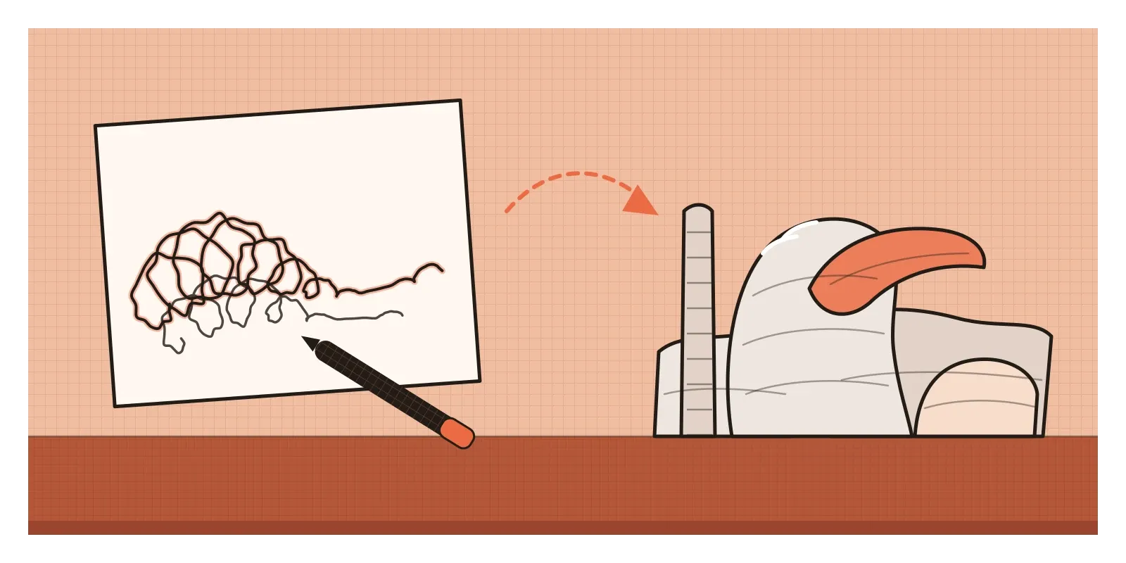
What happened next is the interesting part. Gehry's team didn't treat the scribbles as instructions. They built rough models out of paper, card and wood, changed them, sketched again and built again. Only much later did the shapes go into a computer, using CATIA, software created by the French company Dassault for designing aircraft, so that the curves could be engineered and actually built. The early sketches were never meant to explain the building to anyone else. They were a way for Gehry to get a half-formed feeling out of his head and onto paper, where he could look at it, react to it and push it somewhere new. That's what sketching as thinking means. It's drawing to find an idea, not to record one you already have.
Drawing to find out, not to show
Most of the drawings we see are made to communicate. A technical drawing tells a factory exactly what to make. A rendering, like the ones I described in the post on light, shade and rendering, shows a client what a finished product will look like. A presentation board persuades. These drawings come at the end of a decision. Sketches come before it. They're quick, messy and unfinished on purpose, because their job is to help you work out what the decision should be.
Leonardo da Vinci understood this more than five hundred years ago. In his notes on painting, he warned against drawing the limbs of figures with careful, finished outlines too early. He suggested roughing out a composition first, trying different positions and movements, and only refining once the arrangement felt right. The art historian Ernst Gombrich drew attention to this advice in an essay on Leonardo's working methods, pointing to Leonardo's phrase for such a drawing, componimento inculto, an untidy or uncultivated composition. You can see it in his studies for a Virgin and Child with a cat, made around 1478 to 1481 and now in the British Museum. The figures are drawn again and again on top of one another until the page is a jumble of lines, and on one sheet he even traced the drawing through to the back of the paper to try it the other way round. These aren't failed drawings. They're a mind working something out.
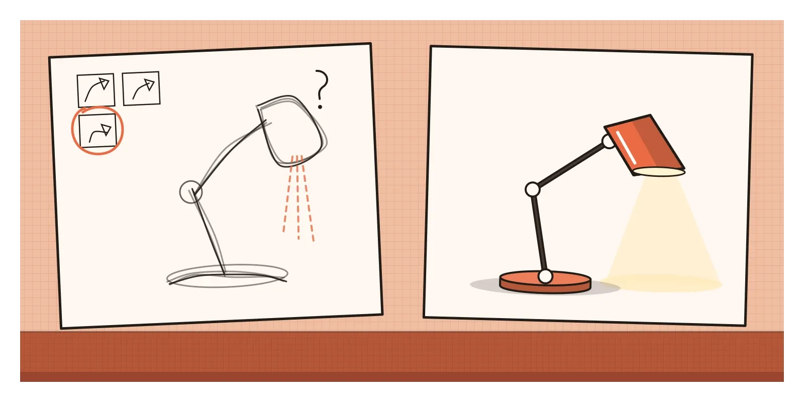
The designer and researcher Bill Buxton made the same distinction for interaction design in his 2007 book Sketching User Experiences. He argued that sketches and prototypes aren't just rough and polished versions of the same thing, because they do different jobs. Sketches are quick, cheap, plentiful and disposable. They suggest and explore rather than confirm, and they're deliberately ambiguous, leaving room for more than one reading. Prototypes test and refine an idea you've already chosen. The book's subtitle sums up the difference neatly. Sketching helps you get the right design. Prototyping helps you get the design right.
A conversation with your own drawing
Why should rough drawing help anyone think? The most influential answer came from the philosopher Donald Schön. In his 1983 book The Reflective Practitioner, he described an architecture teacher he called Quist working with a student, Petra, on a design for a school on a sloping site. As Quist sketched over Petra's drawings, he kept making a move, looking at what it did and discovering consequences he hadn't planned, a new courtyard here, a problem with the slope there. Schön called designing "a reflective conversation with the materials of a situation". You make a mark, the drawing talks back, and you respond.
The key is that a sketch shows you more than you put into it. Once a few lines are on paper, you can see relationships that weren't clear in your head: two shapes lining up, a gap that looks like a path, a form that suddenly reminds you of something else. The design researcher Gabriela Goldschmidt, in a 1991 paper called "The Dialectics of Sketching", described designers moving back and forth between two kinds of looking. "Seeing as" is noticing what a mark could be, a squiggle seen as a roof or a ramp. "Seeing that" is reasoning about it, seeing that the ramp would be too steep or that the room would get the morning sun. Sketching keeps the two going, each feeding the other. Later studies by the cognitive scientist Masaki Suwa, working with Barbara Tversky and others, asked architects to talk through their own sketches. They found that experienced designers regularly noticed things in their drawings they hadn't consciously put there, and that those discoveries often led to new ideas.
This is also why ambiguity matters. A precise drawing can only be read one way. A loose one can be read several ways, and each reading is a possible idea. That's the opposite of what most of us are taught to value in drawing, and it's why people who are skilled at rendering sometimes have to learn to sketch more roughly. It connects to what I wrote in the post on solving the problem or finding it. In design, the problem and the solution often take shape together, and the sketchbook is one of the main places where that happens.
Shots planned in a red cloth notebook
One of my favourite examples of sketching as thinking comes from Indian cinema. Before he became a filmmaker, Satyajit Ray worked as a commercial artist at D. J. Keymer, an advertising agency in Calcutta, and designed book covers on the side, a career I'll come back to in a later post on people. In the 1940s, he was asked to illustrate an abridged edition of Bibhutibhushan Bandyopadhyay's novel Pather Panchali for Signet Press. While drawing those illustrations, he began to imagine the story as a film.
When he finally started shooting Pather Panchali in the early 1950s, with very little money and a crew that had mostly never made a feature film, he didn't have a conventional screenplay. He worked largely from his sketches and notes, drawing the shots he had in mind and using those drawings to explain the film to his crew and to the people he hoped would fund it. The film was released in 1955 and became one of the most celebrated ever made in India, remembered for scenes like the one where the children Apu and Durga run through a field of white kash flowers to see a train for the first time.
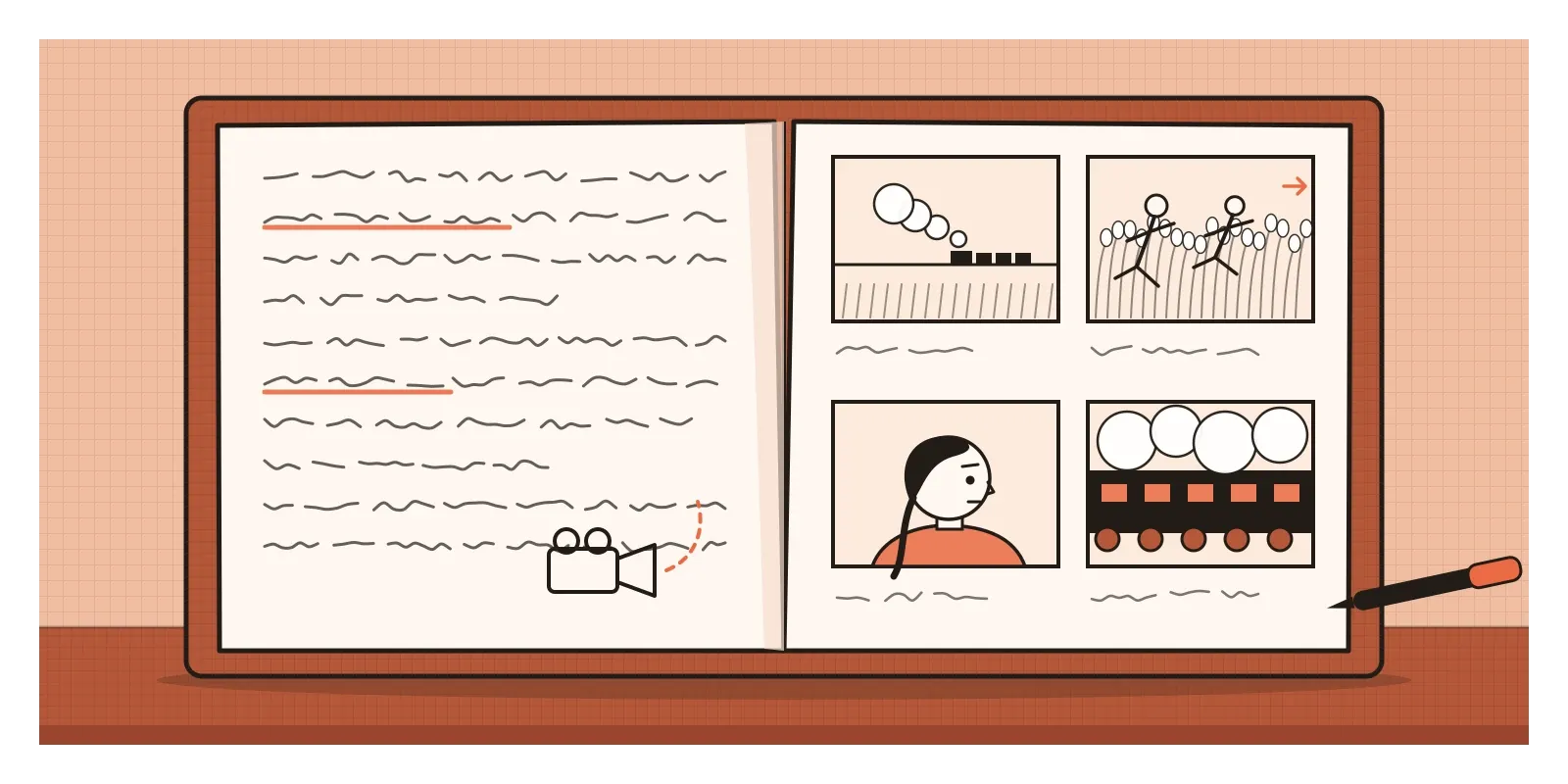
For the rest of his career, Ray planned his films in thick notebooks bound in red cloth, the kind traditionally used in Bengal for keeping accounts, known as a kheror khata. Their pages mix script, dialogue and quick sketches of shots, camera positions, costumes and sets. The drawings are rarely polished, and they didn't need to be. They were where Ray worked out what each scene should look like before anyone stood in front of a camera. They're also a reminder that sketching as thinking isn't only for objects and buildings. It works for anything that has to be imagined before it exists, a sequence of shots, the flow of an app or the layout of a page. The storyboards used today in animation and in user experience design come from the same habit of drawing a sequence to see whether it works.
Sketching on screens, and the trouble with looking finished
Digital product design has its own sketching rituals. The best known is probably Crazy 8s, an exercise from the design sprint process developed at Google Ventures and described by Jake Knapp, John Zeratsky and Braden Kowitz in their 2016 book Sprint. You fold a sheet of paper into eight panels and sketch eight different ideas in eight minutes. One minute per idea is far too short to make anything neat, and that's the point. It pushes you past your first, obvious idea, and usually past the second and third too, to the stranger ones underneath.
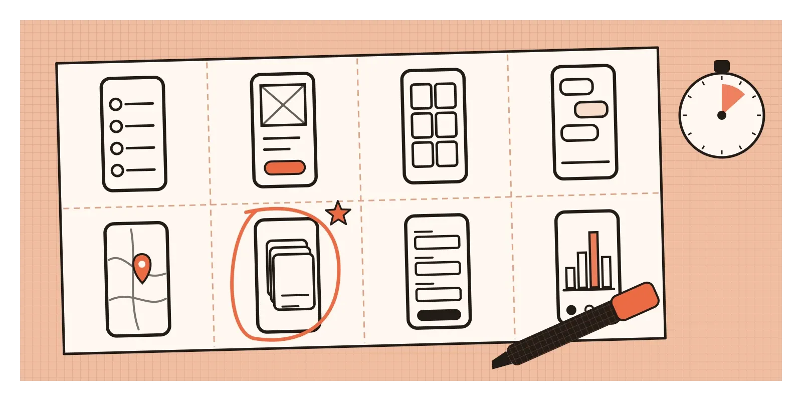
There's a good reason to start on paper rather than in a design tool. Modern software makes everything look finished. Within minutes you can have a screen with real fonts, crisp icons and perfect alignment, and that polish sends a signal that the decisions have been made. People respond accordingly. Colleagues comment on the shade of blue rather than on whether the screen should exist at all, and designers become reluctant to throw away something that looks so complete. Researchers noticed this early. In a 1996 study, Jutta Schumann and her colleagues showed architects the same building drawn by a computer in two styles, one photorealistic and one that looked hand-sketched. The architects felt the sketchy version was better suited to early design discussions, because it looked open to change and invited people to suggest ideas.
AI image tools make this tension sharper. They can turn a sentence into a polished picture in seconds, which is wonderful for some jobs, but they skip the stage where an idea is still vague and full of possibilities. A rough sketch you made yourself, wobbles and all, keeps you in that stage a little longer, and that's often where the best ideas are found.
A few habits help. Use a thick marker rather than a fine pen, so you can't add detail even if you want to. Draw small, with lots of thumbnails on one page, so that no single idea feels precious. Add words and arrows freely, because a sketch of an interface is as much about what happens next as about what things look like. And keep the sketches you reject. An idea that didn't fit one problem often fits another.
Draw badly, and draw a lot
In their 1993 book Art & Fear, David Bayles and Ted Orland tell a story about a ceramics teacher who split a class into two groups. One half would be graded only on the quantity of pots they made, the other only on the quality of a single pot. At the end of the term, the best pots all came from the quantity group. While the quality group had theorised about perfection, the quantity group had made pot after pot and learned from every one. The story may have been polished in the retelling, and a version of it is said to have started in a photography class, but it captures something true about sketching. Ideas improve through volume. Twenty rough sketches will usually teach you more than one careful drawing.
That's the main thing I'd take from this post. Sketching as thinking isn't really a drawing skill. It's a willingness to make bad drawings on purpose, quickly and in quantity, and then to look at them honestly. It draws on everything from the earlier posts in this part of the series, the quick instinct of gesture, the attention of observational drawing and a basic sense of perspective, but it puts all of that to work for a different goal. You're not trying to make a good picture. You're trying to find a good idea.
If you want to try it, take something you're working on, a screen, a product, a poster or even a new way to arrange your room, and give yourself ten minutes and a thick pen. Fill a page with small, ugly sketches of different answers, at least eight of them, without stopping to judge. Then look at the page and circle the one or two that surprise you. In the next post, on visual journaling, I'll write about turning that kind of drawing into a daily habit.
Gehry's tangled lines didn't look like a museum, and they didn't need to. They only had to give him something to look at and argue with. That's all a sketch has to do, and it turns out to be more than enough.
Further reading: Bill Buxton, Sketching User Experiences (2007) · Donald Schön, The Reflective Practitioner (1983) · Gabriela Goldschmidt, "The Dialectics of Sketching" (1991) · Masaki Suwa and Barbara Tversky, "What do architects and students perceive in their design sketches?" (1997) · Andrew Robinson, Satyajit Ray: The Inner Eye (1989)