Proportion and Scale
Why size only means something in relation to something else.
Proportion and Scale
A statue you need binoculars to see properly
On an island in the Narmada river in Gujarat stands the Statue of Unity, a figure of Sardar Vallabhbhai Patel that was completed in 2018. It's 182 metres tall, which made it the tallest statue in the world when it opened. Photographs of it can be oddly confusing. Taken from far away, with nothing nearby to compare it to, it can look like any ordinary statue of a man in a long shawl. It's only when you see the tiny figures of visitors at its feet, or a viewing gallery tucked inside its chest, that its size suddenly lands. Your brain needs a reference point before it can understand how big something really is.
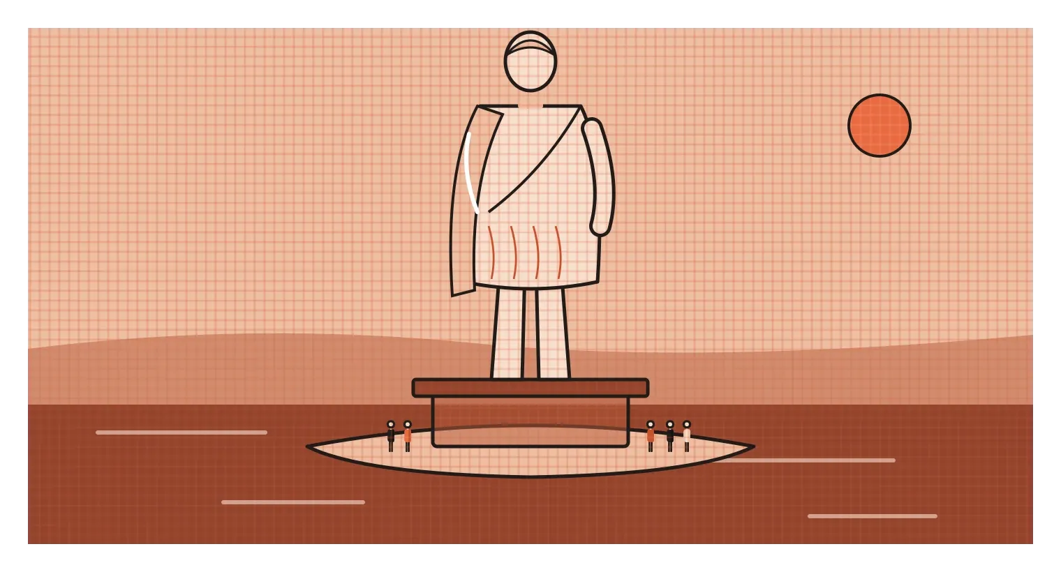
That little moment of confusion explains a lot about how size works in design. On its own, size doesn't mean much. A shape on a blank page could be a coin or a planet. It only becomes big or small in relation to something else, a person, a hand, a doorway, another shape, or the page it sits on. Designers have two related words for these relationships. Proportion describes how the parts of something relate to each other, like the width of a statue's shoulders compared to its height. Scale describes how big something is compared to something outside it, usually the human body. Both are about relationships rather than measurements, and both quietly shape how everything we design is understood.
Inside relationships and outside relationships
The easiest way to separate proportion and scale is to think of a toy car and a real car. A good toy car has the same proportions as the real one. The wheels are the same size relative to the body, the windows sit in the same place and the roof has the same slope. If you photographed it close up against a plain background, you might not be able to tell it apart from the real thing. What's different is its scale. Next to your hand, it's tiny. Next to a real car, it's laughable. Proportion lives inside the object. Scale lives in the relationship between the object and the world around it.
Proportion is what makes things look "right" or "off". A chair with very thin legs and a huge, heavy seat looks unstable even if it's perfectly strong. A logo with a tiny icon next to a huge wordmark feels unbalanced. A face drawn with the eyes too high or the nose too long immediately looks wrong, because we've all spent our lives looking at faces and have a very precise sense of their usual proportions. Designers often adjust proportions by eye until something feels settled, but there are also systems and ratios that help, which I'll get into in the next posts on the golden ratio and proportion systems.
Scale is what makes things feel intimate, normal or overwhelming. A doorway sized for people feels welcoming. A doorway three times taller, like the entrance to a cathedral or a government building, feels grand and makes the person walking through it feel small, which is often exactly the point. Scale also controls importance in a layout. As I wrote in the posts on emphasis and hierarchy, bigger elements tend to be noticed first and read as more important. Changing the scale of a single element relative to everything else is one of the fastest ways to change what a design is about.
The human body as the original ruler
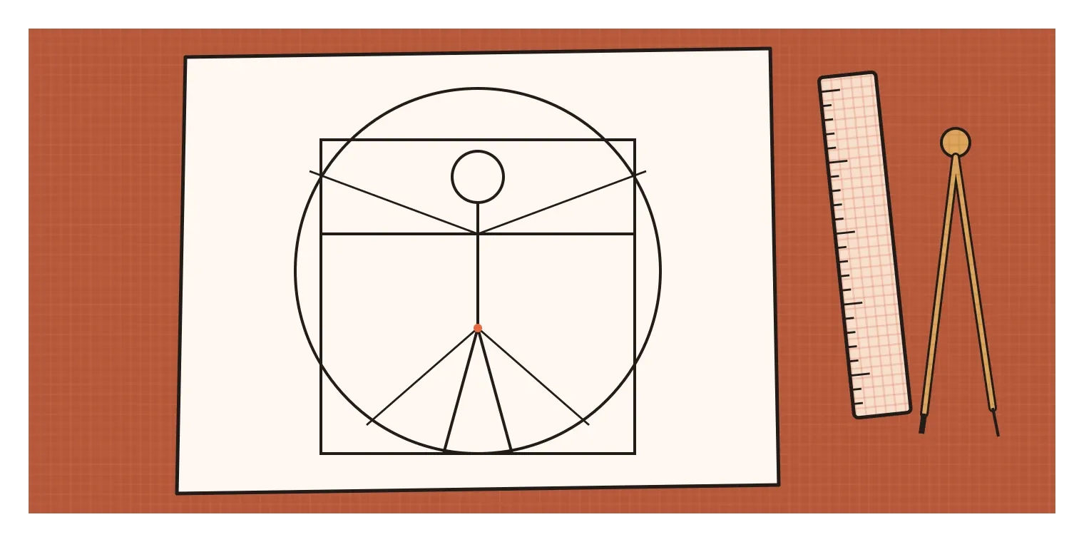
For most of history, the main reference point for both proportion and scale was the human body. Many old units of measurement came straight from it. A cubit was roughly the length from the elbow to the tip of the middle finger, a hand was the width of a palm, and a foot was, more or less, a foot. In ancient Rome, the architect Vitruvius argued that buildings should follow the proportions of a well-formed human body, and he described how a man with arms and legs outstretched could fit inside both a circle and a square. Around 1490, Leonardo da Vinci drew his own version of this idea, now known as the Vitruvian Man, which has become one of the most reproduced drawings in the world.
Indian sculptural traditions developed their own careful systems. Texts on image-making, part of the wider body of Shilpa Shastra literature, describe figures using a unit called the tala, often explained as roughly the length of the face. Different kinds of figures were assigned different numbers of talas for their total height, so that deities, humans and other beings each had their own set of proportions. The exact rules vary between texts and regions, and sculptors adapted them in practice, but the principle was the same as Vitruvius's: beauty and correctness came from consistent relationships between the parts of a body.
The human body still sets the scale of nearly everything around us. Chair seats, door handles, kitchen counters, steps, bus seats and phone sizes are all based, at least roughly, on measurements of people. That field of study is called anthropometrics, and it's something I'll cover in more detail later in this series. For now, the important point is simple. When an object's scale matches the body, it feels natural to use. When it doesn't, like a phone too wide to hold in one hand or a step too high to climb comfortably, people feel it immediately, even if they couldn't explain why.
The clever proportion hiding in your printer
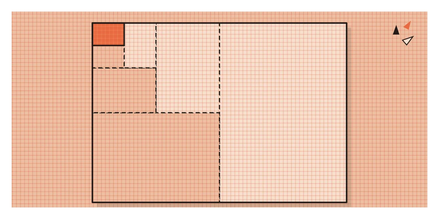
One of my favourite examples of proportion is something most people handle every week without thinking about it: a sheet of A4 paper. A4 belongs to a series of paper sizes, A0, A1, A2, A3, A4, A5 and so on, defined in an international standard now known as ISO 216, which grew out of a German standard from 1922. The clever part is the shape. Every sheet in the series has the same proportions, with the long side about 1.414 times the short side. That number is the square root of two, and it has a lovely property. If you fold or cut a sheet with these proportions in half across its long side, the two halves have exactly the same proportions as the original sheet.
That means an A3 sheet folds neatly into two A4 sheets, an A4 sheet folds into two A5s, and so on, with no awkward strips left over and no change in shape. You can enlarge an A4 document onto A3 paper or shrink it onto A5 on a photocopier, and everything fits perfectly, because the proportions never change. The idea isn't new. In 1786, the German scientist Georg Christoph Lichtenberg wrote about the special properties of paper with this ratio, more than a century before it became a formal standard. The A0 sheet, the largest in the series, has an area of exactly one square metre, and every other size is simply that sheet halved again and again.
There's a good design lesson hidden in this. A well-chosen proportion isn't only about looking nice. It can make a whole system work more smoothly. The square root of two was chosen because it solves practical problems, like scaling, folding and printing, with almost no waste. The fact that the resulting shape also looks pleasant and balanced is a bonus. The best proportions in design often work like this. They're not decorative rules applied on top. They come from what the thing needs to do.
Playing with scale, and getting it right on screens
Because we carry such a strong sense of how big things normally are, changing the scale of an everyday object can be startling, funny or even moving. The artists Claes Oldenburg and Coosje van Bruggen built a career on this. In 1988, they installed Spoonbridge and Cherry in a sculpture garden in Minneapolis, a giant spoon long enough to arch over a pond, with an enormous red cherry balanced on its tip. Their other works included huge clothes pegs, shuttlecocks and torches placed in public spaces. Nothing about the shapes is unusual. It's purely the change in scale that turns a humble household object into something people travel to see. Advertisers use the same trick all the time, showing a product huge on a billboard or tiny in a giant hand, because a surprising scale grabs attention immediately.
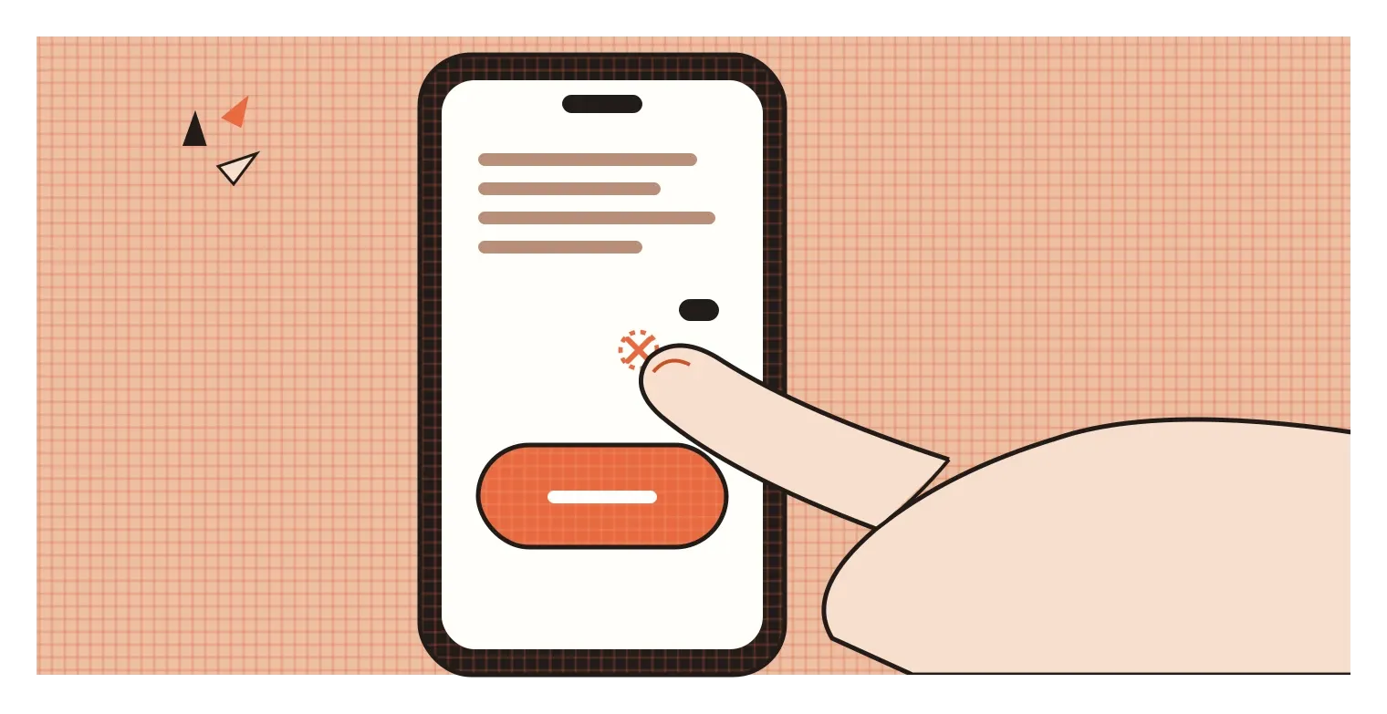
On screens, scale is less about surprise and more about the human body again, specifically fingers. A button that looks fine on a big monitor might be far too small to tap accurately on a phone. Both Apple and Google publish guidelines on this. Apple's Human Interface Guidelines recommend touch targets of at least 44 by 44 points, and Google's Material Design recommends at least 48 by 48 density-independent pixels, roughly the size of a fingertip pad. When targets are smaller than that, people miss them, tap the wrong thing or have to zoom in, which is especially frustrating for older users and anyone with shaky hands.
Scale also matters for text. Body text that's too small forces people to squint or zoom, while headlines that are only slightly larger than the body text fail to create any real hierarchy. Many design systems use a type scale, a set of text sizes that grow by a consistent ratio from small captions to large headings, so that every size relates clearly to the others. It's the same idea as the A-series paper, applied to letters. When each size relates to the next by a steady proportion, the whole system feels coherent, even if readers never consciously notice the maths behind it.
Always ask: compared to what?
Proportion and scale come down to one question that's worth asking about every design decision involving size: compared to what? An element isn't big or small on its own. It's big compared to its neighbours, small compared to the page, comfortable compared to a hand or overwhelming compared to a person. Proportion keeps the parts of a design in a healthy relationship with each other. Scale keeps the whole design in a sensible relationship with the people who will see and use it.
The habits I'd take from this are practical ones. When something looks slightly off but you can't work out why, check its proportions: the ratio of width to height, the size of the parts compared to the whole, the gaps compared to the elements. When something feels uncomfortable to use, check its scale against the body, the hand, the thumb, the eye at reading distance. Print designs at actual size and hold them at the distance people will see them. Test interfaces on a real phone held in one hand, not just on a large monitor. And when you want to make something memorable, consider whether a surprising change of scale could do more than any amount of decoration.
The Statue of Unity only reveals its true size when there's a person standing next to it. That's the heart of this whole topic. Scale and proportion are never really about numbers. They're about relationships, and the most important relationship in design is almost always the one between the thing we make and the human being who meets it.
Further reading: Vitruvius, Ten Books on Architecture (c. 25 BCE) · ISO 216, Writing paper and certain classes of printed matter: Trimmed sizes · Apple, Human Interface Guidelines · Google, Material Design guidelines