The Golden Ratio
Its real uses, its popular myths, and how to tell the difference.
The Golden Ratio
A spiral drawn over everything
If you've spent any time on design blogs or social media, you've probably seen the images. A famous logo, a painting, a celebrity's face or a seashell, with a thin golden spiral drawn over the top and a caption claiming that its beauty comes from the golden ratio. Some of these are genuinely interesting. Many are not quite what they claim to be. If you look closely, the spiral often doesn't actually line up with the important edges, or it starts in a convenient place chosen after the fact, or the rectangles around it aren't quite the right proportions. But the images keep spreading, because the idea behind them is so appealing. Wouldn't it be wonderful if there were one secret number behind all beauty?
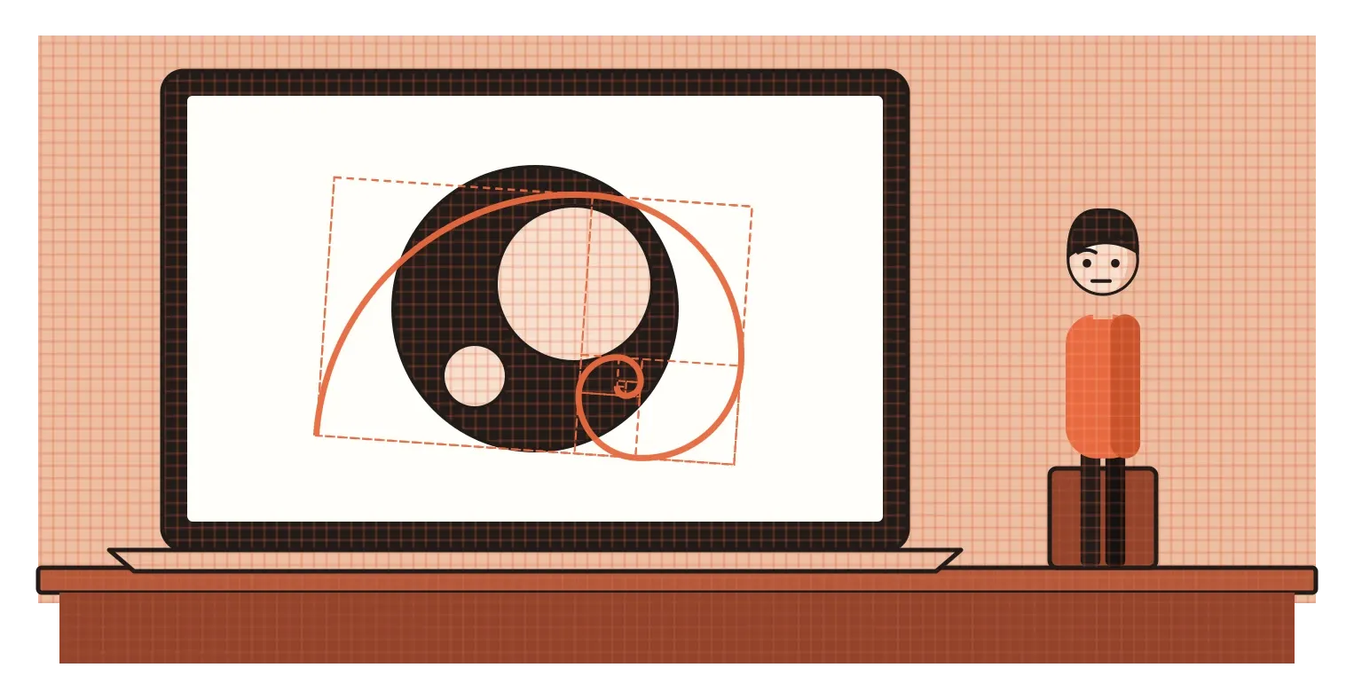
I think the golden ratio deserves a proper look, partly because it really is a fascinating number, and partly because it's one of the most misunderstood ideas in design. It does appear in some surprising places. It has been used deliberately by some artists and architects. But a lot of what's said about it, especially the idea that great works of art and design were all secretly built on it, or that people are naturally drawn to it above every other ratio, doesn't hold up when you check. This post is about separating the real story from the myth, which turns out to be a good lesson in thinking critically about any design "rule".
What the number actually is
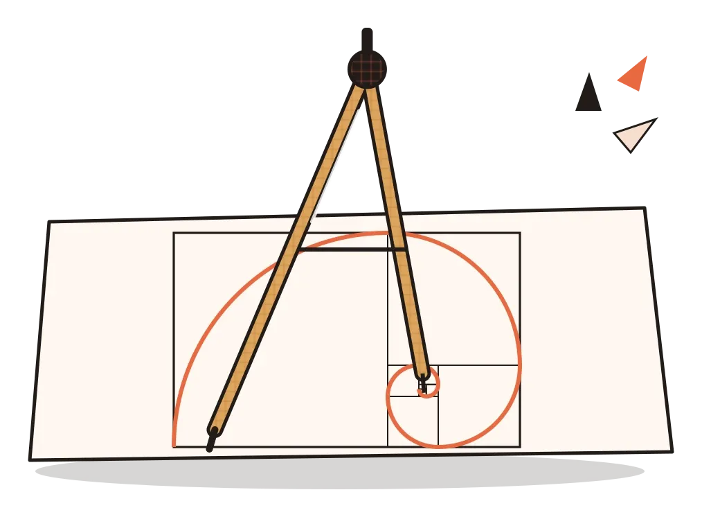
The golden ratio is a number, roughly 1.618, usually written with the Greek letter phi. The easiest way to understand it is with a line. Divide a line into two unequal parts so that the ratio of the whole line to the longer part is the same as the ratio of the longer part to the shorter part. The only way to do that is to make that ratio about 1.618. A rectangle whose long side is about 1.618 times its short side is called a golden rectangle, and it has a neat property: cut a square off one end and the leftover piece is another, smaller golden rectangle. Keep doing that and draw a curve through the squares, and you get the famous spiral.
The idea is very old. Around 300 BCE, the Greek mathematician Euclid described this way of dividing a line in his Elements, calling it division in "extreme and mean ratio". He was interested in it as geometry, especially for constructing shapes like the regular pentagon, where the ratio appears naturally. Much later, in 1509, the Italian mathematician Luca Pacioli published a book called De Divina Proportione, or On the Divine Proportion, with illustrations of geometric solids drawn by his friend Leonardo da Vinci. The name "golden section" seems to have come along much later still, in the 1830s, in the writing of German mathematicians.
The golden ratio is also closely linked to the Fibonacci sequence, the series of numbers that goes 1, 1, 2, 3, 5, 8, 13, 21, 34 and so on, where each number is the sum of the two before it. If you divide any number in the sequence by the one before it, the answer gets closer and closer to 1.618 the further along you go. That's a genuinely beautiful piece of mathematics, and it's partly why the golden ratio has such a mystical reputation. I'll write more about the Fibonacci sequence, including its surprising history in Indian mathematics, in the post on proportion systems.
Where it really does show up: inside a sunflower
The strongest real-world case for the golden ratio comes from plants. Look closely at the centre of a sunflower and you'll see the seeds arranged in two sets of spirals, one curving clockwise and one anticlockwise. If you count them, the numbers are very often two neighbouring Fibonacci numbers, such as 34 and 55, or 55 and 89. Pinecones, pineapples and the scales of some cacti show similar patterns. This arrangement of leaves, seeds and petals is called phyllotaxis, and it has fascinated scientists for centuries, including the computing pioneer Alan Turing, who was studying it in the last years of his life.
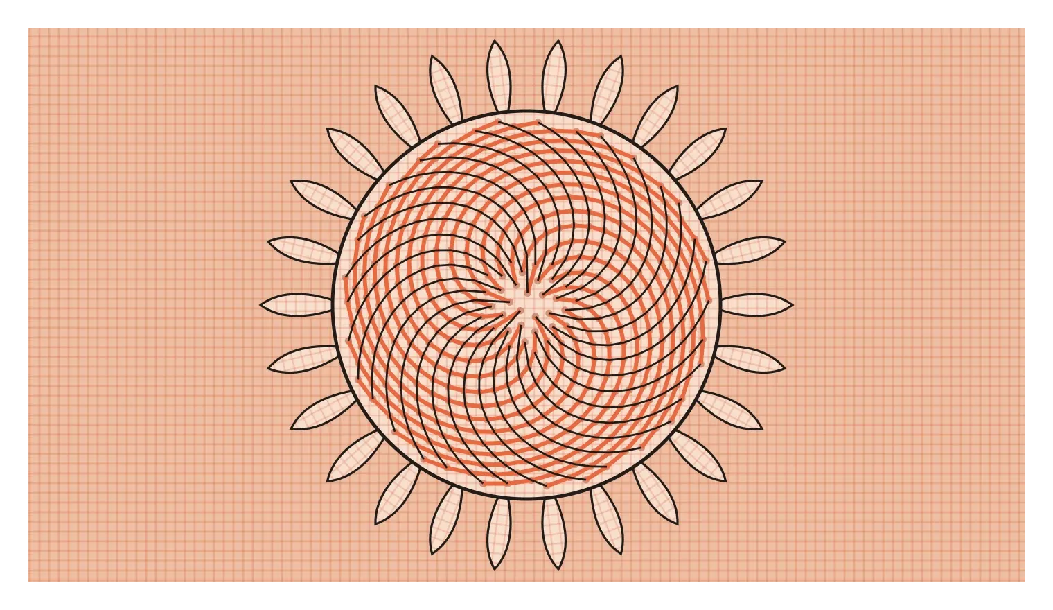
The reason is quite elegant. As a sunflower grows, each new seed forms at the centre at an angle of about 137.5 degrees from the one before. That angle, called the golden angle, is closely related to the golden ratio, and it happens to be extremely good at packing seeds tightly without leaving gaps or lining them up in wasteful straight rows. The spirals we see are simply a side effect of that efficient growth. The golden ratio here isn't decoration. It's the result of a plant solving a packing problem.
Even this example needs a small caution, though. In 2016, a large citizen science project called Turing's Sunflowers, led by Jonathan Swinton and Erinma Ochu, collected and analysed hundreds of sunflower heads grown by members of the public. Most showed Fibonacci patterns, but around one in five did not, showing other number sequences or more irregular arrangements. So even in nature's best example, the golden ratio is a strong tendency rather than an unbreakable law. That's worth remembering, because the leap from "it appears in sunflowers" to "it's the secret of all beauty" is where the myths begin.
Where the story gets stretched
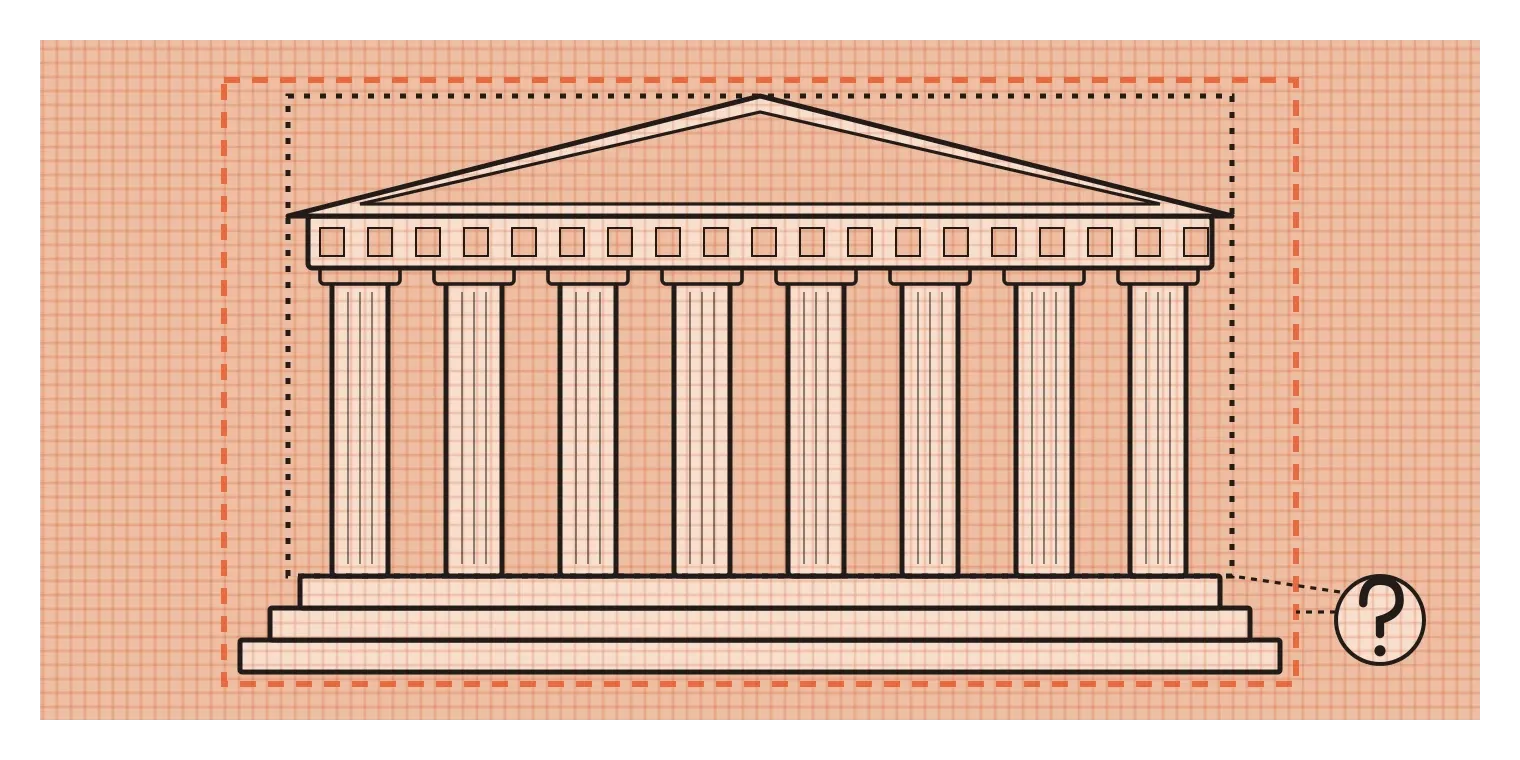
The most famous claim is that the ancient Greeks designed the Parthenon in Athens using the golden ratio. It's repeated in countless books and lectures, but there's no ancient text saying the builders did this, and the measurements depend heavily on where you choose to start and stop measuring. Draw a rectangle around the front of the building one way and you get something close to 1.618. Draw it slightly differently, including or excluding the steps or the roof, and you get a different number. In 1992, the mathematician George Markowsky published a paper called "Misconceptions about the Golden Ratio", looking at popular claims about the Parthenon, the Great Pyramid, Leonardo's paintings and other famous works. His conclusion was that most of them were either unsupported or relied on very selective measurements.
The nautilus shell is another favourite. Its beautiful spiral is often presented as a perfect golden spiral. The nautilus does grow in a type of curve called a logarithmic spiral, where the shape stays the same as it gets bigger. But measurements of real shells have generally found that their spirals grow at a different rate from the golden spiral, and vary from shell to shell. The shell is a stunning piece of natural geometry. It just isn't the golden ratio.
Logos are where the myth has spread fastest in recent years. Diagrams showing famous logos built from circles whose sizes follow the golden ratio are shared widely, but they're usually drawn by fans after the fact, and the original designers rarely confirm that they worked that way. In 2008, a brand strategy document for Pepsi's redesign, produced by the agency Arnell Group, leaked online. It linked the new logo to the golden ratio, the Mona Lisa, the Earth's magnetic field and even the theory of relativity, and it was widely mocked by designers as a perfect example of using grand-sounding maths to justify a simple design. To be fair, some artists really have used the ratio deliberately. Salvador Dalí painted The Sacrament of the Last Supper in 1955 on a canvas with golden proportions, and Le Corbusier built a whole system around it, which I'll cover in a later post. The problem isn't that the golden ratio is never used. It's that it's credited far more often than it was actually used.
Do people really prefer it?
The other big claim is that humans are naturally drawn to the golden ratio, so anything built on it will automatically look more beautiful. This idea has a real scientific starting point. In the 1870s, the German psychologist Gustav Fechner, one of the founders of experimental psychology, showed people a set of rectangles with different proportions and asked which they found most pleasing. The golden rectangle came out on top more often than any other, which seemed to confirm the theory.
The problem is what happened afterwards. Over the following century and a half, many researchers tried to repeat Fechner's experiments in different ways, and the results have been mixed. Some studies found a mild preference for rectangles somewhere around the golden ratio. Others found no particular preference at all, or found that people's choices depended heavily on how the question was asked, which shapes they were shown alongside and even which way the rectangles were turned. Reviews of this research, including work by the psychologist Chris McManus, have generally concluded that if there is a preference for the golden ratio, it's weak and inconsistent, not the powerful universal law it's often presented as.
What seems more likely is that people tend to like rectangles that are neither too square nor too stretched. Plenty of different ratios fall into that comfortable range. A4 paper, at about 1.41, sits in it. So do the 3:2 shape of many photographs and the 16:9 shape of most screens. None of these is the golden ratio, yet all of them are perfectly pleasant and widely used. The golden rectangle is one good option among many, not a magic shape that outperforms the rest.
Use it as a tool, not as proof
None of this means the golden ratio is useless. It's a perfectly good proportion, and it can be a helpful starting point when you're unsure. If you need to split a layout into a main area and a sidebar, a roughly 62 to 38 split based on the golden ratio often looks comfortable. Some designers use it to build type scales, where each heading size is about 1.618 times the one below, although many find that jump too large for everyday interfaces and choose a gentler ratio instead. Using it in these ways is completely reasonable. It's simply one tool among many, alongside the rule of thirds, the square root of two and a good designer's eye.
Where it goes wrong is when it's used as proof. Drawing a spiral over a finished design to show that it's "mathematically perfect" doesn't make the design better, and it can distract from the real reasons a design works or doesn't, like clear hierarchy, good contrast, readable text and a real understanding of the people using it. If a layout feels wrong, adjusting it until it matches 1.618 won't necessarily fix it. Looking at it with fresh eyes, testing it with real people and asking what it needs to do usually will.
I think the golden ratio is a useful case study in something bigger, which is how to treat design "rules" in general. Many of the principles in this series have solid research or long practical experience behind them. Some are more like stories that get repeated because they're satisfying. The habit worth building is to ask, every time, where a claim comes from and whether anyone has actually checked it. The golden ratio survives that question as a beautiful piece of mathematics and an occasionally handy proportion. It just doesn't survive as the secret behind all beauty, and that's fine. Good design was never going to come down to one number.
Further reading: George Markowsky, "Misconceptions about the Golden Ratio" (1992) · Mario Livio, The Golden Ratio (2002) · Jonathan Swinton and Erinma Ochu, "Novel Fibonacci and non-Fibonacci structure in the sunflower" (2016)